What Is UI? A Simple Guide to User Interface Design
Curious about what is UI? This guide breaks down user interface design with clear examples, core principles, and tips for creating amazing digital experiences.

Ever wonder what a User Interface (UI) actually is? In simple terms, it's everything you see and touch on an application or website. It’s all the buttons, the icons, the text, and the screens that let you interact with a digital product.
Think of it as the bridge between you and the technology.
What Is a User Interface and Why Does It Matter?
Let's use an analogy. Imagine sitting in the driver's seat of a car. You have a steering wheel to direct it, pedals to control its speed, and a dashboard to see how fast you're going. Those elements are the car's user interface—they let you control the vehicle and understand what it's doing.
In the digital world, a UI does the exact same thing. It’s the collection of screens, buttons, icons, and menus that allow you to interact with a product.

This interface is the very first thing a person experiences, and it’s responsible for that all-important initial impression. Even the most powerful software can feel completely unusable if the UI is cluttered, confusing, or just plain ugly.
The Critical Role of First Impressions
A great UI does more than just look pretty; it builds instant trust and guides the user without them even having to think. When the layout and components are intuitive, users feel confident and in control. This kind of seamless interaction is what separates successful products from forgotten ones.
Consider these key impacts:
User Retention: A clean, intuitive UI makes people want to stay and explore. Research shows that 88% of online consumers are less likely to return to a site after a bad experience. That's a huge number.
Brand Perception: Your UI is a direct reflection of your brand's quality. A polished, professional interface tells the world you’re a professional and trustworthy company.
Conversion Rates: A clear path to action, guided by well-placed buttons and logical forms, can dramatically increase sign-ups, sales, and any other goal you're aiming for.
Designing for Your Audience
Here's the thing: effective UI is never one-size-fits-all. It demands a deep understanding of who will be using the product. This is why creating detailed user profiles is so important. By defining the target audience, designers can make informed choices about everything from layout and typography to colour schemes that will resonate with their specific users.
Practical Recommendation: Before you design a single screen, create detailed user personas. This forces you to think about your users' goals, frustrations, and technical skills, ensuring your UI decisions are grounded in real user needs, not just assumptions.
If you want to dig deeper into this, check out our guide on creating a comprehensive user persona template.
A thoughtfully designed interface makes technology feel effortless and directly influences whether a user sticks around or leaves in frustration, ultimately impacting business success.
A UI is more than just a collection of visual elements. To summarise, it serves several core functions that make a digital product work for its users.
Core Functions of a User Interface
Function | Description | Example |
|---|---|---|
Interaction | Enables users to directly control and manipulate the system. | Tapping a button, dragging a slider, typing in a text field. |
Information Display | Presents data and system status in a clear, understandable way. | A dashboard showing analytics, an error message, a loading bar. |
Navigation | Provides a clear path for users to move through different parts of the product. | A navigation menu, breadcrumbs, back buttons. |
Guidance | Helps users understand how to complete tasks and achieve their goals. | Tooltips, instructional text, progress indicators on a form. |
Feedback | Confirms user actions and communicates the result or system response. | A "Success!" message after a form submission, a button changing colour when clicked. |
Each of these functions must work together seamlessly for the UI to be truly effective.
Ultimately, UI is the crucial bridge between a person and a piece of complex technology. Platforms like Uxia help teams validate that this bridge is strong and reliable, ensuring the final product is not just functional but a genuine delight to use.
The Inseparable Bond Between UI and UX
One of the biggest points of confusion in digital design is the difference between User Interface (UI) and User Experience (UX). It’s a common mix-up. While they’re totally different disciplines, they are completely intertwined. A product simply cannot succeed without both working in harmony.
Let’s break it down with an analogy. Think about building a house.
User Experience (UX) is the architectural blueprint. It defines the structure, the flow from room to room, and where the doors should go for easy access. UX makes sure the house is logical, functional, and actually liveable.
User Interface (UI) is the interior design. This is the stuff you see and touch—the paint colours, the light fixtures, the texture of the floors, and where the furniture is placed. UI makes the house look and feel good.

You could have a stunning room with beautiful paint and expensive furniture (that’s good UI). But if that room is stuck in a house with a bizarre layout and no windows (that’s bad UX), the overall experience is a disaster. The beautiful room can’t fix a flawed foundation.
How UI Brings UX to Life
This relationship is symbiotic. The UX team does the upfront work—research, defining user journeys, and creating wireframes that map out the product's core logic. They’re answering the big question: "How can we solve the user's problem in the most effective way?"
Then, the UI designer steps in. They take that structural blueprint and give it a tangible, visual form. They translate the UX strategy into the interactive elements users actually see and click on. A great UI makes the intended user journey feel effortless, almost invisible. If the UX plan calls for a simple checkout process, the UI designer is the one who creates the clear buttons, logical forms, and visual feedback that guides the user through it without a second thought.
UI is the saddle, the stirrups, and the reins. UX is the feeling that you get being able to ride the horse.
Essentially, UX defines the problem and sketches out the solution’s skeleton. UI adds the skin and personality, making it engaging and approachable. A beautiful interface that leads nowhere is useless, and a brilliant user flow that's ugly and confusing will just be ignored. If you want to dig deeper into their specific roles, you can explore the key differences between UX and UI design in our detailed guide.
The Business Impact of Getting Both Right
Nailing both UI and UX isn’t just a nice-to-have; it's a business necessity. When they come together effectively, you get a product that’s not just nice to look at, but also incredibly good at solving a real need. This powerful combination leads directly to happier users, stronger loyalty, and, ultimately, better business outcomes.
Practical Recommendation: Foster constant communication between UI and UX designers. Hold joint workshops and review sessions. When UX provides the wireframes, the UI designer should be there to ask questions and understand the 'why' behind the structure. This collaborative approach, facilitated by platforms like Uxia that provide a common ground for testing, prevents the silo effect where a beautiful UI is forced onto a flawed UX foundation.
The Building Blocks of Modern UI Design
Every great interface you use, from a simple mobile app to complex business software, is built from the same set of basic parts. Think of them as the alphabet of design. Knowing these building blocks helps you understand not just how to use digital products, but also how to talk to the teams who build them.
These elements fall into a few key categories, and each one has a specific job to do in helping you get things done. Once you grasp their purpose, you start to see what makes an interface feel so intuitive.
Core Component Categories
At its heart, UI design is about picking the right components for the right task. It’s a lot like how a chef chooses specific ingredients for a recipe; a designer works from a well-defined palette of interactive elements.
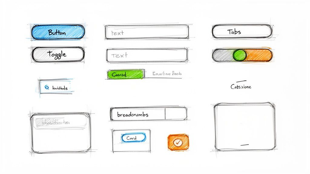
Input Controls: These are all the ways you give information to the system. You’re already familiar with them: buttons to confirm an action, text fields to type in your name, checkboxes to pick a few options, and toggles to switch a setting on or off.
Navigational Components: These elements guide you around a product. Think of things like menus that show you different sections, breadcrumbs that tell you where you are, and tabs that let you switch between views without losing your place.
Informational Components: These give you context or feedback. Icons provide quick visual hints, tooltips offer extra info when you hover, and notifications alert you to important updates. When thinking about these crucial visual elements, exploring AI icon generator tools can be a great way to create consistent and recognisable components for your interface.
An effective user interface is like a good conversation. The components are the words, and the layout is the grammar. When structured correctly, the meaning becomes effortlessly clear to the user.
While individual components are vital, their real power comes alive when they’re combined into UI patterns.
Understanding UI Patterns
A UI pattern is simply a proven, reusable solution to a common design problem. Instead of reinventing the wheel every time, designers lean on these established "recipes" for interaction. Why? Because you, the user, already know how they work, which makes learning a new app so much easier.
For instance, the "card" layout is a pattern you see everywhere—from social media feeds to online shops—used to show bite-sized chunks of content. Another classic is the "wizard," which breaks down a complicated task like signing up for a service into a series of simple, manageable steps. These patterns are essential for structuring a clear user flow diagram, making sure the path you follow is logical and predictable.
Practical Recommendation: Before designing a new feature, research existing UI patterns that solve a similar problem. Look at popular apps in your industry. This not only saves time but also ensures you're using a solution that users are likely to find familiar and intuitive. You can then use a tool like Uxia to quickly test if that chosen pattern actually works for your specific user journey.
The Core Principles of Powerful UI Design
Knowing the building blocks of an interface is one thing. Assembling them into something great is another entirely. A pile of buttons, menus, and text fields only becomes a powerful user interface when it’s built on a solid foundation of design principles. These are the unspoken rules that separate confusing digital products from those that feel intuitive, almost like an extension of your own thoughts.
These principles aren't just artsy suggestions; they're the logic that makes a design work. They turn a visual layout from a jumble of parts into a clear, predictable, and efficient tool. When a UI gets this right, you stop thinking about how to use it and focus purely on what you want to achieve.
Hierarchy and Consistency
The two most important principles are visual hierarchy and consistency.
Hierarchy is all about arranging elements to communicate their importance. Designers use size, colour, and placement to guide your eye, leading you to the most critical actions first. Think about it: a big, bright "Sign Up" button naturally grabs your attention far more than a small, grey "Cancel" link. That’s hierarchy in action.
Consistency is what makes an interface learnable. When the same icon or button style is used for the same action throughout a product, you start to build a mental map of how things work. This predictability is huge—it lowers the mental effort needed to navigate, building your trust and confidence with every click.
A powerful UI is a deliberate craft, not an artistic whim. It follows established rules to create clarity, guide user actions, and build a sense of reliable familiarity.
Feedback and Accessibility
Beyond a solid structure, a great UI has to communicate. This is where feedback comes in. When you tap a button, it should react—maybe by changing colour or showing a quick animation. That tiny confirmation tells you, "Yep, I got that." Without it, you're left wondering if anything happened, which leads to frustration and mashing the button again.
Finally, accessibility is about making sure the interface works for everyone, regardless of their abilities. This means things like providing high-contrast text for people with visual impairments or ensuring every function can be controlled with a keyboard. Accessibility isn't a "nice-to-have" anymore; it's a legal and ethical must.
The UI/UX design market in Europe is exploding, projected to grow from USD 2.20 billion in 2025 to a massive USD 9.28 billion by 2030. A huge driver for this is the European Accessibility Act, which fully kicks in by June 2025. It mandates that digital products have to be inclusive, pushing companies to standardise accessible UI components. You can dive deeper into this trend and its impact on the Mordor Intelligence report.
Practical Recommendation: Create a simple design system or style guide, even for a small project. Define your primary colours, font sizes, and button styles. This document becomes your single source of truth for consistency. Then, use an AI validation tool like Uxia to check your designs for accessibility issues like low contrast or missing labels, ensuring you're building an inclusive product from the start.
How to Validate Your UI with Confidence
A great user interface never happens by accident. It's the product of deliberate, rigorous testing—not guesswork. Once you've established the principles of a good UI, the next logical step is to see if your design actually holds up in the hands of real people. This validation process is what separates a pretty design from a genuinely user-centric product.
For years, teams have leaned on methods like A/B testing or moderated user studies. While these can be valuable, they come with some serious drawbacks. They’re often painfully slow, taking weeks just to find and schedule participants, and the costs can quickly spiral out of control. That pace just doesn't work for modern product development, where quick iteration is everything.
The Rise of AI in UI Validation
Fortunately, a much smarter and faster way to test has emerged. Teams are now turning to AI-powered platforms to crush the entire validation cycle. This approach sidesteps all the usual headaches of traditional testing—like human bias and scheduling nightmares—to deliver almost instant feedback.
This simple decision tree helps you quickly gauge the core strengths of any user interface.
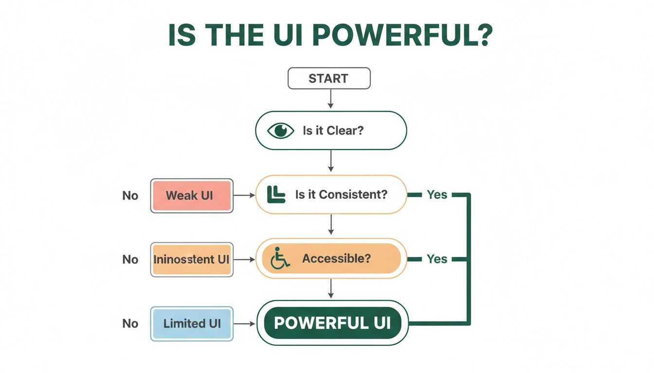
As the flowchart shows, a powerful UI isn’t just about one thing; it's the sum of its parts. True strength comes from being clear, consistent, and accessible. A failure in any single area weakens the entire experience.
A Practical Way to Test at Speed
So, how do you put this into practice? Product teams can use a platform like Uxia, which deploys synthetic AI testers built to analyse your interface designs with incredible speed and accuracy. Forget waiting weeks to find real users. You just upload a design, assign a task, and get back actionable feedback in minutes.
The benefits are immediate:
Speed: Go from a design concept to data-backed insights in minutes, not weeks.
Scale: Run as many tests as you need without the overhead of managing human participants.
Objectivity: Get rid of the biases that creep in from professional testers or unrepresentative user groups.
By using AI for UI testing, teams can shrink the feedback loop from weeks down to mere minutes. This unlocks the kind of rapid, informed iteration needed to build truly exceptional products.
This shift in testing is a game-changer. AI tools complement established practices like User Acceptance Testing (UAT) by providing incredibly fast, early-stage feedback long before you get to final validation.
Thinking about how traditional testing stacks up against this modern approach? Here’s a quick comparison.
UI Testing Methods Compared
Method | Typical Speed | Relative Cost | Key Benefit |
|---|---|---|---|
Traditional Usability Study | Weeks | High | Deep qualitative insights from real people. |
A/B Testing | Days to Weeks | Moderate | Optimises a single variable with quantitative data. |
Unmoderated Testing | Days | Moderate | Gathers feedback at scale without a facilitator. |
AI Synthetic Testing (Uxia) | Minutes | Low | Near-instant, scalable, and objective feedback. |
While traditional methods have their place, the speed, cost, and scalability of AI-powered testing are hard to ignore for teams that need to move fast.
Platforms like Uxia give you the clarity and confidence to move forward quickly. They generate detailed reports that show you exactly where users might get stuck, which bits of copy are confusing, and what crucial elements are being missed. This level of granular feedback, delivered almost instantly, is what helps product teams win.
To dive deeper into modern validation techniques, check out our detailed guide on user interface design testing.
Got Questions About UI? We’ve Got Answers.
To wrap things up, let’s dig into some of the most common questions that pop up for aspiring designers, product managers, and anyone curious about the world of user interfaces. These answers get straight to the point on tools, career paths, and core UI concepts.
What Tools Do UI Designers Actually Use?
At the end of the day, UI designers live in vector design software. This is where they build high-fidelity mockups and create the interactive prototypes that bring their ideas to life. Right now, the big three are Figma, Sketch, and Adobe XD.
Figma has absolutely taken over in recent years, mainly because its real-time collaboration is second to none, making it a dream for team-based work. Beyond the core design tool, teams often use specialised tools like Storybook to build and maintain their design systems. And for the critical hand-off to developers? Tools like Zeplin used to be the go-to, but Figma's own built-in features have become so powerful that many teams just stay within the one ecosystem. The "best" tool really just depends on a team's existing workflow.
Can You Have a Good UI Without Good UX?
Technically, yes—but it's a recipe for disaster. It’s entirely possible to design a visually stunning app (good UI) that is a nightmare to navigate (bad UX). And that product will almost certainly fail.
Think of it like a beautiful, sleek sports car with the steering wheel in the back seat. It looks incredible, but it’s completely unusable. Good UX is the blueprint, the logical foundation that solves a user's problem. Good UI is the intuitive and enjoyable surface that lets them interact with that solution.
Good UI is the finishing touch on a solid UX foundation. Without that foundation, even the most beautiful interface is just a pretty facade on a flawed structure.
How Can I Start Learning UI Design?
The best way to learn is to jump right in and mix theory with a ton of hands-on practice. It’s not about just reading, it’s about doing.
Master the Principles: Don’t just skim the core principles we discussed earlier—like hierarchy, colour theory, and consistency. Really internalise them.
Become an Observer: Start actively analysing the apps and websites you use every day. Break them down. Ask yourself why they work. What makes the UI so effective and easy to use?
Get Your Hands Dirty: Pick a tool like Figma (it has a great free plan) and just start building. A fantastic way to learn is by recreating screens from well-designed apps you admire. This forces you to master the mechanics.
Build Your Portfolio: Don't wait for a job to start working. Create your own personal or conceptual projects to apply what you've learned. A portfolio showing you can solve real problems is everything.
How Does a Tool Like Uxia Improve a Product's UI?
A platform like Uxia improves a product's UI by completely demolishing the feedback loop. Traditionally, getting user feedback on a design is a slow, painful process. It can take weeks of recruiting people, scheduling sessions, and then analysing the results.
With Uxia, you can upload a design and get a deep usability analysis from AI-powered synthetic testers in just a few minutes. These aren't just bots; they simulate real user journeys, flagging exactly where an interface is confusing, where buttons get missed, and where the user flow completely breaks down.
The platform spits out heatmaps and clear, actionable reports that pinpoint the exact friction points. This kind of practical, data-driven feedback lets designers iterate with incredible speed and confidence. It ensures the final UI isn't just beautiful, but that it actually works.
Ready to build user interfaces that just work? With Uxia, you can get actionable feedback on your designs in minutes, not weeks. Start making data-driven decisions and create products your users will love. Learn more and start testing today.