Build Better Products with a User Flow Diagram
Learn how a user flow diagram can map user journeys, reduce friction, and improve UX. Get actionable tips, templates, and examples to build better products.

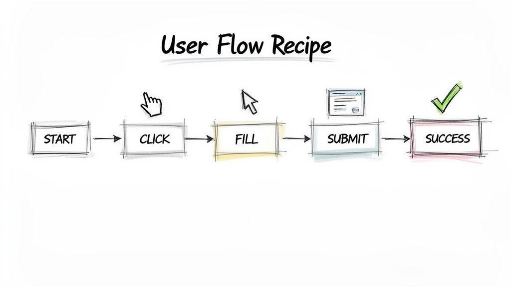
Think of a user flow diagram as a visual recipe for your app or website. It maps out the exact steps someone takes to get something done, charting their journey from the very first click to their final goal. It’s the blueprint for an intuitive experience.
Practical Recommendation: Before your team writes a single line of code, create a user flow diagram. This simple step forces everyone—designers, developers, and product managers—to align on the user’s path, preventing costly rework later. With a platform like Uxia, you can then validate this flow with AI testers in minutes.
What Is a User Flow Diagram
Imagine trying to explore a new city without a map. You might get to where you’re going eventually, but the trip would be confusing, frustrating, and full of wrong turns. A user flow diagram is that map for your digital product, making sure your users never feel lost.
Forget complex technical documents. It’s better to think of it as a story. It follows a user’s path as they try to complete a task, like signing up for a trial, buying a product, or resetting their password. By visualising this journey, your team can spot potential roadblocks and friction points long before writing a single line of code.
The Core Purpose of User Flows
The whole point of a user flow is to force you to design from the user's perspective. It pulls your team out of its internal bubble and makes everyone think about the actual clicks, decisions, and screens a real person will interact with.
This "think first" approach is a game-changer for a few key reasons:
It Aligns the Entire Team: A user flow becomes the single source of truth. Designers, developers, and product managers are all looking at the same map, speaking the same language.
It Reveals Friction Early: The diagram immediately highlights confusing steps, dead ends, or paths that are just too long. These are the exact spots where users give up.
It Prevents Expensive Rework: Fixing a mistake in a diagram is easy. Fixing it after the product has been built is a nightmare of time and money.
Recent research underscores just how critical this is. A survey of the European UX design scene found that a whopping 61.5% of designers named poorly planned navigation as the top reason users abandon a website or app. This is especially true in the booming Spanish tech market, where a seamless user experience is the key to standing out. User flow diagrams directly attack that number one cause of user drop-off. You can dig into similar research over on FlowMapp.com.
Practical Recommendation: Before you even dream of opening a design tool, grab a whiteboard and sketch out a basic user flow. This low-fidelity exercise gets everyone collaborating and ensures the core logic is solid before you invest hours in detailed design. Platforms like Uxia can then help you test even these early sketches to find issues.
Ultimately, a good user flow diagram is the bedrock of any successful digital product. It isn't just about drawing shapes and arrows; it’s about building empathy for your user and creating a smooth, effortless path to their goal.
From there, tools like Uxia can take this a step further. You can test your designs with AI-powered synthetic users to validate that the flow you mapped out actually works in practice. It's a modern way to confirm your assumptions and understand the true importance of user testing.
The Building Blocks of a User Flow Diagram
To build a user flow diagram that actually works, you need to speak its language. The good news is, it’s not complex jargon. It’s a simple visual shorthand that lets anyone on your team—from developers to marketers—grasp a user’s journey instantly. Think of the symbols as the basic ingredients in your visual recipe.
Each shape has a specific job, representing a different kind of moment in the user's path. When you connect them, they tell a clear story of interaction, decisions, and outcomes. Getting these core components right is the first step toward mapping experiences that feel completely natural to your users.
The Essential Shapes and Symbols
While you could get lost in dozens of different symbols, a handful of core shapes will do most of the heavy lifting. If you can master these basics, you have everything you need to start mapping out clear, effective user journeys.
These symbols are the foundation of your diagram:
Ovals (Start/End Points): These mark the very beginning and end of a user’s journey. An oval signals an entry point, like "User lands on the homepage," or a final success state, such as "Purchase complete."
Rectangles (Actions or Processes): This is your workhorse shape. Each rectangle represents a specific action the user takes or a process the system performs—things like "Click 'Sign Up'" or "Enter payment details."
Diamonds (Decisions): Diamonds pop up whenever there’s a fork in the road. They represent a point where a decision must be made, usually a question with a "Yes/No" or "True/False" outcome, such as "Is the user already logged in?"
Practical Recommendation: Create a shared key or legend for your user flow symbols and store it in your team's design system or wiki. This ensures that everyone, from new hires to senior stakeholders, uses a consistent visual language, which makes collaboration much smoother. This consistency is also crucial when setting up automated tests in a tool like Uxia.
Below is a quick reference table for the most common symbols you'll encounter.
Standard User Flow Diagram Notation
Name | Purpose |
|---|---|
Oval (Terminator) | Marks the start or end point of a flow. |
Rectangle (Process) | Represents an action, task, or screen. |
Diamond (Decision) | Indicates a question or branch in the path. |
Arrow (Flowline) | Shows the direction of the user's progression. |
Having this simple toolkit is all it takes to start visualising complex user experiences.
Connecting the Dots with Lines and Arrows
If shapes are the nouns and verbs of your diagram, the connectors are what turn them into sentences. Simple lines with arrows connect the shapes, showing the direction of travel from one step to the next.
These connectors are what put the "flow" in a user flow. They guide the eye through the sequence of events, illustrating the exact path a user takes after each action or decision. Without clear, directional lines, your diagram would just be a confusing jumble of shapes.
For example, a diamond asking "Valid password?" would have two arrows pointing away from it. One, labelled "Yes," would lead to an "Access account" rectangle. The other, labelled "No," would point to an "Show error message" action.
A Practical Example: A Password Reset Flow
Let's put these building blocks into action with a super common scenario: resetting a password.
Start (Oval): User clicks "Forgot Password."
Action (Rectangle): User enters their email address and clicks "Submit."
Process (Rectangle): The system sends a reset link to the user's email.
Decision (Diamond): Did the user receive the email and click the link?
End (Oval): If no, the flow might end or loop back. If yes, the user is taken to a new screen to complete the reset.
This simple sequence shows how these different components lock together to map out a complete task. It’s also a brilliant starting point for getting inside your users' heads. By mapping flows like this, you begin to see the experience through their eyes, which is essential for crafting realistic user profiles. To go deeper, you can learn how to create a comprehensive profile with a user persona template that brings your target user to life.
With platforms like Uxia, you can then take these mapped-out flows and test them with AI to find hidden friction points long before a single line of code gets written.
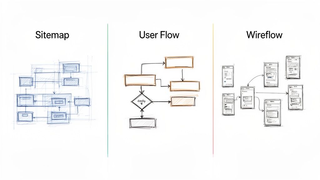
User Flow vs. Sitemap vs. Wireflow: What's the Difference?
When you're designing a digital product, you quickly find yourself swimming in a sea of diagrams and terms that all sound vaguely the same. User flows, wireflows, sitemaps… they’re all essential tools, but they do very different jobs. Knowing when to use which is the key to planning a product that actually works for people.
Let's use an analogy. Imagine you're designing a large building, like a museum.
A sitemap is your architectural blueprint. It shows every room, every floor, and how they’re all connected hierarchically. It’s a complete structural overview, but it won’t tell you the best route to find the impressionist art exhibit.
A user flow diagram is that specific route. It’s the guided path you map out for a visitor who has one goal: "I want to see the Monet paintings." It charts the exact steps they take—from the entrance, past the ticket counter, up the stairs, and into the right gallery. It’s all about the journey, not the entire building.
The Sitemap: The 30,000-Foot View
A sitemap is a high-level chart showing every page on a website or screen in an app. Its job is to define the information architecture and make sure the navigation is logical. Think of it as a complete inventory of your content.
Focus: Structure and hierarchy.
Answers: "What pages exist and where do they live?"
Best For: Planning content organisation and making sure no pages are left stranded.
The User Flow Diagram: The Mission-Specific Path
This is where we zoom in. A user flow diagram deliberately ignores parts of the product that aren't relevant to the user’s immediate goal. Instead, it maps out the sequence of actions, decisions, and screens needed to complete one specific task, like buying a ticket or resetting a password.
It’s less about the entire museum and more about one person's mission inside it. This laser focus is what makes it so powerful for spotting friction points and optimising a specific experience. To tell this story, we use a simple, universal language of shapes.
Here’s a look at the core building blocks you’ll use.
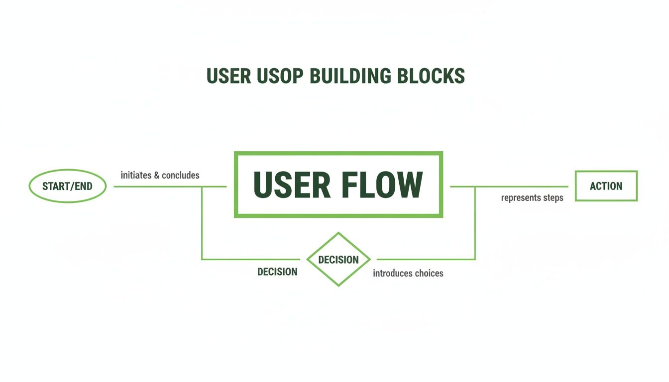
These fundamental shapes are the grammar of a user flow. Ovals mark the start and end points, rectangles show actions, and diamonds represent decision points. They let you tell a clear, unambiguous story about the user’s journey.
Getting this visualisation right isn't just a design nicety; it's a critical communication tool. A comprehensive European analysis of scientific studies found that only 56% of flow diagrams actually met established guidelines. The fact that 47% of these studies came from European institutions shows a widespread gap in clearly communicating complex processes. For UX designers in Spanish scaleups, this is a lesson: building robust, easy-to-read user flows isn’t just good practice—it's essential for getting everyone on the same page. You can dig into the findings on procedural mapping yourself.
The Wireflow: The Hybrid Approach
So what’s a wireflow? It’s a hybrid. It mashes up the high-level path of a user flow with the screen-level detail of wireframes. Instead of using abstract shapes like rectangles to represent a screen, a wireflow plugs the actual low-fidelity wireframe of that screen right into the diagram.
Practical Recommendation: Start with a user flow diagram to lock down the logic and steps first. Once you're confident in the core path, you can evolve it into a wireflow to start thinking about the layout and UI elements on each screen. This modular approach ensures your logical foundation is solid before you invest time in visual design. You can even test the initial user flow logic with Uxia using simple sketches to de-risk your project early.
This approach gives you a lot more visual context than a standard user flow, but it's also more work to create. It's best used when you need to show exactly how a user moves through a sequence of specific screen layouts.
To sum it up, each tool has its moment. Sitemaps define structure, user flows optimise tasks, and wireflows connect screen designs to a specific path. But when you need to validate the core logic of a user’s journey before a single pixel is pushed, the user flow diagram is your non-negotiable starting point. It's the foundation you can later put to the test with platforms like Uxia, ensuring your theoretical path survives contact with real-world interaction.
Common User Flow Patterns and Real-World Examples
The theory behind user flows snaps into focus when you see it in action. These aren’t just abstract diagrams for a workshop; they map out the digital journeys we take every single day. From ordering a coffee on an app to signing up for a new service, there are common patterns that give us a solid foundation for almost any design project.
By studying these well-trodden paths, you can stop reinventing the wheel and start optimising journeys that are already proven to work. Let's break down a few of the most frequent and critical user flow patterns you'll encounter.
Always Start with the "Happy Path"
Here’s a piece of advice that seasoned designers live by: always start with the "happy path". This is the ideal, frictionless journey where the user does everything right and the system works perfectly. Mapping this best-case scenario first gives you a clean, logical backbone for your entire design.
Practical Recommendation: Before you get bogged down in error messages or alternative routes, just map the perfect journey from start to finish. Once that core user flow diagram is solid, you can then build out all the edge cases and error states. This approach keeps you focused and prevents your first draft from becoming a tangled mess. Use a platform like Uxia to validate this happy path quickly before investing time in more complex scenarios.
E-commerce Checkout Flow
The classic e-commerce checkout is probably the most common user flow diagram you’ll see. The goal is simple: get a user from adding an item to their cart to completing a purchase. But that path is littered with critical decision points that can make or break a sale.
A simplified checkout flow often looks something like this:
Start: User clicks "Add to Cart."
Action: User proceeds to the checkout page.
Decision: Is the user a registered customer or a guest?
Action: User enters their shipping and payment info.
Action: User reviews the order summary.
End: User clicks "Confirm Purchase" and lands on a success screen.
That little decision diamond—"guest checkout"—is a huge deal. Forcing registration creates a major point of friction. By offering a guest path, you cater to people who just want a quick, one-time purchase, which can directly improve your conversion rates.
New User Onboarding Flow
Onboarding is your product’s first impression. It's your one chance to welcome new users, show them the value you offer, and guide them to that first "aha!" moment. A good onboarding flow is what turns a curious visitor into an engaged, active user.
This flow often involves a few key steps:
Entry Point: User clicks "Sign Up for Free Trial."
Action: User provides basic details like an email and password.
Process: The system sends a verification email.
Action: User clicks the verification link in their inbox.
Process: User completes a quick setup, like selecting preferences or connecting an account.
End: User is guided through a short, interactive product tour.
The real power of a user flow diagram here is in planning a sequence that doesn't overwhelm someone. For a fintech app, for instance, a well-structured onboarding flow is absolutely crucial for building trust from the very first interaction. You can see how a clear path contributes to success by exploring our case study on fintech user experience.
Subscription Sign-Up Flow
A subscription flow is all about clarity and trust. The user needs to understand exactly what they’re signing up for, how much it costs, and when they’ll be billed. Any confusion here can kill the conversion, so the flow has to be completely transparent to encourage that commitment.
These patterns are just starting points, of course. To see how different companies tackle these common design challenges in the wild, check out these inspiring user flow examples. Ultimately, by mapping these journeys, you can use a platform like Uxia to test them with AI users, ensuring the path you’ve designed is as smooth in reality as it is on the diagram.
How to Validate and Iterate Your User Flows with AI
You've mapped out a user flow. That's a huge step forward, but let's be honest about what it is at this point: a well-informed hypothesis. It's your team's best guess at the most intuitive path for a user. Until it makes contact with real interaction, it remains an unproven theory.
The crucial next step is to move from creation to validation. You need to see if your theoretical flow holds up under pressure, because this is where you uncover the hidden friction, the confusing steps, and the unexpected detours that weren't obvious on the whiteboard.
The Old Way of Testing User Flows
Traditionally, validating a user flow was a slow, painful, and expensive process. It meant recruiting human participants, scheduling moderated test sessions, and then spending days sifting through recordings to spot patterns.
This old method is riddled with bottlenecks:
Recruiting: Finding and vetting test participants who actually match your target audience can easily take weeks.
Scheduling: Trying to coordinate times that work for both the tester and the moderator is a logistical nightmare.
Cost: Paying participants and moderators for their time adds up fast. We're talking thousands of euros for even a small study.
Time Lag: The entire cycle, from starting recruitment to delivering insights, can drag on for a month or more, bringing your development sprints to a grinding halt.
Because of these hurdles, many teams just don't test their flows often enough. Critical design flaws slip through the cracks, only to be discovered after a costly development cycle, which leads to frustrating and expensive rework.
A Faster, More Reliable Way with AI
Thankfully, there’s a much smarter alternative today. Platforms like Uxia are changing the validation game by using AI-powered synthetic testers to automate the whole process. This approach gets rid of the traditional bottlenecks, letting you get rich, actionable feedback in minutes, not weeks.
The process is incredibly straightforward. Instead of recruiting people, you just upload your designs—they can be static images, video prototypes, or live links—and define a mission. This mission should directly correspond to the goal of your user flow diagram.
For example, if your diagram maps out the "new user onboarding," you'd simply tell the AI testers: "Sign up for a free trial and set up your profile."
Practical Recommendation: Define your test mission in Uxia using the same language you used to label your user flow diagram. For example, if your flow's goal is "Complete purchase as a guest," make that the exact task for the AI testers. This direct link ensures you are testing precisely what you designed.
From there, Uxia gets to work instantly. Our AI synthetic testers are designed to mimic real human behaviour and cognitive patterns as they navigate your experience. They interact with your designs, "think aloud" to provide a running commentary, and systematically uncover usability issues along the way.
This gives you a level of insight that was previously impossible to achieve at speed. The AI doesn't just stick to the happy path; it explores the flow, identifies friction points, and flags everything from confusing copy to potential accessibility problems.
Getting Actionable Insights in Minutes
Within minutes of starting a test, Uxia delivers a comprehensive report. This isn't just a mountain of raw data; it's a collection of prioritised, actionable insights that your team can use immediately.
The feedback includes:
Heatmaps and Click Maps: See exactly where the AI testers focused their attention and tried to interact. This instantly reveals if your key calls-to-action are even being noticed.
Full Transcripts: Get a complete "think-aloud" transcript from each AI tester, explaining their thought process, confusion, and expectations at every single step of the flow.
Categorised Usability Issues: Uxia automatically identifies and categorises issues related to navigation, comprehension, trust, and accessibility, complete with severity ratings.
This depth of analysis is grounded in established usability principles. You can learn more about the science behind it by reading our guide on using Nielsen Norman Group research to achieve 98% usability issue detection with AI. The system effectively replicates what a human usability expert would look for, but it does it almost instantly.
The Power of Early and Frequent Iteration
This speed fundamentally changes how you work. You no longer have to wait until the end of a design cycle to get feedback.
Practical Recommendation: Use AI testing early and often to de-risk your designs at every stage. A quick 15-minute test in Uxia on a rough wireframe can uncover a critical flaw in your user flow diagram that would have taken weeks and thousands of euros to find with traditional methods.
By building this kind of rapid validation into your workflow, you can iterate with real confidence. Test a flow, make a change based on the AI feedback, and test it again—all in the same afternoon. This continuous loop of feedback and refinement ensures that by the time your designs hit development, they’ve already been thoroughly vetted, saving you from expensive and time-consuming rework down the line.
Best Practices and Common Mistakes to Avoid
Creating a good user flow diagram isn’t just about connecting shapes; it’s about telling a clear story. To get from a basic chart to a powerful strategic tool, you need to stick to some simple rules and, more importantly, sidestep the classic blunders that turn diagrams into a confusing mess.
Getting the habits right ensures your flows actually drive product decisions. Avoiding common mistakes stops project roadblocks before they even start.
Essential Best Practices for Effective Diagrams
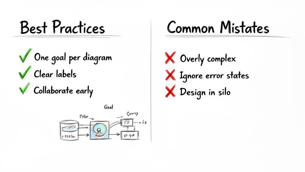
To make sure your user flow is a source of clarity, not chaos, build it on these three pillars. They keep your work focused, easy to understand, and collaborative from day one.
Focus on One Goal Per Diagram: Every flow should map a single, specific task from its start to its end. If you try to cram "sign-up" and "make a purchase" into one chart, you'll end up with a tangled nightmare nobody can follow. One flow, one goal.
Use Clear and Consistent Labels: Every shape and every arrow needs a short, action-focused label. Stick to the same terms throughout the diagram to avoid any confusion. Anyone on the team should be able to look at it and understand what’s happening without a translator.
Collaborate Early with Your Team: User flows are a team sport. Pull in designers, developers, product managers, and even marketers right from the beginning. Getting all those different perspectives helps you spot blind spots and ensures the final path makes sense to everyone involved.
Common Mistakes to Avoid
Knowing what not to do is just as important as knowing what to do. Too many teams fall into the same traps, ending up with diagrams that are either too complicated to be useful or too simple to be helpful.
Practical Recommendation: A great user flow diagram is a story about a single mission. If the story gets too complicated, the reader gets lost, and the mission fails. The goal is clarity, not cramming every possibility onto one page. Use separate diagrams for separate tasks and link them together if needed.
Steering clear of these mistakes will keep your diagrams clean, focused, and effective:
Creating Overly Complex "God Flows": It’s tempting to map every single possible user action in one giant diagram, but resist the urge. These "god flows" are totally overwhelming and a pain to update. Instead, break down big processes into smaller, more focused task flows.
Ignoring Error States and Edge Cases: The "happy path" is a nice start, but what happens when a credit card is declined or a user enters the wrong password? Forgetting to map out error states and edge cases leaves users at a dead end and your development team guessing what to build.
Designing in a Silo: This is the biggest mistake of all. If you create a user flow all by yourself, you risk designing a path that’s impossible to build, doesn't align with business goals, or completely misses what users actually need.
For a deeper dive, this guide on Best Practices for Creating Powerful User Flows is a fantastic resource. By following these principles and dodging the pitfalls, you'll turn your diagrams from simple sketches into powerful tools that guide your product to success. And once your flow is mapped, platforms like Uxia can help you validate it with AI testers in minutes, ensuring your theoretical path works perfectly in practice.
Got Questions About User Flow Diagrams?
Even after you've got the basics down, a few questions always pop up when it's time to actually build one. Let's clear up some of the most common ones so you can get back to designing with confidence.
At What Stage Should I Create a User Flow Diagram?
The sweet spot is right at the beginning of the design process. You'll get the most bang for your buck by creating a user flow after your initial user research is done, but before you start drawing a single wireframe.
Why then? Because it forces you to think through the core logic and navigation of your product first. It’s like creating a blueprint for a house before you start picking out paint colours. Getting this structure right from the start ensures the entire team is aligned on how a user will actually get things done.
Practical Recommendation: Create your user flow diagram as soon as you have defined the user problem and the desired outcome. This ensures that every design decision from that point forward serves the user's core goal.
What Is the Difference Between a User Flow and a User Journey Map?
It’s all about altitude. A user journey map is your high-level, strategic view—it paints the big picture of a person's entire relationship with your brand. It often includes feelings, motivations, and even offline touchpoints that happen long before they ever open your app.
A user flow diagram, on the other hand, zooms way in. It’s tactical. It focuses on a single, specific task inside your product, detailing the exact screens, clicks, and decisions needed to achieve one goal. Think "complete a purchase" or "reset my password."
Practical Recommendation: Start with a user journey map to spot the key moments where someone interacts with your product. Then, for each of those moments, create a detailed user flow diagram to design and perfect the specific task at hand. This connects your high-level strategy to your detailed design execution.
How Does a Tool Like Uxia Test a User Flow Diagram?
Here’s the thing: you don't actually test the diagram itself. You test the design that the diagram represents.
Once you’ve translated your user flow into a clickable wireframe or prototype, you can use a tool like Uxia to see if your logic holds up. You just upload your design and give AI-powered synthetic testers a mission that mirrors your user flow's goal (e.g., "Sign up for a free trial").
The AI will then navigate your prototype just like a real user would, stress-testing the path you’ve laid out. It instantly reports back with heatmaps, think-aloud transcripts, and any dead-ends or confusing steps it found. It’s a super-fast way to get unbiased feedback on whether your flow actually works in practice.
Ready to validate your designs and build with confidence? Uxia replaces slow, expensive user studies with AI testers who deliver actionable insights in minutes. Start testing your user flows today.