Efficient UI Validation with user interface design testing
Learn practical steps for user interface design testing, from planning through analysis, to ship polished, user-friendly interfaces.

Efficient UI Validation with user interface design testing: A Practical Guide
User interface design testing is where we kick the tyres on a product’s visual and interactive bits. It’s all about watching how real people (or their synthetic counterparts) actually use an interface to see where they get stuck, confused, or frustrated—before a single line of code is written. Practical recommendation: Make UI testing a non-negotiable step before any development handoff to catch costly issues early.
Setting the Stage for UI Tests That Actually Matter
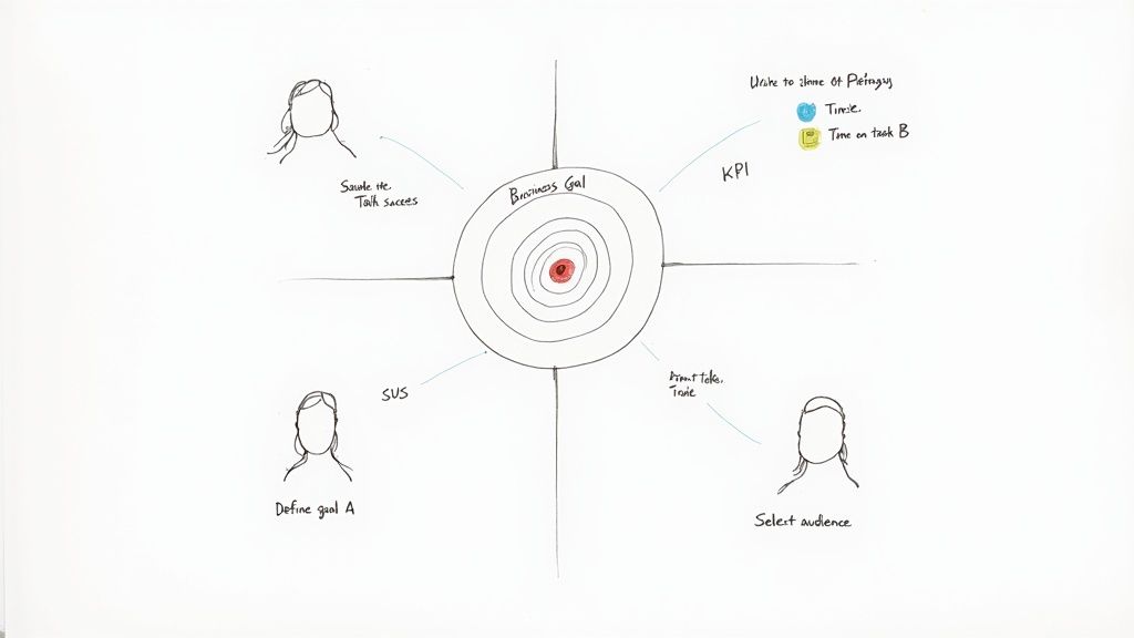
The most important work happens long before you put a prototype in front of a user. Good UI testing isn't just about collecting random feedback; it's a targeted investigation tied directly to what the business wants to achieve. You have to move past vague goals like "make it more user-friendly" to get insights you can actually act on.
The whole thing starts by asking the right questions. Are you trying to slash the number of support tickets from a clunky checkout process? Or maybe you need to boost the completion rate for your new onboarding flow? Without that kind of clarity, you're just wandering in the dark.
Nail Down Your Goals and How You'll Measure Success
To make your testing count, you need to connect it to measurable Key Performance Indicators (KPIs). This is how you turn fuzzy ideas into cold, hard targets and get real proof of what’s working and what isn't. Practical recommendation: Always define success metrics before you write a single test script.
Think about it in these terms:
Business Goal: Cut down on shopping cart abandonment.
UI Testing Goal: Find and fix the friction points in our checkout flow.
Success Metrics: A 15% drop in the cart abandonment rate and a 20% faster checkout time.
Here's another one:
Business Goal: Make users happier with a new feature.
UI Testing Goal: Check if the feature’s interface feels intuitive and does what users expect.
Success Metrics: A System Usability Scale (SUS) score of 75 or higher and a task success rate over 90%.
These numbers become your north star. They guide your analysis, help you prioritise what to fix first, and give you a powerful way to show stakeholders the real-world impact of your work. It's also crucial to separate this kind of focused UI testing from broader user experience research, a distinction you can learn more about in our deep dive on UX vs. UI.
Pinpoint Your Target Audience
Once you know what you're testing, you have to decide who you're testing with. Testing with the wrong people is a waste of time. You wouldn't ask a tourist for directions in your own hometown, right? You need to define your users with precision, thinking about their demographics, tech-savviness, and habits.
Recruitment is often the biggest headache here—it's slow and it costs money. On top of that, the industry is struggling to find enough skilled people. The UK's Chartered Institute for IT (BCS) found that 37% of firms can't find enough skilled UI designers. Research from the U.S. National Institute of Standards and Technology (NIST) also points out that 22% of software usability issues come from inconsistent design standards. It’s clear that both skill gaps and broken processes are holding teams back.
To get around these bottlenecks, smart teams are using new tools. Instead of waiting weeks to find human testers, platforms like Uxia let you generate synthetic user personas in minutes that perfectly match your target audience. This gives you relevant feedback at the speed your team works.
With synthetic testers from Uxia, you can get incredibly specific. You can ask for feedback from "first-time online shoppers aged 55-65" or "expert project managers who use competitor software." This not only speeds everything up but also cuts out the bias you often get from professional testers. A solid plan built on clear goals and the right audience is how you unlock powerful insights from every single test.
Choosing the Right Testing Methods for Your Goals
Once your goals are crystal clear, it’s time to pick the right tool for the job. There's a whole toolkit of user interface testing methods out there, and grabbing the wrong one is a fast track to fuzzy data and wasted effort.
Think of yourself as a detective. You wouldn't use a magnifying glass to survey a crime scene from a helicopter. Each method is a specialised tool built to answer specific questions.
Matching Methods to Your Mission
The trick is to map your testing method directly to what you need to learn. Are you trying to optimise a single button click, or are you trying to figure out why users get lost in a multi-step checkout flow? The answer points you straight to the right approach. Let's break down the heavy hitters.
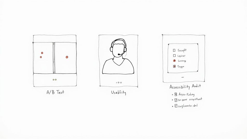
A/B Testing: The Decisive Method for Optimisation
This is your go-to when you have a specific, testable hypothesis. A/B testing is all about showing two (or more) versions of a single element—a headline, a button, an image—to different user segments to see which one performs better against a clear metric.
For example, an e-commerce site might pit a green "Buy Now" button against a red one to see which colour actually drives more sales. It delivers hard, quantitative proof about which design choice wins. It's not for open-ended exploration; it’s for making confident, data-backed decisions.
Task-Based Usability Testing: The Journey Uncovered
When you need to know if users can actually complete a process, task-based usability testing is indispensable. This is where you watch real people (or synthetic ones) attempt to complete specific tasks, like "find a black t-shirt and add it to your basket" or "change your account password."
This method is perfect for finding friction points, confusing navigation, or unclear instructions. A fintech app, for instance, might test its entire onboarding journey to see where new users get stuck and drop off. The insights here are qualitative—they reveal the why behind user behaviour.
Usability testing is less about which button looks better and more about whether the entire journey makes sense. It highlights obstacles you never would have noticed on your own, giving you a direct window into the user’s thought process.
Broadening Your Investigative Toolkit
Beyond these core methods, other specialised tests can answer different kinds of questions, making sure you cover all your bases from inclusivity to first impressions. Platforms like Uxia can run many of these tests using AI-powered synthetic users, which slashes the time it takes to get actionable feedback. We've seen how synthetic user testing vs. human user testing can accelerate this process.
Accessibility Audits: This isn't optional—it's a must-do to ensure your interface works for people with disabilities. Audits check for compliance with standards like WCAG, focusing on colour contrast, screen reader compatibility, and keyboard navigation.
First-Click Testing: A beautifully simple test that reveals a user's initial instinct. You show them an interface, give them a task, and ask where they would click first. It’s incredibly effective for validating your navigation and information architecture before you’ve even built a full prototype.
Preference Testing: Got a few different design variations and just want to know which one people find more visually appealing? This is your method. It's a quick, straightforward way to get subjective feedback on aesthetics.
Choosing the right combination of methods gives you a much richer, more complete picture of your user experience. To get a better sense of the options, it's worth exploring the landscape of essential user experience testing methods for mobile apps. A strategic approach here ensures your resources are spent gathering data that truly matters.
Comparison of UI Testing Methods
To make it even clearer, here’s a quick breakdown of the most common UI testing methods, what they’re good for, and when you should pull them out of your toolkit.
Testing Method | Primary Goal | Best Used For | Key Metrics |
|---|---|---|---|
A/B Testing | Optimise a single element for a specific outcome. | Comparing two or more versions of a button, headline, or layout. | Conversion rate, click-through rate, time on page. |
Usability Testing | Identify friction and pain points in a user journey. | Evaluating end-to-end flows like onboarding, checkout, or feature discovery. | Task success rate, time on task, error rate, user satisfaction. |
First-Click Testing | Validate information architecture and navigation clarity. | Early-stage testing of wireframes or mockups to see if users go the right way. | Click location accuracy, time to first click. |
Accessibility Audits | Ensure the interface is usable for people with disabilities. | Pre-launch checks and ongoing maintenance to meet WCAG standards. | Compliance score, screen reader compatibility, keyboard navigation. |
Preference Testing | Gauge subjective aesthetic appeal. | Deciding between multiple visual designs based on user opinion. | User votes, qualitative comments on appeal. |
This table isn't exhaustive, but it covers the core methods you'll lean on most often. The real magic happens when you start combining them—using a first-click test to validate a wireframe, then moving to task-based usability testing on a full prototype, and finally running A/B tests on the live product to fine-tune conversions.
Getting Real Answers: How to Prep Your Prototypes and Scripts
A user test lives or dies by the quality of its materials. If you walk in with a biased script or a confusing prototype, you’ll walk out with garbage data that sends your team sprinting in the wrong direction. The goal isn't just to run a test; it's to create an environment that encourages genuine, unfiltered user behaviour.
This all starts with the prototype. It's a classic mistake to jump straight to a pixel-perfect mockup for an early-stage idea. You have to match the level of detail—the fidelity—to the questions you actually need answered right now.
Match Prototype Fidelity to Your Goals
Early on, when you're just kicking around big ideas, a low-fidelity wireframe is your best asset. Think simple, skeletal outlines of an interface, maybe just some black-and-white boxes and text.
Their real power is their rawness. People are far more willing to tear apart a basic sketch than a polished design they think is almost finished. This is where you get the hard truths about your core navigation, your information hierarchy, and whether the fundamental concept even clicks with users.
Once you’ve validated the basic structure, you can graduate to a high-fidelity prototype. These are the detailed, interactive mockups that look and feel like the real deal. They're perfect for testing specific interactions, micro-animations, or the overall aesthetic. Use these when you need to know if a checkout flow is smooth or if a new data visualisation is actually understandable.
The Art of the Non-Leading Task
With your prototype in hand, you need a script to guide the session. And here’s the single most important rule: never tell the user how to do something. Your script needs to frame tasks as real-world goals, not as a checklist of clicks.
Leading questions give you confirmation, not insight. They poison your results by nudging the user toward the answer you want to hear, which completely defeats the purpose of testing.
The point of a script is to present a scenario, not a solution. You're there to watch someone’s natural problem-solving process unfold, not to see how well they can follow your instructions.
Let's make this real. Imagine you're testing a new e-commerce app.
A useless, leading instruction: "Click on the magnifying glass icon in the top right, type 'running shoes,' and press enter."
A goal-oriented task that works: "You're training for a 5k and need a new pair of running shoes. Show me how you'd find some on this app."
The first version tests nothing. The second, however, reveals everything. Do they even see the search icon? Do they try navigating through categories first? Do they use filters? This is the rich, behavioural data you're after. Learning to craft prompts like this is a cornerstone of understanding the true importance of user testing.
Building a Script That Delivers
A solid test script isn't just a list of questions; it has a structure that makes the participant feel at ease while making sure you get what you need. While you'll tweak it for every study, a great script generally follows this flow:
The Warm-Up: Start with a friendly welcome. Explain that you're testing the design, not them, and that there are no right or wrong answers. Crucially, get their consent to record the session.
Rapport-Building: Ask a few easy, open-ended questions about their general habits related to your product. For example, "Tell me a little bit about how you normally shop for clothes online." This gets them talking.
The Core Tasks: This is the main event. Give them 3-5 goal-oriented tasks, just like our running shoes example.
Digging Deeper: After each task, probe with follow-up questions. "Was that what you expected to happen?" or "What was going through your mind when you were looking for that?"
The Wrap-Up: Thank them for their time and ask for any final thoughts. A simple, "Is there anything else you'd like to share about your experience today?" can uncover some absolute gems.
Crafting sharp questions is a skill in itself. To really level up, it's worth exploring some great UX research interview questions that teach you how to avoid polite, surface-level feedback.
When you pair the right prototype with an unbiased, goal-driven script, you set the stage to capture feedback that sparks real product breakthroughs.
Right, you’ve got your goals locked in and your prototype is ready to go. Now for the fun part: putting it in front of users and seeing what happens. This is where theory crashes into reality, and it's where you'll find the gold that makes your product better.
How you actually run these sessions makes all the difference. It doesn’t matter if you’re sitting next to someone in person or watching a screen recording from an unmoderated test—your mission is the same. You need to capture what they do (quantitative) and, more importantly, why they do it (qualitative).
Facilitating Insightful Moderated Sessions
When you’re running a moderated test, you're wearing two hats: part investigator, part friendly host. Your number one job is to make the participant feel so comfortable that they forget they're being tested and just act naturally.
Kick things off by building a bit of rapport. A quick chat, a reminder that there are no wrong answers, and a clear statement that you're testing the design, not them. This little bit of setup is crucial.
As they start the tasks, your role is to observe and gently probe without giving anything away. This is all about asking smart, open-ended questions to get inside their head. Practical recommendation: Use the "think aloud" protocol by encouraging participants to narrate their thoughts as they complete tasks.
Instead of, "Was that button confusing?" try asking, "What were you expecting to happen when you clicked that?"
Don't ask, "Did you like that page?" Instead, go with, "How did this page help you get your task done?"
These small shifts in how you phrase questions are everything. They stop you from accidentally leading the witness and encourage raw, unfiltered feedback. What you’re aiming for is a constant stream of their thought process—their expectations, their frustrations, and those little moments of delight.
This simple overview covers the core of preparing for any UI design test.
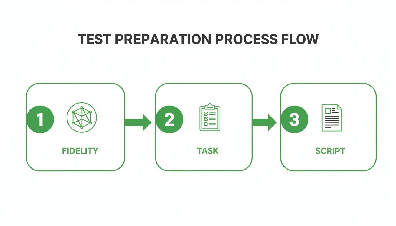
This flow really drives home how the fidelity of your prototype, the clarity of your tasks, and the neutrality of your script all work together to produce data you can actually trust.
Capturing Rich Data from Unmoderated Tests
Unmoderated testing is your ticket to gathering behavioural data at scale, fast. This is where tools like Uxia completely change the game. By using synthetic testers that perfectly match your target audience, you can run tests around the clock without the logistical nightmare of recruiting and scheduling real people.
The data you get back is incredibly rich. You’re not just seeing a simple pass or fail; you’re getting the entire story of the user's journey.
The real magic of unmoderated testing platforms like Uxia is how they weave different data types together. You can watch a session recording and see a user hesitate, then pull up the heatmap to see their cursor danced over three different buttons before they finally made a choice.
A few key data points to zero in on:
Heatmaps: These are fantastic. They give you a visual map of where users are clicking and where their attention is going. Perfect for spotting if a pretty-but-unclickable graphic is stealing focus or if your main call-to-action is being completely ignored.
Session Recordings: Watching a recording of a user (or a synthetic one) is the next best thing to being in the room. You can pinpoint the exact second they hit a roadblock or muttered something in confusion.
Quantitative Metrics: You need hard numbers to track progress. Things like task success rates, time-on-task, and error rates give you the concrete data to prove your design changes are working.
This kind of rigorous testing is becoming non-negotiable, especially with new regulations on the horizon. The upcoming June 2025 enforcement of the European Accessibility Act, for example, is pushing organisations in Spain and across the EU to make sure their digital products are usable by everyone. It's no surprise that the European Commission’s Digital Economy and Society Index (DESI) found that 74% of EU businesses adopted advanced UI/UX frameworks in 2023, boosting customer engagement by 42%. You can dig deeper into these UI design market trends and their impact.
When you blend the 'what' from your metrics with the 'why' from session recordings and transcripts, you build a complete picture of your interface's performance. That’s how you turn a pile of raw data into a clear, actionable to-do list for your design team.
Right, so the tests are done and the data is flooding in. This is where the real work begins.
Staring at a mountain of transcripts, heatmaps, and metrics can feel overwhelming, but raw data is just noise. Your job now is to find the signal in that noise—to transform those observations into real, tangible improvements that make life easier for your users.
The whole point is to create a tight feedback loop where user insights directly fuel the next design sprint. To do that, you need a pragmatic way to analyse what you’ve found, prioritise what actually matters, and translate it all into work your team can execute. Without this, even the best testing session is just a pretty report that gathers dust.
From Raw Data to Actionable Insights
First things first: you need to sift through all that data and spot the recurring patterns. Don't get lost chasing down every single offhand comment or misplaced click. You're hunting for themes.
Are multiple users getting stuck on the same form field? Are they all hesitating before clicking the same navigation link? Are they expressing similar confusion over an icon? Those are your breadcrumbs.
This is where platforms like Uxia can be a massive help. Instead of just dumping raw session data on you, they automatically synthesise the findings and flag common problems tied to usability, navigation, or unclear copy. This carves hours out of the manual work of watching recordings, letting you jump straight to the patterns.
This kind of targeted analysis works beautifully alongside broader customer feedback. When you understand what users do during a test and what they say in surveys or support tickets, you get a much richer, more complete picture. You can learn more about knitting these streams together by building a comprehensive Voice of the Customer programme.
Triage Issues With a Simple Matrix
Once you have a list of usability problems, you have to decide what to tackle first. A typo is a quick win, but a fundamentally broken checkout flow is a five-alarm fire. Not all issues are created equal.
A simple but incredibly effective tool for this is an issue triage matrix. It helps you rank everything based on two critical dimensions:
Severity: How badly does this issue break the experience? A critical bug might completely block a user from finishing their task, while a minor one is just a slight annoyance.
Frequency: How many people hit this wall? A problem that trips up 80% of your testers needs immediate attention, far more than an edge case that only one person found.
Practical recommendation: Plotting each issue on this matrix gives you an instant visual roadmap. The problems sitting in that high-severity, high-frequency quadrant are your non-negotiable priorities. These are the fires you put out first.
Convert Findings Into Actionable User Stories
With your priorities locked in, it's time to translate these findings into a language your design and development teams can run with. Vague instructions like "fix the navigation" are useless. They lack context and direction.
You need to frame the work in clear, actionable user stories. The classic template works perfectly: "As a [type of user], I want to [perform some action] so that I can [achieve some goal]."
Let's make this real. Imagine your testing showed that users couldn't figure out how to change their notification settings.
Raw Finding: A bunch of users clicked on their profile picture looking for settings but gave up.
Prioritised Issue: High severity (people can't stop unwanted notifications) and high frequency (6 out of 8 testers failed).
Actionable User Story: "As a registered user, I want to easily find my notification settings in my profile menu so that I can control how the app communicates with me."
See the difference? That story gives the team everything. It defines the user, their intent, and their motivation, empowering them to design a solution that actually solves the root problem.
Present Your Findings to Drive Real Change
Finally, you need to share what you’ve learned with stakeholders. Your goal isn't just to present a list of problems; it's to tell a compelling story backed by evidence. You have to show the impact.
Short video clips of users struggling are absolute gold—they make the pain points impossible to ignore. Pull out key quotes that capture the frustration. Use heatmaps to create a powerful visual of exactly where people are getting stuck.
Most importantly, frame your recommendations in the context of the business goals you defined from the start. Show how fixing these usability nightmares will directly reduce cart abandonment, boost sign-ups, or improve customer satisfaction.
When you connect user frustration to business outcomes, your test results transform from a simple report into a powerful catalyst for change. This is how you make sure your insights don't just die in a PowerPoint slide but go on to shape a genuinely better product.
Common Questions About User Interface Design Testing
As teams start weaving a formal testing process into their workflow, the same handful of questions always seem to surface. Getting clear answers demystifies the whole thing, helping you move forward with confidence and squeeze every drop of value from your research.
Let's tackle some of the most frequent queries head-on.
How Many Users Do I Really Need for a Test?
This is the classic, and the answer is simple: it depends entirely on your goal.
If you're running a qualitative usability test to find friction points and see where people get stuck, the magic number is often just five. Groundbreaking research has shown this tiny sample size is usually enough to uncover about 85% of the usability issues in an interface. You're looking for repeating patterns of behaviour, not trying to prove a statistical hypothesis.
But for quantitative methods like A/B testing, the game changes completely. Here, you need a much larger sample—often hundreds or even thousands of users—to get statistically significant results you can actually trust. Practical recommendation: For qualitative insights, start with 5 users and add more only if new, critical issues are still emerging.
What Is the Difference Between UI and UX Testing?
It's easy to get these two mixed up, but the distinction is pretty straightforward. The easiest way to think about it is that UI testing is a critical component of UX testing.
User Interface (UI) testing zeroes in on the specific visual and interactive bits of a design. It asks questions like:
Are the buttons and forms easy to see and click?
Is the layout logical and the text readable?
Do the interactive parts work like they're supposed to?
User Experience (UX) testing, on the other hand, zooms out to look at the user's entire journey. It evaluates their emotions, perceptions, and overall satisfaction from start to finish. It's focused on answering the bigger question: "Was this whole experience efficient, effective, and satisfying?"
How Can I Conduct UI Testing on a Tight Budget?
You don't need a massive budget to get high-value insights. There are plenty of practical ways to run effective user interface design testing without breaking the bank.
A great place to start is with unmoderated testing platforms, which are almost always more cost-effective than arranging live sessions. You can also lean on free or low-cost tools to build simple, low-fidelity prototypes—they're perfect for getting honest, early-stage feedback without overinvesting.
Another smart move is to recruit participants from your existing audience. A small incentive, like a gift card or a product discount, often does the trick.
For teams looking to scale their efforts affordably, modern tools offer a huge advantage. Solutions like Uxia, for instance, give you access to powerful synthetic user testing. This delivers rich, actionable feedback without the high costs and slow timelines of traditional participant recruitment.
This approach lets you run more tests, more often. It turns user feedback into a continuous part of your design cycle, not a rare, expensive event.
Ready to get actionable UI feedback in minutes, not weeks? With Uxia, you can run unmoderated tests with AI-powered synthetic users that match your exact audience. Eliminate the guesswork and start building with confidence today.