A Practical Guide to the System Usability Scale
Discover what the System Usability Scale (SUS) is and how to use it. Learn to calculate scores, interpret results, and get deeper UX insights for your product.

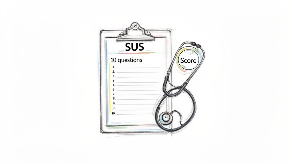
The System Usability Scale (SUS) is one of the most trusted tools in a researcher's toolkit, and for good reason. At its core, it’s a straightforward, 10-item questionnaire designed to measure how easy a product is to use. Developed way back in 1986, it gives you a single score from 0 to 100, making it a standardised and widely recognised industry benchmark.
It's "quick and reliable" for a reason.
What Is the System Usability Scale?
Think of the System Usability Scale as a swift ‘health check’ for your digital product. Instead of a complex, time-consuming diagnosis, it offers a clear, actionable score that tells you how easy—or difficult—users find your system.
Its power lies in its elegant simplicity. The questionnaire features a clever mix of five positively and five negatively phrased statements. This design forces users to actually read and think about each response, preventing them from just flying through and agreeing with everything. This little trick leads to much more honest and accurate feedback.
Key Characteristics of SUS
To help you get a quick handle on what makes the SUS so effective, here’s a summary of its core features.
System Usability Scale at a Glance | |
|---|---|
Characteristic | Description |
Questionnaire Format | A 10-item survey using a 5-point Likert scale (Strongly Disagree to Strongly Agree). |
Scoring Range | Generates a single score from 0 (worst usability) to 100 (best usability). |
Average Score | The global average SUS score is 68. Scores above this are considered above average. |
Question Design | Alternates between 5 positive and 5 negative statements to prevent response bias. |
Time to Complete | Takes only 1-2 minutes for a user to complete, which means higher completion rates. |
This blend of simplicity and scientific rigour is why the SUS has remained a go-to tool for decades. It's not just a survey; it’s a robust instrument with specific attributes that make it incredibly effective for product teams.
Standardised and Reliable: Because the questions are always the same, you can compare your score against that global average of 68. More importantly, you can track your own product's usability improvements over time.
Quick to Administer: Its brevity—just ten questions—means users can fill it out in a couple of minutes. This reduces participant fatigue and stops people from abandoning the survey halfway through.
Versatile Application: It works for just about anything. You can use it to evaluate websites, mobile apps, clunky enterprise software, and even physical hardware.
This standardised approach is a cornerstone of many successful research strategies. By understanding different behaviour research methods, teams can combine SUS with other techniques to get a full picture of the user experience.
The real value of the System Usability Scale is its ability to translate subjective user feelings into a single, comparable number. This score becomes a common language for designers, developers, and stakeholders to discuss and prioritise usability improvements.
Ultimately, SUS gives you a vital quantitative data point. But knowing why you got a certain score is just as important. A low score tells you there's a problem, but it doesn't pinpoint the exact friction point. That’s where modern tools like Uxia come in. They can complement a SUS score with rich qualitative insights from synthetic user testing, instantly connecting the ‘what’ with the ‘why’.
Calculating and Understanding Your SUS Score
A System Usability Scale score isn't just a number; it's a story about your user’s experience. The calculation might look a bit strange at first, but there's a simple, specific method designed to turn subjective feelings into a standardised metric.
Following this process is what allows you to benchmark your product's usability against thousands of others. It’s a two-step process that converts the 1-to-5 Likert scale responses into that final 0–100 score. To get valid, comparable results, you have to follow the steps precisely.
The Two-Step Calculation Process
First things first, you need to convert each participant's raw answers. The formula is different for the odd-numbered (positive) and even-numbered (negative) questions. This is intentional, as it accounts for the alternating positive/negative phrasing.
Here's how it works:
For odd-numbered questions (1, 3, 5, 7, 9): Subtract 1 from the user's response. So, a score of 4 becomes 3.
For even-numbered questions (2, 4, 6, 8, 10): Subtract the user’s response from 5. So, a score of 2 also becomes 3.
Once you've converted all ten responses for a single user, add these new values together. This will give you a total somewhere between 0 and 40.
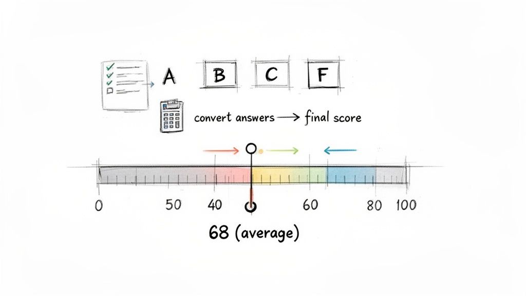
Finally, you multiply that total by 2.5. This last step is what scales the result to the familiar 0–100 SUS score range. For example, if the sum of a user’s converted scores is 28, their final SUS score is 70 (28 x 2.5). Simple as that.
What Does Your SUS Score Mean?
Okay, so you have your score. Now the real work begins—figuring out what it actually means. The biggest mistake people make is treating the score like a percentage. A score of 70 doesn't mean your product has 70% usability; it's a relative score that needs context to be useful.
The global average for a System Usability Scale score is 68. This number is your most important benchmark. If your score is above 68, your product’s perceived usability is better than average. If it's below, you have some work to do.
To make this even clearer, researchers often use a grading scale analogy to translate the score into something more intuitive.
80.3 or higher (A): Excellent. Users find your system highly usable and are likely advocates.
68 - 80.2 (B/C): Good/Okay. This is the sweet spot where most products land. It's usable, but there are clear areas for improvement.
51 - 67.9 (D): Poor. Usability is a significant issue and is probably causing user frustration.
Below 51 (F): Unacceptable. You've got major usability problems that are stopping users from getting things done.
This grading system helps everyone—from designers to stakeholders—quickly grasp how serious the usability issues are. It turns an abstract number into a clear call to action, which is a key principle of data-driven design.
Practical Recommendation: Don't just report the number. Use this grading scale in your presentations to stakeholders. Saying "we have a D-grade usability score" is far more impactful than "our SUS score is 55." For an even deeper analysis, platforms like Uxia can link these scores to specific friction points found by synthetic testers, showing you exactly what’s pulling your grade down.
Accurately calculating and interpreting your score is a must, and mastering survey data analysis gives you a solid foundation for turning raw numbers into insights that genuinely improve your user experience.
Why the System Usability Scale Endures
In a field that changes almost daily, it’s pretty remarkable that a tool from the 1980s is still an industry go-to. The System Usability Scale has stuck around not because it's old, but because it’s exceptionally good at its job. Its staying power boils down to three core strengths that agile teams and researchers really value.
First and foremost is its proven reliability. We’re talking decades of use across thousands of studies, all showing that SUS consistently measures what it’s supposed to: perceived usability. It’s not just a questionnaire; it’s a scientifically validated instrument that gives you data you can trust. That means you can confidently benchmark your product against a global average and actually see if your design changes are making things better.
Next up is its versatility. SUS is completely technology-agnostic. You can use it to evaluate a website, a beast of an enterprise software platform, a mobile app, or even a piece of hardware with a screen. This flexibility makes it an invaluable tool for just about any organisation, no matter what they build.
Efficiency and Accessibility for Modern Teams
The third reason it’s still here is efficiency. People often call it a ‘quick and dirty’ tool, and they’re right—in the best way. SUS delivers solid insights with very little effort. It takes a user maybe a minute or two to complete, which means you get high completion rates without burning out your participants. That speed is perfect for today’s fast-paced development cycles, where teams need feedback now to inform the next sprint.
This efficiency also makes usability testing much more accessible. For startups or teams with tight budgets, the ability to run a simple, effective survey is a massive advantage over more complex and expensive research methods.
Reliability: Gives you a consistent, scientifically-backed measure of usability.
Versatility: Works on a huge range of digital and physical products.
Efficiency: Super quick for users to complete and for teams to analyse, fitting perfectly into agile workflows.
Limitations and the Path Forward
But let's be real—the System Usability Scale isn't a silver bullet, especially when you're dealing with complex enterprise tools. Its simplicity can sometimes hide the messy details of a genuinely difficult user experience. A landmark psychometric evaluation found a mean total SUS score of 65.07 for these kinds of systems, a clear signal of widespread user frustration that a single number doesn't fully capture. Learn more about the findings on enterprise usability.
This is where the SUS becomes a starting point, not the final word. A low score tells you that there's a problem, but it doesn't tell you why or where the problem is.
This is exactly where modern platforms like Uxia give you a crucial edge. Uxia can supercharge a SUS score by running tests with synthetic users. These AI-driven testers don’t just spit out usability metrics; they provide detailed, contextual feedback on specific friction points. They bridge the gap between the what (the quantitative score) and the why (the qualitative reasons behind it).
How to Administer a SUS Study
Putting the System Usability Scale into practice is pretty straightforward, but like anything in research, getting it right comes down to good planning. A solid SUS study really boils down to two things: picking the right participants and asking them for feedback at the perfect moment.
Practical Recommendation: The best time to show someone the questionnaire is immediately after they’ve finished a key task in your product. This timing is crucial. Their experience is still fresh in their mind, which means their feedback will be far more accurate and reliable. You wouldn't ask someone to rate a film a week after they saw it, right? Same idea here.
The Standard SUS Questionnaire Template
To make sure your results are valid and can be compared against global benchmarks, you have to use the standard ten-item questionnaire exactly as it is. Don't change a thing. Even tiny tweaks to the wording can throw off your results and stop you from being able to compare your score against the global average of 68.
Here are the ten statements you'll be using:
I think that I would like to use this system frequently.
I found the system unnecessarily complex.
I thought the system was easy to use.
I think that I would need the support of a technical person to be able to use this system.
I found the various functions in this system were well integrated.
I thought there was too much inconsistency in this system.
I would imagine that most people would learn to use this system very quickly.
I found the system very cumbersome to use.
I felt very confident using the system.
I needed to learn a lot of things before I could get going with this system.
For each statement, users rate their agreement on a 5-point Likert scale, from "Strongly Disagree" to "Strongly Agree."
A Faster Way with AI-Powered Testing
The traditional way of running a SUS study—recruiting people, scheduling sessions, and moderating them—works, but it's painfully slow and expensive. This whole process can create huge delays, especially for teams trying to move quickly in sprint cycles.
Today, AI-driven platforms like Uxia offer a powerful alternative. They automate the entire workflow and deliver results in a tiny fraction of the time, allowing teams to weave usability testing into their design process much more frequently.
Platforms like Uxia use synthetic testers to completely sidestep all those logistical headaches. Instead of burning weeks finding and managing participants, you can get SUS-aligned metrics in minutes. The process is dead simple: you define a task, and Uxia’s AI users navigate your design, giving you immediate feedback.
This infographic shows why the System Usability Scale has stuck around for so long and become a standard in user research.
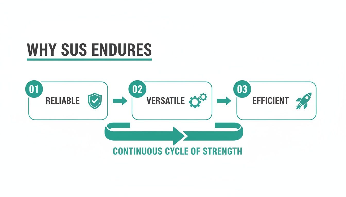
The flow from reliable and versatile to efficient shows just how SUS provides a strong yet lean way to capture vital usability data.
Because these synthetic testers generate instant reports without human bias, your team can make faster, more objective decisions. This approach fits perfectly with modern development, transforming user interface design testing from a rare event into a continuous, integrated part of your workflow. By automating the SUS process with Uxia, you can stop worrying about logistics and start focusing on what really matters: acting on the insights to build a better product.
Moving Beyond the Score with Qualitative Feedback
A System Usability Scale score is a fantastic diagnostic tool. It’s quick, it's reliable, and it gives you a number that tells you what's happening. But it stops short of explaining why it's happening.
Think of it this way: a score of 55 is like a check engine light. It signals a problem, but it doesn't tell you if the issue is confusing navigation, poorly labelled buttons, or a checkout flow that’s completely broken.
To get the full story, you have to pair your quantitative SUS data with rich, contextual qualitative feedback. That combination is what turns an abstract number into a concrete action plan, transforming user frustration into clear design opportunities.
Bridging the Gap Between What and Why
Practical Recommendation: The simplest way to get that "why" is by adding one open-ended question to your SUS survey. Something like, "What's one thing you would change to improve your experience?" can yield incredibly valuable insights with almost zero extra effort.
Another proven technique is to conduct follow-up interviews with a small, representative sample of your survey participants. This lets you dig deeper into their responses, ask clarifying questions, and watch them interact with the product firsthand. This dual approach is essential because what users say about usability doesn't always match what they actually do.
In fact, deep dives into SUS data from European enterprise contexts have shown that post-test scores explain just 6% of the variance in task completion rates. This really hammers home the need to go beyond the score to understand the real friction points.
To get the most from these user comments, it’s crucial to learn how to properly analyze qualitative data. That's where the richest insights are hiding.
Automating Insights with Synthetic Testing
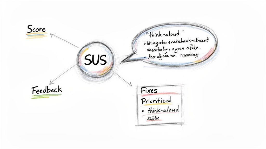
This is where a platform like Uxia becomes a total game-changer. It automates the process of connecting the quantitative score with the qualitative reasons behind it.
Uxia's synthetic testers don't just spit out a usability metric. They produce detailed 'think-aloud' transcripts explaining their actions, motivations, and pain points as they move through your product.
Uxia automatically connects specific usability issues—like confusing microcopy or a poorly placed CTA—directly to your overall usability score. This gives you a prioritized list of fixes that will have the biggest impact.
This AI-driven approach delivers the "why" at a scale and speed that's impossible with manual methods like follow-up interviews. By identifying the root causes behind a low score, Uxia empowers teams to focus their resources on changes that will genuinely move the needle on user experience.
Combining these insights is a powerful way to understand the true voice of the customer and make truly data-informed design decisions.
Common Mistakes to Avoid with SUS
Getting a reliable SUS score isn't just about sending out a questionnaire; it’s about discipline. Even tiny shortcuts can corrupt your data, turning what should be a solid metric into a number that actively misleads your team. To make sure your SUS score is accurate and genuinely useful, you have to steer clear of a few common pitfalls.
The single biggest mistake? Changing the questions. It’s tempting to tweak a word or two to match your product’s specific terminology, but don't do it. The moment you alter the standard phrasing, you lose the ability to benchmark your score. The real power of SUS comes from its standardisation. Change the formula, and you can no longer compare your score of 65 to the global average of 68. It just becomes an internal, isolated number.
Another classic error is treating the final score like a percentage. A SUS score of 70 does not mean your product is 70% usable. Think of it more like a letter grade; a 70 is a solid 'C'—it’s above average, but there's room to improve. Getting this distinction right is key when you're setting expectations with stakeholders.
Maintaining Data Quality and Context
Sample size matters, too. While you can get a gut feeling from a couple of users, a tiny sample of fewer than five participants will give you a volatile score you can't trust. You really want to aim for at least 10-15 users to get a stable, more representative result.
Some teams also make the mistake of treating SUS as a one-off report card. But its true value isn't in a single grade; it's in tracking usability over time.
Practical Recommendation: A single SUS score is a snapshot. A series of SUS scores tells a story. Use it consistently after design sprints or major updates to measure the real impact of your changes on the user experience.
Even if you do everything right, SUS has its limits. European studies, for example, have pointed out some structural weaknesses, especially when first-time users encounter complex technical apps. You can read more about these SUS structural analyses here.
This is where modern tools can add a much-needed layer of context. For instance, a platform like Uxia helps get around these limitations by using synthetic testers to simulate specific user journeys. Instead of one broad score, Uxia can give you detailed feedback on individual flows, helping you pinpoint exactly where users are getting stuck and why.
Common Questions About the System Usability Scale
As teams start using the System Usability Scale, a few practical questions almost always pop up. Getting these right is the key to making sure your results are actually meaningful.
So, let's tackle them one by one.
What’s a “Good” SUS Score, Anyway?
First things first: what score should you even be aiming for? The global average for SUS is 68. Anything above that is technically "above average," but let's be real—you're aiming higher.
A truly good score starts in the high 70s. If you hit anything over 80.3, you’re in the excellent tier, and you should probably be celebrating. On the flip side, a score below 51 is a major red flag, signalling that users are likely having a painful experience.
Can I Change the Questions?
This is a big one. It's tempting to want to tweak the standard questionnaire to make it feel more specific to your product.
The short answer? Don't do it.
The moment you alter the wording—even slightly—you break the scale’s scientific validity. Its power comes from being a standardised tool. Changing it means you can no longer benchmark your score against the global average or track it reliably over time. To get data you can trust, you have to use the ten standard questions exactly as they are written.
How Many Users Do I Need?
You can get a rough directional hint from just a handful of participants, but if you want a score you can stand behind, you need a more stable sample.
Practical Recommendation: For a much more reliable result, the sweet spot is 10-15 users. This gives you enough data to be confident that your score isn't just being skewed by one or two people who loved or hated the experience.
The System Usability Scale is a standardised instrument. Its value comes from following the established methodology for the questionnaire, sample size, and scoring. Deviating from these best practices undermines the integrity of your data.
This is where a platform like Uxia makes a huge difference. Instead of spending days recruiting and running tests, you can get robust data from a large pool of synthetic users instantly. This ensures your score is stable and free from the usual logistical headaches.
Uxia eliminates the slow, expensive process of traditional user testing. Get instant, AI-driven feedback on your designs to build products with confidence. Discover how Uxia can accelerate your design workflow.