Data Driven Design for Product Development: A Practical Guide
Learn how data driven design transforms guesswork into growth. This guide covers the principles, metrics, and workflows to improve UX and business outcomes.

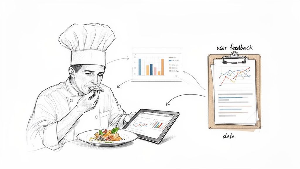
Data-driven design is really about one thing: swapping guesswork for evidence.
Think of a chef. The best ones don't just follow a recipe blindly. They taste, they adjust, they watch how their diners react, and then they refine. That's exactly what data-driven design is for product teams. It's a method that uses real, hard data—both quantitative and qualitative—to make sure you’re building something people will actually love to use.
What Is Data-Driven Design and Why It Matters Now
At its heart, data-driven design is a mindset that puts user evidence ahead of anyone’s personal opinion or a gut feeling from a stakeholder meeting. It’s a structured way for product and UX teams to collect, analyse, and apply user data to create experiences that just work.
This approach is a world away from traditional methods, which often lean heavily on a designer's intuition. Instead, we look at the "what" and the "why" of user behaviour.
Quantitative data—things like click-through rates, session times, and conversion funnels—tells you what users are doing. Qualitative data, which comes from user feedback, interviews, and usability tests, tells you why they’re doing it. The magic happens when you bring these two perspectives together. That’s where the powerful insights live.
The Shift From Guesswork to Evidence
So, why has this become so important? Because building a feature based on a hunch is an incredibly expensive gamble in today's competitive market. Data gives you the confidence to know you’re putting resources into features that will actually deliver value.
To really get why this matters, it helps to look at the bigger picture of data-driven decision making. It’s a philosophy that champions making choices based on solid information, not just speculation. For product teams, this translates directly into more customer-focused products and, ultimately, better business results.
By basing decisions on real-life user data, teams can create products that genuinely meet user needs, leading to higher satisfaction, improved usability, and increased retention.
The differences between the old way and the new way are pretty stark. Here’s a quick breakdown:
Traditional Design vs Data Driven Design
Aspect | Traditional Design (Intuition-Led) | Data-Driven Design (Evidence-Led) |
|---|---|---|
Foundation | Designer's gut feelings, aesthetic trends, stakeholder opinions. | Quantitative analytics, user feedback, A/B test results. |
Process | Linear: concept > design > build > launch. | Iterative: research > design > test > learn > repeat. |
Validation | Happens late, often after launch. | Happens early and continuously throughout the process. |
Risk | High. Features might fail to resonate with users. | Low. Decisions are validated with data before major investment. |
Focus | How the product looks and feels. | How the product performs and solves user problems. |
This table really highlights the core shift: moving from a subjective, high-risk process to an objective, evidence-led one that de-risks development and centres the user.
Modern Tools Are Accelerating the Process
In the past, getting rich qualitative feedback was a huge bottleneck. It was slow, expensive, and a real pain in an agile world. But modern platforms are completely changing the game.
Tools like Uxia are tearing down those old barriers by providing instant qualitative insights at scale. By using AI-powered synthetic testers, teams can get detailed feedback on prototypes and user flows in a matter of minutes, not weeks.
This is a massive shift for any design workflow. It means you can now:
Get rapid validation. A practical recommendation is to run a quick test on Uxia with every new design iteration. This allows you to test ideas and assumptions almost instantly, without the logistical nightmare of recruiting, scheduling, and paying human participants.
Receive unbiased feedback. Get objective insights from AI personas that don't have the human biases that can muddy the waters of traditional testing.
Foster continuous improvement. Weave testing seamlessly into every single stage of development, building a true culture of learning and iteration.
What this all means is that data-driven design is no longer a luxury for big companies with massive research budgets. It's now an accessible—and essential—practice for any team that's serious about building a winning product.
The Core Principles of Data-Driven Design
Data-driven design is so much more than just glancing at an analytics dashboard. It's a disciplined methodology for turning raw numbers into products people actually want to use. When done right, it guides teams from uncertainty to confident, evidence-led decisions, avoiding the common trap of collecting data just for the sake of it.
The whole process kicks off not with data, but with a question. A very clear one. Before you even think about metrics, you have to define what you're trying to achieve. That means setting a solid business objective and turning it into a hypothesis you can actually test. Skip this step, and you’ll drown in information and end up with analysis paralysis.
For example, a vague goal like “improve user engagement” is almost useless. A strong, testable hypothesis is specific: “By simplifying our three-step checkout to a single page, we will reduce cart abandonment by 15% in the next quarter.” Now that gives your data collection a purpose.
Starting with the Right Questions
Asking the right questions upfront is the make-or-break phase. It frames your entire investigation and guarantees the data you gather will be relevant and actionable. This isn't about collecting noise; it's about finding the signals that matter for your specific goals.
A practical recommendation is to create a "hypothesis brief" before starting any new feature work. Ask your team:
What specific user problem are we trying to solve? This keeps the focus squarely on user value.
What business outcome are we hoping to influence? This ties design changes directly to business success.
How will we measure success? This nails down the exact metrics you need to prove (or disprove) your hypothesis.
With those answers in hand, the next step is to gather a balanced mix of data. Relying only on quantitative analytics tells you what is happening, but it almost never tells you why. This is where modern tools are a game-changer. Platforms like Uxia slot right into this phase, giving you rapid qualitative insights from synthetic users that complement your quantitative data. It’s this combination that uncovers the human story behind the numbers.
Turning Data into Actionable Insights
Once you have the data, the real work begins: synthesising it into a clear narrative for what to do next. This is all about spotting patterns, connecting the dots between different data sources, and turning those observations into concrete design recommendations. An insight isn’t just a data point; it’s the actionable conclusion you draw from it.
Let's say your analytics show a high drop-off rate on a sign-up form (quantitative data). You run a quick test on Uxia and get immediate feedback from synthetic users who report that the password requirements are confusing and frustrating (qualitative data).
The actionable insight is crystal clear: The password field is a major friction point, and simplifying its requirements is the priority. This is how data goes from being a passive number to a direct instruction for your design team.
This disciplined approach is quickly becoming the standard, especially as organisations pour more money into analytics. The European data analytics market is a perfect example of this trend. It generated roughly USD 17.58 billion in 2024 and is on track to hit USD 66.89 billion by 2030. With Europe making up over 25% of the global data analytics market, the pressure on product and UX teams to adopt these robust, data-driven workflows has never been higher. You can learn more about the growth of the European data analytics market to see where things are headed.
Finally, the last principle is iteration. Data-driven design isn't a one-off project. It's a continuous cycle of hypothesising, testing, learning, and refining. Every change you make is an experiment, and the data it generates feeds right back into the loop, fuelling the next round of improvements and moving the product forward with confidence.
Choosing the Right Metrics for Your Product
To make data-driven design work, you have to measure what actually matters. It's incredibly easy to get lost in vanity metrics—those shiny numbers that look great in a slide deck but tell you nothing about whether users are getting value or if the business is healthy. The real gold is in actionable metrics, the ones directly tied to your goals, telling you if your design decisions are hitting the mark.
But moving beyond superficial data requires a system. Instead of getting bogged down tracking every single click and hover, the best teams use established frameworks to focus their efforts. Think of these frameworks as a compass, pointing you toward the numbers that reflect genuine user happiness and product performance. They help you turn a fuzzy goal like "improve the user experience" into something specific and measurable.
This switch from vanity to value is everything. It means you stop obsessing over raw traffic and start prioritising metrics that reveal how users behave, how deeply they engage, and whether they stick around for the long haul. Adopting a framework gives your whole team a shared language to talk about performance, helping you make evidence-based decisions with real clarity and confidence.
The HEART Framework for User-Centred Metrics
Developed at Google, the HEART framework is a brilliant tool for measuring the quality of the user experience from all sides. It forces a balanced perspective by focusing on five distinct categories, which stops you from chasing one metric at the expense of another. It’s perfect for getting a holistic, 360-degree view of your product's health.
Here’s a look at the five categories:
Happiness: This is all about user attitudes, usually captured through surveys. A practical recommendation is to implement a simple in-app CSAT survey after a user completes a key task.
Engagement: This measures the depth and frequency of a user’s interaction over time. Key metrics include daily active users, session length, or the number of key features they use.
Adoption: This tracks how many new users start using your product or a specific feature. You’d measure this with things like new accounts created per week.
Retention: This tells you how many users keep coming back. You’ll want to track churn rate alongside repeat usage over set periods (like 7-day or 30-day retention).
Task Success: This gets down to brass tacks: can users do what they came to do, easily and efficiently? This is measured with hard numbers like checkout conversion rates or error rates.
The AARRR Framework for Growth-Focused Metrics
Where HEART is user-centric, the AARRR framework—fondly known as "Pirate Metrics"—is all about the customer lifecycle and business growth. It maps the user’s entire journey, from the first time they hear about you to the moment they become a paying customer. It’s a go-to for startups and product teams who need to meticulously measure and optimise their growth funnel.
The five stages are:
Acquisition: How are people finding you? This stage is all about the channels that bring users to your doorstep, like organic search, paid ads, or social media.
Activation: Did they have a great first experience? This measures that "aha!" moment when a new user performs a key action that shows they’ve understood your product’s value.
Retention: Do they come back for more? Just like in HEART, this is about repeat engagement and is often the single most important metric for sustainable success.
Referral: Are they telling their friends? This tracks word-of-mouth growth through things like referral program invites or social shares.
Revenue: How does the business make money? This final stage is all about the bottom line, focusing on outcomes like customer lifetime value (CLV).
The smartest teams often blend these frameworks. A practical recommendation is to use AARRR to map your overall growth funnel, then zoom in with HEART to diagnose satisfaction and usability issues at a specific stage, like Activation.
To help you decide which framework fits your needs, here's a quick comparison of some popular options.
Key UX Metrics Frameworks at a Glance
Framework | Key Metrics | Best For Measuring |
|---|---|---|
HEART | Happiness, Engagement, Adoption, Retention, Task Success | The overall quality and satisfaction of the user experience. |
AARRR | Acquisition, Activation, Retention, Referral, Revenue | The customer lifecycle and optimising the business growth funnel. |
PULSE | Page Views, Uptime, Latency, Seven-day active users, Earnings | High-level business health and technical performance dashboards. |
Goals-Signals-Metrics | Custom metrics tied to specific product goals | Creating a bespoke measurement plan tailored to your unique objectives. |
Each of these frameworks offers a different lens through which to view your product's performance. The key is to pick one (or combine them) to create a focused, actionable measurement strategy that everyone on the team understands.
Balancing Quantitative and Qualitative Insights
No framework tells the whole story on its own. Your analytics might show that 75% of users are dropping off during your onboarding (quantitative data), but that number alone can't tell you why. Are the instructions a mess? Is there a bug on the page? Is your value proposition just not landing?
This is where you absolutely need qualitative data. To understand what’s causing the friction, you have to hear from your users.
Tools like Uxia were built for exactly this. You can run usability tests with AI-powered synthetic users to get to the "why" behind your numbers in minutes. A practical recommendation is to integrate Uxia testing directly after your analytics reveal a drop-off point. This allows you to get objective, detailed feedback on your onboarding flow, spot confusing copy, and pinpoint the exact moments of user frustration—all without the weeks-long delay of traditional user research. You can learn more by understanding the voice of the customer and making it a core part of your process.
Ultimately, a strong data-driven design practice thrives on this synergy. You use quantitative frameworks like HEART or AARRR to spot the problem areas, then bring in qualitative tools like Uxia to find the root cause and validate that your next design solution actually fixes it.
Implementing a Data-Driven Workflow on Your Team
Moving from theory to practice is where a data-driven design mindset really comes to life. This isn't just about having access to data; it's about building a repeatable process that gives your team the confidence to test, learn, and iterate. When you integrate this workflow, you build a culture where every design choice is just a hypothesis waiting for some real evidence.
This shift begins when you standardise how you tackle problems. Instead of jumping straight into solutions, the first move is always to frame the challenge with a strong, testable hypothesis. From there, you can kick off a structured cycle of testing, analysis, and deployment that makes sure every change is a deliberate step forward.
From Hypothesis to Iteration
The heart of a data-driven workflow is a continuous loop. It's a rhythm teams get into to de-risk development and make sure they're consistently building what users actually need.
The process usually follows these steps:
Generate a Hypothesis: Start with a clear, measurable statement. For example, "We believe changing the checkout button colour from grey to green will increase conversions by 10% because it will be more visible."
Execute Tests: Run an A/B test to see how the new design (the variant) performs against the original (the control). For validating the UI/UX before development, use a tool like Uxia.
Analyse Results: Collect and make sense of the data. Did the change have the effect you predicted? Was the result statistically significant?
Deploy and Iterate: If the hypothesis holds up, roll out the change. If it doesn't, figure out why and use that lesson to form your next hypothesis.
This disciplined cycle pulls design decisions out of the world of subjective debate and grounds them in objective reality.
A Practical Case Study in Action
Let’s walk through a common scenario. An e-commerce team sees a big drop-off at the final step of their checkout flow. Their analytics (quantitative data) show them where the problem is, but not why it's happening. Is the shipping cost a shock? Is the "Confirm Payment" button confusing?
Instead of just guessing, they turn to Uxia. They set up a quick test with synthetic users, instructing them to buy a product. In just a few minutes, they have unbiased feedback. The AI participants consistently flag confusion over a vague error message that pops up when a credit card is declined, causing them to abandon their carts.
With this clear, qualitative insight, the friction point is no longer a mystery. The team now has a specific, actionable problem to solve, backed by evidence.
Armed with this knowledge, the designers rewrite the error message to be more helpful, explaining exactly what went wrong and how to fix it. To check their new solution, they run another quick test on Uxia. The new design works perfectly—synthetic users fly through the checkout without a hitch. The entire feedback loop, from spotting the problem to validating the fix, was compressed from weeks into a single afternoon.
This is a powerful example of how AI-powered tools enable continuous validation. The ability to get instant feedback smashes through bottlenecks, letting teams test ideas constantly and deploy improvements with total confidence. For a deeper dive, you can check out our complete comparison of synthetic user testing vs. traditional human testing to see how these methods really stack up.
Cultivating a Test-and-Learn Culture
Putting a workflow in place is one thing, but making it stick is another. This takes a cultural shift toward curiosity and experimentation. Teams need to feel safe testing ideas that might fail, knowing that a disproven hypothesis is still a win for learning.
Here are a few practical recommendations for building this culture:
Celebrate Learnings, Not Just Wins: Publicly share the results of failed experiments and what the team learned from them. This normalizes failure as part of the process.
Democratise Data Access: Use dashboards and tools that make performance data easy for everyone to see, not just analysts.
Prioritise Action Over Perfection: Encourage small, frequent tests instead of waiting for large, perfect experiments. The goal is momentum.
Once you've collected user feedback, the next crucial step is effectively analyzing interview data to pull out the insights that will shape your design decisions. This flowchart shows a simple process for choosing the right UX metrics to guide your efforts.
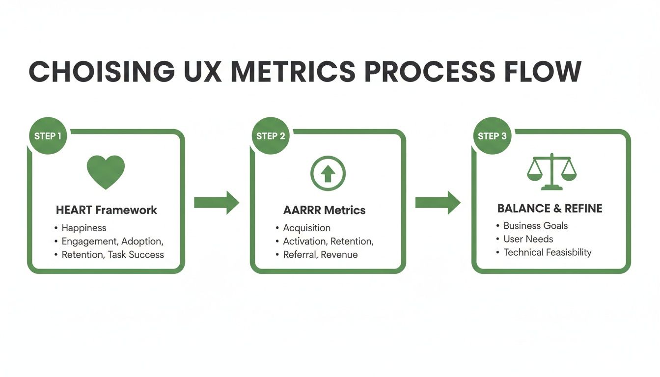
This process highlights the need to select balanced metrics using established frameworks like HEART and AARRR to ensure a holistic view of the user experience.
The rising adoption of AI is making these workflows more achievable than ever. In 2024, there were over 10 million ICT specialists in the EU, with a target of 20 million by 2030. While AI uptake varies, with tools for text-analysis and language generation used by 5-7% of businesses, this shows a growing internal capacity within organisations to integrate AI-powered tools like Uxia into their product validation pipelines.
Common Pitfalls in Data-Driven Design (and How to Avoid Them)
Jumping into data-driven design is a huge step forward for any team, but it’s not a magic wand. If you're not careful, you can easily fall into a few common traps that completely derail your efforts. These pitfalls can turn what should be a source of clarity into a source of confusion, leading to worse decisions, not better ones.
The big three I see time and time again are confirmation bias, analysis paralysis, and the siren song of vanity metrics. The good news is that with the right mindset and tools, you can sidestep all of them and build a data practice that actually works.
Avoiding Confirmation Bias
We’re all human, which means we naturally look for and prefer information that backs up what we already believe. That's confirmation bias. In product design, it looks like a team latching onto any piece of data that supports their favourite feature idea while conveniently ignoring the mountain of evidence suggesting it's a terrible one. This defeats the whole point of using data in the first place.
The best way to fight this is to bring in a truly objective, unbiased voice.
A great way to do this is with a platform like Uxia. Its AI-driven synthetic users give you completely impartial feedback on your user flows. Since these AI testers have no skin in the game—no preconceived ideas, no internal politics—they highlight the real friction points and usability blind spots that a human team is almost guaranteed to miss.
This kind of objective feedback is the reality check every team needs. It forces you to look at the user experience as it is, not as you wish it were.
Overcoming Analysis Paralysis
Ever felt like you're drowning in data? That's analysis paralysis. You've got so much information that you’re totally incapable of making a decision. When teams track dozens of metrics without a clear question to answer, they end up with a mess of conflicting signals and no idea what to do next. The result? Endless meetings and zero progress.
To break out of it, you need to get focused. Here are some practical recommendations:
Start with a clear hypothesis: Before you measure a single thing, write down exactly what you're trying to prove or disprove. For instance, "Changing our sign-up CTA from a text link to a button will lift registrations by 5%."
Pick your key metrics: For any given test, decide on the one or two metrics that genuinely signal success. Everything else is just noise.
Set a deadline for a decision: Get the team to agree that you'll make a call based on the data you have by a specific date. This forces you to move from analysis to action.
Moving Beyond Vanity Metrics
Vanity metrics are the numbers that look great in a slide deck but tell you absolutely nothing about the health of your product or the value you're providing. Think total number of sign-ups or raw page views. Sure, they might make you feel good, but they don't tell you if people are sticking around or actually solving their problems.
A practical recommendation is to conduct a "metric audit." Review your current dashboards and for each metric, ask: "If this number changes, what user-centric decision will we make?" If there's no clear answer, it's likely a vanity metric. Instead, focus on actionable metrics that show real engagement. Frameworks like HEART and AARRR are perfect for this. They shift your attention from superficial stats to the things that actually matter, like retention rates, task completion, and key activation milestones.
For more hands-on guidance, our article on effective user interface design testing digs into strategies for gathering feedback you can actually act on.
The Future of Design: Where AI and Data Come Together
Looking ahead, the partnership between artificial intelligence and data is set to completely rewire how data-driven design gets done. AI is quickly moving beyond its role as just a powerful analysis engine. It's becoming an active, collaborative partner in the creative process itself. This shift is turning what was once a reactive discipline into a proactive one, helping teams anticipate what users need before they even ask.
The future of design is one where insights aren't just discovered—they're generated on demand. This change is being led by platforms like Uxia at the very forefront of this new synergy.

From Periodic Research to Continuous Validation
Traditionally, user research has been a periodic, often clunky, affair. But now, platforms like Uxia are using AI to generate synthetic users for scalable, on-demand feedback. It's a capability that was almost impossible to achieve quickly just a few years ago. This breakthrough allows for continuous design validation throughout the entire development lifecycle.
This transforms UX research from a series of one-off studies into a constant stream of actionable insights.
The ability to test ideas in minutes, not weeks or months, is the cornerstone of this new era. It fuels a culture of confident experimentation and rapid innovation, where teams can de-risk decisions and build with certainty.
The implications for product and UX teams are huge. Instead of waiting for scheduled research sprints, designers can get immediate, unbiased feedback on a new user flow or a prototype before a single line of code is written. Our own research shows it’s possible to achieve 98% usability issue detection through AI-powered testers, bringing incredible efficiency to the design process.
AI-Driven Efficiency and Infrastructure Realities
This boom in AI-powered tooling also brings practical considerations, particularly around infrastructure. For European product teams, the growing demand on data centres has real-world consequences. Between 2018 and 2024, the European data centre market grew at a compound annual rate of about 12.8%, with power demands expected to more than double by 2035.
This infrastructure squeeze pushes vendors to make their AI models more efficient. It gives an edge to platforms like Uxia that are optimised for a smaller computational footprint, delivering powerful results without adding to the strain.
Ultimately, the synergy of AI and data is creating a more intelligent and responsive design world. By embedding AI as a core partner, the future of data-driven design promises not just better products, but a fundamentally smarter way of creating them.
Got Questions About Data-Driven Design?
Putting data-driven design into practice can feel a bit fuzzy at first. Let's clear up some of the most common questions we hear from product and UX teams on the ground.
How Is Data-Driven Design Different from Being Data-Informed?
This is a great question, and the distinction, while subtle, is super important.
Being data-driven can sometimes imply that the numbers make the decision for you, full stop. The data says X, so we do X.
But being data-informed is where the magic really happens. It means data is a critical voice in the room, but it doesn't get to have the final say alone. Your design intuition, hard-won experience, and the bigger business picture all play a role. A practical recommendation is to treat data from tools like Uxia as a key stakeholder whose input must be weighed alongside business goals and technical feasibility.
Can Small Teams or Start-ups Actually Do This?
Absolutely. You don't need a massive analytics department or a team of data scientists to get going.
It all starts with a focused, testable hypothesis and tools that are built for speed. Platforms like Uxia are perfect here because they give you instant, affordable qualitative feedback without the huge cost or slow turnaround of traditional user research. It’s a way for even the smallest teams to check their assumptions and build with a lot more confidence.
What if I Don’t Have Much Data to Start With?
Everyone starts at zero. If you're pre-launch or your user base is still small, your first move should be gathering qualitative data.
A practical recommendation is to use a platform like Uxia to run usability tests on your prototypes to catch the big friction points before a single line of code is written. That early feedback is gold—it sets your product on the right course from day one.
Once you have more users, you can start layering in quantitative metrics to see what people are actually doing at scale. Remember, data-driven design isn't about having perfect data; it's a process of always learning and improving.
How Do I Stop Data from Killing Our Creativity?
This is a common fear, but it’s a misconception. Data shouldn't box creativity in; it should give it a clear direction.
Think of it this way: data helps you find the right problems to solve and then measures how well your creative solutions worked. It provides the guardrails that help designers innovate effectively.
For example, data might flag a huge drop-off on your pricing page. That's not a creative dead end—it's a challenge. It's an invitation for the team to design a clearer, more compelling layout. The problem was found with data, but the solution is pure creativity. A practical way to implement this is to use Uxia to test multiple creative solutions and let the data guide you to the most effective one.
Ready to make faster, more confident design decisions? See how Uxia delivers the rapid, unbiased feedback you need to build better products. Explore Uxia today.