A Guide to Accessibility Testing for Digital Products
Master accessibility testing with our guide. Learn WCAG standards, automated and manual methods, and how to build inclusive digital products for everyone.
Let's talk about accessibility testing. At its core, it’s the simple practice of making sure your website, app, or software can be used by everyone, including people with disabilities. This isn't just a final checkbox to tick before launch; it's a foundational part of creating digital experiences that genuinely work for every single person, regardless of their abilities. A practical recommendation is to integrate these checks from the very start of your design process.
Why Accessibility Is a Cornerstone of Modern Product Design
Too many teams still see accessibility as a niche concern or a last-minute compliance headache. The truth is, it’s a non-negotiable principle of great design that makes the product better for everyone.
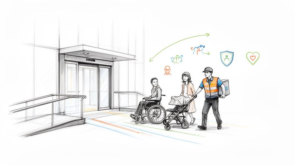
Think about a building with a ramp and automatic doors. Those features are essential for someone in a wheelchair, but they also make life easier for a parent pushing a stroller, a delivery person with a cart, or anyone dragging a heavy suitcase.
The exact same thing happens in the digital world. Features built for accessibility almost always improve the experience for the entire user base. For instance, high colour contrast is crucial for people with low vision, but it also makes your app easier to read for someone using their phone in bright sunlight. Good, logical content structure helps screen reader users navigate, and it also happens to be fantastic for your SEO.
The Foundation: WCAG and Conformance Levels
To get everyone on the same page, the Web Content Accessibility Guidelines (WCAG) act as the global standard. These guidelines are broken down into three "conformance levels," which give teams a clear roadmap to follow:
Level A: This is the absolute minimum. It covers the most basic accessibility features.
Level AA: This is the industry benchmark and the target for most products. It addresses the most common and significant barriers for users with disabilities.
Level AAA: The highest and most comprehensive level of accessibility.
Both the established WCAG 2.1 and the newer WCAG 2.2 use these levels to define what success looks like. A smart accessibility strategy aims squarely for Level AA conformance to ensure your product is robust, inclusive, and on solid legal ground. Diving into web accessibility best practices helps cement this understanding.
Streamlining Accessibility with Uxia
Hitting those standards consistently requires a solid testing process. This is where tools like our platform, Uxia, come in. Uxia is built to check your product against all WCAG 2.1 and 2.2 criteria at levels A, AA, and AAA, turning a potentially overwhelming task into a manageable one. It automatically flags accessibility issues and lays them out in a clean, actionable list.
Practical Recommendation: Use a platform like Uxia to automate your WCAG checks. Uxia categorises issues and assigns them to the right team member—such as visual contrast problems to a designer or code-based errors to a developer—removing ambiguity and streamlining the entire remediation workflow.
This shifts accessibility from a dreaded chore into a collaborative, integrated part of your development rhythm. It’s a modern approach that recognises the importance of user testing in building truly user-focused products.
When you bake accessibility testing into your process from the very beginning, you’re not just minimising legal risks. You’re expanding your audience, building fierce brand loyalty, and, most importantly, creating a better product for every single user out there.
Understanding WCAG: The Global Standard for Accessibility
To make accessibility testing work, everyone on the team needs to be reading from the same playbook. That playbook is the Web Content Accessibility Guidelines (WCAG). Think of it as the shared language and official rulebook for making digital products accessible to everyone.
Developed by the World Wide Web Consortium (W3C), WCAG isn't just a list of friendly suggestions. These guidelines form the backbone of accessibility laws in many countries, making them non-negotiable for any team serious about building inclusive products.
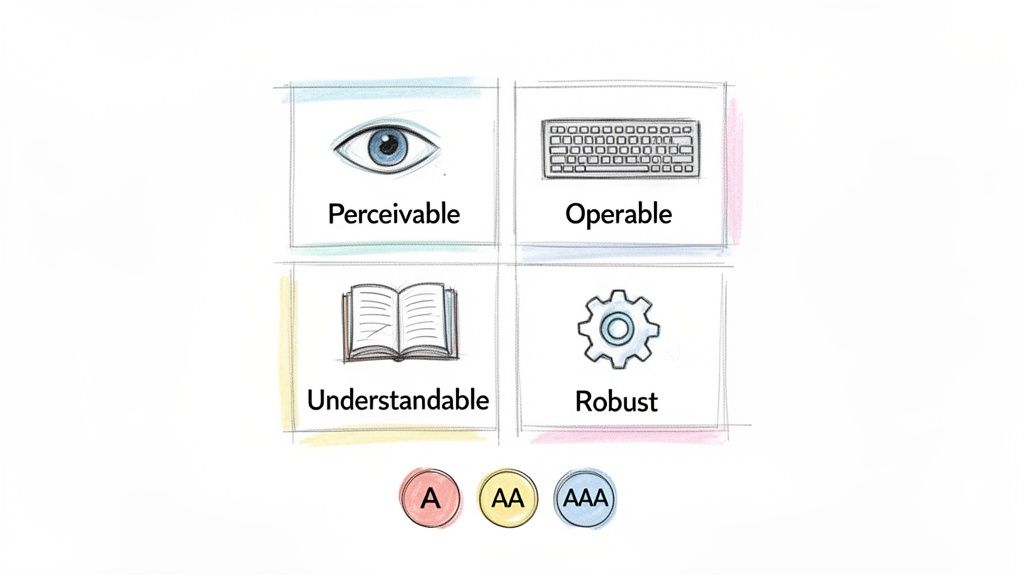
At its core, WCAG is built around four simple but powerful principles. You can remember them with the acronym POUR. To be truly accessible, your product has to be:
Perceivable: Can users see and hear your content? This means providing text alternatives for images or captions for videos so the information isn't invisible to some of their senses.
Operable: Can users actually interact with your interface? Everything must work with a keyboard, not just a mouse. The interface can't demand an action that a user physically cannot perform.
Understandable: Is the information and the interface clear and predictable? This is all about making your content easy to read and your navigation intuitive.
Robust: Does it work reliably across different devices and with assistive technologies? This is where clean, standards-compliant code comes in, ensuring your product doesn’t break when someone uses a screen reader.
The Three Levels of Conformance: A, AA, and AAA
WCAG gets that you can't fix everything at once. That's why it breaks down its criteria into three levels of conformance: A, AA, and AAA. Each level builds on the one before it, giving teams a clear path to prioritise their work. This structure applies to both the established WCAG 2.1 and the newer WCAG 2.2.
Here’s a quick breakdown of what these levels mean in practice.
Conformance Level | Description | Example Criterion |
|---|---|---|
Level A | The absolute minimum. Meeting these criteria is essential, as they address the most critical and severe barriers for users with disabilities. | Providing captions for all pre-recorded videos. |
Level AA | The industry standard and legal benchmark in most regions. This level addresses the most common barriers for a wide range of users. | Ensuring text has a colour contrast ratio of at least 4.5:1 against its background. |
Level AAA | The highest possible standard. It aims to make content accessible to the widest possible audience, often serving as a "gold standard." | Providing sign language interpretation for pre-recorded video content. |
While aiming for AAA is admirable, it's not always practical for every single piece of content.
Practical Recommendation: For most product teams, achieving Level AA conformance is the primary goal. This level strikes the perfect balance, offering a highly accessible experience while remaining realistic for most websites and apps to achieve.
How Uxia Simplifies WCAG Compliance
Let's be honest: combing through hundreds of WCAG 2.1 and 2.2 success criteria is a massive task. It can feel completely overwhelming, and that’s where a platform like our own, Uxia, makes all the difference.
Uxia is built to automatically test your digital products against all these technical standards. Forget the manual checklists and endless spreadsheets.
Uxia flags every issue and organises it into a clear, actionable report. But here’s the clever part: it doesn’t just dump a list of problems on you. It intelligently sorts the issues and suggests who on your team is best equipped to fix them.
For Designers: Uxia will catch visual problems like poor colour contrast or confusing layouts.
For Developers: It pinpoints code-level issues, like missing ARIA attributes or incorrect heading structures.
This transforms accessibility testing from a painful audit into a smooth, collaborative workflow. The right problems go to the right people, so your team can fix issues faster and build WCAG-compliant products from the start.
For a deeper look into the specific requirements, check out this a quick guide to mastering website accessibility requirements.
The Four Pillars of an Effective Testing Strategy
A truly solid accessibility strategy doesn't just lean on one type of testing. It stands on four distinct but complementary pillars, each giving you a different, vital perspective on your product's user experience. When you combine them, you get a complete picture of its health.
Think of it like getting a house inspected before you buy it. You'd use a thermal camera to spot heat leaks (that's your automation). You’d physically check that all the doors and windows open and close properly (manual checks). You’d turn on the taps to make sure the plumbing works (assistive tech). And finally, you’d imagine your family living there to see if the layout actually makes sense (user testing).
Each method uncovers something the others would miss. Let's break down these four pillars.
Pillar 1: Automated Testing
Automated testing is your first line of defence. It’s software that scans your code for common, black-and-white violations of WCAG standards. This is, by far, the fastest way to catch widespread issues with the least amount of effort.
Automated tools are great at catching things like:
Images that are missing their alternative text (alt attributes).
Form fields without proper labels.
Text and background colours with poor contrast.
Heading structures that are out of order (like skipping from an
<h1>to an<h3>).
But while automation is incredibly efficient for catching a high volume of simple bugs, it has its limits. Research shows it can only detect up to 57% of accessibility issues on its own. It simply can’t grasp context or user intent, which is why the other pillars are so crucial.
Pillar 2: Manual Testing
This is where a human expert methodically checks your product for the kinds of issues that automated tools are blind to. It involves putting yourself in the shoes of different users and interacting with the interface in very specific, purposeful ways.
A classic example is keyboard navigation. An automated tool might see that every element is technically focusable, so it won't raise an alarm. But a manual tester will immediately feel when the tab order is completely illogical, trapping a user in a confusing loop on the page. Manual checks are essential for confirming that the experience not only works but also feels intuitive.
Pillar 3: Assistive Technology Testing
This pillar is all about using the actual tools that people with disabilities rely on every single day. It’s about experiencing your product exactly as they would. The most common way to do this is by testing with screen readers like NVDA, JAWS, or Apple's VoiceOver.
By actually listening to how a screen reader announces your content, you uncover critical flaws that are otherwise invisible. Does it read out button labels clearly? Is the information presented in a logical sequence? This type of accessibility testing gives you unfiltered insight into how usable your product really is for someone with a visual impairment.
Practical Recommendation: Assume that if something looks right, it could still be inaccessible. Assistive technology testing proves that what you hear is just as important as what you see.
Pillar 4: User Testing and The Uxia Advantage
The final pillar is often the most insightful: testing your product with people who have disabilities. Nothing can replace watching a real person with lived experience navigate your interface. This is how you uncover the nuanced, real-world problems that no checklist or automated scan could ever predict.
The big problem? Recruiting, scheduling, and running these sessions is notoriously slow and expensive. This is exactly where Uxia comes in, offering a powerful alternative. Uxia’s AI-powered synthetic testers give you the speed of automation but with the deep, human-like feedback of user testing.
Uxia’s AI participants, which can be configured to represent all kinds of user profiles, navigate your designs and prototypes while "thinking aloud." They'll tell you when they're confused, flag points of friction, and identify barriers just like a human would. You get that rich, qualitative feedback in minutes, not weeks.
While it’s not meant to entirely replace human interaction, a look at synthetic user testing vs human user testing shows just how dramatically AI can speed up your feedback loop.
By building your strategy on these four pillars—and using Uxia to supercharge your user testing—you can create a truly effective and continuous accessibility workflow.
Integrating Accessibility Testing into Your Product Lifecycle
Treating accessibility as a final checkbox before launch is a recipe for disaster. It leads to expensive delays, frustrating rework, and a product that still feels bolted together rather than built for everyone.
The only way to win is to "shift left," weaving accessibility checks into every single stage of your product lifecycle. It starts with the very first sketch and continues all the way through to final deployment. This turns accessibility from a last-minute hurdle into a natural, continuous habit.
When your team catches an issue early, the fix is usually simple, fast, and incredibly cheap. But if you wait until the end, you’re often stuck untangling complex code or overhauling core design decisions, blowing up your timelines and budget in the process.
Testing at the Speed of Design
Great accessibility begins long before a single line of code is written. In the design phase, simple checks can head off massive problems later on. Designers should be verifying colour contrast, making sure buttons and other interactive elements are large enough to be tapped easily, and planning out a logical heading structure from the start.
This is where a platform like Uxia becomes a secret weapon for agile teams. You can test early-stage wireframes, mockups, and even video prototypes with AI-powered synthetic testers. Imagine getting actionable feedback on potential barriers before committing to development. That’s how you build inclusive design from the ground up, not as an afterthought.
Embedding Checks into Development and QA
As the product moves into development, the focus shifts to the technical side. Developers should be using semantic HTML, ensuring every interactive element works with a keyboard, and implementing the right ARIA attributes where needed.
Then, throughout the QA phase, your team should run a mix of automated scans and manual audits to catch the widest possible range of issues.
Practical Recommendation: Continuous testing isn't about adding more work; it's about making the work smarter. By integrating these checks at each step, you create a culture where accessibility is a shared responsibility, from designer to developer to QA.
This integrated flow—blending automated, manual, assistive, and user testing—is the backbone of any serious accessibility strategy.
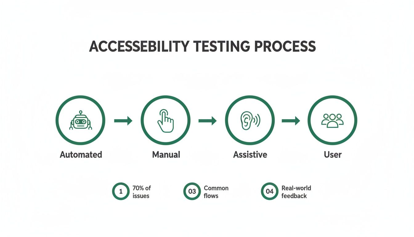
The infographic above paints a clear picture of this multi-layered process. It shows how different testing methods work together to give you robust coverage, ensuring both technical compliance and real-world usability are nailed down.
The Growing Demand for Accessible Products
Make no mistake, robust accessibility is no longer a niche concern. The European accessibility testing market is on track to hit USD 152.15 million by 2030. This growth is fuelled by skyrocketing smartphone use and an aging population that expects, and deserves, inclusive digital experiences.
Back in 2020, 86% of Europeans were mobile subscribers, and that number includes a growing group of users with disabilities who need apps to just work.
This isn't just a market opportunity; it's a clear legal and ethical imperative. Platforms like Uxia, which test against all WCAG 2.1 and 2.2 criteria at levels A, AA, and AAA, are becoming essential. Uxia doesn't just flag problems—it categorises them, telling you whether a designer or a developer should be the one to tackle the fix.
By adopting a data-driven design approach, teams can make informed decisions that improve both usability and compliance, securing a real competitive edge in a market that increasingly values inclusion.
Building a Practical Accessibility Testing Plan
So, how do we move from theory to action? You need a clear, practical accessibility testing plan. Without one, testing easily descends into chaos, leaving massive issues undiscovered until it’s too late.
A great plan is more than just a list of things to check. It sets the scope, identifies the right mix of tools for the job, and establishes a clear reporting process so your team can actually fix things.
First up, you have to define your scope. Trying to test everything at once is a recipe for disaster. Instead, prioritise the most critical user flows. What are the core journeys? Think account creation, the checkout process, or key navigation paths. By mapping these out first, you make sure your efforts deliver the biggest bang for your buck.
Once your scope is tight, it’s time to choose your testing methods. As we’ve seen, relying on a single approach is a mistake. A balanced strategy combines the raw speed of automated scans, the crucial nuance of manual checks, and the real-world gut-check of assistive technology testing.
Creating Your WCAG Checklist
Every solid testing plan is built on the Web Content Accessibility Guidelines (WCAG). Whether you’re referencing WCAG 2.1 or the newer WCAG 2.2, these guidelines provide clear, testable success criteria organised by conformance levels: A, AA, and AAA.
Basing your checklist on these standards ensures your testing is both comprehensive and aligned with global best practices.
For most product teams, targeting Level AA is the sweet spot. It addresses the most significant barriers for users without getting into the highly specialised (and often difficult) requirements of Level AAA. A well-structured checklist keeps your manual testing consistent, thorough, and on track.
Practical Recommendation: A checklist turns abstract guidelines into concrete tasks. It empowers everyone on the team—from designers to developers—to take ownership of accessibility by giving them a clear set of criteria to verify.
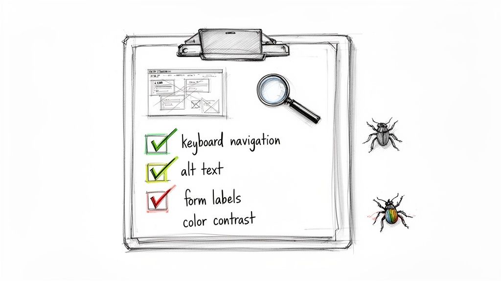
To give you an idea, a starter checklist can help you and your team get into the right mindset. It’s a simple way to start verifying the basics manually.
Sample Accessibility Testing Checklist
Category | Checkpoint | Status (Pass/Fail) | Notes |
|---|---|---|---|
Keyboard Navigation | Can every interactive element be reached and operated using only the Tab key? | ||
Form Labels | Does every form field have a clearly associated and visible label? | ||
Heading Structure | Are headings used logically and sequentially (e.g., no skipping from H1 to H3)? | ||
Alt Text | Do all meaningful images have descriptive alternative text? |
This is just a starting point, of course, but even covering these four areas will put you ahead of the curve.
Streamlining Reporting with Uxia
Finding a bug is only half the battle. To get it fixed, you need clear, actionable documentation. Vague bug reports like “the button doesn’t work” are a developer’s nightmare. A good report needs to explain what went wrong, where it happened, and exactly how to reproduce it.
This is where a platform like our own, Uxia, becomes a game-changer. Its automated reports don't just spit out a list of WCAG violations; they provide rich, contextual feedback. Because Uxia tests against all criteria from WCAG 2.1 and 2.2 at levels A, AA, and AAA, the reports are incredibly thorough. The platform even categorises issues by severity and suggests who should tackle them—a designer for a colour contrast problem, a developer for a code issue.
In a landmark initiative, the European Union's largest government website accessibility test revealed that while 57% of issues can be caught by automation, clear reporting is vital. You can discover more about this extensive EU accessibility study on Deque.com.
Uxia’s AI-powered synthetic testers accelerate compliance by flagging these very issues instantly, complete with the detailed documentation needed for rapid fixes. Building a plan that integrates powerful tools like these is the key to making your user interface design testing both efficient and truly effective.
Legal and Regulatory Landscape: The Push for Compliance
Of course, building better products for everyone should be motivation enough. But let’s be honest: accessibility testing is also a huge deal because of legal and regulatory pressure. Ignoring these rules isn't an option anymore. Non-compliance can lead to massive fines, legal headaches, and getting locked out of entire markets.
The global push for legally mandated digital inclusion is only getting stronger. In the United States, the Americans with Disabilities Act (ADA) has been the standard for years. Now, Europe is taking a giant leap forward with its own landmark legislation.
The European Accessibility Act Is Here
The European Accessibility Act (EAA) is a complete game-changer for any company with a footprint in the European Union. Its goal is to create a single, consistent set of accessibility rules across all member states. This makes it easier for businesses to operate and, more importantly, ensures citizens get the accessible products and services they deserve.
And the EAA’s scope is massive. It covers everything from e-commerce sites and banking apps to smartphones and computers. This isn’t some far-off concern, either—the critical deadline for compliance is June 28, 2025. After that date, any new products or services sold in the EU that fall under the act must be accessible.
Practical Recommendation: Proactive accessibility work isn't just a "best practice" anymore; it's a critical competitive advantage. Meeting these standards before the deadline is essential for avoiding major business disruption and proving you’re truly committed to inclusive design.
This is a huge shift affecting an enormous market. The EAA, first adopted in April 2019, will directly impact 87 million Europeans with disabilities—that's one in four people. It requires compliance with the EN 301 549 standards, which are closely aligned with WCAG 2.1 AA. Countries like Sweden and Denmark are already updating their national laws to match. You can learn more about the EAA's impact on the Accessible EU Centre website.
De-Risking Your Market Entry with Uxia
Trying to navigate complex regulations like the EAA can feel overwhelming, but it doesn't have to be. The trick is to build a testing strategy that maps directly to the required standards. The EAA, for instance, leans heavily on the principles laid out in WCAG, especially Level AA conformance.
This is exactly where a tool like Uxia becomes so valuable. Our platform is built from the ground up to test your digital products against every criterion from WCAG 2.1 and 2.2, covering levels A, AA, and AAA. This ensures your testing efforts are perfectly aligned with the standards cited in the legislation.
By plugging Uxia into your workflow, you can constantly check your designs and code against these official benchmarks. The platform flags every issue, from a simple colour contrast error to an improperly used ARIA attribute, and organises everything into a clean, actionable list. Uxia even tells you if an issue is a designer’s job or a developer’s, which totally streamlines the fix-it process.
Ultimately, using Uxia helps teams de-risk their market entry. It gives you the confidence that your product meets the necessary accessibility standards, so you can launch in Europe and other regulated markets with a much lower risk of legal trouble. It turns a potential compliance nightmare into a clear path forward.
Common Questions About Accessibility Testing
Even with a solid plan, a few questions always seem to pop up. Getting these sorted out early helps clear the runway, letting your team move forward with confidence instead of getting stuck on the details.
So, let's tackle a few of the most common questions we hear from teams just starting to weave accessibility into their workflow.
What is the Difference Between WCAG 2.1 and 2.2?
Think of WCAG updates like new editions of a textbook. They don't throw out the old rules; they just add new, relevant ones.
WCAG 2.1 was a big step forward, bringing in new criteria that specifically targeted mobile accessibility, users with low vision, and people with cognitive and learning disabilities. It modernised the guidelines for the way we use the web today.
WCAG 2.2 is the latest edition. It builds directly on top of 2.1 by adding a few more success criteria, mostly focused on making navigation easier for users with motor impairments or cognitive differences—like ensuring focus indicators are always clearly visible. It doesn't remove anything from 2.1. The simple takeaway? If you’re compliant with 2.2, you’re already compliant with 2.1.
Which WCAG Level Should We Aim For?
This is the big one. The three levels—A, AA, and AAA—aren't just arbitrary labels; they give you a clear roadmap for what to prioritise.
Level A: This is the absolute baseline. Think of it as the foundation. If you fail here, your product has severe, show-stopping barriers for many users.
Level AA: This is the industry standard and what most organisations should be shooting for. It tackles the most common and significant accessibility hurdles and is often the level required by laws like the European Accessibility Act.
Level AAA: This is the gold standard. It’s fantastic to aim for, but meeting every single AAA criterion isn't always practical for all types of content, as the requirements can get very specific and sometimes restrictive.
Practical Recommendation: For a product that's both legally sound and genuinely usable, your team should aim for WCAG 2.2 Level AA conformance. It hits that sweet spot between achieving a high degree of accessibility and maintaining a practical workflow for your designers and developers.
How Can We Test Against All WCAG Criteria Efficiently?
Trying to manually check every single criterion from both WCAG 2.1 and 2.2 is a massive, time-consuming task. Nobody has time for that, and it's where mistakes happen. This is exactly why a platform like Uxia is such a game-changer for modern product teams.
Uxia is built to test your product against all criteria from WCAG 2.1 and 2.2, across every level (A, AA, and AAA). Instead of your team getting bogged down with manual checklists, Uxia automates the entire audit, flagging every issue it finds in minutes.
But it's not just about finding failures. Uxia intelligently sorts the results into a clear, prioritised report. It tells you which issues are likely design-related (like colour contrast) and which ones are for your developers (like code structure). This creates a direct, actionable feedback loop that cuts out the guesswork, helping your team fix the right problems, faster.
Ready to build accessibility into your workflow from the very beginning? With Uxia, you can get instant, actionable feedback on your designs and prototypes, ensuring you meet WCAG standards without slowing down your sprints. Start testing with Uxia today.