What Are Click Maps A Guide to Understanding User Behavior
Discover what click maps reveal about user behavior. Learn how to read, interpret, and use AI-powered click maps from Uxia to get actionable insights instantly.

Click maps are like leaving a trail of digital footprints—they show you exactly where people are clicking on your website or app. This isn't about dry analytics; it's about turning abstract user data into a visual story that reveals what grabs your audience's attention and what they completely ignore.
What Are Click Maps and How Do They Work?
Imagine trying to figure out what's popular in a physical shop without ever seeing where customers walk. It’s impossible. You'd never know which displays work or which aisles are just dead space. Click maps solve this exact problem for digital products by tracking every single tap and click, giving you an instant visual record of how people are engaging.
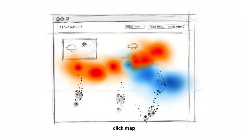
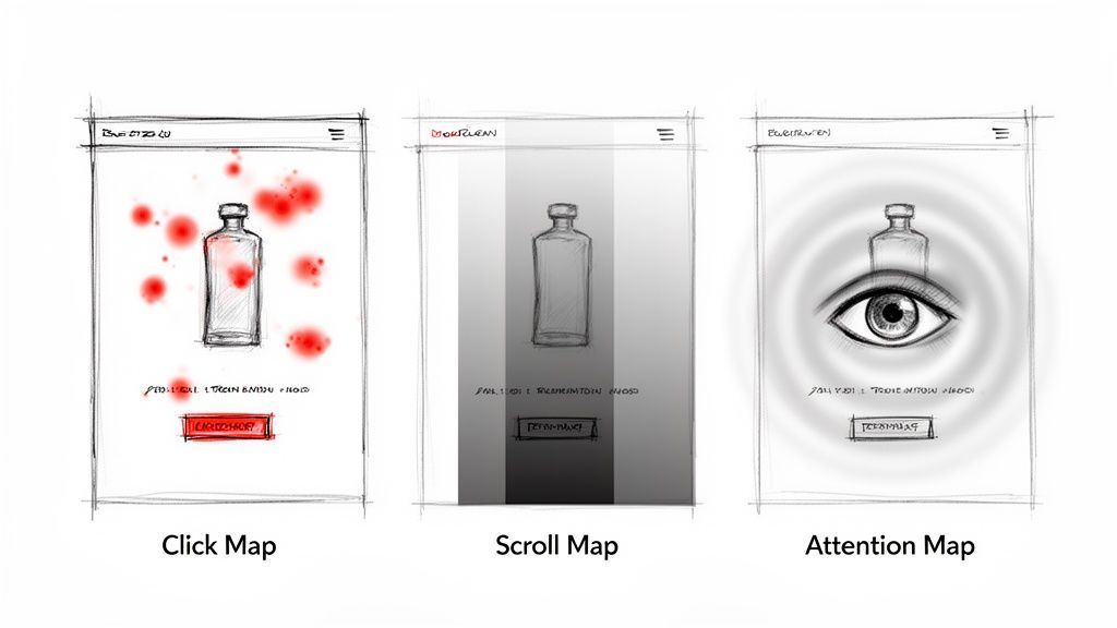
Think of it as a weather map for your user interface. Bright, 'hot' colours like red and yellow cluster around areas with a high concentration of clicks—these are your hotspots, the parts of your page people can't get enough of. Cooler colours like blue and green show you the opposite: areas with low engagement, where users are scrolling right past.
For a quick overview, here's what click maps bring to the table.
Click Maps at a Glance
Concept | What It Reveals | Primary Use Case |
|---|---|---|
Visual Click Overlay | Aggregates all user clicks on a page into a visual heat map. | Identifying the most and least popular interactive elements. |
Hotspots & Coldspots | Shows high-interaction areas (hot) and neglected areas (cold). | Optimising page layout and call-to-action placement. |
Dead Clicks | Highlights clicks on non-interactive elements. | Finding and fixing user frustration points in the UI. |
This at-a-glance format makes it easy to spot trends and validate design assumptions without getting lost in spreadsheets.
Decode User Priorities in an Instant
This visual-first approach is miles faster than digging through tables of numbers. In a single glance, you can immediately spot:
Popular Features: Which buttons and links are getting all the love?
Wasted Clicks: Are people repeatedly clicking on an image or a piece of text, thinking it's a link? This is pure frustration.
Ignored Elements: Is that all-important call-to-action (CTA) button being completely overlooked?
Practical Recommendation: Use click maps on your key pages (homepage, pricing, checkout) to get a quick win. Identify the top 3 most-clicked and least-clicked elements. This simple exercise often reveals immediate opportunities to improve navigation and user flow.
A Modern Approach to Data Collection
Traditionally, generating one of these maps meant you had to wait weeks, sometimes longer, to collect enough data from live traffic. This made it a slow, reactive process—totally out of sync with agile teams who need to move fast and get feedback on new designs now.
That’s all changing. Platforms like Uxia flip this dynamic on its head. Instead of waiting for live users, Uxia deploys AI-powered synthetic users to interact with your designs or prototypes. These AI testers mimic real user behaviour with incredible accuracy, generating a detailed and realistic click map in minutes, not months.
This approach means you can get actionable feedback before writing a single line of code, turning user research from a slow validation step into a proactive part of your design cycle. If you're curious about this shift, you can explore various modern behaviour research methods that are now available to product teams.
Going Beyond Clicks with Other Behaviour Maps
Click maps are a fantastic starting point, but they only tell you a fraction of the story. To genuinely understand what your users are doing—and why—you need to look beyond the click and bring other behaviour maps into the picture.
It’s a common trap for teams to mix up these different maps, which often leads them down the wrong path when trying to fix a problem.
Let's imagine you're looking at a product page on an e-commerce site. A click map clearly shows you which product photos people are interacting with and if they're hitting the "Add to Basket" button. But what happens if that button is getting almost no love? The click map tells you what happened, but it leaves you guessing why.
Scroll Maps: Pinpointing Where Interest Drops Off
This is where a scroll map becomes your best friend. It paints a clear picture of how far down the page your visitors are actually going, typically using a colour gradient from hot (seen by everyone) to cold (seen by very few).
Back to our product page. A scroll map might deliver a bombshell: 70% of visitors never even make it past the main image. They're completely missing the detailed product description, the reviews, and—most importantly—the buy button.
Suddenly, the problem isn't the button's design or its colour. It's the fact that most people never even see it. That single insight shifts your focus from tweaking a button to rethinking the entire page layout.
Attention Maps: Seeing Through Your Users' Eyes
Now, let's add another layer with an attention map. This tool predicts where a user's eyes are most likely to land in the first few critical seconds on a page. Unlike click maps that track a physical action, attention maps forecast visual focus before a finger ever touches the mouse.
On our same e-commerce page, an attention map could reveal that a flashy promotional banner at the very top is sucking up all the initial visual energy, pulling attention away from the product's name and price.
Practical Recommendation: On long pages like blog posts or landing pages, always combine your click map with a scroll map. If a key CTA has no clicks, check the scroll map to see what percentage of users even reached that point. This prevents you from "fixing" a button that users never see.
Building a complete picture means weaving these different data points together. This is especially true in high-stakes industries like tourism. For instance, Spain’s Canary Islands, a top EU destination, logged a staggering 99.5 million nights in tourist accommodations. For a booking platform targeting this market, a simple click map isn't enough.
This is where a tool like Uxia can run synthetic testers that mimic specific user groups, like Spanish families planning a holiday. The resulting click maps might reveal that 15% of older users are abandoning the booking process because the mobile navigation is confusing—a critical friction point that a standalone click map would miss entirely.
This integrated approach is the core of effective data-driven design. While click maps zero in on specific page interactions, it’s also crucial to place these insights into the bigger picture of the user journey, like when you're mastering customer experience mapping.
By combining click, scroll, and attention data from its AI testers, Uxia gives you the full story, helping you diagnose the right problem so you can build an experience that truly works.
How to Read a Click Map to Understand User Intent

A click map full of colourful dots is just a pretty picture until you learn to read the story it’s telling. The real skill is moving from what users clicked to why they clicked. That's how you unlock powerful insights into their goals, frustrations, and unmet expectations.
Every cluster of clicks—or even the lack of them—is a clue. By learning to spot a few key patterns, you can quickly diagnose usability issues and find clear opportunities to make things better.
Spotting Frustration with Rage Clicks
One of the most obvious patterns is the rage click. This is what happens when someone clicks repeatedly and rapidly on the same spot. Why? Usually, it's because an element they expect to be interactive is completely unresponsive.
Imagine a user furiously clicking on a “Download PDF” icon that’s just a static image. Your click map will show this as a dense, angry-red cluster of dots. This isn't just a click; it’s a user screaming at you through their mouse, flagging a broken expectation and a major point of friction.
Identifying Unmet Needs with Dead Clicks
A little different are dead clicks—single clicks on non-interactive elements. They're less aggressive than rage clicks but just as important. These clicks point to a clear mismatch between your design and your user's intuition.
You’ll see them all the time on things like:
Images users think will zoom in or lead to another page.
Underlined text that looks like a hyperlink but isn't.
Decorative icons that look like buttons but do absolutely nothing.
These wasted clicks show you exactly where your design is accidentally misleading people. Each one represents a moment of confusion that hurts the experience and can easily lead to someone giving up and leaving.
Practical Recommendation: Prioritise fixing dead clicks. These are low-hanging fruit for UX improvements. If users are clicking on an image, either make it clickable (if it makes sense) or redesign it so it doesn't look like an interactive element. Tools like Uxia can help you identify these hotspots on prototypes before they ever become a problem for live users.
Visualising Desire Lines
Sometimes, the most interesting clicks are the ones that trace a path across the screen, creating what we call a desire line. This is a sequence of clicks that reveals the journey a user wishes they could take through your interface. For example, a user might click from a product image to a feature description and then to a customer review, trying to piece together their own path.
These patterns are UX gold. They show you exactly how users want to connect information on a page. Recognising desire lines helps you reorganise content and build more intuitive flows that match how people naturally behave.
Adding Context with Uxia’s AI Insights
Spotting these patterns is a huge step, but understanding the full context behind them eliminates the guesswork. This is where Uxia gives you a massive advantage. Click maps generated by Uxia's AI testers come paired with 'think-aloud' transcripts.
So, instead of just seeing a rage click, you get a direct explanation from the AI persona, like: "I am clicking this icon because I expected it to open the specifications sheet, but nothing is happening. This is very confusing." This qualitative feedback gives you the "why" behind the data instantly, so you can fix real usability problems with total confidence.
Generate Instant Click Maps Without Live Traffic
Getting a useful click map used to be a waiting game. The old way involved launching a page, hoping for the best, and then waiting weeks—sometimes months—to collect enough data from real users.
This reactive approach makes it impossible to validate designs before they go live. You’re essentially forced to build something first and only find out if it works later, locking valuable insights behind a slow and expensive development cycle. That model just doesn’t fit how modern teams need to operate.
A More Agile Way to Generate Click Maps
Thankfully, there’s a much faster, more agile way to get these critical insights. With a platform like Uxia, you can generate a rich, realistic click map in minutes, all without needing a single live visitor. The magic behind this is advanced synthetic user testing.
The process is refreshingly simple and completely flips the traditional workflow on its head. Instead of waiting for users to find your design, you bring a simulated version of your audience directly to it.
Here’s how it works with Uxia:
Upload Your Design: Start with whatever you have—a basic wireframe, a polished mockup, or a fully clickable prototype.
Define a Goal: Give your testers a clear mission, just as you would with a human. It could be something straightforward like "find the pricing page" or "add a blue shirt to the basket."
Deploy AI Personas: Choose AI-powered user personas that mirror your target audience's demographics and behaviours. This ensures the feedback is directly relevant to the people you're building for.
Within minutes, Uxia’s synthetic users get to work, navigating your design and trying to complete the goal you set. Every click is tracked and compiled into a detailed click map that looks identical to one generated from thousands of real user sessions.
If you’re curious about the technology that makes this possible, check out our guide on the top synthetic users tools available today.
This shift from reactive to proactive analysis is a game-changer. It lets you spot confusing layouts, dead clicks, and missed opportunities while still in the design phase—the point where changes are cheap and easy to make.
Key Benefits of Synthetic Click Map Testing
This modern approach brings some serious advantages that traditional methods just can’t offer. It’s not simply about saving time; it’s about making smarter, data-backed decisions much earlier in the game.
Unmatched Speed and Efficiency
The most obvious win is speed. Instead of waiting weeks, you get actionable data in under an hour. This frees up your team to test, iterate, and re-test multiple design variations in a single day, shrinking feedback loops from weeks to minutes.
Confidential Pre-Launch Validation
Testing a new feature or a confidential redesign is a non-starter with live traffic. Uxia gives you a secure, private environment to test anything you want. You can validate critical user flows and smooth out usability kinks long before a product ever sees the light of day.
Data-Driven Decisions from Day One
This method lets you ground your design decisions in hard behavioural data, not just hunches or opinions. By generating click maps for early-stage concepts, you ensure every choice is validated against user behaviour. The result? More successful launches and a better final product. With Uxia, you can stop guessing and start knowing—faster than ever.
Practical Click Map Applications and Common Pitfalls
Knowing what a click map is and how to read it is just the start. The real magic happens when you put those insights to work. From tweaking a landing page to overhauling an entire conversion funnel, these visual reports give you direct, actionable feedback from your users. But be careful—it’s just as easy to misinterpret the data and head down the wrong path.
One of the most powerful and practical uses is optimising landing page layouts. Your click map might show that a glowing customer testimonial is getting zero clicks because it’s buried below the fold. You might also find users are furiously clicking on a header image, expecting it to be a link. These are clear signs of confusing navigation that you can fix.
Another great application is improving your calls-to-action (CTAs). Let's say your click map reveals that a tiny "Learn More" link is getting all the clicks, while your big, bold "Get Started" button is being completely ignored. That's your cue to rethink that button's design, its wording, or where it’s placed on the page.
Validating A/B Test Variations
Click maps are your secret weapon for understanding why an A/B test succeeded or failed. Just knowing that "Version B" boosted sign-ups by 10% is only half the story.
A side-by-side click map comparison can show you exactly what happened. Maybe the new button placement in Version B pulled attention away from distracting sidebar links, which directly led to more conversions.
Practical Recommendation: When A/B testing, always generate a click map for each variation. Comparing the click patterns will reveal the behavioural changes that led to the difference in conversion rates, giving you insights you can apply to future designs. Uxia is perfect for this, allowing you to quickly compare multiple design options before you even build the A/B test.
And it’s not just for live websites. Click maps are also brilliant for checking user engagement in simulated environments. Think of something like an interactive product demo guide—you can spot friction points and confusing steps long before a real user ever has to struggle through them.
Common Pitfalls to Avoid
As powerful as they are, click maps come with a few traps for the unwary. It’s incredibly easy to jump to the wrong conclusion if you aren't looking at the full picture.
Here are three big mistakes to watch out for:
Mistaking Correlation for Causation: A user clicked on A, then B. Does that mean A caused them to click B? Not necessarily. Always look for wider patterns across many users before you decide one action is directly influencing another.
Ignoring User Segmentation: People behave differently. A button that’s a breeze to click on a desktop can be a nightmare to tap on a mobile screen. Always break down your click maps by device, traffic source, or user type. You’ll be amazed at what you find.
Relying Solely on Click Data: Clicks tell you where, but they never tell you why. Without that qualitative context, you’re left guessing about what your users were actually thinking. This is exactly the problem Uxia was designed to solve.
By combining click map data with AI-generated usability reports, Uxia gives you the complete story. You don’t just see where users are clicking—you also get AI-driven transcripts that explain their thought processes, frustrations, and expectations in plain language. This mix of hard data and rich context gives you a rock-solid foundation for making truly user-centric design decisions.
Your Actionable Click Map Analysis Workflow
Turning a colourful splash of click data into actual product improvements isn't magic. It requires a repeatable process—a workflow that takes the guesswork out of analysis and makes sure every insight leads to a tangible action. It’s all about creating a cycle of continuous improvement.
And it doesn't start with the data. It starts with a question.
Start with a Clear Hypothesis
Before you even think about generating a report, you need to know what you're looking for. A good hypothesis is just a simple, testable statement about how you think people are behaving.
For example, you might hypothesise, "Users aren't engaging with our new feature banner because it's placed too low on the dashboard."
That single sentence gives your analysis a laser focus. Without it, you’re just wandering through the data hoping to stumble upon something useful.
Generate and Validate with Uxia
Once your hypothesis is ready, it’s time to test it. With a tool like Uxia, you can generate a validation click map in minutes. Just upload your design, give your AI personas a relevant goal, and let them go to work. The result is a rich visual dataset showing you exactly how users interact with the element you’re investigating.
This is a game-changer for any agile design process because you can test ideas before they ever see live traffic. If you want to get really good at this, digging into effective user interface design testing will help you build a rock-solid validation strategy.
Analyse and Cross-Reference Data
With the click map in front of you, look for patterns. Do they support your hypothesis, or do they tell a completely different story? Maybe you see a cold spot right over your new banner, confirming nobody’s clicking it. Or perhaps you see something totally unexpected, like a flurry of clicks on a part of the banner that isn't even interactive.
Now, layer on other data to get the full picture. Cross-reference your click map with:
Scroll Maps: To see if the banner is even visible to most users.
Uxia's AI Transcripts: To hear the "think-aloud" feedback and understand the why behind the clicks or lack thereof.
This simple infographic breaks down the core steps in this continuous optimisation cycle.
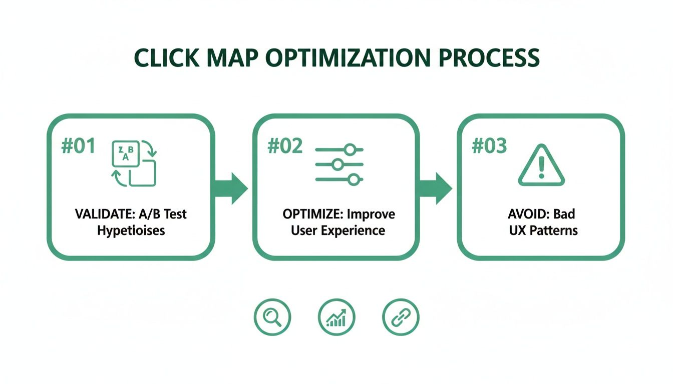
This process is all about validating designs, fine-tuning the user experience, and steering clear of common usability traps.
Practical Recommendation: A startup used this exact workflow to investigate low checkout conversions. Their hypothesis: the "Apply Discount" field was confusing. A click map from Uxia proved them right, showing a storm of rage clicks. The platform's AI transcripts confirmed users thought it was a button, not a text box, providing an immediate and actionable insight.
Formulate an Action Plan
The final piece of the puzzle is turning what you've learned into a concrete plan. For that startup, the action was obvious: redesign the discount field to look and act like a proper input field. They ran a quick follow-up test in Uxia on the new design, which confirmed the fix worked—all before a single line of code was written.
By adopting this simple rhythm—hypothesise, test, analyse, and act—you can bring click map analysis right into the heart of your development cycle and ensure every design decision is backed by real user behaviour.