Lagging vs Leading Indicators for Product Teams
Master lagging vs leading indicators to build better products. This guide helps product teams choose, track, and act on the metrics that drive future success.

The whole lagging vs. leading indicators debate really just boils down to timing and perspective. It's a simple but powerful distinction.
Lagging indicators are backward-looking; they measure what has already happened. Leading indicators, on the other hand, are forward-looking, giving you clues about what's likely to happen next.
The easiest way to think about it is driving a car. Your rearview mirror shows you the road you’ve already covered—that's a lagging indicator. The windshield shows you what's coming up ahead. That's your leading indicator. A practical recommendation is to ensure your product dashboard has a clear view of both.
Understanding the Core Concepts
Lagging and leading indicators are really two sides of the same coin. One tells you the final score, and the other tells you if your team is playing well enough to win. Getting this right is absolutely fundamental for any product team that wants to make decisions based on data, not just react to history.
What's a Lagging Indicator?
A lagging indicator is an output metric. It's the "what happened." They’re usually pretty easy to measure, but they are incredibly difficult to influence directly because, by the time you see the number, the events that caused it are already in the past.
Think about common business metrics like monthly recurring revenue (MRR), customer churn rate, or even Net Promoter Score (NPS). These are all vital for reporting on the overall health of your product, but they tell you the result, not the cause.
And a Leading Indicator?
Conversely, a leading indicator is an input metric. It measures the actions and behaviours that you predict will lead to a desired outcome. These are often a bit trickier to nail down and measure, but the payoff is huge because you can directly influence them.
For a product team, this could be the task success rate in a prototype test or how many daily active users engage with a brand-new feature. When you focus on these, you’re not just reacting—you’re proactively steering your product where you want it to go. Digging into various behaviour research methods is a great way to start uncovering these predictive user actions. For practical application, a platform like Uxia can generate these predictive metrics from your prototypes.

Comparing Lagging and Leading Indicators at a Glance
To make the distinction crystal clear, here’s a quick breakdown of their core differences. The goal isn’t to pick one over the other; a truly complete picture of product performance comes from a smart mix of both.
This is where new tools like Uxia are changing the game. By running synthetic user tests, you can generate powerful leading indicators—like a predicted task success rate—before a single line of code is even written. It gives you a chance to anticipate user behaviour, not just react to it.
Characteristic | Lagging Indicators | Leading Indicators |
|---|---|---|
Time Focus | Backward-looking (Past) | Forward-looking (Future) |
Measurement | Easy to measure, confirms results | Harder to measure, predicts results |
Influence | Hard to influence directly | Easy to influence directly |
Purpose | Measures outcomes and impact | Measures progress and behaviours |
Example | Customer Churn Rate | Feature Adoption Rate |
Ultimately, a balanced approach is what separates good teams from great ones. Lagging indicators tell you if you've won the game. Leading indicators tell you if you’re making the right moves to get there.
Why Leading Indicators Drive a Proactive Product Strategy
While lagging indicators are essential for reporting on past performance, they always arrive too late to change the outcome. Think of them as the final score of a game you've already played.
A proactive product strategy, on the other hand, is all about steering the ship before it hits an iceberg, not just reporting on the damage afterwards. This is where leading indicators come in—they are the compass, not the rearview mirror.
They are what allow agile teams to be genuinely agile. Instead of waiting months to analyse churn data (a classic lagging metric), teams can focus on predictive signals that show where the user experience is breaking down right now. This forward-looking approach empowers you to make sharp, informed decisions and pivot early, saving a huge amount of time and resources. A practical recommendation here is to integrate leading indicator reviews into your sprint planning.
A Scenario: Proactive Pivoting in Action
Imagine your product team is designing a new, fairly complex onboarding flow. The ultimate goal is to increase 30-day user retention, a critical lagging indicator. A traditional, reactive approach would mean launching the feature, waiting a full month, and then digging into the retention data.
If retention drops, the team is left scrambling to figure out why, long after the development work has been paid for. The damage is already done.
Now, let's picture a proactive team. Before a single line of code is written, they build a prototype of the new onboarding flow. Using a platform like Uxia, they run AI-driven user tests to generate powerful leading indicators. Within minutes, they get a predicted task success rate, friction scores for each step, and metrics on navigation clarity.
Suppose the results show a 40% predicted task success rate and high friction on the final step. This leading indicator is a massive red flag. It predicts that the feature, in its current state, will likely fail and drag down their retention goal.
Armed with this insight, the team can iterate on the design immediately. They fix the confusing step, re-test with Uxia, and see the predicted success rate jump to 85%. By focusing on the leading indicator, they avoided shipping a flawed feature, saved weeks of wasted engineering effort, and proactively steered the product toward its ultimate goal.
A leading indicator is a compass that guides your journey; a lagging indicator is a photograph of a destination you’ve already passed. Effective product teams need both to navigate successfully.
This pre-development validation is where agile principles and leading indicators intersect perfectly. It gives teams the power to build, measure, and learn in rapid, truly effective cycles.
Connecting Predictive Metrics to Business Outcomes
The real strength of a leading indicator lies in its direct, causal relationship with a future lagging outcome. The connection isn't always obvious, but identifying it is a game-changer for any product organisation. For a truly proactive strategy, it's crucial to understand how implementing predictive analytics for customer retention can connect early user behaviours with long-term business health.
This predictive power isn't just for product design; it has parallels in much larger systems. In the Spanish economy, for example, the Composite Leading Indicator (CLI) has proven its worth as a forward-looking signal, especially during turbulent times like the post-2008 financial crisis recovery. Product managers can draw a clear parallel: just as the CLI predicts economic turns, synthetic user testing with Uxia spots UX friction in prototypes before real users abandon a flow, slashing iteration times from weeks to minutes.
This connection allows teams to translate early user feedback into predictable business impact. It’s also where gathering qualitative data becomes essential. To understand the ‘why’ behind the numbers, teams need a robust system for collecting user feedback. You can check out our guide on building a Voice of the Customer program to integrate these insights effectively.
By identifying and tracking the right leading indicators, product teams can stop guessing and start building with confidence, knowing their daily work is directly contributing to long-term success.
The Essential Role of Lagging Indicators
If leading indicators are the map for your product's journey, lagging indicators are the destination markers that prove you’ve arrived. It's tempting to dismiss these backward-looking metrics as just historical data, especially when everyone is rushing to be "proactive." But that's a mistake. They play a vital role in validating your strategy and proving the business impact of your work.
Lagging indicators are the language of business results. Metrics like revenue, Customer Lifetime Value (CLV), and market share are the definitive proof that your product strategy isn't just creating user activity, but generating real value for the company. They're non-negotiable for getting stakeholder buy-in and justifying future investment.
Without them, you're just reporting on effort, not on achievement.
Grounding Strategy in Reality
Relying only on leading indicators creates a dangerous blind spot. A team might celebrate a high feature adoption rate (a leading metric) but fail to see that the new feature is cannibalising a more profitable part of the product, causing overall revenue (a lagging metric) to fall.
This happens all the time. Predictive signals can be misleading without the validation of final outcomes. Lagging indicators act as the ultimate reality check, making sure your team’s efforts are actually aligned with bigger business goals. They stop you from optimising for a local high point while the global picture gets worse. A practical recommendation is to always map your leading indicators back to a primary lagging indicator to avoid this pitfall.
Here are a few essential lagging indicators that give you this crucial validation:
Net Promoter Score (NPS): This metric measures overall customer loyalty and satisfaction after they've experienced your product. While leading UX metrics might predict a good experience, NPS confirms whether you actually delivered on that promise.
Customer Churn Rate: This shows the percentage of customers who stop using your product over a certain period. It's one of the most direct measures of whether your product is keeping the value it promised.
Conversion Rate: This tracks the percentage of users who complete a desired action, like making a purchase or signing up. It’s a direct measure of your product's ability to turn user interest into business results.
Lagging indicators aren't just for executive reports; they're the feedback that validates your entire product hypothesis. They confirm that the problems you solved with leading metrics were the right problems to solve in the first place.
The Power of the Feedback Loop
The best product teams don't see this as a battle of lagging vs. leading indicators. They see it as a continuous feedback loop. They use leading indicators to make informed bets and guide their day-to-day decisions. Then, they use lagging indicators to see if those bets paid off.
For instance, a team using Uxia might see a 25% higher predicted task completion rate for a new checkout flow. This leading signal gives them the confidence to ship the design. Two months later, they confirm their success when the lagging indicator for cart abandonment rate drops by 15%. The leading metric guided the decision, and the lagging metric proved its value.
You can even see this dynamic on a macroeconomic scale. Spain's economic playbook shows how lagging indicators, while confirmatory, often arrive too late to steer the ship, as happened during the 2008-2012 crisis. For product designers on sprint deadlines, think about 2022, when lagging unemployment hit 12.9% months after leading indicators had already signalled a slowdown. This is the "lagging regret" that fast-moving teams have to avoid. To learn more about these economic signals, you can find more insights about leading economic indicators from The Conference Board.
Platforms like Uxia help product teams in ES and beyond flip this script, using predictive usability scores to validate flows and dodge the costly consequences of waiting for outcome data. It’s all about creating a powerful, data-driven rhythm: predict, act, and then confirm. This loop turns historical data into fuel for future innovation, making sure every product decision is both proactive and accountable.
How to Choose the Right Product Indicators
So you understand the theory behind lagging and leading indicators. Now for the hard part: putting it into practice.
It’s not about collecting mountains of data. It's about choosing a handful of metrics that connect what users do every day to the high-level business goals you must hit. The right set of indicators tells a clear story, showing exactly how tiny, early user actions snowball into major, long-term outcomes.
Picking your indicators isn’t a one-off task; it's a constant process of refining your focus. You start with your biggest strategic objective and work your way down to the specific user interactions your team can actually influence. This discipline stops your team from just being busy and makes sure they're busy working on the right things.
This decision tree is a simple way to think about it. It helps you classify your goals and pick the right type of indicator to track them.
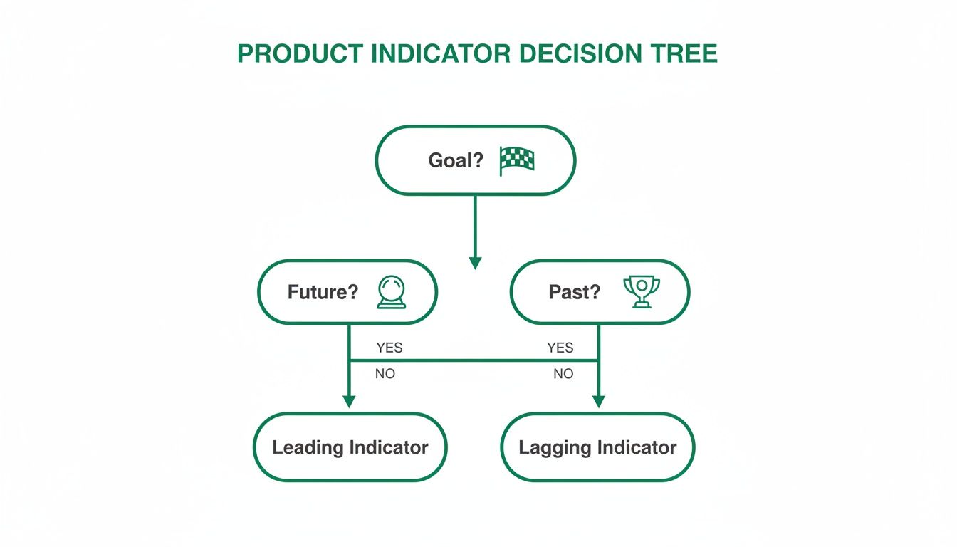
As the visual shows, if you’re measuring a final result (something that already happened), you need a lagging indicator. If you're trying to predict a future outcome, you need a leading one. A practical recommendation is to use this tree in your next planning session to clarify your team's metrics.
Start With Your Business Objective
Before you even think about metrics, you need absolute clarity on what you're trying to achieve as a business. Are you chasing market share? Trying to improve profitability? Or are you focused on boosting customer loyalty? Your top-level goal should be a lagging indicator that everyone from the CEO down understands and cares about.
Let's say a product team's main objective is to increase 30-day user retention by 15% next quarter. That's a perfect lagging indicator. It’s a clean, measurable outcome that has a direct impact on the health of the business. From this point on, every single metric you decide to track should serve this one goal.
Without this north star, teams inevitably get lost chasing vanity metrics—numbers that feel good to report but have zero connection to actual success.
Identify Predictive User Behaviours
Once you've locked in your lagging goal, it's time to brainstorm. What specific user behaviours do you believe will lead to that outcome? If you want to boost retention, what do users need to do inside your product to get enough value to come back? This is where you connect the final outcome to the actions that cause it.
For our goal of increasing retention, some predictive behaviours might be:
Successfully completing the onboarding flow.
Inviting a teammate within the first three days of signing up.
Using a core "sticky" feature at least twice in the first week.
Notice these aren't metrics yet; they're observable actions. This step demands a deep understanding of your users, which is why a real commitment to data-driven design is so critical. You have to ground these hypotheses in actual user insights, not just what you assume in a meeting room.
Select and Instrument Your Indicators
Now you can finally translate those behaviours into specific, measurable leading indicators. Each behaviour should map to one or more metrics. This is the moment you go from abstract ideas to concrete numbers your team can look at every day or week to see if they're making progress.
A common mistake is to choose indicators that are easy to measure instead of those that are genuinely predictive. The most valuable leading indicators are often nuanced and require dedicated effort to instrument correctly.
Let's bring this all together for our retention goal. We can translate our identified behaviours into a powerful set of indicators that create a clear narrative, from a user's first click all the way to long-term success.
Case Study: From Goal to Indicator
Lagging Goal: Increase 30-day user retention by 15%.
Predictive Behaviour 1: Users must understand the product's value quickly.
Leading Indicator: Task Success Rate during the onboarding tutorial.
Predictive Behaviour 2: Users must integrate the product into their workflow.
Leading Indicator: Feature Adoption Rate for the core "project creation" feature.
Predictive Behaviour 3: Users must find the interface intuitive and efficient.
Leading Indicator: Friction Score on the main navigation menu.
This framework creates a direct line of sight from a small usability problem to a massive business objective. It empowers a designer to say, "Improving this friction score will directly help us hit our retention target."
This is precisely where a platform like Uxia becomes indispensable. Instead of waiting for users to fail in your live product, you can generate these critical leading indicators—like Task Success Rate and Friction Scores—straight from a prototype. By running tests with AI-driven synthetic users, you can de-risk your development and confirm your design choices actually support your lagging goals before you write a single line of code.
This proactive validation cycle is the cornerstone of building successful, user-centric products.
Building an Actionable Product Metrics Dashboard
Data is just noise until you give it a story. Once you've handpicked your lagging and leading indicators, the real work begins: visualising them in a way that tells a clear, compelling story about your product’s health. A great dashboard is far more than a collage of charts; it’s a strategic tool that shows your team where you are and where you’re heading.
The whole point is to move past just reporting numbers and start sparking insightful conversations. A well-designed dashboard does this by placing high-level outcomes right next to the predictive signals that drive them. It makes the connection between the team's daily grind and the company's big goals obvious to everyone.

This means you have to think hard about who the dashboard is for and what decisions they need to make. The metrics a CEO glances at are worlds apart from what a product designer needs to see first thing in the morning.
Tailoring Dashboards to Your Audience
Different roles need different levels of detail. A one-size-fits-all dashboard is a recipe for a tool that nobody uses. Your best bet is to segment the information based on who's looking.
Executive Dashboard: This view should be all about the lagging indicators. C-level stakeholders care about the bottom line—things like Monthly Recurring Revenue (MRR), Customer Lifetime Value (CLV), and overall market share. The goal here is a clean, high-level summary of business health that confirms the product strategy is actually working.
Product Team Dashboard: This needs to be packed with actionable leading indicators. Product managers, designers, and engineers need to see the metrics they can directly nudge from one sprint to the next. Think Feature Adoption Rate, Task Success Rate, and User Friction Scores. These are the numbers that guide daily decisions and predict future wins. A practical recommendation is to make this dashboard the first thing the team reviews during sprint planning.
By creating separate views, you guarantee every stakeholder gets the right intel to make smart calls without drowning in data that isn't relevant to them.
Designing for Context and Clarity
A great dashboard doesn't just throw data at you; it provides context. One of the simplest yet most powerful ways to do this is by pairing related metrics together. Putting a leading indicator right next to the lagging one it’s meant to influence tells a much richer story.
For instance, show the Time on Task directly alongside the Task Success Rate for a new feature. If time on task is high but success is also high, you might have a complex but powerful feature. But if time on task is high and success is low, you've just pinpointed a usability disaster that needs fixing, fast.
Your dashboard should be a conversation starter. If people look at it and don't know what questions to ask or what actions to take, the design has failed. The goal is insight, not just information.
This principle of pairing metrics helps teams see the cause-and-effect relationships in their work, turning raw data into something they can act on. To get this right, product managers can borrow best practices from a well-structured software quality metrics dashboard.
Integrating Qualitative Insights
Numbers tell you what is happening, but they almost never tell you why. The most powerful dashboards are the ones that blend quantitative data with qualitative insights. This is where you connect the dots between what users do and what they think.
A leading indicator might show a massive 70% drop-off on your sign-up page. That number flags a problem, but it doesn't tell you how to solve it. Is the copy confusing? Is there a bug? Does the design look untrustworthy?
This is where integrating data from a platform like Uxia becomes a game-changer. By overlaying a heatmap or a friction visualisation from Uxia directly onto your analytics dashboard, you can instantly see where users are getting stuck. When you combine that with AI-generated "think-aloud" transcripts, you suddenly understand the 'why' behind the drop-off, giving your team a clear path to a fix. For a deeper dive, our guide on creating a user flow diagram can help map out these critical journeys.
This fusion of quant and qual transforms your dashboard from a static report into a powerful diagnostic tool. It empowers your team to solve real user problems with precision and confidence.
Common Questions About Product Indicators
Even with a great framework, teams always bump into the same practical questions when they start mixing lagging and leading indicators. Answering them clearly is the difference between a measurement strategy that works and one that just gathers dust.
This section tackles those frequent questions head-on, giving you actionable answers to move from theory to confident, real-world application.
How Many KPIs Should a Product Team Track?
Clarity beats quantity, every single time. The biggest trap teams fall into is tracking too many "vanity metrics"—numbers that look impressive but don't actually help you make a single decision. A cluttered dashboard is a useless dashboard.
A much better way is to anchor everything to one North Star Metric. This is almost always a lagging indicator that captures the core value you deliver, like 'Weekly Active Users' or 'Monthly Subscriptions'. This one metric gets the entire team pulling in the same direction.
To support that North Star, you only need 3-5 key leading indicators. These should be metrics you have strong reason to believe directly influence your main goal, and they're what your team can actually work on, sprint over sprint. A practical recommendation is to define these 3-5 indicators collaboratively as a team to ensure buy-in.
When launching a big new feature, a good rule of thumb is to track:
Two or three specific leading metrics, like 'Feature Adoption Rate' or 'Task Success Rate'.
One primary lagging metric that proves its business impact, like its effect on 'Overall User Retention'.
Your dashboard should tell a focused, compelling story. If it’s starting to look like an encyclopaedia of data, it’s time to simplify.
And remember, metrics aren't for life. Review them regularly. As your product and strategy shift, some indicators will become irrelevant. Don't be afraid to retire them to keep everyone focused on what truly matters now.
Can a Metric Be Both Leading and Lagging?
Yes, absolutely. A metric’s role is defined by its context—what you’re trying to predict versus what you’re trying to confirm. The same data point can do both jobs, depending on the question you ask.
Take 'Weekly User Engagement'. It can easily be a lagging indicator measuring the success of last month’s onboarding campaign. You ran the campaign, waited, and are now looking back to see if engagement went up. Done.
But that exact same metric can also be a powerful leading indicator for next month's 'Customer Churn Rate'. A high, sustained level of engagement this week is a great predictor that fewer people will cancel their subscriptions next month.
The trick is to be crystal clear about what job the metric is doing on your dashboard. Label it. Explain what it’s confirming from the past and what it’s predicting for the future. That clarity stops people from misinterpreting the data and ensures everyone understands the story.
How Do I Find Good Leading Indicators for UX?
Finding solid UX leading indicators means you have to stop focusing on outcomes (like satisfaction scores) and start looking at the behaviours that predict them. You need signals that show up long before you get post-launch survey results.
This is exactly where AI-driven testing platforms like Uxia come in. They let you generate predictive UX data directly from a prototype, way before you’ve written a single line of code.
Some of the best leading indicators for UX you can get are:
Task Success Rate in a Prototype: This is a direct predictor of whether real users will be able to get something done. A low success rate in a test is a massive red flag.
Time on Task: This measures efficiency. If it takes users forever to complete a task, you can predict they'll get frustrated and leave, even if they eventually succeed.
Friction Scores on UI Elements: By pinpointing exactly where users hesitate or stumble in a flow, these scores predict future drop-off points with startling accuracy.
These pre-launch metrics let your team find and fix huge usability problems before they can tank your important lagging KPIs, like conversion rates or customer satisfaction. By testing designs with platforms like Uxia, you move from hoping for a good user experience to proactively engineering one based on predictive data.
Ready to stop guessing and start building with confidence? Uxia gives your team the power to generate actionable leading indicators from your designs in minutes. Eliminate the guesswork and validate your product decisions with AI-driven user testing. Start testing with Uxia today.