A Practical Guide to Mastering WCAG 2.2
Master WCAG 2.2 with this complete guide. Learn the new criteria, find practical examples, and discover how to test and implement for full compliance.

The Web Content Accessibility Guidelines (WCAG) 2.2 have arrived, and they represent the latest thinking on how to make digital content more accessible. It’s easy to get lost in the technical details, but at its heart, WCAG is a blueprint for creating products that simply work for everyone, including people with disabilities. The goal is to ensure every digital experience is perceivable, operable, understandable, and robust.
Why WCAG 2.2 Is a Big Deal for Your Business
Digital accessibility has moved from a niche concern to a core part of modern product development. It's a massive business opportunity. Getting on board with WCAG 2.2 isn't just about ticking a compliance box; it’s about future-proofing your product, reaching a wider market, and building a brand that people trust. For product teams, this means shifting from reactive fixes to proactive, inclusive design—and that’s a powerful competitive advantage.
This has become especially urgent with new laws like the European Accessibility Act (EAA), which is setting new, legally enforceable standards. While the EAA currently points to WCAG 2.1 AA, savvy organisations are already adopting WCAG 2.2 to get ahead of the curve and, more importantly, to better serve their users.
The Growing Accessibility Gap
The data shows a pretty stark reality. Take Spain, where the push for WCAG 2.2 is picking up steam. According to the 2025 WebAIM Million report, home pages there averaged 64.0 errors per page—a massive 25.6% jump from previous years. It's not just a local issue. Globally, a staggering 94.8% of top home pages fail WCAG 2 conformance, leaving just 5.2% fully compliant.
This gap isn't just a statistic; it represents a huge missed opportunity. Inaccessible sites risk alienating the 15% of users with disabilities who often just give up and avoid the web altogether. You can dig into the full global accessibility audit from WebAIM to see the scale of the problem.
From Afterthought to Advantage
Baking accessibility into your process from day one is always cheaper and more effective than trying to patch it in later. This is where a proactive mindset, powered by the right tools, really pays off.
When you build with inclusive principles from the start, accessibility stops being an expensive problem to fix and becomes a core feature. It’s about building better products for everyone, right from the first sketch.
This is exactly the shift that platforms like Uxia are designed to support. By letting teams test early prototypes with AI-powered synthetic users, Uxia helps embed these inclusive practices directly into the design workflow. You can spot and fix potential accessibility roadblocks before a single line of code gets written, saving a ton of time and money down the road. And to really get a handle on WCAG 2.2, it helps to understand the different WCAG compliance levels.
Diving Into the New WCAG 2.2 Success Criteria
The real meat of WCAG 2.2 is in its nine new Success Criteria. These aren’t just abstract rules; they're practical fixes for real-world frustrations that users bump into every single day, especially on mobile or for those with cognitive and motor disabilities. Let’s break them down, focusing on what they actually mean for your work.
Getting a handle on these criteria is the first step toward building digital products that are genuinely inclusive. This isn't just about ticking boxes for users—it's a smart move for your business and legal standing, too.
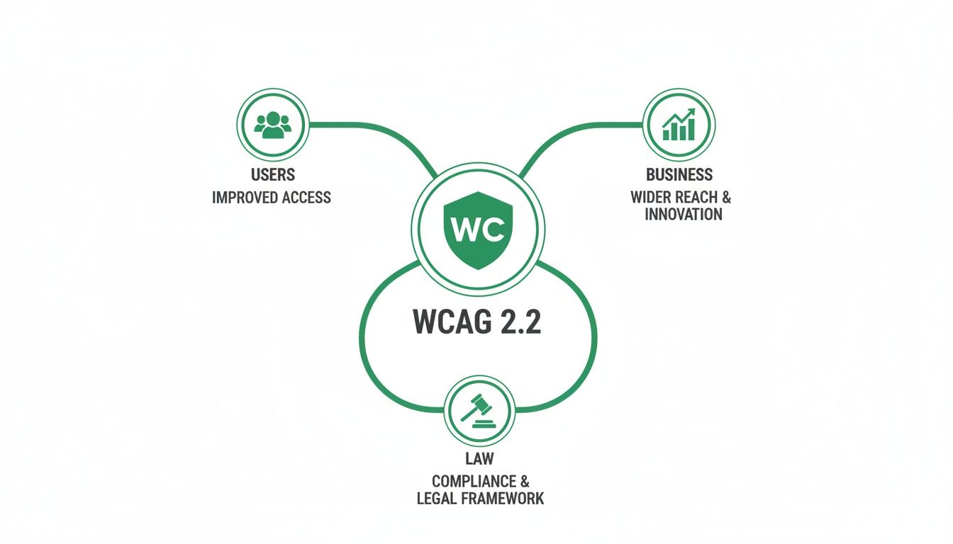
As you can see, improving the user experience creates a ripple effect. It directly supports business growth and helps you stay ahead of evolving legal standards. It’s a powerful reminder that inclusive design is a strategic decision, not just a nice-to-have.
Here’s a quick overview of what’s new before we dig into the details.
WCAG 2.2 New Success Criteria at a Glance
This table sums up the new additions, their required conformance levels, and who they help the most.
Success Criterion (SC) | Conformance Level | What It Solves | Primary Beneficiaries |
|---|---|---|---|
2.4.11 Focus Not Obscured (Minimum) | AA | Sticky headers/footers hiding the active element. | Keyboard users, users with low vision. |
2.4.12 Focus Not Obscured (Enhanced) | AAA | Any part of the active element being hidden. | Keyboard users, users with low vision. |
2.4.13 Focus Appearance | AAA | Weak or invisible focus indicators. | Keyboard users, users with low vision. |
2.5.7 Dragging Movements | AA | Interfaces that rely only on drag-and-drop. | Users with motor disabilities, touch screen users. |
2.5.8 Target Size (Minimum) | AA | Tiny, hard-to-tap buttons and links. | Mobile users, users with motor impairments. |
3.2.6 Consistent Help | A | Hard-to-find help and support options. | Users with cognitive disabilities, anxious users. |
3.3.7 Redundant Entry | A | Asking for the same information multiple times. | Users with memory impairments, all users. |
3.3.8 Accessible Authentication (Minimum) | AA | CAPTCHAs that block users with disabilities. | Users with cognitive and visual disabilities. |
3.3.9 Accessible Authentication (Enhanced) | AAA | Complex login processes requiring memorisation. | Users with cognitive disabilities, password manager users. |
Now, let's explore what each of these means in practice.
2.4.11 Focus Not Obscured (Minimum) (AA)
Ever tried to fill out a form on your phone, only to have a sticky header or a cookie banner slide over the exact field you’re typing in? It’s a common frustration, and it’s precisely what Focus Not Obscured is designed to fix.
This criterion states that when an element gets focus—like a form field or a button—it must be at least partially visible. Nothing should completely cover it up. For someone navigating with a keyboard, this is make-or-break; if they can’t see where they are, they can’t use your site. Simple as that.
2.4.12 Focus Not Obscured (Enhanced) (AAA)
Taking things a step further, the enhanced AAA version of this rule demands that the focused element must be fully visible. No part of it can be hidden by other content.
While Level AAA is a higher bar, aiming for it delivers a much smoother experience. Think about a user with low vision who relies on a screen magnifier. If even a tiny corner of a button is obscured, they might miss it completely. This criterion guarantees total clarity.
2.4.13 Focus Appearance (AAA)
This one is another game-changer for keyboard navigators. Focus Appearance sets clear, unambiguous rules for how the focus indicator—that outline you see when you tab through a page—should look.
It needs to have enough colour contrast against the background and be a certain thickness to make sure it’s easy to spot. Think of it as a bright, clear spotlight that follows the user, making it impossible to lose their place. A faint, barely-there dotted line just doesn't cut it anymore.
2.5.7 Dragging Movements (AA)
Lots of modern interfaces use drag-and-drop for things like reordering lists or uploading files. But for someone with a motor disability, executing a precise click-and-drag motion can be incredibly difficult, if not impossible.
This criterion says that if your interface uses a dragging movement, you have to provide a simple, single-pointer alternative. For instance, next to a drag-and-drop file uploader, you should also include a standard "Upload File" button. This ensures no one gets locked out of key features.
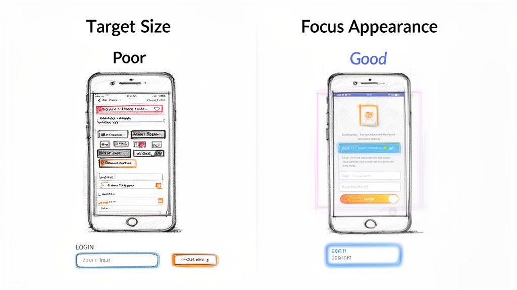
2.5.8 Target Size (Minimum) (AA)
This is a massive win for mobile usability. Target Size (Minimum) requires interactive elements—like buttons, links, and icons—to be at least 24 by 24 CSS pixels.
This straightforward rule helps prevent those annoying "fat finger" errors, where you accidentally tap the wrong link because everything is too small and crammed together. It helps everyone, but it’s a lifeline for users with motor impairments or anyone trying to use their phone on a bumpy train ride.
3.2.6 Consistent Help (A)
When you need help on a website, where’s the first place you look? The top right corner? The footer? Consistent Help makes this predictable. It says that if you offer a help mechanism—like a contact form, a chatbot, or a support link—it has to be in the same relative place on every page.
This consistency is crucial for users with cognitive disabilities, anxiety, or frankly, anyone who’s feeling a bit lost. They learn where to find help once and can trust it’ll always be there, which cuts down frustration and builds confidence.
3.3.7 Redundant Entry (A)
There’s nothing more irritating than filling out a long form, only to be asked for the exact same information again a few steps later. For users with memory impairments or other cognitive disabilities, this isn't just annoying; it can be a complete blocker.
Redundant Entry requires that information a user has already provided should either be auto-populated or be available for them to select. This applies to multi-step processes within the same session, making workflows much smoother and less error-prone for everyone.
3.3.8 Accessible Authentication (Minimum) (AA)
How many times have you squinted at a fuzzy, distorted image of letters to prove you're human? These CAPTCHA puzzles can be impossible for users with visual or cognitive disabilities to solve.
This criterion insists that authentication processes can’t rely only on a cognitive function test. If you use one, you must offer an alternative that doesn’t, such as two-factor authentication via email or SMS. Tools like Uxia can even help you test these flows by simulating users with different abilities, revealing friction points your team might otherwise miss.
3.3.9 Accessible Authentication (Enhanced) (AAA)
The enhanced version, Accessible Authentication (Enhanced), goes even further. It says the login process shouldn't require a cognitive function test at all, unless it involves something simple like recognising objects or personal content the user provided themselves (like "select your own photos").
On top of that, username and password fields must allow auto-filling from password managers to remove the need for memorisation. This is the new gold standard for creating login experiences that are both accessible and incredibly user-friendly.
Bringing WCAG 2.2 to Life with Practical Examples
Knowing the theory behind WCAG 2.2 is one thing, but actually putting it into practice is a whole different ball game. It’s time to move from abstract rules to concrete actions. Let's look at some real-world examples and code snippets that make these guidelines tangible, taking the guesswork out of your design and development workflow.
This is where many teams get stuck—translating the official guidance into functional, accessible user interfaces. We’ll bridge that gap by showing you what great implementation looks like, from mobile checkouts to login forms.
Making Target Size (Minimum) Work
One of the most important new rules is 2.5.8 Target Size (Minimum). This Level AA criterion says all interactive elements need a target size of at least 24 by 24 CSS pixels. It’s a direct response to how much we all use our phones, and it’s designed to stop those frustrating mistaps.
Think about a checkout screen on a mobile app. A poor design might have tiny radio buttons for shipping addresses, all squished together. If you're trying to tap the right one while on a bumpy bus ride, you’re almost guaranteed to hit the wrong one.
Practical Recommendation: In your design system, define minimum tap targets for all interactive components. Don’t just specify the icon size; define the full clickable area, including padding.
Good Practice Example: Mobile Checkout
Poor Design: The radio buttons are only 16x16px, with hardly any space between them.
Excellent Design: The radio button and its label are combined into one big, tappable area that’s 44x44px, with plenty of breathing room. The entire row is the target, not just the tiny circle.
This simple adjustment makes a world of difference for users with motor impairments, people with larger fingers, and honestly, every single person using a mobile device. You can uncover these kinds of real-world friction points by digging into effective user interface design testing.
Nailing Focus Appearance
Another game-changer is 2.4.13 Focus Appearance, a Level AAA criterion that finally sets clear standards for what a keyboard focus indicator should look like. That barely-there, 1px dotted outline just doesn't cut it anymore for an accessible experience.
Picture a standard login form. A keyboard user needs to see exactly which field is active as they tab from username to password.
The focus indicator is the visual spotlight that guides a keyboard user through your interface. If that spotlight is dim or flickering, the user is left in the dark, unable to navigate with confidence.
Practical Recommendation: Create a custom, on-brand focus style that is thick, has high contrast, and is clearly visible on any background colour your site uses. Store this in your global CSS file so it applies everywhere consistently.
CSS Example for Better Focus
/* A simple but effective focus style / :focus-visible { outline: 3px solid #005fcc; / A thick, high-contrast outline / outline-offset: 2px; / Adds space so it doesn't overlap the element / border-radius: 4px; / Softens the corners to match your design */ }
This little CSS snippet gives any element receiving keyboard focus a thick, high-contrast blue outline. The :focus-visible pseudo-class is the modern way to do this, applying the style only for keyboard navigators and not for mouse clicks.
Implementing Alternatives to Dragging Movements
The 2.5.7 Dragging Movements criterion (Level AA) is straightforward: if an action requires dragging and dropping, you must provide a single-click alternative. This is a lifeline for users who find precise dragging movements difficult or impossible.
A classic example is a Kanban board where you drag tasks between columns. To meet WCAG 2.2, you have to offer another way to move those cards.
Practical Recommendation: For any drag-and-drop feature, design a simple button or context menu that provides the same functionality. This "Move" option should be easily discoverable and usable with a keyboard.
Practical Solution: Kanban Board
When a user focuses on a task card, a "Move" button or menu appears.
Clicking it opens a simple dropdown listing the available columns ("To Do," "In Progress," "Done").
The user selects the new column with a single click or key press. Done.
This approach delivers the exact same functionality without demanding a complex physical gesture, making the interface usable for a much wider audience.
Integrating Consistent Help
Finally, 3.2.6 Consistent Help (Level A) is all about making things predictable. If you provide a way to get help—like a chat widget, support link, or phone number—it needs to be in the same relative spot on every single page.
It’s an easy one to implement, but it has a massive impact on usability. This is especially true for users with cognitive disabilities or anyone feeling anxious. They learn the pattern once and can trust that help is always in the same place.
Practical Recommendation: During the initial design phase, define a global header or footer component that includes your primary help mechanism. Ensure this component is used on every page template to guarantee consistency.
Checking these implementations early on is vital. This is where a platform like Uxia becomes a secret weapon. Instead of waiting for a developer to build it, you can upload your design prototypes to Uxia and let AI-powered synthetic testers go to work. These synthetic users, representing a diverse range of abilities, will interact with your mockups and automatically flag accessibility gaps—like a fuzzy focus state or a hidden help link—before a single line of code is written. This proactive validation saves countless hours of expensive rework and builds inclusivity into your product from the very start.
Building a Modern Accessibility Testing Strategy
To get WCAG 2.2 right, your testing strategy needs to be more than just a final checkbox before launch. A really common mistake is to lean entirely on automated scans. While they’re useful, these tools are notorious for missing the critical, context-sensitive issues that trip up real users.
An automated scanner can tell you if an image has alt text, but it has no idea if that alt text actually makes sense.
A truly robust accessibility strategy blends the raw speed of automation with the irreplaceable nuance of human insight. This is the only way to catch the full spectrum of barriers that people with disabilities run into every single day.
The Limits of Automated Scanning
Automated accessibility checkers are a great first line of defence. Fire one up, and it will quickly scan your site or app and flag clear-cut violations of WCAG 2.2—things like missing form labels or obvious colour contrast failures. It’s fast, repeatable, and fantastic for catching low-hanging fruit.
The problem? Research consistently shows that automated tools alone only detect somewhere between 30% and 40% of all accessibility issues. They simply can’t understand context, user intent, or the logical flow of a task. That’s a massive gap that leaves your product vulnerable and your users frustrated.
The Power of Manual Testing
This is where manual checks become non-negotiable. Manual testing means a human is actually interacting with your product, often simulating the experience of someone using assistive technologies. It’s not about finding bugs; it’s about understanding the human experience of your interface.
Practical Recommendation: Create a manual testing checklist that your QA team can run before each release. This should include keyboard-only navigation, screen reader checks on key user flows, and testing on mobile devices with magnification enabled.
Key manual methods you absolutely have to do include:
Keyboard-Only Navigation: Can you get to and use every single button, link, and form field using only the Tab, Enter, Spacebar, and arrow keys?
Screen Reader Walkthroughs: Using tools like NVDA, JAWS, or VoiceOver, you get to experience your product just as a blind or low-vision user would.
Zoom and Reflow Checks: Can a user magnify the page up to 400% without the layout breaking or forcing them to scroll horizontally?
These manual tests are what uncover the exact issues scanners miss—like a confusing navigation flow or an illogical reading order that can completely block someone from finishing what they came to do.
Bridging the Gap with Synthetic User Testing
Manual testing is incredibly powerful, but let’s be honest: it can be slow and hard to scale, especially for agile teams who need feedback yesterday. This is the gap where modern solutions are changing the game, giving you the depth of manual testing at the speed of automation.
A modern testing strategy doesn’t just find bugs; it reveals friction. It moves beyond technical compliance to uncover where real people will struggle, and it does so at the speed of your development cycle.
This is precisely where Uxia comes in. Instead of waiting days to recruit and run tests with human testers, you can deploy AI synthetic users with diverse abilities directly onto your Figma prototypes in minutes. These aren’t just scanners; they’re designed to perform tasks and simulate real user behaviour.
You can set a mission, like "complete the checkout process," and watch as synthetic users with different needs—such as a keyboard-only user or someone with low vision—try to get it done. Uxia gives you real-time feedback and automatically flags the friction points that automated tools would never, ever catch. It delivers rich, qualitative insights at a scale that was previously impossible.
You can learn more about this approach in our detailed guide on modern accessibility testing.
By combining automated scans for baseline checks, manual testing for deep dives, and platforms like Uxia for early-stage validation, you build a comprehensive strategy. This proactive approach ensures your product not only meets WCAG 2.2 standards but also delivers a genuinely inclusive and usable experience for everyone.
Embedding WCAG 2.2 Into Your Product Workflow
Let’s be honest: treating accessibility as a final tick-box exercise before launch is a disaster waiting to happen. It leads to expensive fixes, frustrated users, and a product that fails a huge portion of its potential audience.
To get WCAG 2.2 right, you have to stop thinking about it as a compliance checklist and start weaving it into the very fabric of how you build things. This is a mindset shift. It’s about moving from reactive fixes to proactive, inclusive design from the absolute beginning.
This isn't just one person's job; it's a team-wide responsibility that kicks in long before a single line of code is ever written.
From Personas to User Stories
The first practical change you can make is to inject accessibility directly into your core product documents. It’s time to move beyond generic user personas.
Practical Recommendation: Update your user story template to include a mandatory "Accessibility Acceptance Criteria" section. This forces the conversation early and ensures every feature is evaluated through an accessibility lens.
Inclusive Personas: Build out personas that actually reflect the real world. Think about a user who relies solely on a keyboard, someone who uses a screen reader, or a person with ADHD who needs clear, simple workflows to succeed.
Accessibility Acceptance Criteria: Your user stories need to get specific. A feature isn’t truly "done" until it meets clear accessibility goals. For example, a story for a new dropdown menu should include criteria like, "All interactive elements have a visible focus state that meets a 3:1 contrast ratio."
This simple habit forces everyone—from product managers to designers—to think about diverse user needs right from the start. Inaccessible designs get stopped in their tracks before they ever become a development problem. If you want to dive deeper into putting users first, check out our practical guide to user-centred design.
Integrating Into Sprints and Design Systems
Once accessibility is baked into your planning, the next step is to make it a part of your team's daily habits and reusable tools. This is where you build systems that make doing the right thing the easy thing.
Your design system should become the single source of truth for accessibility. Every single component, from buttons to form fields, needs to be accessible by default. This means your colour palettes are pre-vetted for contrast and interactive elements come with built-in focus states and proper ARIA labels.
When accessibility is baked into your design system, every new feature you build starts from an inclusive foundation. This scales good practice across your entire product automatically.
Likewise, accessibility checks need to become a non-negotiable part of your sprint planning and reviews. Spend a few minutes in every sprint demo navigating a new feature with just a keyboard or with a screen reader running. This makes accessibility real and tangible for the whole team and reinforces it as a core measure of quality.
This is exactly where a tool like Uxia becomes a game-changer. By running continuous accessibility validation on your designs, Uxia helps you catch and fix issues almost as soon as they’re created. You can run tests with AI synthetic users on every design iteration, flagging potential WCAG 2.2 failures in minutes.
This approach makes it incredibly easy to maintain an accessible workflow. Problems are caught when they're cheapest and fastest to fix—long before they turn into a technical debt nightmare for your engineers.
Your Role-Based WCAG 2.2 Compliance Checklist
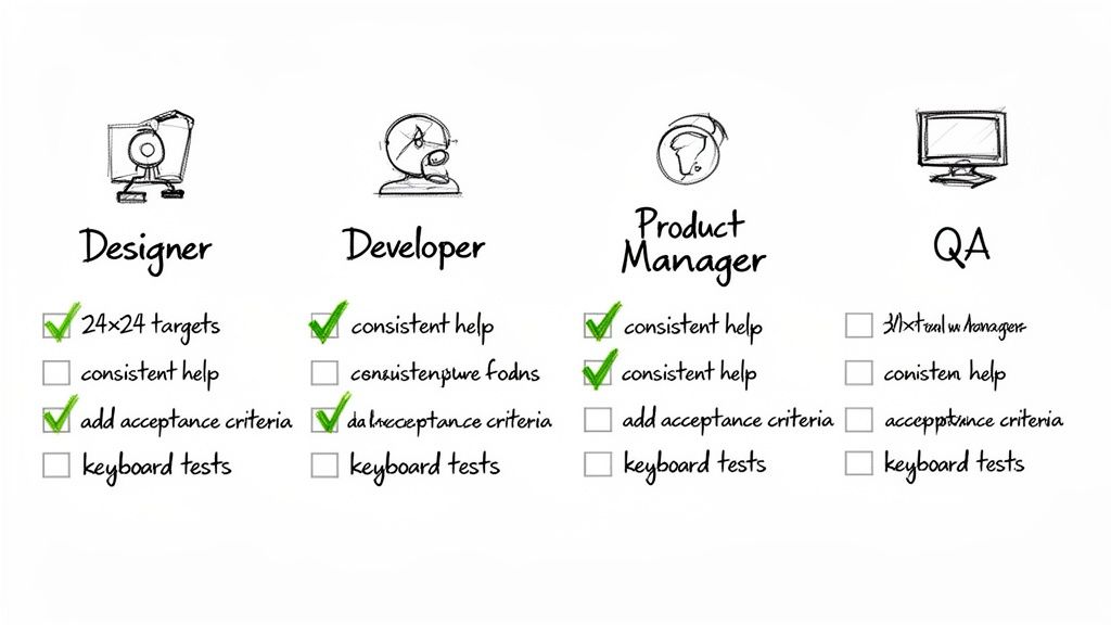
Getting to WCAG 2.2 compliance isn't a solo mission—it's a team sport. To make it feel less like a mountain to climb and more like a set of clear, actionable steps, I’ve broken it down by role. Think of this as your quick-reference guide.
This checklist gives everyone on the team ownership over their piece of the accessibility puzzle. It’s all about building a practical, team-wide habit of creating genuinely inclusive products right from the start.
For Designers
Your job is to bake inclusivity into the experience long before a single line of code is written. From the first wireframe to the final prototype, the focus should be on clarity and ease of use for absolutely everyone.
Verify Target Sizes: Make sure every button, link, and icon is at least 24x24 CSS pixels. This is non-negotiable for meeting the new minimum target size.
Design Clear Focus States: Create obvious, high-contrast focus indicators for anything a user can interact with. No one should ever have to guess where they are on the page.
Provide Help Consistently: Decide on a single, consistent spot for help mechanisms—like a chat icon or a support link—and stick to it across every screen.
Offer Alternatives to Dragging: If your UI uses drag-and-drop, you must also design a simple, single-click alternative for moving items.
For Developers
You’re the one who brings the designs to life, and your code is what makes an interface truly accessible or not. The big things for you are semantic structure and making sure everything plays nicely with assistive technologies.
Implement Focus Not Obscured: Ensure that sticky headers, footers, or those pesky pop-up banners never, ever completely cover an element that has focus.
Ensure Consistent Help Location: Code all help components so they appear in the same relative order on every single page, just as the designer intended.
Prevent Redundant Entry: In multi-step forms, use auto-population or simple selection options for any information the user has already given you. Don't make them repeat themselves.
Build Accessible Authentication: When building login flows, avoid cognitive function tests (like solving a puzzle). If you must, always provide a non-text-based alternative.
Want to catch issues before they become a headache? Run your prototypes through a platform like Uxia. Its AI synthetic users can test your designs against WCAG 2.2 criteria, flagging problems when they’re still cheap and easy to fix.
A Few Common Questions About WCAG 2.2
When teams first start digging into WCAG 2.2, a few practical questions almost always come up. Let's clear the air on some of the most common ones so you can move forward with confidence.
Do I Have to Fix Everything at Once?
Absolutely not. Trying to tackle all 86 criteria in one go is a recipe for getting overwhelmed. A prioritised, pragmatic approach is always better.
Practical Recommendation: Start with an accessibility audit of your most critical user journeys. Focus on Level A and AA criteria first. This will give you a high-impact, manageable starting point.
Start with Level A and AA criteria, since these are the ones typically mandated by regulations like the European Accessibility Act. From there, zero in on your highest-traffic areas and most critical user flows—think login, sign-up, or the checkout process. This ensures you’re knocking down the biggest barriers for the most people first.
A great first step is to get a baseline. Using a platform like Uxia to run a quick diagnostic on your designs can instantly highlight the most impactful issues. This gives you a clear, realistic roadmap for improvement instead of staring at a giant, intimidating checklist.
Is WCAG 2.1 Obsolete Now?
Not at all. It's better to think of WCAG 2.2 as a modern update, not a total replacement.
The new standard is fully backwards-compatible. That means if your product meets WCAG 2.2 guidelines, it automatically meets 2.1 as well. The new version just adds a few extra criteria to address the realities of today's web, especially for mobile users and people with cognitive disabilities.
Practical Recommendation: Aim for WCAG 2.2 in all new development. For existing products, prioritise implementing the new WCAG 2.2 criteria during regular updates and redesigns to stay ahead of the curve.
How Can I Get Stakeholders to Invest in This?
The key is to frame accessibility as a driver of business growth, not just a legal checkbox. You need to connect it to things they already care about: expanding market reach, boosting user experience for everyone, and protecting the brand’s reputation.
Don't just talk about compliance; show them the risk. Use data to illustrate potential fines and, more importantly, lost customers. Make the problem real by showing exactly where users are struggling.
Practical Recommendation: Use tangible evidence to build your case. Present statistics on the market size of users with disabilities, show competitor sites that are doing it well, and use real-world examples of user frustration.
This is where tools like Uxia can be a huge help. You can generate data-backed reports that visually demonstrate user friction. Watching a session recording of a synthetic user getting stuck in a key flow is powerful, undeniable evidence that makes the need for investment crystal clear to any stakeholder.
Ready to build more accessible products from the start? Discover how Uxia can help you test your designs with AI-powered synthetic users and catch WCAG 2.2 issues before they become costly problems. Visit https://www.uxia.app to learn more.