
A Complete Guide to UX Design Wireframes
Master UX design wireframes with our complete guide. Learn the process, tools, and how to validate your designs instantly with AI-powered platforms like Uxia.

Before you even think about colours, fonts, or flashy animations, every great website or app starts with a simple sketch. This is the world of wireframing—the art of creating a blueprint for your digital product.
Think of a wireframe as the architectural drawing for a house. It shows you where the walls, doors, and windows will go, but it doesn't get bogged down with paint colours or furniture choices. Its job is to map out the structure and flow, focusing purely on function. A practical first step is to grab a pen and paper and sketch out the main screens; this low-cost action can save hours of digital rework.
What Are UX Design Wireframes and Why Do They Matter
Imagine trying to build that house without the blueprint. You'd likely end up with a kitchen miles from the dining room or a bathroom without a door. In the digital world, UX design wireframes prevent that kind of chaos. They are a low-cost, high-impact way to map out the core structure and user journey of your product before a single line of code is written.
Wireframes are deliberately simple. They're often just greyscale boxes, lines, and placeholder text. This isn't laziness; it's a strategic choice.
By stripping away all the visual flair, wireframes force everyone—designers, developers, and stakeholders—to focus on what truly matters at this early stage:
Information Hierarchy: What’s the most important thing on this page? What comes second?
User Journey: How does a person get from point A to point B to complete their goal?
Core Functionality: Does the layout actually support what we need users to do?
The Strategic Value of a Structural Blueprint
Sorting out the structure first saves an incredible amount of time and money down the line. It's far easier (and cheaper) to move a grey box on a wireframe than it is to rebuild a fully designed and coded interface. It gets everyone on the same page from day one. If you want to dive deeper into the nuts and bolts of this process, this guide on wireframing for mobile apps is a great resource.
This isn’t just good practice; it's smart business. Foundational UX work like wireframing is a key driver in the digital economy. In Spain, for instance, the User Experience market is projected to hit USD 153.78 million, growing at a solid 14.6% annually. That growth is built on efficient, user-centred methods that validate ideas quickly, something our platform Uxia is designed to accelerate.
A wireframe is a conversation starter. Its primary purpose isn’t to be a perfect, polished document, but to facilitate discussion, gather feedback, and create alignment on the fundamental structure of a digital experience.
Before diving into wireframing, it's crucial to know what key elements to include. The table below breaks down the essential components that give a wireframe its structure and purpose.
Key Components of a UX Wireframe
Component | Purpose and Description | Practical Recommendation |
|---|---|---|
Layout and Grids | Establishes the basic structure, defining where major content blocks and navigational elements will sit on the page. | Use a standard grid system (like a 12-column grid for web) to ensure consistency and a professional layout from the start. |
Content Placeholders | Uses simple shapes (boxes, lines) to represent where text, images, and videos will go, focusing on placement, not the content itself. | Use "lorem ipsum" for text sparingly. For key headings or CTAs, use realistic draft copy to provide better context. |
Navigation Systems | Outlines how users will move around the product, including menus, buttons, and links. | Sketch out the primary navigation first. Ensure it logically groups features and is easily accessible on all main screens. |
Key UI Elements | Includes placeholders for essential interface components like search bars, forms, buttons (CTAs), and icons. | Label interactive elements clearly. A box with "CTA" inside is better than just a box, as it defines user action. |
Information Hierarchy | Shows the priority of information through size and placement of elements, guiding the user’s attention to the most important content. | Use varying font sizes (e.g., large for H1, smaller for body text) even in greyscale to visually communicate importance. |
User Flow Indicators | Often includes simple annotations or arrows to explain how a user moves from one screen to the next to complete a task. | Add brief notes explaining interactions, like "Clicking this opens the filter modal," to clarify functionality for your team. |
These components work together to create a clear, functional blueprint that communicates the design's intent without getting lost in visual details.
Validating Your Blueprint from Day One
Traditionally, validating a wireframe meant huddling around a whiteboard or showing it to a handful of users. But today, we can do better.
Modern tools allow you to get feedback on your structural ideas almost instantly. Platforms like Uxia let you test your wireframes with AI-powered synthetic users, giving you immediate feedback on usability and flow. This means you can confirm your core logic is sound before you even start thinking about visual design.
This approach ensures your project is built on a user-tested foundation from the very beginning. Of course, this all starts with knowing who you're building for. A strong user persona template is the perfect starting point to ground your research and inform your wireframes.
Exploring the Spectrum of Wireframe Fidelity
When we talk about wireframes, one of the first things you'll hear is the term ‘fidelity’. All this means is how closely a design sketch resembles the final, polished product. Think of it as a spectrum, running from a rough-and-ready drawing all the way to a detailed, interactive layout that looks almost real.
Knowing which fidelity to use at which stage is key to a smooth design process. You wouldn't commission a detailed architectural rendering just to figure out where the kitchen and bedrooms should go, right? You'd start with a simple floor plan. It's the same in UX design—you start with broad strokes and fill in the details as you get more confident in the direction. A practical tip is to always start with low-fidelity sketches on paper to explore multiple ideas quickly and cheaply.
Low-Fidelity Wireframes: The Quick Sketch
Low-fidelity (or lo-fi) wireframes are the fastest way to get an idea out of your head and onto something tangible. These are your classic, often hand-drawn sketches on paper, a whiteboard, or even the back of a napkin. Their whole purpose is to map out the basic structure, screen layouts, and user flow without getting bogged down.
They’re not supposed to be pretty; they’re supposed to be fast and disposable. This raw format is fantastic for brainstorming because nobody feels precious about crumpling up a piece of paper and starting again. It keeps the creative process fluid and iterative.
Key features of lo-fi wireframes usually include:
Basic Shapes: Simple boxes, circles, and lines stand in for UI elements.
Minimal Detail: Forget colour, specific fonts, or real images. Placeholder text like "lorem ipsum" is your friend here.
Focus on Structure: The only goal is to nail down the layout and information hierarchy.
This stage is all about quantity over quality. You want to explore as many different concepts as you can without getting married to a single one.
Mid-Fidelity Wireframes: Adding Structure and Clarity
Once everyone’s on board with the basic flow and layout, it's time to move into mid-fidelity. These wireframes are usually built with digital tools and offer a much more structured, clean-looking version of the interface. They're still greyscale and visually simple, but they provide a ton more detail than a rough sketch.
Mid-fidelity wireframes are the real workhorses of the design process. They clearly define where every element goes, establish a visual hierarchy with proper sizing and spacing, and sometimes even include basic click-through interactivity. This level of detail is perfect for getting early feedback on usability without the distracting noise of brand colours and final imagery. Practical recommendation: Use a consistent set of greys and one or two simple fonts to maintain clarity without adding visual complexity.
A mid-fidelity wireframe is the bridge between a vague idea and a concrete plan. It’s where the abstract concepts from those lo-fi sketches start to feel like a real product, letting you run early usability checks and get solid stakeholder buy-in.
High-Fidelity Wireframes: The Detailed Blueprint
Finally, we have high-fidelity (hi-fi) wireframes. These are the most detailed and realistic of the bunch. They look and feel incredibly close to the final product, often including the final copy, actual imagery, and specific UI components. Frankly, sometimes it’s hard to tell them apart from the final mockups.
These wireframes are super valuable in the later stages of design for a couple of big reasons. First, they act as a precise blueprint for developers, leaving almost no room for guesswork. Second, they're perfect for user testing where realism is crucial for getting accurate feedback on complex interactions and the overall feel of the product.
This is also where AI-driven tools can give you a massive advantage. Platforms like Uxia can take these detailed wireframes and run them through simulated user tests, giving you rapid feedback on friction points before a single line of code is written. It’s a powerful way to ensure your polished design isn’t just beautiful, but also a joy to use.
Comparing Low Fidelity vs High Fidelity Wireframes
Choosing the right fidelity can feel tricky, but it really just depends on where you are in the design journey. Are you brainstorming big ideas or are you fine-tuning the small details for development? Each fidelity level has its own strengths.
This table breaks down the core differences to help you decide which one fits your current needs.
Aspect | Low-Fidelity Wireframes | High-Fidelity Wireframes |
|---|---|---|
Purpose | Brainstorming, exploring concepts, mapping user flows | User testing, developer handoff, final design validation |
Tools Used | Pen and paper, whiteboard, simple digital tools | Figma, Sketch, Adobe XD, interactive prototyping tools |
Visuals | Basic shapes, placeholders, no colour or images | Final UI elements, real copy, images, brand colours |
Interactivity | None or very limited (e.g., arrows on paper) | Fully interactive, simulating the final user experience |
Speed | Very fast to create and iterate (minutes) | Slower to create, requires more detail (hours to days) |
Feedback Focus | Structure, layout, information hierarchy, and flow | Usability, micro-interactions, visual appeal, content clarity |
Best For | Early-stage ideation and internal team alignment | Late-stage design and pre-development validation |
Ultimately, there’s no "best" fidelity—only the most appropriate one for the task at hand. Starting with lo-fi sketches helps you build a solid foundation quickly, while detailed hi-fi wireframes ensure that your vision is executed flawlessly.
Your Step-by-Step Guide to Creating Effective Wireframes
Building great UX design wireframes isn't about being an artist. It’s a structured process, a way of turning solid research into a functional blueprint. Think of it as building a bridge between what your users need and the final product you’re going to ship.
Each step builds logically on the last. This ensures your design is grounded in strategy, not guesswork. Following a system like this makes the whole process clear and accessible, whether you’re a designer, a product manager, or anyone else on the team.
Let's walk through the key stages to turn your initial ideas into a testable, interactive wireframe.
Start with Foundational Research
Before you even think about drawing a single box, you have to nail down the ‘why’. This first step is all about gathering context. What problem are you trying to solve? Who are you solving it for? And what are the business goals driving this whole project?
This means digging into user personas, checking out what competitors are doing, and getting crystal clear on what stakeholders need. Without this foundation, your wireframe is just a pretty picture with no purpose. It’s the difference between designing something people actually need versus something you think they want. Practical tip: Summarize your research into 3-5 key user goals. Keep these visible as you wireframe to ensure every design decision supports them.
Map the User Flow
Once your research is solid, it's time to visualise the user's journey. A user flow is basically a simple map that charts the path someone takes to get something done, like signing up or buying a product.
You're not worrying about screen layouts just yet. Instead, you're mapping out the sequence of actions and decisions. For a deeper look into this crucial step, check out our guide on how to create a user flow diagram. This map becomes your instruction manual for what screens you need to create and how they all connect.
Sketch Your Initial Ideas
Okay, now it’s time to grab a pen. The fastest way to explore different layout ideas is through quick-and-dirty, low-fidelity sketching. Seriously, just use a notebook or a whiteboard and start drawing the basic shapes of each screen from your user flow.
Don't get bogged down in perfection. The whole point here is speed and exploration. How could the homepage be laid out? What absolutely needs to be on the product page? Sketching lets you churn out tons of ideas cheaply and quickly, helping you find the strongest concepts before you ever touch a digital tool. Practical recommendation: Time-box your sketching. Give yourself 5 minutes per screen to generate multiple layout ideas without overthinking.
Wireframing is a process of progressive enhancement. You start with a simple sketch, add detail to create a structured digital layout, and finally refine it into a high-fidelity model that closely mirrors the final product.
The image below shows this perfectly—moving from a rough idea to a detailed blueprint.
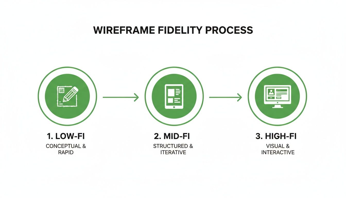
This visual journey shows how each stage layers on more detail, shifting from an abstract structure to a concrete representation.
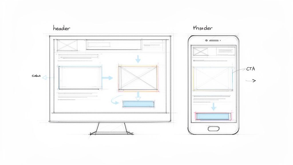
Transition to a Digital Wireframe
When you’ve landed on a sketch that feels promising, it's time to take it digital. This is where you'll create a mid-fidelity wireframe in your design tool of choice. Rebuild your sketches using clean boxes, standard fonts, and proper alignment. You're not adding brand colours or fancy visuals here; it's all about creating a clear, organised layout that communicates the information hierarchy.
At this stage, your wireframe should clearly communicate:
Structure: How all the major UI elements are arranged on the page.
Content: Where text, images, and other bits of media will live.
Hierarchy: The visual importance of different elements on the screen.
Add Detail and Create Interactivity
With the static screens built, you can start adding more detail. Swap out placeholder text for more realistic copy, and start defining what key elements like buttons and forms actually do.
Next, link your screens together to make a simple, clickable prototype. This is what turns your static layouts into something that feels real. It lets stakeholders and users click through the flow just like they would in a live application. This step is absolutely essential for checking if the journey's logic actually makes sense.
Validate Your Flow Instantly
The final, and most critical, step is validation. A wireframe is just a bunch of assumptions until it's been tested by users. In the past, this meant scheduling user interviews, which can be a real drag on time and resources. Today, you can get that feedback in minutes.
By uploading your interactive wireframe to a platform like Uxia, you can run usability tests with AI-powered synthetic users. Just define a task—like "find a product and add it to the cart"—and you’ll get immediate, unbiased feedback on your design's flow and clarity. This lets you spot friction points and make evidence-based changes long before you write a single line of code, saving countless hours and making sure your product is built on a solid, validated foundation.
Essential Tools for Modern Wireframing
Choosing the right wireframing tool is a bit like a chef picking the right knife—the choice depends entirely on the job. You wouldn't use a massive cleaver for a delicate garnish, and you shouldn't jump into a heavyweight design platform for a quick brainstorming session. The modern designer’s toolkit is packed with options for every single stage of the process.
The right software doesn’t just make your life easier; it streamlines collaboration and clears up communication with your team. From scribbling down initial ideas to building out detailed prototypes, the tools you pick will define your entire workflow.
Tools for Ideation and Low-Fidelity Concepts
When you just need to get ideas out of your head and onto a canvas, low-fidelity tools are your best friend. They’re intentionally simple, which forces you to focus on structure and flow instead of getting lost in visual fluff.
Balsamiq: A true classic for a reason. Balsamiq is famous for its sketchy, hand-drawn look. This is a deliberate feature that constantly reminds everyone they’re looking at a rough draft, not a finished design. It’s perfect for getting a bunch of concepts down fast and keeping the conversation focused on core functionality.
Miro: While not purely a wireframing tool, Miro is a phenomenal digital whiteboard that’s brilliant for collaborative brainstorming. Teams can map out user flows, throw ideas onto sticky notes, and sketch rough wireframes together in real time. It's ideal for those very first project meetings.
These tools are all about speed and fluidity. They help you fail fast, find the right direction, and move on without sinking a ton of time into something that might not work.
All-in-One Platforms for High-Fidelity Design
Once your concepts start taking shape, you’ll need something with more muscle. This is where all-in-one design platforms come in. They are the powerhouses of the modern design world, letting you go from mid-fidelity wireframes all the way to pixel-perfect, interactive prototypes.
Your design tool is more than just software; it's the environment where your ideas take shape. Choosing one that supports both individual creation and team collaboration is crucial for a streamlined workflow.
Figma: The undisputed leader in collaborative design. Because it’s browser-based, Figma makes it ridiculously easy for an entire team to jump into the same file at the same time. It’s packed with powerful features for creating interactive prototypes, building out design systems, and handing off specs to developers.
The screenshot below gives you a peek into Figma's interface, showing off its collaborative nature and powerful vector editing tools. You can see how designers can build complex, high-fidelity wireframes and prototypes all in one place.
Sketch: A long-time favourite for Mac users, Sketch is a slick vector editor known for its clean interface and huge ecosystem of plugins. While Figma has eaten into its market share with killer collaboration features, Sketch is still a rock-solid choice for designers who prefer a native desktop app.
These tools give you the precision needed to create high-fidelity wireframes that look and feel almost like the real thing—essential for proper user testing and giving developers exactly what they need. Unsurprisingly, being skilled in these tools is a big deal. For instance, wireframing in UX design has become indispensable in Spain's digital economy, where professionals pull in an average of €36,261 annually. You can dig into more trends shaping Spain's digital future on datareportal.com.
The Missing Piece: The Validation Engine
Okay, so you’ve created a beautiful wireframe. But how do you know if it actually works? This is where a whole new category of tool comes into play: AI-powered validation platforms.
While tools like Figma and Sketch are for creation, a platform like Uxia is for validation. Think of it as an instant feedback engine. It turns your static or interactive wireframes into a goldmine of user insights in minutes. Instead of spending weeks trying to schedule user interviews, you can upload your design, set a task, and get immediate, unbiased feedback from synthetic users.
This is the modern design stack: a creation tool plus a validation engine. By pairing a platform like Figma with Uxia, you can design, test, and iterate on your UX design wireframes at a speed that was unthinkable a few years ago, making sure every single design choice is backed by solid data. Practical recommendation: Integrate validation early. Test your mid-fidelity wireframes on a platform like Uxia to catch major structural flaws before you invest time in high-fidelity visuals.
Validating Your Wireframes for Maximum Impact
Let’s be honest. A wireframe on its own is just a collection of well-organised assumptions. A good-looking guess. To turn that blueprint into a solid foundation for your product, you absolutely must validate it.
Think of it like stress-testing architectural plans before laying the first brick. Validation is where you find the weak points before you commit to building something real. It’s the process of testing your wireframe’s logic, flow, and clarity to answer the single most important question in design: “Does this make sense to someone who isn’t me?”
Without this step, you’re flying blind. You risk sinking time, money, and effort into a structure that’s fundamentally flawed from the start.
Traditional Validation Methods and Their Limits
For years, design teams have relied on a handful of trusted methods to test their wireframes. These approaches definitely have their place, but it's crucial to recognise their limitations, especially when you need to move fast.
You're probably familiar with the classics:
Moderated User Interviews: The gold standard for deep, qualitative insights. You sit with a user one-on-one and watch them work through a task. It's powerful, but it’s also painfully slow and expensive.
Hallway Testing: The quick-and-dirty method. You grab a colleague—or anyone who’ll stand still long enough—and get their gut reaction. It’s fast, sure, but the feedback is almost always biased by people who are way too close to the project.
Surveys and Questionnaires: Great for gathering quantitative data from a larger group. The problem is, you learn what users are struggling with, but you get almost no insight into why.
While these methods can work, they all hit the same roadblocks: time, cost, and recruitment. Finding the right people, scheduling sessions, and then sifting through all the feedback can take weeks. That's a huge drag on momentum.
The Modern Approach: AI-Powered Validation
Today, there’s a much faster, more efficient way to get the feedback you need. AI-powered validation platforms are changing the game by completely removing those traditional bottlenecks. They let you test your UX design wireframes almost instantly.
This is where a tool like Uxia becomes essential. Instead of spending days recruiting human testers, you can use synthetic users powered by AI. You just upload your wireframe, define a task you want them to complete, and the platform gets to work. Immediately.
Validation isn't a one-time event; it's a continuous loop of designing, testing, and iterating. The faster you can complete that loop, the faster you can build a product that users genuinely love.
This modern approach completely flips the economics and speed of UX research. A process that used to take weeks of planning can now be done in minutes, right inside your design workflow.
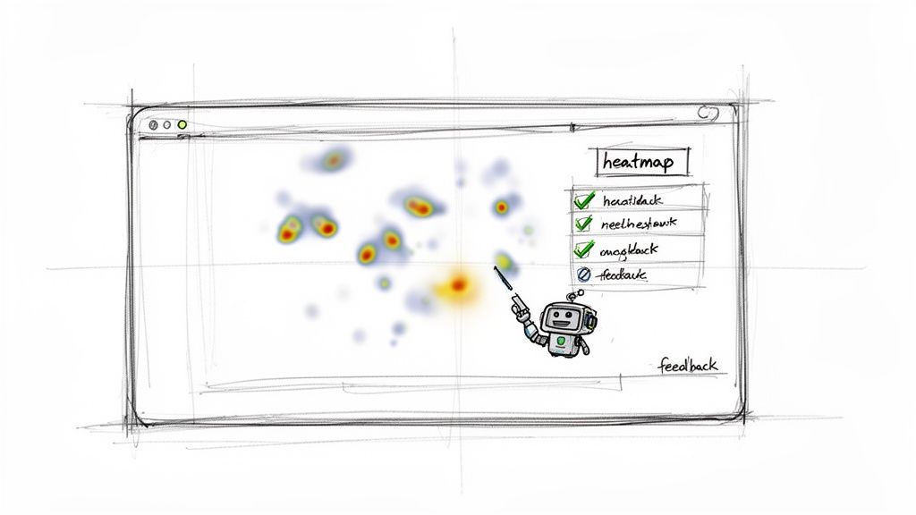
Actionable Insights You Can Get Instantly
The real magic of an AI validation engine like Uxia isn't just its speed—it's the depth and clarity of the feedback. You get actionable, data-driven insights that empower you to make smarter design decisions with confidence.
Here’s a taste of what you can expect:
Predictive Heatmaps: See exactly where users are most likely to look and click. This instantly tells you if your key calls-to-action are actually getting the attention they need.
Friction Scores: Get a clear score showing how difficult it was for synthetic users to complete their task. It pinpoints the exact moments of confusion or frustration in the user flow.
Detailed Usability Reports: Receive comprehensive reports that flag specific usability issues—from unclear navigation to confusing labels—and even give you actionable recommendations for how to fix them.
This rapid feedback loop allows you to iterate on your designs at an incredible pace. You can test multiple layout variations in a single afternoon and move forward with the one backed by data, not just gut feeling. To dig deeper, you can learn more about user interface design testing in our detailed guide.
Ultimately, maximising the impact of your wireframes means solving real user problems, which often ties directly to business goals. For example, applying proven UX fixes early in the design process can have a massive impact on things like reducing cart abandonment later on. By integrating AI validation with a platform like Uxia, you not only build better products but also build them smarter and faster.
Common Wireframing Mistakes You Need to Avoid
Even seasoned designers fall into a few common traps that can derail a project. A good wireframe isn’t just about what you put in; it's also about what you leave out. Steering clear of these missteps keeps your process tight, your feedback useful, and your project moving forward.
One of the biggest blunders is jumping into visual design way too soon. Throwing colours, fancy fonts, or polished graphics into a wireframe is a massive distraction. It shifts the conversation from core structure and user flow to subjective arguments about aesthetics.
Just stick to greyscale. Use basic shapes. The whole point is to get everyone on the same page about the fundamental layout and user journey. A simple, unadorned wireframe forces stakeholders to focus on function, not finish. Practical recommendation: Create a simple wireframe style guide for your team with approved greyscale colours, fonts, and element styles to ensure consistency and prevent "design creep."
Losing the User's Story
Another classic pitfall is designing screens in isolation. A pile of static pages doesn't tell a story. Users don't see an app as a series of disconnected screens—they experience it as a continuous path to getting something done.
Always, always link your wireframes into a clickable prototype, no matter how basic. It forces you to think about the journey from one step to the next and helps everyone understand the context behind each screen.
A wireframe’s job is to communicate a user's journey, not just a screen's layout. If your wireframes don't tell a story of how a user accomplishes a task, they are failing to communicate the most important part of the design.
Inconsistent labels and placeholder text also create chaos. Using different words for the same action (like "Submit," "Send," and "Confirm") across different screens will confuse stakeholders and, later on, your users.
The fix is simple: create a quick glossary of terms and stick to it. For placeholder text, try to use realistic copy instead of "lorem ipsum." This gives people crucial context about what each content area is for and leads to much better feedback.
The Biggest Mistake? Skipping Validation
Maybe the most critical error of all is treating a wireframe as a final blueprint and skipping validation entirely. A wireframe is a hypothesis, and every hypothesis needs testing. If you don't get feedback at this stage, you’re building your entire product on a foundation of unproven assumptions. That’s a recipe for costly rework down the line.
This is where you need a fast way to get feedback. Waiting weeks for traditional user testing just kills momentum. A much better approach is to build a rapid validation tool right into your workflow.
With a platform like Uxia, you can upload your wireframe and get instant, unbiased feedback from AI-powered synthetic users. This lets you test every single iteration, turning potential mistakes into opportunities for improvement. It ensures your final design is built on a solid, user-tested foundation from day one.
Ready to build with confidence? Uxia eliminates the guesswork by providing fast, reliable feedback on your wireframes in minutes, not weeks. Discover how AI-powered validation can transform your design process at Uxia.