Your Ultimate Guide to the User Experience Test
Discover how a user experience test can transform your product. Learn key methods, metrics, and tools to run tests that deliver actionable insights.

Ever built something you thought was brilliant, only to watch people struggle to use it? That's where a user experience test comes in. It's a method for figuring out how easy and enjoyable your digital product actually is by watching real or synthetic users try to complete tasks with it. This process gives you a direct look into user behaviour, helping your team spot friction points and validate design choices before a costly launch.
What Is a User Experience Test Anyway?

Think of a user experience test as a dress rehearsal for your app, website, or software. Before the curtains go up on launch day, you get a sneak peek of how the audience will react. It’s a chance to see your product through your users’ eyes, uncovering everything from confusing navigation to features that just don't click.
This isn’t about hunting for technical bugs; it’s about understanding human behaviour. Does the flow feel natural? Is the language clear? Can someone achieve their goals without getting frustrated? Answering these questions early saves a massive amount of time and money, stopping you from having to do major overhauls after release.
Beyond Guesswork: The Core Purpose of Testing
The whole point of a user experience test is to replace assumptions with cold, hard evidence. Instead of your team debating what users might want in a meeting room, you can observe what they actually do. This direct line into the user’s thought process is priceless for making informed decisions.
Running these tests helps you:
Validate Design Concepts: Confirm that your solutions really solve user problems.
Identify Usability Issues: Pinpoint specific points of friction, like confusing icons or hidden menus, that stop users in their tracks.
Improve User Satisfaction: Create an experience that’s not just functional but genuinely pleasant, which builds loyalty and keeps people coming back.
Reduce Development Costs: Fixing a design flaw in a prototype is 100 times cheaper than fixing it after the product is already live.
Modernising the Feedback Loop
Traditionally, setting up these tests was a slog of recruitment, scheduling, and logistics. But that’s changing fast. The process is being completely reshaped by platforms like Uxia, which use AI-powered synthetic users to give you that critical feedback almost instantly. Instead of waiting weeks, teams get actionable insights in minutes.
Practical Recommendation: To make testing a regular habit, integrate a tool like Uxia into your design sprints. When you complete a new prototype, immediately run a test. This ensures feedback arrives while the design is still fresh in everyone's mind.
This incredible speed allows teams to test far more frequently, embedding user feedback directly into their daily workflow. For any team serious about building products that people love, understanding why user testing is so important is the first step. By making testing a continuous habit, you build confidence and ensure your final product truly serves its users.
Diving Into the Core User Experience Test Methods
So, you’re sold on why you need to run a user experience test. The next question is how. Stepping into the world of UX testing methods can feel a little overwhelming, but nearly every approach boils down to a few key choices. It’s like having a toolbox—you just need to know which tool to grab for the specific job at hand, depending on your project stage, budget, and what you’re trying to learn.
Your first big decision usually splits along two lines: will it be moderated or unmoderated, and will it be remote or in-person? Each combination gives you a completely different lens for understanding your users.
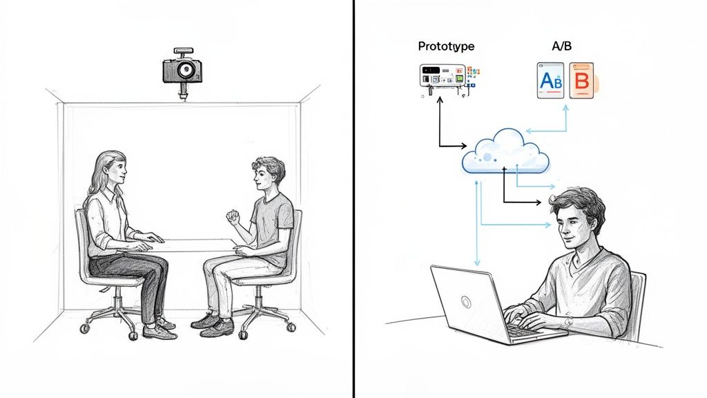
Moderated vs Unmoderated Testing
A moderated user experience test is like taking a guided tour. You have a researcher sitting with the participant (either physically or virtually), asking follow-up questions and digging into their thought process. This method is fantastic when you need to understand the why behind someone's actions or explore a really complex task.
Unmoderated testing, on the other hand, is like handing someone a map and letting them explore on their own. Participants complete tasks independently on their own devices and in their own time. It’s a super scalable way to see how people behave naturally, without a researcher peering over their shoulder.
This is where platforms like Uxia really shine, offering a powerful unmoderated option using synthetic users. You can sidestep recruitment delays entirely and get fast, unbiased feedback on user flows—a perfect fit for agile teams who need to test constantly.
Remote vs In-Person Sessions
The other big fork in the road is location. In-person testing means bringing participants to a lab or your office. This lets you observe body language and build a better rapport, which often leads to richer, more detailed qualitative feedback. The downside? It can be slow, expensive, and logistically a nightmare.
Remote testing lets people participate from literally anywhere. It’s faster, way more cost-effective, and gives you access to a much bigger and more diverse user pool. For most teams today, modern tools have made remote testing the default choice.
Practical Recommendation: For early-stage discovery where you need deep insights, a moderated session is invaluable. But for validating specific flows or getting feedback at scale, an unmoderated remote test using a platform like Uxia is a far more efficient machine.
To help you decide, here’s a quick rundown of the most common user experience test methods.
A Quick Guide to UX Testing Methods
This table breaks down the main methodologies, highlighting what they're good for and where they might fall short.
Method Type | Best For | Pros | Cons |
|---|---|---|---|
Moderated In-Person | Deep discovery, complex tasks, and building user empathy. | Richest qualitative data, ability to observe non-verbal cues. | Expensive, slow to recruit, geographically limited. |
Moderated Remote | Exploring user motivations and complex flows with a wider audience. | Good qualitative depth, broader recruitment pool, cost-effective. | Lacks non-verbal cues, potential for tech issues. |
Unmoderated Remote | Validating specific tasks, benchmarking performance, gathering quantitative data at scale. | Very fast, highly scalable, cost-effective, captures natural behaviour. | Lacks "why," limited ability for follow-up questions. |
A/B Testing | Optimising specific conversion goals (e.g., clicks, sign-ups). | Statistically valid quantitative data, removes guesswork. | Doesn't explain user behaviour, needs significant traffic. |
Prototype Testing | Getting early feedback on concepts and navigation before development. | Low cost, easy to iterate, catches major flaws early. | Feedback is based on a non-functional model, not the real thing. |
Accessibility Checks | Ensuring usability for people with disabilities. | Creates a more inclusive product, improves overall UX, avoids legal issues. | Requires specialised knowledge and tools. |
Choosing the right blend of these methods is the key to a strong research strategy. You don't just pick one; you combine them based on your needs at each stage of the design process. A platform like Uxia excels at the unmoderated remote and prototype testing phases, delivering insights at lightning speed.
Other Core Testing Methods
Beyond those foundational choices, a few other methods are essential for any team’s toolkit.
A/B Testing: This is a numbers game. You pit two designs against each other (Version A vs. Version B) to see which one performs better on a single, clear metric, like getting more people to sign up. It’s great for telling you what works better, but it will never tell you why.
Prototype Testing: This is all about testing a mockup or a rough version of your product before a single line of code is written. It's a cheap, fast way to get feedback on ideas, check if your navigation makes sense, and catch huge design flaws when they’re still easy to fix.
Accessibility Checks: This specialised test makes sure your product is actually usable by people with disabilities, including those who depend on screen readers or other assistive tech. Accessibility isn't just a box to tick for compliance—it's a pillar of good design that ultimately makes the experience better for everyone.
Every user experience test is a chance to learn something new. To dig deeper, you can find out more about the different behaviour research methods in our detailed guide. Additionally, when you’re gathering all this feedback, seeing how platforms like Productboard help teams organise and prioritise it can be a game-changer.
The Metrics That Truly Matter in UX Testing
Running a user experience test without clear metrics is like sailing without a compass. You’re moving, sure, but you have no idea if you’re actually heading in the right direction. While data is everywhere, the real skill lies in zeroing in on the numbers and observations that reveal the true quality of your design.
The most effective way to make sense of all this information is to split it into two simple camps: quantitative metrics tell you what is happening, while qualitative insights tell you why.
Quantitative data gives you the hard numbers. It’s objective, measurable, and brilliant for benchmarking performance or comparing design variations. Think of it as the facts, not feelings, that help you pinpoint exactly where users are succeeding or struggling.
Qualitative insights, on the other hand, provide the rich, human context behind those numbers. This is where you uncover the frustrations, the "aha" moments, and the emotional responses that figures on a spreadsheet can never capture. A successful user test needs both to paint the full picture.
Key Quantitative Metrics to Track
When you need to measure efficiency and effectiveness, these are the core metrics that matter most. They form the bedrock of any solid analysis.
Task Success Rate: This is the most fundamental metric of all. It’s simply the percentage of users who manage to complete a given task. If only 40% of users can add an item to their basket, you have a clear, undeniable problem.
Time on Task: How long does it take a user to get the job done? A lower time usually points to a more efficient and intuitive design. If a simple sign-up process takes five minutes, you’ve got friction.
Error Rate: This tracks how many mistakes users make along the way. For example, how many times did they click the wrong button or enter information incorrectly before succeeding? A high error rate is a massive red flag for a confusing interface.
These metrics are powerful because they’re unambiguous. They quickly highlight where the user journey is breaking down, giving you a data-backed starting point for any design improvements.
Uncovering the 'Why' with Qualitative Insights
While numbers tell you what’s wrong, qualitative data tells you how to fix it. This is where you move beyond spreadsheets and get inside the user’s head, gathering insights that drive real innovation.
Practical Recommendation: When analyzing qualitative feedback, create a "pain point priority matrix." Chart issues based on frequency (how many users hit it) and severity (how badly it blocks them). This helps you focus on fixing the most impactful problems first.
Focus on collecting these types of insights:
Direct User Quotes: What are people actually saying as they navigate your design? A quote like, "I have no idea what this button is supposed to do," is an immediate, actionable signal that something needs to change.
Observed Behaviours: Notice where users hesitate, scroll back and forth, or even sigh in frustration. These non-verbal cues often reveal usability issues that users don’t think to mention out loud.
Pain Points and 'Aha' Moments: Identify the exact moments where users get stuck (pain points) or where the design delights them ('aha' moments). Both are equally valuable for refining the experience.
Combining these observations with your quantitative data allows you to build a strong case for change. To take this further, explore how to apply these findings through data-driven design principles in our comprehensive guide.
From Data to Action with Uxia
Manually gathering, organising, and analysing all this data can be a monumental task. This is where AI-powered tools like Uxia give you a massive advantage.
Instead of spending days compiling spreadsheets and watching hours of recordings, Uxia automates the entire process. The platform runs tests with synthetic users and automatically translates that raw data into clear, visual reports. It generates heatmaps to show where users are clicking, flags specific usability issues with context, and provides prioritised insights.
This frees your team from the grunt work of analysis, allowing you to focus on what truly matters: creating solutions and building a better product.
Right, you've got your head around the metrics. Now it’s time for the real work: building your first user experience test plan.
Think of a test plan as your blueprint for success. It aligns your team, clarifies exactly what you need to learn, and makes sure the feedback you get is actually useful. Without one, you’re just running sessions that are unfocused, probably biased, and ultimately, a waste of everyone's time.
This plan doesn't need to be a hundred-page monster. Its real job is to force you to answer the tough questions before you start testing: What are we actually trying to achieve here? Who are we testing with? What specific things will we ask them to do? Nailing these down upfront is the difference between collecting random opinions and gathering concrete evidence.
This flowchart shows a simplified view of how you turn raw test data into a real improvement strategy.
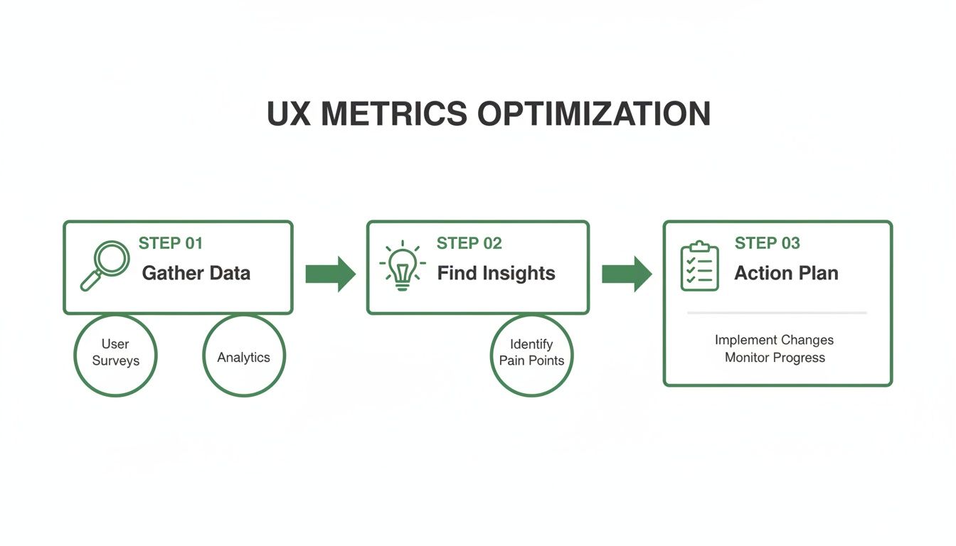
The journey from gathering data to creating an action plan is the whole point. Testing isn't just about finding problems; it's about creating solutions.
Step 1: Define Your Test Objectives
Before you write a single task, you have to know what you're trying to prove or disprove. Your objectives need to be specific, measurable, and tied directly to a business goal or a known user problem. A vague goal like "see if the design is good" is completely useless.
A strong objective sounds more like this: "Can a new user successfully sign up for a free trial and create their first project in under three minutes?" It’s specific, it has a time-based success metric, and it zeroes in on a critical part of the user journey.
Here are a few more practical examples of clear objectives:
For an e-commerce site: Find out if users can locate a specific product category, filter the results by colour, and add an item to their basket without any help.
For a mobile app: Check if users understand what a new icon in the navigation bar does and can use it to get to the right feature.
For a B2B platform: Verify that an account manager can generate a quarterly report and export it as a PDF.
Once you have one or two laser-focused objectives, everything else in your plan will fall into place much more easily.
Step 2: Script Realistic Task Scenarios
With clear objectives in hand, you can start writing the tasks for your participants. The golden rule here is simple: provide context and a goal, but never give away the answer. You want to avoid leading questions that tell users exactly where to click. Instead of saying, "Click the 'Profile' button to change your password," frame it as a real-world scenario.
Practical Recommendation: Always do a quick pilot test of your script with a colleague. This dry run will immediately reveal if your tasks are confusing, leading, or too complex before you test with actual users.
The second option mirrors what a real user would actually be thinking. It tests whether your design's navigation and labels are intuitive enough for someone to solve their own problem. Always frame your tasks around a user story, not your product's features.
A Simple Template for Your Test Plan
You don't need fancy software to get started. A simple shared document is perfect. Here are the essential pieces to include in your first user experience test plan.
Plan Component | Description | Example |
|---|---|---|
Objective(s) | What key questions are you trying to answer? | Can users complete our new checkout flow in less than 90 seconds? |
Participants | Who are you testing with? Define the target audience. | Five existing customers who have made a purchase in the last six months. |
Task Scenarios | The goal-oriented tasks for participants to complete. | "You've decided to buy the blue t-shirt. Add it to your basket and complete the purchase." |
Key Metrics | What data will you collect to measure success? | Task success rate (%), time on task (seconds), error rate. |
The Uxia Advantage: From Plan to Results in Minutes
Building a test plan, recruiting users, scheduling sessions, and then analysing all the results can traditionally take weeks. This is where modern tools completely change the game. With a platform like Uxia, you can bypass nearly that entire manual process.
Instead of writing a detailed plan and then burning weeks on logistics, you just define your mission and target audience. Uxia generates AI-powered synthetic users that match your criteria and immediately run through your tasks. It handles the entire user experience test automatically, delivering prioritised insights, heatmaps, and clear reports in minutes, not days.
This allows your team to go from a design question to a data-backed answer within a single afternoon.
The Rise of AI in User Experience Testing
The future of the user experience test is already here, and it’s being supercharged by artificial intelligence. For years, the biggest roadblocks to getting solid user feedback have been the sheer manual effort, slow recruitment, and unavoidable human bias. Now, AI-driven testing is tearing down those barriers, completely changing how we build and check our digital products.
This new wave revolves around something called synthetic users. Instead of spending weeks finding, scheduling, and paying human testers, platforms like Uxia use advanced AI to generate incredibly realistic digital participants.
These aren't just mindless bots. They are sophisticated models built to match specific user profiles, complete with demographic traits, behavioural patterns, and clear goals. It lets teams run an unmoderated user experience test whenever they want, getting high-quality, actionable feedback in a tiny fraction of the time.
The Power of Instant, Scalable Feedback
Picture this: you need to validate a new checkout flow. The old way means finding five to ten representative users, a process that could easily eat up a fortnight. With AI, you can define your target audience—say, "first-time online shoppers aged 25-35"—and have hundreds of synthetic users test your design within minutes.
This kind of speed and scale brings huge benefits:
No More Recruitment Delays: The single biggest time-waster in UX research just disappears. You can get feedback on the same day you have a question.
Less Tester Bias: Synthetic users are consistent and objective. They don't have good or bad days, aren't trying to please the researcher, and haven't become "professional testers" who know exactly what to look for.
Shorter Validation Cycles: What once took weeks of planning and work can now be done in the time it takes to grab a coffee. This lets teams build user insights directly into their agile sprints, not just at major checkpoints.
Practical Recommendation: Use AI-powered testing from Uxia to create benchmarks. Run a test on your current live site to establish baseline metrics for task success and time. Then, as you test new designs, you can objectively measure if your changes are actually improving the experience.
The way Audio to Text AI is changing research further highlights this shift, allowing teams to instantly turn spoken feedback from traditional studies into structured data for analysis. AI isn’t just automating tasks; it’s unlocking a deeper layer of understanding.
A Strategic Shift Driven by the Market
This isn't just a passing fad; it's a strategic move by top companies trying to keep up with non-stop digital demands. The market data tells a clear story. In the European UX software market, especially in countries like Spain, France, and Italy, big companies are pouring money into user experience testing tools, with total annual spending now over $6 billion.
Why? Because they need scalable, cloud-based solutions that support dedicated UX teams and allow for continuous testing without the delays of old-school human studies. In Spain, for example, UX software revenue is on a steady rise, showing just how many businesses are focused on improving usability and accessibility. You can find more details on these European UX software trends at MarketReportAnalytics.com.
Platforms like Uxia are at the very centre of this movement. They provide the instant, scalable feedback modern product teams need to stay ahead. By generating realistic digital participants who can navigate flows, find friction points, and even "think aloud," Uxia delivers the depth of qualitative feedback with the speed and scale of quantitative analysis.
This organised approach helps teams move faster and with a lot more confidence. To really get into the details, you can learn more about the differences between synthetic users vs. human users in our detailed article. This change isn't just about being more efficient; it's about fundamentally changing how products are imagined, built, and perfected.
Common UX Testing Pitfalls You Can Easily Avoid
Even with the best of intentions, a user experience test can go sideways fast. Tiny mistakes can poison your data, burn through your budget, and send your team building something nobody wants. The good news? These common slip-ups are completely avoidable once you know what to look for.
Think of it like being a detective. If you ask the wrong questions or follow bogus leads, you'll never crack the case. A poorly run test gives you misleading clues about your users, sending your design process down a rabbit hole. Let's make sure you’re gathering clear, unbiased evidence instead.
Recruiting the Wrong Participants
This is hands-down the most common—and most damaging—mistake. If you test with people who aren't your actual target audience, their feedback is irrelevant at best and dangerously misleading at worst. Testing a complex financial planning tool with university students looking for a part-time job won't tell you a thing about how a seasoned accountant will use it.
Your insights are only as good as the people you get them from. To sidestep this, create a detailed persona or screener survey that filters for the exact demographics, technical skills, and behaviours that match your ideal users. Get specific and be ruthless about who you let into your study. Platforms like Uxia solve this by letting you define your ideal user persona, and the AI generates synthetic users that perfectly match that profile.
Writing Biased and Leading Questions
The way you phrase a question can completely change the answer you get. A leading question subtly nudges the participant towards a response you want to hear, rendering their feedback useless. It’s the difference between asking for an honest opinion and asking for confirmation of your own biases.
For example, asking, "Wasn't that new checkout process easy to use?" pressures the user to agree. They want to be helpful, so they'll probably just say "yes" even if they struggled. A much better approach is to ask an open-ended question that prompts an action.
Practical Recommendation: Frame every task as a goal, not an instruction. Instead of "Click the 'Profile' button," say "Show me how you would change your email address." This forces users to think and navigate naturally, revealing the true intuitiveness of your design.
The second question forces the user to actually do something, revealing genuine friction points through their actions, not just their words. Always focus on observing behaviour over collecting opinions.
Testing Too Late in the Process
So many teams make the critical error of waiting until their product is nearly finished before running their first user experience test. By that point, making significant changes is incredibly expensive and slow. Discovering your core navigation is a confusing mess a week before launch is a true nightmare scenario.
The trick is to make testing a continuous habit, not a one-off event. Here’s a simple way to think about it:
Early Concepts: Test low-fidelity sketches or wireframes to validate the core idea.
Interactive Prototypes: Test clickable mockups to check navigation and user flows.
Live Product: Test the final product to find optimisation opportunities and new features.
This is where automated platforms like Uxia give you a massive advantage. Instead of dealing with the logistical headache of traditional testing, you can run tests with synthetic users at any stage, in minutes. Uxia’s AI-powered testers can follow tasks on a simple prototype or a live site with perfect consistency, helping you avoid tester bias and delivering objective feedback on friction points. This makes it practical to test early and often, catching problems when they are still cheap and easy to fix.
Your Top User Experience Testing Questions, Answered
If you're getting ready to run your first user experience test—or even your fiftieth—a few questions always seem to pop up. Getting them sorted builds confidence and makes sure the feedback you get is actually useful. Here are the most common ones we hear from product teams.
How Many Users Do I Really Need for a Test?
The old rule of thumb, which still holds up for qualitative insights, is that testing with just five users will uncover about 85% of the major usability roadblocks. It's a fantastic starting point for spotting the most glaring issues. But if you need hard numbers and statistical confidence, you'll need a much bigger sample, often 20 participants or more.
This is where the game completely changes with AI-powered platforms like Uxia. Instead of the slow, manual process of finding and scheduling real people, you can get feedback from hundreds of synthetic users in minutes. This gives you the best of both worlds: the "why" behind user behaviour and the "what" from solid quantitative data, all without the recruitment headaches.
What's the Difference Between a UX and a UI Test?
It's easy to get these two mixed up, but the distinction is pretty simple.
UI (User Interface) testing is all about the mechanics. Do the buttons work? Do the menus open properly? It’s a functional check to see if the interface is broken.
A UX (User Experience) test, on the other hand, goes much deeper. It asks if the product is intuitive, efficient, and even enjoyable. To put it another way: UI testing asks, “Can you use it?” while UX testing asks, “Do you want to use it?”
How Often Should My Team Be Testing?
Testing isn’t something you do once, right before a big launch. The most effective product teams build it into their DNA, testing constantly throughout the entire development cycle.
Practical Recommendation: Aim to run at least one small-scale user experience test per sprint. It doesn't have to be a massive study. Even a quick, five-minute task validation on a new design can prevent costly mistakes down the line.
This idea of continuous testing is what makes rapid tools like Uxia so powerful. It lets you embed user feedback directly into every development sprint. Your product doesn't just get a big update once a year; it gets smarter and more user-friendly with every single release.
Ready to get fast, actionable feedback without the hassle of traditional user testing? See how Uxia can deliver insights in minutes, not weeks. Discover the future of UX testing today.