10 Best Template User Journey Tools for 2026
Find the perfect template user journey for your project. Compare 10 top tools and learn how to adapt templates for onboarding, checkout, and discovery.

What's the point of a template user journey if it only looks good in a workshop and never survives a real test? That's a common oversight. A journey template should do more than organize stages, touchpoints, and emotions. It should help you simulate a real path, validate assumptions, and uncover friction before design or engineering spends time on the wrong fix.
The best tools in this space split into two camps. Some are stronger for mapping and collaboration, others are better for turning a journey into a testable scenario. For teams using Uxia, that distinction matters, because Uxia turns mapped journeys into live validation with synthetic users, think-aloud feedback, and structured reporting. If you're building a template user journey for onboarding, discovery, or checkout, the fastest win usually comes from pairing a mapping tool with a testing tool instead of expecting one product to do both jobs.
1. Uxia
Uxia fits the work once the journey already exists on paper and the team needs to prove whether it holds up. It turns a template user journey into a live scenario, so product, design, and research teams can test a known flow without spending time on a separate build of the test environment. The platform's library covers common journeys like onboarding, product discovery, and checkout, and each flow can be shaped around a specific audience, mission, and scenario.
That level of control matters because a journey map only becomes useful when it reflects the situation you want to evaluate. Strong mapping guidance usually starts with a persona, stages, touchpoints, pain points, emotions, and opportunities, then asks the team to validate those assumptions with real input rather than leave the map as a static artifact Figma's journey map template guidance. Uxia takes that same structure and moves it into execution by letting synthetic users follow the path and reveal friction through transcripts, heatmaps, and prioritized issues.
Practical rule: use Uxia when the question is, “Does this journey actually work?”, not, “How should we draw it?”
The trade-offs are clear. Uxia is not the right place to sketch the first rough version of a map, and it requires a prototype or live URL before you can test. That constraint helps teams stay specific, though. A scenario like “tourist buying a ticket with a Mastercard and needing a receipt” is far more testable than a vague checkout flow, because it gives the session a concrete task, context, and expected outcome. Visit Uxia if you want the map to become an executable test, not just a slide.
2. Miro
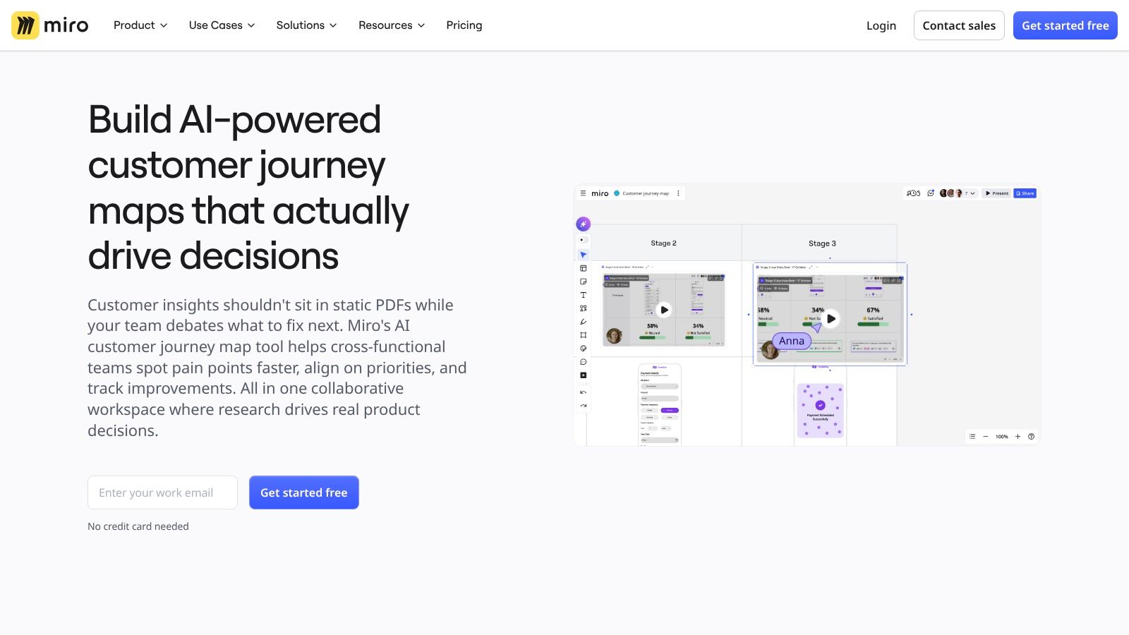
Miro is the best-known collaborative whiteboard option for teams that still need a shared canvas. Its strength is breadth, because it gives you ready-made journey templates, a community ecosystem through Miroverse, and AI-assisted drafting for fast workshops. That makes it a strong fit for cross-functional mapping sessions where product, design, research, and support all need to react to the same board.
The trade-off is control. Miro makes it easy to add content, but large journeys can become crowded quickly, especially when every stakeholder piles on notes, tags, and comments. That's why Miro works best when the team already has a clear scope and a facilitator who keeps the map focused on one primary goal.
Where Miro fits best
Workshop-heavy teams: Use it when stakeholders need to co-create the journey in real time.
Async iteration: Use comments and @mentions to keep edits moving between meetings.
Template reuse: Pull from the built-in and community library when you need a fast starting point.
Miro is a good map-building space, but it's not a validation engine. If your goal is to test whether a path is clean, especially in onboarding or checkout, Miro should feed a platform like Uxia rather than end the process. The strongest workflow is often map in Miro, then test in Uxia.
3. Figma and FigJam
Figma and FigJam work well when journey mapping needs to stay tied to interface design. The main advantage is continuity, because the same team can sketch the journey in FigJam and move into UI work in Figma without switching tools. For product and design teams, that reduces handoff friction and keeps decisions visible in one place.
Figma's journey mapping guidance also mirrors the structure many teams use in practice, persona, stages, touchpoints, pain points, emotions, and opportunities. That gives teams enough structure to stay focused without forcing the map into a rigid process document. It is a practical fit for teams that want a shared template they can adapt quickly, rather than a heavier system that demands extra setup.
Figma also keeps the journey close to the design artifact. That matters when discovery, interface iteration, and stakeholder review are happening in the same workspace, because the map stays connected to the screens it is meant to inform. The trade-off is specialization. If a team needs stronger governance, richer research fields, or more formal operating rules around journey work, Figma is less purpose-built than a dedicated mapping platform.
For teams already inside Figma, the stronger pattern is to treat the map as a working hypothesis and move it into testing instead of leaving it as a static artifact. A practical next step is to pair the map with interface design testing, so the journey can be checked against a prototype before the team commits to a direction. Small changes to the map, such as clarifying a touchpoint or separating two emotional states, can expose very different behaviors once the flow is tested.
4. Lucidchart
Lucidchart is the right pick when the team wants structure first. It's strong for formal diagrams, swimlanes, process-heavy maps, and artifacts that need to look clean in an enterprise setting. If your journey work needs to align operations, support, and product around the same workflow, Lucidchart gives you a disciplined layout.
That discipline is also the main limitation. Lucidchart can feel more rigid than a whiteboard, so it's less natural for exploratory research conversations. It's better at representing how things should be organized than capturing the messy narrative of how people behave. That matters because journey mapping is most useful when it reveals friction, not when it sanitizes it.
Use Lucidchart for standardized flows where ownership matters. It's particularly useful when a team wants a formal artifact that can survive handoff between functions. If the map needs to be read like a process diagram, Lucidchart is a sensible choice. If the map needs to carry qualitative nuance, you'll usually need another layer of evidence alongside it.
A practical approach is to build the structure in Lucidchart, then validate the assumptions in a testing platform. That keeps the diagram neat without pretending the diagram itself is the answer.
5. UXPressia
UXPressia fits teams that treat journey mapping as an ongoing discipline rather than a one-time workshop output. It works well for CX and UX researchers who want to keep maps, personas, impact maps, and service blueprints in one place. The platform also keeps the method visible, which helps newer teams avoid the common mistake of producing a polished map with no follow-through in operations.
What makes UXPressia different
Mapping depth: It is built around journeys and the artifacts that support them, not general whiteboarding.
Presentation readiness: Branded exports and presentation views make it easier to share work with leadership.
Education support: The academy materials help teams learn the method, not just the software. UXPressia's academy materials also align with the approach outlined in our journey testing guide.
That narrower focus is also the trade-off. Teams that want free-form collaboration or broader workshop modes may find it less flexible than Miro. It also suits teams that already believe journey maps should stay living documents with clear ownership.
The strongest use case is a CX team that needs a maintained journey repository with enough narrative detail to support decisions. For teams using Uxia, UXPressia can serve as the upstream layer where the journey is documented before it becomes a testable scenario. That pairing works because the map stays structured while validation happens in a separate step.
6. Smaply
Smaply is the tool I'd pick for teams that need permissions, repositories, and repeatable journey operations. It has a more systems-oriented feel than many map tools, which is useful when multiple teams contribute to different journeys over time. The role management model, admin/editor/viewer separation, and portfolio approach make it practical for larger organizations.
It's also one of the better options for keeping related evidence connected to the map. Integrations with tools such as Google Analytics, Power BI, Jira, and DevOps make Smaply more useful when journey mapping is tied to operational data instead of workshop notes alone. That matters because a journey map should be updated with real evidence, not frozen after a kickoff session.
The downside is the interface. Smaply can feel more form-based than creative, so teams that want a loose whiteboard experience may find it less inviting. It's not the best place to brainstorm freely, but it is a strong place to manage ongoing journey work once the team knows the structure it wants to preserve.
For scaled journey operations, Smaply is a better repository than a sketchpad. That makes it a good companion to Uxia when the goal is to maintain the map in one system and test the scenario in another.
7. Custellence
Custellence is one of the fastest ways to get from a blank page to a starter map. Its AI Customer Journey Template Generator is useful when a team needs a first draft by industry or scenario, then wants to refine it collaboratively. That makes it especially attractive for CX teams that standardize journey mapping across multiple projects.
The primary benefit is momentum. A lot of teams stall before the first version is even visible. Custellence removes some of that friction by generating a usable starting point, then letting the team evolve the lanes, presentation view, and change history over time. It's a practical choice when the main barrier is speed.
If the team can't explain the journey in a clear draft, it probably isn't ready to test yet.
Custellence is less expansive than Miro or Figma as a general collaboration surface, but that isn't necessarily a weakness. It's built for journey narratives, not broad diagramming. For teams that already know they need a living map and want to avoid starting from scratch, Custellence is efficient and focused.
The best pattern is to use it as the first map draft, then move the validated scenario into Uxia. That sequence keeps the early thinking loose without letting it stay hypothetical for too long.
8. Whimsical
Whimsical is the right fit when speed matters more than depth. It's lightweight, tidy, and easy to learn, which makes it a good option for early-stage teams or fast-moving product groups that want a clean journey map without a lot of setup. The combination of flowcharts, wireframes, and docs also helps when a journey needs to sit next to a rough interface sketch.
The strongest reason to use Whimsical is cognitive load. Teams can get a presentable map together quickly, and non-designers usually don't need much guidance to participate. That makes it useful for quick alignment sessions where the map is meant to support a conversation rather than replace research.
The limitation is research structure. Whimsical doesn't give you the same depth of fields, operational detail, or CX-specific scaffolding that dedicated journey tools provide. For complex journeys, it can become too simple. That's fine when the task is early exploration. It's not fine when you need traceable evidence and validation.
Whimsical is most useful as a fast sketching space. Once the path matters enough to test, the work should move into a validation layer such as Uxia.
9. Canva Online Whiteboard
Canva's online whiteboard is best for teams that care about presentation quality as much as they care about the map itself. The template library is easy to use, the visuals are polished, and the brand kit support helps non-designers keep shareouts consistent. That makes it popular with teams that need a journey map for executive review or stakeholder communication.
The upside is obvious. Canva lowers the barrier for people who are intimidated by blank whiteboards or complex diagram tools. It also makes the output look finished fast, which can help when the audience is leadership and the goal is clarity. If the map needs to live inside a broader brand deck, Canva is convenient.
The downside is specialization. Canva is more polished than it is rigorous, which means it works better as a communication layer than a research system. It's not where I'd expect a team to manage edge cases, evidence, ownership, and validation over time.
For many teams, Canva is the last mile, not the working layer. It's useful for showing the journey, but not for proving it. That's where Uxia fits better, because a testable scenario gives you the friction data that a polished board can't.
10. FlowMapp
What happens when journey mapping has to stay close to information architecture and user flows? FlowMapp fits that workflow well, especially for UX teams that move between sitemaps, flow diagrams, and journey planning in the same project. The value is the connection between structure and journey, not just the map itself.
The platform combines templates, AI sitemap generation, and in-map wireframing, which makes it practical for site-heavy or product-heavy work. If the journey is really an entry point into navigation design, FlowMapp keeps the artifacts close together. That shortens the gap between mapping a path and building it.
FlowMapp's approach to IA also lines up with the principles in our user flow diagram guide, especially when a team needs the path logic to stay explicit before testing.
Why FlowMapp works for structured teams
Sitemap and journey alignment: Useful when the information architecture shapes the path.
Project roles: Helps small teams and agencies keep ownership clear.
Export options: PNG and PDF make it easy to share outside the tool.
The trade-off is focus. FlowMapp is narrower than Miro or Figma, so it will not serve as the shared collaboration hub for every team. For teams that need a focused bridge between journey planning and flow design, that narrow scope is a strength. I would especially consider it when a Uxia test needs a clear path definition before validation, because structural clarity reduces ambiguity in the scenario.
User Journey Template Tools Comparison
Product | Core Focus | Unique / USP ✨ | UX Quality ★ | Target Audience 👥 | Value / Price 💰 |
|---|---|---|---|---|---|
Uxia 🏆 | AI synthetic UX testing, validate journey maps & prototypes in minutes | ✨ AI participants with think‑aloud, auto transcripts, heatmaps & prioritized insights | ★★★★★ | 👥 Product & UX teams; SMB→Enterprise | 💰 Tiers (SMB→Enterprise); cuts recruiting/time |
Miro | Collaborative whiteboard & journey templates for workshops | ✨ Large template ecosystem + real‑time collaboration | ★★★★☆ | 👥 Cross‑functional teams & workshops | 💰 Free→Paid; AI metered |
Figma / FigJam | Journey mapping integrated with design handoffs | ✨ Seamless Figma handoff, widgets & plugins | ★★★★☆ | 👥 Design teams & UI handoffs | 💰 Free→Paid; ideal if on Figma |
Lucidchart | Structured diagrams, swimlanes & process alignment | ✨ Swimlanes, data import & enterprise exports | ★★★☆☆ | 👥 Process/enterprise teams | 💰 Paid tiers; enterprise‑friendly |
UXPressia | Purpose‑built customer journey maps, personas & blueprints | ✨ Deep CJM features, branded exports & academy | ★★★★☆ | 👥 CX/UX researchers & storytellers | 💰 Paid plans; strong research value |
Smaply | Scaling journey ops with roles, portfolios & integrations | ✨ Role management, personas & BI/Dev integrations | ★★★☆☆ | 👥 Teams scaling journey operations | 💰 Paid; viewer seats vary |
Custellence | Fast multi‑lane maps with AI starter templates | ✨ AI template generator + presentation mode | ★★★☆☆ | 👥 CX teams standardizing maps | 💰 Affordable→paid gates |
Whimsical | Lightweight flowcharts, wireframes & quick journey maps | ✨ Minimal UI for fast tidy maps | ★★★★☆ | 👥 Early‑stage teams, PMs & rapid prototyping | 💰 Freemium; low learning curve |
Canva (Online Whiteboard) | Polished, on‑brand journey visuals & presentations | ✨ Brand kits, rich graphics & slide exports | ★★★☆☆ | 👥 Non‑designers & exec‑ready shareouts | 💰 Freemium; great visuals |
FlowMapp | IA, sitemaps, user flows plus journey planning | ✨ AI sitemap generator & in‑map wireframing | ★★★☆☆ | 👥 UX architects, agencies & IA work | 💰 Paid tiers; free plan limits |
Activate Your Template From Static Map to Dynamic Uxia Test
A template user journey only becomes valuable when it drives a decision. The strongest teams don't treat the template as the deliverable. They use it to define a specific persona, a clear mission, and a realistic scenario, then test that path against real behavior. That's the move from illustration to evidence.
The details matter more than one might expect. A mobile onboarding map should include the entry point, value proposition, account creation or login, verification, permissions, personalization, navigation to the first meaningful action, and a clear moment that confirms onboarding is complete. If the flow includes failure states, add the obvious ones too, like skipping optional steps, going back, correcting an error, or recovering when the user doesn't understand what to do. The journey should end at the user's first moment of value, not just when the final screen disappears.
That same discipline applies to commerce. A good purchase journey doesn't just say “buy a ticket” or “add to cart.” It gives testers realistic context, like a tourist in Amsterdam buying a day pass with a Mastercard and needing a receipt for an expense report. That kind of scenario can expose hidden problems, including confusing payment language, trust issues, or a detour into onboarding before checkout is complete, which is exactly the kind of friction a generic mission tends to miss.
The broader lesson is simple. A journey map should be built with enough structure to be testable, but not so much rigidity that it loses real behavior. Many template tools help you build the map. Uxia helps you validate whether the map matches what users experience. For teams that want to work faster without guessing, that distinction is the difference between a workshop artifact and a decision-making tool.
If you're ready to move your template user journey from static documentation to real validation, start with Uxia. It's built for teams that want to test onboarding, discovery, and checkout flows without recruiting delays. Use it to turn your journey map into actionable evidence, then iterate with confidence.