System Usability Score: Master the system usability score for better UX
Discover the system usability score and how it reveals your product experience. Learn calculation, interpretation, and practical tips to boost UX with AI tools.

The System Usability Scale, or SUS, is a brilliantly simple tool for measuring how easy people feel your product is to use. Think of it as a quick and reliable report card for usability, boiling down complex user feelings into a single, straightforward score from 0 to 100 using a 10-question survey.
Understanding the System Usability Score
Imagine you’ve just shipped a new feature. Your team is convinced it’s a stroke of genius, but what’s the real-world verdict? Guessing can lead to expensive mistakes, but the SUS cuts right through the noise. It’s designed to turn those fuzzy, subjective user opinions into hard, quantitative data you can act on.
Developed way back in 1984 by John Brooke, the SUS has stuck around for one simple reason: it works. It’s famously reliable and incredibly easy to deploy. While it won’t pinpoint exactly what to fix, it gives you a crystal-clear signal that a usability problem exists. This single score creates a common language that everyone—from designers to product managers and executives—can understand and get behind.
The whole point of SUS is to stop making assumptions. It gives you a standardised snapshot of user perception, which lets you benchmark your performance, track improvements over time, and make design decisions with confidence.
Why SUS Still Matters Today
You might think a tool from the 80s would be obsolete, but the opposite is true. SUS is more relevant than ever. Whether you're a fast-moving startup or a massive enterprise, it provides a quick pulse check on user experience without needing a PhD in statistics to interpret.
It’s Fast and Efficient: The survey takes just a couple of minutes to fill out, so you can easily slot it into any testing process without causing user fatigue.
It’s Reliable: SUS has been stress-tested across thousands of studies. It’s proven to be remarkably consistent, even with small groups of users.
It’s Versatile: You can use it on almost anything—websites, mobile apps, internal software, and even hardware.
This metric is a powerful ally for smoothing out friction points. For example, a low SUS score can be a huge red flag that you need to improve customer onboarding process before you start losing new users.
Modernising Data Collection with Uxia
Traditionally, getting SUS data meant running moderated user studies, which are notoriously slow and costly. But modern platforms are changing the game and making this essential metric far more accessible. At Uxia, for example, we let you gather SUS feedback at scale using our AI-powered synthetic testers.
Instead of waiting weeks to recruit and schedule real people, you can deploy a test and get back statistically relevant SUS scores in a matter of minutes. This completely changes how you work. It empowers teams to weave usability measurement into every single part of the development cycle, turning it from a one-off check-up into a continuous loop of improvement. This approach ensures your product doesn’t just function—it feels completely effortless.
How to Calculate Your SUS Score Step-by-Step
Calculating your System Usability Score sounds more intimidating than it is. You don't need a statistics degree to get it done. The beauty of SUS is its simple questionnaire and a surprisingly straightforward two-step calculation that anyone on your team can master.
The whole process kicks off with the standard 10-item questionnaire. Participants rate each statement on a 5-point Likert scale, from "Strongly Disagree" (1) to "Strongly Agree" (5). The real genius here is the alternating mix of positive and negative statements. This little trick keeps users on their toes and prevents them from just sleepwalking through the survey ticking the same box for every question.
This flow chart breaks down how the SUS process turns subjective user feelings into a concrete score that guides real design decisions.
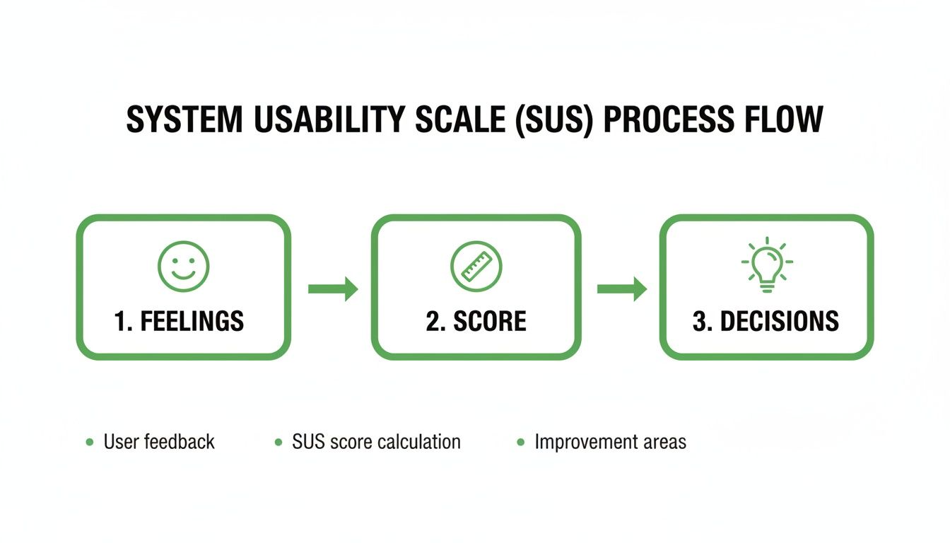
It’s a great reminder that SUS isn't just a number; it’s the bridge between what users feel and the actionable insights your team needs.
The Standard SUS Questionnaire and Scoring Rules
Before we dive into the calculation, here are the 10 standard SUS statements and the specific rules for scoring each one. Getting this right is the most critical part of the process.
Item | Statement | Scoring Rule |
|---|---|---|
1 | I think that I would like to use this system frequently. | User Score - 1 |
2 | I found the system unnecessarily complex. | 5 - User Score |
3 | I thought the system was easy to use. | User Score - 1 |
4 | I think that I would need the support of a technical person to be able to use this system. | 5 - User Score |
5 | I found the various functions in this system were well integrated. | User Score - 1 |
6 | I thought there was too much inconsistency in this system. | 5 - User Score |
7 | I would imagine that most people would learn to use this system very quickly. | User Score - 1 |
8 | I found the system very cumbersome to use. | 5 - User Score |
9 | I felt very confident using the system. | User Score - 1 |
10 | I needed to learn a lot of things before I could get going with this system. | 5 - User Score |
The alternating scoring rule is what makes the final score an accurate reflection of perceived usability.
Step 1: Convert User Responses
First things first, you need to convert each participant's 1-5 scale response into a new point value that ranges from 0 to 4. The rule you use depends on whether the statement is positive or negative. This is the secret sauce that makes the SUS calculation work.
For odd-numbered questions (the positive statements): You simply subtract 1 from whatever the user answered.
If a user answers 5 (Strongly Agree), their new point value is 4 (5 - 1).
If they answer 1 (Strongly Disagree), their new point value is 0 (1 - 1).
For even-numbered questions (the negative statements): Here, you subtract the user's response from 5.
If a user answers 5 (Strongly Agree), their new point value is 0 (5 - 5).
If they answer 1 (Strongly Disagree), their new point value is 4 (5 - 1).
This clever reversal for negative items ensures that a higher point value always means better perceived usability. No confusion.
Step 2: Calculate the Final Score
Once you have the new 0-4 point values for all ten responses, just add them all up. This gives you a total for that specific user, which will land somewhere between 0 and 40.
The last step? Multiply that sum by 2.5. The result is your final SUS score, a single, easy-to-understand number between 0 and 100.
Final SUS Score = (Sum of all 10 converted responses) x 2.5
This final multiplication is just a scaling exercise. It transforms the 0-40 total into the familiar 0-100 score, which makes it much easier to interpret and stack up against industry benchmarks.
Let's walk through a quick example. Imagine a user provides these answers:
Question 1 (Positive): 4 → (4 - 1) = 3 points
Question 2 (Negative): 2 → (5 - 2) = 3 points
Question 3 (Positive): 5 → (5 - 1) = 4 points
...and so on for all 10 questions.
If the sum of all ten of their converted scores adds up to 30, you’d calculate the final SUS score like this: 30 x 2.5 = 75
So, that user's individual SUS score is 75. To get the overall score for your product, you just take the average of all the individual scores from your participants. Simple as that.
Practical Tips for Calculation
Getting the calculation right is obviously critical. One small slip-up can skew your entire dataset and lead you to the wrong conclusions.
Practical Recommendation: For teams just starting out with SUS, the safest bet is to use a pre-made template or a simple spreadsheet. It’s the best way to avoid human error and ensure your calculations are consistent every single time. Set up columns for each question, one for the raw score, one for the converted score based on the scoring rules, and a final column to sum the results before multiplying by 2.5.
When you're running unmoderated tests at scale, this is where platforms like Uxia really shine. Our synthetic testers complete the survey automatically, and the platform crunches all the numbers for you instantly. You get a final, aggregated SUS score without lifting a finger, saving you time and eliminating the risk of manual mistakes.
Interpreting Your SUS Score with Industry Benchmarks
So, you've run your study and calculated your System Usability Score. Let's say it’s 72. That's a great start, but what does that number actually mean? On its own, a raw score is just a piece of data.
To make it meaningful, you need context. Without it, telling a stakeholder your product scored a 72 doesn't answer the one question they really care about: "Is our product easy to use?"
This is where industry benchmarks, percentile rankings, and simple grading scales come in. They help you place your score within a much wider landscape of product performance, turning that simple number into a powerful story about your user experience.
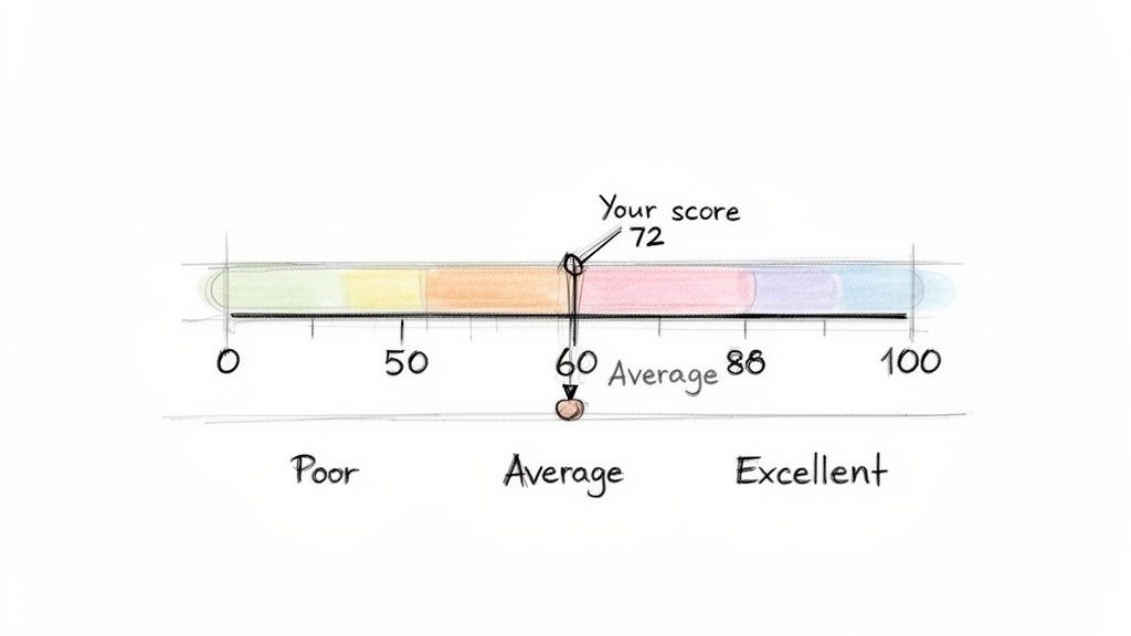
First, let's clear up a common misunderstanding: a SUS score is not a percentage. A score of 70 doesn’t mean your product has 70% usability. Think of it as a relative score that positions your product on a scale against the thousands of others that have been tested over the years.
The Critical Benchmark: A Score of 68
If there’s one number you need to remember in the world of SUS, it's 68. Across an enormous database of studies, the average System Usability Score consistently lands right around this mark.
This makes 68 the crucial dividing line. If your score is above 68, you can confidently say your product's usability is better than most. If it's below, it’s a clear signal that there are significant usability issues that need your team's immediate attention.
Think of 68 as the "C" grade in usability—it's passable, but it’s not impressive. It represents the 50th percentile, meaning half of all systems tested score higher, and half score lower. Your goal should always be to climb well above this baseline.
Extensive research across hundreds of studies has helped establish clear grading boundaries. A score of 80.3 or higher puts you in the 'A' grade territory (top 10%), where users are far more likely to recommend your product. A score below 51 is considered an 'F' (bottom 15%).
From Numbers to Grades and Adjectives
While percentiles are statistically sound, they aren’t always the easiest concept to get across to a non-technical audience. That’s why translating scores into familiar letter grades (A-F) and simple adjective ratings (Excellent, Good, Poor) is so powerful. It creates a shared language that everyone can understand instantly.
Here's a handy guide to help you map your raw SUS score to these more intuitive benchmarks.
SUS Score Interpretation Guide
SUS Score Range | Adjective Rating | Grade | Percentile Rank |
|---|---|---|---|
80.3 – 100 | Excellent | A | Top 10% |
68 – 80.2 | Good | B-C | 51st - 89th |
51 – 67.9 | OK | D | 16th - 50th |
0 – 50.9 | Poor | F | Bottom 15% |
This framework transforms an abstract number into a clear performance indicator. Telling a stakeholder "we have a SUS score of 55" might not land with much impact. But telling them "our usability is currently graded as a D, putting us in the 20th percentile" immediately clarifies the situation and creates urgency.
When you pair this quantitative data with qualitative insights, you can paint a complete and compelling picture of your user experience. To learn more about combining these approaches, check out our guide on the differences between qualitative and quantitative research.
Using Benchmarks for Strategic Goal Setting
Knowing where you stand is the first step; the next is deciding where you want to go. Benchmarks aren't just for reporting—they're essential tools for setting realistic and ambitious usability goals for your team.
Here are a few practical ways to use them:
Track Improvement Over Time: Don't treat SUS as a one-off metric. Measure it after every major design iteration to show progress. Seeing a score climb from a 65 to a 75 provides concrete evidence that your team’s work is paying off.
Set Competitive Goals: Is your main competitor known for its slick user experience? Aim for a score that puts you firmly in the "Excellent" category to build a real competitive advantage.
Align Teams with a Clear Target: Establish a target SUS score (e.g., "Achieve a score of 80 by the end of Q3") to rally your design, product, and engineering teams around a single, measurable objective.
Platforms like Uxia make this continuous tracking incredibly simple. By running SUS tests with AI synthetic testers after every sprint, you can monitor your score's trajectory without the logistical headaches of traditional testing. This turns goal-setting from a yearly exercise into a continuous improvement loop.
Strengths, Limitations, and When to Use SUS
The System Usability Score is a remarkably powerful tool, but like any specialised instrument, you need to know its strengths and weaknesses. Figuring out when SUS is the right choice—and when you need to pair it with other methods—is the key to building a truly effective user research strategy.
Think of it as a quick, reliable pulse check on your product's health. It’s brilliant for that. But it's not a complete diagnostic tool on its own.
One of the biggest advantages of the system usability score is its proven reliability and simplicity. Because it's a standardised questionnaire used thousands of times since the 1980s, there's a huge wealth of benchmark data out there. This lets you quickly compare your score against industry averages and competitors, turning an abstract number into a genuinely meaningful performance indicator.
On top of that, it’s a low-cost, high-speed method. You can gather valuable quantitative data from a small group of users in just a few minutes, which is perfect for agile teams that need to make quick, data-informed decisions.
The Main Limitation: It's Not a Diagnostic Tool
Here’s the single most important thing to remember: SUS is not diagnostic. It’s fantastic at telling you if you have a usability problem, but it will never tell you what that problem is or why it’s happening.
A low score is like the check engine light in your car. It’s a clear warning that something is wrong, but it doesn’t tell you whether you just need an oil change or if the entire engine is about to fail. You still have to pop the bonnet and look closer to find the root cause. This is exactly why pairing SUS with qualitative methods is so critical.
A SUS score gives you the "what"—the measure of perceived usability. To get to the "why," you need to combine it with methods that uncover user behaviours, motivations, and specific pain points.
Understanding these strengths and limitations is vital. For a more complete picture of how SUS fits into a broader strategy, you might find this guide on how to conduct usability testing helpful.
When to Use the System Usability Score
Given its unique profile, SUS really shines in specific scenarios. You'll get the most value from it when you use it for comparative analysis and tracking progress over time.
Here are the ideal times to deploy a SUS survey:
Benchmarking Your Product: Measure your score against your main competitors to understand exactly where you stand in the market.
Tracking Design Iterations: Run a SUS survey before and after a major redesign to get quantitative proof that your changes actually improved the user experience.
Comparing Different Versions: Use it to compare two different design approaches (like in an A/B test) to see which one users perceive as easier to use.
A pivotal psychometric study in the 'ES' region focusing on demographic-specific contexts evaluated the System Usability Scale among caregivers using a health app, revealing a mean SUS score of 65.07. This score dipped just below the acceptable threshold of 68, highlighting how specific user demographics can influence results and underscoring the need for targeted analysis. Discover more insights about these demographic-specific findings on pmc.ncbi.nlm.nih.gov.
Practical Recommendation: To make SUS diagnostic, follow up with qualitative questions. After a user provides a low rating on a SUS item (e.g., "I found the system unnecessarily complex"), ask an open-ended question like, "Could you tell us what parts of the system felt complex?" This combines the "what" from SUS with the "why" from qualitative feedback. Platforms like Uxia integrate this by providing AI-generated qualitative insights alongside the quantitative SUS score, pinpointing friction points automatically. To create a truly well-rounded strategy, you should explore various UX testing methodologies to find the right mix for your goals.
How to Scale SUS Testing With AI
Collecting System Usability Scale data the old-fashioned way often feels like trying to steer a container ship. It’s slow, expensive, and buried under a mountain of logistics—from recruiting and scheduling users to running one-on-one moderated sessions. For agile teams that need to move fast, this process is a huge bottleneck, turning a simple usability check into a project that drags on for weeks.
But what if you could get that crucial feedback loop running in minutes instead of weeks? This is where modern, AI-powered platforms are changing the game entirely. They offer a powerful way to get frequent, reliable SUS data at a scale that was once impossible.
This is how AI completely transforms the testing workflow, taking a prototype and turning it into a detailed SUS report in a tiny fraction of the time.
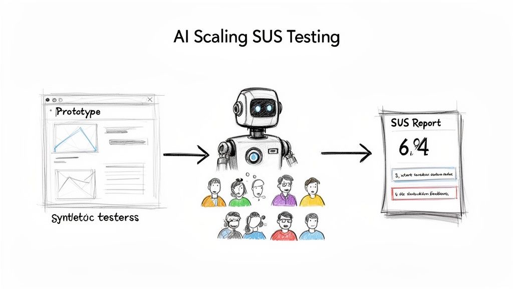
This automated approach gets rid of all the manual effort and delays, letting your team get straight to analysing results and making improvements.
The Power of Synthetic User Testing
Platforms like Uxia are leading this shift, replacing the slow grind of human recruitment with instantly available synthetic testers. These aren't just dumb bots; they are sophisticated AI personas built to mimic the behaviour and thought patterns of your actual target audience.
The process couldn't be simpler:
Upload Your Design: Start by uploading an image, video, or interactive prototype of the user flow you want to evaluate.
Define Your Persona: Next, tell the system who you're testing with. Is it a tech-savvy millennial or a cautious first-time user?
Deploy and Analyse: The AI testers then go through your design, complete their mission, and fill out the SUS questionnaire for you.
Within minutes, you get a statistically relevant system usability score. This incredible speed turns SUS from a once-in-a-while check-up into a continuous validation tool you can use after every single sprint. For a deeper look at this process, check out our complete guide to synthetic user testing and rapid UX insights.
Going Beyond the Score With Qualitative AI Insights
Getting an instant SUS score is a massive win, but the real magic of these AI platforms is their ability to go beyond just the number. A score tells you if a problem exists, but it doesn't tell you why. That's where AI-driven qualitative feedback comes in.
Platforms like Uxia don’t just hand you a score; they deliver rich, actionable insights that explain the user experience behind the number.
By pairing the quantitative SUS score with qualitative data, you get the full story. You understand not just what users rated, but why they rated it that way, giving your team a clear path to meaningful improvements.
This includes features like:
'Think-Aloud' Transcripts: Get a running commentary from the AI user as it navigates your prototype, highlighting moments of confusion or delight.
Heatmaps and Clickstreams: See exactly where users focused their attention and the path they took to complete a task.
Friction and Issue Detection: The AI automatically flags specific moments of hesitation or struggle, pinpointing the UI elements causing the problem.
This blend of quantitative and qualitative feedback is a huge leap forward. It allows product teams to upload a prototype, define their target audience, and get back clear, actionable results in minutes—bypassing weeks of recruiting real users.
By adopting an AI-driven approach, you eliminate testing bottlenecks, reduce the biases that can come from using the same pool of human testers, and empower your team to build better products, faster. It’s all about making usability measurement a seamless, effortless part of your daily workflow.
Common Questions About the System Usability Score
As you start working with the System Usability Score, a few questions always pop up. Getting straight answers is the key to using SUS with confidence and explaining what it really means to your team.
Let's clear up some of the most common ones.
What Is Considered a Good SUS Score?
This is probably the number one question. A raw score can feel abstract, so what are you actually aiming for?
Anything above the industry average of 68 is a decent start. Think of it as getting a passing grade.
A score between 70 and 80 is generally considered good, putting your product in the top 30% of all systems ever tested. If you want to hit 'A' grade territory and be considered excellent, you need to break 80.3.
On the other hand, a score below 68 signals there are usability problems that need fixing. And if you see anything under 51, you've got serious issues to address.
Can I Change the Wording of SUS Questions?
Simple answer: No.
You should never touch the wording or change the order of the 10 standard SUS questions. The entire power of SUS comes from its standardisation. That’s what lets you benchmark your score against a massive database of thousands of other products.
Changing the questions, even a tiny bit, invalidates your score. You immediately lose the ability to compare your results against industry benchmarks, which is one of the main reasons to use SUS in the first place.
Practical Recommendation: If you absolutely need to ask specific questions about your product, here’s a pro tip: add them as a separate section after the standard SUS questionnaire. That way, you get the custom feedback you need without wrecking the integrity of your usability score. For example, after the 10 SUS questions, add a section titled "Additional Feedback" with questions like, "How would you rate the new checkout process?" or "What was your experience with the search feature?"
How Many Users Do I Need for a Reliable Score?
One of the best things about SUS is how reliable it is, even with a small group of users. Research has shown you can get a surprisingly stable and accurate score with as few as 5 users.
For most qualitative studies, 10-15 users is a solid, practical number that will give you results you can trust.
Of course, if you're doing large-scale quantitative analysis, you'll want a much larger sample. This is where a tool like Uxia becomes a game-changer. It lets you run the test with hundreds of AI synthetic testers instantly, giving you a robust score without the headache and cost of recruiting real people.
Is SUS the Same as Net Promoter Score (NPS)?
Not at all. They measure two completely different things, and it's crucial not to mix them up.
System Usability Score (SUS): Measures perceived usability. It answers the question, "How easy is this product to use?"
Net Promoter Score (NPS): Measures customer loyalty. It answers the question, "How likely are you to recommend this product?"
While great usability often leads to happy, loyal customers, the two metrics aren't interchangeable. SUS gives you a laser-focused look at the user experience, while NPS tells you more about overall brand perception and satisfaction. Practical Recommendation: Use both SUS and NPS at different points in the customer journey. For example, use SUS during usability testing of a new feature pre-launch, and use NPS in a survey sent to established customers to gauge their overall satisfaction and loyalty. Tools like Uxia focus on pre-launch usability with SUS, while post-launch feedback tools often handle NPS.
Ready to stop guessing and start measuring? With Uxia, you can get a reliable System Usability Score in minutes, not weeks. Ditch the slow, expensive user recruitment and let our AI synthetic testers provide the fast, actionable feedback you need to build better products. Start your free trial today and see how effortless usability testing can be.