Your Practical Guide to the SUPR-Q Score for Website UX
Unlock better website performance with our guide to the SUPR-Q score. Learn to measure, interpret, and improve your user experience with actionable insights.

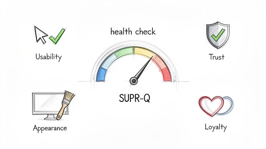
Ever felt like "good UX" is a vague, moving target? The SUPR-Q, or Standardized User Experience Percentile Rank Questionnaire, is here to fix that. It’s a sharp, 8-question survey designed to give you a complete health check for your website's user experience.
Instead of relying on gut feelings, it rolls up metrics for usability, trust, appearance, and loyalty into one powerful, benchmarked score. This tells you exactly how your site stacks up against hundreds of others. For teams using platforms like Uxia to continuously test and improve their designs, the SUPR-Q provides a clear, quantitative measure of their success.
What Is the SUPR-Q Score and Why Does It Matter?
Think of your website’s user experience not as a single feeling, but as a mix of different impressions. Is it easy to navigate? Does it feel secure? Does it look professional? Are people likely to come back? The SUPR-Q is built to answer all these questions with a single, reliable number.
It pushes you past vague feedback by measuring four critical pillars of the user experience. This holistic approach stops teams from getting tunnel vision on one area—like flashy visuals—while ignoring foundational issues like trust or basic usability.
To quickly grasp its components, here's a look at SUPR-Q's core concepts.
SUPR-Q at a Glance
Concept | Description | Why It's Important |
|---|---|---|
Purpose | An 8-question survey providing a single, benchmarked UX score. | Moves UX from a subjective feeling to a measurable, comparable metric. |
Components | Measures Usability, Trust, Appearance, and Loyalty. | Gives a balanced view, preventing over-indexing on one aspect of the experience. |
Key Benefit | Percentile ranking against a database of hundreds of websites. | Offers concrete context—you know exactly where you stand against the competition. |
Primary Use | Diagnose UX health, track improvements, and communicate value. | Aligns teams around a common goal and demonstrates the ROI of design efforts. |
This structure makes SUPR-Q an incredibly practical tool for any team serious about improving their digital product.
A Holistic View of Website Performance
Product managers and designers lean on the SUPR-Q because it gives them the bigger picture that simple conversion rates just can't provide. A conversion tells you what happened, but a SUPR-Q score helps explain why.
A low score is like an early warning system, flagging hidden problems before they start hitting your bottom line. It creates a common language for everyone, from designers to the C-suite, to talk about and prioritise UX improvements.
But the real magic is in its percentile ranking. An average score of 50 means your website is better than 50% of the sites in a massive, cross-industry database. That's context you can act on.
The SUPR-Q transforms the abstract concept of "good UX" into a tangible, trackable metric. It gives you a baseline to measure against, making it possible to demonstrate the direct impact of design changes over time.
This is more important than ever. In Europe, often dubbed the 'ES' region, the User Experience market hit USD 1,875.36 million in 2024 and is expected to grow at a compound annual rate of 15.5% through 2031. It’s clear that teams are dedicating serious resources to building better digital products.
Practical Application for Modern Teams
The SUPR-Q score fits neatly alongside other customer success metrics for SaaS, which typically fall into categories like revenue, usage, and sentiment. By putting a hard number on sentiment and usability, it gives you solid data to guide your strategy.
Practical Recommendation: Deploy SUPR-Q surveys at key moments in the user journey, like after a first purchase or a major feature interaction. For the continuous feedback needed between those surveys, a platform like Uxia lets you test prototypes with synthetic users. This helps you spot friction points that could drag down your next SUPR-Q score, allowing you to build better products, faster.
If you’re exploring other key UX metrics, you might also find our guide on the System Usability Scale useful.
Deconstructing the Four Pillars of SUPR-Q
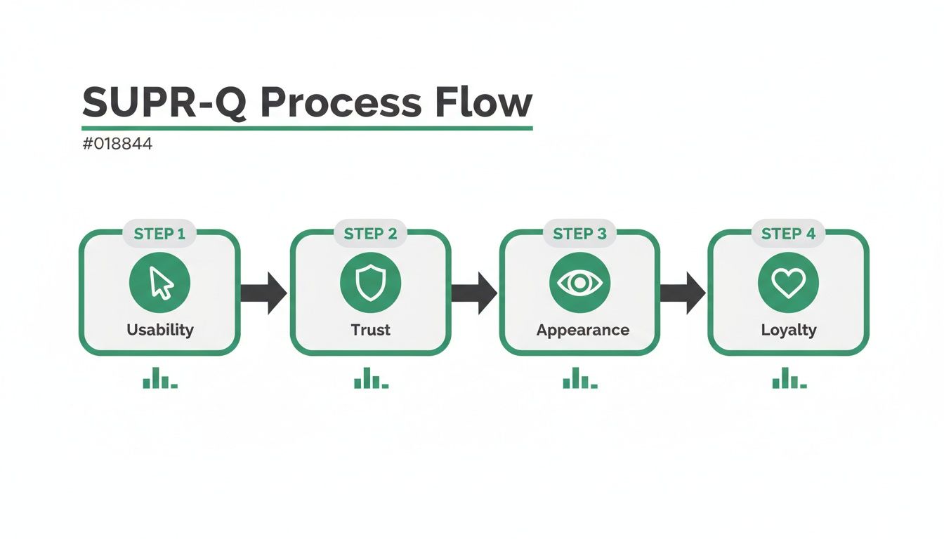
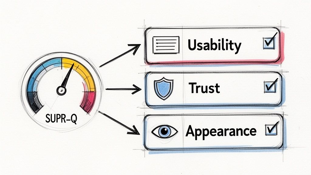
The real power of the SUPR-Q score isn't just the final number. It’s what that number is made of. The score is built on four distinct pillars—Usability, Trust, Appearance, and Loyalty—that together give you a rich, multi-dimensional view of your user experience. If you don't understand them individually, you're missing the point.
Think of it like a car inspection. The overall "pass" is great, but knowing the tyres are worn and the brakes need checking gives you a specific to-do list. The SUPR-Q components do the same for your website's UX, moving you beyond a simple score to a clear action plan.
Usability: How Effortless Is the Experience?
Usability is the bedrock. It measures how easy and intuitive it is for people to get things done on your website. If users can't find what they're looking for or stumble through basic tasks, nothing else matters. All the fancy design and trust signals in the world can't save a site that's a pain to use.
Imagine someone trying to navigate a confusing checkout with poorly labelled fields and a hidden "next" button. That friction and frustration translate directly into a poor Usability score. This pillar isn't about flashy features; it's about pure functional clarity and efficiency.
Practical Recommendation: A low usability score is a massive red flag. It means friction is causing users to abandon tasks and, very likely, your site altogether. This is where tools like Uxia become invaluable. By deploying synthetic users to run through specific flows, you can get immediate, granular feedback on exactly where the confusion happens, letting you fix usability issues before they impact real customers.
Trust: How Safe and Credible Does Your Site Feel?
Trust is the currency of the digital world. This pillar assesses whether users feel safe and confident interacting with your site, covering everything from the security of their personal information to the credibility of your content.
Little things can quickly erode that confidence. A missing security seal, an outdated design, or an ambiguous privacy policy are all it takes. For example, if a user lands on a payment page without seeing familiar logos like Visa or PayPal, they might think twice about entering their card details. That hesitation directly lowers the Trust score.
Key Takeaway: Trust isn't built by a single element but by the sum of many small signals. Every broken link, typo, or unprofessional image chips away at a user's confidence, making this pillar a crucial indicator of your website's perceived reliability.
A high Trust score tells you that users see your site as a secure, reputable place to do business. A low score, however, can be a major barrier to conversion, even if every other part of your site is perfect.
Appearance: How Visuals Shape Perception
Appearance is about more than just looking pretty; it’s about how the visual design of your website influences a user's perception of your brand's quality and professionalism. A clean, modern, and well-organised layout immediately inspires confidence and makes your content easier to digest.
Think of two restaurants. One is clean, well-lit, and has a clear menu. The other is cluttered and dimly lit. You instinctively trust the first one more, even before tasting the food. The exact same principle applies to websites.
The Appearance score reflects this powerful first impression. It tells you whether your design is helping or hurting your brand. Key factors here include:
Visual Hierarchy: Is it obvious what’s most important on the page?
Colour Scheme: Do the colours fit your brand and create a pleasant experience?
Typography: Is the text easy to read on different devices?
Consistency: Does the design feel cohesive from one page to the next?
While a beautiful design can't fix terrible usability, a poor design can absolutely undermine an otherwise functional website.
Loyalty: How Likely Are Users to Return and Recommend?
Loyalty is the ultimate goal. This pillar measures how likely users are to come back to your website and, just as importantly, to recommend it to others. It’s the component that directly connects user experience to business growth.
This is where the Net Promoter Score (NPS) question often comes in: "How likely are you to recommend this website to a friend or colleague?" A user who had a seamless, trustworthy, and pleasant experience is far more likely to become a promoter for your brand.
On the flip side, a frustrating experience creates detractors who won't just leave—they might share their negative experience, too. The Loyalty score is a powerful gut check for long-term customer satisfaction and brand health. It answers the critical question: "Was this experience good enough to earn another visit and a positive referral?" This makes it one of the most important components of the SUPR-Q.
How to Run and Score Your SUPR-Q Survey
Putting SUPR-Q into practice is all about turning subjective user feelings into hard, comparable data. To do it well, you need to know more than just what to ask; you need to understand when and how to ask it. That's how you get clean, meaningful insights.
The standard SUPR-Q is built around eight core questions. Seven of these use a simple 5-point Likert scale (from "Strongly Disagree" to "Strongly Agree"). The final question is the classic Net Promoter Score (NPS) item asking about the likelihood to recommend, which is measured on an 11-point scale.
The questions are carefully designed to measure four key pillars of the user experience.
Each pillar—Usability, Trust, Appearance, and Loyalty—is a critical piece of the puzzle, and the survey gives you a solid read on all of them.
Running a Successful Survey
Timing is everything. You want to capture feedback from people who've had a real interaction with your site, not just someone who casually browsed for a few seconds. Good moments to trigger a survey are right after a purchase, when a user completes a key task, or following a deep dive into a new feature.
Practical Recommendation: Never interrupt a user mid-task. A survey pop-up that gets in the way of a checkout flow will only annoy people and mess up your results. Instead, show the survey on a confirmation page or send it in a follow-up email. For even faster feedback, you can use Uxia to test specific user flows with AI agents before launch, helping you catch friction points without ever surveying a live user.
Getting the sample size right is another crucial step. While there's no single magic number, a sample of 30-50 responses can give you a good directional sense of where you stand. But if you want statistically solid data that you can confidently benchmark against competitors, you really want to aim for 100+ responses.
Calculating Your SUPR-Q Score
Once you’ve collected the responses, it's time to crunch the numbers. The process is pretty straightforward: you sum up the scores from the first seven Likert scale questions and then add the NPS score to that total. This raw score is then compared against a massive, constantly updated database of other websites.
The final result isn’t just some arbitrary number; it’s a percentile rank. So, if you get a score of 75, it means your website's UX is better than 75% of all the other sites in that database. It's this context that makes SUPR-Q so powerful for benchmarking your performance and tracking progress over time.
This powerful structure lets you see exactly which parts of your UX are pulling your score up or dragging it down, giving you a clear roadmap for improvements.
Comparing SUPR-Q with Other Key UX Metrics
SUPR-Q doesn’t exist in a vacuum. It’s one of several fantastic tools for measuring user experience, and each has its own strengths. Knowing where it fits in helps you pick the right tool for the job.
Here’s a quick rundown of how SUPR-Q stacks up against other popular metrics like the System Usability Scale (SUS) and Net Promoter Score (NPS).
Metric | What It Measures | Number of Questions | Best For |
|---|---|---|---|
SUPR-Q | A holistic view of website UX (Usability, Trust, Appearance, Loyalty). | 8 | Getting a comprehensive, benchmarked score of your website's overall user experience. |
SUS | Perceived usability of a system or product. | 10 | Quick, reliable assessments of how easy a product is to use, especially during usability testing. |
NPS | Customer loyalty and willingness to recommend. | 1 | Gauging overall brand health and predicting business growth based on customer sentiment. |
This table makes SUPR-Q's unique advantage clear: its multi-dimensional perspective. While SUS is laser-focused on usability and NPS zeroes in on loyalty, SUPR-Q pulls them together with trust and appearance for a much more complete picture of the user experience. For a deeper dive into measurement methods, check out our guide comparing qualitative and quantitative research.
Ultimately, running a SUPR-Q survey gives you far more than just a score. It’s a diagnostic tool that helps you pinpoint weaknesses and a baseline to measure your improvements against. And for validating changes between those big surveys, a platform like Uxia lets you test prototypes with synthetic users, helping you proactively fix issues that could hurt your next SUPR-Q results.
Turning Your SUPR-Q Score into Action
A SUPR-Q score is a powerful number, but it’s just that—a number. Its real value comes alive when you translate it from a single data point into a clear plan of attack. Just knowing your score isn’t enough. You need to understand what it’s telling you about your users' real-world experience and where to focus your efforts for the biggest wins.
First, let's get the percentile rank right. This isn’t like a school test where 50% is a failing grade. A SUPR-Q score of 50 means your website’s user experience is perfectly average—better than 50% of the hundreds of sites in the benchmark database. An 80, on the other hand, is excellent, putting you ahead of 80% of other sites. Getting this context right is essential for setting realistic goals.
Digging into the Pillar Scores to Find the Real Problems
The overall score gives you the headline, but the real story is buried in the component scores: Usability, Trust, Appearance, and Loyalty. It’s surprisingly easy for a decent total score to mask a serious weakness in one of these areas. Breaking down the SUPR-Q results is like running a diagnostic check on your website’s health.
Picture this: your overall score is a respectable 75th percentile, but your Trust score is stuck down at the 30th percentile. That’s a massive red flag. It tells you that even if your site is easy to use and looks great, people just don't feel safe or confident enough to stick around. This one insight instantly points your team toward a specific, critical problem to solve.
Building a Smart Action Plan
Once you’ve found your weakest pillar, you can build a focused roadmap. The lowest-scoring area is almost always the best place to start because fixing it will give you the biggest boost to the overall user experience.
Here’s how those low scores translate into real-world fixes:
Low Usability Score: This means friction. Users are probably getting stuck in core journeys, fighting with confusing navigation, or struggling to find what they need. Practical Recommendation: Use a tool like Uxia to run synthetic users through the specific tasks associated with low usability. Their feedback will pinpoint the exact points of failure, turning vague problems into a clear design-fix checklist.
Low Trust Score: This screams a lack of credibility. You might need to make security badges more prominent, add customer testimonials, write a clearer privacy policy, or just make your contact info easier to find.
Low Appearance Score: This suggests your design feels dated, messy, or unprofessional. Time for a refresh. This could mean updating your visual branding, improving typography for readability, or creating a more consistent layout.
By zeroing in on your weakest link first, you make sure your resources go where they’ll make the most difference. It’s a simple, strategic way to move from knowing there’s a problem to methodically fixing it.
Closing the Loop: Validating Fixes and Tracking Progress
Okay, so you've implemented changes based on your SUPR-Q analysis. You're not done yet. You have to make sure your solutions actually worked. This is where a platform like Uxia becomes a game-changer for agile teams. Before you pour development resources into a fix—say, a redesigned security section to tackle that low Trust score—you can test a prototype.
With Uxia, you can deploy AI-powered synthetic users to test your new design in minutes. They give you immediate, actionable feedback on whether the changes actually improve clarity and user confidence. This lets you test multiple ideas fast, ensuring the solution you finally build is the right one.
By combining periodic SUPR-Q surveys with continuous testing on Uxia, you create a powerful system for data-driven improvement. You turn raw scores into a tangible, better user experience.
Making SUPR-Q Actionable with AI and Synthetic Users
A SUPR-Q score is a fantastic snapshot of your website’s health. It tells you what is working and, more importantly, what isn’t. But to actually fix things, you need to know why users are having a certain experience.
This is where the real magic happens. By pairing your quantitative SUPR-Q data with AI-driven, qualitative feedback, you can build a complete picture.
When you connect SUPR-Q with a platform like Uxia, you stop diagnosing problems and start solving them—almost instantly. It’s a combination that transforms your workflow, letting you validate fixes and innovate with far more speed and confidence.
Bridging the Gap Between Data and Design
Let's get practical. Imagine your latest SUPR-Q report shows a dip in the Usability score, and it's dragging down your entire rating. You know there's a fire, but where is the smoke coming from?
Guessing is slow and expensive. Is it the navigation? A confusing checkout form? Maybe the button labels are just unclear?
Instead of spending weeks setting up traditional user interviews, you can deploy AI-powered synthetic users from Uxia directly onto your design or prototype. These testers will navigate the exact flow that’s causing trouble and give you immediate "think-aloud" feedback.
Suddenly, you have rich, qualitative context for your numbers. The AI testers will tell you exactly where they got stuck, what they found confusing, and why they were about to give up. The guesswork is gone, pointing your team straight to the source of the friction.
The real power comes from connecting the dots. A drop in your SUPR-Q Usability score from 65% to 50% tells you a story of user struggle. AI feedback from Uxia provides the dialogue for that story, revealing the exact moments of confusion that caused the drop.
This mix of hard data and qualitative insight is potent. You can even enhance it further by using a digital assistant for simulating user behaviour through modern browser automation, which provides another layer of invaluable data.
Creating a Continuous Improvement Loop
The biggest win here is creating a rapid, continuous feedback loop that slots perfectly into modern agile sprints. You no longer have to wait for the next quarterly survey to find out if your design changes actually worked.
Practical Recommendation: Establish an improvement cycle using both SUPR-Q and Uxia.
Identify the Problem: Your quarterly SUPR-Q survey flags a low score in a key area, like Trust.
Test a Hypothesis: You design a new version of your checkout page with more prominent security seals and clearer return policies.
Validate with AI: You upload the new design to Uxia. Within minutes, synthetic users test the prototype, giving you feedback on whether the changes genuinely make them feel more secure.
Measure the Impact: Once you deploy the validated fix, your next SUPR-Q survey confirms the improvement with a higher Trust score.
This cycle transforms UX improvement from a slow, reactive chore into a proactive, data-driven engine for growth. It cuts out the time and cost of recruiting human testers, allowing your team to iterate much faster. You can see a detailed comparison by reading our analysis of synthetic users versus human users.
Automation in the European Context
This move toward automated testing isn't just a niche trend; it's picking up serious momentum, especially in Europe. The market in the 'ES' region—covering Spain and other key European hubs—was valued at USD 10.43 billion in 2024 and is projected to explode to USD 42.97 billion by 2033.
These numbers tell a clear story: automated validation has become critical for product teams to stay competitive. Discover more insights about the European automation testing market on Market Data Forecast.
For product designers and enterprise teams using Uxia, synthetic AI testers are true game-changers. They simulate real users navigating prototypes, capturing think-aloud transcripts and heatmaps without any of the recruiting headaches. It’s a perfect match for the speed and efficiency demanded by today's market.
SUPR-Q in the Real World: Your Questions Answered
Even when you've got the basics of SUPR-Q down, a few practical questions always pop up once you start using it. Let's clear up the common hurdles so you can put the metric to work with confidence, sidestep easy mistakes, and actually get value out of the whole process. Here are the questions I hear most often from teams bringing SUPR-Q into their workflow.
How Often Should We Run a SUPR-Q Survey?
Practical Recommendation: For most teams, measuring your SUPR-Q score quarterly hits the sweet spot. It’s frequent enough to see how major product updates or marketing pushes are landing, but not so often that you start annoying your users with constant surveys. This rhythm gives you a steady pulse on your website’s health and lets you build a clear trend line over time.
That said, if your team is shipping updates constantly in a more agile setup, you might want to run a SUPR-Q survey after each significant feature release. This gets you immediate feedback on how new functionality is impacting the user experience. Whatever you choose, the key is consistency. Regular measurement creates a powerful baseline that helps you prove the ROI of your UX work. Between these bigger surveys, you can use a platform like Uxia for quick-fire validation of smaller design changes, making sure every little tweak is moving you in the right direction.
Can I Use SUPR-Q for Our Mobile App?
This is a really important one. While the idea of a standardised score is the same, SUPR-Q was built and validated specifically for websites. Its questions and benchmarks are all tuned to the desktop and mobile web experience.
For native mobile apps, you need its sibling: the SUPR-QM (Standardized User Experience Percentile Rank Questionnaire for Mobile). The SUPR-QM reworks the questions for the unique world of mobile apps, covering things like performance, navigation patterns, and touch controls. Using the right tool is non-negotiable if you want your results to be accurate and truly comparable to other mobile app benchmarks.
What’s a Common Mistake Teams Make with SUPR-Q?
The single biggest mistake I see is teams getting fixated on the overall score and completely ignoring the four scores that make it up. A decent total score can easily mask a critical weakness that’s quietly poisoning your user experience.
For example, a visually stunning design might pull in a super high Appearance score, artificially inflating the total. But lurking underneath could be a dangerously low Trust score because your checkout process is confusing or lacks clear security signals. It’s a classic case of winning a battle but losing the war.
Practical Recommendation: You have to dive deeper. The real gold is in the individual scores for Usability, Trust, Appearance, and Loyalty. Your lowest-scoring pillar isn't a failure; it's your most valuable piece of feedback. It tells you exactly where to focus your efforts first. Use your lowest component score to define the next user journey you test in Uxia.
How Does SUPR-Q Compare Different Kinds of Websites?
This is where SUPR-Q really shines. Its normative database is massive, packed with data from hundreds of websites across dozens of industries—from huge e-commerce sites to niche B2B software. This gives you a solid, cross-industry benchmark that shows you how your UX stacks up against the web as a whole.
This "big picture" view is fantastic for a general health check. But for more surgical, competitive insights, you can usually filter the database. This lets you compare your site directly against others in your specific market. This dual capability is incredibly useful, giving you both a general report card and a precise competitive analysis. It helps you understand if a score of 60%, which might be average for the entire web, is actually exceptional for your particular industry. That context is everything when it comes to setting realistic and meaningful goals for your team.
Ready to stop guessing and start knowing? Uxia helps you validate design fixes and improve your SUPR-Q scores by providing instant, actionable feedback from AI-powered synthetic users. Stop waiting for survey results and start building better products today. Get started with Uxia.