Quantitative Research for UX: Playbook 2026
Master quantitative research for UX. This playbook covers choosing metrics, designing tests in Uxia, analyzing data, and turning insights into UX improvements.

Quantitative research isn't supposed to be slow. In product teams, it only becomes slow when the method is heavier than the decision.
That's the shift more teams need to make. The point of quantitative research in UX isn't to produce a grand report a month later. It's to get reliable signals on satisfaction, task success, and friction early enough to change the design before the sprint ends. Experimental designs are built around a clear sequence of baseline measurement, intervention, and post-measurement to establish causality, and when samples are representative and randomized, success rates for detecting statistically significant differences in usability metrics typically exceed 85% with n > 384 per group for 95% confidence according to Grand Canyon University's overview of quantitative research design.
In practice, most UX teams aren't running that kind of full-scale causal study every week. They're trying to answer sharper questions faster. Did the revised checkout reduce confusion? Did the new onboarding path improve completion? Did satisfaction move after a copy change? That's where a modern workflow matters, and where AI-driven platforms such as Uxia change the operating model from occasional research to continuous validation.
Rethinking Quantitative Research for Modern Product Teams
The old assumption is that quantitative research means long setup cycles, slow recruitment, and delayed analysis. That assumption no longer fits agile product work.
A modern product team needs numbers that are good enough to guide a design decision now, not a polished slide deck after engineering has already shipped the wrong thing. The primary bottleneck isn't analysis. It's waiting: waiting to recruit, waiting to schedule, waiting to synthesize, waiting to get a simple answer to a measurable UX question.

Why the old model breaks in product work
Traditional quantitative studies still have a place. If you're benchmarking a mature flow, validating a large experiment, or making a high-stakes roadmap decision, rigorous sampling and formal hypothesis testing matter. But most design decisions happen much earlier than that.
Teams need rapid evidence during concept testing, pre-launch reviews, and iteration cycles. If the research process takes longer than the design cycle, it stops being operationally useful. Quantitative research becomes theater instead of support.
Practical rule: Match the research design to the decision. Use heavyweight studies for heavyweight decisions. Use fast directional measurement for flow-level usability choices.
Another common mistake is chasing trends in dashboards without understanding signal quality. Teams often react to movement in conversion, engagement, or satisfaction metrics without checking whether the underlying pattern is stable, segmented correctly, or distorted by noise. That's why resources on avoiding data trend pitfalls are useful alongside UX measurement. They help teams separate interesting movement from actionable movement.
Continuous validation beats one-off measurement
The better model is continuous quantitative research. Instead of treating testing as an occasional checkpoint, teams run short, structured studies repeatedly across a sprint cycle.
That changes behavior in practical ways:
Designers validate flows earlier: They test prototypes before polishing edge cases.
Product managers reduce guesswork: They see where users complete tasks and where they stall.
Researchers spend time on interpretation: They focus less on logistics and more on what the numbers mean.
Teams catch satisfaction problems sooner: They spot friction before it becomes a retention issue.
Uxia fits naturally into the workflow. It's useful when a team wants measurable usability feedback without the lag of traditional recruiting and scheduling. The platform's speed changes what quantitative research can look like operationally. Instead of one study at the end, teams can validate multiple iterations while the design is still movable.
That's the mindset shift. Quantitative research isn't a phase. It's a feedback loop.
Choosing Your Metrics for User Satisfaction
User satisfaction looks simple until you try to measure it. Organizations often either ask too little, usually a single survey question, or they ask too much and end up with a pile of disconnected scores.
The cleaner approach is to separate attitudinal metrics from behavioral metrics. Attitudinal metrics tell you what users say they felt. Behavioral metrics tell you what they did while trying to complete the task. You need both, but they don't play the same role.
The core survey metrics
Some metrics are useful because they're simple and broadly understood.
Metric | What It Measures | When to Use It | Sample Question |
|---|---|---|---|
CSAT | Immediate satisfaction with a task or interaction | Right after a specific flow or support interaction | How satisfied were you with this experience? |
NPS | Loyalty or willingness to recommend | Relationship-level tracking, not task-level usability | How likely are you to recommend this product to a colleague? |
SUS | Perceived usability across a standard questionnaire | Benchmarking and comparing usability across versions | I thought the system was easy to use. |
CSAT works best when you want an in-the-moment pulse. It's direct and fast. If someone completes checkout or finishes onboarding, CSAT can tell you whether the experience felt smooth.
NPS is broader. It's not a usability metric in the strict sense. It reflects overall sentiment and loyalty more than interaction quality, so it's less useful for diagnosing a specific screen.
SUS is often the better choice when you need a standardized usability benchmark rather than a general opinion score. If your team needs help deciding when SUS fits and when alternatives are better, this guide to the System Usability Score and its alternatives is a practical reference.
Why behavior usually reveals friction earlier
Survey scores lag behind behavior. A user can report decent satisfaction and still struggle through a task with hesitation, backtracking, and avoidable mistakes.
That's why the most predictive UX metrics are usually behavioral:
Task completion: The clearest signal of whether users can achieve the goal.
Misclick rate: Early evidence that labels, hierarchy, or affordances are off.
Drop-off points: The exact moments where the journey breaks down.
Journey deviations: Cases where users reach the goal through the wrong or inefficient path.
Post-test satisfaction: A useful companion signal after behavior has been observed.
Completion matters, but it can hide poor usability. A user who succeeds on the third attempt hasn't had a clean experience. Misclicks and journey deviations often identify trouble before completion rate visibly drops.
A flow can look successful on paper while still training users to rely on trial and error.
Picking the right metric for the job
A simple decision rule helps:
Use CSAT when you need a fast reaction to a specific interaction.
Use SUS when stakeholders need a structured usability benchmark.
Use NPS for relationship tracking, not task diagnosis.
Use behavioral metrics first when the team is redesigning a user journey.
Pair behavior with attitudinal feedback when you need stronger evidence for a design change.
What doesn't work is choosing a single vanity score and treating it as the whole truth. Satisfaction is rarely one number. It's usually a pattern across performance, confidence, friction, and sentiment.
If your aim is practical product improvement, start with the behaviors that block success. Then use survey metrics to add context, not to replace observation.
Designing Your Study for Rapid and Reliable Insights
Bad quantitative UX studies usually fail at setup. Teams test too much at once, mix incompatible audiences, or collect metrics before defining the decision the study needs to support.
The fix is disciplined scoping. A fast study still needs a clear user goal, a defined audience, one artifact to evaluate, and a precise rule for what counts as completion, failure, or abandonment. That is how teams get signal quickly instead of debating messy results later.

The setup fields that matter
Uxia is useful here because it forces the same inputs experienced researchers ask for at kickoff: mission, scenario, audience, the prototype or live URL, and a stop condition. That structure is not admin work. It determines whether the output is actionable.
Each field changes the quality of the readout:
Mission: Defines the job the user is trying to complete.
Scenario: Gives the task enough context to produce realistic behavior.
Audience: Keeps one segment's behavior from distorting another's.
Prototype or live URL: Locks the test to the exact experience under review.
Stop condition: Prevents fuzzy interpretation of success.
Skip that discipline and the team gets activity, not evidence.
A repeatable workflow for sprint-speed validation
I use a simple playbook for quantitative usability studies because consistency matters as much as speed.
Test one flow at a time
Checkout, onboarding, account creation, upgrade, and search each deserve their own study. Bundling them creates vague results and weak decisions.Write the task in plain user language
“Start a free trial for a five-person team” produces better behavior than “evaluate the pricing experience.”Split audiences before launch
New users, returning users, admins, and end users should not share the same test unless the product decision applies universally to all of them.Start narrow, then scale if the decision requires it
Early validation is about pattern detection. If the same friction appears across a focused first pass, the team usually has enough evidence to fix it and retest.Review consistency before declaring confidence
One surprising path is interesting. Repeated failure at the same step is a product problem.
That workflow works especially well with AI-powered synthetic testers because it removes the usual delays around recruiting, scheduling, and screening. Teams can validate a flow, adjust the design, and run the next study while the work is still in the sprint. For a practical UX-specific framework, Uxia's user research methodology guide for faster insights is close to how product teams operate. For a broader academic reference, this guide to research methodology is a useful companion.
Reliability without overstating certainty
Do not confuse rapid usability validation with formal survey research or experimental inference. They answer different questions.
For product work, the immediate goal is usually to identify repeated friction, compare versions, and confirm whether a design change improves task performance. That is different from proving causality with the standards required in academic or large-scale experimental research.
The trade-off is straightforward. Traditional studies can deliver stronger statistical confidence, but they often arrive too late for sprint decisions. Uxia's faster testing model is better suited to continuous validation, where teams need frequent directional evidence and a tight feedback loop. Use it to catch problems early, verify fixes quickly, and decide when a higher-rigor follow-up study is worth the time.
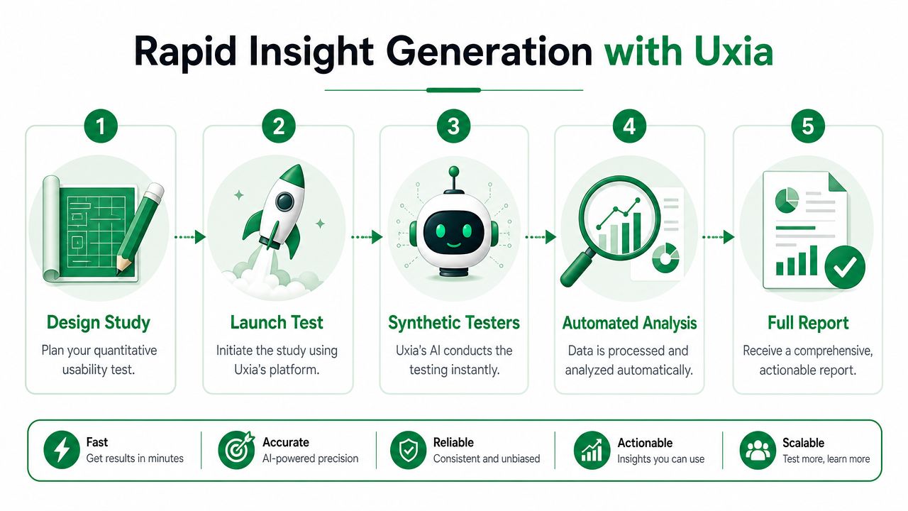
From Launch to Analysis in Under Fifteen Minutes
Speed matters most after launch. That's where traditional quantitative research usually slows the team down. Recruitment starts. Calendars fill up. Analysis waits until the moderator notes are cleaned up. By the time the report lands, the sprint has moved on.
That delay is avoidable. Uxia delivers a complete, actionable UX research report in under 15 minutes, enabling teams to validate design iterations and user flows within a single sprint cycle without waiting days for human recruitment, according to Uxia's explanation of synthetic users for UX validation.
What to read first in the report
When the report arrives, don't start with the transcript. Start with the behavioral pattern.
The first pass should answer five operational questions:
Are users completing the task?
Where do they drop off?
What are they clicking that doesn't help them progress?
Are they following the intended journey or improvising?
Does post-test feedback align with observed behavior?
That order matters. It keeps the team from overreacting to a single quote when the pattern is stronger in the numbers.
A practical reading sequence
Here's the sequence I use when reviewing a fresh test:
Completion pattern
If users aren't reaching the endpoint, the flow has a structural issue. Look for concentration, not isolated failure.Drop-off location
A drop-off at one screen usually indicates a localized friction point. A spread of drop-offs across the journey usually points to broader clarity or trust problems.Misclick clusters
Misclicks are often the earliest visible sign of weak affordance, copy mismatch, or hierarchy problems.Journey deviations
If users reach the goal through detours, the flow may be technically usable but cognitively inefficient.Post-test satisfaction
This helps distinguish between a rough task that users tolerate and a rough task that actively damages confidence.
After at least one review pass, it helps to align the team around the process itself:
Why rapid analysis changes team behavior
The biggest benefit of a sub-fifteen-minute cycle isn't just speed. It's timing.
When the report arrives inside the same working block as the design change, teams still remember the rationale behind the iteration. Designers can compare expected behavior to observed behavior while the screen is open. Product managers can decide whether to ship, revise, or test another variant before the sprint review.
Fast reporting creates a different kind of research culture. Teams stop treating usability evidence as a retrospective artifact and start using it as an active design input.
This also changes how standups work. A team can review fresh friction points after a design update and decide immediately whether an issue belongs in copy, navigation, trust signals, or flow logic. That's a much more practical use of quantitative research than waiting for a formal debrief at the end of the cycle.
What doesn't work is treating speed as permission to be sloppy. A fast report is only valuable if the mission, audience, and stop condition were set up clearly. Rapid analysis amplifies good study design. It doesn't rescue weak study design.
Connecting Quantitative Whats with Qualitative Whys
A strong quantitative study tells you where the problem is. It doesn't always tell you why users got stuck.
That gap matters because design decisions are easier to defend when the team can connect a measurable failure to a human explanation. If a flow has low task success, stakeholders want more than a chart. They want to know whether users were confused by the label, distrusted the screen, missed the call to action, or followed the wrong mental model.
The best UX evidence is paired evidence
Uxia's synthetic testers generate interaction heatmaps, think-aloud transcripts, and automated usability flags to provide both quantitative and qualitative insights. The platform presents metrics side-by-side to link low success rates directly to specific journey snags, as shown in Uxia's overview of synthetic user testing outputs.
That combination is where quantitative research becomes persuasive.
A useful evidence chain often looks like this:
The what: Task success is weak or inconsistent.
The where: Heatmaps show attention clustering in the wrong place.
The how: Journey data shows detours or repeated attempts.
The why: Think-aloud transcripts reveal confusion, hesitation, or distrust.
The category: Usability flags group the issue under navigation, copy, or trust.
How to synthesize the story
This stage is frequently underused. They report the metric and maybe paste a quote. That's not synthesis. It's juxtaposition.
A stronger readout links the signals into one claim.
For example, instead of saying users struggled on the pricing page, say this: users reached the page but deviated from the intended path, attention clustered around secondary content, and transcript evidence showed uncertainty about plan differences. That creates a much clearer design mandate. Simplify comparison language, strengthen hierarchy, and reduce the need to scan.
Quantitative data earns urgency. Qualitative evidence earns belief.
That distinction matters in stakeholder meetings. Metrics tell a team that a problem exists. Transcripts and heatmaps make the problem legible enough to act on.
When mixed evidence is especially valuable
Pairing the two modes is especially useful in these situations:
When completion looks acceptable but behavior looks messy
Users may still be succeeding through guesswork.When satisfaction scores are neutral
Neutral sentiment can hide specific usability flaws.When stakeholders disagree on root cause
Combined evidence shortens debates about whether the issue is copy, navigation, or trust.When teams need prioritization support
A problem with measurable impact and clear explanatory evidence is easier to move up the backlog.
If your team needs a broader framing for how the two methods complement each other, Uxia's article on qualitative research and quantitative research is a helpful reference point.
The mistake to avoid is forcing one method to do the other's job. Numbers don't explain motivation on their own. Narratives don't establish prevalence on their own. Good UX research uses each for what it does best.
Turning Data into Prioritized UX Improvements
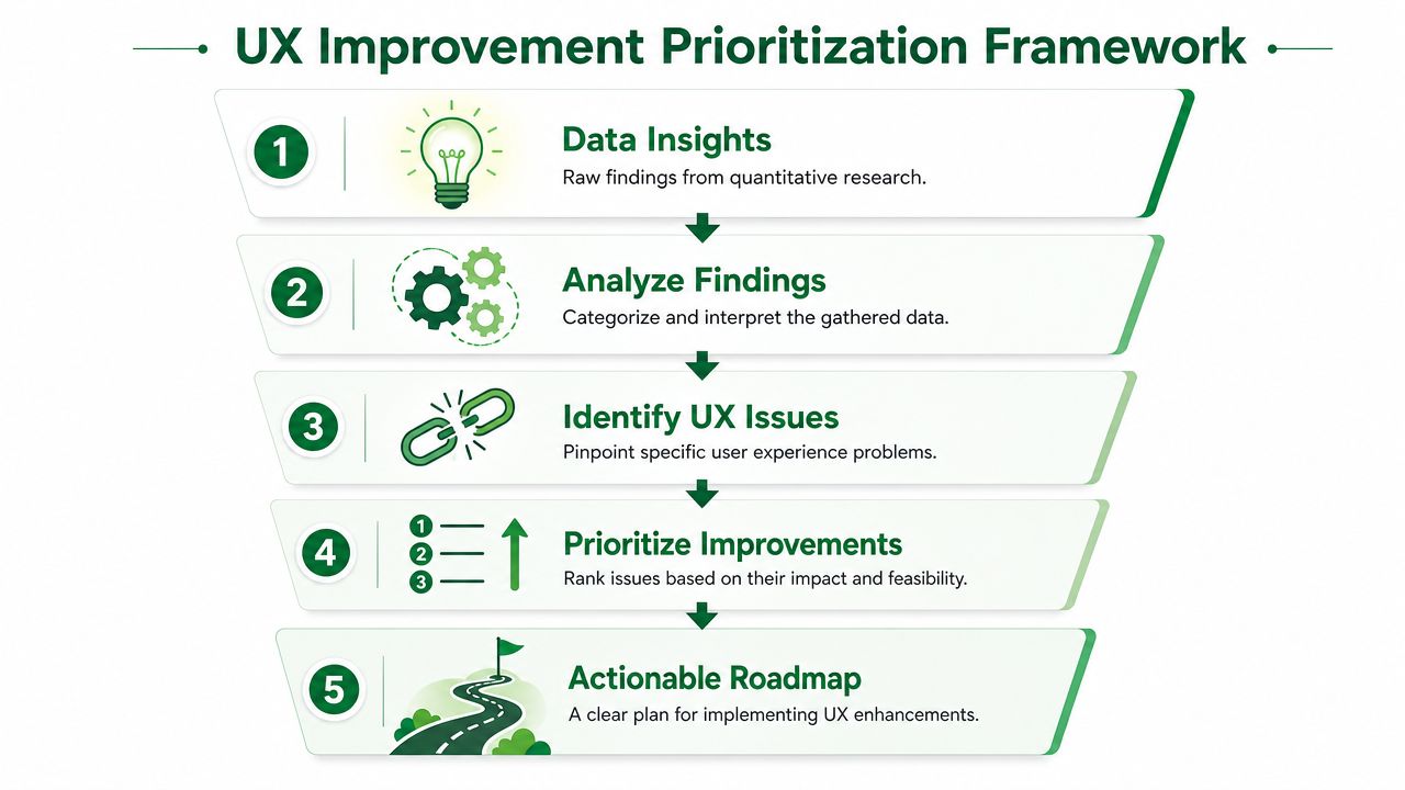
Fast quantitative research earns its keep when it changes what the team ships next. The practical goal is a ranked backlog, not another report. Teams need a method that converts signal into action while the design is still live, and AI-driven testing with Uxia makes that cycle much shorter than a traditional study cadence.
Start with segmentation, not averages
Average scores create false comfort. A flow can look acceptable overall while one audience is struggling enough to suppress conversion, trust, or retention.
Split the results in ways that match product decisions:
New versus existing users
Existing users often work around weak structure because they already know where things are.Mobile versus desktop users
Layout density, tap targets, and navigation patterns often shift the failure points.Market or region differences
Copy, trust expectations, and browsing behavior vary across audiences.Intent-based audiences
Someone comparing options behaves differently from someone ready to complete a purchase.
This is usually the point where backlog discussions get sharper. Instead of debating whether a problem is "big enough," the team can see which segment is blocked, where it happens, and how often it repeats.
Benchmark the flow, then benchmark the iteration
The first study sets the baseline. It does not need to answer every question. It needs to establish current performance clearly enough that the next test can measure change.
Then rerun the same mission on the revised design. Keep the task, success criteria, and scoring stable so the comparison stays clean. Here, quantitative UX research becomes operational, especially with Uxia. Teams can test, revise, and validate again in the same week instead of waiting on recruiting, moderation, and synthesis.
A useful benchmark review asks:
Did task completion become cleaner?
Did drop-offs move or shrink?
Did misclick patterns reduce?
Did users follow the intended path more often?
Did post-test satisfaction align with the behavioral improvement?
Decision filter: Move up issues that hurt core-task success, repeat within a defined segment, and still appear after an initial round of cleanup.
Separate correlation from causation
Teams waste time when they treat correlation as proof. If satisfaction and completion rise together, that still leaves open several explanations. Device type, prior familiarity, traffic source, or content changes may be influencing both metrics at once.
Researchers working with correlational designs are expected to control for confounders and validate findings with stronger follow-up methods. Industry data shows 70% of UX reports fail to account for such confounders (PubMed Central article on quantitative correlational design and confounders).
For prioritization, the working rule is straightforward:
Treat strong correlations as decision inputs, not final proof
Add control variables when the product decision is expensive or irreversible
Recheck high-impact issues with a follow-up test
Protect engineering time from weak causal stories
Mixed-method validation improves confidence here. The same research reports that studies using quantitative plus qualitative validation achieved 92% accuracy in identifying friction points (https://pmc.ncbi.nlm.nih.gov/articles/PMC12969534/). In practice, that is why I pair behavioral metrics with session evidence before recommending major changes.
Build the roadmap around impact and effort
Once the data is segmented and benchmarked, turn it into a visible queue. A good roadmap does two things at once. It shows which problems deserve immediate action, and it prevents lower-value issues from crowding out work that affects revenue or retention.
A practical roadmap usually has three lanes:
Priority lane | What belongs here | Typical response |
|---|---|---|
Immediate fixes | Core-task blockers and repeated navigation failures | Update copy, labels, hierarchy, or interaction cues |
Next-sprint improvements | Important issues that do not fully block completion | Redesign sections of the flow and retest |
Strategic redesigns | Structural issues that span multiple screens or segments | Reframe the journey and validate iteratively |
Teams looking for a broader operational checklist for achieving successful UX research can pair that guidance with this prioritization model.
The ranking criteria should stay simple: task impact, repeatability, segment severity, and effort to fix. That keeps the backlog defensible in planning meetings and makes retesting easier after each release. Traditional one-off studies often stop at insight generation. A faster AI-supported workflow lets teams validate fixes continuously, which is what turns quantitative research into product progress.
If your team needs faster UX evidence without waiting on traditional recruiting cycles, Uxia is a practical way to run structured usability studies, review behavioral metrics, and connect them with transcripts and journey evidence while the design is still in motion.