
A Guide to the System Usability Score and Its Alternatives
Master the System Usability Score (SUS). Learn to calculate, interpret, and compare it with alternatives like SUPR-Q to elevate your product's user experience.

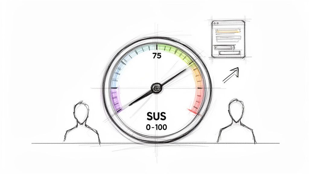
The System Usability Score (SUS) is one of the most trusted tools in a UX professional's kit. It’s a straightforward way to measure your product’s perceived usability, boiling it down to a single score from 0 to 100. Think of it as a vital KPI for tracking improvements, benchmarking against competitors, and getting reliable data to back up your design changes. Platforms like Uxia can automate this process, delivering a SUS score alongside practical, AI-driven recommendations in minutes.
Understanding the System Usability Score
At its core, the System Usability Score (SUS) is a 10-item questionnaire that uses a 5-point Likert scale. It was developed way back in 1984 by John Brooke, but its simplicity and reliability have made it an industry staple. It’s designed to give you a high-level, quantitative snapshot of your product's usability.
People often call it "quick and dirty," but don't let that fool you. Its real power comes from providing a standardised score that helps teams answer one fundamental question: "How easy is our product to use?" And it’s not just about ease of use; a good SUS score often points to higher user satisfaction and better learnability. While SUS is a cornerstone for quantifying user experience, it's just one piece of the puzzle. It's helpful to see how it fits alongside other valuable Google Analytics UX metrics to get a complete picture.
Key Characteristics of SUS
Reliability: SUS is known for giving consistent results, even with small sample sizes. You can get a reliable score with as few as five users.
Ease of Use: It's fast for participants to fill out and pretty simple for teams to administer and score.
Versatility: You can use the questionnaire on almost anything—websites, mobile apps, hardware, or even internal software.
But here’s the catch: a raw SUS score doesn't mean much on its own. For context, a score of 68 is considered the industry average, which is basically a 'C' grade. This is where a simple number needs more depth, and it’s where modern platforms like Uxia completely change the game.
While SUS tells you what the usability score is, it can't tell you why. Uxia bridges that gap. By using AI-driven synthetic testers, Uxia can run usability tests and generate a SUS score in minutes.
But the platform doesn’t stop there. It connects that score to specific friction points, heatmaps, and AI-summarised insights, turning a flat number into a powerful roadmap for real design improvements.
To get a better handle on how this metric can shape your product strategy, we've written a whole article on the benefits of the System Usability Score. Combining a trusted metric like SUS with the diagnostic power of Uxia allows teams to not only measure their user experience but to systematically improve it.
A raw System Usability Score on its own doesn't tell you much. Getting the number is the easy part. The real value comes from understanding what that number means for your product's health.
Let’s walk through how to calculate your SUS score step-by-step and, more importantly, how to translate it into real-world insights.
The process kicks off with the standard 10-item questionnaire. Once you’ve gathered your user responses on the 1-to-5 Likert scale, the calculation begins. The maths might seem a little strange at first, but it’s a standardised method that makes your score comparable to thousands of others.
The Four-Step Calculation
Calculating the SUS score for a single user is straightforward. The formula is designed to normalise the mix of positive and negative questions.
For odd-numbered items (1, 3, 5, 7, 9): These are the positive statements. Take the user's score and subtract 1. A rating of 5 becomes 4, a 4 becomes 3, and so on.
For even-numbered items (2, 4, 6, 8, 10): These are the negative statements. Subtract the user’s score from 5. A rating of 1 becomes 4, a 2 becomes 3, and a 5 becomes 0.
Sum the new scores: Add up all ten of the adjusted values. This will give you a total between 0 and 40.
Get the final SUS score: Multiply that sum by 2.5. The result is your user's final SUS score, which will be a number between 0 and 100.
To get your overall score for the product, just take the average of all the individual user scores. That’s the number you’ll use for benchmarking and tracking over time.
From a Raw Score to Real Meaning
So you have your score. Now what? A score of 70 might sound like a decent C grade, but in the world of SUS, it's actually just a hair above average.
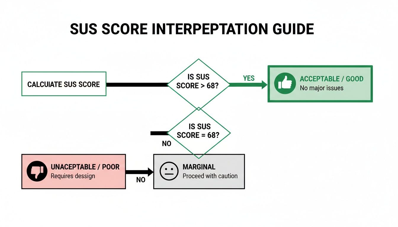
The widely cited average SUS score is 68, which only lands a product in the 50th percentile. This is where frameworks like grading scales and adjective ratings come in handy to give the score context.
Many products struggle with this. For instance, a detailed psychometric evaluation in the ES region found the Thrive by Five app had a mean SUS of 65.07. That score falls just below the 'acceptable' threshold, putting it in the 'marginal' category and right around the 50th percentile. This is a perfect scenario where a platform like Uxia can help, using rapid synthetic user testing to find and fix the navigation and learnability issues that drag scores down, pushing them into the 'acceptable' (71.4+) and 'excellent' (80.3+) ranges. You can learn more about these usability findings from the study.
Key Takeaway: A SUS score isn't a percentage. A score of 68 means your product is more usable than 50% of all systems tested—it's perfectly average, not 68% "good". To truly stand out, you want to aim for a score above 80.3, which puts you in the top 10% of products and earns you an 'A' grade.
Interpreting Your Score with Grades
A grading scale developed by Jeff Sauro makes it easy to see where you stand. It turns that abstract number into something your team can instantly understand.
Grade | SUS Score Range | Percentile | Adjective Rating |
|---|---|---|---|
A+ | 84.1 - 100 | 96-100 | Best Imaginable |
A | 80.8 - 84.0 | 90-95 | Excellent |
B | 74.1 - 77.1 | 70-79 | Good |
C | 65.0 - 71.0 | 41-59 | OK / Average |
D | 51.7 - 62.6 | 15-34 | Poor |
F | 0 - 51.6 | 0-14 | Awful |
Telling your stakeholders "Our product has a 'C' grade for usability" is far more powerful than saying "It scored a 68." It creates an immediate, shared understanding and a clear target to aim for. Following these steps helps you move beyond just collecting data and start using SUS to drive real product improvements.
SUS vs. SUPR-Q Score: Which Should You Use?
While the System Usability Score (SUS) is the go-to for a quick measure of perceived usability, it's not your only option. The Standardised User Experience Percentile Rank Questionnaire (SUPR-Q) is a prominent alternative that captures a more complete picture of the user experience.
Choosing between them isn't about which is "better" but which is right for your goals. Do you need a focused usability metric or a holistic view of the user's entire experience? Let's compare SUS vs. SUPR-Q score to help you decide.
Scope: Focused Usability vs. Holistic UX
The biggest difference between SUS and SUPR-Q is what they measure.
SUS is laser-focused on one thing: perceived usability. Its 10 questions are engineered to tell you how easy and straightforward users find your system.
SUPR-Q, on the other hand, uses 8 items to measure four distinct factors: usability, trust & credibility, appearance, and loyalty (similar to NPS).
This broader scope means the SUPR-Q score gives you a more rounded picture of the entire user experience. If you need to understand how visual design or brand trust are affecting user satisfaction, SUPR-Q is the better instrument.
Practical Recommendation: Use SUS for iterative design sprints when your team is focused on improving core functionality and needs a quick, reliable score. Opt for the SUPR-Q score when you're running a comprehensive UX audit or a competitive analysis that needs to include factors like brand perception and visual appeal. With Uxia, you can deploy either questionnaire to our AI-powered synthetic users and get results in minutes.
Diagnostics: Single Score vs. Granular Insights
Another key difference is the level of diagnostic detail you get. SUS delivers a single, powerful number. A score of 75 tells you usability is ‘good,’ but it doesn’t tell you why. Its main weakness is that it isn’t diagnostic; it signals a problem exists but offers no clues about the cause.
The SUPR-Q score, by contrast, is inherently more diagnostic. Because it provides separate scores for usability, credibility, loyalty, and appearance, you can immediately pinpoint areas of weakness. A high usability score paired with a low appearance score gives your team a clear directive to focus on visual design.
This is where platforms like Uxia add tremendous value. By pairing a SUS questionnaire with AI-driven synthetic user testing, Uxia bridges this diagnostic gap. It pinpoints the exact friction points dragging your score down, showing you heatmaps and session recordings that reveal exactly where users are struggling. It connects the quantitative 'what' from SUS with the qualitative 'why'.
For a deeper dive, check out our guide on what the SUPR-Q score can reveal about your UX.
Comparing SUS vs. SUPR-Q Score at a Glance
Criterion | System Usability Score (SUS) | SUPR-Q Score |
|---|---|---|
Primary Focus | Perceived usability only. | Holistic UX (usability, credibility, loyalty, appearance). |
Number of Items | 10 | 8 |
Output | A single score from 0 to 100. | An overall score plus four sub-scores. |
Diagnostic Power | Low. Identifies that a problem exists but not why. | High. Pinpoints specific areas of weakness. |
Cost | Free and open-source. | Licensed (paid). |
Benchmarking | Compares against a huge public database of 500+ studies. | Compares against a proprietary, curated database of 200+ sites. |
Best For | Quick, iterative testing and tracking internal progress. | Comprehensive UX audits and competitive analysis. |
Benchmarking and Cost
How you compare your score to others is also a major factor. SUS is an open-source, free-to-use standard with a massive public database, making the average score of 68 a well-established industry baseline.
The SUPR-Q score is from a licensed, commercial product. Its strength is its proprietary, actively maintained benchmarking database, which is updated quarterly. This allows for more direct and current competitive benchmarking, like comparing your site's credibility score against Amazon's.
Practical Recommendation: If you need a fast, free, and reliable metric for internal progress, SUS is perfect. If you need deep, competitive insights and have the budget, the SUPR-Q score offers a valuable proprietary database.
To get the most out of the System Usability Score, you first have to understand its limits. It's a fantastic tool, but like any metric, it comes with major strengths and some very real weaknesses. Knowing both sides helps your team use it correctly and get real value from the results.
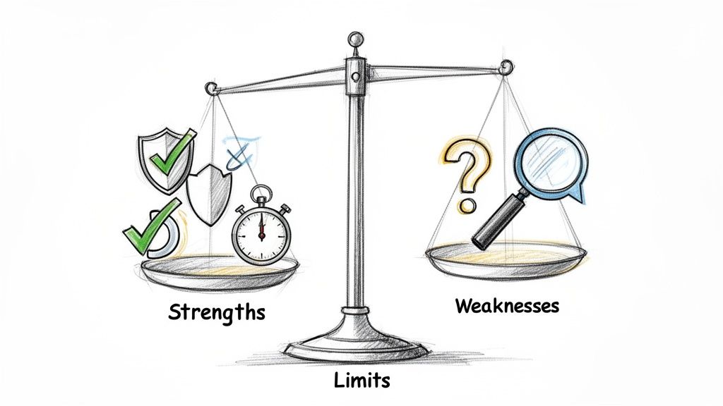
The main draw of SUS is just how efficient it is. It gives you solid, reliable data without needing a ton of resources, which is why it’s a favourite for agile teams and startups who need to move fast.
The Clear Strengths of SUS
The staying power of the System Usability Score really comes down to a few key advantages that make it a practical choice for almost any project.
Proven Reliability and Validity: After decades of use, we know SUS works. It consistently produces accurate results and is a trusted, scientifically validated way to measure perceived usability.
Zero Cost: The questionnaire is completely open-source and free. This gets rid of any budget hurdles, making usability measurement accessible for teams of any size.
Minimal Sample Size: You can get a reliable score with as few as five users. This tiny sample requirement makes testing quick and cheap, perfect for frequent checks throughout the design process.
Versatility: You can use SUS to evaluate just about anything—websites, mobile apps, hardware, or even internal company software. This makes it a universal yardstick for usability.
These factors add up to make SUS an incredibly efficient tool. You get a robust, benchmarkable score with a tiny investment of time, money, and participants. That's why it's still the go-to for quick, iterative feedback.
The Primary Weakness: It Is Not Diagnostic
For all its benefits, SUS has one critical limitation you can't ignore: it is not diagnostic. A low score is a giant red flag telling you there’s a usability problem, but it gives you zero clues about what or where that problem is.
A score of 52 tells you users are frustrated, but it won’t tell you if the problem is a confusing navigation menu, vague button text, or a broken checkout flow. It identifies the "what" (bad usability) but completely misses the "why." This is where most teams get stuck.
Practical Recommendation: Never rely on a SUS score by itself. Always pair it with qualitative methods like user interviews, think-aloud protocols, or observation to find the root causes behind the number. The score tells you where you are; the qualitative feedback tells you what to fix.
This is exactly where a platform like Uxia becomes a game-changer for modern product teams. Uxia is built to close the gap between a quantitative score and the actionable, qualitative insights you need to make targeted fixes.
While a traditional study just gives you the SUS score, Uxia goes much further.
By analysing AI-driven user sessions, Uxia complements your score by automatically pinpointing the exact friction points, moments of confusion, and dead-ends that are dragging your score down. It takes the raw number from your system usability score and enriches it with heatmaps, session recordings, and AI-generated summaries that explain why users felt that way.
In short, it connects the quantitative "what" with the qualitative "why," giving you a complete picture to guide your next design sprint.
When to Use the System Usability Score in Your Projects
Knowing how to calculate SUS is one thing. Knowing when to actually use it is what separates teams that collect data from teams that make great decisions.
SUS isn't a silver bullet. Its real power comes from its lightweight nature, making it the perfect tool for getting a quick, reliable read on perceived usability in very specific situations. When used strategically, it gives you hard data to guide your product without slowing you down.
A/B Testing Design Variants
Product teams are constantly debating design variations. A new homepage, a different checkout flow, a restructured navigation—these discussions often get stuck in a loop of subjective opinions.
This is where SUS cuts through the noise.
Imagine your team has two competing onboarding flows. Instead of arguing about which one feels better, you can get a definitive answer. Run a small group of users through each version and ask them to complete the SUS questionnaire.
Variant A: Users complete the flow and give it an average SUS score of 72.
Variant B: The same task, but this time the average SUS score is 81.
Suddenly, the debate is over. The data shows a clear winner. Variant B delivers a measurably better experience, and your team can move forward with confidence, backed by quantitative proof.
Pulse Checks in Agile Sprints
Agile is all about small, iterative improvements. You ship a change, measure its impact, and repeat. SUS works beautifully in these fast cycles, acting as a usability "pulse check" from one sprint to the next.
Let's say your team just refactored your product's search feature. Before the change, the SUS score was a mediocre 65. After deploying the new version, you run a quick test and discover the score has jumped to 74.
This immediate feedback confirms your work had a positive impact. On the flip side, if the score had dropped, it would be an early warning sign that something went wrong, allowing you to investigate and fix it before it causes bigger problems.
Using the system usability score this way creates a consistent benchmark to make sure you're always heading in the right direction. With a platform like Uxia, you can even automate these checks. Run synthetic users through your prototypes sprint after sprint and get instant SUS feedback without the overhead of recruiting human testers.
High-Level Competitive Benchmarking
You need to know how your product's experience stacks up against the competition. While a full competitive analysis is a deep dive, SUS offers a quick and simple way to get a high-level usability comparison.
Say you want to benchmark your e-commerce site against your biggest rival. Recruit a small group of participants and have them perform a core task on both sites—like finding a specific product and adding it to the cart.
After they use each site, give them the SUS questionnaire. If your site scores a 71 and your competitor's hits an 82, you now have a concrete metric showing you're lagging behind. This insight can justify investing more in UX and gives your team a clear target to aim for.
Automating System Usability Score at Scale with AI Platforms
Anyone who’s run a traditional System Usability Score study knows the pain. It’s a reliable metric, but the process is slow and eats up resources. Recruiting participants, scheduling sessions, and manually crunching the numbers can bring projects to a halt and drain budgets, making it almost impossible to test as often as you should.
But that’s starting to change. Modern platforms are finally tackling these bottlenecks, offering a much faster and more scalable way to get SUS data.
Uxia is at the forefront of this shift, automating and scaling SUS data collection with AI-powered synthetic testers. Instead of waiting weeks for human feedback, you can get it in minutes. Just upload your design, prototype, or a link to your live website, and our platform’s AI users get to work.
These AI testers perform the key tasks you’ve defined and then automatically complete the SUS questionnaire based on their experience. The logistical nightmare of manual testing disappears, replaced by immediate, unbiased feedback.
From Score to Actionable Insight
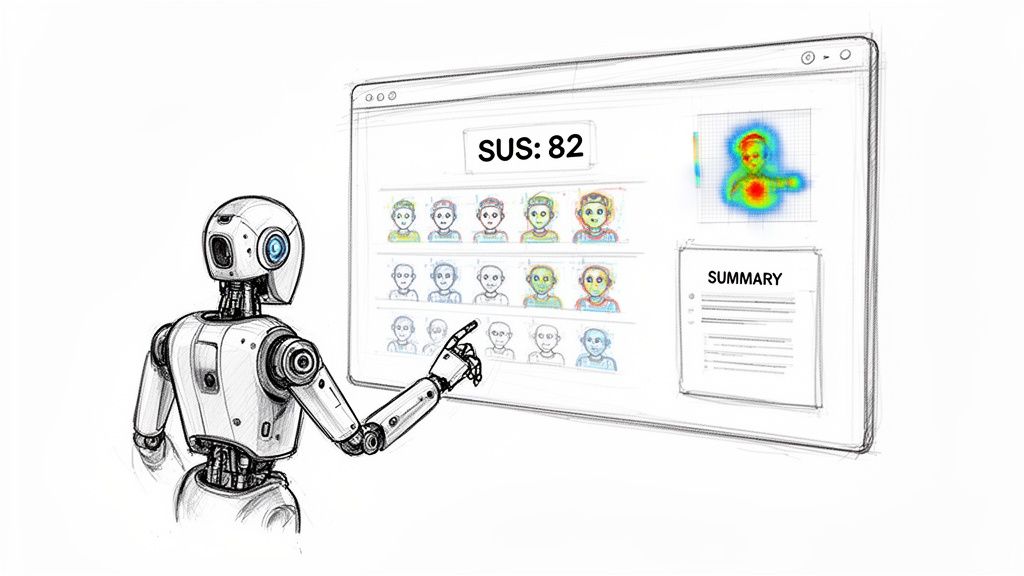
The real power of a platform like Uxia isn't just getting a score faster; it’s what comes next. A classic SUS study hands you a number. Uxia gives you the story behind it.
Our dashboard instantly calculates your system usability score, benchmarks it against industry averages, and—most importantly—ties it directly to qualitative findings. This includes:
AI-Summarised Friction Points: Clear, concise summaries of exactly where the AI users struggled. No more guessing.
Heatmaps and Click-paths: Visualise exactly what users saw, what they focused on, and where their journey went off the rails.
Session Replays: Watch the entire user flow to understand the context behind every issue.
This combination turns a simple metric into a powerful diagnostic tool. You don't just know your score is low; you know why it's low and get a clear, prioritised list of what to fix first. If you're curious about the mechanics, you can see exactly how synthetic users compare to human users in our detailed breakdown.
By connecting the quantitative SUS score with qualitative insights, platforms like Uxia bridge the gap between measurement and action. You can move directly from identifying a problem to solving it.
Supporting Advanced Usability Metrics
We're also seeing a growing need for more specialised metrics, especially in complex corporate software. Enterprise product teams in the ES region, for example, are increasingly adopting the Enterprise System Usability Scale (ESUS). It’s a streamlined evolution of SUS designed for technical users.
Microsoft Research highlights its advantage, noting its reliability without needing sample-specific tweaks. In regional pilots, ESUS scores averaged 72.5—a 6.5-point uplift from the global SUS benchmark of 68—because it better reflects the reality of intricate enterprise workflows.
This is where an AI-driven platform really shines. Uxia not only supports variations like ESUS but can simulate specific ES demographic profiles to flag issues long before a product launch. This helps our corporate clients diagnose problems faster and achieve Grade A scores (80+) far more efficiently than they ever could with traditional methods. By automating these tailored assessments, teams can finally ensure their products meet the high usability standards that specialised users demand.
Your Top System Usability Score Questions, Answered
When you start using the System Usability Score, a few questions almost always pop up. Getting these right is the difference between applying the metric correctly and just gathering noisy data.
Let’s clear up the most common points of confusion.
What Is a Good System Usability Score?
This is the big one. What number should you actually aim for?
A score of 68 is the long-established average. Think of it as a "C" grade—it's just "okay." Hitting this mark means your product is more usable than about half of all systems ever tested, but it’s certainly not something to celebrate.
A genuinely "good" score starts above 74. To break into the top 10% and earn an 'A' grade, you need to be aiming for a score over 80.3.
Don't aim for average. The real goal is to deliver an experience that is demonstrably better than most.
How Many Users Do I Need?
This one comes up all the time. Teams worry they need a huge sample to get valid data, but one of the biggest strengths of SUS is that you don't.
Research has shown again and again that you can get a stable, reliable score with as few as five users. It’s incredibly efficient.
If you’re in a high-stakes project or just want extra confidence, a sample of 10-12 users will give you a highly accurate measurement. This small requirement makes SUS perfect for fast, iterative testing cycles.
Can I Change the Questionnaire?
It’s tempting to want to tweak the questions to fit your product, but this is a mistake you should avoid at all costs.
It is strongly advised not to modify the wording or order of the 10 standard SUS questions. The entire value of the score—its validity, reliability, and comparability—is built on decades of research using that exact phrasing.
Changing the questions instantly invalidates your results. More importantly, you lose the ability to benchmark your score against the thousands of other products in the global database.
Is the System Usability Score a Percentage?
This is probably the single biggest misconception about SUS.
Even though it’s on a 0-100 scale, the score is not a percentage. A score of 68 doesn't mean your product is "68% usable."
It’s a normalised score that is best understood as a percentile rank. That score of 68 actually puts your product at the 50th percentile—meaning it’s more usable than half the products tested. This distinction is critical for reporting results to stakeholders without causing confusion.
An AI-driven platform like Uxia can help by automatically calculating the score, benchmarking it, and providing the correct percentile context so your team can interpret the data accurately.
At Uxia, we help teams get fast, reliable feedback by automating usability testing with AI-powered synthetic users. Go beyond raw scores and get actionable insights in minutes. Discover how Uxia can transform your product development process.