Product Design and Prototypes: A Practical Playbook
A practical guide to product design and prototypes, covering fidelities, methods, testing loops, and how synthetic testing speeds iteration for modern teams.

You're in the meeting where the team wants to ship the onboarding flow because the roadmap is already slipping, and somebody says the dreaded line, “let's just launch it and see.” That moment feels efficient. It usually isn't. A prototype is cheaper than a rewrite, faster than debate, and far better at revealing where the design breaks before the codebase, the launch plan, and the support queue all pay for the mistake.
Why Prototyping Has Become a Core Operating Habit
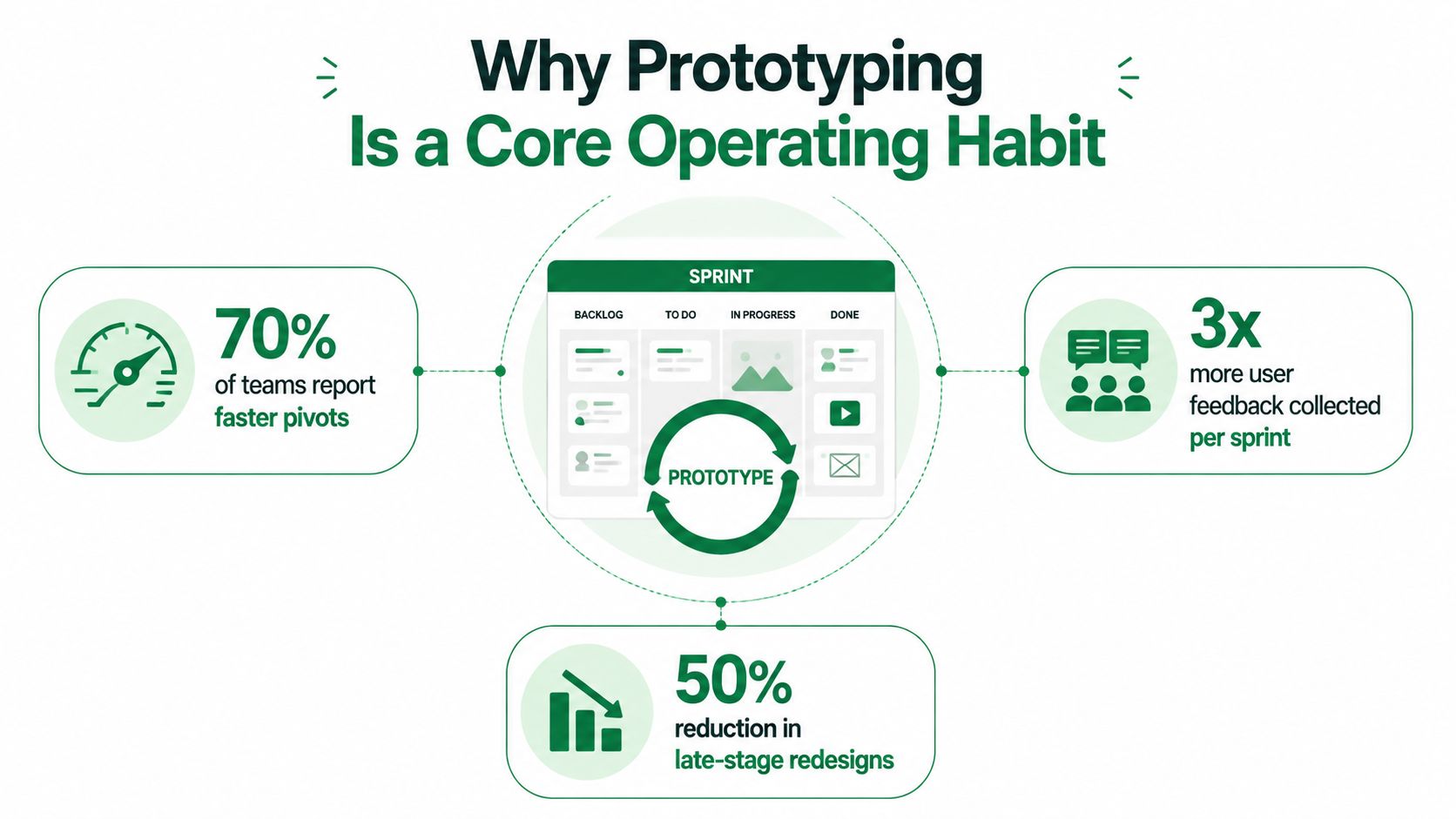
The strongest product teams stopped treating prototypes like optional polish a long time ago. In a 2020 survey, 99% of design professionals said prototyping was more important than ever, 70% said they had increased their commitment to it over the previous two years, and 74% said it was critical or very important to project success, which is a pretty clear sign that prototyping moved from side activity to operating habit. That same momentum shows up in market data too, with the global product prototyping market estimated at US$25.75 billion in 2026 and forecast to reach US$44.19 billion by 2031, a projected 11.41% CAGR (state of prototyping 2020).
A typical sprint makes the trade-off obvious. The team wants to push a new onboarding flow because the deadline is close, but no one can agree on whether the second screen is clear enough, whether the copy builds trust, or whether the new steps create friction on mobile. A prototype turns that argument into evidence. It lets the team test a decision before the implementation cost becomes real.
Practical rule: If a prototype can prevent one expensive wrong turn, it's usually worth the hour you spent building it.
Why the repetition matters
Iteration is where product teams earn confidence. One 2026 industry statistic reports that products with 3+ prototype iterations are 50% less likely to fail, and another benchmark says top-performing companies in product innovation have a 76% success rate versus 51% for other companies, a 25-point gap (DesignRush product design statistics). The number that matters in practice isn't the iteration count itself, it's the reduction in uncertainty before the team locks in a direction.
That's especially important because product development averages about 22 months (DesignRush product design statistics). Teams that wait too long to test end up paying for the same mistake in design time, engineering time, and launch coordination. Prototypes are now the fastest way to expose what people misunderstand, what breaks technically, and what doesn't deserve to be built.
The rest of this playbook stays practical. It focuses on what a prototype is, how to choose fidelity, how to fit testing into a sprint, how synthetic testers can compress the loop, and how to avoid the habits that waste a team's time.
What a Prototype Actually Is and Is Not
A prototype is an early artifact that simulates enough of a product's design or behavior to test a specific question before development is complete (IxDF). That definition matters because it separates learning tools from finished-looking assets. A prototype can be ugly, partial, or narrow, as long as it answers the question the team cares about.
Narrow is a strength
A prototype doesn't have to simulate everything. In practice, the strongest ones isolate one risk at a time, such as navigation, copy, interaction pattern, or a critical handoff. Research on design prototyping describes prototypes as representations of part or all of an interactive system, and the design-science literature treats them as artifacts that approximate one or more features, not necessarily the entire product (Cambridge design prototyping methods).
That narrower scope is useful because it keeps teams from blending multiple failures into one vague reaction. If a user gets stuck, you want to know whether the issue came from the navigation structure, the wording, the interaction model, or the test audience. A measured artifact makes that distinction possible.
A prototype is only “unfinished” if the team hasn't decided what it's for.
Measured, not decorative
A technically serious prototype should be treated as a measured artifact, not a visual mockup with nicer shading. The Design Society's prototype data model captures physical dimensions, volume, materials, participant background, number of physical iterations, material cost, production time, and man-hours, which is a useful reminder that prototype quality and prototype effort both matter (Design Society prototype data model). When teams don't define the test context, they end up arguing over whether a failure came from the design or the method.
That same logic applies to digital work. Uxia's image and video upload model fits this narrow approach because it lets teams isolate the highest-risk interaction first instead of waiting for a fully built product. For a concrete visual example of that kind of early-stage artifact, the user interface mockup reference is a good anchor.
The practical habit is simple. Decide what question the prototype needs to answer, build only enough to answer it, and treat every session like a measurement, not a performance.
The Fidelity Spectrum and How to Choose
The wrong fidelity choice wastes time in a very predictable way. Teams either overbuild something that should have been a sketch, or they underbuild something that needed functional validation. The fix is to match fidelity to the risk you're trying to reduce, not to the stage you think the project “should” be in.
Pick fidelity by question, not by taste
Low fidelity, such as paper, sticky notes, whiteboard flows, and rough wireframes, is best for concept screening and fast alignment. Digital clickable prototypes are better when the team needs to validate flow, hierarchy, and comprehension. High-fidelity builds matter when the question is about fit, assembly, performance, or whether the interaction works under realistic conditions. In other words, the more the question depends on real behavior, the more the prototype needs to behave like the thing it will become.
A useful comparison looks like this:
Question You Need to Answer | Recommended Fidelity | Example Artifact | Typical Time to Build |
|---|---|---|---|
Is the idea worth pursuing? | Low | Paper sketch or whiteboard flow | Very fast |
Can users follow the path? | Low to medium | Clickable wireframe | Fast |
Does the copy make sense? | Medium | Annotated screen set | Fast |
Will the interaction pattern hold up? | Medium to high | Interactive digital prototype | Moderate |
Does it work physically or operationally? | High | Functional prototype | Slower |
For physical products, the product 3D modeling workflow is useful because it shows how form, fit, and functional expectations often need a different artifact than a screen flow.
Simpler prototypes often teach more
Research on prototype design found that prototypes with fewer parts correlate with better design outcomes, and that prototypes with fewer parts added during development also perform better (MIT ideation paper). That's not a stylistic preference, it's a debugging advantage. When a prototype has too many moving pieces, feedback becomes hard to attribute, and the team starts “fixing” the wrong thing.
Practical rule: Test one flow or one design hypothesis per run. If you can't explain what changed, you can't explain what improved.
That's why early sketches often beat polished screens in a sprint review. They make the risk visible without encouraging the team to confuse visual finish with learning quality. High fidelity still matters, but only when the question needs realism.
A Simple Workflow That Actually Fits a Sprint
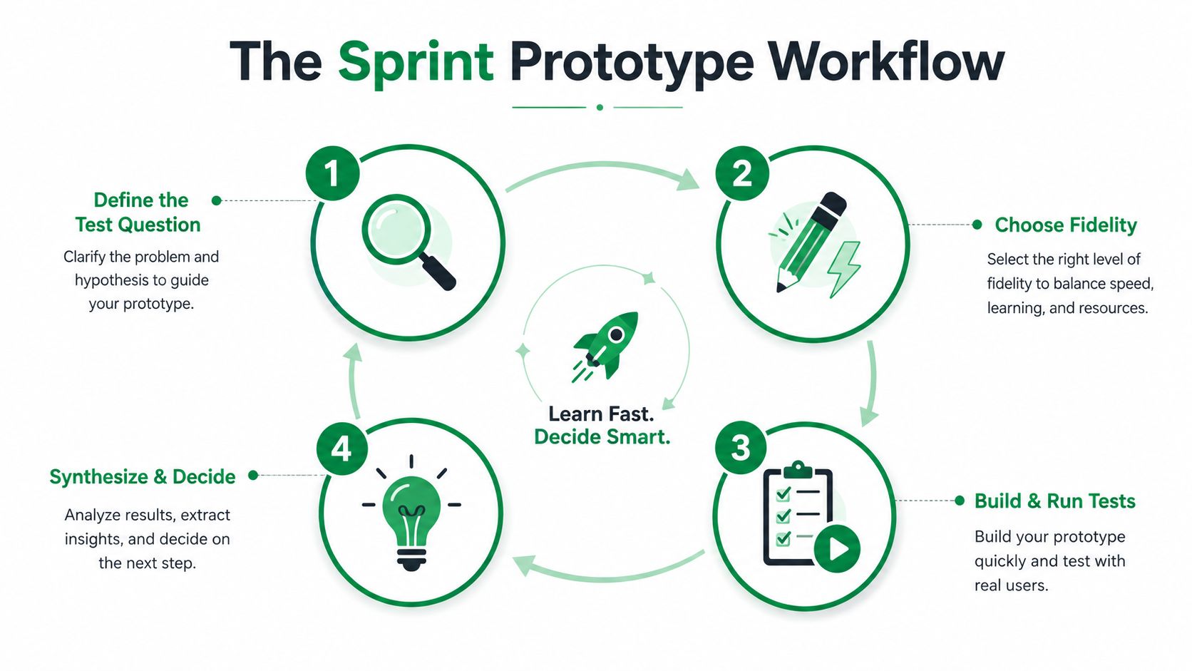
The most useful prototype loop is short enough to run inside a normal sprint and disciplined enough that the output becomes a decision, not a pile of opinions. The loop works because it keeps the team focused on a single question, a small artifact, and a specific next step.
Build, measure, learn without theatrics
Start by writing one test question. Not three. One. “Can new users complete onboarding without confusing the permission step?” is better than “Do people like the new flow?” because it gives the team something concrete to observe. From there, choose the smallest artifact that can answer it, then decide whether the audience should be recruited, simulated, or split between both.
Industry guidance describes the core loop as build, measure, learn, where the team develops the prototype, tests it with real users from the target audience, and analyzes feedback to optimize the product (Technia prototype development guidance). That guidance also emphasizes mapping user flows, linking screens and interactions, and testing scenarios that reflect real-world context rather than ideal paths.
Here's the working sequence I'd trust in a sprint:
Define the test question. Write it so a reviewer could tell whether the result passed or failed.
Choose the smallest artifact. Build only enough to answer the question.
Set the audience. Use representative users, or a close simulation when speed matters.
Run the test. Watch for friction, confusion, hesitation, and workarounds.
Log the decision. Write down what changed, what stayed, and what gets tested next.
Keep the decision log alive
A decision log matters because it stops each round from becoming a restart. If the team knows why a screen changed, what problem it was supposed to solve, and what remains unresolved, the next iteration can build on the last one instead of re-litigating it. Stanford Biodesign recommends establishing metrics before testing, using a written protocol that records controllable conditions, and preserving version control for every revision so the experiment can be recreated later (Stanford Biodesign prototyping guide).
For teams that already work in agile, the right comparison is mastering agile in product development, because the point isn't to add process. It's to make the sprint produce evidence the team can act on immediately.
Testing and Validation With Synthetic Testers
Human testing is valuable, but it's also slow, hard to schedule, and often filtered through professional testers who've learned how to behave in a lab. That creates a familiar problem. The team gets feedback, but not always the kind that best reflects real audience behavior. Synthetic testing fits here as a complementary layer, especially when the goal is fast iteration on digital prototypes.
Where synthetic testing changes the loop
Uxia lets teams upload image, video, or Figma-based prototypes, set a mission and audience profile, and run unmoderated sessions with AI participants aligned to demographic and behavioral profiles. The system captures transcripts, flags issues in usability, navigation, copy, trust, and accessibility, and returns heatmaps and prioritized insights in branded workspaces. For product teams running sprint cycles, that changes the economics of testing because the gap between “we changed the screen” and “we learned something useful” gets much smaller.
The better mental model is mixed-method validation. Synthetic testers are strong for rapid coverage, repeated iteration, and early detection of friction. Human researchers are still essential when the work demands deep empathy, edge-case nuance, or interpretation of behavior in complex contexts. That's why it helps to use synthetic sessions for fast prototype pressure-testing, then escalate to human research when the question becomes relational, emotional, or highly situational.
A practical way to structure the test is to define one explicit question and one success metric before the session starts. That keeps the output legible. For example, a team might want to know whether users understand the second step in onboarding, or whether the trust language around permissions feels clear enough to continue.
Coverage versus depth
A lot of teams debate whether they need five testers or ten. The useful answer depends on what they're trying to reduce. If the goal is quick pattern detection, a smaller round may be enough to expose repeated friction. If the team is exploring a broader flow, additional coverage can reveal different failure modes. The point is not to treat numbers as a ritual. It's to balance cost and coverage against the level of confidence the decision requires.
For teams experimenting with AI-driven evaluation, using sandboxes for RL workloads is a helpful adjacent read because it reinforces the same operational principle, isolate the experiment, run it safely, and inspect the result before moving on. That's the logic behind a useful synthetic testing loop too.
The practical payoff is speed with discipline. The prototype gets tested, the team gets transcripts and visual patterns, and the next change is grounded in observed friction instead of whoever spoke loudest in the critique.
Common Pitfalls and the Habits That Fix Them
Most prototype programs don't fail because the team lacks talent. They fail because the team builds the wrong habit around the work. The usual mistakes are familiar, and they're expensive precisely because they look reasonable in the moment.
Four habits that quietly break the loop
Polishing too early makes teams spend time on visual finish before they know whether the interaction deserves to exist. The fix is to separate learning from presentation. Stanford Biodesign's guidance on metrics and written protocols is useful here because it forces the team to define what success means before the prototype starts collecting compliments (Stanford Biodesign prototyping guide).
Skipping tests because the design “feels right” usually means the team is trusting familiarity instead of evidence. The replacement habit is a short, repeatable test with a clear protocol, not a debate in Slack.
Treating accessibility as a launch checklist leaves too much risk too late. Research on Design From the Margins argues that teams should center the most impacted users from ideation through deployment, not only test accessibility once the design is mostly finished (Design From the Margins).
Listening only to the loudest voices distorts what the prototype is saying. A few confident reactions can crowd out the patterns that matter, especially when the test lacks a written question and documented criteria.
The best prototype sessions don't end with “people liked it.” They end with a clear decision and a record of why.
A working agreement teams can actually use
Define metrics first. Decide what success looks like before the session starts.
Keep the test protocol written. Record conditions, version, and audience profile.
Center the right users early. Don't wait until launch to discover who was left out.
Separate feedback from decisions. Not every comment deserves a product change.
Run one hypothesis per prototype. Fewer moving parts make the result easier to read.
That list is deliberately blunt because prototype culture usually drifts toward ambiguity. When the team knows what it's measuring, who it's serving, and what gets changed next, the work gets calmer and the results get clearer.
A Short Story From a Real Prototype Loop
A product team I worked with was redesigning onboarding for a new SaaS workflow. The first draft looked fine in the review, which is usually the warning sign. Rather than waiting for a fully built flow, the team uploaded an image prototype into Uxia, wrote a mission around the second onboarding step, and set an audience profile that matched the people most likely to hit that step in the actual product.
The first round of synthetic testers surfaced a pattern fast. The transcript data showed users hesitating on the second screen, and the heatmap made the same point visually, attention clustered around the wrong copy block instead of the action the team wanted. The problem wasn't the visual style. It was that the screen tried to do too much at once.
The team made one targeted change, tightened the copy, and clarified the action. They reran the prototype the same day. The second round was cleaner, and the decision log captured exactly what changed and why, so the next design review didn't reopen the same argument. Under a traditional recruiting path, that loop would've taken days of scheduling, moderation, and post-session synthesis before the team even got to the first correction.
That's the value of a tight prototype loop. It replaces vague confidence with evidence the team can point to, and it does it while the sprint is still alive.
Putting It All Together and Choosing Your Next Step
Use the simplest checklist that still protects the decision. Define the question. Pick the smallest fidelity that can answer it. Run a synthetic test in Uxia with a clear audience profile. Log the friction. Ship one change. Re-test. Escalate to human research when the question needs empathy, edge-case depth, or broader behavioral context.
That's also the point where the prototype to production guide becomes useful, because the transition from tested concept to shipped product should feel deliberate, not accidental. Uxia is not a replacement for deep ethnographic work, regulatory testing, or brand sentiment research. It's the fast validation layer that helps product teams keep prototypes honest before they spend significant money.
If you want a faster prototype loop with less scheduling drag, visit Uxia and test the next screen before your team turns it into code. You'll get synthetic testers, transcripts, heatmaps, and clear issue summaries that fit the way product design and prototypes work in sprint cycles.