Unlock User Interface Mockup Success 2026
Learn the user interface mockup, its role vs. wireframes, & crucial importance. Our 2026 guide shares best practices, tools, & AI design validation.
A lot of teams hit the same wall at the same point.
A feature starts as a confident sentence in a planning meeting. Then it turns into five different mental models. The PM sees a short path to value. The designer sees hierarchy, spacing, and edge cases. Engineering sees states, dependencies, and failure modes. Marketing sees the launch screenshot. Nobody is wrong, but nobody is looking at the same thing yet.
That’s why a user interface mockup matters. It gives the team a concrete artefact early enough to change direction cheaply. In a modern workflow, the mockup shouldn’t be the end of the design phase. It should be the start of a validation loop.
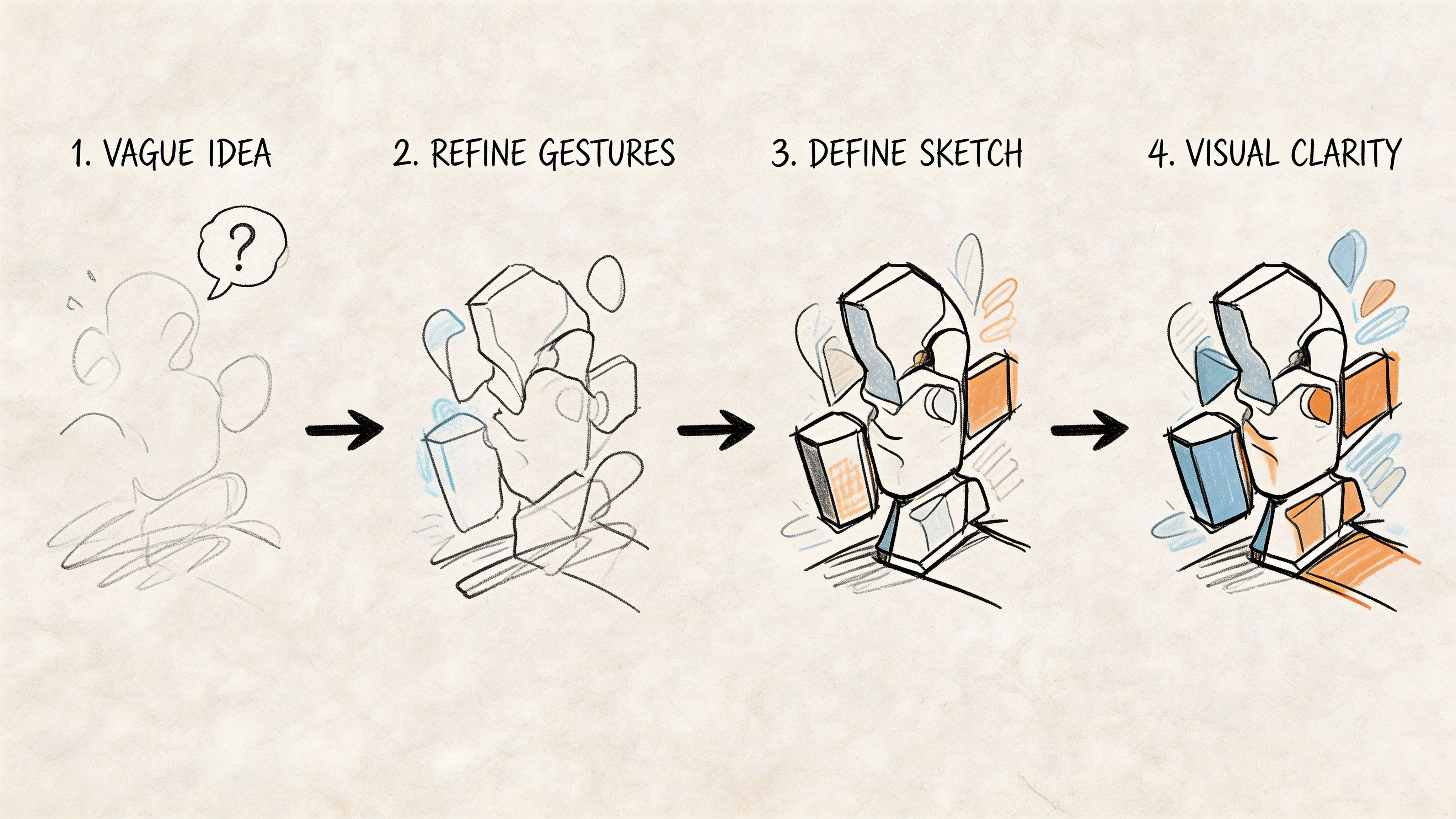
From Vague Idea to Visual Clarity
A new feature sounds clear until the team tries to build it.
A PM might say, “Users need a faster way to reorder.” That sounds simple. But the moment people react, differences appear. Should reorder live on the account page or in the order history? Is it a full cart restore or a one-click action? Does it show delivery context, stock changes, and price changes?
A mockup is where those hidden assumptions stop hiding.
When the interface is visible, discussions get sharper. The PM can point to the sequence. Engineering can flag states that need handling. Brand can react to tone and presentation. Legal or compliance can review copy before it ships. The conversation changes from abstract preference to visible trade-off.
Why teams get stuck before the mockup
Most early confusion comes from three gaps:
Problem gap. The team agrees on the outcome, but not on the user problem.
Flow gap. Everyone pictures a different path through the feature.
Detail gap. Nobody has tested whether the content, hierarchy, and states make sense together.
A short spec helps before pixels appear. If you need a simple structure for that handoff, a solid Product Requirements Document keeps assumptions, scope, and user outcomes visible before design work expands.
Practical rule: If a team is debating a feature in nouns, it needs a mockup. If it’s debating a mockup in detail, it’s finally discussing the product.
The strongest teams don’t use mockups as presentation theatre. They use them to expose disagreements early, while changes are still cheap and quick.
What a User Interface Mockup Really Is
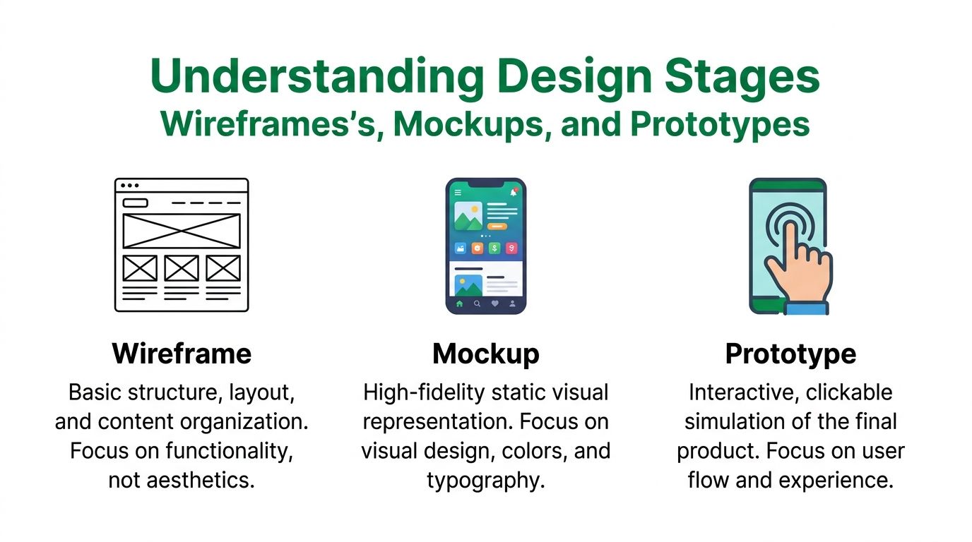
A user interface mockup is a high-fidelity, static visual design of a product screen or flow. It shows what the interface is supposed to look like when the product is built, but it doesn’t yet behave as a functional product.
That distinction matters.
A mockup includes the visual decisions that shape user perception: colour, typography, spacing, icons, imagery, component states, and copy. It lets the team judge whether the interface feels trustworthy, clear, and on-brand before any code is written.
Think of it as a design render
A wireframe is closer to an architectural plan. A mockup is closer to the rendered interior view that shows materials, lighting, and finish.
That’s why mockups are useful in review sessions. They help people react to the actual experience users will see, not just the structure underneath it.
What a mockup is not:
Not a sketch. Sketches are loose and fast. Mockups are deliberate.
Not a prototype. A prototype can simulate interaction. A mockup is static.
Not frontend code. It may look finished, but it isn’t implementation.
What a mockup needs to communicate
A strong mockup answers practical questions fast:
What should stand out first
What action should feel primary
What content supports trust
What happens when content gets longer or messier
Whether the design system is being used consistently
If a PM or engineer has to ask where the main action is, the mockup hasn’t done its job.
For a more foundational breakdown of UI terminology, this guide on what UI is is useful because it separates visual interface work from broader UX decisions.
A polished screen isn’t automatically a good mockup. If it hides hierarchy problems under attractive styling, it delays feedback instead of improving it.
Where mockups fit in real work
In practice, mockups are best when the team already understands the feature shape. You don’t want to spend time fine-tuning visual treatment while core flow questions are still unresolved.
That’s the trade-off. Move to high fidelity too early and you create attachment to weak ideas. Move too late and stakeholders react to implementation rather than design intent.
The right timing is often the point where the structure is stable enough to visualise, but still cheap enough to revise.
Mockups vs Wireframes vs Prototypes Explained
These three artefacts are mixed together frequently. That creates bad meetings.
If someone asks for a mockup but really needs a wireframe, the team starts discussing colour before the flow works. If someone asks for a prototype when a mockup would do, design burns time simulating interactions that nobody has agreed on yet.
Wireframe vs. Mockup vs. Prototype
Attribute | Wireframe | Mockup | Prototype |
|---|---|---|---|
Primary focus | Structure and layout | Visual design and hierarchy | Interaction and behaviour |
Fidelity | Low | High | Medium to high |
Interactivity | None | None | Clickable or simulated |
Best used for | Early thinking, alignment, scope | Visual review, stakeholder sign-off, handoff direction | Usability testing, flow validation |
Typical content | Boxes, labels, rough content blocks | Real styles, real copy, component detail | Transitions, states, navigation paths |
Main question answered | “What goes where?” | “What will it look like?” | “How will it work?” |
Risk if misused | Debates about aesthetics too early | False confidence without behavioural testing | Excess effort before visual or structural clarity |
Use wireframes when the idea is still moving
Wireframes are cheap on purpose.
They help teams organise content, sequence screens, and agree on what belongs in the interface. That’s why PMs should be comfortable working with them. If your team needs a simple primer, this article on how to create wireframes is a practical starting point. For a product-focused angle, https://www.uxia.app/blog/ux-design-wireframes is also useful.
Wireframes are the right tool when:
Scope is still changing
You’re mapping flows across multiple states
The team needs alignment before visual design begins
Use mockups when structure is settled enough to judge the interface
A mockup is where design intent becomes visible.
You use it when stakeholders need to react to the actual interface, not a rough placeholder. It’s also the right stage for checking whether visual hierarchy supports the product goal. If the call to action looks secondary, the team can catch that before implementation.
Mockups work well for:
Design reviews
Executive or client sign-off
Copy and content review
Early accessibility checks
Developer handoff direction
Use prototypes when behaviour is the question
A prototype earns its keep when the team needs to observe how a user moves through the design.
That includes navigation, task completion, branching, and transitions between states. Prototypes are helpful when a concept depends on interaction patterns that a static screen can’t explain.
Decision shortcut: If you’re debating placement, use a wireframe. If you’re debating presentation, use a mockup. If you’re debating behaviour, use a prototype.
The mistake isn’t choosing one over the others. The mistake is asking one artefact to do every job.
Why and When to Create UI Mockups
A UI mockup is most valuable when decisions are expensive enough to matter, but still early enough to change.
That’s why good teams create mockups before development commits hard to a direction. A mockup helps stakeholders react to the product that’s about to exist, not the one they assumed existed from a Jira ticket or a verbal walkthrough.
Mockups create alignment that meetings can’t
People may believe they agree because they agree in language.
Then a screen appears and the misalignment becomes obvious. The headline is too vague. The primary action looks secondary. The trust signals are missing. The mobile layout collapses under real content. These aren’t minor details. They affect whether the feature works commercially and operationally.
A mockup gives everyone one object to react to:
PMs check whether the flow supports the intended outcome.
Designers test hierarchy, consistency, and edge cases.
Engineers spot implementation complexity and missing states.
Stakeholders understand what they’re approving.
Mockups are where content starts affecting performance
This is visible in e-commerce.
For ES-region e-commerce UI mockups, a recent benchmark found that region-specific microcopy such as “Añadir al carrito” can significantly increase conversion funnel completion (spawoz.com). This is impactful because copy decisions may look cosmetic in planning, but they change whether users understand and trust the screen.
If you only review wireframes, you can miss that entirely.
The right moment to create them
Create a mockup when these conditions are true:
The user flow is stable enough that major structural questions are mostly resolved.
The team needs feedback on presentation rather than raw layout.
You’re close enough to shipping that content, accessibility, and component consistency matter.
Don’t create detailed mockups when the product still lacks basic flow agreement. That just adds polish to uncertainty.
A mockup pays for itself when it prevents one sprint of avoidable rework. That threshold is often lower than people think.
The strongest use of a user interface mockup isn’t decoration. It’s decision quality. It lets the team inspect language, hierarchy, trust, and visual clarity before code turns assumptions into cost.
Best Practices for Creating Effective Mockups
A good mockup isn’t just attractive. It’s reviewable.
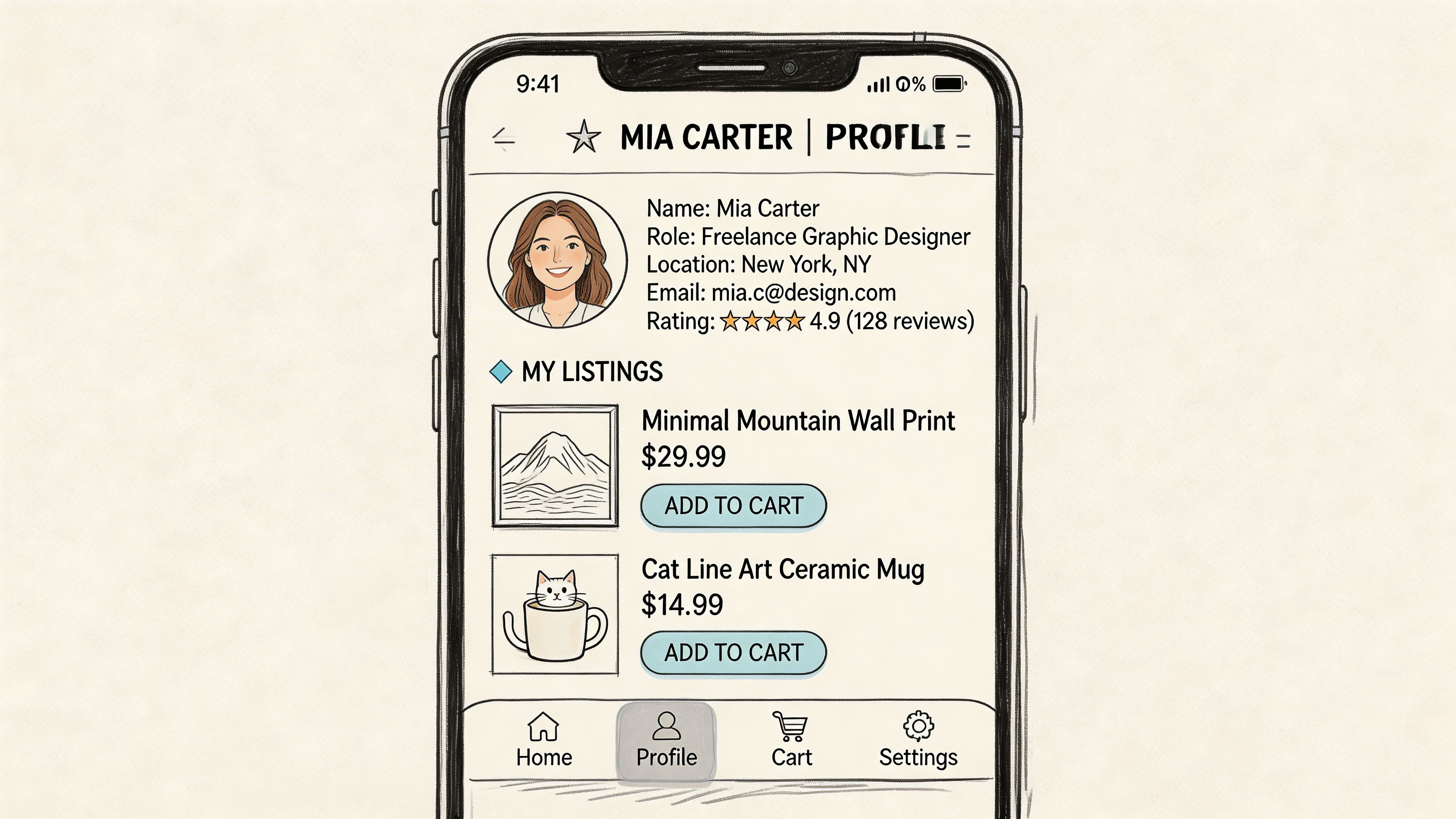
That means it needs enough realism for the team to judge the design. Placeholder content, perfect data, and idealised layouts make weak interfaces look stronger than they are.
Use real content early
Lorem ipsum hides hierarchy problems. Short placeholder labels hide spacing issues. Stock avatars hide what happens when image assets fail.
Use realistic copy, actual product names, and messy edge cases as early as possible. If the button breaks when the label gets longer, that’s useful information. If the empty state feels vague with real language, that’s a design issue, not a copy issue.
A practical review set should include:
Long names and long labels
Empty, loading, and error states
Different permission or account states
Mobile and desktop variations where relevant
Build from a system, not from memory
Design systems reduce noise during review.
When every button, input, and card is redrawn from scratch, teams waste time debating inconsistency that shouldn’t exist. Components, spacing rules, and type scales should already be organised in Figma, Sketch, or your preferred tool.
That frees the review to focus on product decisions instead of visual drift.
Treat accessibility as a design input
Accessibility can’t be a final QA task.
In Spain, Royal Decree 1112/2018 mandates WCAG 2.2 AA compliance, and a 2023 study found that 68% of government UI mockups failed initial evaluations because of poor contrast. The same source reports that using AI tools to enforce pixel-perfect specs reduced those failures by 75% (bridging-the-gap.com).
That’s a practical lesson for any team, not just public-sector work. If contrast, focus order, text size, and alt-text behaviour are missing in the mockup stage, they usually become more expensive later.
Be careful with angled and perspective mockups
Marketing teams like device-frame presentations and angled shots because they look polished.
That’s fine for launch assets. It’s risky for design review. Perspective can distort spacing, readability, tap-target judgement, and perceived hierarchy. If you’re testing the interface, review flat screens first. Use angled compositions later for presentation, not core UX decisions.
Working habit: Keep one “truth set” of flat mockups for review and one polished presentation set for stakeholder decks or launch materials.
A mockup should reduce ambiguity. If the format adds ambiguity, it’s the wrong format for that stage.
Validate Mockups Instantly with AI
The old workflow had a gap in the middle.
Designers created a mockup, then someone had to turn it into a clickable prototype, recruit participants, schedule sessions, moderate tests, and synthesise findings. That process can be worth it for deeper research. It is frequently too slow for day-to-day iteration.
What AI changes in the validation loop
AI-based validation lets teams pressure-test a static mockup much earlier.
Instead of waiting until a prototype is fully wired, teams can upload a screen, define a task and audience, and inspect likely friction points. That includes confusing labels, weak hierarchy, trust issues, and accessibility concerns that are visible from the design itself.
Many usability problems don’t come from advanced interaction. They come from the basics:
Users don’t know where to click
The page doesn’t establish trust
The hierarchy points attention to the wrong thing
The copy uses team language instead of customer language
For teams exploring this workflow, synthetic user testing with AI-driven workflows is a useful reference point for how rapid validation fits into a modern product cycle.
What to validate on a static mockup
A static screen can answer more than people think.
Check these first:
First-glance clarity. Can someone identify the screen’s purpose quickly?
Primary action. Is the next step obvious?
Information scent. Do labels and sections match user expectations?
Trust and reassurance. Are there cues that reduce hesitation?
Accessibility signals. Do contrast, readability, and structure hold up?
If those fail, building a richer prototype won’t rescue the concept.
Here’s a useful walkthrough on the broader shift in testing methods:
The trade-off to watch
AI validation is fast, but it still needs discipline.
A Q1 2026 study by UPM Tech Lab found that AI hallucination in perspective-rendered mockups can lead to a 22% inaccuracy in heatmap generation (mockey.ai). That’s a strong argument for validating clean source designs, not heavily stylised perspective assets.
Fast feedback is only useful if the input is trustworthy. Test the interface, not the marketing composition of the interface.
Used well, AI shortens the loop between design and evidence. Teams can compare variants earlier, reject weak options faster, and arrive at stronger prototypes before development starts.
Frequently Asked Questions About UI Mockups
Is a user interface mockup clickable
No. A mockup is typically static.
If the screen responds to taps, clicks, or transitions, you’re moving into prototype territory.
Should PMs review mockups or leave that to designers
PMs should review them closely.
They don’t need to critique kerning or corner radius, but they should check whether the screen supports the intended user outcome, reflects the product strategy, and communicates clearly.
Can a mockup be enough for user testing
Sometimes, yes.
If you’re testing first impressions, hierarchy, trust, or copy clarity, a static mockup can reveal a lot. If you’re testing behaviour across multiple steps, you’ll typically need a prototype.
How many screens should a mockup include
Enough to represent the decision being made.
For a simple feature, that may be one key screen plus obvious states. For a more complex flow, include the critical path and the states most likely to break understanding.
What’s the biggest mistake teams make
They polish too early or validate too late.
A polished mockup can make a weak concept look finished. A late mockup turns design feedback into implementation rework. The sweet spot is when the flow is stable enough to visualise, but still flexible enough to improve.
If your team wants to turn mockups into fast, actionable evidence instead of waiting for slow research cycles, Uxia is worth a look. It helps product teams test images and prototypes with synthetic users, surface friction in minutes, and tighten the validation loop before development costs rise.