
Key Research Terms: Your 2026 Glossary
Master key research terms with our practical glossary. Get plain definitions for usability testing, personas, metrics & more from Uxia.

Why do so many research readouts end with a debate about definitions instead of a decision about the product?
In practice, the problem usually isn't a lack of effort. Teams run tests, gather quotes, watch sessions, export reports, and still leave the room unsure what they learned. One person says the task was clear. Another says the audience was wrong. A third says the findings can't be trusted because the setup was vague from the start.
That's why key research terms matter more than people often realize. If your team uses the same words to mean different things, you don't have a research process. You have a terminology problem disguised as a methodology problem.
At Uxia, that lesson shows up fast. AI can accelerate testing, but speed only helps when the inputs are precise. A weak definition creates fast confusion. A strong definition creates useful feedback.
Why a Shared Research Vocabulary Matters
When research fails, teams often blame the method. They say the sample was weak, the prototype was unfinished, or the session format wasn't right. Those things matter, but the more common breakdown happens earlier. People never aligned on what the task was, who the task was for, or what success meant.
A shared vocabulary fixes that. It gives design, product, and research teams one frame for setting up studies and reading outputs. Without it, each role interprets the same test through a different lens. Product hears validation. Design hears confusion. Research hears ambiguity in the brief.
Misalignment starts small and spreads fast
The most expensive research mistakes often look harmless at first:
A task statement becomes too broad: Participants wander through a flow because no one defined the exact action to complete.
Context gets mixed into the objective: Researchers think they wrote a clean task, but they wrote a story.
Audience labels stay generic: “New users” sounds useful until the team realizes it includes people with very different needs and behaviors.
In rigorous methodology, operational definitions are the gold standard because they specify exactly how a concept is measured or observed, which reduces ambiguity and makes replication possible. A strong operational definition follows a precise structure: “[Term] in this study refers to [specific measurement procedure, tool,or threshold anchored to an external standard]” according to Editage's guidance on operational definitions.
That principle applies directly to UX work. If a team can't define a term in a way another researcher can reuse, the term isn't ready for high-stakes decision-making.
Practical rule: Before launching any study, ask one question for every key term: would another researcher run the same test, with the same intent, from this wording alone?
Teams that want a stronger terminology discipline can also borrow practices from adjacent research workflows. Resources on AI tools for academic writing are useful here because they reinforce a habit product teams often skip: defining terms before interpreting results.
The Foundation of High-Quality Research
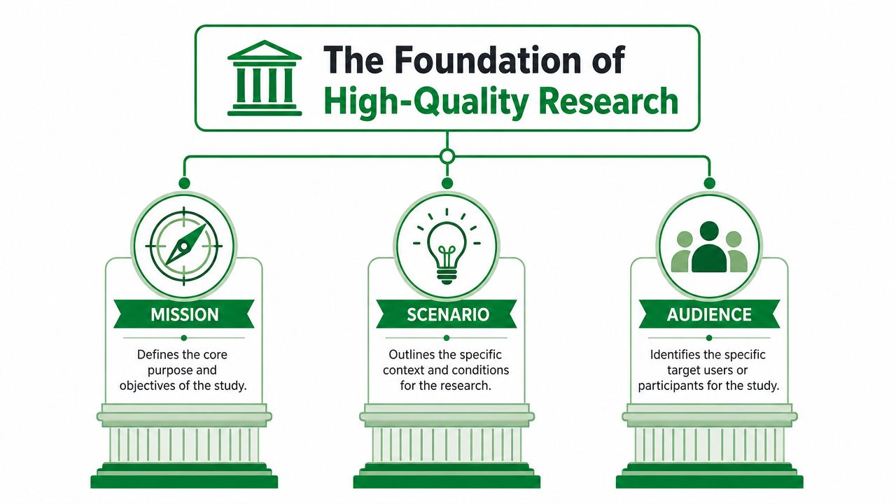
At Uxia, three terms come first with every new UX hire: Mission, Scenario, and Audience. Not journey map. Not SUS. Not segmentation model. Those three terms shape research quality more than the testing format itself.
Mission is the task
A Mission defines what the participant must accomplish. Uxia defines Mission as the specific task a participant must accomplish, such as “Purchase a 1-hour subway ticket,” which serves as the measurable core of research quality and directly determines whether feedback aligns with intended workflows, as described in Uxia's guide to mobile website testing.
That's the standard to use. Specific action. Observable outcome. No extra storytelling.
A good mission helps you answer practical questions:
Did the participant understand the intended workflow?
Where did they hesitate, detour, or abandon?
Were comments tied to the actual task, or to an imagined one?
If the mission is vague, every downstream insight gets softer.
Scenario is the context
A Scenario explains why the task matters in that moment. It gives the participant a setting, a motivation, and often a constraint. It should influence decision-making, but it shouldn't replace the task itself.
One of the most common setup mistakes is turning the mission into a mini narrative. That sounds harmless, but it broadens interpretation and weakens the feedback.
A real example from a project made this obvious. A customer wrote a mission that said, “You just arrived in New York and need to use the subway.” It sounded plausible, but it wasn't a task. It was context.
The fix was simple and important:
Mission: Purchase a 1-hour subway ticket.
Scenario: Imagine you've just landed in New York for the first time and need a way to get around the city using the subway.
Once those were separated, testers focused on the intended flow instead of guessing the objective.
When the mission and scenario get merged, participants solve different problems. The findings look rich, but they aren't comparable.
Audience is the who
An Audience defines who is performing the task. In market research terms, precise specifications are the technical standard for defining detailed participant requirements so studies stay aligned with their purpose. Those specifications should cover relevant demographic and behavioral variables, according to Quirk's glossary entry on specifications.
In UX practice, that means “busy parents,” “first-time crypto users,” and “small-business finance admins” aren't interchangeable labels. Each audience brings different expectations, language, confidence levels, and decision shortcuts.
A useful audience definition usually includes:
Role or identity: Who is this person in relation to the product?
Relevant behavior: What do they already do, avoid, or prefer?
Decision context: What pressure, urgency, or familiarity shapes the task?
Teams that want to sharpen this setup work can borrow from a more detailed user research methodology guide for faster insights, especially when they need consistency across multiple studies.
Core Research Methods Explained
Method names often sound more complex than the work itself. In practice, a few core methods carry most of the load in product teams. What matters is understanding what each method is for, and what changes when AI handles part of the execution.
Usability testing
Usability testing checks whether people can use an interface to complete a task. The point isn't whether they like the design in the abstract. The point is whether they can move through it, understand it, and recover when something feels off.
A traditional example is testing a new onboarding flow with participants and asking them to create an account, verify email, and reach the dashboard. Researchers watch for hesitation, confusion, and false assumptions.
In an AI-driven workflow, synthetic testers can run that same type of task repeatedly against different missions and audience profiles. That changes the pace of iteration. Teams don't need to wait for recruiting and scheduling just to learn that a form label is unclear or a CTA looks secondary.
Task analysis
Task analysis breaks a user goal into the steps required to complete it. It's one of the most useful methods for finding friction before launch because it forces teams to inspect the path, not just the screen.
If a product team is evaluating a subscription cancellation flow, task analysis might expose issues that aren't visual at all:
Entry confusion: Users can't predict where cancellation lives.
Sequence overload: Too many decisions appear before the critical step.
Policy mismatch: The interface language doesn't match user expectations about billing or timing.
Synthetic testers are helpful here because they reveal where a path branches unexpectedly. That's valuable when teams need fast feedback on revised flows, alternate layouts, or new copy.
Think-aloud protocol
Think-aloud protocol asks participants to verbalize what they're thinking while they complete a task. In classic moderated research, the facilitator prompts gently and tries not to lead.
Done well, this method surfaces mental models. You hear comments like, “I assumed this button would show pricing,” or “I don't trust this step because it looks like an ad.” Those moments are often more useful than a simple completion result.
Uxia modernizes this pattern by having synthetic testers perform a think-aloud process as they interact with prototypes. Instead of waiting for a moderated session to hear where the interface breaks expectation, teams can review feedback that already ties observed friction to narrated reasoning.
The most useful think-aloud feedback doesn't tell you that a page is “bad.” It tells you what the participant expected to happen next, and why that expectation failed.
Moderated vs Unmoderated Testing
The choice between moderated and unmoderated testing isn't philosophical. It's operational. You're deciding whether your next question needs speed and scale, or whether it needs live follow-up.
A checkout flow is a good example. If a team has just redesigned purchase completion and wants to know whether users can finish the transaction, waiting days to recruit and coordinate human sessions can slow the entire sprint. Unmoderated testing is better for that job.
Where each format wins
Moderated research still matters. It's the right format when the team needs to probe emotions, unpack contradictions, or ask, “What made you say that?” in the moment.
Unmoderated testing wins when the team already knows the task and wants clean, repeatable feedback on the flow itself.
Attribute | Moderated (Human) | Unmoderated (Uxia) |
|---|---|---|
Speed to start | Slower because recruiting and scheduling happen first | Fast launch once the setup is defined |
Follow-up questions | Strong for probing and clarifying live | Limited to what the test setup captures |
Iteration pace | Harder to run multiple rounds in one day | Well suited to rapid repeat testing |
Best use case | Emotions, ambiguity, exploratory depth | Workflow validation, friction finding, scalable evaluation |
Researcher role | Active facilitator shapes the session | Setup quality shapes the outcome |
The practical trade-off
Human moderation adds nuance, but it also introduces variables. The facilitator's phrasing, pacing, and follow-up style can influence what participants focus on. That's not always bad. Sometimes it's exactly the point.
Synthetic testing is strongest in unmoderated research because it removes the coordination drag and keeps the task structure consistent. That makes it especially useful for flow validation, navigation checks, and copy clarity reviews.
Teams that are still deciding when moderated sessions are worth the extra effort should read Uxia's breakdown of moderated user testing, especially if they're balancing speed against depth.
A useful operating model
The best teams don't treat these methods as rivals. They sequence them.
Use unmoderated testing first: Validate the flow, identify friction, and fix obvious blockers.
Bring in moderated research second: Explore motivations, emotional reactions, and unresolved behaviors.
Keep the task structure stable: If you change the mission every round, comparisons get weak.
That workflow is usually more effective than forcing one method to do everything.
Essential Research Artifacts and Outputs
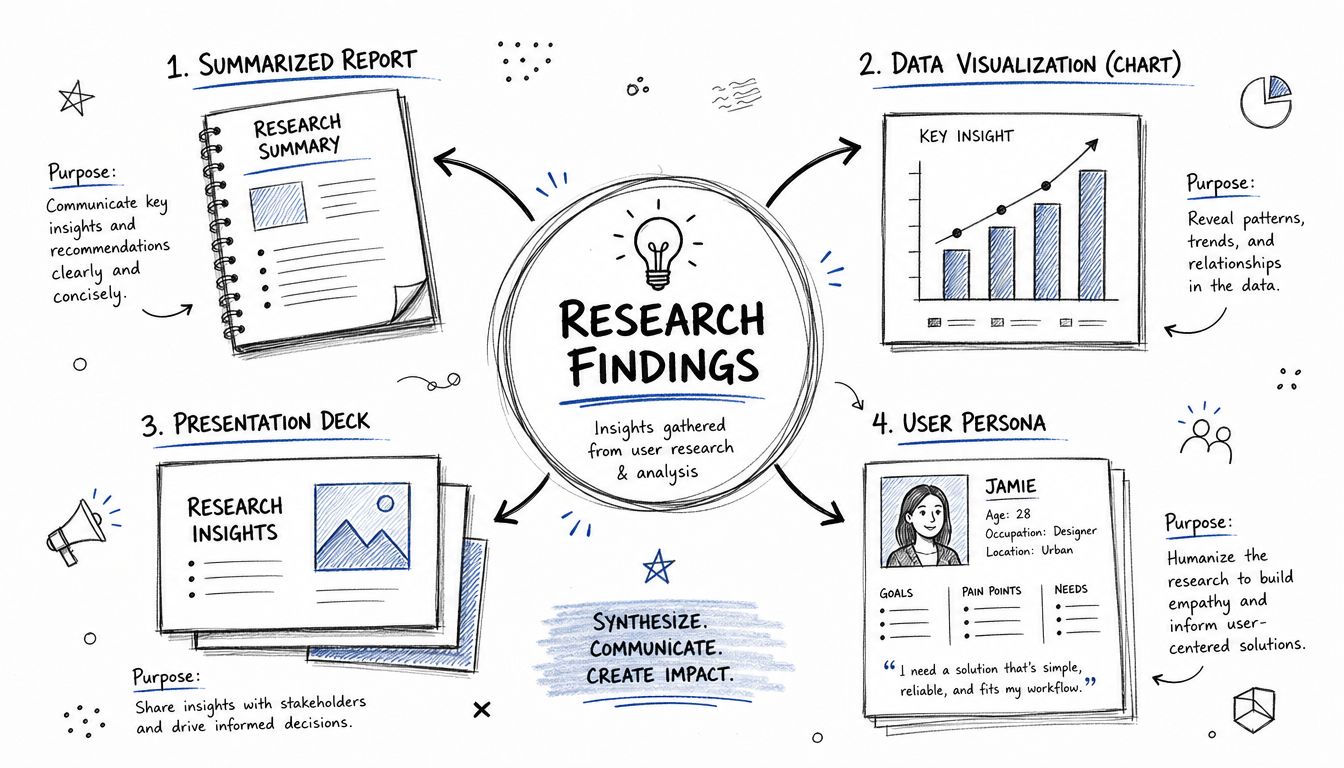
Research creates value when teams can see the pattern, not just read the raw notes. That's where artifacts matter. They turn scattered observations into shared understanding that product, design, and leadership can act on.
Personas
A persona is an archetypal representation of a user group. A good persona doesn't read like fiction. It captures the behaviors, motivations, constraints, and expectations that are relevant to product decisions.
Weak personas usually fail in one of two ways. They become too generic, or they become overly biographical. Teams don't need a favorite coffee order. They need to know what this user is trying to get done, what makes them hesitate, and what they already understand before they arrive.
A practical persona should help answer:
What does this user care about right now
What do they assume will happen in the interface
What kinds of language, risk, or complexity will slow them down
Heatmaps
A heatmap visualizes where users click, tap, or focus their attention. It's useful because it compresses a lot of behavioral data into one view. You can spot attraction points, dead zones, and misleading UI signals without rewatching every interaction.
In traditional workflows, building these artifacts can become a manual burden. Researchers export logs, sort notes, tag behaviors, and then assemble a presentation layer afterward. That analysis work is real, but it's also where many teams lose time.
A strong artifact doesn't just summarize the study. It helps the next stakeholder understand what to change.
Modern platforms change that by generating visual outputs directly from the test activity. When heatmaps, transcripts, and issue summaries are produced as part of the workflow, researchers spend less time packaging evidence and more time interpreting what it means for the product.
Measuring the User Experience with Key Metrics
What does a usability score prove?
Teams often treat metrics as the answer when they are only part of the evidence. A clean number can make a review feel settled, even when the study design was loose enough to produce misleading confidence.
The practical job of UX metrics is narrower. They help teams compare experiences, track changes over time, and spot where a product needs closer inspection. They do not fix weak task design, vague success criteria, or poor participant targeting.
Common metrics and their blind spots
Task Success Rate is the metric product teams ask for first because it ties directly to behavior. Did participants complete the task or not? That sounds objective, but the result only holds up if the task, endpoint, and allowed path were defined clearly before the test started.
I see this issue often in checkout, onboarding, and account recovery studies. A participant reaches a screen that looks like progress, the observer marks the task as complete, and the team logs a win. Later, support volume or funnel data shows the flow still breaks in production. The metric was not useless. The study framed success too loosely.
Two other metrics show up in nearly every research stack:
SUS: Measures perceived usability through a standardized questionnaire.
NPS: Measures willingness to recommend, which is usually more useful for brand sentiment or relationship strength than interface diagnosis.
Task Success Rate: Measures whether users completed a defined goal in the test.
Each metric answers a different question. Problems start when teams use one metric to answer all of them.
A low SUS score may point to friction, but it will not tell you where the interaction broke. A high task success rate can hide hesitation, workarounds, or mistrust. NPS can move for reasons that have little to do with the screen you just tested.
Research quality affects metric quality
The stronger question is not which metric to use first. It is whether the test setup deserves trust.
That is where modern UX operations have changed. In a traditional workflow, teams collect task outcomes, survey responses, and recordings, then spend hours reconstructing whether the study was well scoped. Uxia brings that quality check closer to the start of the process by structuring missions, participant fit, and evidence capture inside the testing workflow itself.
At Uxia, that shift matters more than adding one more dashboard metric. A study can produce strong-looking completion data and still lead the team in the wrong direction if the task prompt was broad, the participant pool was off target, or the scenario skipped real constraints. AI helps here by surfacing inconsistencies faster, but the principle is still classic research practice. Better setup produces better interpretation.
For teams benchmarking usability perception, Uxia's guide to the System Usability Score and its alternatives is a useful reference for choosing the right scoring method.
What to standardize before looking at results
Before any metric goes into a report or dashboard, define four things:
Success criteria: The exact outcome that counts as completion.
Audience definition: The user group the result is meant to represent.
Mission wording: The precise task language shown to participants.
Scenario boundaries: The context included in the test, and actual constraints left out.
These decisions shape the meaning of every number that follows.
In practice, AI-supported research platforms earn their place. Uxia does not replace established UX metrics. It makes them more usable by tightening setup, generating cleaner evidence, and reducing the manual work required to interpret what a score means. That is the essential upgrade in modern research. Faster reporting helps, but better research confidence helps more.
Understanding and Mitigating Research Bias
Bias doesn't only show up in analysis. It often enters during setup, facilitation, and participant definition. By the time a team notices it in the findings, the damage is already baked in.
Two common failures
Confirmation bias appears when researchers look for evidence that supports a preferred conclusion. This can happen in note-taking, in playback selection, or even in how a mission is phrased. If the task nudges users toward a desired path, the test stops being diagnostic.
Sampling bias appears when the people or profiles in the study don't represent the users the product serves. In UX, this often hides behind loose audience labels like “general consumers” or “digital natives.”
There's an added complication with underserved groups. The NIHR-INCLUDE project shows no universal definition exists for underserved research groups, and underserved status depends on population, condition, and intervention. It also found that only 13% of researchers feel equipped to meet underserved needs, which helps explain why one-size-fits-all definitions keep excluding important users, as discussed in Clinical Leader's summary of the NIHR-INCLUDE project.
What better bias control looks like
Bias mitigation starts with structure:
Tighten audience definitions: Don't rely on broad labels when behavior or context matters more.
Separate task from context: A vague mission invites interpretation bias.
Keep execution consistent: Variation in facilitation can create variation in findings.
Structured, automated systems help because they reduce some human-introduced inconsistencies. Synthetic testers don't try to please the moderator, don't arrive with hidden recruiting incentives, and don't drift off brief because of session dynamics. That doesn't eliminate all bias. It does remove several common sources of noise.
Bias reduction isn't about pretending objectivity is perfect. It's about removing avoidable distortions before they shape the findings.
Build with Confidence Using an AI-Powered Workflow
Mastering key research terms is what makes fast research trustworthy instead of chaotic. A key advantage of an AI-powered workflow isn't just speed. It's consistency. When teams define the Audience, separate the Mission from the Scenario, and launch unmoderated tests with those terms locked in, the resulting feedback becomes easier to trust and easier to act on.
A practical workflow is simple. Define who the test is for. Write the exact task. Add the context that shapes the decision. Launch the study. Review think-aloud output, visual behavior patterns, and prioritized issues. Then revise the design and run the next round while the question is still fresh.
What teams should do next
If you want better research next sprint, don't start by buying a bigger dashboard. Start by tightening the language in your test setup.
Use this checklist:
Rewrite broad tasks into missions: Make the action specific and observable.
Move background detail into the scenario: Keep context, remove task ambiguity.
Define audience with real constraints: Include relevant behaviors, not just demographics.
Review outputs against setup quality: Trust findings in proportion to the clarity of the brief.
That's also where modern tooling earns its place. A platform that captures feedback, visualizes behavior, and reinforces setup discipline helps teams move faster without lowering the standard.
A short product walkthrough makes that concrete:
When those core terms are handled well, teams stop arguing about what the study meant and start deciding what to change.
If you want to put these ideas into practice, try Uxia. It gives teams a faster way to define missions, audiences, and scenarios, run unmoderated UX tests with synthetic users, and turn raw feedback into usable insights without the usual recruiting and scheduling delays.