EU Accessibility Act Digital Products 2026: Get Compliant
Ensure your compliance with the EU Accessibility Act digital products 2026 deadline. Learn how to prepare digital products using testing strategies for success.

If you're shipping a website, app, checkout flow, or account experience into the EU in 2026, accessibility can't sit in a side backlog anymore. Teams that treated it as a future audit item in 2024 or early 2025 are now dealing with a different reality. Accessibility defects in live product journeys can affect release decisions, legal exposure, and whether a customer can complete a basic task.
The teams handling this well aren't doing one giant remediation push and calling it done. They're building accessibility into delivery. That means testing core journeys early, finding where users get blocked, fixing those issues inside normal sprint cycles, and validating again after changes.
One shift matters more than the rest: treat EAA readiness as a product workflow, not a last-minute compliance checklist.
The 2026 EU Accessibility Act Deadline Is Here
The deadline has already passed. The European Accessibility Act applies to e-commerce digital products and other covered consumer-facing services in the EU, and enforcement began on 28 June 2025, which means 2026 product releases and major feature changes must already meet the Act's accessibility requirements rather than being parked as future work, as noted by the European Disability Forum on the EAA entering into force.
For product teams, that changes the conversation. Accessibility isn't just design quality anymore. It's part of whether your product is fit for the EU market.
What this changes in practice
The risk isn't abstract. It sits inside the flows your team ships every sprint:
Checkout and payment flows: If a customer can't review, understand, or complete payment steps, the issue is bigger than conversion loss.
Account creation: Weak labels, vague validation, or inaccessible input states can block entry into the product entirely.
Product discovery: Search, filtering, and category navigation need to work for users navigating in different ways.
Support paths: If users can't get help or understand next steps, the compliance problem extends beyond the primary interface.
Practical rule: Start with the journeys that generate revenue, identity, or support demand. If users can't complete those, nothing else matters.
A common mistake is to ask, "How close are we to WCAG?" too early. The better first question is, "Can people complete the critical task from start to finish without confusion, loss of context, or input traps?" That framing pushes teams toward real product behavior instead of static checklist coverage.
Why one-time audits break down
One-off audits still have value. They don't solve release velocity.
A point-in-time review can identify defects, but it won't protect the next redesign, the next experiment, or the next checkout update. In 2026, the stronger model is continuous validation: test important flows before release, prioritize blockers in sprint planning, and re-test after implementation. That's how accessibility becomes part of product operations instead of a periodic panic project.
Understanding Core EAA Requirements for Products
The legal framework is broad, but product teams need a practical interpretation. The European Accessibility Act sets EU-wide accessibility requirements for products and services including websites, mobile apps, e-commerce services, computers, and self-service terminals. It was adopted as Directive (EU) 2019/882, with national rules due by 28 June 2022 and the main compliance date beginning on 28 June 2025, according to the European Commission's overview of the European Accessibility Act.
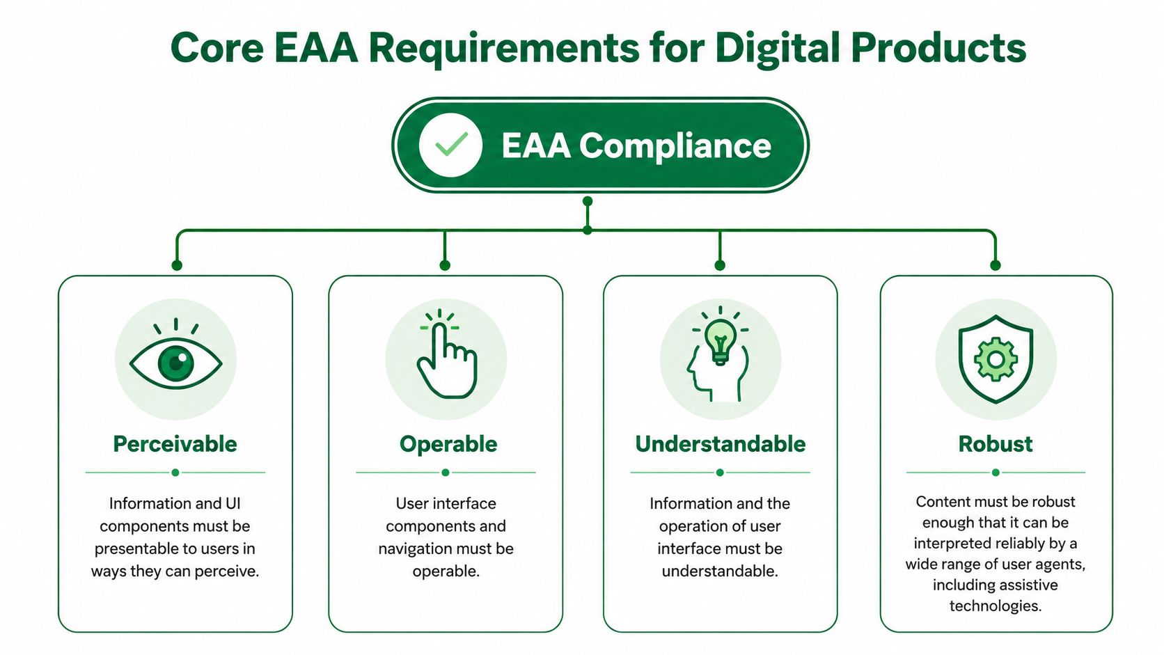
The four product questions that matter
Teams typically don't need a legal memo to get started. They need a usable lens for reviewing interfaces. The four core requirements are a strong one:
Requirement | Product question |
|---|---|
Perceivable | Can users notice and consume the information they need? |
Operable | Can they navigate and act without getting stuck? |
Understandable | Do labels, instructions, and outcomes make sense? |
Robust | Does the interface work reliably with assistive technology? |
Many audits get too technical too fast. Teams jump to code inspection before checking whether the journey itself is comprehensible.
Start with task completion, not legal language
The first requirement I would tackle in any EU Accessibility Act digital products 2026 audit is perceivability and operability across key flows. Not because the other principles matter less, but because that's where the highest-impact failures usually sit.
Look at flows such as:
Onboarding: Is the sequence clear, or does the user lose context between steps?
Navigation: Can users move through menus, filters, and content without guesswork?
Forms: Do fields have clear labels, instructions, and recoverable validation states?
Decision points: Can users compare options, understand consequences, and continue confidently?
If your team is still using an accessibility checker as the main entry point, pair it with a more journey-based review. This guide to using an accessibility web checker in 2026 is useful as a starting reference, but checkers alone won't tell you whether a user can recover from a failed payment or understand a form error.
Accessibility work gets more effective when you phrase findings as blocked tasks, not failed criteria.
That wording changes remediation quality. "Error message lacks recovery guidance" is a better product ticket than "validation state needs accessibility review."
Adopting a Persona-Based Testing Workflow
The scale of this work is one reason checklist thinking fails. Accessibility guidance commonly cites about 87 million Europeans living with a disability, and digital product compliance is typically aligned with EN 301 549 and WCAG 2.1 AA, which means teams have to test real product behavior, not just visual presentation, as summarized in these digital accessibility statistics and EAA notes for 2026.
That has a direct implication for workflow. If your testing process only answers, "Did we include the right components?" you'll miss what matters more: "Can this kind of user finish the journey?"
Why persona-based testing finds better issues
A persona-based workflow forces teams to examine the product from distinct user perspectives. Not as a branding exercise. As a testing method.
For accessibility, that means creating test conditions around how people interact with the interface:
A keyboard-first user moving through navigation, menus, and modal states
A user who depends on clear instructions during forms, setup, and recovery moments
A user facing cognitive load from dense layouts, weak hierarchy, or unclear next actions
A screen reader-dependent user journey where semantics and structure determine success
This method surfaces a category of problems many teams underestimate: issues that are both accessibility risks and usability friction. Those are usually the most valuable fixes because they improve task completion for more than one audience.
What the workflow looks like
The strong version of this process is continuous and lightweight enough to repeat:
Choose one mission per flow. Don't test "the whole app." Test account creation, checkout, or password reset.
Assign realistic user perspectives. Define how that user perceives instructions, moves through controls, and responds to errors.
Capture hesitation, not just failure. Confusion before failure is often where the best design improvements sit.
Turn findings into product language. Labels, hierarchy, focus order, error recovery, trust cues.
If your team hasn't formalized user perspectives yet, this guide to creating a user persona strategy for 2026 is a useful operational reference.
The most expensive accessibility issue is often the one nobody notices during a technical review because the flow still "works" on paper.
A form may submit. A checkout may technically complete. A support page may be reachable. None of that proves the experience is clear, operable, or resilient under real user conditions.
Designing Tests for EAA Core Task Compliance
The most defensible technical path is to align digital products with EN 301 549 and, at minimum, WCAG 2.1 AA. That matters because the standard translates accessibility into functional requirements that can be verified through testing, including keyboard operability, accessible forms, text alternatives, and correct semantic structure for screen readers. It also means validation must combine automated scans with user testing because automated tools catch only a subset of failures, as explained in Level Access's EAA compliance overview.

Test the flows that carry business risk
For EU Accessibility Act digital products 2026 work, I wouldn't begin with the homepage. I'd begin with the flows where a user must understand information, make a decision, enter data, or recover from an error.
A strong first test set usually includes:
Onboarding and sign-up: New users hit the highest instruction burden here.
Login and account recovery: Small clarity failures create hard lockouts.
Navigation and product discovery: Menus, filters, and category structures expose operability issues quickly.
Checkout or payment: These flows compress trust, comprehension, and form accuracy into one path.
Support and help journeys: Users often arrive here already under strain.
What to look for inside each mission
Don't write vague test briefs like "check accessibility." Write missions around observable user outcomes.
For example:
Flow | Test prompt | Failure signals |
|---|---|---|
Account creation | Create an account and fix any errors you encounter | unclear labels, weak validation copy, focus loss |
Checkout | Purchase one item and confirm delivery details | inaccessible payment steps, confusing hierarchy, poor error recovery |
Password reset | Recover access after entering incorrect data | vague system feedback, missing confirmation states, broken keyboard path |
The recurring defects are rarely exotic. They tend to be ordinary UI mistakes with accessibility consequences:
Unclear labels that force users to infer meaning
Instructions separated from fields so guidance disappears at the point of need
Error states that rely on color or position instead of explicit explanation
Low contrast and weak hierarchy that make scanning harder
Interactive elements that look obvious visually but break under keyboard navigation
A better way to write accessibility tickets
Raw findings like "form inaccessible" don't help a sprint team. Better tickets isolate the user problem and the likely cause.
Use this structure:
Task attempted
Observed friction
Why recovery failed
Affected principle such as perceivable or operable
Validation method for re-test
For example: user entered invalid card details, saw an error, but couldn't tell which field needed correction because the message was vague and visually detached from the input. That gives design and engineering something concrete to fix.
Accelerating Compliance with Synthetic Testing
Three days before sprint lock, the team finally tests the checkout flow with a keyboard and screen reader. The path works until payment fails. Focus lands in the wrong place, the error message is vague, and nobody can say with confidence whether the task is recoverable. That is how EAA work gets pushed into late QA and turned into a release risk.
Synthetic testing changes the timing. It gives product teams a way to check active flows during the sprint, while the design, copy, and interaction choices are still cheap to fix.

Where synthetic testing adds value
The gain is not only speed. It is repeatability and better evidence.
In practice, synthetic testers are useful for the grey area between a technical pass and a usable experience. A flow can meet a checklist item and still leave users unsure what to do next, especially after a state change, validation failure, or confirmation step. Synthetic testing exposes that hesitation in context, task by task.
I have found this especially useful on high-volume journeys where teams cannot wait for a quarterly audit. Run the same mission on a prototype, run it again on staging, then re-run it after the fix ships. That cadence turns accessibility from a one-time review into part of delivery.
Turning observed friction into action
Uxia fits this workflow in a practical way. Teams can upload a prototype or live flow, define the mission and user context, and run synthetic tests that surface friction in copy, hierarchy, trust signals, and accessibility. The useful output is the tester's reasoning. That makes it easier to isolate whether the breakdown came from the label, the field association, the recovery message, or the next action.
If you want the operating model behind this approach, this practical guide to faster UX validation with synthetic users lays it out clearly.
If a tester says "I don't know what changed" after an error appears, you've found a product issue that often slips past automated checks.
That feedback is easy to route into delivery. Design can rewrite the message and clarify hierarchy. Engineering can fix focus order, announcements, and field associations. QA can re-test the same recovery path with the same mission instead of guessing whether the issue is resolved.
A short product walkthrough helps make this workflow concrete:
A key advantage is operational. Teams can test a core task before sprint planning, fix the highest-risk problem in the next sprint, and re-run the mission after implementation. That is a better fit for EAA compliance than treating accessibility as a single audit event, because it catches regressions early and turns compliance work into steady product improvement.
Integrating Findings into Your Product Roadmap
Most accessibility programs fail at handoff. Research identifies good issues. Delivery teams acknowledge them. Then they sit in a deck, a spreadsheet, or a vague "phase two" backlog.
Accessibility work sticks when the findings enter the same planning system as any other product risk.
A sprint triage model that works
After each testing round, group issues by flow, severity, and effort. Keep the categories simple enough that product, design, and engineering all use them the same way.

A practical model looks like this:
Critical blockers: Users can't complete a task, submit a form, understand a required action, or recover from an error. Put these into the next sprint.
Medium-severity issues: The task is possible, but the interface creates confusion, hesitation, or unnecessary cognitive load. Group these into accessibility improvement or design debt tickets.
Lower-priority issues: Useful fixes that don't block completion. Track them for later iterations and bundle them intelligently.
This approach prevents two common failures. One is treating every issue as urgent. The other is downgrading everything because none of it looks catastrophic in isolation.
Track progress with product-facing metrics
The best KPIs aren't abstract compliance scores. They are signs that the journey is becoming easier to complete.
Track a mix of delivery and experience signals:
What to track | Why it matters |
|---|---|
Task completion by flow | Shows whether users can finish the journey |
Critical blockers per flow | Highlights where release risk sits |
Unresolved accessibility issues | Prevents silent backlog growth |
Error recovery success | Measures whether users can fix mistakes |
Form completion friction | Exposes unclear labels and instructions |
Priority flows tested and re-tested | Confirms validation is ongoing |
Add qualitative signals too. Where do users hesitate? Where do they rely on trial and error? Where do they misunderstand instructions?
Make re-testing part of done
A fix isn't complete when code ships. It's complete when the user can successfully execute the task that previously failed.
That means your definition of done should include:
Original issue linked to a concrete user task
Design or engineering fix documented
Re-test on the affected flow
Result captured in the same ticket or release note
Accessibility work becomes manageable when teams stop treating it as a parallel initiative and start treating it as normal product maintenance with higher consequences.
That operating model is what keeps compliance from turning into a scramble before every release.
Common EAA Compliance Pitfalls to Avoid
The first pitfall is overconfidence in automated scans. They are useful for finding certain classes of defect. They don't tell you whether a user can interpret a form error, understand a support article, or recover from a broken purchase path. Teams that rely on scanner output alone often miss the issues regulators and customers care about most: failed interaction, not just failed markup.
The second pitfall is treating compliance as a one-time event. That model was weak before enforcement. In 2026, it's risky. Every redesign, copy rewrite, component update, and checkout experiment can introduce fresh barriers into a previously reviewed flow.
The gap most teams discover late
Many guides acknowledge EN 301 549 as the presumed technical standard, but they don't spend enough time on how far accessibility extends into documentation, customer-service channels, and complaint-handling workflows. Some 2026 guidance also notes that accessible information, labeling, and even a description of how the product meets EAA requirements may be required, while national penalties can vary sharply, from six-figure fines to market removal, as outlined in this review of what EAA compliance really involves.
That point changes how mature teams approach compliance. Passing a product audit isn't the finish line if your help center, legal notices, onboarding documents, or support process still create barriers.
What doesn't work
A few patterns consistently create trouble:
Late accessibility review: Problems found after design signoff are slower and more expensive to fix.
Homepage-first audits: They create a false sense of progress while high-risk flows stay untouched.
Detached ownership: If accessibility lives only with legal, QA, or one specialist, product teams won't maintain it.
Checklist-only acceptance: Teams mark tickets done without validating whether the user journey improved.
The more defensible posture is operational, not ceremonial. Covered digital products need accessible journeys, accessible surrounding information, and a repeatable way to prove issues are being found, fixed, and checked again.
If you're trying to make accessibility part of the way your team ships, not just something you revisit under deadline pressure, Uxia is worth evaluating as part of that workflow. It gives product teams a practical way to run synthetic tests on key journeys, surface accessibility and usability friction early, and feed those findings directly into sprint planning and re-testing.