
Your Guide to Using an Accessibility Web Checker in 2026
Go beyond basic scans with this guide to using an accessibility web checker. Learn to interpret results, avoid common pitfalls, and ensure true WCAG compliance.
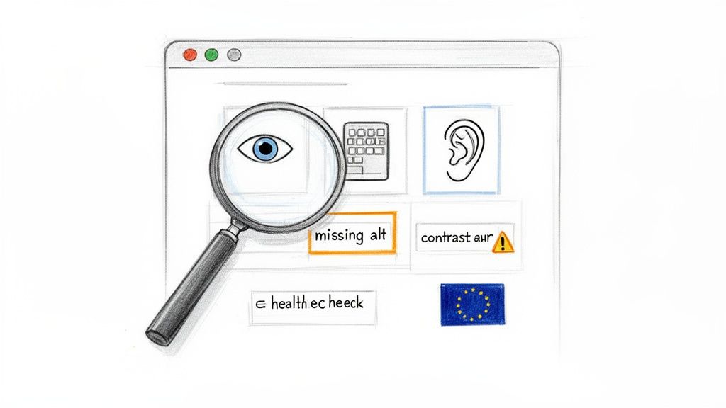
An accessibility web checker is a piece of software that automatically scans your website for problems that might block people with disabilities from using it. You can think of it as a quick health check for your site’s code, pointing out common mistakes like low-contrast text or images without descriptions. These tools are the very first step you should take to make your digital products more inclusive.
Practical Recommendation: Start by using a free browser extension checker like WAVE or Axe DevTools on your homepage. This will give you an immediate, high-level overview of common issues and provide a starting point for discussion with your team.
Why an Accessibility Web Checker Is Your First Step
Starting your accessibility journey can feel overwhelming, but a web checker gives you a clear and immediate place to begin. It works like an automated detective, running through your website and checking it against the established Web Content Accessibility Guidelines (WCAG). In just a few minutes, you get a list of technical errors that are creating barriers for your users.
These tools are fantastic for catching what we often call "low-hanging fruit"—the straightforward, code-level mistakes that are surprisingly easy to fix once you know they're there. For any product team, this initial scan delivers a baseline report card, showing you exactly how your digital product is performing from a technical accessibility standpoint. While invaluable, remember this is just a starting point. A platform like Uxia then takes you to the next level by testing the actual user experience, not just the code.
The Growing Importance of Digital Inclusion
With major regulations like the European Accessibility Act (EAA) coming into full force from 28 June 2025, digital inclusion is no longer just a "nice-to-have." It’s a legal and commercial must-do. The stakes are high, especially when you consider that an estimated 100 million EU citizens have some form of disability. If you ignore accessibility, you're not just risking non-compliance; you're shutting out a huge part of your potential audience.
The urgency here isn't just theoretical. A massive test of public sector websites in the European Union, mandated by the Web Accessibility Directive (WAD), found some pretty alarming results. Out of more than 800 detailed audits, only four websites were fully accessible. This shows a massive gap between what we want to achieve with accessibility and what's actually happening on the ground—a gap that affects millions of real people every day. You can read more about these groundbreaking findings in the EU's extensive accessibility testing report on Deque.com.
An accessibility web checker is brilliant at telling you what’s broken in your code. But it can’t tell you if the experience itself is broken for a human. That’s the critical difference.
Automated Checkers vs. Manual Audits
It's easy to get confused about what automated checkers do versus what a manual audit by a human expert covers. To clear things up, here’s a quick side-by-side comparison:
Automated Checkers vs Manual Audits at a Glance
Capability | Automated Accessibility Web Checker | Manual Accessibility Audit |
|---|---|---|
Speed | Extremely fast (minutes) | Slow (days or weeks) |
Scope | Detects 20-50% of WCAG issues | Can detect 100% of WCAG issues |
Cost | Low (many are free) | High (can cost thousands) |
Best For | Finding clear-cut technical errors (e.g., missing | Assessing nuanced issues (e.g., logical reading order, context) |
False Positives | Common (e.g., flags decorative images needing | Rare (experts can interpret context) |
When to Use | Early and often in the development process | For deep compliance checks and pre-launch validation |
This table makes it clear: automated checkers are for catching obvious, repeatable errors quickly and cheaply. Manual audits are for deep, contextual analysis that only a human can provide. You need both.
Practical Recommendation: Use automated checkers as a continuous safety net within your development pipeline, and schedule manual audits before major releases or on an annual basis to ensure comprehensive compliance. This hybrid approach offers the best of both worlds.
The Limits of Automation and the Path Forward
While an accessibility web checker is an indispensable first step, you have to understand its limits. These tools are masters at finding concrete, machine-readable errors.
Here are a few examples of what they can easily spot:
Missing alternative text: When an
<img>tag is missing itsaltattribute.Low colour contrast: When the text and its background don't meet the WCAG required 4.5:1 ratio.
Empty form labels: When an input field isn't programmatically tied to a descriptive label.
But automated checks are just the start. A checker can tell you an alt tag exists, but it can’t tell you if the description is actually useful. "Image of a chart" is not the same as "Bar chart showing a 30% increase in Q3 sales." This is where platforms like Uxia come in. By simulating how real people interact with your designs, Uxia moves beyond simple code checks to find genuine user experience problems. It helps you build products that aren't just compliant, but truly usable and enjoyable for everyone.
How an Accessibility Web Checker Works
Think of an accessibility web checker as a spellchecker, but for your website's code. It methodically scans your HTML, CSS, and JavaScript, flagging anything that breaks the rules laid out in the Web Content Accessibility Guidelines (WCAG). It's incredibly efficient at spotting clear, black-and-white technical violations.
But just like a spellchecker knows a word is spelled right but can't tell you used "their" instead of "there," these tools don't understand context. An accessibility checker can tell you a technical rule is broken, but it has zero insight into the human experience behind that rule. It’s a fantastic first line of defence, but it can’t see the whole picture.
This is a critical distinction for product managers and designers. A report from a checker isn’t a bug list; it's a set of clues. Your job is to translate those technical flags into real-world design and development tasks that make a tangible difference for your users.
Finding and Fixing Common Contrast Errors
Poor colour contrast is one of the most common issues an accessibility checker will find. This happens when text is hard to read against its background, creating a major hurdle for users with low vision or colour blindness. In fact, around 2.2 billion people globally have a visual impairment that can impact how they see colour.
The WCAG Level AA standard—what most organisations aim for—demands a contrast ratio of at least 4.5:1 for normal text. A checker automates this by measuring the colour values of your text and its background, instantly telling you if you meet that threshold.
Practical Recommendation: Instead of fixing colours ad-hoc, define a compliant colour palette in your design system. This ensures that any new component or page automatically adheres to contrast standards, preventing future issues.
To learn more about the different tools available for these kinds of tests, you might be interested in our guide on WCAG checker tools.
Correcting Missing Image Descriptions
Images make for a rich experience, but for someone using a screen reader, an image without a description is a complete blank. Accessibility checkers are excellent at catching <img> tags that are missing their alternative text (alt text) attribute.
The real purpose of alt text is to convey the same meaning or function as the image. A checker can confirm the attribute is present, but only a human can judge if the description is actually useful. This is where platforms like Uxia provide deeper value by testing the experience of the content, not just its code.
Practical Recommendation: For decorative images that add no informational value, use an empty alt attribute (
alt=""). This tells screen readers to ignore the image, reducing unnecessary "noise" for the user. For functional images like icons, the alt text should describe the action (e.g.,alt="Search").
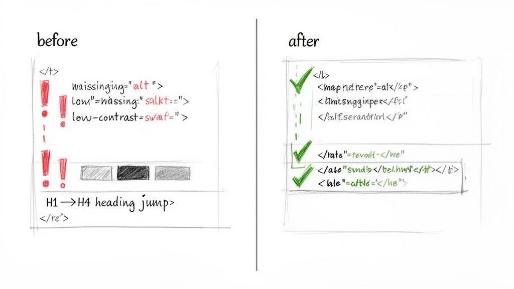
Uncovering Form and Heading Structure Issues
A clear, logical structure is everything for navigation, especially for users relying on assistive technologies. Checkers are brilliant at spotting two big structural problems: forms with missing labels and illogical heading hierarchies.
Every form input needs a <label> that is programmatically tied to it. This is how a screen reader knows what to announce for each field. Similarly, jumping from an <h1> to an <h4> makes no sense to a screen reader user who navigates by headings; it's like skipping chapters in a book.
Practical Recommendation: Use a single
<h1>per page for the main title. Then, use<h2>for major sections and<h3>for subsections within them. Never skip heading levels. This simple discipline makes your content instantly navigable for assistive technology users.
By understanding what an accessibility web checker excels at, your team can quickly knock out these foundational issues and get on the path to building a truly inclusive product.
What Automated Checkers Will Always Miss
Getting a clean "pass" from an accessibility checker feels like a win, but it's a dangerously misleading one. It creates a false sense of security because these tools can only flag a fraction of what makes a website truly accessible for everyone.
The reality? Automated checkers can only test for roughly 30-40% of all WCAG success criteria, leaving massive, critical gaps in your evaluation.
This is perhaps the most important lesson for any product team to learn. An automated scan checks for technical rule violations, not for a good human experience. It can tell you if your code follows certain machine-readable standards, but it has zero understanding of context, nuance, or basic usability. The real issues often lie in the user journey, which is why platforms like Uxia are essential for uncovering experience-based barriers.
The biggest danger lies in what these tools don't see—the issues known as false negatives. These are the real, experience-breaking barriers that an automated checker will happily ignore while giving your site a clean bill of health.
The Gap Between Code and Context
The core limitation of any automated checker is its inability to understand meaning. It runs on simple, binary logic: a rule is either met or it isn't. It can't judge the quality or appropriateness of your content, which is where many of the most severe accessibility barriers hide.
A perfect example is alternative text for images. A checker can confirm an <img> tag has an alt attribute. Pass! But it can't tell you if that text is meaningful or completely useless.
Useless Alt Text:
alt="image.png"oralt="chart"Meaningful Alt Text:
alt="A diverse team collaborating around a whiteboard, brainstorming ideas on sticky notes."
For someone using a screen reader, the first example is just noise. The second delivers the full context and purpose of the image. The checker sees both as equally valid, completely missing a critical accessibility failure.
The Flawed Logic of Navigation Order
Another classic failure point for automated tools is keyboard navigation. A checker can confirm that keyboard focus is visible and that interactive elements are reachable. What it absolutely cannot do is figure out if the focus order is logical or completely maddening for a user.
Imagine a user tabbing through your header. A logical path would be: Logo -> Nav Item 1 -> Nav Item 2 -> Search -> Login. But thanks to the way the page is coded, the focus might jump erratically from the logo to the login button, then back to the search bar.
A checker can verify the presence of a keyboard focus indicator, but it cannot assess the logic of the navigation path. For a keyboard-only user, an illogical focus order can make a site completely unusable, trapping them in confusing loops or forcing them to tab through dozens of irrelevant elements.
This disconnect between technical ticks and real-world usability highlights a worrying trend. A recent European survey revealed that while 62% of organisations now see digital accessibility as a top priority, a startlingly low 21% claim their websites actually meet WCAG 2.1 standards. Even more telling, over half didn't know their compliance status at all.
This data, which you can dig into in the full European accessibility standards survey on thiis.co.uk, shows just how big the gap is between good intentions and real-world results. It's a clear signal that we need to move beyond simple checkers.
To give you a clearer picture of these blind spots, here are some of the most common and critical issues that automated tools almost always miss.
Common False Negatives in Automated Accessibility Testing
This table highlights critical accessibility issues that automated checkers often miss, showing why manual and user-centric testing is essential.
Accessibility Barrier | Why Automated Checkers Miss It | Real-World Impact |
|---|---|---|
Illogical Focus Order | Tools can see if elements are focusable, but not if the tab sequence makes sense. They don't understand layout or user intent. | A keyboard user gets trapped in navigation loops or has to tab through dozens of unrelated elements to reach their goal. |
Unclear Link Text | Checkers can't understand context. "Click here" or "Read more" passes the technical check but fails the usability test. | A screen reader user hears a list of generic phrases and has no idea where any of the links will take them. |
Poor Colour Contrast on Text Over Images | The tool can't analyse the contrast between text and the specific part of the background image it sits on, especially if it's a complex photo. | A person with low vision can't read hero text or calls-to-action placed over a busy background image. |
Confusing or Unannounced Error Messages | A checker might see that an error message exists in the DOM, but it can't tell if it's announced by a screen reader at the right time or if it clearly explains how to fix the error. | A user makes a mistake in a form but receives no feedback, leaving them stuck and unable to proceed. |
Inaccessible Custom Widgets (e.g., Date Pickers) | These are built with | A keyboard or screen reader user cannot select a date, making it impossible to book a flight or schedule an appointment. |
Content Hidden Off-Screen | Content positioned with CSS outside the visible viewport is technically still on the page. A screen reader may read it, but a sighted keyboard user can't see the focus. | A keyboard user's focus "disappears" into an invisible element, leaving them disoriented and unable to navigate further. |
These are not minor bugs; they are fundamental barriers that can prevent someone from using your product entirely. Relying solely on automated scans means you're leaving these critical issues undiscovered.
Why Complex Experiences Break Automated Tools
The more interactive and dynamic your user interface, the less reliable an automated checker becomes. Think about these common digital experiences—they are almost impossible for an automated tool to evaluate properly.
Interactive Data Tables: A checker might see the table has headers (
<th>), but it can't tell you if a screen reader correctly announces the column and row for each cell as a user navigates it.Complex Forms: It can see if a field has a label, but it can't judge if error messages are clear, helpful, and announced at the exact moment they're needed.
Interactive Charts and Graphs: A checker has no way of knowing if the data shown visually in a chart is also available in an accessible format for people who can't see it.
These scenarios demand human judgment and experience-based testing. This is exactly why platforms like Uxia are so powerful. Uxia’s synthetic testers can simulate how a person using a screen reader would actually try to get through your checkout flow or make sense of your data visualisations.
By focusing on the human journey, synthetic testing uncovers the frustrating, experience-based barriers that automated scans are guaranteed to miss, letting you fix the problems that truly matter.
A Practical Workflow for Using Checkers Effectively
Knowing an accessibility web checker’s limits is one thing, but building a process that actually accounts for them is a whole different ball game. An effective workflow doesn't just run scans; it weaves accessibility thinking into every single stage of product development. The aim is to shift from reactive fire-fighting to proactive, inclusive design from the start.
This involves a battle-tested, three-stage approach. It's designed to help you catch the easy wins early, keep an eye on your site's overall health, and, most importantly, validate the real human experience. By following this playbook, your team can use checkers to their full potential without grinding your sprints to a halt.
Stage 1: Catch Low-Hanging Fruit Early and Often
The first stage is all about speed and education. Use a browser-extension accessibility web checker during your day-to-day development and design reviews. This lets you spot and fix the obvious stuff—like contrast errors or missing form labels—in real-time, right as you're building.
For developers, plugging an accessibility web checker into your Continuous Integration/Continuous Deployment (CI/CD) pipeline is a game-changer. It automates the scan, catching basic WCAG violations before a line of problematic code even gets merged. Think of it as an always-on guardrail, stopping simple mistakes from ever making it to production.
Practical Recommendation: Install a free checker extension like Axe DevTools in your browser. Make it a team-wide habit to run it on any new component or page before a pull request is submitted.
Team Impact: This simple practice helps educate your entire team by making accessibility a visible, daily part of their workflow, not some task tacked on at the end.
This first step ensures all the easy-to-find technical issues are handled immediately. That frees up your team's brainpower to focus on the more complex challenges down the line.
Stage 2: Monitor Overall Health and Prevent Regressions
Once you have a process for catching issues during development, the next stage is to zoom out and look at the big picture. Schedule regular, automated full-site scans to track your website’s overall accessibility health. A weekly or bi-weekly cadence usually works well.
These scans are absolutely essential for catching regressions—those annoying accessibility bugs that creep back in after you’ve already fixed them. A full-site report gives you a high-level view of your progress and shines a light on any new problem areas that have popped up as your site evolves.
Think of it like a regular health check-up. The daily spot-checks catch immediate problems, while the scheduled full-site scans give you the data to track long-term health and make sure you're consistently moving in the right direction.
This consistent monitoring creates accountability and provides valuable metrics for your team. You can set clear goals, like reducing the number of critical errors by 10% each month, and actually track your performance over time.
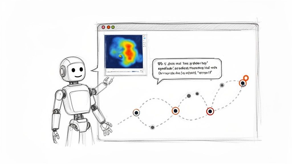
This infographic shows the fundamental gap between automated checks and the human insight needed for true accessibility.
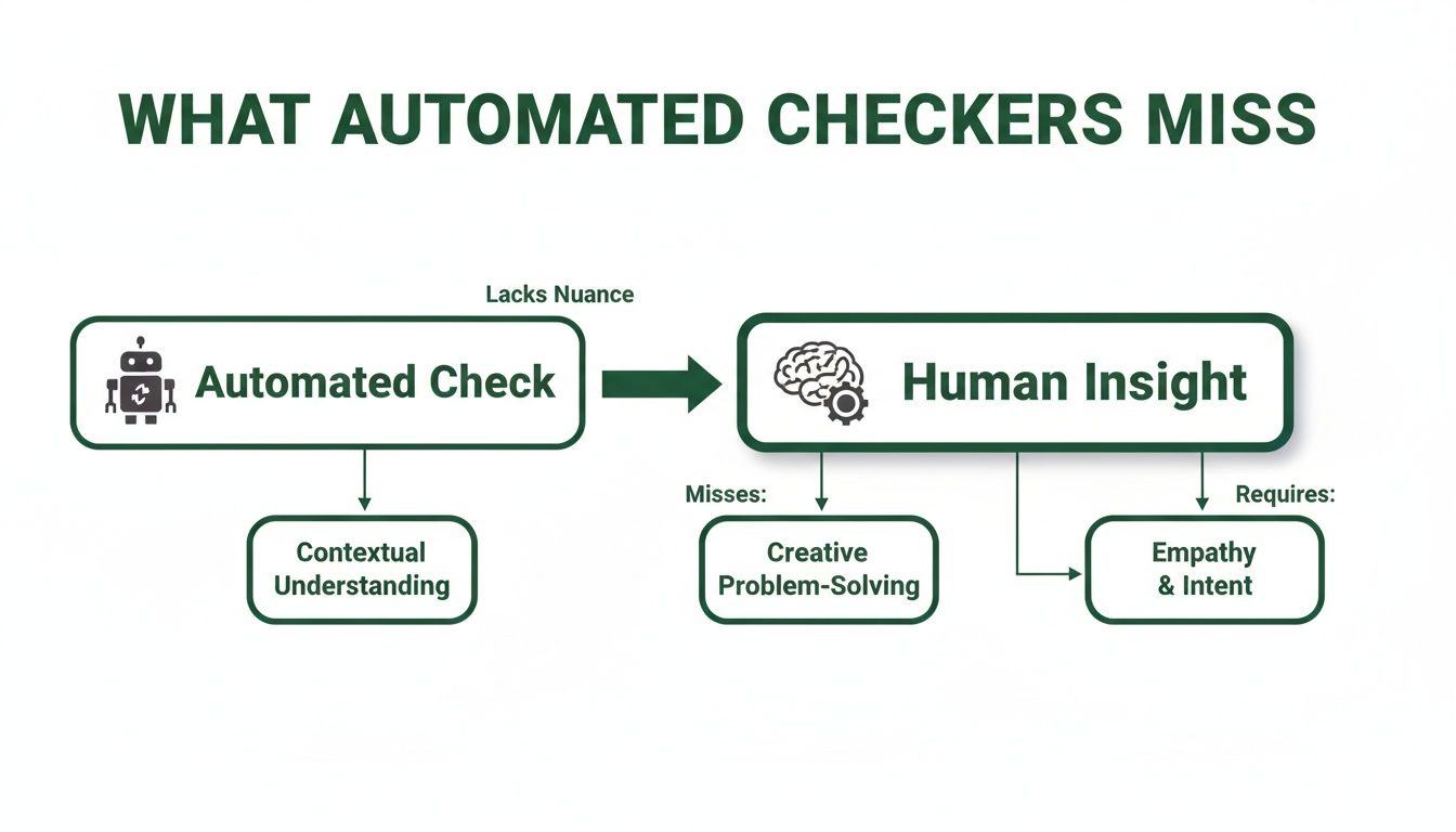
The visualisation makes it clear: while machines are great at finding technical rule violations, they can't tell you anything about the quality or usability of the experience itself.
Stage 3: Validate the Human Experience
The final and most crucial stage is to go beyond the code and validate the actual user experience. This is where you fill the gaps that all automated checkers leave behind. It means pairing your automated scans with experience-focused validation, and this is where a platform like Uxia becomes incredibly powerful.
Instead of waiting until your product is fully coded, you can upload design prototypes or mockups directly to Uxia. The platform then deploys synthetic users—AI agents programmed to mimic human behaviour and assistive tech use—to interact with your designs.
This approach finds the nuanced, journey-based issues that a simple accessibility web checker could never catch. For example, a synthetic user can verbalise their confusion when a button’s label doesn’t match its function or when the navigation flow is illogical. This gives you profound insights into real-world usability barriers.
By testing the experience long before you write a single line of code, you save your team from expensive rework and stressful, last-minute scrambles. You can learn more about this approach by exploring our deeper guide on the different types of accessibility testing. This workflow transforms accessibility from a technical checklist into a core part of creating excellent user experiences for everyone.
Go Beyond Checkers with AI-Powered UX Testing
Let's be clear: accessibility web checkers are a fantastic first line of defence. They catch obvious technical errors in your code. But the future of accessibility isn't just about passing a technical audit; it's about deeply understanding the real human experience behind the screen.
To build truly inclusive products, you have to go deeper. This is where the next evolution of testing comes in, led by AI-driven platforms like Uxia. These tools move beyond the simple yes/no logic of a checker to simulate and analyse actual user journeys. It’s a crucial shift in thinking: a checker validates your code, while a platform like Uxia validates the experience.
The Difference Between Validation and Experience
Imagine you’re testing a checkout process. A standard accessibility web checker will confirm that your form fields all have labels and your buttons exist. Great. It gives you a technical pass.
But what if a user with low vision tries to check out? A platform like Uxia can simulate that journey. It might show you that this user gets stuck because an icon is too abstract, a button doesn't properly announce its function to a screen reader, or the tab order sends them on a frustrating loop around the page.
Suddenly, you're not just looking at a list of technical errors. You're capturing the "why" behind the friction. This is exactly the kind of insight needed as we head towards new regulations.
The European Accessibility Act (EAA), for example, becomes effective from 28 June 2025. While a recent survey found 86% of European professionals say their company has accessibility policies, a worrying 55% aren't actively preparing for the EAA's strict demands. The bar is being raised from technical compliance to genuine usability.
Rich Reports That Tell a Human Story
Instead of just getting a list of WCAG failures, AI-powered testing delivers rich, qualitative data that tells a story. This is the kind of insight that, until now, was only available through slow and expensive human user studies.
These reports often include things like:
User Transcripts: Get a "think-aloud" style narrative from a synthetic user as they interact with your design, telling you exactly where they get confused or what works well.
Interaction Heatmaps: See precisely where users click, hesitate, or get stuck. These visuals instantly highlight the parts of your interface causing friction.
Prioritised Insights: Receive automatically generated summaries that connect user behaviour to specific accessibility and usability issues, all ranked by severity.
With synthetic user testing, you get the human insight of a user study combined with the speed and scale of automation. It’s about understanding the journey, not just inspecting the parts.
This approach gives you unbiased, actionable feedback in minutes, not weeks. It's a game-changer when combined with other modern tools. For example, platforms offering features like Medial V9's AI auto-captioning features can dramatically improve how users experience your video content, and synthetic testing can validate its effectiveness.
Empowering Fast-Moving Teams
For product managers and designers working in fast-paced environments, this speed is a superpower. The old way—recruiting, scheduling, and running human user tests for every design tweak—is just too slow. It creates a bottleneck that often leads to accessibility being skipped or addressed way too late in the game.
With a platform like Uxia, teams can test every single design change. Upload a new prototype, deploy a synthetic user with specific accessibility needs, and get a full report back before your next daily stand-up.
This creates a continuous validation loop. You’re not just checking for compliance at the end; you’re building an inclusive experience from the very first wireframe. It makes accessibility testing practical for teams of any size, empowering every designer and developer to build with empathy and confidence.
To see how this works in practice, you can learn more about how synthetic user testing delivers rapid UX insights.
Building Genuinely Inclusive Digital Products
Let's bring it all together. An accessibility web checker is a vital part of your toolkit, but it's not a silver bullet. You can't achieve true digital inclusion just by ticking boxes on a compliance report.
Genuine inclusivity comes from something deeper—a cultural shift. It’s about a company-wide commitment to understanding and designing for diverse human needs right from the start. This means moving beyond just reacting to code scans and building a proactive, multi-layered strategy instead.
The most effective teams I've seen create a workflow that combines the best of all worlds. They build a powerful system of checks and balances that drives real, tangible inclusivity.
The Ideal Accessibility Workflow
So, how do you build products that are genuinely a joy for everyone to use? It’s about creating an integrated process that empowers your entire team. A solid workflow ensures you cover all your bases, from the technical code right through to the subtle nuances of human experience.
I've found the best process involves three key layers of validation:
Constant Automated Monitoring: This is your first line of defence. Integrate an accessibility web checker directly into your development pipeline. It will continuously catch low-level, code-based errors, acting as a constant safety net.
Targeted Manual Audits: On top of that, you need to periodically perform focused manual checks. These are especially critical for complex user flows like a checkout process or a multi-step sign-up form. A human auditor adds crucial context that automated tools will always miss.
Early Experience Testing: This is the most important—and often overlooked—layer. Test the actual human experience early and often. Platforms like Uxia let you deploy synthetic users on your earliest design prototypes. This uncovers usability and accessibility friction long before a single line of code is written.
When you combine the speed of automated checkers, the context from manual reviews, and the deep experiential insights from a platform like Uxia, you get to move beyond a simple pass/fail mindset.
The ultimate goal is to create products that feel intuitive and empowering to everyone, regardless of their abilities. This isn't just about avoiding legal trouble; it’s about building a brand known for inclusivity and unlocking new markets.
To truly get there, your team needs to internalise the principles of accessible design. Moving beyond basic compliance and building genuinely inclusive products requires a deeper understanding, and a great resource for this is the guide on Mastering Accessibility Website Design for Enterprise Platforms.
The takeaway here is incredibly empowering. By combining smart tools with a user-first mindset, you transform accessibility from a last-minute hurdle into a core part of how you innovate. This approach doesn't just meet standards—it creates better, more usable products for all.
Frequently Asked Questions
As you start to get the hang of what accessibility web checkers do, a few common questions always pop up. It's one thing to understand the theory, but putting it into practice is where things get interesting. Let's clear up a few final points so you and your team can move forward with confidence.
How Often Should I Use an Accessibility Web Checker?
Consistency is everything. For best results, you need to weave accessibility web checkers directly into your development workflow.
Practical Recommendation for Developers: Integrate a linter like
axe-coreinto your CI/CD pipeline. This automates scans on every code commit, preventing basic accessibility errors from ever reaching production.Practical Recommendation for Teams: Schedule automated full-site scans on a weekly or bi-weekly basis. This helps you monitor overall health, track progress, and catch regressions before they become major problems.
Can I Achieve Full WCAG Compliance with Just an Automated Checker?
No, and it's absolutely critical to understand this. An automated accessibility web checker can only reliably catch around 30-40% of all potential WCAG issues. Why? Because they can't grasp context or what makes a user experience genuinely usable. They are fantastic for spotting clear-cut technical problems, but they'll miss all the nuanced, human-centred issues.
Practical Recommendation: Achieve full compliance by using a layered approach. Combine automated scans with manual keyboard-only navigation tests and screen reader checks on key user journeys. Then, use a platform like Uxia to test the real-world experience and close the remaining gaps.
What Is the Difference Between a Checker and a Platform Like Uxia?
The difference comes down to what they're built to evaluate: code versus experience. A standard accessibility web checker scans your site’s code, checking it against a predefined list of WCAG rules. Its output is a list of technical errors, like a missing image attribute or a colour contrast failure.
A platform like Uxia, on the other hand, simulates actual human interaction to test the real user experience. It doesn't just find technical errors; it identifies usability friction, confusing navigation, and trust issues that a real person with a disability would run into. Uxia gives you much richer, more actionable insights because it shows you why an experience feels broken, not just that a technical rule was violated.
Where Is the Best Place to Start if My Team Is New to Accessibility?
The best way to begin is to take a small, manageable first step. Don’t try to boil the ocean. Run a free accessibility web checker on your most important pages—like your homepage or checkout flow—to find the "low-hanging fruit." Use the report it gives you as a conversation starter and an educational tool for the team.
Practical Recommendation: After your initial scan, host a 30-minute meeting with designers and developers to review the top 3-5 issues. Assign owners to fix them. This small win builds momentum and demonstrates that accessibility is a shared responsibility. From there, you can explore experience-focused tools like Uxia to build a sustainable practice.
Ready to go beyond basic checkers and test the real user experience? Uxia’s AI-powered platform delivers deep, actionable insights in minutes, not weeks. Get started with Uxia today and build products your users will love.