Effective Comparison Testing with AI: Your 2026 Guide
Learn to run effective comparison testing. Our guide covers planning, metrics, analysis, & AI testers like Uxia for actionable results in minutes.

You have two strong design options on the screen, a deadline at the end of the sprint, and a room full of opinions. Product wants the version that explains value more clearly. Design prefers the cleaner interaction pattern. Engineering wants the path with fewer edge cases. Everyone has a reason. Nobody has evidence.
That's where comparison testing earns its keep.
Used well, comparison testing turns a design debate into a controlled decision. You give people the same task, hold the context steady, and compare how each version performs. The problem is that traditional comparison studies are slow enough that many teams save them for the end of a project, when changing direction is expensive.
That timing is backwards. Design comparisons are most valuable when the work is still fluid.
AI-based testing changes the cadence. Instead of treating comparison testing as a final checkpoint after recruiting, scheduling, moderation, and manual synthesis, teams can run it during exploration. That shift matters because better product decisions usually come from faster feedback loops, not bigger meetings.
Why Most Design Debates Go Nowhere
Most design debates stall because teams aren't arguing about the same thing. One person is optimizing for clarity. Another is protecting brand expression. Someone else is reacting to a single sales call or support ticket. Without a shared test structure, “better” becomes a moving target.
Comparison testing fixes that by forcing one question into the open: when users face the same job in the same context, which version helps them succeed more cleanly?
That sounds obvious, but many teams still evaluate variants through shallow outcome lenses. In B2B SaaS especially, much of the public advice around comparison testing overweights top-of-funnel metrics and underweights business quality. As noted in this analysis of comparison page testing for B2B SaaS positioning, teams often focus on surface-level conversion rates while ignoring downstream measures like lead quality, SQL rate, and pipeline influence. The same piece also points out that failing to segment by user intent can produce false winners that increase clicks while lowering revenue quality.
That mistake shows up in product design too. A version can create more immediate action and still produce worse user understanding, lower confidence, or more avoidable friction later in the flow.
Comparison testing only works when the team agrees on what “winning” means before the first result appears.
A lot of adjacent buying decisions have the same problem. Support teams evaluating Scalable customer support options for SaaS run into a similar trap. If they compare channels only on response speed, they miss experience quality and resolution depth. Design comparisons fail for the same reason when the scorecard is too narrow.
The practical shift is simple. Stop using comparison testing as a way to validate opinions you already hold. Use it to reduce uncertainty early, while the cost of changing the interface is still low.
Laying the Groundwork for a Fair Test
A product team has two onboarding concepts on the table by Tuesday. In a traditional workflow, that debate can sit for two weeks while recruiting starts, scripts get approved, and prototypes drift. With AI synthetic testers, the constraint shifts. The hard part is no longer speed. The hard part is test discipline.
A fair comparison starts with one controlled question. If the team changes navigation, copy, hierarchy, and task flow at the same time, the result only shows that one package performed differently from another. It does not show why.
Start with one decision, not a broad preference check
The strongest comparison studies ask a narrow question tied to a real product decision. “Which onboarding flow helps new users understand the next step faster?” works. “Which version feels better?” leaves too much room for interpretation.
That setup matters even more when you can run tests in under an hour. Fast testing is useful only if both variants are built to answer the same question under the same conditions. In Uxia, that means defining the research question first, uploading both versions, assigning the same mission, and running them side by side against the same audience definition.
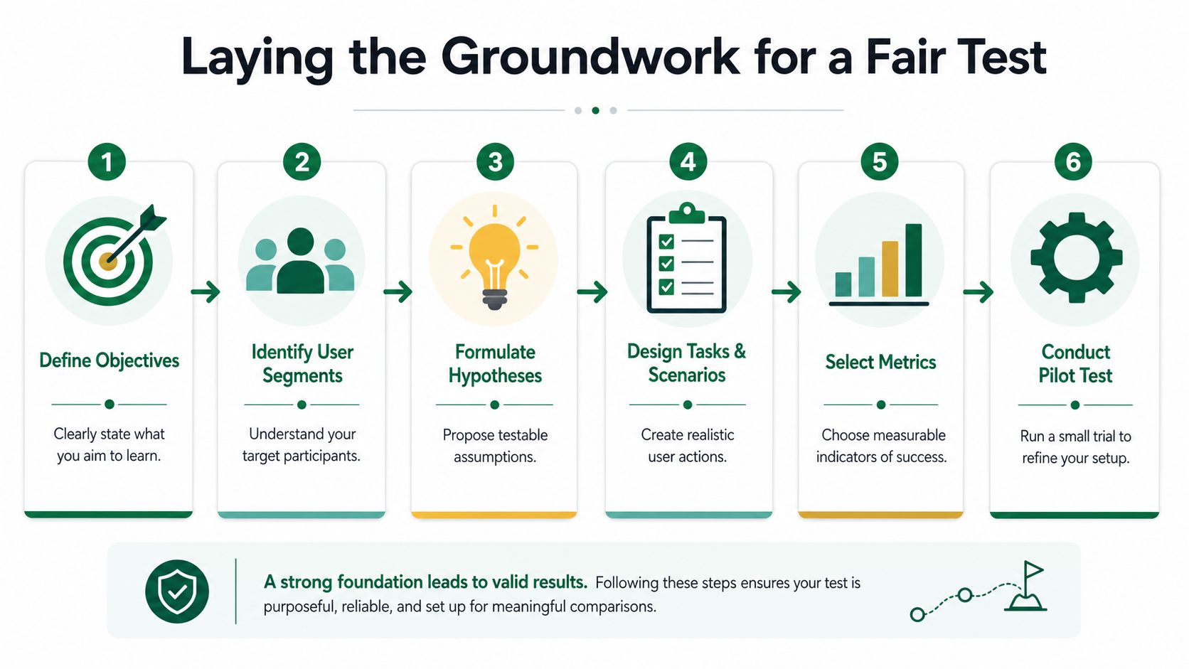
Teams that get a usable answer usually keep to three rules:
Define the decision in plain language
“Should we explain setup before asking for action?” is testable. “How should the experience feel?” is too broad to score cleanly.Keep the core journey equivalent across variants
If one version has extra steps, missing labels, or incomplete states, the comparison is biased before anyone starts. This overview of comparative usability testing makes the same point. The user's path needs to stay aligned so the design difference is the variable being tested.Use the same scenario and task wording
Small wording shifts can change what people look for, what they expect, and how patient they are with friction.
Hold the audience steady
Audience mismatch is one of the fastest ways to corrupt a comparison. If version A is reviewed by experienced admins and version B is reviewed by less technical users, the result is not a design verdict. It is a sampling problem.
This is one reason AI synthetic testing changes the comparison loop. Instead of waiting on whoever was easiest to recruit, teams can keep the participant profile consistent across both versions and rerun the same setup as the design evolves. That turns comparison testing from a late validation ritual into an ongoing design check.
For teams refining that setup, Uxia's guide to audience and sample planning for UX research is a practical reference.
A simple rule helps here. If a stakeholder asks to include “just a few other changes,” say no. Once multiple variables move together, the team loses the ability to attribute the outcome.
The same principle applies outside UX. Product teams evaluating leading AI platforms face the same fairness problem. Stable criteria and stable test conditions are what make a comparison credible.
Control order before preference gets distorted
Sequence effects can skew results even when the designs are otherwise well matched. The first version sets expectations. The second version benefits from familiarity, or suffers from it.
If participants see both variants in one study, randomize the order. Some testers should go through A then B. Others should go through B then A. If the order never changes, the team may end up measuring exposure effects instead of interface quality.
This sounds basic. It is also where many fast-moving teams cut corners. AI removes the recruiting bottleneck. It does not remove the need for clean experimental setup.
Choosing Metrics That Truly Matter
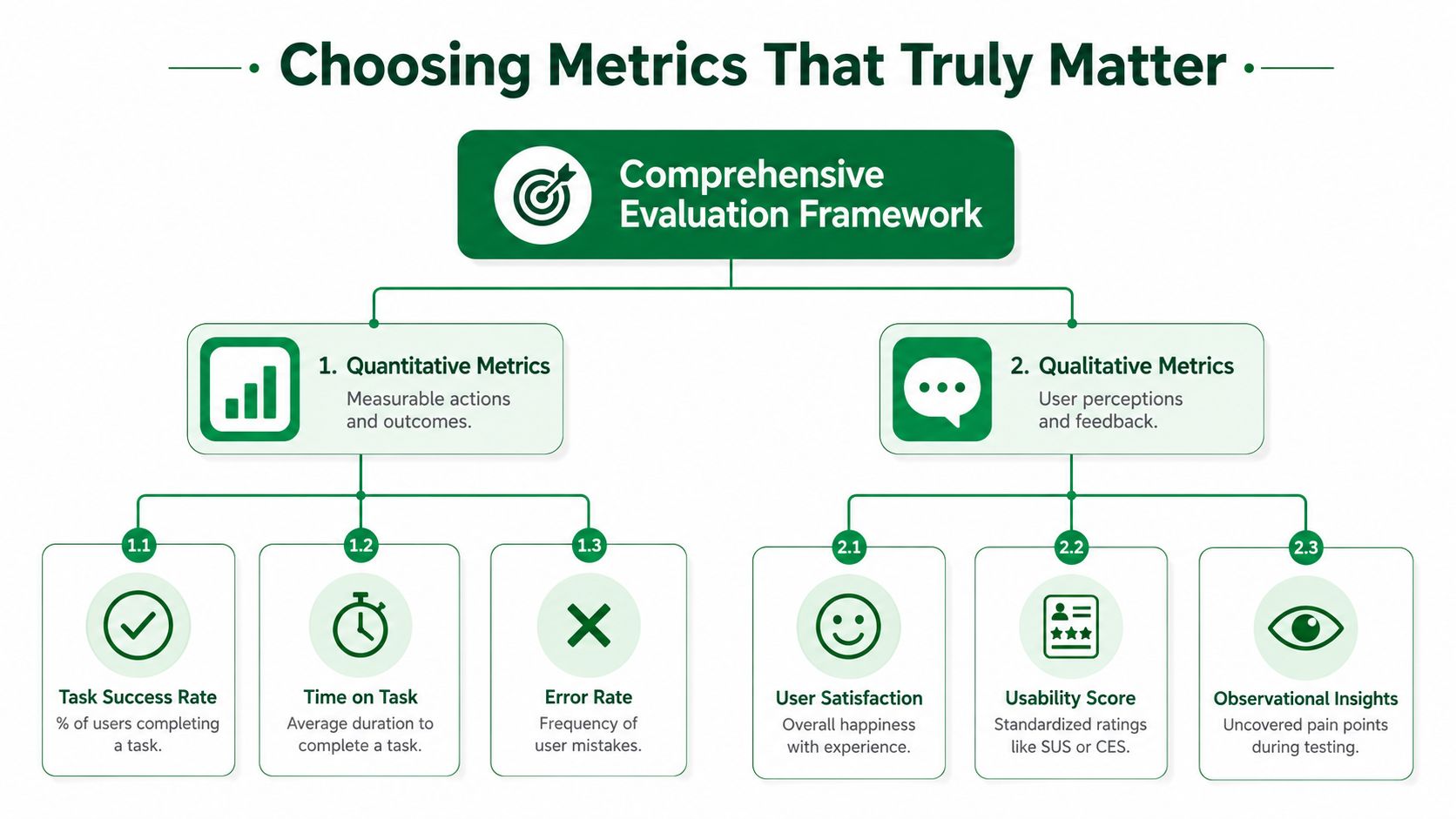
A weak scorecard creates weak decisions. If the team only compares click volume or raw completion speed, it will miss the reasons a design works or fails.
The strongest comparison testing setups combine behavioral signals with qualitative reasoning. You need both. Numbers show the shape of the outcome. User reasoning explains the cause.
The first metrics to review
When comparing two versions, I wouldn't trust a single metric to declare a winner. A practical review sequence looks like this:
What to review | What it tells you | Why it matters |
|---|---|---|
Task success | Whether users achieved the goal | Failure at the core task outweighs cosmetic improvements |
Navigation friction | Where people hesitated, backtracked, or got confused | Reveals structural problems before they become support or churn issues |
Severity of usability issues | Which version generates more serious blockers | Not all friction has the same business cost |
User confidence | Whether people sounded certain or uncertain during the task | Confidence often predicts whether the flow feels learnable |
Qualitative reasoning | Why users preferred one approach | This is often the tie-breaker when performance is close |
That's why transcript quality matters so much in AI-assisted comparison testing. Uxia's reporting captures detailed transcripts and flags issues in usability, navigation, copy, trust, and accessibility, then summarizes patterns into visual reports with metrics, heatmaps, and prioritized insights. That structure makes it easier to compare behavior and reasoning side by side.
Don't let one clean number overrule messy evidence
There's a familiar mistake in design reviews. One version completes slightly faster, so the team calls it the winner and moves on. Then you read the feedback and realize users were uncertain the entire time.
That's not a strong win. It's a fragile one.
If both versions perform similarly on task completion, qualitative evidence often decides the direction. The most useful comments aren't isolated opinions. They're recurring explanations. Users keep saying they don't know where to click next. They keep misreading the same label. They keep expressing more certainty in one version.
For teams that still lean heavily on single composite scores, it helps to understand where standardized measures fit and where they don't. Uxia's article on system usability score alternatives and trade-offs is a good reference point for that discussion.
A design that “wins” on speed but repeatedly creates uncertainty usually costs more later.
Match metrics to the decision
Not every comparison needs the same scorecard. If you're testing an onboarding flow, confidence and early comprehension may matter more than raw pace. If you're testing a high-frequency internal tool, friction reduction might outrank explanatory richness.
The point isn't to collect every metric. It's to collect the ones that can settle the actual decision in front of the team.
Running Your Test with AI Speed
Traditional comparison testing is often constrained by operations, not research quality. Recruiting takes time. Scheduling takes time. Moderation takes time. Analysis takes even more time, especially when someone has to watch recordings, pull clips, code notes, and assemble a coherent recommendation.
That's why teams postpone testing until the end. The process is too heavy to support active design iteration.
With AI-based workflows, comparison testing can happen while the sprint is still moving.
What the workflow looks like in practice
A typical design comparison can move from setup to decision in well under an hour. The setup itself usually takes only a few minutes. Most of the time goes into reviewing the synthesized findings and deciding what to do next.
That's a major operational difference from traditional studies, where recruiting participants, scheduling sessions, and manually analyzing recordings can take days or weeks.
A representative example is onboarding. One version explains product features first. The other tries to get users to their first meaningful action as quickly as possible. In practice, the faster, action-oriented path often performs better because users spend less time deciphering the interface and reach value sooner. The qualitative feedback usually reflects that too, with more confidence and fewer navigation questions.
Why AI changes the cadence
The important shift isn't just speed for its own sake. It's what speed lets the team do.
Instead of testing one polished concept at the end, you can compare multiple directions during design. Instead of waiting for a full research cycle, you can check whether an information hierarchy change reduces hesitation. Instead of reviewing isolated recordings one by one, you can inspect synthesized themes across both variants.
One practical way to approach this is to establish a baseline with a small human sample, then run the same flow through synthetic testing and compare overlaps in issues and reasoning. That workflow is discussed in Uxia's guide to synthetic users for faster UX validation.
Teams make better product calls when comparison testing becomes part of the sprint, not a ceremony after the sprint.
There's also a quality angle here. In a direct comparison, Uxia's synthetic testing pipeline uncovered 3x more insights than a comparable human panel, including subtle technical and branding issues the human testers missed, according to Uxia's synthetic vs. human comparison study. That doesn't mean human research stops mattering. It means AI comparison testing can surface a wider field of friction quickly enough to influence live design decisions.
What to compare during the run
When the test is live, focus on differences that can change the product:
Behavior paths
Look at where users diverge. Do they follow the intended route, or invent their own?Moments of hesitation
Backtracking, pauses, and repeated scanning often reveal that the design's logic isn't visible enough.Confidence language
Statements like “I think this is right” or “I'm not sure what this means” matter. They often predict later drop-off better than speed alone.Issue clustering
One-off complaints are weaker signals than repeated patterns across usability, copy, trust, or navigation.
A quick product walkthrough makes this process easier to visualize:
Where traditional methods still fit
AI speed doesn't eliminate the need for judgment. If the design problem involves emotional nuance, sensitive domain expertise, or high-stakes behavioral interpretation, human moderation still has a place.
But for side-by-side prototype comparisons, especially when the team needs a fast answer on one interface decision, the bottleneck is rarely insight quality alone. It's the lag between question and decision. Removing that lag is what makes continuous comparison testing viable.
Analyzing Results and Making a Confident Decision
The hard part isn't collecting output. It's deciding what deserves action.
Many teams open a report, skim the top-line result, and stop too early. Better analysis moves from broad signal to specific cause. Start with whether users completed the task. Then inspect where the paths split. Then look at the reasoning behind those behaviors.
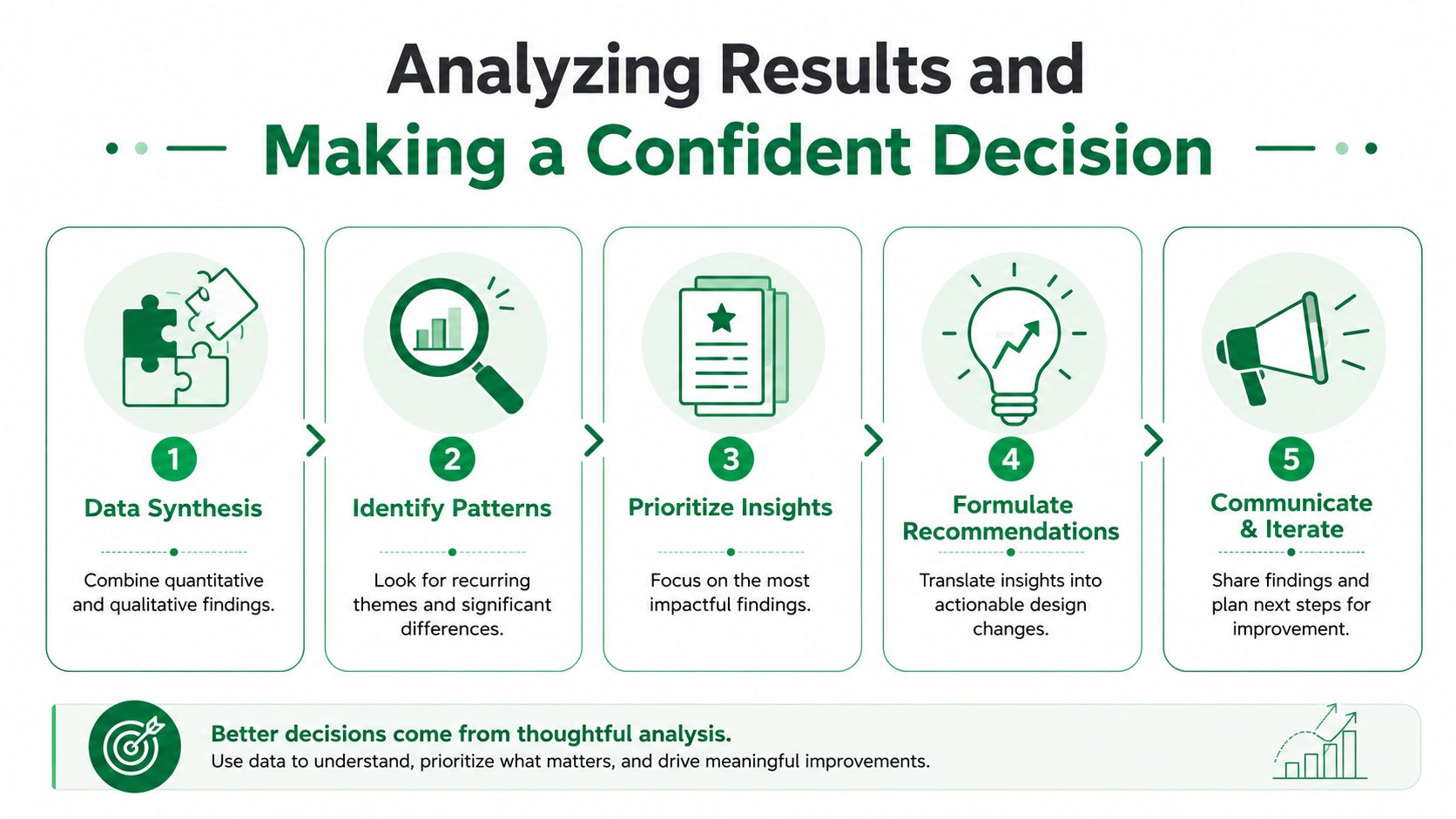
Read the result in layers
A practical analysis sequence looks like this:
Check task success first
If one version fails the core job more often, that's the first serious signal. Cosmetic strengths don't rescue a design that blocks completion.Inspect the journey, not just the endpoint
Two designs can end with the same completion outcome and still produce very different experiences. One may get users there directly. The other may rely on recovery after confusion.Review recurring friction by category
Group findings into navigation, copy, trust, accessibility, and interaction issues. This keeps the conversation focused on patterns, not anecdotes.Compare confidence and reasoning
If participants complete both tasks but speak with more certainty in one version, that often points to the stronger interface.Prioritize fixes by severity and frequency
A rare annoyance and a repeated blocker shouldn't receive the same weight.
Why pattern recognition matters more than isolated comments
Single quotes can be memorable and still be misleading. One participant may hate a label for idiosyncratic reasons. That doesn't make it a design priority.
Patterns matter more. If confusion keeps appearing at the same point in the flow, across the same task, in the same variant, that's the signal worth acting on.
Synthesis quality becomes decisive. Uxia's reporting combines navigation data with user reasoning, which is useful for tagging issues by severity and frequency and fixing the smallest number of things that remove the most friction, as described in Uxia's prototype testing guide.
The best comparison decision usually comes from a small set of repeated problems, not the longest list of comments.
Make the recommendation easy to defend
A strong recommendation doesn't just name a winner. It explains why that version wins and what should happen next.
Use a short decision format:
Decision element | What to include |
|---|---|
Winning direction | Which version moves forward, or whether both need revision |
Primary reason | The main behavioral or qualitative difference |
Critical evidence | The few strongest recurring signals |
Risk note | What still needs validation before shipping |
Next action | Revise, retest, or proceed |
That structure helps when stakeholders ask predictable questions. Why did this version win if completion was similar? Why are we prioritizing copy changes over layout? Why are we iterating instead of shipping immediately?
Bring statistical discipline when comparisons scale
Most product teams won't run formal classifier-style statistical evaluations on prototype variants. But the logic from algorithm comparison is still useful. When comparing two alternatives across multiple datasets, the recommended non-parametric approach is the Wilcoxon signed-ranks test, while comparison across more than two alternatives typically uses the Friedman test with post-hoc analysis, based on the guidance established in Demšar's review in the Journal of Machine Learning Research. That guidance became standard because these methods remain effective even when normality and equal-variance assumptions don't hold.
The broader lesson for product work is simple. If you compare many versions or many outcomes, your risk of false positives climbs. Don't overstate weak differences. Treat near-ties as near-ties, and let the qualitative pattern do more of the decision work when the quantitative edge is marginal.
Common Pitfalls and Pro Tips
Comparison tests rarely fail because the method is flawed. They fail because the setup was loose, the readout was shallow, or the team asked the test to settle a question it was never designed to answer.
The pattern shows up constantly in design reviews. A team compares two flows, but one version changed copy, hierarchy, and interaction cost at the same time. Or both versions use slightly different task prompts. Or a cleaner completion rate gets more attention than repeated hesitation in the session logs. By the time people notice the issue, they are debating noise.
Order effects are another common source of bad calls. If participants always see Version A first, familiarity can look like preference. Randomize exposure order, or rotate it evenly across sessions, so the design earns the result instead of inheriting it.
A short checklist prevents most of the damage:
Keep the change narrow
Test one decision at a time. If copy, layout, and flow all move together, you learn which bundle performed better, not why.Hold the task constant
Use identical prompts and success criteria. Small wording changes can shift attention, confidence, and behavior.Treat speed as one signal
Faster is not automatically better. A shorter path that creates uncertainty, backtracking, or weak recall can still be the worse option.Weight repetition over volume
Ten different one-off comments matter less than the same friction appearing across multiple testers and scenarios.Set a decision rule before you run the test
Decide in advance what counts as a meaningful win. That prevents stakeholders from cherry-picking whichever metric supports their preferred design.Use AI comparison testing while options are still cheap to change
This is where the process changes materially. With synthetic testers in Uxia, teams can run comparisons in under an hour instead of waiting weeks for recruiting, moderation, and synthesis. That speed turns comparison testing into an ongoing design practice rather than a final checkpoint.
The practical advantage is simple. Fast loops reduce bad debate. Instead of arguing in Slack for three days about which variant "feels clearer," teams can test both, review where synthetic users hesitate, compare task outcomes, and decide while the work is still easy to revise.
Strong teams build that cadence into product delivery. They compare earlier, narrow questions more aggressively, and rerun tests after each meaningful revision. That habit produces better decisions than saving comparison testing for polished mocks and late-stage approval.