
UX Testing for Agencies: Elevate Client Results
Master UX testing for agencies. Discover expert strategies for participant selection, blending human and synthetic testers for faster, more reliable client

Agency work creates a constant tension. Clients want confidence before they approve a design direction, but the project clock rarely leaves room for a slow research phase. That's why UX testing for agencies can't sit at the end of delivery anymore. It has to run inside the delivery model.
The practical problem isn't whether testing matters. Many organizations already agree on that. The primary challenge is how to test often enough to guide decisions without turning every sprint into a recruitment and reporting exercise.
A modern agency workflow solves that by matching the method to the decision. Small human studies still matter when nuance and depth are the priority. Faster synthetic testing helps when the team needs directional evidence, recurring validation, and a way to pressure-test prototypes before design reviews or handoff.
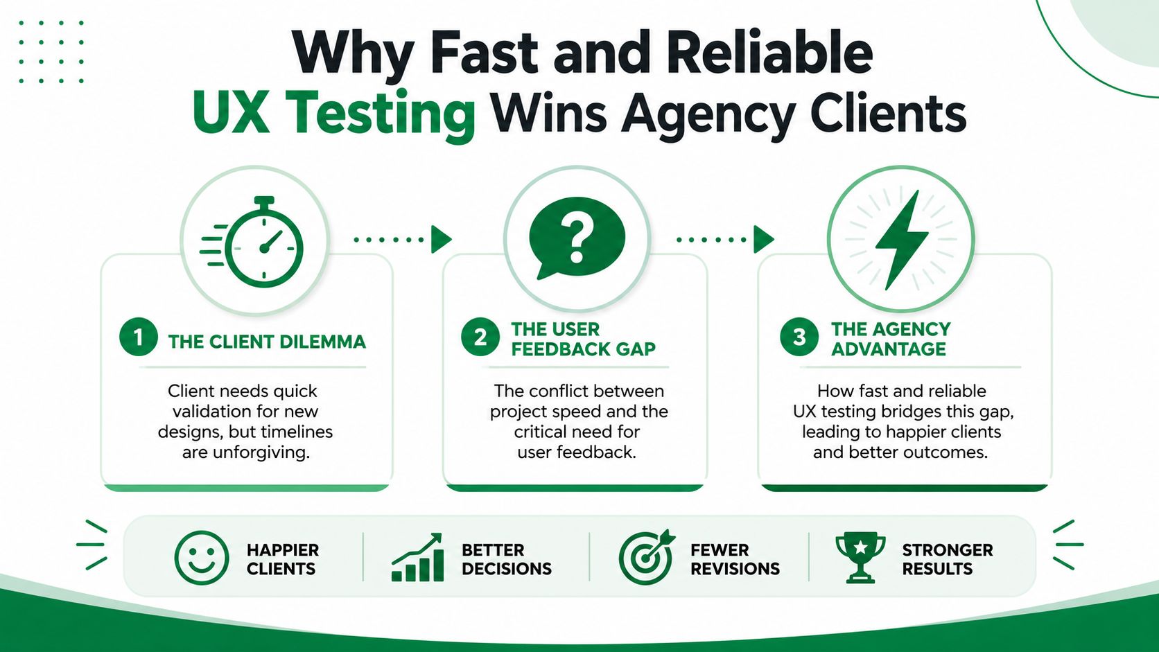
Why Fast and Reliable UX Testing Wins Agency Clients
The usual agency scenario is familiar. A client has a prototype in Figma, a live landing page, or a checkout flow that needs validation before the next meeting. The design team needs evidence. The client needs answers quickly. Traditional testing can deliver strong insight, but recruitment, scheduling, incentives, moderation, and analysis often push the work later than anyone planned.
That delay changes the economics of the project. Feedback is most useful before stakeholders lock in a direction and before developers start building. If testing arrives after those decisions, the agency still learns something, but fixing the issue becomes slower and more political.
Clients now expect continuous validation
UX testing is no longer a nice-to-have line item. According to a Forrester-based model cited by Maze's UX statistics coverage, organizations that invest in continuous UX testing can improve revenue retention by up to 10.8% over three years, with modeled gains of 3.6% in year one, 7.2% in year two, and 10.8% in year three after risk adjustment. The same coverage says 55% of companies are already conducting user experience testing.
For agencies, that changes the client conversation. Testing is no longer framed as a design preference. It becomes part of retention, conversion, and launch risk management.
A lot of agencies already understand this in adjacent service lines. The same shift happened in channel planning, content operations, and paid media. If you work across digital programs, the 2026 social media playbook is useful for the same reason: clients increasingly expect repeatable systems, not one-off deliverables.
Speed matters, but trust matters too
Clients also worry about independence. If the agency designed the experience, the client wants to know whether the validation is objective or whether the team is defending its own work. Fast testing helps only if it produces evidence the client can trust.
Practical rule: If your testing workflow can't show where users hesitated, got confused, or dropped confidence, it won't settle stakeholder debates.
That's why agencies need a testing layer that produces observable behavior, recurring friction points, and clear rationale for recommendations. Fast tools are useful when they reduce lag without reducing scrutiny. That's the standard to hold.
If your team is still selling testing as a late-stage checkpoint, it's worth revisiting why user testing matters in the first place. The agencies that win more follow-on work usually do one thing well. They make validation feel routine, not exceptional.
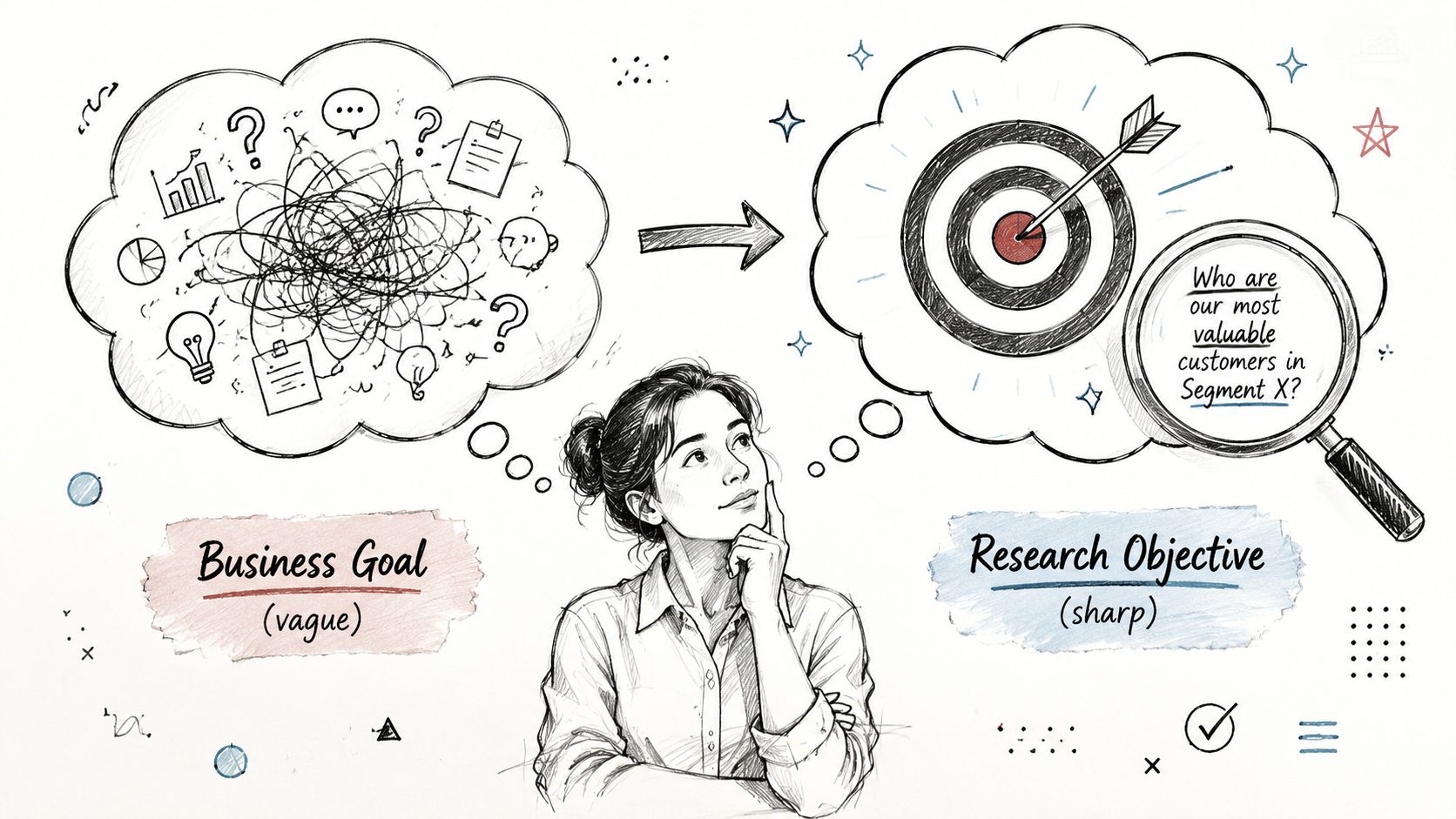
Start with the Why to Define Your Research Objectives
Most agency testing goes off course before the first participant is recruited. The brief says something broad like “validate the new flow” or “see if users like the redesign.” That's too vague to produce a useful study. A test should answer a decision, not just gather reactions.
Harvard's user-research guidance is clear on the sequence. A rigorous workflow starts by defining the problem and success metrics before choosing a method, which allows teams to capture signals such as time-on-task and repeated error patterns instead of relying on opinions alone, as described in Harvard's user-research recommendations.
Turn client goals into testable decisions
Start with one question in the kickoff or work session: what decision needs to be made after this test?
That forces clarity fast. The decision might be:
Choose a direction: Decide between two homepage concepts before moving into detailed UI.
De-risk a step: Validate whether users can complete a checkout, signup, or onboarding sequence without support.
Resolve an internal debate: Determine whether the issue is layout, copy, information hierarchy, or trust.
Those are very different research jobs. If you treat them as the same, the study becomes bloated and the findings become soft.
A practical objective usually has three parts:
The business decision the client needs to make.
The journey segment that carries the most risk.
The evidence required to support a recommendation.
Use a brief that limits scope
A simple testing brief beats a long strategy deck. For agency work, these prompts are enough:
What are we validating? A Figma prototype, live page, or defined flow.
Where is the risk highest? First impression, plan selection, form completion, trust moment, or comprehension step.
What would count as failure? Users stall, misread the offer, miss the next step, or repeat the same mistake.
What should the team do next if the test confirms the issue? Rewrite copy, simplify choices, reorder information, or redesign the interaction.
A study without a decision attached usually turns into a presentation, not a recommendation.
Agency teams often waste time. They test too much surface area because nobody wants to exclude a stakeholder request. The better move is to name the riskiest moment and test that deliberately.
Match objective to method
Once the objective is clear, the method gets easier to choose. A concept comparison may need broad directional feedback. A critical transaction flow may need deeper observation. A pre-review prototype check may need quick friction detection.
That same objective-first approach works whether you're running moderated sessions, unmoderated human tasks, or a synthetic test setup. The workflow doesn't start with the tool. It starts with the decision the client has to make next.
From Demographics to Behaviors to Build Your Participant Profile
A weak participant profile is one of the fastest ways to get comforting but useless feedback. Agencies often start with demographics because they're easy to pull from a brief. Age range, job title, company size, region. That information can help with basic fit, but it rarely explains why one user moves through a flow confidently while another hesitates at every decision.
Better UX testing for agencies uses behavioral profiles. The question isn't only who the user is. It's how they approach the task.
Build around the behavior that changes the outcome
For client work, these traits usually matter more than broad demographics:
Intent level: Is the person actively trying to solve the problem today, or are they casually exploring?
Digital familiarity: Do they compare products comfortably, or do they need more reassurance and clarity?
Confidence: Will they commit quickly, or do they second-guess every option?
Decision style: Do they scan for proof, compare details, defer to brand trust, or look for the fastest path?
The same pricing page can feel simple to a confident evaluator and ambiguous to a cautious first-time buyer. If your participant definition doesn't capture that contrast, your findings will flatten the core problem.
Separate the designer from the evaluator
Agency teams also need to account for bias. A widely cited UX practitioner has pointed out that the key solution to the “marking your own homework” problem is to separate the researcher from the designer, as discussed in this practitioner talk on independent validation.
That doesn't always require another vendor. It does require structure.
Use a participant profile that's specific enough to challenge the design instead of confirming what the team hopes users will do. When you brief human recruitment this way, the recruiter can filter for realistic behavior. When you configure synthetic testing, the same profile creates distance between the design author and the evaluator.
A useful reference point is this guide to building user persona strategy, especially if your team needs a tighter handoff between research planning and audience definition.
A practical profile template
Don't overcomplicate this. For most agency studies, one-page profiles are enough.
Include:
Primary goal: What the user is trying to accomplish in plain language.
Context: Why they're here now.
Friction sensitivity: What tends to make them hesitate or leave.
Trust cues: What they need before taking the next step.
Decision posture: Fast chooser, cautious comparer, delegated buyer, skeptical evaluator.
Strong participant profiles don't just help you find users. They help you predict where the design will break.
That's also why profiles should be shared before tasks are written. If the team writes missions first and personas second, the test usually ends up biased toward the intended path. Good profiling keeps the study anchored in user motivation, not interface logic.
How Many Users to Test for Human vs Synthetic Studies
“How many users do we need?” is still one of the first questions clients ask. Agencies need a practical answer, not a theoretical one. The right sample depends on the method, the type of evidence required, and how fast the team needs to act.
Jakob Nielsen's long-cited guidance says 5 users can uncover about 85% of usability problems. That's why qualitative usability testing often uses 5–8 participants per user group, while quantitative testing typically needs 40+ participants for stronger statistical significance, as summarized in UX Tigers' overview of user testing sample sizes.
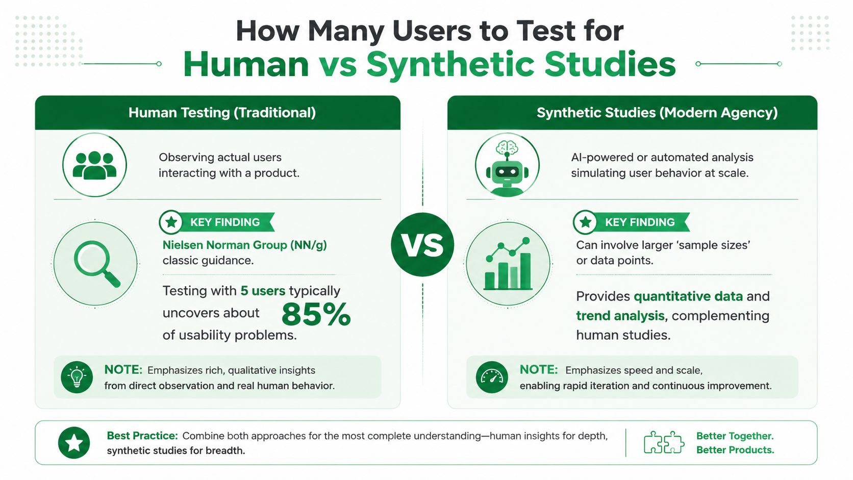
When small human studies are enough
The classic small-sample test still works well when the agency needs depth.
Use human participants when you need to understand:
Emotional nuance: Hesitation, trust, frustration, and motivation in context.
Complex domain behavior: Regulated, technical, or high-stakes journeys where background knowledge changes how people interpret the interface.
Facilitated probing: Cases where follow-up questions are part of the value.
This model is efficient because it finds patterns quickly. It also fits the way agencies budget work. A focused round, synthesis, redesign, then a second round is often more useful than one oversized study.
Where synthetic studies change the agency workflow
Synthetic testing changes the constraint, not the goal. It removes the slow parts of setup, especially recruitment and scheduling, so teams can run broader validation earlier and more often. That makes it useful for prototypes, concept selection, copy comprehension, navigation friction, and pre-handoff checks.
Here's a useful walkthrough on the distinction:
The practical advantage for agencies is repeatability. If the design team needs another validation pass before a client review, synthetic studies are easier to fold into the sprint.
For teams weighing methods, this comparison of synthetic users vs human users is a good framing device. The strongest workflows don't treat one as a replacement for the other. They use each where it has the clearest value.
A method selection rule that works
Use this simple split:
Study need | Better fit |
|---|---|
Early friction check on a prototype | Synthetic study |
Deep diagnosis of a risky workflow | Human study |
Repeated validation across design iterations | Synthetic study |
High-context interpretation with follow-up questions | Human study |
The mistake isn't using a small human sample. The mistake is asking that small sample to carry every kind of evidence the client wants. If stakeholders need speed, repetition, and broader directional confidence, synthetic testing often handles that better. If the team needs rich interpretation, direct observation still earns its place.
Writing Screeners and Tasks That Uncover Real User Behavior
Bad tests usually fail in two places. The screener recruits the wrong people, or the tasks tell users what to do so directly that the team ends up testing obedience instead of usability.
Agencies can avoid both mistakes by writing for behavior. That means screening for what people do, then giving them a realistic goal rather than a route through the interface.
Write screener questions around real habits
A strong screener filters for relevant behavior without hinting at the desired answer. You want evidence that the participant belongs in the scenario, not that they can guess what the researcher wants.
Here's a practical table to use when writing your own brief.
Goal | Good Question (Behavioral) | Bad Question (Leading/Hypothetical) |
|---|---|---|
Find people who compare products | Tell us about the last time you compared tools or services for this kind of need. What did you look at? | Would you be comfortable comparing plans on a website? |
Identify decision-makers | When your team needs a new tool, what role do you usually play in the decision? | Are you the person who makes software decisions? |
Recruit users with recent intent | What prompted you to look for this type of product recently? | If you needed this product, would you use a website like this? |
Spot less confident users | When you have to choose between several plans online, what usually slows you down? | Do you ever find pricing pages confusing? |
Good screener questions ask about recent behavior, current responsibility, and actual decision patterns. Bad ones ask people to predict themselves or confirm a premise.
Write tasks as missions, not instructions
Task writing matters just as much. If the prompt says “click the pricing tab and choose the middle plan,” the team has already removed the usability question. The task should describe the user's goal, not the interface path.
Use this pattern instead:
Context: Why the user is here.
Goal: What they need to decide or complete.
Constraint: What matters to them as they choose.
Examples work better than theory:
Weak task: Click the button to start your free trial.
Better task: You're interested in trying the product but want to understand what happens after signup before you commit.
Weak task: Find the enterprise plan.
Better task: You're choosing a plan for your company and need to work out which option fits your needs.
If the task tells users where to click, the design hasn't passed anything except compliance.
This is one reason agencies get better results when they write missions after they define the participant profile. The mission should sound natural to that audience.
Make accessibility part of the default workflow
Accessibility shouldn't be treated as a separate audit after the main usability work is finished. Deque's guidance says thorough UX testing must include people with disabilities and focus on accessibility errors and barriers, not only satisfaction or speed, as outlined in Deque's guidance on including users with disabilities in UX testing.
For agencies, that changes the workflow in practical ways:
Recruit or model disability-specific journeys: Don't assume a general audience test will surface those barriers.
Adjust facilitation and task wording: Some sessions need different pacing, clearer prompts, or alternative interaction expectations.
Report accessibility findings alongside usability findings: Clients need one priority view, not a siloed appendix.
The most useful habit is simple. Treat accessibility as part of the first round of validation whenever the journey matters, not as a compliance check after design decisions harden.
Turning Test Insights Into Actionable Client Recommendations
Testing only creates value when the agency turns raw observation into a decision-ready recommendation. Clients don't need a transcript dump. They need a clear view of what's working, what's blocking progress, what should change first, and what needs to be re-tested.
One useful client example involved a decision point that looked fine in internal reviews. The page was visually clear. Previous feedback focused on layout preferences and presentation. But once the team ran synthetic testers in Uxia, several testers hesitated at the same moment. They understood the page visually, but they weren't sure which option applied to their situation or what would happen after clicking the main call to action.
That changed the recommendation. The issue wasn't primarily visual. It was comprehension. The fix was to simplify the decision step, rewrite the supporting copy, and make the next action more explicit.
Turn patterns into priorities
A client-ready summary should group findings by actionability, not by screen order.
A practical format looks like this:
What's working: Steps users move through with confidence.
What's blocking users: Repeated hesitation, confusion, or misinterpretation.
What to change first: The smallest set of fixes with the clearest effect on the journey.
What to validate next: The items that still carry risk after revision.
That structure helps clients act. It also keeps the agency from over-reporting minor issues that don't affect the main decision.
The strongest recommendation is not the longest one. It's the one that ties observed behavior to the next design move.
Keep the report short enough to use
A good testing report should help the client decide, not admire the research process. That usually means pulling a few recurring patterns from transcripts, hesitation moments, heatmaps, and task outcomes, then writing direct recommendations in plain language.
If the client also needs broader site context, a practical companion resource is Surnex's website audit guide. It's useful when UX findings sit inside a larger conversation about structure, content, and conversion friction across the full site.
The agency standard should be simple. Every finding needs an owner, an action, and a reason to retest. That's how UX testing for agencies becomes a strategic service line instead of a research artifact.
If your agency needs a faster validation layer between concept reviews and human studies, Uxia is one option to evaluate. It lets teams test prototypes or live flows with synthetic users, review reasoning and friction points, and turn those patterns into repeatable client recommendations without waiting for a full recruitment cycle.