Usability Testing Task Examples: E-commerce, SaaS, Mobile
Get practical usability testing task examples for e-commerce, SaaS, & mobile apps. Write effective scenarios to gain actionable insights quickly.

A great product idea can still lose users if the experience is confusing. The bridge between a polished interface and an intuitive product is task-based usability testing, and the quality of the study usually comes down to the task itself. Strong usability testing task examples help teams expose friction in checkout, onboarding, search, navigation, forms, and other high-impact journeys before those issues become expensive product problems.
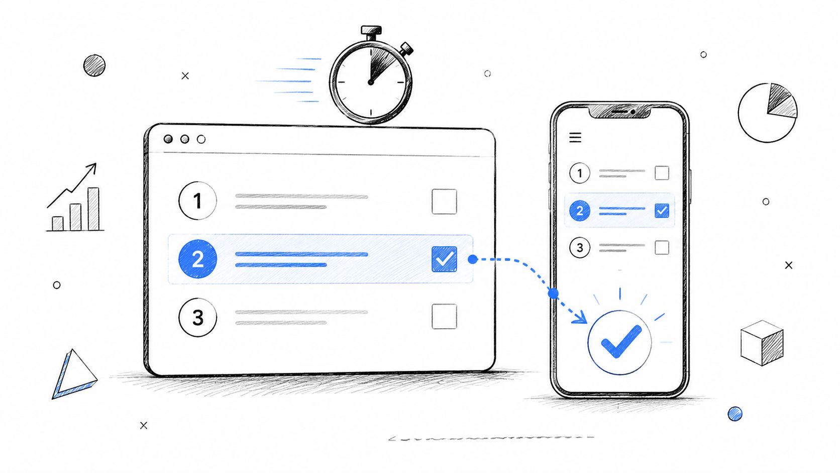
Good tasks don't tell people what to click. They give people a goal they'd have in real life. Nielsen Norman Group recommends scenario-based tasks with enough context to support natural behavior, while avoiding step-by-step clues that distort results, and Dscout notes that for a 45 to 60 minute usability test, five to seven tasks is generally the right range to preserve focus without overwhelming participants (Nielsen Norman Group on task scenarios). That's why task design matters so much. The task is the unit you measure through success, failure, time on task, and errors.
Bad task: “Use the filter button to find red shoes.”
Better task: “You want to buy a pair of red running shoes under £100. Find an option you would consider purchasing.”
Bad task: “Click ‘Create account' and fill in the form.”
Better task: “You've decided to try this product for the first time. Create an account using the information provided and tell us where, if anywhere, you feel unsure.”
This shift from instruction to scenario is what turns generic UX testing examples into useful user testing scenarios. It's also what makes unmoderated testing work better, especially when teams need feedback quickly on prototypes or live flows.
1. Ecommerce & Checkout Flow Tasks
Ecommerce tasks should follow a real buying journey. Users don't visit a store to “test the filter component.” They arrive with a product need, compare options, evaluate trust, and decide whether checkout feels safe and worth the effort.
A practical set of usability test tasks for retail usually includes product discovery, product evaluation, cart editing, and purchase completion. If the flow breaks at any point, abandonment risk goes up.
Better ecommerce task examples
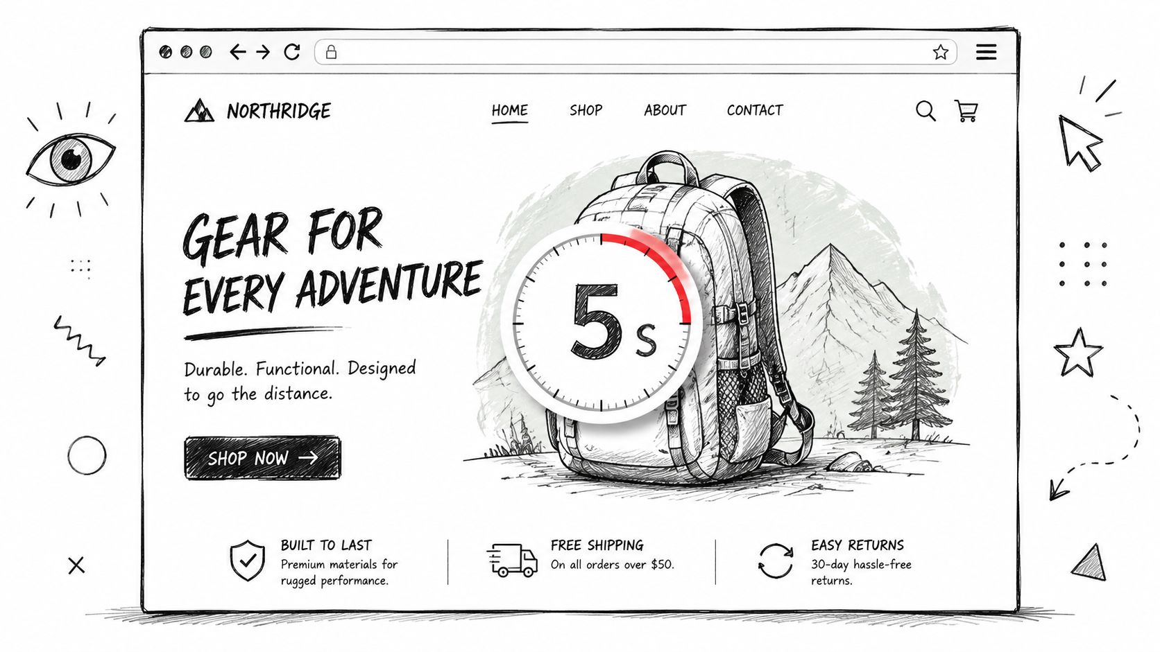
Product discovery: “You need a waterproof jacket for a weekend trip. Find one you'd seriously consider buying.”
Comparison: “You're choosing between two similar products. Compare them and decide which one you'd buy.”
Cart review: “You've added an item to your cart, but now you want a different size. Update your order.”
Checkout: “Complete your purchase using the test payment details provided.”
Practical rule: If a task starts with “click,” rewrite it. People shop with goals, not interface labels.
Here's the poor-versus-improved pattern in action:
Bad task: “Click the cart icon and proceed to checkout.”
Better task: “You're ready to buy the item you selected. Complete the purchase in the way that feels most comfortable to you.”
Bad task: “Use the promo code box.”
Better task: “You have a discount code and want to apply it before paying. Show how you'd do that.”
To tighten these studies, map tasks to the journey before you test. A simple user flow diagram for checkout journeys helps teams decide whether they're testing discovery, confidence, or completion. For pattern inspiration, it's also useful to review Tagada's checkout page strategies, then test whether your own flow supports the same trust and clarity cues.
What to observe
Trust signals: Is shipping, returns, or payment clarity easy to find?
Decision confidence: Do users hesitate on sizing, delivery, or total cost?
Recovery behavior: Can they edit cart contents without confusion?
2. SaaS Onboarding & Feature Discovery Tasks
For SaaS, the first session matters because users are trying to answer one question fast: can this product help me do my job? Onboarding tasks should test whether a new user can understand the promise, set up the basics, and reach an early win without hand-holding.
When we write tasks for onboarding, we avoid feature-tour language. “Complete setup wizard step two” tests compliance, not comprehension.
Strong onboarding scenarios
Account setup: “You've just signed up and want to get the product ready for your team. Set things up as far as you can.”
First value moment: “You want to use this product to solve your main problem today. Start the first action you'd expect to take.”
Feature discovery: “You need to invite a teammate and share access to your work. Show how you'd do that.”
Settings confidence: “You want notifications to match how you work. Find where you'd change that.”
A bad task often leaks the answer.
Bad task: “Open the onboarding checklist and connect Slack.”
Better task: “You want this product to fit into the tools your team already uses. Set up any connection you think would be useful first.”
Use follow-up usability testing questions sparingly. Ask what they expected to happen, what felt unclear, and what almost stopped them. That usually reveals whether your onboarding explains value or just explains UI.
What works in unmoderated SaaS tests
Unmoderated studies need a little more explicit wording because there's no moderator to rescue ambiguity, but they still shouldn't become step-by-step instructions. MeasuringU makes that distinction clearly in its guidance on writing better task wording for unmoderated tests.
At Uxia, AI-powered testing becomes especially useful. Teams can test a Figma flow, a clickable prototype, or a live onboarding sequence against target-user missions and review where synthetic testers hesitate, misread copy, or miss the next step. That's useful early, when onboarding is still changing every sprint.
3. Navigation & Information Architecture
Navigation tasks reveal whether your structure matches the user's mental model. If someone can't find pricing, support, returns, templates, or security information, the issue often isn't the label alone. It's the structure around it.
These user testing scenarios should feel like information-seeking, not conversion tasks. Keep them focused on findability.
Task examples for IA and findability
Support content: “You bought a product and now need to return it. Find the information you'd use.”
Policy discovery: “You're checking whether this service works for your company's compliance needs. Find the relevant details.”
Feature location: “You want to understand whether this product includes collaboration tools. Find where you'd confirm that.”
Content hierarchy: “You're considering this service but want to see customer stories before making a decision. Find them.”
Users rarely say “your IA is broken.” They say “I don't know where I'd expect this to be.”
Poor and improved versions usually differ by one thing: realism.
Bad task: “Click Resources, then Case Studies.”
Better task: “You want to see whether companies like yours have used this product successfully. Find any examples that help you decide.”
If navigation is the primary question, run tree testing before full usability sessions. It isolates labeling and grouping without visual design noise. Here, tree testing for UX structure decisions becomes useful.
What to watch for
First click logic: Does the participant start in the place you'd expect?
Backtracking: Do they bounce between categories that sound similar?
Label mismatch: Do internal labels fail to match user vocabulary?
4. Search & Filtering Tasks
Search tasks are high value because they show whether users can narrow a large space into a sensible choice. These studies are rarely about the search bar alone. They expose gaps in terminology, filter logic, empty states, sort order, and result quality.
A published ecommerce example from UXtweak used a nine-task study with realistic scenarios and then grouped issues through recordings and affinity mapping. Problems clustered around search and filtering, cart edits, picture carousel, and dropdown menus, including small icons, confusing terminology such as “downvote,” and controls that didn't match user expectations (UXtweak usability testing examples).
Search task examples that reveal real behavior
Catalog narrowing: “You want to buy a pair of red running shoes under £100. Find an option you would consider purchasing.”
Search intent: “You need noise-cancelling headphones for travel. Find a product that seems like a good fit.”
Content search: “You need help connecting your account to another tool. Find the relevant help article.”
Filter logic: “You're only interested in options available this week and within your budget. Narrow the list until you find one you'd choose.”
Bad search tasks usually give away the mechanism.
Bad task: “Use the filter button to find red shoes.”
Better task: “You want to buy a pair of red running shoes under £100. Find an option you would consider purchasing.”
What makes these tasks useful
They test vocabulary: Do users search with your terms or their own?
They test refinement: Can users recover from broad or poor results?
They test confidence: Do users trust that the filtered list matches what they asked for?
For mobile and web products alike, search tasks become stronger when the target is realistic but not unique. If there's only one obvious answer, you're testing recognition. If there are many plausible answers, you're testing decision support.
5. Form & Account Setup Tasks
Forms fail in quiet ways. Users pause, reread, guess, or abandon. Good form tasks expose where labels are unclear, validation feels punitive, and required effort doesn't match perceived value.
A common mistake is treating account creation as one step. It's usually several. Field comprehension, password rules, verification, privacy confidence, and error recovery all show up in one flow.
Better form and setup tasks
Registration: “You've decided to try this product for the first time. Create an account using the information provided and tell us where, if anywhere, you feel unsure.”
Profile completion: “You want your account ready before you start using the service. Fill in the details you think matter most.”
Contact flow: “You need support with an urgent issue. Submit a request and explain anything that slows you down.”
Error recovery: “Your first attempt doesn't go through. Show what you'd do next.”
The best form tasks surface hesitation, not just completion.
Use neutral prompts after the task. Ask what felt easy, what felt risky, and whether any field asked for information they didn't expect to share. For inspiration on common registration patterns, teams sometimes review VeeForm templates for customer sign-ups, then test whether their own version creates unnecessary effort or uncertainty.
What to score
Usability testing tasks around forms are usually measured with concrete performance metrics. UXtigers notes that task-based studies commonly track task success, time on task, and error counts, which is why the task itself needs to be tightly written and observable (UXtigers on user testing design).
That also changes sample planning. UXtigers describes a widely cited practice of using 5 to 8 participants per user group in qualitative usability work, with quantitative studies often moving to 40+ participants, and suggests planning five to seven tasks in a 60-minute session in many study designs. Use those ranges as practical planning guidance, not as a substitute for recruiting the right audience.
6. Pricing & Plan Comparison Tasks
Pricing pages deserve their own usability test tasks because users aren't just reading numbers. They're trying to map plans to team size, risk, feature needs, billing expectations, and upgrade confidence.
If a participant can't explain why they chose a plan, the page probably isn't doing enough work. It may still convert some buyers, but it's adding friction to a high-intent moment.
Poor versus improved pricing tasks
Bad task: “Click the pricing page and select the Pro plan.”
Better task: “You're evaluating this product for your team. Find the plan that would best fit a growing team and explain why you would choose it.”
Bad task: “Find the annual billing toggle.”
Better task: “Your company prefers to pay once per year if the value is clear. Compare the billing options and choose what you'd recommend.”
These tasks work because they test comprehension, not page scanning. You learn whether users understand limits, add-ons, included features, and whether they can confidently justify a choice to a manager or finance partner.
Useful follow-up questions
Decision rationale: “What made this plan feel like the right fit?”
Missing clarity: “Was there anything you expected to compare but couldn't?”
Upgrade confidence: “Would you feel comfortable committing to this plan today?”
For teams running unmoderated studies, pricing is a good candidate for scenario-based tests because user intent is easy to simulate. It also works well with Uxia when you want synthetic testers that mimic different buyer profiles, such as a solo user, a startup founder, or a procurement-minded team lead.
7. Dashboard & Data Visualization Tasks
Dashboards fail when users can see the screen but can't answer the question they came with. That's why dashboard usability testing task examples should start with a decision, not a metric.
Don't ask someone to “find monthly active users.” Ask them to figure out whether performance is improving, whether something needs attention, or where they'd click next to investigate a change.
Dashboard task examples tied to decisions
Trend interpretation: “You're checking whether performance improved this month. Find the information you'd use and explain your conclusion.”
Alert investigation: “Something looks off in your results. Show where you'd go to understand the problem.”
Segment comparison: “You want to compare two groups to see which is performing better. Walk through how you'd do that.”
Report sharing: “You need to send a quick update to a teammate or manager. Show how you'd pull together the relevant view.”
This category benefits from disciplined analysis. MeasuringU reports that in a Monte Carlo simulation based on 61 large-sample usability tasks, the geometric mean best estimated the middle of the population for task-time data and had the least bias. The same analysis found that for sample sizes below 25, the geometric mean was the strongest single summary for task performance (MeasuringU on average task times).
Why that matters in practice
Task times for dashboards often vary a lot because one person immediately spots the right chart while another explores multiple routes. If you summarize time poorly, outliers can distort your read on whether the interface supports the typical user.
That matters even more when you're iterating quickly. In Uxia-style AI user testing, teams can compare prototype versions against the same dashboard mission and inspect where synthetic users slow down, misinterpret labels, or fail to connect a metric to an action.
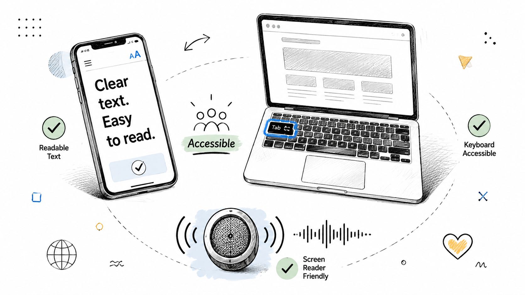
8. Accessibility-Focused Tasks
Accessibility-focused tasks should test whether people can complete core journeys with the tools and constraints they use. That might include keyboard-only navigation, screen readers, zoom, reduced motion settings, high contrast needs, or voice input.
Treat these as first-class usability test tasks, not edge-case audits. If a user can't complete checkout, signup, search, or settings with assistive technology, the product isn't usable for that audience.
Accessibility task examples
Keyboard navigation: “Starting from the homepage, find a product and add it to your cart without using a mouse.”
Screen reader flow: “Create an account and describe any point where the labels, order, or feedback become unclear.”
Focus visibility: “Update a setting in your account and note whether it's always clear where you are on the page.”
Error understanding: “Submit the form with missing information and try to recover from the error.”
A useful pattern is to reuse mainstream tasks from other sections, then test them under accessible conditions. That shows whether accessibility issues appear only in isolated components or across the full conversion funnel.
Choosing the right number and complexity of tasks
Teams often overload accessibility sessions with too many steps. That usually muddies the findings. Broader usability guidance on study design is split here. User Interviews recommends no more than 3 to 4 tasks per study, while Lyssna advises keeping tasks short and often limiting a test to one or two tasks in some contexts. That mismatch becomes especially important when you're testing complex end-to-end workflows rather than isolated actions (User Interviews on usability testing best practices).
For accessibility work, shorter tasks usually produce cleaner insight. If you need to evaluate structure first, then interaction, split the flow. If you need deeper coverage, pair those studies with accessibility testing methods for product teams.
Comparison of 8 Usability Testing Tasks
Task | Implementation complexity 🔄 | Resource requirements ⚡ | Expected outcomes 📊 | Ideal use cases 💡 | Key advantages ⭐ |
|---|---|---|---|---|---|
Ecommerce & Checkout Flow Tasks | Medium–High, payment flows, multi-step validation | Catalog/prod data, payment sandbox, realistic carts | Detect checkout friction, cart abandonment rates | Online stores, checkout redesigns, mobile commerce | Direct conversion impact; measurable uplift (⭐⭐⭐) |
SaaS Onboarding & Feature Discovery Tasks | Medium, guided flows and stateful user journeys | Test accounts, onboarding variants, role-based personas | Time-to-value metrics, onboarding completion | New-user activation, product launches, feature rollouts | Improves activation & retention (⭐⭐) |
Navigation & Information Architecture (IA) Tasks | Low–Medium, structural testing, first-click focus | Static prototypes, tree tests, heatmaps | Findability scores, first-click success, path analysis | Content-heavy sites, docs, complex menus | Clarifies labels & structure for better discovery (⭐) |
Search & Filtering Tasks | Medium, relevance tuning and filter logic | Large dataset or realistic catalog, search analytics | Filter effectiveness, zero-result rate, time-to-find | Marketplaces, large e‑commerce catalogs, media sites | Reduces time-to-find; improves precision (⭐⭐) |
Form & Account Setup Tasks | Medium, validation, error handling, UX microcopy | Test data, form variants, accessibility checks | Completion rate, field error rates, abandonment | Sign-ups, applications, multi-step forms | Lowers friction and errors; higher conversions (⭐⭐) |
Pricing & Plan Comparison Tasks | Low, content clarity and scenario mapping | Pricing variants, persona scenarios, feedback capture | Time-to-decision, correct plan selection, confidence | SaaS pricing pages, tiered service offerings | Reveals messaging gaps; improves plan clarity (⭐) |
Dashboard & Data Visualization Tasks | Medium, realistic data + interaction testing | Dummy/realistic datasets, personas, multiple layouts | Time to locate KPIs, interpretation accuracy | Analytics products, executive dashboards, BI tools | Improves insight discovery and actionability (⭐⭐) |
Accessibility-Focused Tasks | High, assistive tech compatibility, WCAG checks | Assistive tech/users or synthetic testers, accessibility experts | WCAG compliance signals, keyboard/screen-reader success | Legal compliance, inclusive design, public services | Prevents exclusion; reduces risk and improves reach (⭐⭐⭐) |
Your Task-Writing Checklist & The Future of Testing
The best usability testing task examples are realistic, goal-based, and easy to score. They don't explain the interface. They reveal whether the interface explains itself. That's the standard to use whether you're testing a Shopify checkout, a B2B SaaS onboarding flow, a mobile banking app, or an internal analytics dashboard.
Before you launch a study, pressure-test every task against a few practical questions. If the wording sounds like a QA script, rewrite it. If the task has no clear outcome, tighten it. If it names the button, menu, or feature the user should use, it's probably leading.
Task-writing checklist
Is it a scenario, not an instruction? Give users a goal, not a command.
Is it realistic? Use a situation that sounds like something a real customer or user would do.
Is it actionable? Make sure there's a clear outcome you can observe.
Is it unbiased? Avoid lifting labels directly from the UI.
Is it focused? Test one primary behavior at a time.
Is it suited to the method? Unmoderated tasks usually need slightly more explicit wording, but they still shouldn't become tutorials.
One more trade-off matters in practice. Rich end-to-end user testing scenarios are more realistic, but they also make diagnosis harder because several issues can appear in one run. Narrow tasks are cleaner to analyze, but they can miss the friction that happens between steps. Strong research teams mix both. They use smaller task slices to isolate a problem, then use broader flows to see whether the whole experience holds together.
That's also why usability testing should happen earlier and more continuously than many teams allow. Waiting until launch week to test the checkout, onboarding, pricing, or dashboard flow usually means you're validating decisions that are already expensive to change. Testing prototypes, draft designs, or live pages sooner gives product and design teams a chance to fix structure, copy, and interaction issues before they harden into roadmap debt.
Platforms like Uxia fit this workflow well because teams can validate designs, prototypes, and live user flows with AI-generated testers that mimic target users, then review friction points quickly. That doesn't replace every human study. It does make continuous validation far more practical when teams need actionable feedback in minutes instead of waiting through a longer recruiting and scheduling cycle. For product-led teams, that speed changes how often testing happens, and that's usually the difference between research being aspirational and research being operational.
If you're building your own library of UX testing examples, start small. Pick one journey. Write three tasks. Remove anything that sounds like a hint. Then run the study and see where users hesitate, backtrack, or lose confidence. That's where the redesign work should start, and that's where good task-based usability testing earns its value.
If your team wants to validate UX flows earlier, Uxia can help you test prototypes, designs, and live experiences with AI-generated testers built around specific target audiences and missions. It's a practical way to run more continuous usability testing without waiting for a full traditional research cycle.