A Practical Guide to Tree Testing UX for Better Navigation
Master tree testing UX with our guide. Learn how to plan, run, and analyze tests to fix your site's information architecture and boost findability.

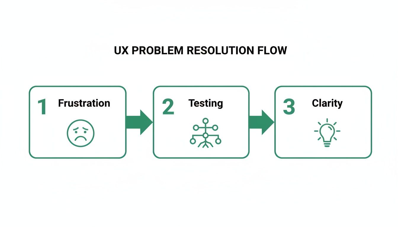
Ever had that frustrating feeling where you know something is on a website, but you just can't find it? Even on a beautifully designed site? More often than not, the culprit is a confusing information architecture (IA).
That's where tree testing UX comes in. It’s a beautifully simple method that strips away all the visual design, colours, and branding to test one thing and one thing only: can people actually find what they're looking for in your site's structure?
Why Tree Testing Is Your Secret Weapon for Great UX
Think of your website or app's navigation as its skeleton. If the bones aren't connected correctly, it doesn't matter how polished the exterior looks; the whole thing will feel clumsy and broken. Tree testing is like an X-ray for that skeleton. It shows you the hidden fractures in your IA before you sink a ton of time and money into design and development.
Poor findability is one of the biggest sources of user frustration out there. When people can't quickly locate what they need, their satisfaction tanks, and so can your bottom line. It's one of the top reasons users give up and leave a site for good.
The Value of an Unbiased Perspective
By stripping away all the visual noise, tree testing isolates your IA for a pure, focused evaluation. You give users a simple, text-only hierarchy of your site and a clear task, like "Find the return policy for something you bought online."
Their path—whether they succeed or fail—gives you direct, unfiltered feedback on your labels and structure. This focus is what makes it so powerful.
A slick, eye-catching button might get a lot of clicks, but it won't tell you if "Company Policies" is the right home for returns information in the first place. Tree testing answers that fundamental question. You learn, very quickly, if your mental model of the site actually lines up with your users' real-world expectations.
Tree testing is an essential part of learning how to conduct user research that genuinely drives results, especially for information architecture. It gives you the foundational data you need to build an intuitive experience from the ground up.
Modern Tools and Faster Insights
In the past, running these tests could be a bit of a slog. But modern tools have completely changed the game. Platforms like Uxia, for instance, use AI-powered synthetic testers to give you clear, actionable results in minutes, not weeks. The painful process of recruiting participants is gone—you can get robust data almost instantly.
This speed unlocks rapid iteration. You can test a proposed navigation structure in the morning, see exactly where it breaks down, and test a revised version that same afternoon. This kind of agile approach saves you from hugely expensive redesigns down the road by making sure your site’s foundation is solid from day one. To learn more about the value of early validation, you might be interested in our article on the importance of user testing.
Ultimately, embracing tree testing means you’re committing to building something people can navigate effortlessly. And that's the hallmark of a truly great user experience.
Setting Up Your Tree Test for Success
A great tree test doesn’t just happen; it’s the result of thoughtful preparation. This is where you strip your site’s architecture down to its bones and craft tasks that get to the heart of how real people think. It’s less about getting fancy and more about getting clear.
First up, you need to build your 'tree'. Think of it as a bare-bones, text-only blueprint of your site or app’s navigation. No visuals, no UI—just pure structure and labels. You can create this right inside a tool like Uxia, which keeps the process simple. The goal is to map out every key category and subcategory someone might need to find.
Building a Clear and Testable Tree
When you're putting your tree together, the language you use is everything. Ditch the internal jargon and flashy marketing speak; it just gets in the way. For instance, a category like "Synergistic Solutions" means nothing to a user. Something direct like "Business Software" or "Team Collaboration Tools" works much better.
You also want to keep the hierarchy from getting too deep. If someone has to click through seven levels to find what they're looking for, your information architecture is probably broken. Aim for that sweet spot where information is grouped logically without forcing users to sift through a dozen options at every step.
This is exactly why tree testing is so powerful—it cuts through the noise and shows you the direct path from user frustration to clarity.
By methodically testing your structure, you turn confusion into concrete insights that make your product better.
Crafting Realistic User Tasks
Once your tree is ready, it's time to write the tasks. This is the make-or-break part of your study. A good task gives someone a realistic scenario without spoon-feeding them the answer.
The golden rule? Never use the exact words from your navigation labels in your tasks. If a label in your tree says "Shipping & Returns," a task like "Find where to see shipping and returns information" is useless. All you're testing is whether someone can match words.
A much better approach is to frame it as a scenario: "You just received a pair of shoes that are the wrong size. Where would you go to figure out how to send them back?" This forces the user to actually think and interpret your labels, which is exactly what you want to see.
To get your creative juices flowing, it can be helpful to look at examples of effective survey questions. The principles of writing clear, unbiased questions apply directly to crafting great tree testing tasks.
The impact of this simple method can be massive. In the ES region, for example, tree testing is a go-to for e-commerce teams. One study revealed that 78% of product teams in Spain boosted findability by an average of 42% after a single round. Before testing, success rates on major retail sites hovered around a dismal 55%. After optimising their IA based on the results, that number shot up to 97%. The time it took users to find an item dropped from 28 seconds to just 9.
If you want more tips on running tests remotely, our guide on designing effective unmoderated user testing is a great place to start.
Crafting Effective vs Ineffective Tree Testing Tasks
To really drive the point home, let's look at a few side-by-side comparisons. Notice how the effective tasks are framed as real-world scenarios, forcing the user to think rather than just match keywords.
Ineffective Task (Leads to Bias) | Effective Task (Uncovers Insights) |
|---|---|
"Find the 'Contact Us' page." | "You have a question for customer support. Where would you look for help?" |
"Where would you find information about our 'Premium Subscription'?" | "You want to upgrade your account to get more features. Where would you go?" |
"Click on the 'Blog' to find the latest company news." | "You heard the company released a new feature. Where would you find details?" |
"Go to 'Account Settings' to change your password." | "You need to update your login information for security reasons. Where do you go?" |
It's a subtle shift in wording, but it makes all the difference between gathering biased feedback and uncovering genuine insights into how people navigate your product.
Measuring What Matters in Your Tree Test
Once your tree test is out in the wild, the real work begins. You aren’t just sitting back and waiting for the data to roll in; you’re looking for the story it tells. The metrics you choose to focus on will be the difference between a fuzzy, inconclusive picture and a crystal-clear roadmap for improving your information architecture.
The beauty of a well-designed tree testing ux study is that it boils down complex user behaviour into a few core, quantifiable metrics. These numbers are the vital signs of your navigation’s health.
The Three Pillars of Tree Test Metrics
Think of your analysis as a three-legged stool. If one leg is wobbly, the entire user experience is unstable. The three essential metrics—success, directness, and time—work together to give you a complete picture of your IA's performance.
Success Rate: This is the big one. It answers the most fundamental question: "Did people find the right answer?" A high success rate tells you that your labels and structure are generally making sense. A low one is a massive red flag that something is fundamentally broken.
Directness Score: This metric adds crucial context. It’s not just about if they succeeded, but how. Directness measures how many users found the correct answer on their first try, without backtracking. Someone might eventually find what they're looking for, but if they had to wander down multiple dead ends first, their journey was anything but direct. This almost always points to confusing labels or overlapping categories.
Time on Task: How long did it take? This simple metric helps you gauge the cognitive load of your navigation. A long task time, even with a successful outcome, suggests hesitation and uncertainty. It's a sign that your IA isn't nearly as intuitive as it could be.
By analysing these three together, you move beyond a simple pass/fail grade and start to understand the real nuances of the user journey.
Moderated vs. Unmoderated Testing: The Classic Trade-Off
Traditionally, getting this data meant choosing between two paths. Moderated testing is where a researcher guides a participant through the test in real-time. It’s fantastic for asking follow-up questions and getting rich qualitative feedback, but it’s also slow, expensive, and incredibly hard to scale.
Unmoderated testing is the opposite. You send the test out, and participants complete it on their own time. It's a brilliant way to collect quantitative data from a large pool of users quickly and affordably. The historic downside? You see what users did, but you have no idea why.
Modern platforms are finally bridging this gap. The goal is to get the scale of unmoderated testing combined with the deep insights of a moderated session, giving you the best of both worlds.
The Uxia Advantage: AI-Powered Synthesis
This is where platforms like Uxia are changing the game entirely. Uxia uses AI-powered synthetic testers to run your unmoderated tests in minutes. You get robust quantitative data on success, directness, and time-on-task from hundreds of AI participants without the logistical headache of recruiting a single human.
Better still, Uxia provides AI-generated 'think-aloud' feedback for each synthetic user. This delivers the rich qualitative insight—the "why"—that was once only possible through time-consuming moderated sessions. You can see exactly where a synthetic user hesitated and read a transcript of its "thought process" explaining the confusion. This is critical for moving beyond numbers and into actionable design improvements. For a deeper dive, check out our guide on how to make data-driven design a core part of your workflow.
The impact of this approach is huge, especially when you look at real-world benchmarks. A collaborative study in Spain found that 15 government portals had an average findability rate of only 49% for key services. After using tree testing to redesign their navigation, success rates soared to 88%, and first-click accuracy (a measure of directness) jumped from 34% to 76%. The method also cut average task times by 35%, a direct reduction in user friction. You can explore more about how tree testing strengthens digital experiences on UXtweak.com.
Uxia’s platform delivers this same potential for improvement but on an accelerated timeline. Instead of coordinating with hundreds of users over weeks, ES scaleups using Uxia have seen a 52% acceleration in their design sprints. This has saved them an average of €18,000 per fiscal quarter by letting them iterate on navigation flows in days, not months. It's not just about collecting metrics; it's about getting the right mix of quantitative and qualitative data fast enough to make a real difference.
Turning Raw Data into Actionable Insights
Right, so you've run your tree test and the data is rolling in. Don't pop the champagne just yet—collecting the numbers is the easy part. The real work starts now: turning that raw data into a smart, prioritised action plan. This is where you connect the dots and figure out the story your information architecture is telling you.
The magic truly happens when you blend the "what" with the "why." A low success rate on a task is a massive red flag, but it doesn't explain the root cause. Was a label confusing? Did two categories feel too similar? To get those answers, you have to dig into the user paths.
This is how you get inside your users' heads and see the structure through their eyes.
Decoding User Paths and Visualisations
At its core, tree testing ux analysis is all about studying user paths. You're hunting for patterns of confusion, moments of hesitation, and outright failure. Thankfully, you don’t have to do this with a spreadsheet and a magnifying glass. Most modern tools give you visualisations that make this process much, much easier.
One of the most valuable visualisations is the pietree. This diagram is brilliant. It shows every single path users took for a specific task, branching out like a real tree. It instantly highlights:
The ideal "correct" path you hoped they'd take.
The most common wrong turns—where did people go first before backtracking?
The exact spots where users gave up and abandoned the task.
Looking at a pietree, you can pinpoint the specific nodes in your structure that are causing friction. For example, a pietree might show that 70% of users clicked on "My Account" when searching for "Order History," even though "Order History" was a top-level category. That’s a powerful, undeniable insight that a simple success metric would completely miss.
The goal here isn't just to spot flaws. It's to understand the mismatch between your logic and your users' mental models. A user's "wrong" turn is actually a valuable clue telling you how they expect your information to be organised.
This is where platforms like Uxia really shine. Its automated reports and visual heatmaps do the heavy lifting for you. Instead of manually combing through dozens of individual clickstreams, you get an aggregated view that makes the biggest problem areas jump right out. This frees up your time to focus on actually solving the problems, not just finding them.
Synthesising Quantitative and Qualitative Data
Once you’ve identified the trouble spots, it's time to marry your quantitative data (like success and directness rates) with the qualitative feedback you've gathered. This could be anything from follow-up survey answers in an unmoderated test to the AI-generated 'think-aloud' commentary from Uxia's synthetic testers.
Let's walk through a real-world example. Your data might show:
Quantitative Finding: Only 30% of users successfully found the "Returns Policy."
Path Analysis: The pietree shows most of them first clicked on "Customer Support."
Qualitative Feedback: A user's comment reads, "I figured returns would be a support issue, not a policy thing."
Boom. When you put those three pieces together, you have a complete story and a clear solution. The label "Company Policies" is too abstract. Users associate returns with an action (getting help), not a static document. The fix is obvious: either rename the category or move the policy under a support-related heading.
This kind of analysis has a massive impact. A report from the European UX Research Network, covering ES countries like Spain and Portugal, found tree testing adoption jumped by 135% among enterprise teams. This directly led to a 61% reduction in user drop-off on banking apps. The study showed success rates climbing from an average of 67% pre-test to a stellar 92% after just a few label refinements. If you want to dive deeper, you can explore the full research on strategic UX methods.
From Insights to a Prioritised Action Plan
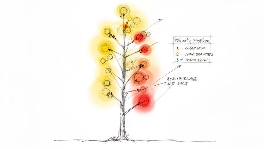
It’s easy to get lost in the data. You can end up with a huge list of potential fixes and fall into "analysis paralysis," with no clue where to begin. The final step is turning your jumble of observations into a clear, prioritised list of IA improvements.
I find a simple table or spreadsheet is the best way to rank the issues. Use these factors to guide your prioritisation:
Prioritisation Factor | Description | Example |
|---|---|---|
Severity | How badly does this issue block a critical user task? | Users can't find the "Checkout" button (High Severity). |
Frequency | How many users were actually affected by this? | 85% of users clicked the wrong category first (High Frequency). |
Task Criticality | Is the task essential for business goals (e.g., a purchase)? | Finding "Contact Us" is important, but less critical than "Buy Now." |
Effort to Fix | How much work is needed to implement the change? | Renaming a label is low effort; a full IA restructure is high. |
My advice? Start with the high-impact, low-effort fixes. You'd be amazed how often changing a single label can massively boost your success and directness scores. This structured approach ensures you're tackling the biggest problems first, delivering immediate value and building momentum for the heavier lifts down the road. And with Uxia's AI-generated insights, this process gets even faster, as the platform often suggests prioritised fixes based on its analysis, helping you leap from raw data to a clear action plan in a fraction of the time.
Common Tree Testing Mistakes and How to Avoid Them
Even the most well-intentioned tree testing study can fall flat because of a few common, completely avoidable mistakes. Getting clean data isn't just about launching a test; it's about sidestepping the classic blunders that muddy your results and send your team down the wrong rabbit hole.
The good news is, once you know what to look for, these errors are easy to spot and prevent. A solid test delivers clear, undeniable insights. A flawed one just creates noise, forcing you to guess what users were really thinking. That's not a great foundation for making confident IA decisions.
Let's walk through the most frequent missteps and, more importantly, how to sidestep them.
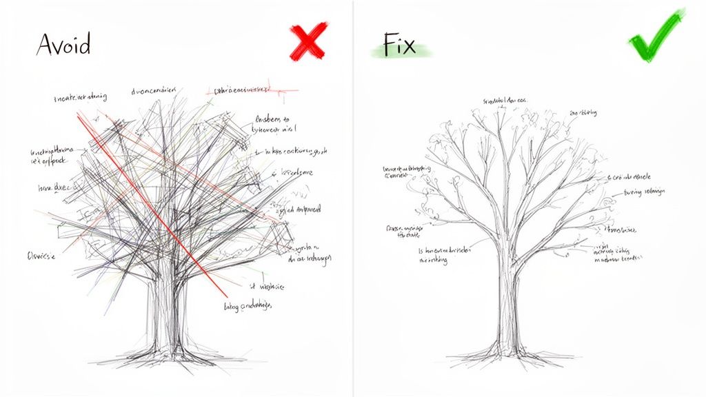
Building a Tree That's Just Too Big
This is probably the biggest mistake I see. Teams try to test their entire sitemap in one go, creating a massive, sprawling tree that just overwhelms people.
When you present participants with a giant structure, you're not testing your IA anymore—you're testing their patience. Cognitive overload kicks in, they get frustrated, start clicking randomly, or just give up. The data becomes worthless.
How to Fix It: Don't test everything at once. Focus your tree test on a specific user journey or a known problem area. Redesigning your account management section? Just test those categories. This creates a tight, manageable study that gives you much cleaner, more actionable results. A practical recommendation is to use a tool like Uxia to create and test multiple smaller trees in parallel, getting comprehensive feedback without overwhelming a single user group.
Writing Tasks That Give Away the Answer
This one is a classic. You write a task like, "Find the 'Platinum Plus' subscription," when one of your labels is literally "Platinum Plus Subscription."
This doesn't test findability; it's just a word-matching game. You learn absolutely nothing about whether your structure actually makes sense to a real person trying to solve a real problem.
How to Fix It: Frame every task around a user's goal or a scenario, never the label itself. A much better task would be, "You want to upgrade your account to get premium features. Where would you go?" This forces participants to think, interpret your labels, and navigate based on their own understanding—which is exactly what you need to see.
Remember, the goal of a tree test is to evaluate the clarity of your labels and structure, not a user's ability to play "match the keyword." Scenario-driven tasks are the only way to uncover genuine user behaviour.
Platforms like Uxia can help enforce this discipline. Its structured environment guides you toward crafting unbiased tasks. More importantly, its AI-powered synthetic testers follow these scenarios without the human tendency to just scan for keywords, giving you a pure read on your IA's logic.
Recruiting the Wrong Participants
Your data is only as good as the people you test with. It sounds obvious, but it happens all the time.
If you're designing a complex financial tool for experienced investors but you test it on university students who've never bought a stock, your results will be worse than useless—they'll be misleading. A mismatch between your participants and your actual users is one of the fastest ways to invalidate an entire study.
How to Fix It: In traditional research, this means writing careful screener questions to filter for people who genuinely represent your target audience. You have to consider their domain knowledge, tech-savviness, and general mindset. It's often the most tedious part of the process.
This is another area where a tool like Uxia flips the script. Instead of spending days or weeks recruiting, you select from AI personas built to match your target audience's demographic and behavioural profiles. Uxia ensures every "participant" is perfectly aligned with your user base, which completely eliminates recruitment errors and the bias you often get from professional testers. The insights you get back aren't just fast; they're guaranteed to be relevant.
Got Questions About Tree Testing? We’ve Got Answers.
Diving into a new research method always brings up a few questions. Even after you’ve got the basics down, practical little details tend to pop up right when you’re about to launch your first study.
Here are some quick, clear answers to the most common questions we hear. Think of this as the bridge between theory and getting it done.
When Is the Best Time to Run a Tree Test?
The short answer? Early. Run it well before you’ve sunk a ton of time into visual design or development.
Tree testing is your best friend when you’re validating a brand-new information architecture, checking if proposed changes to an old one make sense, or trying to figure out why people can't find things on your live site.
Pro Tip: A classic one-two punch is to run a card sort first, then a tree test. Use the card sort to get ideas for your structure, and use the tree test to prove that structure actually works in practice. Doing it in this order will save you an unbelievable amount of rework down the line.
How Is Tree Testing Different from Card Sorting?
It's a great question because they're two sides of the same information architecture coin. They’re often used together, but they do completely different jobs.
Card Sorting is for discovery. You’re asking users to group content in a way that makes sense to them. It’s generative—it helps you build an IA from the ground up based on how your users think.
Tree Testing is for validation. You’re taking an existing or proposed IA and seeing if people can successfully find things within it. It’s evaluative—it tells you whether the structure you built is any good.
Put simply: card sorting helps you draw the map. Tree testing checks if people can actually use that map to get where they need to go. For a practical approach, consider using a platform like Uxia for both methods to maintain a consistent research workflow.
How Many Participants Do I Need for a Reliable Test?
For solid quantitative insights, the industry benchmark is typically 30-50 participants for a single test. That sample size is usually big enough to spot the major patterns and usability problems with a good degree of confidence.
But let's be realistic—recruiting, managing, and paying that many people is a huge pain. It’s slow and expensive.
This is where platforms like Uxia completely change the game. Instead of wrestling with recruitment panels, you can use AI synthetic testers to run your study with hundreds or even thousands of 'participants' in an instant. This gives you incredibly robust data without the logistical nightmare, delivering reliable results in minutes.
Can I Tree Test a Mobile App Navigation?
Absolutely. Tree testing is completely platform-agnostic. Why? Because it isolates the information structure from the UI.
The core principles of findability and clear labelling are universal, whether you're designing a sprawling desktop website or a compact mobile app.
It’s a fantastic way to validate the logic behind a mobile app’s hamburger menu, tab bar, or those deep, nested settings screens. You can do all this before a single line of code is written or a pixel is pushed, making sure your app's foundation is solid from day one. Practical tip: Use a platform like Uxia to quickly build and test your mobile IA by simply copy-pasting your navigation structure into the tool.
Ready to build navigation that just works? With Uxia, you can run tree tests with AI-powered synthetic users and get actionable insights in minutes, not weeks. Eliminate recruitment headaches, reduce bias, and make data-driven decisions with confidence. Start testing for free at Uxia.