Research Documentation: Bridge Insight to Action 2026
Master research documentation for modern teams. Get best practices, templates, & tools like Uxia to bridge insight & action effectively.

You've probably got research in five places right now.
A few usability sessions live in a testing platform. Someone pasted observations into Slack. A designer saved screenshots in Figma. A product manager copied takeaways into a planning doc. The recordings are still sitting in a folder that nobody opens unless there's an argument about what users said.
That mess slows teams down more than weak research ever does. The problem usually isn't lack of insight. It's lack of research documentation that people can find, trust, and reuse.
Good documentation turns one-off studies into institutional memory. It helps a new designer understand why a pattern exists. It helps a product manager avoid rerunning the same question every sprint. It helps a researcher move from proving isolated points to building a body of evidence that compounds over time.
Beyond Reports The Value of Great Research Documentation
Documentation is often treated like the final administrative step after the interesting work is done. That's backward. If the output of research ends up buried in decks, comments, and meeting notes, the study might as well not exist six weeks later.
I've seen this pattern repeatedly. A team runs a healthy set of user tests, everyone agrees there are important issues, and then the findings scatter. The immediate launch decision gets made, but the deeper learning disappears. Months later, another team member asks the same question, starts a fresh study, and nobody remembers the earlier evidence.
What teams lose when documentation is weak
The first loss is speed. People spend more time locating evidence than acting on it.
The second loss is confidence. If stakeholders can't trace a recommendation back to user behavior, they treat it like opinion. Designers defend choices from memory. Product managers rely on whoever spoke most recently in the last review.
The third loss is continuity. New teammates inherit a product but not the reasoning behind it.
Great research documentation isn't a library of PDFs. It's a working memory for the product team.
A simple planning habit helps here. Before any study starts, align on goals, assumptions, audience, and method in a structured document. If your process is loose, this sample research plan is a useful reference because it shows the level of clarity that prevents downstream confusion.
What strong documentation actually does
Strong documentation connects the full chain:
Question to evidence so people know what the study was trying to learn
Evidence to finding so the conclusion doesn't feel subjective
Finding to decision so design and product changes don't float free of user input
When teams get this right, research stops being an archive and starts acting like infrastructure. You can compare studies across releases. You can onboard people faster. You can see whether a known issue keeps recurring or has been resolved.
That's the shift that matters. The job isn't to produce a polished report once. The job is to build a system where insight stays usable.
Anatomy of a Research Finding
A scalable system starts with one rule. Every finding should look the same structurally, even when the study format changes.
That doesn't mean every project needs a long report. It means each finding needs enough context that another person can understand it without chasing the original researcher through chat history.
Start with the research plan
A finding without a plan is hard to interpret. You need the original framing:
Goal so readers know what problem the study addressed
Method so they understand whether the evidence came from moderated interviews, unmoderated testing, surveys, or prototype evaluation
Hypothesis or assumptions so the team can compare expectations against what occurred
This matters because findings can look stronger than they are when stripped from context. If a checkout issue appeared in a prototype test, that tells a different story than the same issue appearing in a live product flow.
Add participant details without overloading the record
You don't need a novel here. You do need enough information to interpret relevance.
Useful participant documentation usually includes recruitment criteria, audience segment, and any traits that materially shape behavior. For product teams, that often means whether participants were new users, existing customers, or enterprise buyers, plus the platform they used.
A common mistake is storing this in a separate recruiting doc that never gets linked back. Then the finding travels alone and loses the audience context that made it meaningful.
Keep the raw data accessible
Raw material is where trust comes from. That includes transcripts, recordings, screenshots, post-task responses, and observation notes.
Don't paste everything into the main narrative. Link it cleanly. People need to verify, not drown.
Practical rule: If a stakeholder challenges a finding, you should be able to reach the supporting clip, quote, or transcript in one hop.
Write synthesized findings, not loose observations
The core issue is that many repositories fail. They store fragments instead of findings.
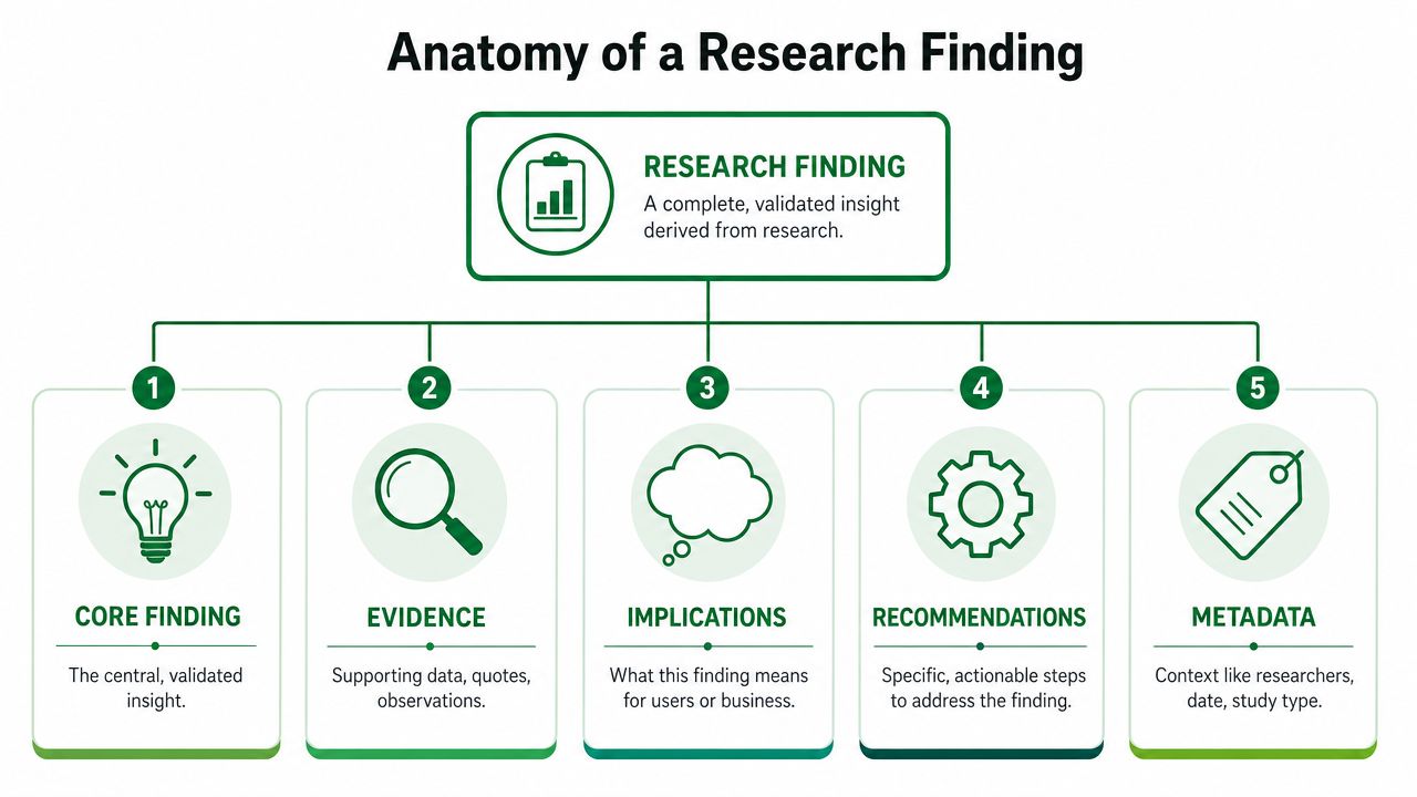
A usable finding has five parts:
Core finding
State the validated insight plainly. For example, users confuse the primary and secondary actions at a decision point.Evidence
Attach the observation trail. That may include transcripts, screenshots, repeated behaviors, and representative participant quotes.Implications
Explain why it matters. Does it create hesitation, reduce trust, increase errors, or block progress in a critical flow?Recommendations
Make the next move explicit. Adjust hierarchy, rewrite copy, simplify a branch, or revise validation timing.Metadata
Capture who ran the study, when it happened, what product area it touched, and what type of research it was.
Finish with actionable recommendations
A repository full of insight but no action path becomes academic fast. Recommendations don't need to prescribe a perfect solution. They do need to help the product team move.
Here's the distinction that works in practice:
Documentation element | Weak version | Strong version |
|---|---|---|
Finding | Users had trouble | Users hesitated at form submission because error feedback appeared too late |
Evidence | Several participants mentioned it | Transcript excerpts, screenshots, and repeated failure pattern linked to the task |
Recommendation | Improve the form | Show validation earlier and make required fields clearer before submission |
That structure makes research documentation traceable, reusable, and much easier to scale.
The Action-Oriented Report Template
A good report template does one thing well. It helps different readers get what they need without making the researcher rewrite the study for every audience.
The format I keep coming back to is concise, evidence-backed, and easy to scan.

The sections worth standardizing
My preferred report structure includes:
Executive Summary
A short overview of the main findings for stakeholders who need the story fast.Key UX Issues
Prioritized by severity, user impact, and business impact.Evidence
Quotes from testers, transcripts, screenshots, and user journeys that support each finding.Quantitative Metrics
Task completion, drop-offs, misclicks, satisfaction, and other relevant KPIs when the study includes them.Recommendations
Specific, actionable improvements for the product team.Appendix
Full transcripts and post-test responses for anyone who wants to go deeper.
This works because executives can absorb the conclusion quickly, while designers and researchers still get the material needed to make changes responsibly.
Why this template holds up under pressure
The Executive Summary forces prioritization. If you can't state the main story clearly, the report probably contains observations rather than findings.
The Key UX Issues section is where many reports either become useful or collapse. Don't organize by task chronology unless the study demands it. Organize by problem. Stakeholders act on problems, not on the order in which participants encountered them.
The Evidence section protects the report from debate-by-opinion. A quote on its own isn't enough. Pair quotes with visible behaviors, screenshots, and task moments so the issue is hard to dismiss.
For teams refining this approach, this guide to a modern UX research report template for AI insights is worth reviewing because it reflects how structured reporting improves scannability without losing substance.
What not to do
Some report habits make documentation look polished but less useful:
Don't bury the recommendation under a long narrative
Don't mix evidence and interpretation so tightly that readers can't tell what happened versus what you infer
Don't turn the appendix into a dumping ground with no links back to the main findings
A walkthrough helps make the format concrete:
When reports follow a repeatable structure, stakeholders stop asking where to find things. That alone removes a lot of friction from research operations.
Building a Living Research Repository
Single reports help in the moment. Repositories help over time.
The difference is operational. A report answers one project's question. A repository lets the team ask new questions against old evidence. That's where research documentation starts to support continuous product development instead of occasional validation.
Name studies so people can identify them instantly
A naming convention should work before anyone opens the file.
The most practical format I've used is:
[Product] – [Flow] – [Objective] – [Sprint/Version]
Examples:
Mobile App – Checkout – Guest Purchase – Sprint 12
Website – Pricing Page – Enterprise CTA – v3
That format does two things well. It tells people what they're looking at, and it stays consistent enough for sorting, filtering, and comparing across releases.
If naming is inconsistent, libraries decay quickly. A study titled “usability test final” is useless after a few months. Nobody remembers which product, which flow, or which iteration it covered.
Tag for retrieval, not for decoration
Tags only help when they reflect real retrieval needs. There's a tendency to over-tag or create tags nobody searches for.
The core tags I'd keep are:
Element | Example Value | Purpose |
|---|---|---|
Product area | Checkout | Find all studies related to a functional area |
Platform | iOS | Separate behavior by device or operating system |
Research type | Usability | Distinguish evaluative work from benchmark or accessibility studies |
Audience | New Users | Compare behavior across user segments |
Release or sprint | Sprint-12 | Track changes across iterations and releases |
Typical tags that stay useful include Checkout, Onboarding, Search, Web, iOS, Android, Usability, Accessibility, Benchmark, Prototype, New Users, Existing Customers, Enterprise, and release labels such as Sprint-12 or Q3-Launch.
A consistent taxonomy becomes especially valuable when someone asks a compound question like, “Show me usability issues for new users on iOS in onboarding.” If your repository can't answer that, it's storage, not a system.
For teams designing this capability, this piece on best research repositories from storage to action is a practical reference because it focuses on retrieval and decision support rather than simple archiving.
Link research to design decisions
The most impactful habit is connecting research to the design system, or at least to the design rationale attached to components and patterns.
I wouldn't put raw study material directly into the design system itself. That tends to clutter the system and age badly. What works better is linking a design decision to the evidence behind it.
If recurring studies show confusion around button hierarchy, document the recommended hierarchy pattern alongside the component guidance and add a reference to the supporting research. If form validation repeatedly causes drop-off, update the form pattern with the rationale behind the change and the studies that informed it.
Evidence-based design systems age better than opinion-based ones.
This turns the system into more than a style reference. It becomes a record of why the pattern exists. That matters when teams revisit a component months later and someone wants to reverse a decision without understanding the user problem that prompted it.
Build habits that keep the repository alive
A repository dies when maintenance depends on heroic effort. Keep the operating model simple:
Create the record immediately after the study launches, not after final readout
Add findings as standalone entries so they can be reused across reports
Review recurring issues regularly during sprint planning or design critique
Retire duplicate tags before taxonomy sprawl sets in
The shift is cultural. Teams need to treat research documentation as part of shipping quality, not as optional cleanup work.
Automating Documentation with Modern Tools
The biggest documentation bottleneck isn't knowing what good looks like. It's the labor required to produce it consistently.
Researchers lose hours to transcription, clipping evidence, grouping similar observations, drafting summaries, and reformatting the same material for different audiences. That work is necessary, but too much of it is mechanical.
Where automation helps most
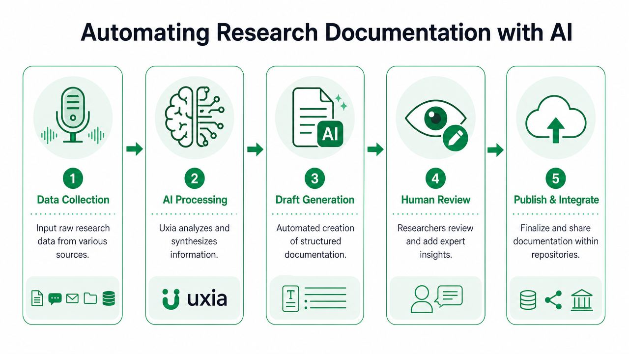
Modern tools are most valuable when they take over the repetitive parts of synthesis without pretending to replace judgment.
The highest-value tasks to automate are:
Transcripts from recorded sessions or think-aloud tests
Clustering similar observations into recurring UX issues
Draft summaries that give the researcher a structured starting point
Evidence extraction such as representative quotes and task-level friction points
Publishing workflows that move findings into a searchable repository
If you've looked at adjacent workflows, this overview of AI transcription for meetings is useful context for understanding why documentation gets easier when speech-to-text and summarization stop being manual chores.
A concrete workflow that saves real time
One of the clearest examples is a usability evaluation of a multi-step checkout flow.
Without automation, a researcher might spend a large block of time reviewing transcripts, tagging repeated friction, grouping similar patterns, selecting quotes, and then translating that into a report. The hard part isn't only analysis. It's the packaging.
With modern AI-assisted workflows, the process changes. The system clusters recurring UX issues, generates summaries, highlights representative tester quotes, and estimates user and business impact. Instead of building the report from raw material line by line, the researcher reviews, refines, and prioritizes.
That changes the role of the researcher in a good way. Time shifts from administrative synthesis to actual judgment. Teams spend more time discussing what to fix and less time assembling slides.
Automation should produce a strong first draft, not the final truth.
That distinction matters. Blind trust in auto-summaries creates sloppy documentation. But rejecting automation entirely usually means reports arrive late, stay inconsistent, or never make it into the repository in usable form.
What still needs a human
Even the best automated workflow won't handle:
Prioritization across product and business context
Interpretation when signals conflict
Recommendation quality that reflects design constraints
Stakeholder framing for different audiences
Automation makes research documentation faster. Researchers still make it credible.
Putting It All Together with Concrete Examples
Abstract guidance only goes so far. The easiest way to improve documentation is to look at concrete artifacts and copy the patterns that hold up in real team workflows.
Example one from a usability test report
Study name: Mobile App – Checkout – Guest Purchase – Sprint 12
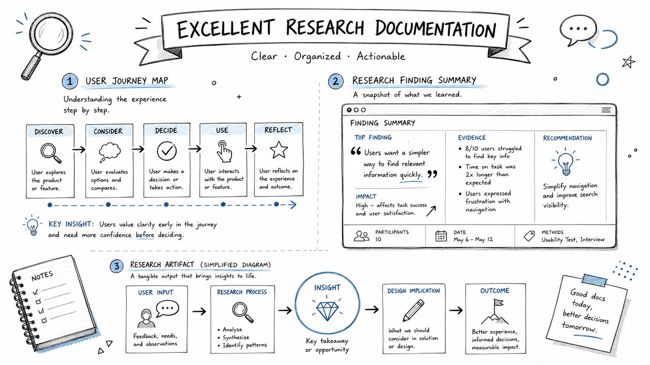
A clean issue entry might look like this:
Finding
Guest users hesitate when asked to create an account before payment.Evidence
Multiple testers pause at the account step, question whether checkout can continue without registration, and backtrack to look for a guest option.Implication
The flow introduces uncertainty at a sensitive moment where users expect speed and clarity.Recommendation
Make guest purchase the default visible path and place account creation as a secondary option after order completion.
That's short, but it's traceable. Anyone reviewing the record can inspect transcripts, clips, and screenshots in the linked evidence set.
Example two from a design system note
Component: Primary Button
Pattern rationale entry:
Studies across checkout and onboarding showed confusion when primary and secondary actions used similar visual weight. The guideline now reserves the strongest emphasis for the main forward action, while secondary actions use quieter styling. See linked research records for checkout guest purchase and onboarding account recovery.
That's enough to stop the design system from becoming a list of unexplained preferences.
Example three from repository search behavior
A product manager wants to answer a practical question before planning the next release: what usability issues affect new users on iOS?
With a useful repository, they can filter by:
Platform iOS
Audience New Users
Research type Usability
Product area Onboarding or Checkout, depending on scope
The result isn't just a list of old reports. It's a set of comparable findings with evidence, severity logic, and linked recommendations.
What teams usually discover at this point is that recurring issues don't hide in one study. They repeat across versions and surfaces. Once you can see that pattern, prioritization gets easier.
From Archive to Asset Your Next Steps
The main shift is simple. Stop treating research documentation as the final wrapper on a study. Treat it as the product team's memory.
That means standardizing the basic unit of a finding, using a report template that people can scan quickly, organizing studies with naming and tagging that support retrieval, and linking evidence to design decisions so rationale doesn't disappear. It also means using automation where it reduces mechanical work, while keeping human judgment in charge of interpretation and prioritization.
If your current system feels messy, don't try to rebuild everything at once. Start with the next study. Create a clean name. Capture the plan. Store the raw material. Write findings in a repeatable structure. Add tags that someone will use later. Link the outcome to a real product decision.
Teams that want to strengthen this habit across product and design can learn a lot from approaches to data-driven design that make evidence part of everyday decision-making rather than occasional validation.
The payoff compounds. Better research documentation reduces repeated work, sharpens design rationale, and helps teams make faster decisions with less debate from memory.
If you want a faster way to turn raw user feedback into usable documentation, Uxia helps teams capture transcripts, surface recurring issues, and turn research into a searchable asset that supports continuous product development.