Modern UX Research Report Template for AI Insights
Download our actionable UX research report template for modern teams. Integrate AI insights, craft compelling data stories, and drive design changes.

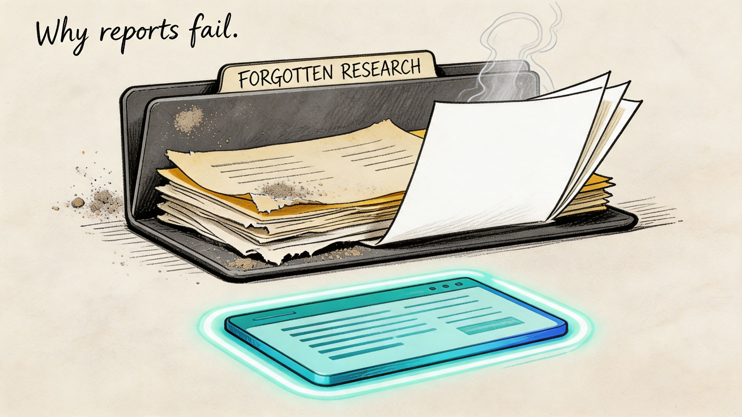
Often, teams don't have a research problem. They have a reporting problem.
The study happens, the findings are real, the team even agrees the issues matter. Then the report lands as a long document, nobody revisits it, and the product keeps shipping the same friction. A good ux research report template fixes that by turning evidence into a decision tool, not an archive.
That matters even more now. Integrating AI-generated synthetic user data into UX research report templates remains poorly addressed, despite a projected 2025 to 2026 trend showing 68% of product teams adopting AI for UX testing, according to User Interviews' reporting on UX research templates and presentations. Most templates still assume slow, manual studies. They don't tell teams how to present AI transcripts, auto-generated heatmaps, friction flags, or fast iteration cycles in a way stakeholders can absorb.
Beyond the Blank Page Why Modern UX Reports Fail
A team finishes a usability sprint on Tuesday morning. By Tuesday afternoon, Uxia has already produced transcripts, friction flags, click-path patterns, and highlight clips. Then the old template slows everything down. Someone spends the next day forcing fast evidence into a report structure built for slower, manual studies, and the result is a document that looks thorough but delays the decision it was supposed to support.
Traditional UX reporting still borrows too much from academic structure. Teams lead with methods, stack raw observations, and hide the recommendation near the end. That format made sense when reports took weeks to assemble and lived as documentation. In product teams, it creates drag. Design, PM, and engineering need to know what changed in user behavior, how confident the team is, and what should ship next.
Reports aren't the deliverable. Decisions are
A strong report shows relevance under time pressure. It makes four things easy to find: the user goal, the failure point, the evidence, and the recommended response.
That standard matters more with AI-generated research outputs. Uxia can produce a lot of useful material fast. Speed helps only if the report filters that material into a ranked set of decisions. If the team drops every transcript excerpt, every heatmap, and every issue cluster into one file, stakeholders get volume instead of clarity.
A report that gets used in planning is better than a polished archive nobody opens again.
Practical rule: If a stakeholder cannot explain the top three issues after two minutes with your report, the report needs less content and sharper prioritization.
What modern reports need that old templates miss
Older templates assume the researcher is doing slow synthesis by hand. Read notes, tag quotes, summarize patterns, then write the story. Modern workflows are different. Platforms like Uxia generate transcripts, path data, heatmaps, misclick clusters, and issue summaries across repeated test runs. The reporting job shifts from collecting evidence to selecting and sequencing it.
That creates a real trade-off. Teams can ship findings faster, but they can also flood stakeholders with auto-generated output that has not been curated. Good modern templates solve that by putting interpretation ahead of exhaust. The report should show what matters first, then let people inspect the supporting evidence.
The structure that holds up looks like this:
Mission first: What was the user trying to complete?
Observed friction second: Where did the journey break, slow down, or create doubt?
Evidence third: Which clips, quotes, screenshots, or behavior patterns prove the issue?
Action last: What should the product team change, test, or defer?
This approach matches strong data-driven design workflows. The point is discipline. Use AI to speed up synthesis, not to dump more material into a report that nobody can scan.
The Anatomy of an Actionable UX Report Template
A good ux research report template helps a product team decide what to change, why it matters, and how confident to be. If any section does not support that decision, cut it.
The template also needs to fit a faster workflow than older report formats were built for. With AI-assisted testing in Uxia, the bottleneck is rarely collecting observations. The bottleneck is turning a large volume of generated evidence into a small set of decisions people can act on this week.
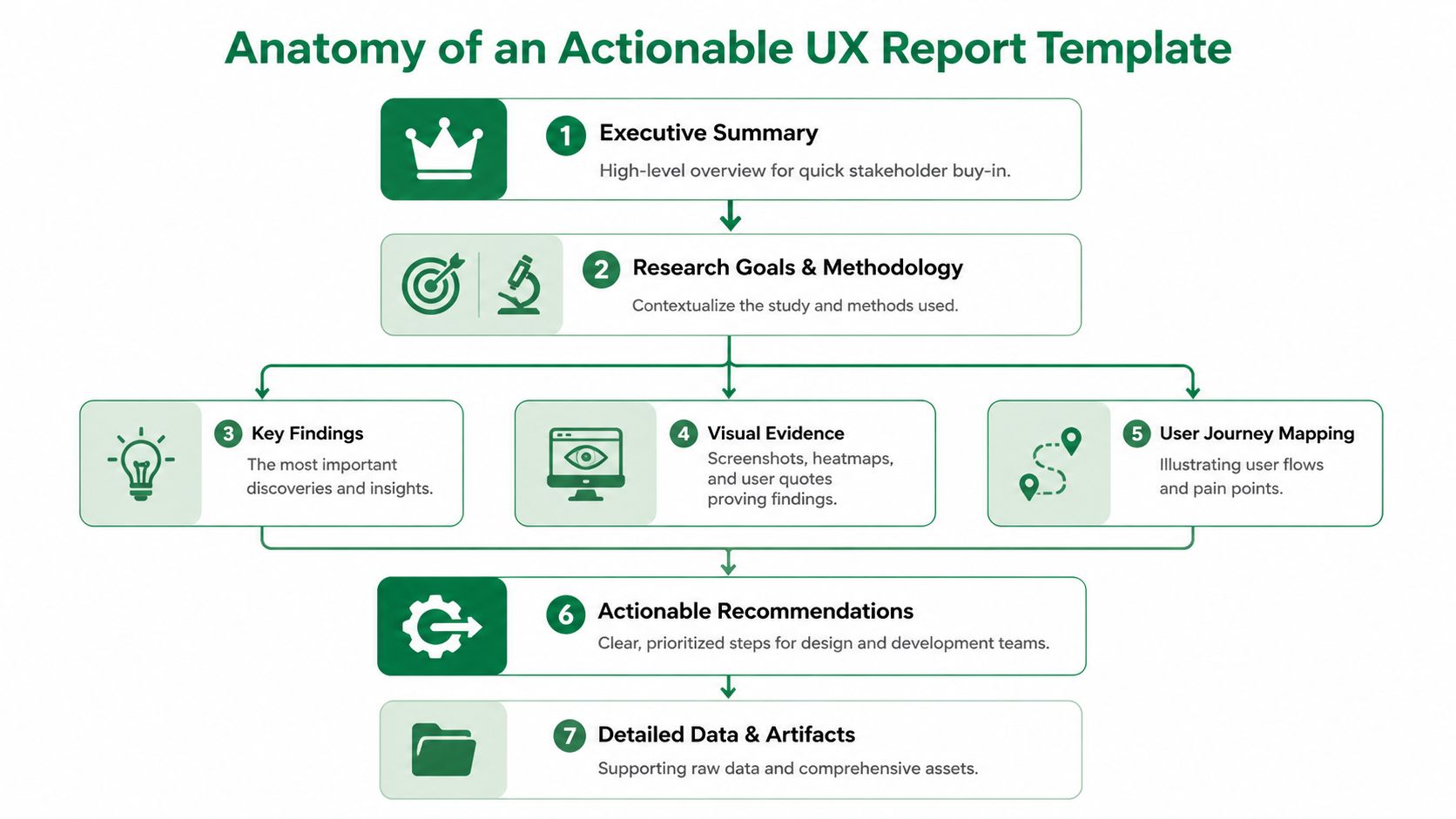
The sections that should always be present
I use a simple test. If a PM, designer, or engineer opens the report cold, they should know the user goal, the main breakdowns, and the next action within a few minutes.
That usually requires nine parts.
Executive summary
Keep this to one page or one screen. State the top issues, likely product impact, and the recommended next step. This is the part leaders use to approve scope, so make the decision obvious.Test setup
Explain what was tested, in what environment, and with which constraints. Keep it brief, but specific enough that nobody confuses prototype feedback with production behavior.Audience definition
Name the user segment the findings represent. If the report mixes first-time users, power users, and edge cases without saying so, the team will argue about validity instead of fixing the problem.Mission and scenario
Write the user task in plain language. Good reports anchor every issue to what the participant thought they were trying to do, not just to a screen or feature.Key UX findings
Rank issues by consequence. Group related observations into a single finding when they point to the same breakdown. AI outputs can produce too many fragments, so this section needs editorial control.Visual evidence
Add screenshots, click maps, journey paths, or interaction views that make the issue visible. Visual proof speeds up alignment, especially with teams that did not observe the session.Quotes or transcript snippets
Use short excerpts that explain intent, hesitation, or a wrong assumption. One clear quote tied to one observed behavior usually works better than a long transcript block.Severity or impact
Show whether the issue affects completion, trust, speed, conversion risk, or support load. Severity labels matter because they force the team to distinguish between annoyance and failure.Clear fix suggestions
Recommend the next product move. That might be a design change, a copy revision, another test, or a conscious decision to defer. A report without a proposed action creates discussion, not progress.
How the template should behave under real team constraints
The format matters almost as much as the content. In fast product cycles, teams need a report that supports three behaviors at once. Quick scanning before a meeting, enough detail for design work, and traceable evidence when someone challenges a finding.
That is why I treat the report as a layered system.
Report choice | What it helps | What it costs |
|---|---|---|
Long written document | Full context and archival reference | Slower reading and weaker prioritization |
Slide deck | Fast review and easier stakeholder discussion | Supporting detail can get buried |
Live dashboard alone | Direct access to artifacts and patterns | Weak narrative and uneven decision quality |
For AI-assisted research, the best answer is usually a hybrid. Use a concise summary for the meeting. Keep the proof underneath in a linked workspace. If the team needs a cleaner structure for repeated studies, a dedicated UX research reporting workspace keeps evidence, summaries, and recommendations in one place.
The structure that holds up when AI generates the raw material
Traditional templates were built around manual synthesis. Modern templates need a stronger filter.
Uxia can generate transcripts, behavior patterns, friction flags, and issue summaries quickly. That speed is useful, but it also creates a reporting risk. Teams start copying generated outputs directly into the report, and the document turns into a warehouse of artifacts instead of a ranked argument.
A stronger template prevents that. It forces a few decisions from the researcher before anything goes to stakeholders:
Which findings are distinct enough to stand alone
Which evidence proves each finding
Which issues deserve action now versus later
Which recommendation fits the confidence level of the study
That filtering step matters whether you are using thematic coding, behavioral clustering, or mixed-method synthesis. Teams comparing methods for choosing research analysis approaches run into the same reporting problem. The more analysis outputs you have, the more disciplined the template needs to be.
A practical standard for an actionable report
A useful template is short at the top, specific in the middle, and decisive at the end.
Stakeholders should be able to read the summary and know what needs attention. Designers and researchers should be able to inspect the evidence without hunting through folders, screenshots, and chat threads. That balance is what makes a modern ux research report template work.
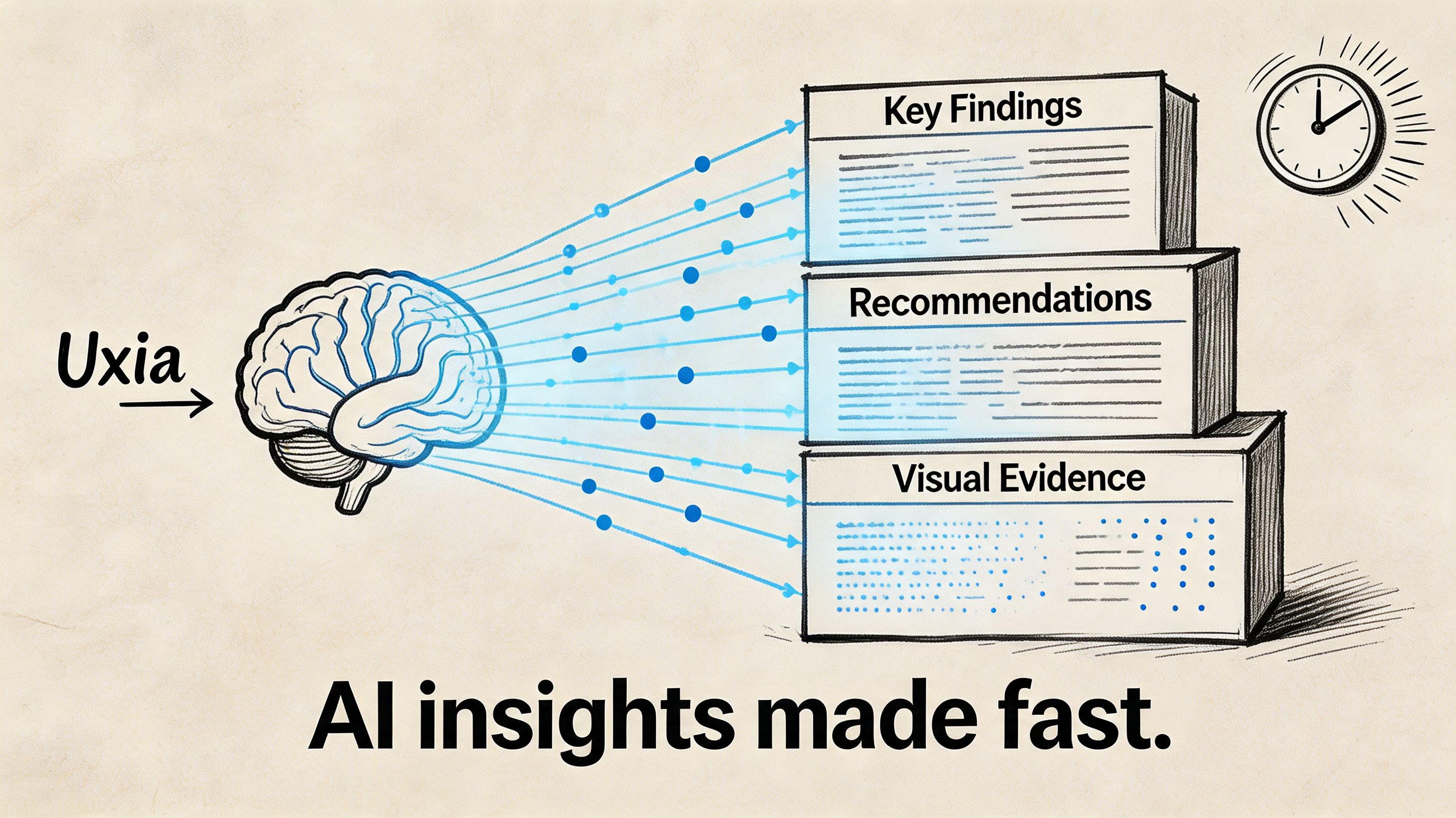
Populating Your Template with Uxia Insights
A modern template is only useful if you can fill it quickly and consistently. That's where AI-generated outputs become practical. Instead of spending most of the cycle organizing notes, you spend the time shaping a sharper story.
Start with one concrete flow. Onboarding works well because it usually contains intent, decision points, trust checks, and obvious drop-off risk.
Map each platform output to a report section
When I populate a ux research report template from AI-assisted testing, I don't start writing prose. I start by matching outputs to report blocks.
Uxia output | Where it belongs in the report | Why it matters |
|---|---|---|
Mission definition | Mission and scenario | Anchors the entire story |
Audience settings | Audience definition | Shows who the results represent |
Prioritized friction flags | Key findings | Gives you a draft issue hierarchy |
Heatmaps and click patterns | Visual evidence | Makes confusion visible |
Path deviations and drop-offs | Severity or impact | Shows where momentum breaks |
Transcript snippets | User quotes or evidence | Explains expectations and reasoning |
Suggested issue summaries | Executive summary and recommendations | Speeds up synthesis, but still needs judgment |
That last point matters. AI can surface patterns quickly, but it shouldn't replace prioritization. The report still needs a researcher or product thinker to decide what deserves the front page.
A practical onboarding example
Say you're testing a new sign-up flow. The mission is simple: create an account and reach the first dashboard screen.
The report shouldn't open with every observed behavior. It should open with the blocker. If the primary CTA is visually weak, that becomes Finding 1. If users hesitate on account type selection, that's Finding 2. If trust breaks around asking for payment details too early, that's Finding 3.
A useful evidence chain looks like this:
Behavioral layer: users click around the hero area instead of the CTA
Path layer: users leave the expected path before completing account creation
Qualitative layer: transcript snippets show they expected a stronger prompt or different wording
Recommendation: increase CTA prominence, rewrite label, and retest the first screen
That beats a generic statement like "users found onboarding confusing."
A similar pattern appears in traditional moderated testing. In one example, a task like "create a new sprint" had a 30% completion rate because the button was hard to find. Manual logging can capture that, while an AI platform can flag the issue, provide heatmaps of misclicks, and surface transcript snippets explaining user expectations instantly, as described in this UX research report methodology example.
Keep synthesis separate from raw output
Teams get into trouble when they copy auto-generated observations straight into the report. That's fast, but it's lazy. A stakeholder doesn't need the machine's entire output. They need a judgment call.
A simple working method:
Collect the machine-generated signals
Pull friction flags, transcripts, heatmaps, and path views into one workspace.Choose an analysis frame
If you're comparing themes, flows, or task stages, be explicit. If you need a refresher on choosing research analysis approaches, that guide is useful because it helps distinguish when to organize around behaviors, themes, or decision points.Write findings as claims, not logs
"Users didn't trust the pricing step because the plan details lacked context" is a finding. "Three testers paused on pricing" is just an observation.Attach only the strongest proof
One screenshot, one heatmap, one transcript snippet, one recommendation. That's usually enough.
Teams building faster validation loops often move this work into a repeatable workflow tied to synthetic user testing for rapid UX insights. The report gets better when the input structure stays consistent across tests.
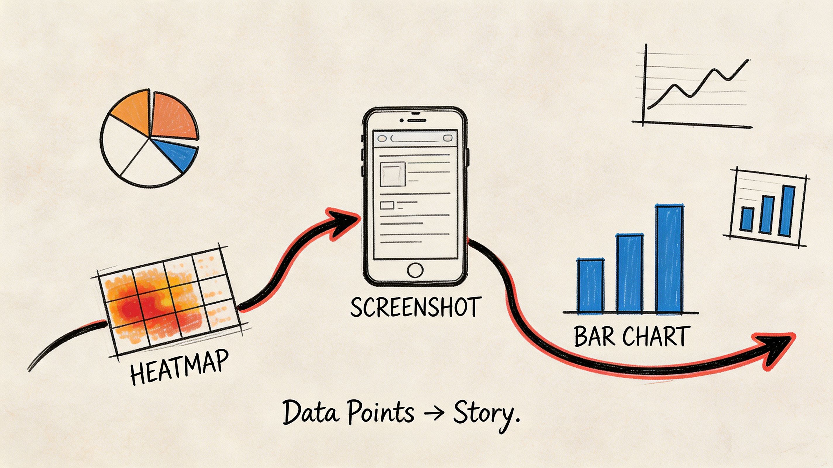
Telling a Coherent Story with Visual Evidence
A report full of visuals can still be hard to follow. The problem isn't a lack of charts. The problem is sequence.
Visual evidence works when it follows the user's journey. It fails when it mirrors the tool interface. Stakeholders don't need to browse every tab you used during analysis. They need to understand how a user moved through a flow, where that flow broke, and why the issue deserves action.
Build the sequence around one finding
Take a checkout confirmation issue. The user thinks a button will finalize the order, but the interface uses language that suggests another intermediate step.
The visual story should unfold in order:
Show the mission
"Complete purchase and confirm the order."Show the expected path
A simple journey view or annotated screen sequence establishes what success should look like.Show the actual behavior
Heatmaps or click clusters reveal users interacting with the wrong area or hesitating near the main action.Show the explanation
Add a transcript snippet that captures what users expected the button to do.Show the recommendation
End with the proposed copy, hierarchy, or layout fix.
That sequence creates a narrative. It moves from behavior to meaning to action.
Don't lead with the chart that impressed you most. Lead with the visual that makes the problem obvious.
Choose the right visual for the job
Different visuals answer different questions. Mixing them without intent turns the report into noise.
Visual type | Best used for | Common mistake |
|---|---|---|
Heatmap | Early confusion, scattered attention, competing click targets | Treating it as proof without context |
Journey map or path view | Expected vs actual flow | Making it too detailed to scan |
Screenshot annotation | UI-level fixes | Annotating every pixel |
Transcript snippet | Explaining user reasoning | Using long quotes nobody reads |
Drop-off view | Identifying breakpoints in a task | Presenting it without the preceding screen context |
The strongest reports connect each visual to a direct recommendation. A heatmap alone says, "something's off." A heatmap plus transcript plus annotated fix says, "what should be changed."
Why visuals improve adoption
Visuals aren't decorative. They lower the effort required to agree on a problem.
A 2024 Maze.co analysis of 1,000+ studies found that templates incorporating visuals like heatmaps and journey maps increase actionable insight adoption by 40%, with 72% of product managers reporting faster decision-making, as cited in this summary of UX research templates and examples.
That's exactly what I see in practice. Once a designer and PM can look at the same evidence and point to the same moment of friction, debate gets narrower and action gets faster.
Presenting Findings for Maximum Stakeholder Impact
A single report format doesn't work across functions. The same evidence needs different packaging depending on who has to act on it.
When teams ignore that, findings get diluted in handoff. Data shows 45% of research insights are lost when translating findings to non-technical stakeholders. Customizing reports, such as focusing on ROI for executives instead of jargon-heavy methodology, is critical for driving buy-in, according to Maze's guide on UX research reports.
Give each audience the version they can use
Executives don't need a full walkthrough of your method unless the study will be challenged. Designers do. Product managers need prioritization and timing. Engineers want enough context to understand why the change matters and where edge cases may appear.
A practical way to handle this is modular reporting.
For executives: lead with risk, opportunity, and next actions. Keep it concise. Focus on business impact such as trust, activation, conversion, support burden, or implementation urgency.
For product managers: present the ranked issue list, the severity logic, and the validation plan after changes.
For designers: include screenshots, path evidence, transcript snippets, and direct UI recommendations.
For engineers: clarify the exact interaction breakdown and the conditions under which it appears.
The underlying evidence can stay the same. The framing should change.
Use modular insight nuggets, not one giant deck
A report doesn't need to be one file. In fast-moving teams, the more useful format is often a small set of shareable units.
One slide can carry a complete issue if it includes:
the user mission
the finding
one visual
one proof point from behavior or transcript
the recommended fix
the retest plan
That format travels well in Slack, email, planning docs, and leadership reviews.
Field note: When people forward a single slide, they preserve the finding. When they forward a ten-page report, they usually summarize it badly.
What to remove for each audience
Tailoring isn't only about adding the right material. It's also about cutting the wrong material.
Audience | Remove or minimize | Keep front and center |
|---|---|---|
C-suite | Dense method detail, raw transcripts, exploratory side findings | Risk, opportunity, recommendation |
Design | Broad business language without UI context | Screens, behaviors, rationale |
PM | Excessive visual detail with no prioritization | Severity, sequencing, validation |
Sales or marketing | Research jargon and taxonomies | Customer friction, trust, messaging clarity |
Many generic templates fall short. They assume product, design, and leadership all want the same report. They don't. A better ux research report template is flexible enough to preserve one evidence base while changing the packaging.
How to Evolve Your Report Template Over Time
A report template shouldn't freeze after the first version. It should absorb what the team keeps learning.
The pattern usually appears after repeated tests. The same categories start resurfacing. CTA confusion shows up in onboarding, then in pricing, then in checkout. Form field hesitation keeps appearing across account creation and support flows. At that point, the template needs to make those recurring signals easier to compare.
Treat repeat friction as a reporting signal
When the same issue type returns, add structure for it.
You might create:
A recurring friction section for onboarding
A standard evidence block for trust issues
A comparison panel for repeated form failures across flows
A retest note that tracks whether a previous fix helped
This turns the template into a learning system rather than a one-off document shell.
Keep the template stable, but not rigid
The core sections should stay consistent: summary, context, findings, evidence, impact, recommendation. What should change is the emphasis.
If your product keeps surfacing the same classes of issue, the template should spotlight them sooner. That helps teams recognize patterns across releases, not just within a single test. Over time, the report becomes part of institutional memory instead of another artifact buried in a folder.
Frequently Asked Questions
What's the best format for a ux research report template
For stakeholder communication, slides usually work best because they're fast to scan and easy to present asynchronously or live. For deeper documentation, a Notion page, Confluence page, or linked repository works better.
The strongest setup uses both. Put the summary and top findings in a deck, then link to the fuller evidence set for anyone who needs detail.
How should I handle conflicting AI-generated findings
Treat conflicting signals as something to interpret, not something to hide.
If most testers struggle with a flow but a smaller group succeeds, the dominant pattern still deserves priority. The successful paths may reveal an alternate route, a learned behavior, or a segment-specific expectation. Capture that as an outlier and decide whether it's useful or distracting for the current product goal.
Can this template work for traditional research too
Yes. The structure works for moderated usability tests, interviews, diary studies, and survey synthesis.
The reason it works is simple: it separates context, evidence, interpretation, and action. That's good reporting regardless of method. AI-assisted testing mainly changes the speed and richness of the input material.
What should never be missing from the report
At minimum, include:
An executive summary
Audience and mission
Top findings
Visual evidence
User reasoning, such as quotes or transcript snippets
Severity or impact
Clear fix suggestions
A plan to validate changes
If any of those are missing, the report gets harder to trust or harder to use.
If you're trying to replace slow reporting loops with faster, clearer UX evidence, Uxia gives product teams a practical way to test flows, surface friction, and turn AI-generated insights into reports stakeholders can take action on.