Pull Down Menu Design: Patterns, Pitfalls, and Testing
Master pull down menu design with proven patterns, accessibility rules, mobile fixes, and synthetic testing workflows. Practical guide for product and UX teams.

A pull-down menu can look polished and still fail the people who rely on it. Baymard found that 74% of desktop e-commerce sites used hover-based drop-down menus, yet its research also shows that unexpected opening and closing can interrupt product finding, and 60% of sites failed to provide the recommended hover delay (Baymard's e-commerce navigation research). That contrast is the starting point for good pull down menu design: widespread patterns aren't automatically usable.
A reliable menu needs more than tidy spacing and attractive icons. You need to validate its anatomy, interaction model, motion, keyboard behavior, responsive layout, and real task performance. This guide treats Uxia as a practical testing option for checking those decisions with synthetic users before a menu damages navigation and trust.
The Cost of a Broken Dropdown
A menu can pass a design review and still slow down everyday work. In Figma, the categories align, the panel has generous white space, and the arrow suggests what will happen. After release, users may hover over the wrong labels, miss account settings, or open the panel while reaching for another control. When it closes, they lose their place. A screenshot cannot reveal those failures.
The problem begins when a team evaluates a pull-down menu as a static composition. It is a high-impact interaction surface that affects how people find categories, understand product structure, recover from mistakes, and decide whether the interface is trustworthy. A polished visual treatment cannot repair unclear hierarchy or unstable behavior.
Practical rule: Treat a menu as a task system, not a decorative component.
Pull-down menus became a foundational graphical-user-interface pattern during the Xerox Star and Apple Macintosh era of the 1980s. Their central idea, progressive disclosure, keeps secondary commands hidden until a user activates a visible label. The pattern preserves access to many functions without keeping every option on screen.
That space-saving trade-off does not remove cognitive work. Users still have to discover the hidden structure, interpret the labels, control the opening behavior, and move through the available choices. A menu redesign should answer four questions:
Anatomy: Can users identify the trigger, hierarchy, groups, and available actions?
Interaction and motion: Does the menu open at the right moment and stay stable while users move through it?
Accessibility: Can people operate and understand it without a mouse?
Validation: Do realistic users complete tasks with few errors and little backtracking?
A small example shows why these questions belong together. If a visitor needs to change billing settings, a clear label may help them find the right category, while predictable opening behavior keeps the route visible. Keyboard focus and a useful open state determine whether the same task remains possible without pointing. Synthetic testing can expose these failures before they become support requests. Use a structured workflow such as UX validation for digital products to connect design decisions with observable behavior.
For teams documenting the component, Waymap's template info reference can help organize its states, rules, and content decisions. That record gives designers and engineers a shared reference for what the menu should do, not only how it should look.
Anatomy of a Pull Down Menu
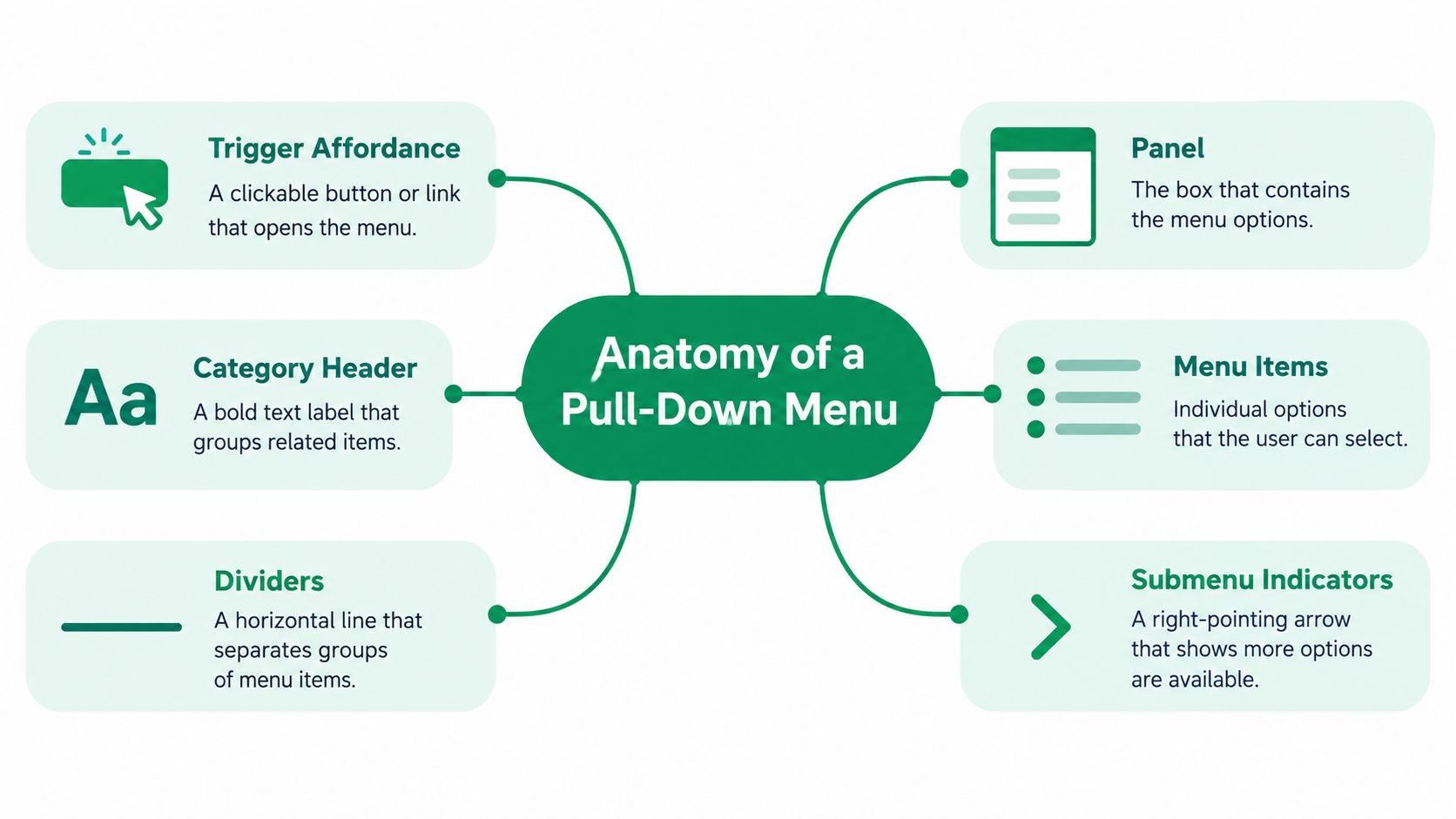
Start with a concrete example. Suppose a commerce header contains Products, Solutions, Resources, and Company. When a user activates Products, a panel opens with Analytics, Integrations, and Security. Each part of that experience carries meaning.
Name every moving part
The category header tells users what broad area they're entering. It should use a familiar, specific label rather than an internal team term. The trigger affordance might be a text label, a button, a chevron, or a combination. Its visual state should change when the menu is focused, hovered, or open.
The panel is the container that establishes the boundary of the open menu. It should feel attached to the trigger, not like an unrelated card that appeared elsewhere on the page. Inside it, menu items should use concise labels that describe destinations or actions. If items belong to different groups, dividers, spacing, or headings can make those relationships visible.
A submenu indicator, such as a right-pointing arrow, tells users that selecting or hovering over an item reveals another level. Don't add one merely because the design system includes it. It creates an expectation of another panel, so it should correspond to real behavior.
The final component is easy to miss: the bridge or hover corridor between the trigger and the panel. Users often move diagonally from the category label toward a nested option. If that path crosses an unrelated region or closes the menu too quickly, the pointer movement becomes a source of failure.
Progressive disclosure needs a visible hierarchy
Progressive disclosure keeps secondary commands hidden until a user activates a visible menu label, reducing persistent screen clutter while preserving access to multiple functions.
This principle shaped early desktop interfaces and remains useful for dense navigation. Menus can expose category hierarchies without requiring a separate page for every option. The principle doesn't justify hiding every list, though. A hidden choice still needs a clear label, predictable behavior, and enough context for users to understand where they are.
Use typography and spacing to communicate levels. A stronger weight can distinguish a group heading, while indentation can show a child relationship. Decorative imagery shouldn't carry the hierarchy by itself. A Nielsen Norman Group study of USA.gov mega-menus found that participants often ignored images inside expanded menus or failed to recognize that those images were clickable. When a task required selecting an image, task success dropped considerably (Nielsen Norman Group research discussed by Baymard).
Sketch the component on paper before styling it. Draw the trigger, panel, groups, items, dividers, indicators, and pointer path. Label the purpose of each part. If you can't explain why an element exists, remove it or test the assumption before it becomes code.
Interaction Patterns and the Compactness Trade-Off
No single opening method wins in every context. Hover can support rapid desktop exploration, but it depends on pointer precision and timing. Click gives users explicit control and works better when accidental activation would be costly. Focus supports keyboard users and should be part of the interaction model even when mouse behavior receives most of the design attention. Type-ahead can speed selection in long lists, provided the control announces and preserves the selected value clearly.
A 2022 peer-reviewed product-configurator study makes the trade-off concrete. Participants gave tab navigation a higher System Usability Scale score than a drop-down menu with arrow buttons, 41.04 versus 38.26, while the corresponding system-usability means were 33.64 versus 30.80. The reported differences were statistically significant, with p-values of 0.004 and 0.002. Yet the drop-down was faster in that experiment, with average task times of 164.85 seconds versus 181.50 seconds for tabs, and the timing difference was statistically significant at p = 0.008 (the peer-reviewed product-configurator study).
The lesson isn't that tabs are better or menus are faster. A compact menu may accelerate selection for people who understand the hierarchy, while tabs may make choices easier to scan and compare. Track completion time alongside errors, hesitation, abandonment, and confidence. A fast wrong choice isn't a successful interaction.
Geometry changes the experience
Menu rows need clearly separated hit areas. Ambiguous gaps between a parent item and its submenu create accidental transitions, especially when users move diagonally. An ACM CHI experiment found that expanding target areas and using visually impenetrable borders improved selection performance, with borders producing the greatest benefit. It also found that bar-menu access could be faster than the best walking-menu condition even on large monitors (the ACM CHI target-geometry experiment.
For a redesign, compare dense rows with more generous spacing. Test slower pointer movement and trackpad input, not only fast mouse movement. Record mis-selections, pointer reversals, and abandonment. If stronger boundaries reduce errors without materially increasing scan time, keep them. If errors remain, simplify the hierarchy or replace the nested menu with a flatter choice model.
Pattern | Best For | Main Risk | Watch Metric |
|---|---|---|---|
Hover | Desktop category exploration | Accidental opening or closing | Mis-trigger rate |
Click | Explicit selection and mixed input | Extra activation step | Task completion |
Focus | Keyboard and assistive technology | Unclear focus movement | Focus errors |
Hybrid | Products serving mouse, keyboard, and touch users | Inconsistent states across inputs | Cross-input completion |
For a fuller representation of the paths users take, map the menu into a user flow diagram. That makes hidden branches, backtracking, and dead ends easier to identify before you polish the component.
Making the Menu Work Without a Mouse
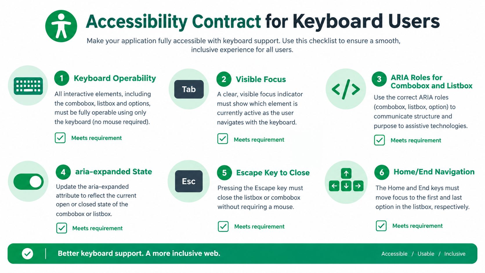
A pull-down menu has an accessibility contract. WCAG 2.2 Success Criterion 2.1.1 requires all functionality to be operable through a keyboard without requiring specific key timing (WCAG 2.2). A menu that works with a pointer but traps focus or hides its state from a screen reader hasn't met that contract.
Test the keyboard path as a real journey
Start with the trigger. Press Tab until the focus reaches it, and confirm that the focus indicator is visible against the surrounding interface. Press Enter or Space to open the menu, then use arrow keys to move through options. The current option should be visually clear and programmatically exposed.
For a custom control, use the correct combobox and listbox semantics where that pattern fits. The trigger needs a relationship to the option list, and its expanded or collapsed state should be exposed through aria-expanded. An aria-controls relationship can identify the controlled list when appropriate. Native HTML select controls provide much of this behavior by default, which is why replacing them should solve a real interaction problem rather than merely satisfy a visual preference.
Support explicit dismissal. Escape should close the menu and return focus predictably to the trigger. Home and End behavior, or type-ahead where appropriate, can help users move through longer lists. When a selection changes, the user needs an understandable announcement, not only a color change.
Run this short QA protocol:
Enter the component: Tab to the trigger and verify the focus order.
Open it: Use Enter or Space and confirm that the expanded state is announced.
Move through it: Move with arrow keys and check that focus or the active option is clear.
Select: Choose an item and verify that the selected value is announced.
Dismiss: Press Escape and confirm that focus returns to the trigger.
Recover: Reopen the menu without losing the user's position or context.
For a practical overview of this workflow, use accessibility testing guidance.
The broader problem isn't limited to one component. The 2025 WebAIM Million report found that accessibility errors and WCAG-conformance failures remained widespread across the web despite small year-over-year improvements. Menus belong in the same quality process as forms, dialogs, and page structure. Test screen readers, switch access, touch, and keyboard input rather than signing off after a visual inspection.
Responsive and Mobile Behavior
A navigation menu and a form control may share a dropdown shape, yet they support different decisions. A form control lets users choose a value while keeping the page context stable. Primary navigation helps users explore categories, compare destinations, and understand the product structure. Applying one native pattern to both can hide too much information.
On mobile, the container's size determines how much users can compare at once. Baymard's research found that an opened native dropdown occupied about 50% of the screen, commonly showed three options initially, and displayed no more than five options even when optimally scrolled. That narrow window makes category scanning difficult, so native controls may suit form input but not primary navigation (Baymard's mobile dropdown navigation research).
Choose by task, not by visual consistency
For mobile navigation, use a clearly tappable custom trigger and reveal broad categories before deeper levels. Keep the parent category visible as users move down the hierarchy, show whether the menu is open, and make the route back obvious. Touch targets should be approximately 7 × 7 millimeters or larger, following Baymard's practical recommendation in the same research.
Desktop hover needs a separate interaction rule. A 300 to 500 millisecond delay gives deliberate pointer movement time to settle before the panel opens, while still keeping exploration responsive, as described in Baymard's hover-menu guidance. Keep the panel open as the pointer travels from the trigger to its content. Test the timing with diagonal movement across the header, then record accidental opens, missed panels, and wrong-item selections.
A simple decision rule helps:
Choosing a value: Prefer a native or carefully implemented select control for compact form input.
Exploring categories: Use a custom navigation pattern that reveals structure and preserves orientation.
Comparing a short set: Show choices directly when space and hierarchy allow it.
Moving across devices: Define equivalent states for hover, click, touch, keyboard, and screen-reader input.
Responsive behavior requires more than shrinking a desktop menu. It changes how much context users can see and how each interaction begins, continues, and closes.
When a Pull Down Menu Is the Wrong Choice
Teams often collapse a list because the interface feels cleaner afterward. That instinct can hide the very choices users need to compare. A peer-reviewed study found that static vertical menus presenting items simultaneously were more favorable than dynamic menus requiring additional steps, and recommended simple, flat menu architectures plus text labels for icons and controls (the peer-reviewed study on static and dynamic menus).
The finding matters especially for older users and anyone who needs to inspect alternatives before choosing. A pull-down forces users to remember what was hidden, reopen the control when comparing options, and backtrack when the chosen path turns out to be wrong. Compactness saves screen space, but it can spend attention and memory.

Select the simplest model that supports the task
Selection model | Discoverability | Comparison | Screen cost | Backtracking |
|---|---|---|---|---|
Pull-down menu | Moderate, depends on trigger clarity | Limited while closed | Low | Can be high in nested structures |
Visible list | High | Strong | Higher | Usually straightforward |
Segmented control | High for short sets | Strong for adjacent choices | Moderate | Low |
Search | Variable, depends on labels and recall | Weak for browsing | Low | Can be high when terms are unknown |
The cost of a poor choice appears in task behavior, not just visual criticism. A 2025 summary of Baymard's benchmark reported mediocre or poor performance for 58% of desktop and 67% of mobile e-commerce sites, with no site achieving a perfect score (Baymard's navigation benchmark summary). That doesn't mean every weak result came from a dropdown, but it does show that navigation quality remains a widespread product problem.
Keep the pull-down for hierarchical categories, dense enumerations, and cases where progressive disclosure clearly helps. Switch to a visible list when users need comparison, to a segmented control for a short set of mutually exclusive choices, and to search when the list is broad but users know what they want. For high-stakes choices, visible labels and recoverable selection usually matter more than saving a little space.
Validating the Menu With Synthetic Testers
A menu redesign becomes easier to judge when you turn it into a specific mission. In Uxia, upload a prototype frame, static design, video prototype, live website, or product flow, then write an instruction such as “Open the menu and find the Returns policy.” Select a synthetic audience that matches the intended users, including relevant device habits and familiarity with the product category.

Design missions that surface how the menu fails
Ask participants to complete a task that requires the menu. A visual preference question produces opinions, while a mission produces observable behavior. Compare prompts such as:
“Find the plan that includes team permissions.”
“Locate the security documentation.”
“Change the account language.”
“Find the Returns policy and explain where you found it.”
Track task completion, time to first correct choice, mis-selection rate, abandonment, and backtracking. A participant who succeeds after opening three wrong panels has exposed a different failure mode from someone who never recognizes the trigger. Record the path, not only the final answer.
Read the think-aloud transcript for clues about navigation, copy, trust, and accessibility. “I expected this arrow to open a new page” points to an affordance problem. “I don't know whether this is still open” points to weak state communication. These comments help connect a visible behavior to a specific design change.
Compare variants in one workspace
Prepare two or three versions with one meaningful difference at a time. Compare a hover delay with immediate opening, a dense panel with wider row spacing, or a nested hierarchy with a flatter list. Keep labels and task wording stable so the interaction change remains interpretable.
Synthetic testing supports head-to-head comparisons within a design cycle. Use Uxia's visual reports and heatmaps to find repeated pointer paths, hesitation areas, mis-click clusters, and abandoned branches. Convert each pattern into a design ticket containing a condition, observed behavior, and proposed change. For example: “Users crossed the gap between the trigger and submenu and closed the panel. Add a stable pointer corridor and retest diagonal movement.”
Test each meaningful input method, including pointer, keyboard, and touch where the product supports them. A menu can pass a pointer mission while failing because focus disappears, a submenu closes unexpectedly, or a touch target is difficult to activate.
Use one acceptance question: Can the intended audience complete the task, understand the structure, and recover from a wrong move across the input methods you support? If the answer is no, revise the interaction before polishing its appearance.
A Field-Tested Checklist Before You Ship
Paste this checklist into the design review or Jira ticket. Assign each block to an owner instead of asking one reviewer to approve a vague “looks good.”
Anatomy and behavior
Trigger: The label and affordance communicate what opens.
Hierarchy: Groups, children, and submenu relationships are visible through text and spacing.
Boundaries: Rows have clear hit areas, and the pointer path remains stable.
States: Closed, focused, hovered, open, selected, and disabled states are distinct.
Pass gate: A first-time user can open the menu, identify the relevant group, and select the intended item without guessing.
Accessibility
Keyboard: Tab, Enter or Space, arrow keys, Escape, and relevant Home or End behavior work.
Focus: The focus indicator remains visible and returns predictably after dismissal.
Semantics: Custom controls expose appropriate combobox or listbox relationships and
aria-expanded.Announcement: Screen readers receive the trigger state and selected value.
Pass gate: A keyboard-only user can complete the same mission without a mouse.
Responsive behavior
Desktop: Hover timing prevents accidental opening and closing.
Mobile: Navigation uses a tappable trigger with enough target area and preserved orientation.
Task fit: Form selection and category exploration use patterns suited to their different goals.
Pass gate: Users can scan, choose, and backtrack on each supported device class.
Validation
Missions: Test realistic destinations, not opinions about appearance.
Metrics: Record completion, first correct choice, errors, abandonment, and backtracking.
Variants: Compare meaningful alternatives in the same testing workspace.
Tickets: Convert repeated findings into specific design and engineering actions.
For broader product guidance, the UX best practices resource from Cleffex Digital ltd provides useful context for placing menu decisions within a larger interface system.
The cheapest time to fix a menu is before launch. The next cheapest time is the next sprint, while the most expensive time is after a quarterly review reveals unexplained funnel drop-off. Synthetic testing can compress those feedback windows into minutes, giving the team evidence while the design is still easy to change.
Uxia lets product teams test prototype frames, static designs, live websites, and product flows with synthetic users, then review transcripts, usability flags, metrics, heatmaps, and prioritized findings. Create a pull-down menu mission, compare variants, and validate keyboard, mobile, and navigation behavior by visiting Uxia.