Pricing Page Usability Testing Before You Redesign It
Run a rigorous pricing page usability testing program before you redesign. Practical methods, missions, metrics, and a Uxia workflow for product teams.

The roadmap ticket says “refresh the pricing page.” The Figma file is nearly ready, the annual billing toggle looks cleaner, and stakeholders agree that the recommended plan should stand out more. Then someone asks the uncomfortable question: has anyone watched a real buyer choose a plan on the current page?
That question often arrives too late. A team can launch a more attractive interface that still causes users to select the wrong tier, miss an overage charge, or assume an annual price is billed monthly. Pricing page usability testing catches those comprehension failures before they become conversion, support, refund, and retention problems.
Why Most Pricing Page Redesigns Skip the Hard Part
A familiar redesign begins with internal alignment. Product supplies the pricing model, marketing supplies the positioning, design supplies the visual system, and engineering prepares the implementation. Everyone can explain the page. That confidence creates a dangerous assumption, users will understand it too.
They often don't. A buyer may choose the lowest tier because the feature matrix hides a decisive limit below the fold. Another may interpret “$200 per month” as a monthly charge even when the checkout requires an annual payment. Someone else may click the CTA, then abandon after discovering that taxes, additional seats, or renewal terms weren't visible.

The issue isn't primarily color, spacing, or button shape. A pricing page is a decision interface. Users need to identify the right plan, calculate the commitment, understand entitlements, and decide whether the terms feel trustworthy. Baymard found that 48% of U.S. online shoppers abandoned an order because extra costs were too high, 16% abandoned because they couldn't see the total order cost before checkout, and 18% stopped because they didn't trust the site with their credit-card information. Those findings are reported in Baymard's UX statistics research.
Practical rule: Don't ask participants whether they “like” the redesign. Ask them what they believe they'll pay, what they'll receive, and what happens if they cancel.
A short test of the existing page is usually cheaper than discovering after launch that the new hierarchy amplified the wrong assumption. Give representative buyers realistic missions, observe their choices, and record the language they use to reconstruct the offer. A UX review can also expose adjacent discoverability and accessibility risks. SemDash's UX SEO audit checklist is a useful companion because pricing-page clarity affects both user decisions and how teams assess the broader experience.
Uxia can support this early diagnostic by letting a team provide a pricing flow, define an audience and mission, and review how synthetic participants move through, interpret, and discuss the page. The point isn't to replace every live conversation. It's to get evidence into the redesign before the Figma file becomes expensive to change.
Planning the Test Around Real Decisions
Start with a decision, not a design opinion. “Improve the pricing page” isn't testable. “Help a qualified buyer select the correct plan and explain the first-year cost without assistance” gives research, design, analytics, and growth a shared target.
Write hypotheses against specific page elements:
Tier naming: If plan names describe the buyer's situation more clearly, participants should select a suitable tier without relying on feature jargon.
Billing presentation: If monthly-equivalent pricing is paired with the immediate charge, participants should accurately explain when and how much they'll be billed.
Feature comparison: If decision-critical limits appear before secondary details, participants should identify the relevant entitlement with fewer detours.
Trust information: If cancellation, renewal, taxes, and overages are visible at the point of choice, participants should report greater confidence in the terms.
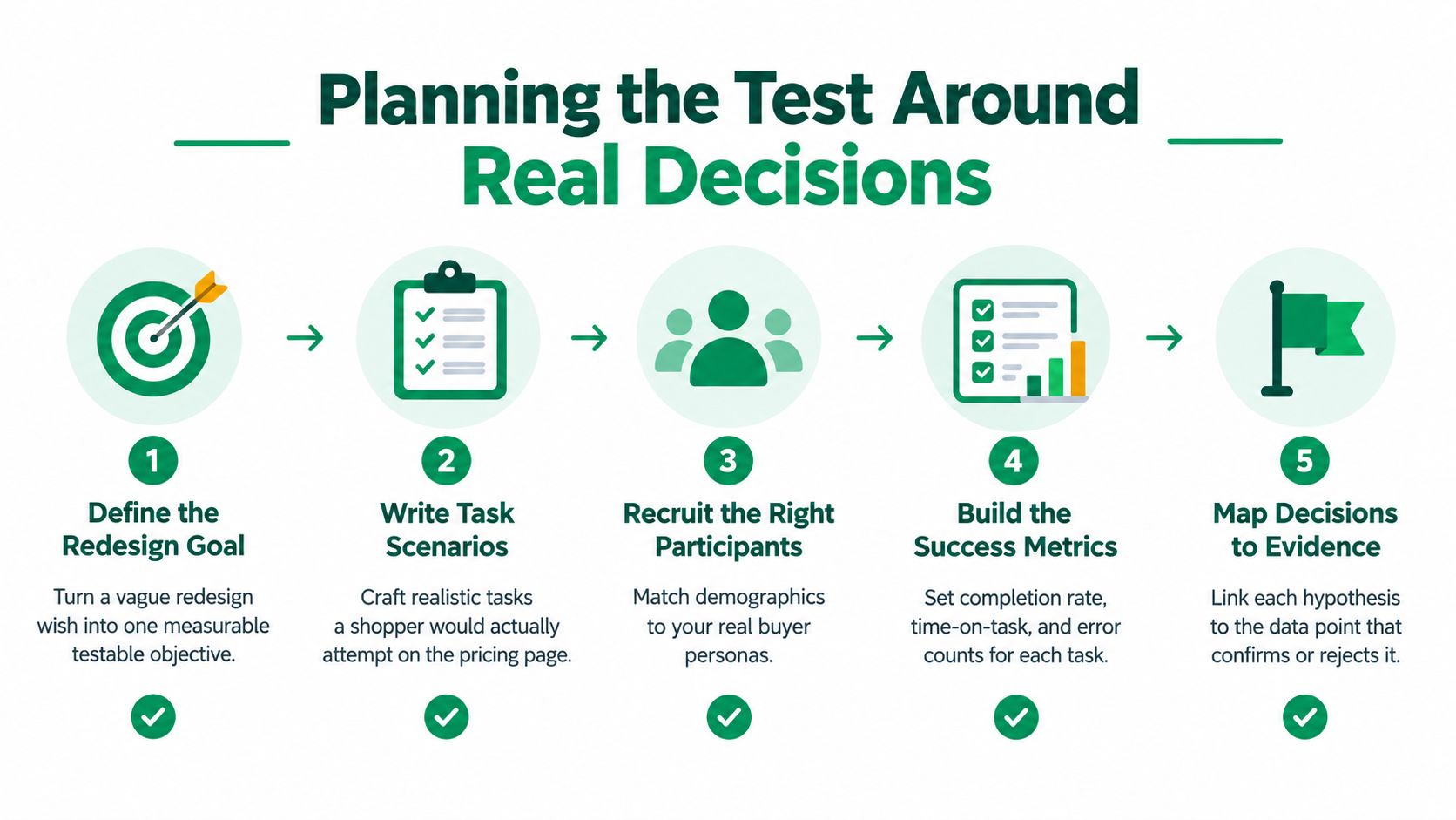
Before showing any alternative, establish a baseline. Influenceflow recommends tracking pricing-page conversion rate, bounce rate, time on page, and plan selection, then pairing those measures with trial-to-paid conversion as the primary commercial check. Segment the baseline by new and returning visitors, device, geography, acquisition channel, self-serve versus sales-assisted intent, and monthly versus annual billing. Without that separation, a change in traffic mix can look like a usability improvement.
Choose one primary outcome before exposure. Qualified checkout initiation or completed signup may be appropriate, but a CTA click alone isn't enough. Add guardrails for refund requests, support contacts, trial activation quality, and early churn. A variation that generates more low-intent signups can look successful in a dashboard while weakening the business.
A reported portfolio of 13 pricing experiments produced 2 winners, 8 inconclusive results, and 3 negative outcomes, a 15.4% win rate, as described in this pricing experiment analysis. That result doesn't establish a universal benchmark, but it does challenge the assumption that visual simplification or persuasive copy will reliably improve performance.
Put the plan on one page. Include the target audience, primary task, hypotheses, baseline segments, success measure, guardrails, device coverage, and the decision rule for shipping. A practical usability test plan template can help the team document those choices before opinions fill the gaps.
Building Participant Profiles and Task Missions
A pricing test needs buyers who resemble the people making the decision, not a generic collection of website visitors. Separate profiles by company size, role, buying authority, technical confidence, acquisition context, and device. A product manager at a startup may care about seats and implementation effort, while an enterprise researcher may need procurement terms, security information, and a sales path.
The profile changes the mission. Use neutral prompts that reveal the participant's mental model rather than pointing toward the intended answer.
Write missions around consequences
A strong mission gives the participant a situation and a decision:
“You're choosing software for a 12-person team. Select the plan you'd recommend with annual billing, then explain what you expect to pay during the first year.”
Follow with tasks that test the offer's mechanics:
Identify what each selected tier includes.
Explain the effective monthly price and the actual billing frequency.
Find included seats and the cost of additional users.
State what happens when a trial ends.
Locate cancellation and renewal conditions.
Say which limitation would make you upgrade.
Don't write “Find the recommended plan.” That prompt tells participants where to look and can hide whether the recommendation is discoverable. Ask them to choose the best plan and explain why. Their explanation will expose whether they used the audience label, feature list, price, badge, or an assumption imported from another product.
Nielsen Norman Group reports that a simple usability study with one design and one device typically uses 5 to 8 participants, while more complex studies involving multiple audiences or designs commonly cost 80,000 to 150,000 dollars. The practical implication is to keep the first study focused, then expand coverage when the decision requires comparisons across segments or markets.
Treat devices and abilities as separate contexts
Run desktop and mobile missions separately. Comparison tables, horizontal scrolling, sticky CTAs, and expandable feature groups can change the path to a decision. Don't assume that a page understood on a wide screen will remain clear when the billing control and total-cost explanation move below the fold.
Include keyboard and screen-reader flows where those users form part of the buying audience. Ask participants to operate the billing toggle, compare plans, understand unavailable features, and reach the CTA without visual shortcuts. Store reusable audiences and missions in a user persona template, then adapt the language to the product's actual buying situations.
Metrics That Actually Predict Pricing Page Success
A pricing page can produce healthy-looking clicks while failing at the decision it was designed to support. Measure three layers together: what people do, what they understand, and what happens after they commit.
Behavioral signals show where the flow creates effort. Record task success, time to decision, misclicks, scroll depth, plan changes, hesitation, and whether participants return to earlier sections. A participant who clicks the CTA after changing plans repeatedly hasn't necessarily succeeded. The reason for the final choice matters.
Comprehension checks reveal whether the participant can reconstruct the offer. Ask them to explain the selected plan in their own words, state the first invoice, identify recurring and one-time charges, name the relevant limits, and describe what happens after cancellation or trial expiry. Billing mechanics deserve particular attention because Baymard's pricing presentation includes a plan shown at $200 per month and $2,400 billed annually, with three users included and $20 per month for each extra user. The example demonstrates why labels must distinguish an equivalent monthly price from the amount charged.
Commercial outcomes connect usability to revenue quality. Track trial-to-paid conversion, average revenue per user, revenue per visitor, average contract value, plan mix, expansion, refund requests, support contacts, and early churn. The right metric depends on the business model, but the principle is consistent: don't treat a short-term click as proof that buyers understood the commitment.
Layer | What it measures | Example metric | Failure severity |
|---|---|---|---|
Behavior | Whether users can complete the decision path | Unassisted plan selection and time to decision | Blocked purchase or material delay |
Comprehension | Whether users understand the offer | Accurate explanation of price, limits, renewal, and cancellation | High priority when price or entitlement is misunderstood |
Business outcome | Whether the page attracts viable customers | Trial-to-paid conversion, revenue per visitor, or early churn | Commercial regression despite stronger clicks |
Code each issue consistently. A blocked purchase is more severe than a cosmetic alignment problem. A misunderstanding of total cost, renewal, limits, or cancellation remains high priority even if the participant reaches the CTA, because the click may represent an uninformed commitment.
Set a release benchmark for core tasks. Requiring 80 to 90% unassisted completion is a practical standard, provided the team treats it as a decision aid rather than a universal law. Pair it with qualitative evidence and guardrails. If participants complete the task but cannot explain the billing terms, the page isn't ready.
Running a Pre-Redesign Test with Synthetic and Live Users
Test the current pricing flow before touching the redesign. Upload a recording, live experience, or prototype to Uxia, define an audience, and create missions such as choosing the right plan for a five-person startup or explaining the difference between Pro and Enterprise. Synthetic participants can attempt the flow independently and think aloud, giving the team an early view of confusion before recruiting and scheduling live sessions.

Start with a narrow mission set. Ask participants to select a plan, calculate the expected charge, identify a limit, and explain cancellation. Review transcripts for exact misunderstandings, friction flags for repeated obstacles, and heatmaps for attention patterns. Cluster findings into usability, navigation, copy, trust, billing, and accessibility rather than creating a long unranked list.
Use synthetic testing for breadth and iteration. Use live moderated sessions when the result depends on an ambiguous motivation, a sensitive procurement concern, or a customer-specific constraint that requires follow-up. The comparison between synthetic users and human users is most useful when the team assigns each method a clear job instead of treating them as interchangeable.
Prototype fidelity should match the question. Low-fidelity wireframes can test whether tier hierarchy and information scent make sense. High-fidelity clickable prototypes are necessary for billing toggles, sticky CTAs, expandable feature details, trust signals, and realistic error states. Don't spend time polishing visual detail before confirming that participants can explain the offer.
A compact cadence can fit inside one sprint:
Early sprint: Establish analytics baselines, select segments, and write missions.
Mid sprint: Run the current flow through synthetic participants and cluster comprehension failures.
Late sprint: Conduct targeted live sessions for unresolved high-severity questions.
Before handoff: Test the redesigned prototype with the same core missions and compare failure patterns.
Use established example usability test scripts to structure introductions, neutral prompts, follow-up questions, and closing probes. Keep the moderator from teaching the interface. If a participant asks where the annual total is, record the difficulty before helping them continue.
When Lower Friction Is the Wrong Goal
A shorter path isn't automatically a better path. Some friction protects the business by making commitments, usage limits, minimums, or qualification requirements visible before a buyer signs up.
A pricing variant might increase self-serve registrations by hiding complexity, then attract accounts that can't activate or retain. Another version might ask a qualification question or direct larger teams to sales, reducing raw signup volume while improving fit. The usability question is whether the friction helps the right buyer make an informed decision or merely blocks progress.
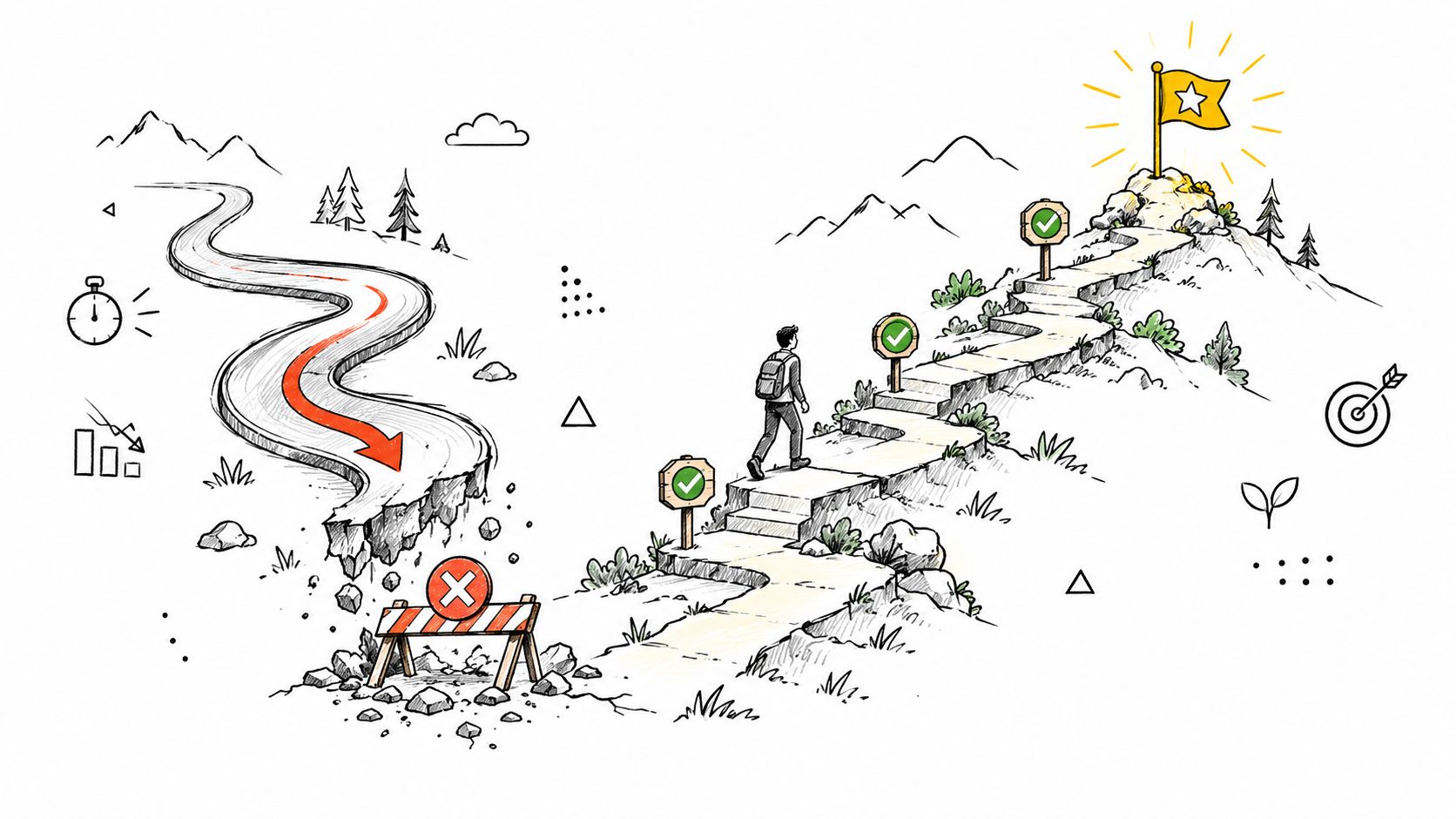
Segment results by acquisition source, company size, geography, device, selected plan, and self-serve versus sales-assisted intent. Ask, “What do you expect to pay over the first year?” and “What would make you hesitate to start?” Those answers reveal whether a pause reflects confusion, healthy caution, or poor fit.
Discovered Labs recommends tracking revenue per visitor, average contract value, and trial-to-paid conversion, rather than click-through rate alone, and notes that deliberate friction such as qualification questions can improve lead quality. The recommendation is detailed in its analysis of pricing-page optimization and conversion impact.
Turning Findings into a Pre-Redesign Report and Ship List
A useful report helps stakeholders make decisions without replaying every session. Start with an executive summary that states the primary task, the largest comprehension failure, the affected audience, and the recommended action. Avoid declaring the page “confusing” as a general diagnosis. Name the exact problem, such as “annual billing participants reported the monthly-equivalent price as the immediate charge.”
Organize the evidence around missions. For each finding, include:
Observed behavior: What the participant did, including plan changes, misclicks, hesitation, or abandonment.
Interpretation: The assumption or information gap that best explains the behavior.
Severity: Blocked purchase, material delay, misunderstanding of price or entitlement, or cosmetic friction.
Evidence: A transcript excerpt, task result, heatmap pattern, or analytics segment.
Recommendation: The smallest change that could resolve the issue.
Validation method: The same mission to rerun on the redesigned experience.
Evidence should change the interface, not just the presentation. If buyers can't state what they'll be charged, revise the billing model's explanation before debating visual polish.
Create a ship list with three tiers. Ship high-severity issues that affect total cost, renewal, cancellation, limits, accessibility, or plan selection in the redesign itself. Put lower-risk copy refinements and secondary comparison details into the next iteration when they don't obstruct the core decision. Keep unresolved questions visible rather than burying them in a backlog with no owner.
Before launch, verify that participants can select the intended plan, explain the immediate and recurring charge, identify included usage, find overage terms, operate the billing control on desktop and mobile, and understand what happens after trial or cancellation. After launch, repeat the core missions and compare the same baseline segments. Review trial-to-paid conversion and revenue-quality guardrails alongside page behavior.
The redesign is successful when buyers make an informed choice and the resulting customers remain viable, not merely when more people click a button. That standard gives design, research, product, and revenue teams a common definition of improvement.
Use Uxia to upload your current pricing flow, define realistic buyer missions, and identify confusion around plans, billing, limits, trust, and cancellation before the redesign ships. Visit Uxia to run a focused synthetic pricing-page test, prioritize the findings, and validate the revised experience with the same decision tasks.