P-Value Less Than 0.05 Explained for UX A/B Testing
Learn what a p-value less than 0.05 means in UX A/B testing, its common misinterpretations, pitfalls, and best practices with Uxia recommendations.

You've probably had this moment already. You run a quick A/B comparison, the dashboard returns p = 0.04, and someone on the team says, “Great, it's significant. Ship it.”
Then the room gets quiet.
Because the precise numerical value is frequently not what is required. They need an answer to a product question: is this difference likely to be real, or could it just be random chance? That's what a p-value is trying to help with. But in UX work, especially when you're comparing two design versions, the number gets treated like a verdict when it's really just one piece of evidence.
That confusion matters. A team can overreact to a p-value less than 0.05 and launch a change that barely helps users. Or they can see a result just above the cutoff and abandon a promising idea too early. Both mistakes are common in A/B testing because the metric feels more definitive than it is.
Introduction to p-value in UX A/B Testing
A p-value enters the conversation when a UX team wants to compare two versions of something. Maybe it's a checkout flow, a signup form, or a navigation pattern. The team observes a difference and wants to know whether that difference looks convincing enough to treat as more than noise.
In plain language, a p-value less than 0.05 means that, assuming there really is no difference, the probability of seeing results this extreme or more extreme is less than 5%. That standard is widely used to reject the null hypothesis in hypothesis testing, and it has become the dominant convention across scientific research and clinical investigations, even though it was established as a norm rather than a mathematical law by Ronald Fisher in 1925.
For designers, that sounds abstract until you tie it to a real decision. If version A and version B look different in your test, a low p-value is telling you the observed gap would be unusual if there were no effect. It is not telling you the redesign is automatically valuable, user-friendly, or worth engineering effort.
That's why good UX interpretation always goes one step further. You ask what changed, how large the change was, whether users behaved consistently, and whether qualitative findings support the pattern. The statistic can help you avoid guessing. It can't replace judgment.
Understanding the Key Concepts
A UX team runs an A/B test on two onboarding flows in Uxia. Version B gets a higher completion rate. The question is not just "did B win?" The fundamental question is whether the gap is large enough, and consistent enough, to treat as more than the usual noise you get whenever different users pass through a design.
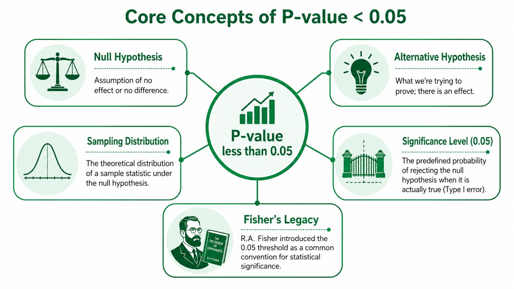
Null hypothesis and alternative hypothesis
Every A/B test starts with two competing explanations.
Null hypothesis: any observed difference between version A and version B could be random variation.
Alternative hypothesis: the difference reflects a real effect from the design change.
In product terms, the null says your new button label, layout, or content hierarchy did not change user behavior in a reliable way. The alternative says it did.
The p-value evaluates your result against the null. It asks: if there were no effect, how unusual would this observed difference be?
That wording matters because many design teams unwittingly swap in a different question. They read a low p-value as "our redesign works." The statistic does not answer that. It only tells you whether the result would be unusual under a no-effect assumption.
A useful habit is to translate the result into plain team language: "If nothing really changed, seeing a gap this large would be uncommon." That keeps the conversation grounded, especially when synthetic user testing on Uxia is being used to compare flows before a full launch.
Why 0.05 became the standard
The 0.05 threshold is a convention. Teams use it because it gives a shared rule for deciding when a result looks unusual enough to investigate seriously.
You can picture it like a smoke alarm threshold. Set it too loose, and it goes off for burnt toast every morning. Set it too strict, and you miss an actual kitchen fire. The 0.05 cutoff became a common middle ground, not a law of nature.
So when analysts say "p < 0.05," they mean the observed result would happen less than 5% of the time if the null hypothesis were true. That is why the result is often labeled statistically significant.
The practical takeaway for designers is narrower than the label suggests. Statistical significance helps you decide whether a pattern is likely to be random. It does not tell you whether the change improved usability enough to justify design and engineering work.
A clear visual explanation of this idea appears in this video walkthrough of p-values and confidence intervals. If your team wants to place that metric inside a broader decision process, this guide to quantitative research methods for UX teams connects significance testing to the rest of a product measurement workflow.
Sampling distribution in designer language
Sampling distribution sounds technical, but the underlying idea is familiar. Run the same test many times with different groups of similar users, and your conversion rates will shift a little each time. Some groups will be slightly faster, slightly slower, slightly more patient, or slightly more distracted.
That spread is the sampling distribution.
A weather analogy helps. One warm afternoon does not prove the season changed. You compare today's temperature with the usual range for this time of year. A/B testing works the same way. You compare your observed result with the range of outcomes that could happen through ordinary random variation.
The p-value is one way to make that comparison concrete.
For UX work, this matters because small apparent wins show up all the time in prototypes, moderated studies, and synthetic user simulations. A result only becomes persuasive when it stands far enough outside that ordinary wobble to deserve action.
A short visual explanation helps here:
Common Misunderstandings about p-value Thresholds
The biggest problem with p-value less than 0.05 isn't the statistic. It's the mythology built around it.
Myth one, p < 0.05 proves the hypothesis is true
It doesn't.
A p-value only tells you how incompatible the data are with the null hypothesis under a specific statistical model. It does not tell you the probability that your design idea is true. That misconception is stubborn. A discussion of the issue notes that 68% of clinical researchers in a 2023 study still treat p < 0.05 as a definitive marker of importance rather than a measure of statistical evidence, while newer guidance emphasizes that p-values near the threshold provide only weak evidence against the null in this analysis of the “magic” of p < 0.05.
In product work, the practical translation is simple. A low p-value means your result is harder to explain as chance alone. It doesn't mean your new onboarding flow is “correct.”
Myth two, statistical significance means practical significance
At this point, designers get burned.
Suppose a test says the new design is statistically significant. That still leaves several unresolved questions:
Was the observed effect noticeable to users
Did it reduce friction in an important task
Will the implementation cost outweigh the gain
Did interviews or session reviews support the same conclusion
A tiny improvement can be statistically significant and still not matter. A p-value can't answer whether the effect is meaningful for adoption, comprehension, trust, or retention. That requires effect size, confidence intervals, and product judgment.
A statistically significant result can still be a bad product decision.
Myth three, 0.05 is a magic line
Teams often treat 0.049 and 0.051 as if they belong to different universes. They don't.
The threshold helps standardize decisions, but the evidence doesn't suddenly transform at the line. A result just under 0.05 is not automatically decisive. A result just over it is not automatically worthless. That's one reason experienced researchers avoid turning the number into a ritual.
A cleaner interpretation is to ask: how strong is the evidence, how large is the effect, and does the rest of the research agree?
What UX teams should do instead
When you review an A/B result, don't stop at the p-value. Check these alongside it:
Question | Why it matters |
|---|---|
What was the observed difference? | Significance alone doesn't show magnitude |
Was the sample large enough? | Small samples can make interpretation unstable |
Did user behavior patterns line up? | Quantitative and qualitative evidence should support each other |
What would the team do next if the result were borderline? | Pre-deciding follow-up steps reduces bias |
That habit is what separates statistical literacy from dashboard theater.
Statistical Context and Design Implications
A/B testing looks tidy on the surface. Two variants. One metric. One p-value. In reality, the number is sitting inside a full decision process.
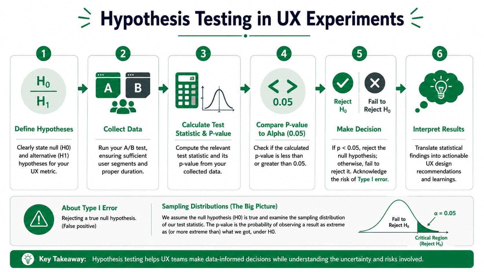
What the p-value is doing in an A/B test
In an A/B context, a p-value of 0.05 means that if the tested feature had zero influence on user behavior, there would still be a 5% probability of getting the observed result or a more extreme one purely by chance, as explained in this practical A/B testing guide.
That gives teams a formal way to evaluate whether the observed difference is likely to reflect a real effect or just random variation in the sample.
But there's another implication hidden in that definition. If your p-value is above the threshold, the issue may not be “the design failed.” It may be “the study didn't collect enough evidence.”
The decision flow designers actually use
A useful UX testing process usually looks like this:
State the no-difference assumption
Write down what “no effect” means before looking at results.Choose the behavioral outcome
Completion, error rate, hesitation, comprehension, or another metric.Run the comparison cleanly
Keep the variants focused so the result has a clear interpretation.Compare p to alpha
If p is below your chosen significance level, reject the null. If it isn't, fail to reject it.Interpret, don't just classify
Ask what the result means for the product, not just for the spreadsheet.
This is also where design teams can borrow from adjacent measurement disciplines. If you've ever looked at newsletter analytics, the same discipline applies: define the outcome first, then interpret the metric inside a larger decision system. This short guide on how to track Substack performance is a good example of that mindset in a different channel.
Type I error and the cost of false certainty
The reason researchers often use alpha = 0.05 is that it controls the chance of a Type I error, which means falsely rejecting a true null hypothesis. In other words, you conclude there's a difference when there really isn't one.
That's important in product work because false positives are expensive. You can push code, retrain stakeholders, redesign flows, and move roadmap priorities based on an effect that isn't real.
If your test is exploratory, treat it as hypothesis generation. If your decision is high stakes, move to a confirmatory study.
This distinction matters a lot in design research. Exploratory studies help you spot friction and generate ideas. Confirmatory studies help you decide whether a difference is strong enough to generalize.
Shipping decisions need more than one statistic
When a team asks, “Should we ship version B?” the p-value can only answer one narrow question. It helps with evidence against the null. It doesn't tell you whether the change is large enough to matter, whether it improves the broader experience, or whether the pattern shows up across methods.
That's why strong teams combine quantitative testing with qualitative review. If the p-value is low, users still need to make sense. If the p-value is borderline, the interviews, task recordings, and error patterns may tell you whether the idea deserves another round.
Ensuring Reliable Results with Power and Sample Size
A lot of disappointing A/B tests don't fail because the idea was bad. They fail because the study was too weak to detect a meaningful effect.

What power means in practice
Statistical power is the ability of a study to detect an effect if one really exists. In UX terms, power asks whether your test had a fair chance to catch the difference you cared about.
The mechanics are straightforward. To achieve p ≤ 0.05, researchers need to set the significance level alpha before the study, usually at 0.05, and make sure the sample size is large enough to detect the expected effect size. If p is greater than alpha, the null hypothesis is not rejected, meaning the result isn't statistically significant, as summarized in this explanation of significance levels and sample planning.
A practical planning routine
Before running a test, write down these four decisions:
What difference would matter
Don't ask whether any difference exists. Ask what difference would change a product decision.What alpha will be used
By convention, 0.05 is often used, but it should be chosen before data collection.How much variability you expect
Noisier behavior requires more data.How much certainty the decision needs
A homepage tweak and a pricing change usually don't need the same level of caution.
For broader planning on who to test and how to think about research coverage, this guide to audience and sample selection in UX research is worth bookmarking.
What underpowered studies feel like
Underpowered studies create a familiar pattern. The team sees a suggestive result, gets excited, and then can't tell whether the signal is real. That ambiguity often leads to overconfident storytelling or premature dismissal.
A healthier response is to say, “We don't have enough evidence yet.”
Here's the practical recommendation:
For exploratory work use smaller studies to surface issues and generate hypotheses.
For confirmatory comparisons increase sample size enough that the test can reasonably detect the effect you care about.
For high-stakes releases pair the statistical result with effect size and qualitative validation before shipping.
Power doesn't make your test smarter. It makes your conclusion more trustworthy.
Guarding Against Multiple Comparisons and p-Hacking
Once teams learn that p-value less than 0.05 matters, some start chasing it.
That's when trouble begins.
How multiple comparisons create false wins
If you test enough things, one of them may look significant by chance alone. A team might compare several layouts, several copy options, and several success metrics, then highlight the one result that dipped below the cutoff.
That practice inflates the risk of false positives. The p-value was designed for a specific test under a specific setup. When you run many tests and then selectively report the flattering one, the interpretation breaks.
A good discipline is to decide in advance:
Which comparison matters most
Which metric will decide the result
Whether any correction is needed for multiple tests
What the team will do with borderline outcomes
Borderline results need restraint
A result like p = 0.06 is where many teams lose their footing. It's tempting to call it a “trend” and move on as if the effect almost counts. But p > 0.05 technically means there isn't enough evidence to reject the null, and it still doesn't prove the null is true. A p-value of 0.06 means a 6% chance of seeing results this extreme by random chance if no effect exists, while recent discussions also note that some fields now advocate lower thresholds such as 0.01 or 0.005 for greater rigor, as discussed in this overview of p-value interpretation and borderline cases.
The right move is context, not spin.
When a result lands just above the cutoff, ask whether you need more data, a clearer design contrast, or a better-specified hypothesis.
Anti p-hacking habits for UX teams
You don't need a formal methods committee to stay honest. You need a few simple habits.
Pre-commit the main test. Write down the primary metric and comparison before opening the dashboard.
Keep a decision log. Record what changed during the study and why.
Separate exploration from confirmation. Exploration is where you generate ideas. Confirmation is where you test a specific claim.
Treat post-hoc findings as leads. Don't present them as if they were the original hypothesis.
That discipline protects the team from fooling itself. It also makes stakeholder conversations calmer, because the evidence chain is clearer.
Alternatives to Significance Testing
A binary threshold is convenient, but product decisions usually need more texture than “significant” or “not significant.”
Effect sizes and confidence intervals
A better report doesn't stop with the p-value. It also tells readers how big the observed difference was and how uncertain that estimate is.
That's where effect sizes and 95% confidence intervals help. A p-value can tell you the data are unlikely under the null. It can't tell you whether the difference is substantial enough to matter in the product. Confidence intervals add a range around the estimate, which helps teams judge practical importance instead of only threshold crossing.
This is one of the clearest upgrades a UX team can make. When a result is statistically significant but the estimated improvement is tiny or highly uncertain, the report should say so plainly.
Bayesian thinking for product teams
Bayesian A/B testing offers a different framing. Instead of asking how unusual the data are under the null, Bayesian methods focus on updating belief about competing explanations in light of the data.
That can be useful for product teams because the outputs often match stakeholder language more naturally. People want to know how likely it is that a change helps, harms, or is negligible. Bayesian methods are often better suited to that style of question.
Still, the same caution applies. Better framing doesn't remove the need for sound design, enough data, or clear success criteria.
A blended approach works best
For many UX teams, the strongest workflow is not “choose one philosophy forever.” It's simpler than that.
Use:
P-values when you need a standard hypothesis-testing rule
Effect sizes when you need to understand magnitude
Confidence intervals when you need to communicate uncertainty
Qualitative evidence when you need to understand why the behavior changed
That combined view is much closer to how real product decisions happen. A team rarely ships because one number crossed one line. They ship because the numbers, the user behavior, and the design rationale all point in the same direction.
Reporting Templates and UX Team Checklist
Most reporting problems start with missing structure. Teams remember to include the winning variant, but forget to document the hypothesis, significance level, or limitations.
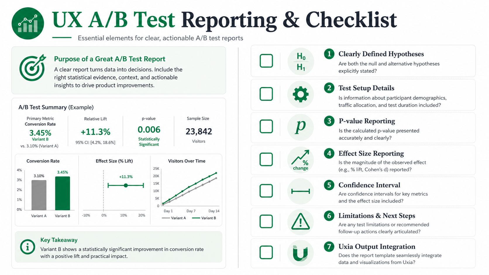
A simple report template
Use a report format like this:
Section | What to include |
|---|---|
Hypothesis | Null and alternative hypotheses in plain language |
Test setup | Variants, audience, task, and primary metric |
Statistical rule | Alpha level and planned comparison |
Result | P-value, effect estimate, and confidence interval |
Interpretation | What the result suggests and what it does not prove |
Qualitative evidence | Key usability findings that support or challenge the result |
Limitations | Sample concerns, multiple comparisons, or unresolved questions |
Recommendation | Ship, iterate, or collect more data |
If your team wants a cleaner way to package AI-generated findings for stakeholders, this modern UX research report template can help standardize the output.
A checklist before sharing results
Run this quick check before the report goes out:
Hypotheses are explicit. Don't make readers infer what was tested.
Alpha is documented. State the significance level used for the decision.
Sample rationale is included. Explain why the study size was considered adequate.
P-value is interpreted correctly. Don't say it proves the hypothesis.
Effect size and interval are present. Magnitude and uncertainty belong in the same report.
Multiple testing is disclosed. If you tested many outcomes, say so.
Decision guidance is concrete. Tell the team what to do next, not just what the number was.
Good reporting is part of good research. It keeps the team honest, makes the work reproducible, and helps product partners understand what the evidence can support.
If your team wants faster UX feedback before moving into formal confirmatory testing, Uxia gives you a practical way to run exploratory synthetic user studies, surface usability issues quickly, and build stronger hypotheses before you invest in full A/B validation.