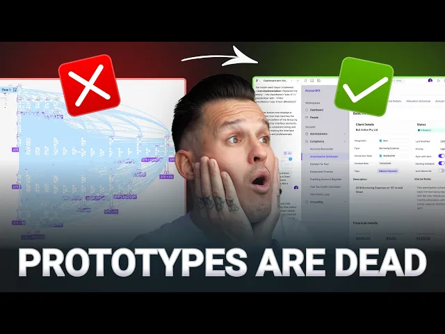
Mastering Claude Design: 7 UX Strategies for 2026
Learn what Claude Design is and how to apply it in your UX workflow. Explore 7 key strategies from research to testing to build better products faster in 2026.

AI design talk often jumps from blank-canvas generation to polished mockups and skips the hard question. How does this fit into an actual UX workflow that already includes Figma libraries, prototypes, research notes, accessibility reviews, and developer handoff? That gap is why Claude Design matters.
Anthropic launched Claude Design on April 17, 2026 as a research-preview workspace for creating visual work such as designs, prototypes, slides, and one-pagers, and said it's powered by Claude Opus 4.7 with rollout to Claude Pro, Max, Team, and Enterprise subscribers inside the existing Claude product ecosystem in Anthropic's launch announcement. In practice, Claude Design is best understood as a design partner, not a replacement for UX judgment. It helps turn briefs, rough concepts, interface requirements, and system constraints into first drafts you can react to.
That matters because Claude itself already enters this moment with broad distribution. One industry statistics roundup reported roughly 30 million monthly active users worldwide, availability across 159 countries, and strong engagement signals before Claude Design arrived, which helps explain why teams are paying attention early in this Claude statistics overview. The more useful framing, though, isn't “AI makes screens.” It's that AI now participates in documentation, flow design, copy, testing, and synthesis.
If you want a broader view of how teams compare large models in production workflows, this write-up on GPT-4, Claude, DeepL for Django localization is a useful companion read.
1. Design System Documentation and Component Libraries
Claude Design works best when you don't ask it to invent your product language from scratch. Give it a design system, and it becomes much more useful. Give it vague screenshots and scattered brand notes, and you'll spend your time correcting style drift.
That's why mature teams should start with the same foundation they already use in Figma, Storybook, and token documentation. Airbnb Design Language System, Google Material Design, Microsoft Fluent, and Shopify Polaris all illustrate the same principle. Components are only reliable when their rules are explicit.
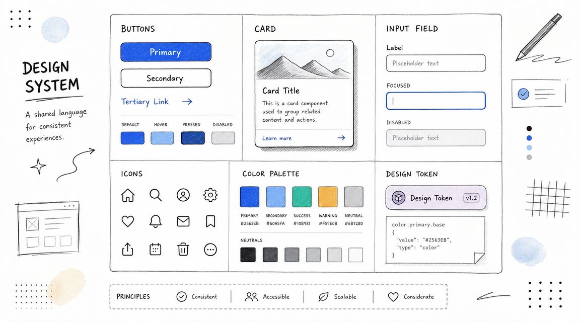
What Claude Design needs from your system
A usable setup includes more than colors and spacing. Claude Design needs component intent, content rules, interaction constraints, and accessibility expectations. If your Button component has five variants but no documentation on when each variant appears, the model will guess.
I've found that teams get better outputs when they document not just what a component looks like, but why it exists. A card used for transactional confirmation should carry different content and hierarchy rules than a card used for marketing promotion, even if both share the same visual shell.
Define intent per component: Explain when to use banners, modals, drawers, and inline alerts.
Attach accessibility guidance: Document keyboard behavior, focus order, labels, and contrast expectations at the component level.
Keep one source of truth: Use Figma shared libraries and match them to Storybook or code-based references where possible.
Record revisions clearly: Before-and-after examples make it easier for designers, engineers, and AI tools to follow changes.
Practical rule: If a human teammate couldn't recreate the component correctly from your docs, Claude Design won't either.
This is also where Uxia fits naturally. Before you roll updated components into product flows, test the patterns in Uxia with synthetic users against realistic tasks. That gives you another layer of validation beyond visual consistency. It helps catch where a “correct” component still creates friction in context, especially in forms, account settings, and onboarding steps.
2. User Flow and Journey Mapping Tools
Most AI-generated UI problems aren't visual. They're structural. The screens look plausible, but the journey breaks under real use.
Claude Design becomes more valuable when you feed it flow logic before asking for interfaces. Tools like Miro, FigJam, and Lucidchart help define that logic. A clean journey map gives Claude Design a path to follow instead of a prompt to improvise.
Use flow maps as prompts, not just artifacts
Take a common SaaS onboarding sequence. You have sign-up, verification, setup, invitation, and first-use moments. If you ask Claude Design for “an onboarding flow,” you'll get something generic. If you provide the happy path, the primary drop-off risks, and the moments where reassurance matters, the output becomes much closer to something a team can test.
Journey maps also improve AI testing. If you already define missions by flow stage, Uxia can evaluate those missions with more precision. That's particularly useful when the problem isn't “is this page usable?” but “does this sequence preserve momentum?”
For a grounded refresher on mapping flows clearly, Uxia's guide to a user flow diagram is worth keeping nearby.
Where designers usually go wrong
Teams often map edge cases too early or skip emotional context entirely. Start with the happy path. Then add friction points such as account uncertainty, permission hesitation, or fear of making an irreversible choice.
A strong map for Claude Design usually includes:
Primary goal: What the user is trying to accomplish at this stage.
Decision points: Where users hesitate, compare, or abandon.
Emotional state: Confidence, confusion, urgency, skepticism.
Validation task: What Uxia or moderated testing should verify after the draft is built.
Fast concept generation is useful. But production teams still need to know what survives export, handoff, and downstream editing when they operationalize Claude Design in a broader workflow, especially given reported concerns around no native image generator, export compatibility issues, and strict rate caps noted in this overview of current limitations from a product discussion video.
That reliability issue matters most when your journey map spans multiple tools and owners. A rough first draft is only helpful if the flow remains editable and testable after handoff.
3. Accessibility Testing and WCAG Compliance Frameworks
Claude Design can accelerate interface exploration. It can't be trusted as your accessibility standard on its own.
That's not a knock on the tool. It's the same rule that applies to any design workflow. Accessibility has to be reviewed against WCAG, checked with tools like Axe, WAVE, and Lighthouse, and then tested in task-based scenarios that reveal where real users still struggle.
Accessibility needs structure, not optimism
Designers often make one of two mistakes with AI-assisted work. They either assume the generated output is inaccessible until proven otherwise, or they assume modern models have absorbed enough best practice to be mostly safe. The first response is too pessimistic to be useful. The second is too risky to be professional.
A better approach is to treat Claude Design as a draft generator and accessibility frameworks as the evaluation layer. If Claude helps you assemble a settings screen, pricing page, or dashboard shell, review semantic hierarchy, focus flow, labels, state changes, error handling, and copy clarity before anyone calls it ready.
Use Uxia here as a behavioral complement. Automated scanners can catch technical issues. Uxia can surface task friction that often overlaps with accessibility problems, such as unclear labels, overloaded forms, weak affordances, or instructions users interpret differently than expected.
For a practical companion resource, Uxia's article on using an accessibility web checker in 2026 is a strong way to operationalize this step.
Test early: Review accessibility during wireframes, prototypes, and pre-release QA.
Document decisions: Write down why you chose a pattern, especially for complex interactions.
Combine methods: Pair automated scans with user-like task testing.
Keep it continuous: Recheck accessibility when copy, states, or layout changes.
Accessibility debt often starts in “temporary” AI drafts that nobody re-audits later.
If Claude Design becomes part of your daily workflow, accessibility review has to become part of the same rhythm.
4. Prototyping and Interaction Design Tools
Claude Design is most interesting when it stops being a static mockup assistant and starts helping with interaction thinking. That's where Figma, Adobe XD, Framer, and ProtoPie still matter. They provide the environment where motion, sequencing, feedback, and edge states become testable.
A rough concept can come from Claude Design. The interaction truth usually emerges in a prototype.
Here's a useful walkthrough to keep in mind while shaping interaction-heavy work:
Use Claude Design to compress the first draft
The best use case isn't “replace Figma.” It's “arrive in Figma, Framer, or ProtoPie with better starting material.” For example, Claude Design can help assemble a multi-step setup experience, draft empty states, or suggest how an account recovery flow should branch. Then the designer refines timing, feedback, and interaction detail in the prototyping tool.
I'd be strict about scope. Claude Design is good at getting you unstuck. It's less dependable when you need polished interaction nuance across many states. Hover behavior, transition timing, disclosure logic, interruption handling, and micro-feedback still benefit from designer control.
What to include before testing
A testable prototype should include more than the ideal path. Teams that move quickly with AI often skip the moments that matter most in review.
Add error states: Failed payments, invalid fields, expired links, empty search results.
Include alternate paths: Backtracking, skipping, retrying, saving progress.
Document rationale: Note why a pattern was chosen before handoff to engineering.
Run task-based tests: Use Uxia on prototypes before stakeholder review when possible.
Framer is especially useful when you want higher-fidelity behavior without waiting for engineering, and ProtoPie is still strong when gestures or advanced interactions matter. Claude Design can tee up the structure, but those tools are where interaction quality gets sharpened.
5. Heatmap and Session Recording Analysis
Claude Design can suggest where friction might happen. Heatmaps and session recordings tell you whether users behave that way.
That distinction matters because AI-generated interfaces often feel coherent in review meetings. Then you watch a session replay and realize people ignored the most important action, misread the page hierarchy, or clicked the wrong thing three times before recovering.
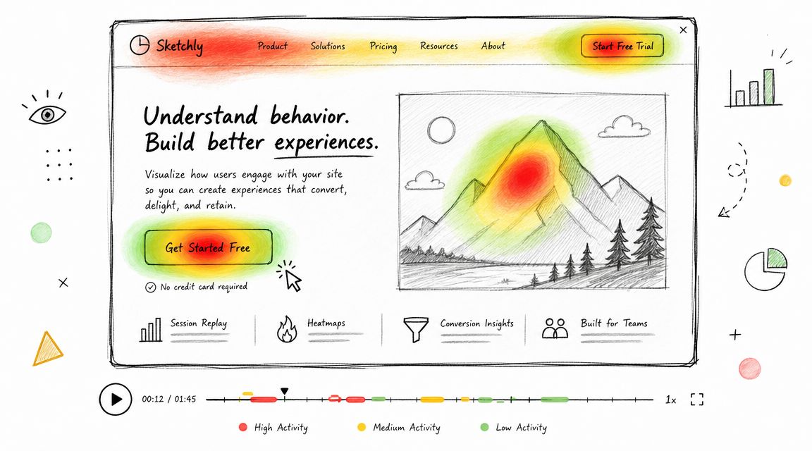
Triangulate instead of trusting one signal
Hotjar, Microsoft Clarity, Mouseflow, and similar tools help you see attention patterns, dead clicks, rage clicks, and abandonment behavior. Uxia adds a different layer. It gives you synthetic user feedback on likely friction before or alongside live traffic data.
Used together, they create a practical loop. Claude Design generates a first pass. Uxia tests likely task failures and copy confusion. Heatmaps and recordings confirm whether the same pain points appear in production-like behavior.
That's especially useful on pages with mixed intent, such as product detail pages, pricing, and onboarding checkpoints. Designers often overestimate how obvious the primary action is because they already know the interface.
Good analysis questions
When you review replay and heatmap data after introducing Claude Design into your workflow, ask:
Where did attention pool first: Was it the content you wanted users to notice?
Which clicks produced no value: Dead clicks often point to misleading affordances.
Where did users stall: Long pauses can signal uncertainty, not engagement.
Did synthetic and live findings align: If Uxia and behavioral analytics disagree, inspect the scenario more closely.
If a Claude-generated layout looks clear but users keep navigating around it awkwardly, trust the behavior over the layout polish.
This is one of the healthiest habits teams can build around Claude Design. Don't debate screenshots for too long. Validate the flow with observed behavior.
6. Copy Testing and Content Strategy Frameworks
Claude Design isn't just a visual workflow. It's a copy workflow. In many product experiences, the biggest gain comes from using AI to draft and iterate microcopy faster, not from generating the screen itself.
That matters because weak UX writing can sink an otherwise strong interface. A button can be visible and still feel unsafe. A form can be usable and still sound bureaucratic. A success state can confirm completion and still leave the user unsure what happens next.
Use Claude Design for variation, then test for interpretation
Claude is naturally strong at generating multiple versions of onboarding headlines, error states, helper text, trust messaging, and empty-state guidance in minutes. The value isn't volume on its own. The value is that teams can compare tones and intents before locking one in.
Real brands show how much voice affects product feel. Slack's conversational product copy helps reduce tension in collaborative workflows. HubSpot's educational framing often clarifies next steps instead of merely naming a feature. Those are useful reference points because they show copy doing interface work.
Uxia is a strong companion here because synthetic testers can react to wording in context. That's far more useful than reviewing a spreadsheet of alternatives disconnected from the interface.
What to test first
Start with the copy that carries the most risk or ambiguity.
Buttons and CTAs: Users infer consequence from short labels.
Error messages: These often decide whether a user retries or gives up.
Empty states: Good empty states orient users, not just fill space.
Trust copy: Billing, permissions, and account security language needs extra scrutiny.
Anthropic's Economic Index found Claude usage heavily concentrated in software development and technical writing, with 37.2% of queries in the computer-and-mathematical category and 57% of tasks classified as augmentation rather than automation, which reinforces the practical view of Claude as a collaborative drafting partner rather than a pure replacement engine in Anthropic's Economic Index.
That's exactly how copy teams should use it. Draft with Claude. Judge with humans. Validate in context with tools like Uxia.
7. User Research Synthesis and Insight Generation Methods
Claude Design becomes much more powerful after testing, when the team has to turn scattered observations into decisions, a point where many workflows slow down. Notes pile up. Clips pile up. Contradictions pile up. Nobody wants another giant synthesis board unless the outcome is clear.
AI can help here, but only if you give it disciplined input.
Synthesis works when the structure is human
Jobs-to-be-Done, affinity mapping, and thematic analysis still matter because they force prioritization. Claude can cluster observations, summarize interviews, and suggest patterns, but it shouldn't decide what matters strategically without a researcher or design lead checking the reasoning.
For example, if Uxia surfaces repeated friction around plan selection, navigation labels, and perceived trust, don't treat those as equal by default. A JTBD lens might show that users don't need more navigation clarity. They need reassurance that choosing a plan won't lock them into the wrong commitment.
That's the difference between summarizing feedback and synthesizing insight.
A good process is to use Uxia's outputs as inputs to a more formal research pass. If you want a practical guide for that cadence, Uxia's article on user research methodology for faster insights is a useful reference.
A practical synthesis stack
I'd recommend this sequence for Claude Design teams:
Collect task evidence: Pull transcripts, friction flags, and behavior observations from Uxia.
Cluster by user intent: Group issues by the job users are trying to get done.
Separate symptom from cause: “Users hesitate” is a symptom. Ambiguous consequence is often the cause.
Prioritize by product risk: Fix what blocks understanding, trust, or completion first.
“The fastest team isn't the one generating the most ideas. It's the one that can decide which signals deserve action.”
Claude Design helps create artifacts quickly. Research synthesis determines whether those artifacts improve the product or just multiply options.
Claude Design, 7-Resource Comparison
Core Features | UX Quality ★ | Value Proposition 💰 | Target Audience 👥 | Unique Selling Points ✨🏆 |
|---|---|---|---|---|
Design System Documentation & Component Libraries: centralized components, design tokens, interactive previews, versioning, accessibility guidelines | ★★★★☆, consistency & predictable UI behavior | 💰 High, reduces rework, speeds testing & handoff | 👥 Designers, front‑end devs, design ops, product teams | ✨ Single source of truth; 🏆 improves Uxia synthetic tester accuracy |
User Flow & Journey Mapping Tools: collaborative whiteboards, flow templates, integrations, version history, exports | ★★★★☆, clarifies paths and decision points | 💰 Medium, prevents costly UX rework & targets tests | 👥 PMs, UX designers, researchers, cross‑functional teams | ✨ Visualizes happy/edge paths for Uxia missions; 🏆 aligns teams quickly |
Accessibility Testing & WCAG Frameworks: WCAG criteria, automated scans, conformance reports, manual guidance, cognitive checks | ★★★★★, ensures inclusive, compliant UX | 💰 High, legal risk reduction and broader market access | 👥 Accessibility leads, compliance teams, UX researchers | ✨ Standards‑backed checks + Uxia real‑interaction flags; 🏆 critical for compliance |
Prototyping & Interaction Design Tools: interactive components, animations, state logic, multi‑screen flows, design‑to‑code | ★★★★☆, realistic interaction validation | 💰 High, validates interactions before dev, cuts rework | 👥 Product & interaction designers, prototypers | ✨ High‑fidelity interactions; 🏆 direct integration with Uxia for rapid testing |
Heatmap & Session Recording Analysis: click/scroll heatmaps, session replay, funnels, segmentation, form analytics | ★★★☆☆, real behavior but lacks intent/context | 💰 Medium, cost‑effective validation of hypotheses | 👥 Growth teams, analysts, product managers | ✨ Real user behavior evidence to triangulate Uxia findings; 🏆 uncovers unexpected navigation issues |
Copy Testing & Content Strategy Frameworks: A/B testing, tone/voice guides, microcopy frameworks, CTA analysis | ★★★★☆, boosts clarity, trust & conversions | 💰 High, small copy wins drive outsized impact | 👥 Content strategists, UX writers, marketers | ✨ Microcopy optimization + Uxia think‑aloud insights; 🏆 surfaces confusing copy early |
User Research Synthesis & Insight Methods: JTBD, affinity mapping, thematic analysis, prioritization, persona creation | ★★★★☆, transforms data into strategic direction | 💰 High, turns testing output into actionable roadmap | 👥 UX researchers, product leaders, strategy teams | ✨ Structured synthesis + Uxia automated summaries; 🏆 reveals root motivations and priorities |
Integrating Claude Design Into Your Daily Workflow
Claude Design is easiest to adopt when you stop treating it like a special event. It works better as a recurring layer inside your existing design process. Use it when you need first drafts, alternate directions, draft copy, research summaries, or a quick way to pressure-test assumptions before spending more design or engineering time.
Start with one workflow you already run every week. Design system updates are a good candidate. So are onboarding flows, empty states, pricing-page copy, or prototype reviews before stakeholder meetings. If you introduce Claude Design in all places at once, the team usually creates confusion about ownership. If you introduce it in one narrow area, the trade-offs become visible fast.
The most important trade-off is reliability. Claude Design is compelling because it can move from prompt to concept quickly, but professional UX teams still need editable outputs, stable handoff, and clarity about what breaks after export. That's where process discipline matters more than enthusiasm. Treat AI output as a draft artifact. Keep your design system documentation tight. Preserve journey maps. Review accessibility separately. Validate behavior with testing and analytics. Synthesize findings with structure.
That's also why Uxia fits well in a Claude Design workflow. If Claude helps your team generate and iterate, Uxia helps you validate. It gives product teams a way to test flows, copy, trust signals, and friction patterns without waiting for a traditional study cycle. Used together, they support a faster loop from concept to evidence.
Claude Design isn't valuable because it makes design automatic. It's valuable because it shortens the distance between an idea and something your team can review, test, and improve. The teams that benefit most won't be the ones producing the most screens. They'll be the ones building better habits around documentation, testing, and synthesis.
If you're also exploring the broader ecosystem around Claude workflows, Beyond Time's Mcp Claude setup is a useful operational read.
If you want to put Claude Design ideas into a practical testing loop, Uxia gives product teams a way to validate prototypes, flows, copy, and UX friction with synthetic users before launch. It's a useful next step when you want AI-assisted design decisions backed by structured testing, not just faster drafts.