Landing Page Usability Testing: Boost Conversions in 2026
Master landing page usability testing. Learn planning, synthetic user testing with Uxia, analysis & fixes to boost conversions effectively in 2026.

You launch a landing page on Friday. The design is clean, the copy passed internal review, and the team feels good about the offer. By Monday, the page isn't converting, nobody agrees on why, and the next conversation turns into guesswork.
That pattern is common because landing pages usually fail long before analytics confirm it. The page may look polished and still break at the exact moments that matter: a weak value proposition, a form that feels heavier than expected, a CTA that competes with everything around it, or mobile friction nobody noticed in review. Good landing page usability testing catches those issues before launch, when fixing them is cheap and fast.
Why Most Landing Pages Fail Before They Launch
A lot of teams still treat usability as a post-launch clean-up task. They ship first, wait for traffic, then hope A/B testing will tell them what to do. That sounds disciplined, but it often delays the substantive work. If visitors don't understand the page, the test doesn't start from a strong baseline.
One 2026 industry roundup reports a median landing-page conversion rate of about 6.6%, an average of 4–5%, and bounce or exit levels of 70–90% on many pages, which means most visitors leave without converting according to this landing page statistics roundup. Those numbers matter because they reframe the problem. Weak performance isn't an exception. It's the default.
Polished design doesn't guarantee usability
A landing page can fail in quiet ways:
The headline sounds smart, not clear. Users read it and still can't tell what the product does.
The CTA is visible but unconvincing. People see the button and hesitate because the risk feels unclear.
The layout looks modern but breaks the reading path. Visual attention goes to decorative elements instead of the offer.
The mobile version inherits desktop decisions. What looked balanced on a large screen becomes cramped, stacked, and hard to scan.
Practical rule: If a user has to interpret the page before they can trust it, you've already introduced conversion friction.
This is why teams that care about conversion rate optimization also need to care about comprehension, task flow, and first-click confidence. CRO doesn't start with experiments. It starts with removing obvious blockers.
If you're already working through broader ways to optimize landing pages for lead generation, usability testing should sit near the top of that process, not at the end of it. Structure, message clarity, and interaction cost influence everything that happens later.
Waiting for traffic is often the slowest way to learn
Traditional workflows have a hidden cost. A team launches, waits for enough visits, sees underperformance, debates hypotheses, then starts testing variants. That sequence can work, but it assumes the page deserved traffic in the first place.
Pre-launch testing changes the order of operations. Instead of waiting for live users to expose confusion, teams can evaluate the page earlier through task-based review, think-aloud feedback, and prototype testing. A useful primer on that broader toolkit is this guide to essential methods of usability testing.
The practical shift is simple. Don't ask only, "Which version converts better?" Ask, "Can the right user understand this page, trust it, and complete the intended action without friction?" That question catches more failure modes, earlier.
Planning Your Test and Defining Success Metrics
Most weak usability studies fail before the first participant sees the page. The team hasn't decided what success means, so the test collects reactions instead of evidence.
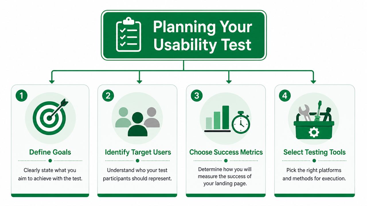
Test conversion and comprehension separately
A frequent mistake in landing page usability testing is treating conversion as the only outcome that matters. That misses a more basic question. Do visitors understand the offer quickly enough to make a decision?
Message-testing guidance has pushed this issue into focus by arguing that many pages underperform because users don't grasp the offer, value proposition, or trust signals fast enough, as discussed in this landing page testing guide. That's an important distinction. A visitor can't convert on what they don't understand.
Use two lenses:
Comprehension testing asks whether users can explain the offer, identify who it's for, and describe the next step in their own words.
Conversion-focused testing asks whether they can complete the target action with confidence and without friction.
Those lenses overlap, but they aren't the same. A page might generate clicks while still confusing users. It might also explain the offer well and still bury the action.
Pick a small set of metrics that explain behavior
Good usability metrics don't just confirm failure. They reveal where it happens.
The most useful set for landing pages usually includes:
Task success. Can the user complete the intended action?
Time on task. How long does it take them to understand what to do?
Abandonment points. Where do they stop, hesitate, or leave?
Click paths. What do they try first, and what distracts them?
Confusion signals. What language or elements trigger doubt?
A simple planning model works well in practice:
Planning choice | What to define |
|---|---|
Primary goal | One business action such as submitting a form or requesting a demo |
User type | The audience the page is actually for, not "everyone" |
Test focus | Comprehension, conversion flow, or both |
Evidence needed | Success rates, hesitations, wrong clicks, and open-ended feedback |
A landing page can lose users before the form. Most friction happens in understanding, not submission.
Write the research question before you write tasks
This keeps teams honest. Instead of asking participants to "review the page," ask a sharper question such as:
Can a first-time visitor tell what this company offers?
Can a qualified lead find the next step without prompting?
Do users recognize trust signals before they need reassurance?
Does the mobile layout make key information harder to scan?
If the page exists to support lead generation, trial signups, webinar registration, or product demos, define one primary objective and let the rest of the metrics diagnose why people miss it. Without that discipline, the team tends to overreact to aesthetic comments and underreact to structural friction.
Creating Tasks That Reveal True User Behavior
Bad task design produces fake confidence. If you tell users exactly where to click, they'll usually comply. That doesn't mean the page works.
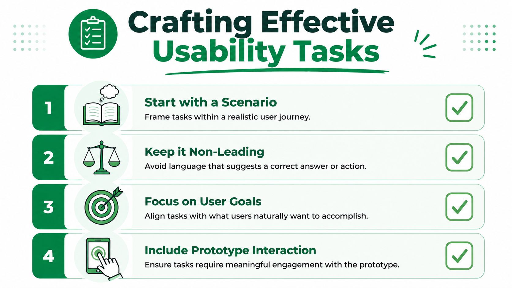
Give users a situation, not an instruction
The strongest landing page tasks are short, realistic, and non-leading. They frame intent without revealing the answer.
Compare these two prompts:
Click the green button and sign up for the webinar.
You're evaluating whether this webinar is worth your time. Find the details you need and decide what you'd do next.
The second task creates room for hesitation, confusion, and comparison behavior. That's where useful insight lives.
For usability validation, Nielsen Norman Group recommends frequent small tests with 4–5 users thinking aloud, then reporting task success as a percentage with a confidence interval, as described in their guidance on success rate as a usability metric. That recommendation fits landing page work well because most major issues appear quickly when tasks are written well.
What effective tasks look like
Use tasks that reflect user intent:
Evaluation task. Ask the participant to decide whether the offer is relevant to them.
Action task. Ask them to take the next step if they feel ready.
Trust task. Ask them what would make them feel comfortable sharing their information.
Recovery task. Ask them to find a missing piece of information such as pricing, proof, or eligibility.
Avoid these common errors:
Naming the CTA. If you say "click Start Free Trial," you've removed the discovery step.
Explaining the product upfront. That hides whether the page explains it well enough.
Bundling multiple goals together. A single task should expose one behavior pattern, not five.
If the task sounds like internal QA, users will behave like testers. If it sounds like a real decision, users will behave like buyers.
A sample script you can adapt
Use a lightweight script and keep it consistent across rounds.
Phase | Instruction/Question |
|---|---|
Intro | "You're seeing this page for the first time. Please think aloud as you go." |
First impression | "What do you think this page is offering?" |
Relevance | "Who do you think this is for?" |
Main task | "If you were interested, what would you do next?" |
Trust check | "What, if anything, would make you hesitate here?" |
Clarity check | "What feels unclear or missing?" |
Wrap-up | "Would you continue, leave, or compare other options first?" |
For teams that want more structured prompts, this collection of usability test script examples is a useful starting point.
A final practical point matters here. You don't need a fully coded page to run this work. Static mockups, clickable prototypes, and even video walkthroughs can reveal message and flow problems early. That's often where the biggest savings happen, because redesigning a prototype is easier than rewriting a launched page under pressure.
From Human Panels to Synthetic Users with Uxia
The classic bottleneck in usability research isn't analysis. It's operations. Recruiting participants, screening them, scheduling sessions, handling no-shows, and waiting for enough feedback can slow down a landing page decision that should've taken a day.
Where traditional panels still make sense
Human testers remain valuable when you need live probing, domain-specific expertise, or nuanced emotional reactions. They can surface context that scripted studies won't catch. They're especially useful for later-stage validation when the stakes justify a slower cycle.
But for pre-launch landing page work, the old panel model often breaks down. Teams need speed more than ceremony. They need directional evidence before traffic arrives, not a research project that takes longer than the build.
A/B testing has already pushed optimization toward a more disciplined model. Modern guidance commonly uses a 95% statistical significance threshold and expects teams to document hypotheses, changes, duration, and results, according to this overview of landing page A/B testing practice. Pre-launch usability work benefits from the same mindset: define the question, collect evidence, and make the next decision fast.
What synthetic users change
Synthetic users are useful when the team needs to test understanding, user journeys, trust, and interaction flow before the page has enough traffic for experiments. Instead of recruiting participants, you configure audience traits, assign a mission, and review how those simulated users traverse the experience.
That approach is especially practical for:
Early-stage pages where no traffic exists yet
Variant screening before engineering spends time building tests
Message validation when the offer keeps changing
Agency workflows where clients need feedback before launch approvals
For a deeper comparison of trade-offs, this breakdown of synthetic users vs human users is worth reading.
Later in the process, it's helpful to see the workflow in motion:
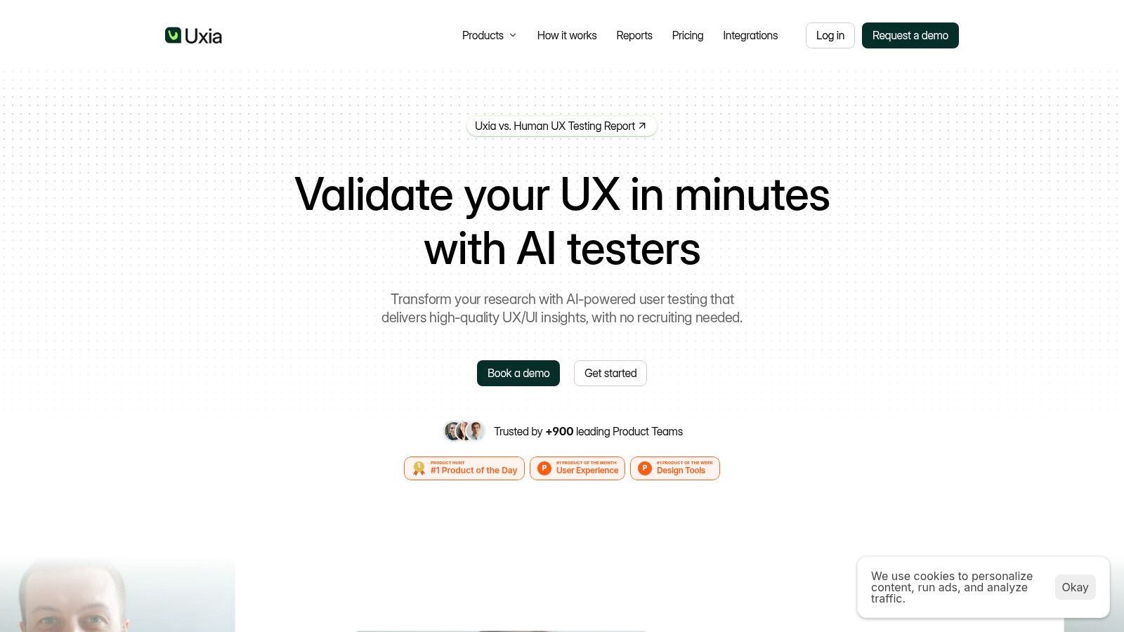
Uxia fits this category of pre-launch research tooling. It lets teams upload images or video prototypes, define audience and mission, and review how AI-generated participants interact with the system, think aloud, and surface issues in user flow, copy, trust, and accessibility. That doesn't eliminate the need for live-user validation forever. It changes when you need it. Instead of waiting until after launch to discover obvious friction, teams can remove a large share of it before the first paid click lands.
Turning AI Feedback into Actionable Fixes
Raw output isn't insight. A transcript dump, a click map, or a summary report only matters if the team can turn it into concrete page changes.
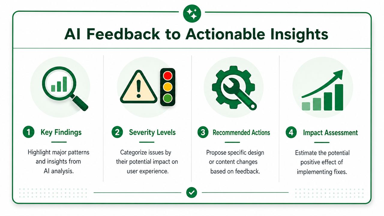
Read for patterns, not isolated comments
The most useful AI-assisted reviews combine several evidence types:
Task outcomes show whether users complete the intended action.
Click paths reveal what they try before they commit.
Heatmaps show where attention clusters and where important content gets ignored.
Think-aloud transcripts explain what users believe the page is saying.
A practical reading order helps. Start with failed tasks. Then inspect where behavior diverged. Finally, read the transcript excerpts around hesitation, doubt, or wrong turns. That sequence prevents the team from chasing random comments.
Look for repeated confusion tied to the same element. That's a usability issue. A single opinion about color usually isn't.
Prioritize fixes by severity and proximity to conversion
Not every issue deserves the same urgency. Some problems are cosmetic. Others block trust, comprehension, or action.
A useful triage model:
Severity | What it usually means | Typical response |
|---|---|---|
High | Users don't understand the offer or can't find the next step | Rewrite headline, CTA, layout order, or form flow |
Medium | Users understand the page but hesitate or detour | Improve proof, labels, supporting copy, or visual hierarchy |
Low | Users complete tasks but comment on polish issues | Queue for later refinement |
Mobile and accessibility reviews become especially important. A key area for testing is mobile-specific and accessibility-focused usability, because viewport constraints, tap-target issues, or assistive-technology incompatibilities can materially change task success even when the desktop version appears fine, as noted in this landing page UX discussion.
Typical fixes that come out of AI-assisted reviews
The most common high-value fixes are rarely dramatic redesigns. They're usually targeted adjustments:
Clarify the first screen. Rewrite the headline so users can explain the offer in plain language.
Reduce CTA competition. Remove nearby links or secondary buttons that split attention.
Move proof earlier. Bring testimonials, logos, guarantees, or trust statements closer to the decision point.
Shorten the path. Reduce unnecessary form fields or extra scroll before the main action.
Repair mobile scanning. Tighten spacing, simplify stacked sections, and make primary actions easier to tap.
When analysis is automated well, the team spends less time locating friction and more time fixing it. That's the key advantage. Faster review isn't useful on its own. Faster prioritization is.
From Insights to Impact on Your CRO Roadmap
Usability findings only create value when they change the roadmap. That's where many teams stall. They run a test, gather smart observations, and then file the report like a post-mortem.
Turn findings into decisions
A good landing page report is short and operational. It should tell stakeholders three things:
What blocked users
Why it mattered
What the team should change next
Keep the language tied to user behavior, not design opinion. Say "users couldn't explain the offer after reading the hero" instead of "the hero needs improvement." Say "mobile users missed the CTA after scrolling past social proof" instead of "the layout felt off."
This makes usability work easier to defend in growth conversations. The discussion stops being about personal preference and starts being about removal of friction in the conversion path.
Connect pre-launch testing to post-launch experiments
A strong workflow is simple. Define one primary conversion metric, create a control, isolate one page change in a variant, and compare the predefined metric while segmenting by traffic source and device, following the process outlined in this landing page testing workflow.
That sequence works better when pre-launch usability testing has already removed obvious confusion. Then A/B testing can focus on meaningful refinements instead of cleaning up preventable issues.
If your team is building a broader practice around optimizing conversions, this is the operational takeaway: use usability testing to de-risk the page before traffic, then use experiments to validate narrower hypotheses after launch. Those are different jobs. Teams get better results when they stop forcing one method to do both.
A mature CRO program doesn't treat landing pages as one-off assets. It treats them as testable interfaces with clear tasks, measurable friction, and a steady loop of revision. That's what professionalizes the work.
If you want to test a landing page before it goes live, Uxia gives teams a way to simulate users navigating prototypes and live pages, surface comprehension and usability issues, and prioritize fixes before traffic and ad spend are on the line.