10 Essential Methods of Usability Testing
Explore 10 key methods of usability testing: from moderated sessions to AI analysis. Learn when to use each, pros/cons, and get faster insights.

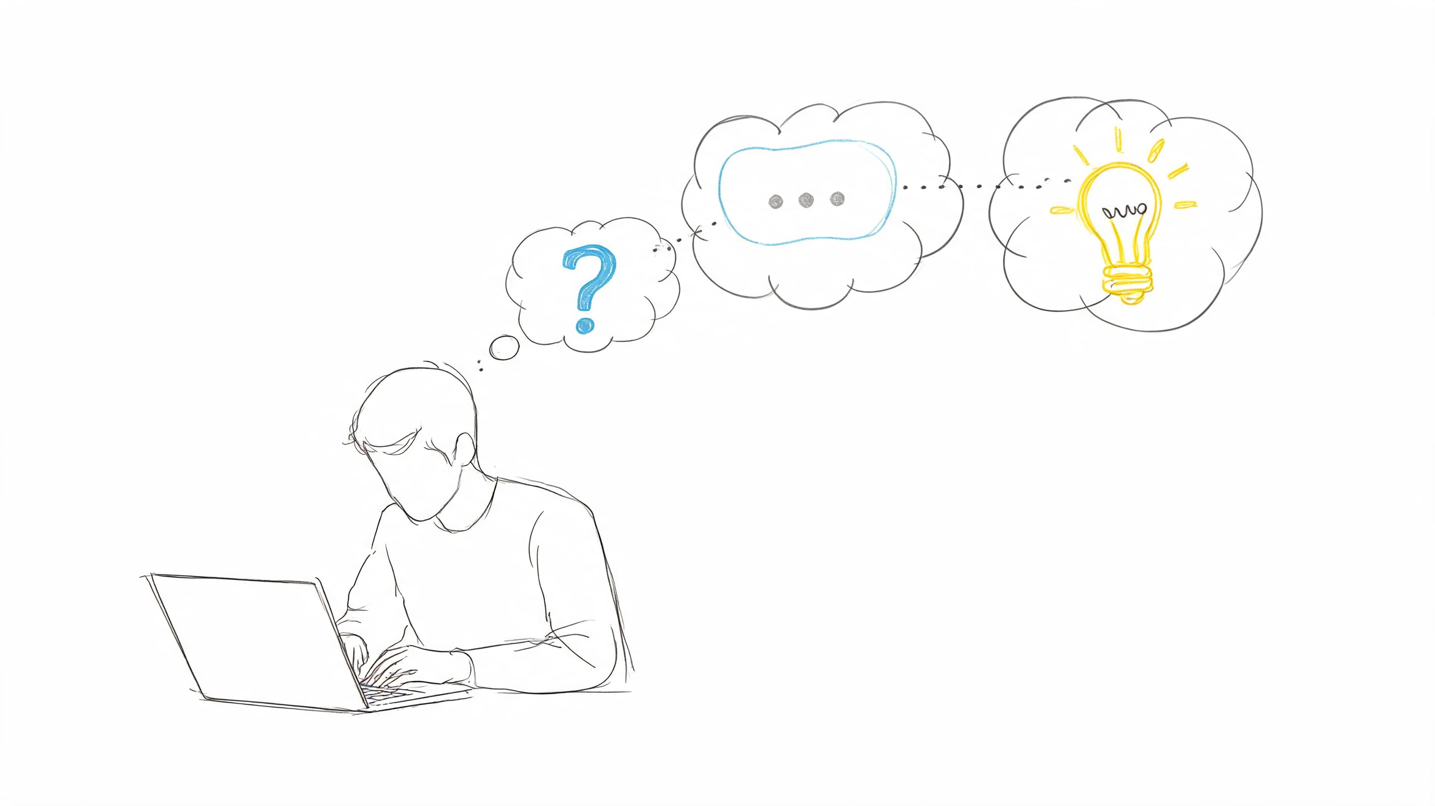
Building a great digital product requires evidence, not opinion. Usability testing gives teams a way to measure whether people can complete key tasks, where they hesitate, and which parts of the experience create avoidable friction. That matters because product decisions now happen faster than traditional research cycles can support, yet many teams still rely on stakeholder preference, design reviews, or a few isolated sessions.
That approach misses failure points that only show up during real task execution.
The methods in this guide hold up under real delivery pressure. Some are fast and directional. Others are slower and better suited to high-risk decisions. Some work best on early concepts and prototypes. Others belong in production, where live behavior, benchmark metrics, and experimentation can confirm whether a change improved the experience.
The practical question is not which single usability testing method is best. The practical question is how to combine methods without creating research bottlenecks. Strong teams pair diagnostic methods with evaluative ones, then run them on a schedule the product team can sustain.
AI changes that operating model. Platforms like Uxia can run synthetic, unmoderated-style usability tests on prototypes and live websites, then return transcripts, likely friction points, and structured findings quickly. That does not replace moderated sessions, accessibility reviews, or production experiments. It lets teams spend human research time where judgment matters most and use continuous validation to catch obvious issues earlier.
If you want a broader process for mastering usability testing methods, start with the ten methods below and build a testing cadence your team can repeat.
1. Moderated Usability Testing
Moderated testing is still the best method when you need to understand why a user hesitates, mistrusts a label, or takes an unexpected path. A skilled moderator can catch the moment a participant goes off-script, probe gently, and separate surface complaints from the actual obstacle.
This is the method I use when the flow is high stakes. Checkout, onboarding, account recovery, pricing, permissions, enterprise setup, anything with risk or complexity usually deserves live facilitation. You're paying for depth, not scale.
Where it works best
A discussion guide keeps the session focused, but rigid scripts usually weaken the work. Good moderators stay neutral, let silence do some work, and ask short follow-ups such as what the participant expected to happen or what they'd click next.
In practice, moderated sessions are especially useful after a fast synthetic pass in Uxia. Uxia can surface likely friction points first. Then the moderator can spend live time on the highest-risk moments instead of rediscovering obvious issues one participant at a time.
Practical rule: Use moderated testing when the team needs explanation, not just detection.
A common scenario is a B2B setup flow that looks clear in design review but breaks under real decision-making. In a live session, you'll hear whether the participant is confused by terminology, reluctant to commit, or unable to find the next step. Analytics won't tell you that.
What usually goes wrong
The biggest failure mode is moderator interference. Leading language, excessive reassurance, or rescuing the participant too early distorts the test. Another problem is treating moderated sessions like they should answer every question. They won't. They trade scale for nuance.
Keep the tasks realistic and keep observers disciplined. If stakeholders pile on with pet questions, the session turns into a product review instead of research.
2. Unmoderated Remote Usability Testing
Unmoderated remote testing is the fastest way to catch repeatable usability failures before they turn into release debt. It gives teams scale, device diversity, and faster turnaround without spending days on scheduling.
The method is simple. Participants complete realistic tasks alone, in their own environment, on their own device. That setup reduces facilitator influence and exposes whether the interface can carry the interaction without help.
Fast enough for weekly validation
This method works best when the team needs broad signal across several tasks, flows, or audience segments. It is especially useful for checkout paths, onboarding, account creation, navigation changes, and prototype comparisons where the goal is to find friction patterns quickly.
AI testers improve the economics of this method. Uxia can run structured tests on prototypes and live sites, then return transcripts, grouped findings, friction patterns, and usability indicators fast enough to support active sprint decisions. That changes the operating model. Instead of waiting for a formal research cycle, product and design teams can validate continuously and decide what deserves human follow-up.
That speed matters even more for distributed product orgs working across time zones or with LATAM developers, where live session coordination can slow down straightforward validation work.
Remote testing also expands reach. The Interaction Design Foundation's overview of remote usability testing notes that remote methods help researchers access participants across locations and test in more natural usage contexts than lab studies.
Where teams get bad results
The failure mode is usually poor task design, not the method itself.
If a prompt is vague, loaded, or too abstract, the result is useless. You cannot tell whether the participant misunderstood the product or the research team handed them an artificial task. Good unmoderated studies use short prompts, realistic goals, and clear success criteria. They also remove extra explanation that would never exist in the actual interface.
A practical example is a signup flow with plan selection. If multiple participants hesitate at the pricing step, re-read plan details, and stall before continuing, that is a strong signal. If the transcripts also show uncertainty about billing terms or feature differences, the problem is specific enough to act on. Uxia is useful here because it helps surface those repeated friction points early, so the team can fix the obvious issues first and reserve moderated sessions for the questions that still need explanation.
The trade-off is straightforward. Unmoderated testing gives breadth faster than moderated research, but it is less effective for probing motivation in the moment. Use it when the product should stand on its own and the team needs continuous validation, not live interpretation.
3. A/B Testing
A/B testing settles product arguments with behavior, not opinion. It works best after the team has already identified a plausible fix and needs to measure whether version A or version B performs better against one specific outcome.
That distinction matters. A/B tests are decision tools, not discovery tools. If the hypothesis is weak, the team still gets a winner, but learns very little about the underlying usability problem.
When to use it
Use A/B testing when the change is narrow, the metric is clear, and the product has enough traffic to produce a trustworthy result. Good candidates include CTA copy, page hierarchy, default selections, checkout steps, and navigation labels.
The measurement plan has to stay disciplined. Pick one primary metric tied to the task you want to improve, then define the guardrails that keep you from harming adjacent parts of the experience. Conversion rate alone is often too blunt. In usability-focused experiments, teams usually pair it with signals like task completion, first-click success, form abandonment, or downstream error patterns.
A simple example is a pricing page redesign. If one version gets more plan selections but also increases refund requests or support tickets, the test did not improve usability. It shifted the problem further down the funnel.
The trade-off most teams ignore
A/B testing gives confidence at scale, but it strips away context. You can measure which variant won. You usually cannot see hesitation, false confidence, or misinterpretation unless you pair the experiment with session review, follow-up research, or AI-based testing.
That is where continuous validation changes the workflow. Teams can use Uxia before launch to pressure-test candidate variants, catch obvious friction, and discard weak options before exposing them to live traffic. That shortens the experiment queue and reduces wasted engineering cycles. Instead of testing two rough guesses in production, the team starts with versions that already survived basic usability scrutiny.
Execution speed matters too. Product teams working with distributed squads and LATAM developers often use that setup to ship variants faster, instrument them correctly, and keep experimentation from stalling behind core roadmap work.
A/B testing is for choosing between credible options. It should sit on top of usability research, not replace it.
4. Think-Aloud Protocol
Think-aloud testing exposes usability problems that analytics will miss.
Used well, it shows what users expect before they click, what they misread, and where interface language breaks their momentum. Used poorly, it creates artificial behavior because the participant starts narrating for the moderator instead of trying to complete the task.
That trade-off matters. The method is strongest when the team needs to understand reasoning, not just outcomes. It is especially useful for early flows, prototypes, onboarding, search, settings, and any task where labels, sequence, or feedback messages do a lot of the work.
How to get useful verbal data
Effective think-aloud sessions begin before the task itself. Provide participants with a short practice exercise to help them distinguish between reporting actions and explaining intent. “I'm looking for shipping details” is useful. “Now I'm clicking the button” is not.
Prompt lightly. Ask questions such as “What do you expect to happen?” or “What made you choose that?” Avoid leading prompts that insert confusion or approval into the session. Once the moderator starts steering, the verbal data gets weaker.
Post-task reflection still helps. A short ease rating or a follow-up question about confidence can add structure to what you heard during the session without interrupting the task itself.
Where it fits with Uxia
AI makes this method easier to run at higher frequency, but it does not replace human judgment. Uxia is useful for screening flows that generate a lot of language-based friction, because transcript-heavy outputs can be clustered fast by step, theme, and severity. That gives the team a practical triage layer before booking moderated sessions.
I use it to answer a simple question. Is this a wording problem, a flow problem, or both?
For example, if repeated synthetic sessions stall at the same plan description or form instruction, the team can revise terminology first, then confirm the fix with live participants. That shortens research cycles and keeps human sessions focused on the parts of the experience where nuance matters most.
5. Eye-Tracking Studies
Eye-tracking is specialized. It's not the first usability method I'd recommend for general application, but it becomes valuable when visual hierarchy is the problem and self-report won't help. If users say the page felt clear but missed the key action entirely, eye-tracking can expose the mismatch.
It records attention patterns, not comprehension. That distinction matters. Looking at something doesn't mean understanding it, and not looking at something doesn't always mean it failed. You need context.
This kind of study is easiest to explain visually.
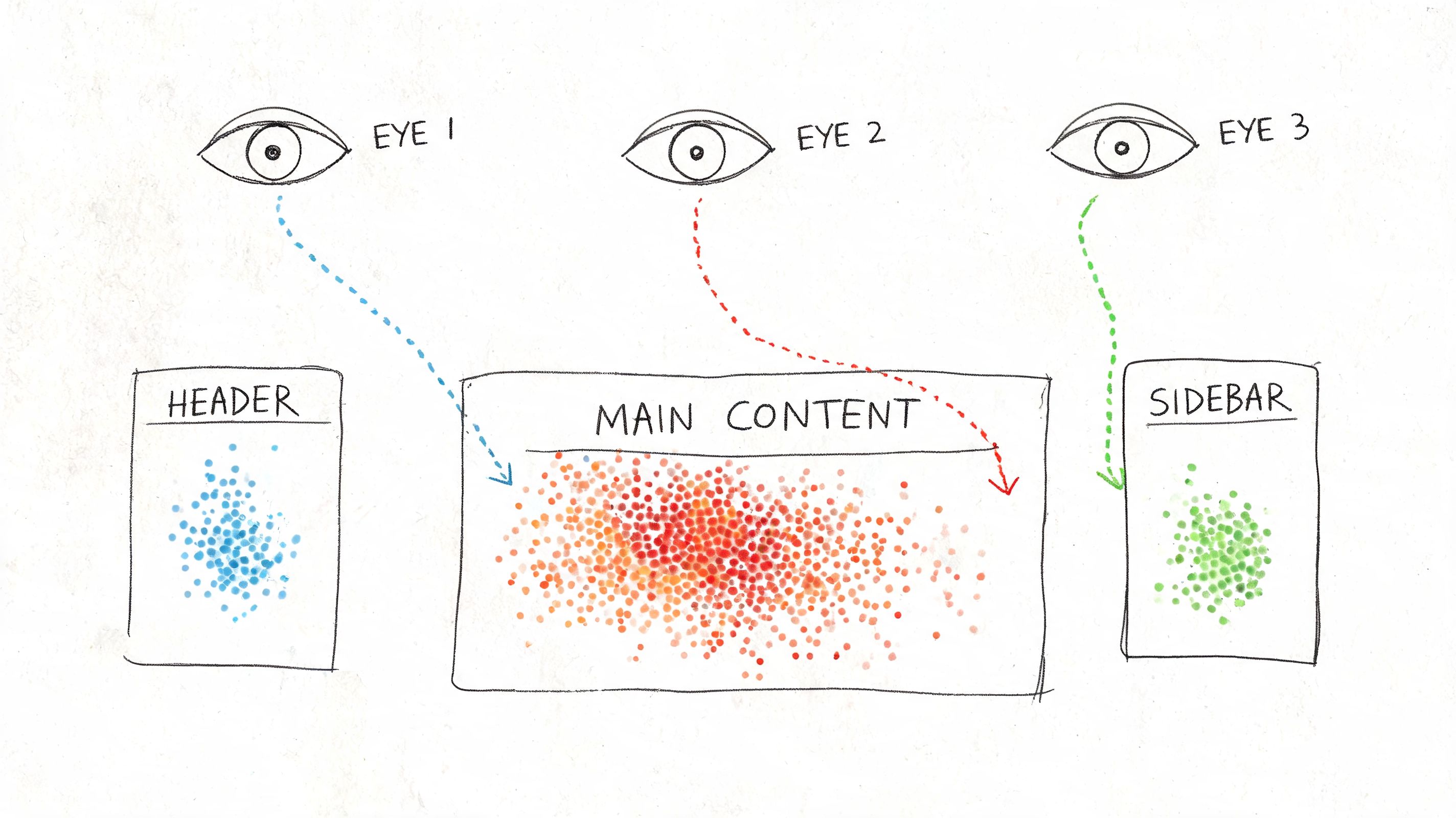
What eye-tracking is good for
Use it when stakeholders are debating page layout, scan patterns, ad or banner interference, or whether the main call to action competes with secondary elements. It's also useful in content-heavy interfaces where people claim they “can't find anything,” but the root cause is poor hierarchy rather than bad IA.
Heatmap-style evidence is often persuasive because it's concrete. It shows where attention clusters and where it drops off. Uxia can contribute a faster approximation of interaction friction through heatmaps and click patterns in synthetic testing, which is often enough for routine design decisions even when full eye-tracking isn't practical.
What it won't solve
Eye-tracking is rarely the best standalone method. Pair it with think-aloud, follow-up questions, or task-based testing. Otherwise you get attention data without interpretation.
A real-world scenario is a landing page redesign where the team keeps moving the primary CTA. Eye-tracking can show whether users' gaze gets trapped in the hero image, drifts to navigation, or lands on trust elements first. That can settle debates quickly, but only if you tie the visual data back to task completion and user intent.
6. User Testing with Prototypes
Prototype testing is where product teams save themselves from expensive certainty. You don't need production code to discover that a flow is unclear, a label is weak, or a sequence feels wrong. You need enough realism for the user to believe the task.
This method is ideal when design is still fluid. It's also where Uxia has obvious practical value because the platform is built for testing images, screen flows, video prototypes, and interactive prototypes without waiting for recruitment.
Match fidelity to the decision
Low-fidelity prototypes are fine when you're testing structure, sequence, or concept. High-fidelity prototypes make more sense when the question involves trust, copy clarity, visual emphasis, or step-by-step interaction.
Don't overbuild the prototype. If the decision is about checkout order, you don't need perfect brand polish. If the decision is about whether people trust the payment step, you probably do.
Test the cheapest version that can still trigger the behavior you need to observe.
A common scenario is onboarding. A clickable prototype might reveal that users understand the first step but misread the second because the button label suggests review instead of confirmation. That's a prototype issue you want to catch before handoff.
Why teams underuse it
Many teams treat prototype testing as optional because it feels less “real” than live-product testing. In practice, it's often the fastest route to meaningful course correction. Uxia's synthetic testing is especially useful here for early diagnosis because it can surface hesitation, confusion, and probable failure points on prototypes before engineering effort compounds the mistake.
If a prototype fails repeatedly in synthetic testing, I don't need to argue for another round of design iteration. The evidence is already focused enough to act on.
7. Heuristic Evaluation
Heuristic evaluation is the fastest expert-led way to spot obvious usability issues without running a user study first. It's an inspection method, not a substitute for behavioral evidence. That distinction keeps teams honest.
I use it when I need a fast read on whether the product violates known principles around system feedback, consistency, control, error prevention, or recognition over recall. It's efficient because experts can review a lot of surface area quickly, especially in enterprise products with sprawling settings and nested flows.
Best use of expert review
Run heuristic evaluation early, before participant time is involved, or after a user study when you want to broaden the review beyond the tested tasks. It's also useful for prioritization. Some issues are visible immediately to trained reviewers even if users haven't hit them yet.
The strongest evaluations document each violation clearly, attach screenshots, and explain the impact in plain language. Severity ratings can help triage, but the primary value is specificity. “Poor error prevention” is weak. “Destructive action sits beside primary action with identical styling” is usable.
Limits you should respect
Experts aren't users. They can identify likely problems, but they can also miss domain-specific confusion, emotional resistance, and context-driven workarounds. That's why I treat heuristic evaluation as a filter and accelerator, not a final verdict.
Uxia complements this well because synthetic testing adds task-based behavioral signals. An expert may suspect a navigation issue. Uxia can then show whether testers hesitate, click incorrectly, or express uncertainty in the flow. That pairing cuts down a lot of wasted debate.
8. Card Sorting
Card sorting is one of the best methods of usability testing when the actual problem is structure, not screens. If users can't predict where content lives, no amount of visual polish will rescue the experience.
Open card sorting helps you learn how people naturally group information. Closed card sorting helps you test whether your proposed categories make sense. Both are useful, but they answer different questions.
Here's the core mechanic in one image.
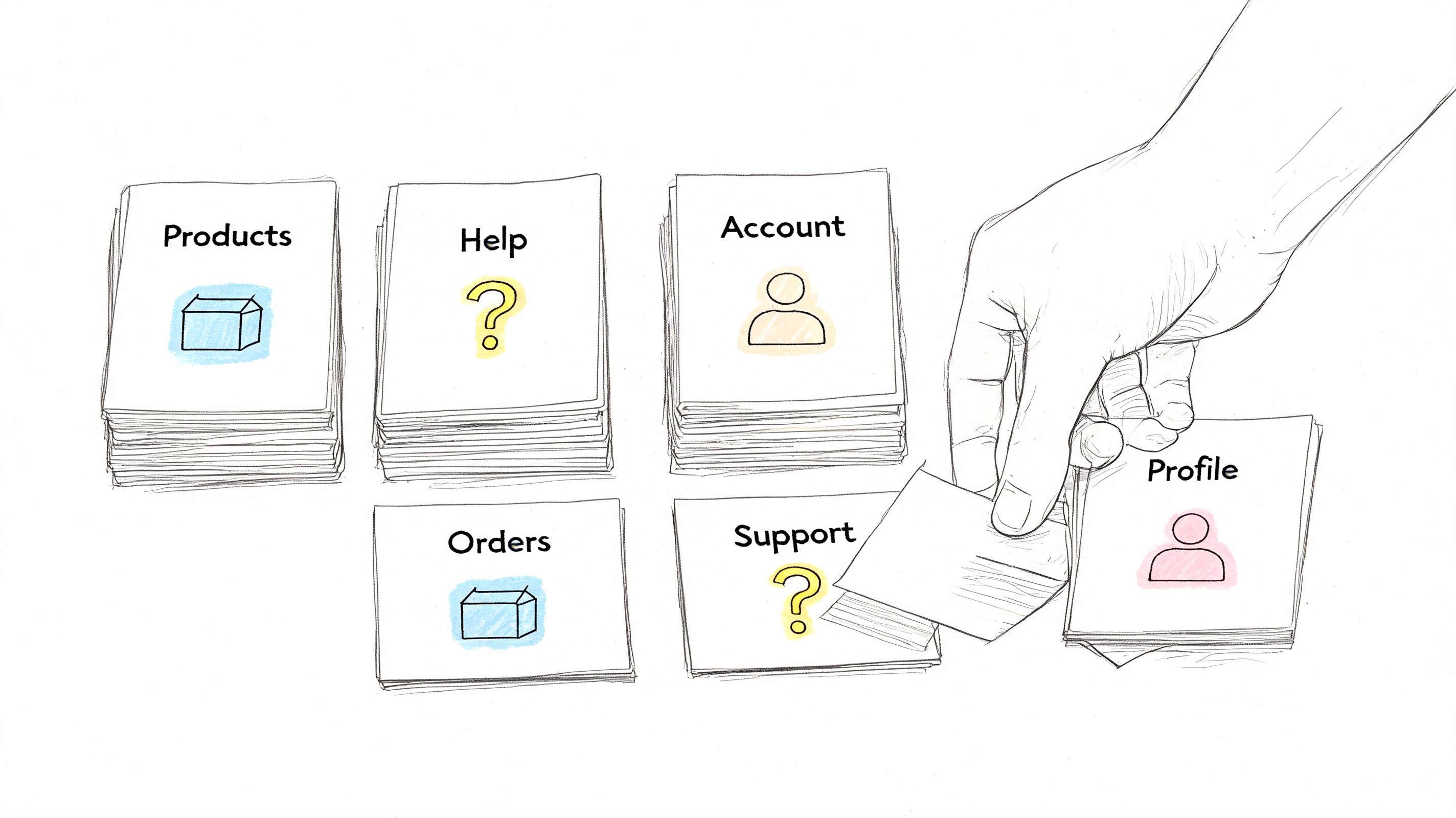
Where card sorting earns its keep
Use it when you're redesigning navigation, reorganizing a help center, merging product lines, or restructuring a dense settings area. It works especially well before tree testing, because sorting gives you the raw material for a better information architecture.
For a SaaS knowledge base, for example, card sorting can reveal whether users think “billing,” “plans,” and “invoices” belong together, or whether they split those concepts between account management and finance. That's not a visual issue. It's a mental model issue.
The practical trade-off
Card sorting doesn't validate whether someone can complete a real task in the final navigation. It reveals how users categorize concepts. That makes it exploratory and highly useful, but incomplete on its own.
I'd often run card sorting before using Uxia or another task-based method on a prototype. First fix the structure. Then test whether people can find and complete what matters.
9. Usability Metrics and Analytics
Usability work gets expensive fast when teams rely on opinions instead of performance data. Metrics fix that by turning UX quality into something you can compare, track, and improve release after release.
The core set is straightforward: task success rate, time on task, error rate, and post-task or post-study satisfaction measures such as SUS. These metrics are useful because each one answers a different product question. Can users finish the job? How much effort does it take? Where do they break? How usable did the experience feel once they were done?
What to measure and when
Start with task success rate. It forces the team to define what success means, which is often where vague UX discussions become actionable. Time on task adds an efficiency lens. Error rate exposes where users hesitate, backtrack, misclick, or recover poorly. SUS helps you compare overall usability across versions or products without rebuilding your scorecard each time.
Checkout is a good example. A team might see healthy add-to-cart rates and assume the flow is fine, while completion data shows users stalling at payment, address entry, or promo code handling. Metrics isolate the weak step instead of hiding it inside a general impression of the journey.
This method works best in benchmark studies, release validation, and continuous optimization programs.
Why analytics alone is not enough
Metrics show the size of the problem. They rarely explain the cause. A drop in completion rate could come from confusing labels, weak hierarchy, mobile layout issues, trust concerns, or accessibility failures that block part of the audience outright. Teams that serve smaller organizations should keep that overlap in mind, especially if compliance and inclusive design affect conversion and risk. Guidance on website accessibility for small businesses is often relevant here because usability and accessibility problems frequently appear in the same funnel data.
That is the actual trade-off. Quantitative signals scale well, but they flatten human behavior unless you pair them with session evidence.
I usually treat metrics as the detection layer, then use recordings, transcripts, and follow-up tasks to explain the pattern. Uxia is useful in that workflow because it combines task outcomes with friction analysis and transcripts, which cuts the time between spotting a failure and understanding why it happened. That matters when teams need continuous validation instead of a one-off study every quarter.
10. Accessibility Testing
Accessibility testing isn't a side audit. It's a usability method with specific requirements, specific users, and very real failure modes. If the experience depends on pointer precision, unlabeled controls, weak contrast, or visual-only cues, the product is failing a meaningful share of users before the broader launch conversation even begins.
Standard usability testing practices often need modification for specialized audiences. Research with medically underserved Hispanic populations found that teams had to adapt methods through interpreters, more flexible timing, trusted intermediaries, and accommodation for family members, and the researchers warned that failing to adapt methods can substantially reduce the use and value of the website (study on adapting usability methods for underserved audiences).
What real accessibility testing looks like
You need manual testing, assistive-technology testing, and direct feedback from people who interact with systems differently from your default assumptions. Keyboard-only interaction, screen reader behavior, alternative text, responsive layout behavior, and color contrast all matter. Automated scanners help, but they don't tell you whether the product is usable.
For small companies, this often starts with core journeys: navigation, form completion, account creation, checkout, and support access. If you're building public-facing sites, legal compliance matters. So too do reach and trust. Teams looking for a practical baseline often benefit from a plain-language guide to website accessibility for small businesses.
Accessibility testing should change recruiting, facilitation, environment, and analysis. Not just the final QA checklist.
Where Uxia can help, and where it can't
Uxia is useful for broadening early coverage by simulating varied behavioral profiles and surfacing likely friction in copy, navigation, and accessibility-related interaction patterns. That can help teams catch issues sooner and test more often.
But accessibility testing still requires direct work with people who use assistive technologies and interact with products in ways synthetic testing can only approximate. The best teams use both.
10-Method Usability Testing Comparison
Method | Implementation complexity 🔄 | Resource requirements ⚡ | Expected outcomes 📊 | Ideal use cases 💡 | Key advantages ⭐ |
|---|---|---|---|---|---|
Moderated Usability Testing | High, trained moderator & live facilitation 🔄 | Moderate–High, moderators, participants, scheduling ⚡ | Deep qualitative insights into motivations and emotions 📊 | Complex or novel interfaces; uncovering the "why" 💡 | Adaptive probing and rich behavioral context ⭐ |
Unmoderated Remote Usability Testing | Low–Moderate, task setup and platform config 🔄 | Low, platform access and broader participant pool ⚡ | Scalable qualitative feedback with recordings/transcripts 📊 | Fast validation at scale; geographic diversity 💡 | Cost-effective, fast, reduced observer bias ⭐ |
A/B Testing (Split Testing) | Moderate, experiment setup and traffic allocation 🔄 | Moderate, dev support, analytics, sufficient traffic ⚡ | Clear quantitative comparisons of performance metrics 📊 | Live products with enough traffic; conversion optimization 💡 | Statistically driven decisions; objective outcome evidence ⭐ |
Think-Aloud Protocol | Moderate, instruction and facilitation skills needed 🔄 | Low–Moderate, moderator or clear prompts, recordings ⚡ | Direct insight into user cognition and mental models 📊 | Understanding decision processes and usability misconceptions 💡 | Reveals reasoning and expectations in real time ⭐ |
Eye-Tracking Studies | High, specialized hardware, calibration, controlled lab 🔄 | High, eye trackers, analysts, lab time ⚡ | Objective attention heatmaps and gaze metrics 📊 | Validating visual hierarchy, layouts, and attention hotspots 💡 | Quantifies visual attention and reveals overlooked elements ⭐ |
User Testing with Prototypes | Low–Moderate, depends on prototype fidelity 🔄 | Low–Moderate, prototyping tools and participants ⚡ | Early detection of usability issues and flow problems 📊 | Pre-development validation and rapid iterative design 💡 | Saves dev time; enables quick iteration and stakeholder buy-in ⭐ |
Heuristic Evaluation | Low, expert review against established heuristics 🔄 | Low, UX experts, documentation time ⚡ | Identified heuristic violations with severity ratings 📊 | Early-stage audits, pre-launch checks, and quick audits 💡 | Fast, cost-effective expert-driven recommendations ⭐ |
Card Sorting | Low, prepare items and run sessions 🔄 | Low, participants and digital/physical cards ⚡ | Reveals user categorization and informs IA decisions 📊 | Designing navigation, taxonomy, and information architecture 💡 | Exposes user mental models and grouping consensus ⭐ |
Usability Metrics and Analytics | Moderate, instrumentation and metric definition 🔄 | Moderate–High, analytics tools, data analysts ⚡ | Objective behavioral metrics and trend tracking over time 📊 | Monitoring live product performance and measuring ROI 💡 | Scalable, objective data for prioritization and tracking ⭐ |
Accessibility Testing | Moderate, knowledge of standards and varied tests 🔄 | Moderate, tools, assistive tech, testers with disabilities ⚡ | Identifies compliance gaps and accessibility issues 📊 | Ensuring WCAG/ADA compliance and inclusive product design 💡 | Reduces legal risk and broadens user reach; improves UX for all ⭐ |
Building Your Hybrid Testing Playbook
The teams that improve usability fastest do not pick one favorite method and force every question through it. They build a repeatable testing system that matches method to decision, cost, and speed.
A practical playbook starts with one clear split. Qualitative methods explain why people hesitate, misread, abandon, or mistrust a flow. Quantitative methods show scale, trend, and comparative performance. You need both, but not at the same point in the cycle.
Start with broad, fast coverage. Run AI-supported testing in Uxia against a prototype, a new journey, or a live page to surface friction points, confusing labels, broken expectations, and task failures early. That first pass reduces waste. It keeps your team from spending moderated research time on issues that were already obvious and easy to catch.
Then get selective. Bring in moderated usability testing for expensive decisions and ambiguous behavior. I use it for trust-heavy flows, onboarding logic, pricing interpretation, permissions, and any workflow where hesitation could mean confusion, risk, or policy concerns rather than simple UI friction. AI testing is excellent for coverage and speed. Human moderation is better when the team needs to probe intent, emotion, or workarounds in real time.
The strongest programs pair methods instead of treating them as substitutes. Use card sorting before task validation if the issue is structural. Use prototype testing before development if the risk is flow logic. Use eye-tracking or click evidence alongside think-aloud if the debate is about visual hierarchy, attention, or missed calls to action. Use analytics after release to confirm whether the fixes changed behavior at scale.
Timing matters.
Teams that quantify too late struggle to prove progress. Teams that quantify too early often compare weak options and produce clean-looking data on the wrong question. A better sequence is simple: diagnose first, narrow the problem, then benchmark the fix. That gives you evidence the product team can act on, not just research output that sits in a deck.
Continuous validation changes the operating model. Instead of treating usability as a phase before launch, strong teams test inside the sprint. They use AI testers like Uxia to run frequent checks, catch regressions, and expand coverage across more flows than a small research team could handle manually. Then they reserve human sessions for the moments where nuance matters and the decision cost is high.
That balance is the point. AI does not replace human research. It removes bottlenecks, shortens feedback loops, and gives teams a practical way to validate more often without waiting for a full study every time.
The best playbook is the one your team can run every week. If testing fits the workflow, findings arrive sooner, prioritization gets sharper, and usability becomes part of delivery instead of a last-minute audit.
If you want a faster way to validate prototypes and live flows, Uxia gives product teams a practical starting point. You can run AI-powered usability tests, review transcripts and friction points, and use those findings to decide where human moderation, benchmark metrics, or accessibility review should go next.