
Best Product Design Tools: Master Your 2026 Workflow
Find the best product design tools for 2026. Build a modern stack with Figma, Miro, & Uxia to validate ideas in minutes, not weeks, and boost your workflow.

Most lists of the best product design tools get the question wrong.
They compare canvases, components, AI features, and export options as if design teams lose time drawing rectangles. They don't. Teams lose time waiting to learn whether a flow works. The biggest delay in product design usually happens after the prototype looks good and before engineering starts, when nobody has fast, reliable feedback on what users will do.
That gap matters more than another whiteboard template or another UI generator. Modern roundups still focus on ideation, wireframing, and prototyping, but they rarely help teams decide how to handle the research-to-design handoff or continuous validation after the first prototype, even as the market shifts from “make screens faster” to “learn faster,” as noted by Maze's overview of AI tools for product designers.
If you care about shipping, the best product design tools aren't the ones with the longest feature list. They're the ones that shorten the loop between idea, prototype, feedback, and revision.
Early in the process, that usually means a simple stack that does three jobs well: align the team, build a realistic flow, and validate it before code.
Your Team Has More Tools Than Ever but is Slower Than Ever
Product teams keep adding software to fix coordination problems. Then they wonder why work still drags.
The reason is simple. More tools don't remove uncertainty. They often spread it around. A PM has one view of the flow in a roadmap tool. A designer has another in Figma. Research sits in transcripts. Engineering waits for decisions. Stakeholders approve visuals without seeing where users struggle. The stack gets bigger, but the team still doesn't know if the design works.
The bottleneck isn't design output
Producing wireframes and polished mockups quickly is now a widespread capability. That part has improved a lot. What still breaks momentum is the period between “we made the prototype” and “we trust this enough to build.”
That's where rework starts.
A flow can look clean in review and still fail when someone tries to complete a task. Navigation labels can be ambiguous. Form fields can create hesitation. Key actions can be easy to miss. If you only discover that after engineering has already implemented the flow, every change costs more.
The teams that move fastest don't just design faster. They learn faster.
Why generic tool lists miss the point
A lot of buying advice treats design software like a static category. It isn't. Product teams need different tools for different jobs, and the key trade-off isn't “which app has more features.” It's “which app helps us remove risk before development starts.”
That changes how you evaluate the best product design tools:
Tool category | What it's for | Where teams get stuck |
|---|---|---|
Whiteboarding tools | Discovery, journey mapping, workshop alignment | Great for discussion, weak for validation |
Design and prototyping tools | Interactive flows, screens, comments, handoff | Strong for creation, not enough for evidence on their own |
Validation tools | Usability checks, task-based feedback, issue finding | Often added too late, after design has already hardened |
The practical mistake is treating validation as a later phase. It should sit inside the design loop, not after it.
When teams make that shift, tool choice gets clearer. You don't need more software. You need a tighter workflow.
The Modern Product Design Workflow That Actually Works
The design loop that holds up in real teams is straightforward: ideate, prototype, validate, iterate.
That sounds obvious, but teams often overinvest in the first two steps and underinvest in the third. They brainstorm thoroughly, produce strong screens, and then rely on opinion, stakeholder confidence, or delayed research to decide what happens next. That's where schedules slip.
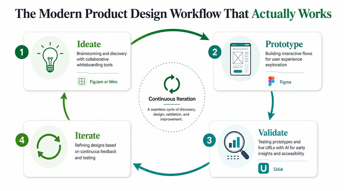
Use one tool per job
For most product teams, the stack doesn't need to be exotic.
FigJam or Miro handle the messy front end. They're where teams map journeys, compare assumptions, cluster pain points, and get people aligned before visual design starts.
Figma is the core execution layer. Its rise marked a real shift from single-user desktop workflows to collaborative, cloud-first product design, and that move helped turn design tools from static mockup software into integrated systems for prototyping and iteration, as described in UserTesting's guide to product design tools.
Validation tooling closes the loop. This is the part many teams still bolt on too late, even though it's the layer that determines whether the prototype is safe to hand to engineering.
Why this loop works in practice
This workflow creates fewer dead ends because every stage produces something the next stage can use immediately.
A workshop board becomes a prototype plan. A prototype becomes a test asset. Test findings become a revision list. Then the cycle repeats without a long handoff gap between design and research.
That's also why high fidelity matters only when it serves a decision. If your team is moving from low-fi ideas to realistic interactions, a practical guide to high-fidelity designs is useful because it forces the right question: what level of detail is necessary to evaluate the experience, not just present it.
Practical rule: If a prototype can't be tested quickly, it's still halfway done.
Start with Alignment Using Miro or FigJam
A surprising amount of bad product design starts before anyone opens a design file.
It starts when teams skip alignment. They move from problem statement to screens too quickly, usually because everyone feels pressure to show progress. The result is familiar: polished interfaces built on fuzzy assumptions.
Use whiteboarding tools to reduce decision debt
Miro and FigJam are useful because they slow the team down at the right moment.
Not for weeks. Just long enough to answer the questions that keep causing rework later:
What job is the user trying to do? A journey map forces clarity when a feature request is still vague.
Where does the current experience break down? Pain-point mapping surfaces friction before anyone proposes a solution.
What needs agreement now? Workshops expose differences between product, design, research, and stakeholder assumptions.
This work looks lightweight, but it prevents a lot of expensive confusion.
Keep workshops tied to output
The mistake isn't using workshops. It's running workshops that never turn into design decisions.
Good boards should produce concrete artifacts. A ranked list of user problems. A sketched task flow. A clear first-test scenario. If a FigJam session ends with sticky notes and no draft path into prototyping, the team had a conversation, not a design step.
I've found the most effective teams treat whiteboarding tools as decision tools, not creativity theaters. They use them to narrow, not expand, the problem space.
That's why Miro and FigJam belong in any serious conversation about the best product design tools. They're not where the product gets polished. They're where the team avoids building the wrong thing beautifully.
Build Interactive Flows in Figma
Figma matters because it keeps the design conversation attached to the actual product flow.
That sounds basic, but it's still a major advantage. When screens, comments, prototype links, and component changes live in one place, teams spend less time translating decisions across tools and more time improving the experience. That's why Figma remains central in modern product workflows.
Treat Figma as a prototyping engine
A lot of teams still use Figma like a static design board. That leaves value on the table.
Its real usefulness shows up when you build interactive paths, not isolated screens. Taps, transitions, branching decisions, state changes, and edge cases are what make a prototype worth testing. A homepage mockup rarely reveals much. A checkout flow, onboarding path, or settings task usually does.
That's also where Figma's newer AI-assisted direction fits. Browser-based collaboration was the milestone. Automation is the extension. The tool now supports more than drawing screens, and that's useful when it removes repetitive setup work rather than replacing product judgment.
The prototype is not the finish line
Clickable flows feel persuasive in internal reviews because they create a sense of completion. That confidence is often false.
A design team can produce a clean Figma prototype and still have no evidence that users understand the copy, notice the next action, or trust the path enough to continue. That's why I don't treat a prototype as proof. I treat it as the first draft of a testable experience.
If your team is using newer Figma workflows, this Figma Make guide is a useful reference for turning concepts into more realistic interactive artifacts. The key is what happens next. As soon as the flow is credible enough to simulate a task, it should be validated.
A prototype becomes valuable when it answers a question, not when it looks finished.
Get Actionable Insights in Minutes with Uxia
Most usability testing advice still assumes a slow research cycle. Recruit participants, schedule sessions, moderate tasks, compile notes, summarize findings, align the team, then decide what to change. That process can be valuable, but it often arrives too late for fast-moving product work.
For design-stage validation, speed matters because designs are still flexible. Once engineering starts, every issue carries more cost.

Use validation tools for research jobs, not generation jobs
AI gets oversold in design. The important question isn't whether AI is present. It's whether it's being used for the right task.
That distinction matters because broad AI coverage often blurs together generation, brainstorming, wireframing, and research. The more practical view is that teams need decision criteria for when AI helps and when it doesn't. For research, the value is clear: AI can help solve the problem of getting fast, reliable feedback on specific design jobs, as discussed in UX Pilot's analysis of product design tools.
For teams that need to validate prototypes or live URLs before development, Uxia fits that research side of the workflow. It supports testing from Figma prototypes and live product experiences, and its think-aloud style output helps teams understand not just what went wrong, but why a user-like tester hesitated, misread, or expected something else.
What speed changes operationally
The practical win isn't that a report arrives faster. It's that the team can still act on it while the design is fluid.
When validation takes too long, people compromise. They move ahead with unanswered questions because deadlines don't wait. That's how usability debt gets pushed into development. Faster feedback lets teams test a flow, revise copy or structure, and run another pass before handoff.
Internal Uxia materials frame this as minutes instead of weeks. That tracks with how design teams work. You don't need a ceremonial research phase every time a key flow changes. You need a way to check whether the current version is understandable enough to keep moving.
A concrete example from GVB Amsterdam
One of the clearest examples is a usability evaluation of the GVB Amsterdam public transport ticket-purchase flow. In that internal comparison, the setup-to-insights process took about 25 minutes instead of 12+ hours, which the team described as roughly 30x faster. The same comparison reported 17 real usability issues versus 4 from human testing.
That kind of difference changes what's realistic during prototyping. It means teams can validate while decisions are still cheap to change, not after they've already hardened.
Here's the comparison in a simple view:
Stage | Uxia (AI Testing) | Human Panel Testing |
|---|---|---|
Setup to insights | About 25 minutes | 12+ hours |
Relative speed | Roughly 30x faster | Slower cycle |
Issues surfaced in the comparison | 17 real usability issues | 4 issues |
A walkthrough helps make the workflow concrete:
What to look for in the output
Fast testing only matters if the feedback is usable.
The most helpful validation tools don't just say a user failed. They show where friction appeared and what expectation gap caused it. That could be a label that doesn't match intent, a button that looks secondary when it shouldn't, or a path that feels reversible when it isn't.
That's also why I prefer validation before handoff, not after launch. The point isn't to produce research theater. It's to remove uncertainty early enough that engineering starts with stronger decisions.
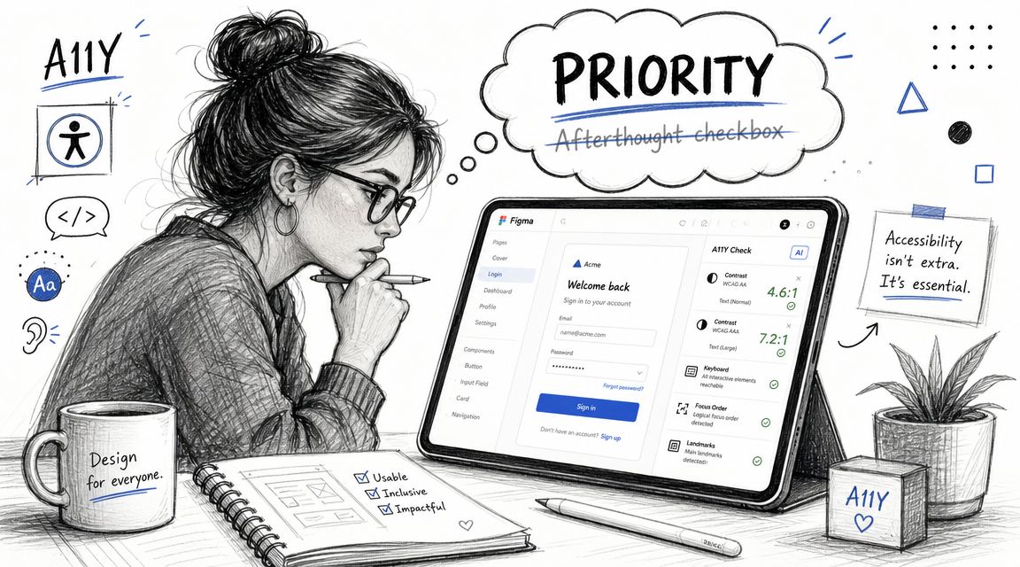
Make Accessibility a Priority Not an Afterthought
Accessibility work gets delayed for one reason more than any other. Teams assume they can clean it up later.
That's usually a mistake. Once code is written, accessibility issues get entangled with implementation details, deadlines, QA cycles, and design debt. At the design stage, the same issues are easier to spot and easier to fix.
Accessibility is product quality
This isn't a separate compliance track. It's part of whether the experience works.
That connection shows up in business outcomes too. In a McKinsey study summarized by DesignRush, companies with top design scores across a sample of 300 companies achieved 32% faster revenue growth and 56% higher total returns to shareholders than peers. The same summary reports that inclusive design can boost usability by up to 30% and that 52% of designers integrate sustainability, which is a useful reminder that design quality now connects directly to broader product performance, not just interface polish, according to DesignRush's product design statistics roundup.
Check accessibility before development starts
The practical move is to evaluate likely accessibility issues during design review, not after release.
That includes things like navigation clarity, interaction cues, readable hierarchy, and obvious WCAG-related concerns before engineers translate the flow into code. If your team wants a design-stage workflow for this, Uxia's own accessibility web checker guide is relevant because it focuses on catching issues from prototypes instead of waiting for live implementation.
Accessibility work done in design is cheaper than accessibility work done in a bug queue.
A similar principle applies outside product UI. Teams managing learning platforms or media-heavy experiences should also understand where accessibility requirements affect content itself. For that, MEDIAL's guide to video accessibility for LMS is a useful companion resource.
What doesn't work
Teams get into trouble when accessibility is reduced to contrast checks and a final QA pass.
That approach misses structural issues. Ambiguous labels, weak focus logic, misleading affordances, and inaccessible task paths don't show up clearly if you only audit at the end. They need to be considered while the flow is still being shaped.
The best product design tools support that earlier review. The strongest teams make it part of design quality from day one.
A Practical Checklist for Choosing Your Design Tools
If you're comparing tools, stop scoring them by how many features they advertise.
Score them by whether they help your team make better decisions before engineering starts. That means using practical criteria tied to actual workflow, not marketing pages.
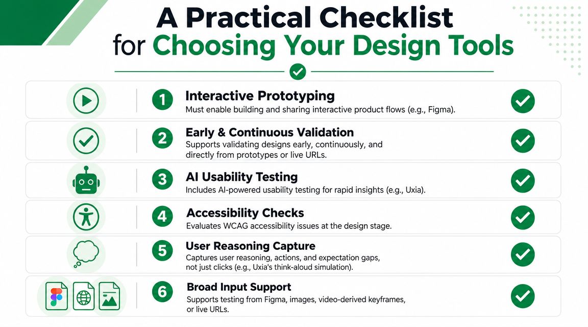
The non-negotiables
Figma import matters because most serious product ideas become clickable prototypes before they become code. If a testing tool can't work with that artifact, your team will create extra steps.
Live URL testing matters because eventually you need to validate the live product, not just the prototype.
AI usability testing matters when the goal is shortening the feedback cycle enough to test continuously, not occasionally.
Accessibility checks matter because design teams should catch obvious WCAG-related issues before implementation.
Fast reporting matters because insights that can't be shared quickly don't influence sprint decisions.
Stakeholder-friendly output matters because a finding only helps if product, design, and engineering can act on it together.
Judge tools on task performance
A useful benchmark comes from UX measurement, not design marketing. Nielsen Norman Group recommends benchmarking around 5 to 10 top tasks and measuring success rate, time on task, and error count. They also note that quantitative usability testing, analytics, and survey data work well for UX benchmarking. That's a better way to compare product tools because it focuses on actual user performance rather than feature sprawl, as explained in Nielsen Norman Group's guidance on product UX benchmarks.
If a tool helps your team evaluate those kinds of outcomes earlier, it's probably useful. If it mostly creates more artifacts to manage, it probably isn't.
A simple buying filter
When I evaluate the best product design tools, I ask six blunt questions:
Can the team go from idea to interactive flow without friction?
Can we validate that flow before development begins?
Can we test both prototypes and live experiences?
Can we catch usability and accessibility issues early?
Can the output show reasoning, not just clicks?
Can findings be shared without a lot of manual synthesis?
That's a better filter than “which tool is hottest this year.”
If you're comparing options for your broader stack, this UX/UI designer tools roundup is a practical place to continue, especially if you want to evaluate tools by workflow role instead of category hype.
The short version is this: good teams don't need more software. They need a tighter loop between prototype and proof.
If your team wants to validate product flows earlier and reduce rework before engineering starts, Uxia is worth evaluating as part of that workflow. It supports testing from Figma prototypes and live URLs, helps surface usability and accessibility issues before code is written, and gives teams a faster way to turn design assumptions into evidence.