
Your Ultimate Guide to WCAG 2.2 Compliance
Master WCAG 2.2 with our expert guide. Learn the new criteria, practical implementation steps, and how to test for full accessibility compliance in 2026.

If you've heard whispers about the Web Content Accessibility Guidelines (WCAG) 2.2, you're in the right place. These aren't just another dry set of standards; they represent the latest evolution in making digital content—from websites to mobile apps—truly work for people with disabilities. Released in October 2023, this update brings nine new success criteria that tackle modern user needs head-on, especially around mobile use and cognitive accessibility.
For any digital product team, this is a crucial new benchmark.
Why WCAG 2.2 Is Your New Accessibility North Star
It’s tempting to see WCAG 2.2 as a restrictive rulebook, but it's much more useful to think of it as an updated map for creating products that simply work better for everyone. While previous versions laid the essential groundwork, this latest release is built for today's web. It directly addresses the dominance of mobile devices and the nuanced needs of users with cognitive or learning disabilities—areas where the older guidelines were starting to show their age.
Adopting WCAG 2.2 isn't just about avoiding legal trouble; it’s a smart business decision. Over 15% of the world's population lives with some form of disability. That’s a huge, often overlooked, market. By complying with these guidelines, you not only expand your user base but also build your brand’s reputation as an inclusive and forward-thinking organisation.
The European Accessibility Act and Your Strategic Advantage
There’s also a ticking clock. The push to adopt these standards is getting a serious boost from regulations like the European Accessibility Act (EAA), which has a firm compliance deadline of June 28, 2025. This directive makes digital accessibility a legal must-have for a wide range of businesses operating in the EU.
Instead of scrambling to meet the deadline, getting ahead of the curve now gives you a real competitive edge. A practical first step is to conduct an initial audit of your key user journeys. Use a tool like Uxia to run a quick test with synthetic users to identify the most glaring issues against the new WCAG 2.2 criteria. This gives you an immediate, prioritized backlog.
For product teams, the key is to see WCAG 2.2 as a strategic guide, not just a compliance checklist. It’s about building superior user experiences that lead to higher engagement, better retention, and a healthier bottom line.
Of course, embracing these guidelines means understanding how modern tools can help you get there. For instance, getting features like subtitles right can make a massive difference. A helpful resource on Unlocking Accessibility with AI Auto Captioning shows just how vital technology is in meeting these standards efficiently.
This guide will help you become a pioneer in this new accessibility landscape. With the right mindset and a toolkit that includes platforms like Uxia for validating designs with synthetic users, you can navigate these changes confidently and build products that are truly for everyone.
Decoding the New Success Criteria in WCAG 2.2
The leap from WCAG 2.1 to WCAG 2.2 is a pretty big deal. It brings nine new success criteria to the table and gets rid of one, signalling a major step forward for digital accessibility. But to really get why these changes matter, we have to look past the technical jargon and connect with the human experiences they’re designed to fix.
These aren't just abstract rules; they're direct solutions to real-world frustrations that millions of people face every single day. Each new criterion is laser-focused on making digital products smoother and more intuitive for people with physical, cognitive, and visual disabilities.
A Clearer Path with One Less Hurdle
Before we jump into what’s new, let’s talk about what’s gone. WCAG 2.2 officially retires Success Criterion 4.1.1 Parsing. This rule used to require code to be free of certain syntax errors so that assistive technologies could read it without tripping up.
Years ago, this was absolutely critical. But today’s browsers and assistive tools are much smarter and more forgiving—they can handle slightly imperfect code just fine. Removing this criterion actually simplifies compliance. It lets teams focus their energy on issues that have a direct, tangible impact on users, rather than chasing technical perfection that often makes no real-world difference.
It’s a practical shift, prioritising the user experience over rigid code validation. And honestly, that’s a move toward efficiency we’re big fans of at Uxia when it comes to testing what truly matters.
WCAG 2.2 vs WCAG 2.1 Key Changes at a Glance
To give you a quick overview, WCAG 2.2 introduces several new requirements focused on making interfaces more usable for people with motor, cognitive, and low-vision disabilities. At the same time, it removes one outdated criterion.
Here’s a snapshot of the key changes:
Success Criterion (SC) | SC Number | Conformance Level | Primary Beneficiary |
|---|---|---|---|
Focus Not Obscured (Minimum) | 2.4.11 | AA | Low-vision and keyboard users |
Focus Not Obscured (Enhanced) | 2.4.12 | AAA | Low-vision and keyboard users |
Dragging Movements | 2.5.7 | AA | Motor disability users |
Target Size (Minimum) | 2.5.8 | AA | Motor disability and mobile users |
Consistent Help | 3.2.6 | A | Cognitive disability users |
Redundant Entry | 3.3.7 | A | Cognitive disability users |
Accessible Authentication (Minimum) | 3.3.8 | AA | Cognitive disability users |
Accessible Authentication (Enhanced) | 3.3.9 | AAA | Cognitive disability users |
Focus Appearance | 2.4.13 | AAA | Low-vision and cognitive disability users |
Parsing (REMOVED) | 4.1.1 | A | N/A (obsolete) |
These updates represent a clear trend: making technology work better for human brains and bodies, not just for machines. Now, let's break down what these new rules mean in practice.
Understanding the New Focus and Input Criteria
A huge chunk of the new criteria is all about how people see and interact with your interface. They zero in on common pain points that can make a product totally unusable for someone relying on keyboard navigation or who has a motor impairment.
2.4.11 Focus Not Obscured (Minimum) (AA): We've all been there. You're trying to fill out a form, but a sticky chat widget or cookie banner is sitting right on top of the field you need to see. This criterion puts a stop to that. It ensures that when an element receives keyboard focus, it’s not hidden by other content. It's a game-changer for keyboard-only users who need a clear line of sight to know where they are on the page.
2.4.12 Focus Not Obscured (Enhanced) (AAA): This is the super-strict version of the one above. It demands that absolutely no part of the focused element is covered by author-created content.
2.5.7 Dragging Movements (AA): So many interfaces rely on dragging—reordering a list, adjusting a slider, moving a card on a Trello board. For a user with a motor disability, that can be a complete blocker. This criterion mandates that any action needing a dragging motion must have a single-pointer alternative. Think arrow buttons or a simple tap-and-select interaction.
2.5.8 Target Size (Minimum) (AA): Ever tried to tap a tiny button on your phone and hit the wrong one by mistake? This criterion fixes that by requiring a minimum target size of 24 by 24 CSS pixels for interactive elements. It’s a simple change, but it dramatically improves usability for anyone with a motor impairment, someone with large fingers, or even just a person trying to use their phone on a bumpy bus ride. Validating this across every component can be a monumental task, but this is where synthetic user testing with a platform like Uxia becomes your best friend, instantly flagging undersized targets.
A practical recommendation: Add "single-pointer alternative" as a required user story for any new feature involving drag-and-drop. This ensures compliance with 2.5.7 is baked into your development process from the start.
Supporting Cognitive and Learning Disabilities
WCAG 2.2 also makes huge strides in cognitive accessibility, an area that has been overlooked for far too long. These new criteria are all about helping users who might struggle with memory, focus, or complex processes.
As this chart shows, adopting WCAG 2.2 isn't just about compliance—it has a direct line to core business benefits.
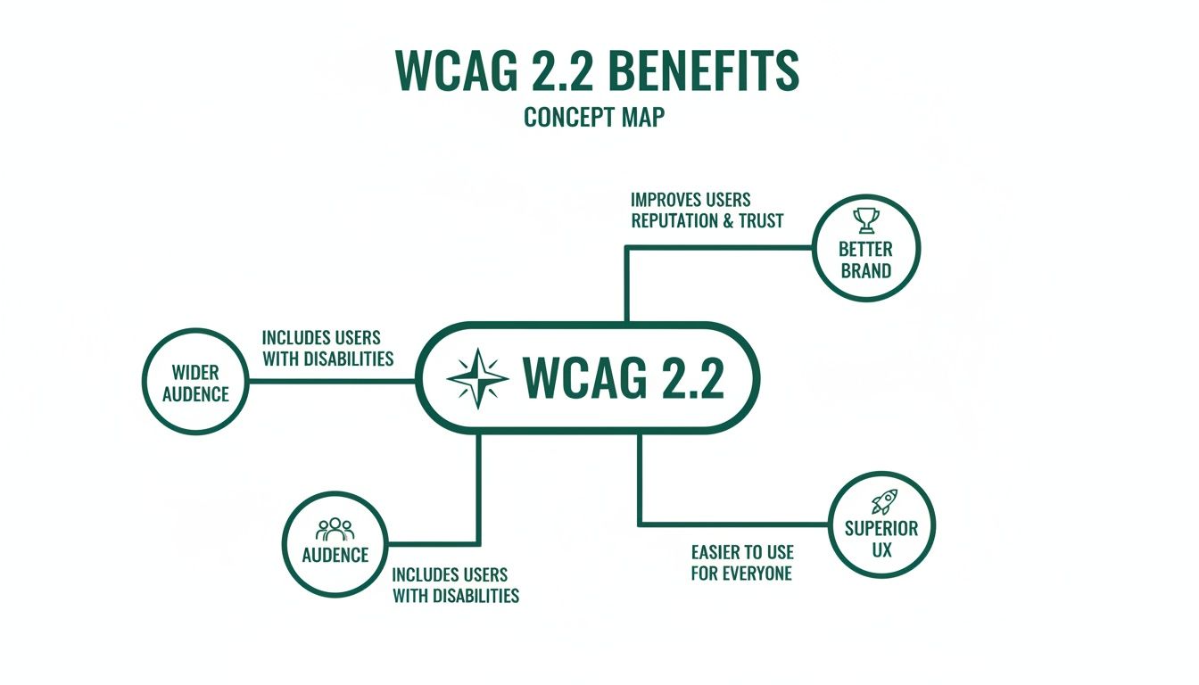
The message is clear: these guidelines expand your audience, strengthen your brand, and ultimately create a better experience for everyone.
Here’s how the new criteria get you there:
3.2.6 Consistent Help (A): This one is beautifully simple. If you offer a help mechanism—like a contact number, an FAQ link, or a chatbot—it has to be in the same consistent place on every page. This predictability helps users with cognitive disabilities find support without having to relearn your site’s layout over and over.
3.3.7 Redundant Entry (A): Is there anything more annoying than typing in your address for shipping, only to have to type the exact same information again for billing? This criterion prevents that. It requires that information a user has already entered in the same session is either auto-populated or available for them to select, which reduces cognitive load and sheer frustration.
3.3.8 Accessible Authentication (Minimum) (AA): This rule takes aim at complicated login processes. It forbids cognitive function tests—like memorising a sequence of pictures or solving a puzzle—unless there’s a simple alternative available. It ensures that logging in doesn't rely on memory, transcription, or other cognitive skills that can be a barrier for many users.
Together, these three rules create a more forgiving and supportive digital environment. They reduce friction, build user confidence, and are practical steps toward making products that are genuinely helpful, not just functional. Platforms like Uxia can validate these cognitive criteria by simulating user journeys where memory and focus are tested, flagging inconsistencies automatically.
Putting WCAG 2.2 into Practice
Understanding the newWCAG 2.2success criteria is the first step. Now it’s time to move from theory to action and figure out how to actually apply these rules in your day-to-day work. This is where your team can make a real, tangible difference for users with disabilities.
This isn’t about a complete product overhaul. Think of it as making small, high-impact tweaks to the UI components you already use. Let's get practical with some clear 'before-and-after' examples for your designers, developers, and product managers.
For Designers Creating Accessible Interfaces
As a designer, you’re on the front line of implementing WCAG 2.2. Your decisions directly determine whether an interface is a pleasure to use or a source of deep frustration. Two of the most critical new criteria—Target Size and Focus Not Obscured—land squarely in your court.
Target Size (Minimum) (2.5.8)
This criterion is a direct answer to the frustrations of using touchscreens. We've all fumbled with tiny buttons, but for users with motor impairments or even just large fingers, they can be a total dead end.
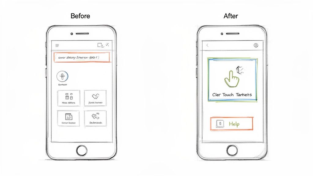
Before: Your design has sleek, icon-only buttons for actions like 'delete' or 'edit'. They look clean, sure, but at 16x16 pixels, they're a nightmare to tap accurately.
After: You ensure every interactive element has a minimum target area of 24x24 CSS pixels. Even if the icon itself is smaller, you can use padding to create an invisible-but-tappable area around it. It's a simple change that massively cuts down on errors.
Practical Recommendation: Update your design system's button components to enforce the 24x24px minimum target size by default. This makes compliance automatic for all future designs.
Focus Not Obscured (Minimum) (2.4.11)
Sticky headers, footers, and live chat widgets are everywhere. The problem? They often create accessibility black holes by hiding the very element a user is trying to interact with.
Before: A user tabs through your site with a keyboard. Just as they land on a link in the main content, your sticky header slides down and completely covers the focus indicator. The user is now lost, with no idea where they are.
After: When designing components like cookie banners or pop-ups, you make sure they never cover other interactive elements. You test your layouts to confirm that as a user tabs through, the focused element is always at least partially visible.
Implementing these changes isn't about making your designs "boring" or "ugly." It's about being intentional. A compliant design is an adaptable design that works for everyone—and it can still be beautiful and modern. Tools like Uxia can check your design mockups for these issues before development even starts.
For Developers Building Compliant Components
Developers are the ones who turn designs into a functional reality. Your code is what makes an experience truly accessible or not. WCAG 2.2 brings in new requirements for authentication and help mechanisms that demand thoughtful implementation.
Accessible Authentication (Minimum) (3.3.8)
Logins that rely on complex cognitive tests are a huge barrier. Your goal here is to offer simpler, secure alternatives.
Before: Your login process forces users to solve a visual puzzle or re-type a string of garbled characters from an image (a classic CAPTCHA). This can be completely impossible for users with cognitive or visual disabilities.
After: Instead of a cognitive test, you let users log in by clicking a magic link sent to their email or by using a password manager. If you absolutely must use a CAPTCHA, you provide an accessible alternative with an audio option or a simple "I am not a robot" checkbox.
Practical Recommendation: Prioritize implementing passwordless login options (like magic links or social logins) as they often inherently meet this criterion while improving usability for all.
Consistent Help (3.2.6)
When a user gets stuck, they need to find help easily and predictably. This criterion is all about reliability.
Before: A "Help" link is in the footer on the homepage, a sidebar on the pricing page, and buried inside a user menu on the dashboard. This forces people to hunt for support on every single screen.
After: You place your help mechanism—whether it's a "Contact Us" link, a chatbot, or an FAQ—in the exact same relative location on every page. A common and effective practice is to put it in the main site header or footer.
Integrating Compliance into Your Workflow
Fixing these issues one by one is a good start, but the real win is embedding these practices into your team's DNA. Update your design system components so the 24x24 pixel target size is the default. Add accessibility checks to your pull request templates in GitHub.
This is also where testing becomes non-negotiable—not just at the end of a project, but right from the very beginning. Platforms like Uxia are essential for this modern workflow. You can upload design mockups and have AI-powered synthetic users test your flows against these new WCAG 2.2 criteria before a single line of code is even written.
For example, you can set up a mission in Uxia to see if a synthetic user with simulated motor impairments can complete your checkout process. The platform will automatically flag undersized touch targets or areas where focus gets obscured, giving your team actionable feedback in minutes, not weeks. This kind of early validation saves a fortune in rework and ensures every new feature is compliant from day one.
And to truly embrace the spirit of WCAG 2.2, look for ways to go beyond technical compliance. Exploring options like audio articles for accessibility shows how you can make content available to everyone, creating a genuinely inclusive experience.
How to Test and Validate Your Compliance
Getting your site aligned withWCAG 2.2is a huge step, but the job isn't finished until you’ve thoroughly tested everything. Real confidence comes from rigorous, multi-layered validation that goes far beyond basic automated scans.
A modern testing strategy combines the essential context you only get from manual testing with the incredible speed and scale of AI-driven validation. This is how you ensure your product doesn't just tick a box on paper but is genuinely usable for people with disabilities. It’s the process that turns good intentions into a solid, defensible, and truly inclusive user experience.
The Foundation: Manual Testing Essentials
Automated tools are powerful, but they’re also blind to a huge portion of accessibility issues. They can't tell you if a user flow is confusing or if your help text is actually helpful. That’s where manual testing comes in, providing the human perspective that code checkers simply can't.
To properly validate your compliance, you have to start with these non-negotiable manual checks:
Keyboard-Only Navigation: Unplug your mouse. Now, try to use your entire website. Can you reach every single button, link, and form field? Is the focus indicator always visible—especially with sticky elements as required by Focus Not Obscured (2.4.11)? This is a foundational test.
Screen Reader Walkthroughs: Fire up a screen reader like NVDA, JAWS, or VoiceOver and navigate your key user journeys. Does the audio output actually make sense? Are images described properly? Do form labels announce correctly? This is the only way to truly step into the shoes of a blind or low-vision user.
Practical Recommendation: Create a simple checklist of your top 5 user journeys (e.g., login, search, checkout) and have a team member perform a keyboard-only test on them once per sprint.
These manual methods are fundamental to achieving genuine accessibility. They uncover the nuanced, experience-based flaws that automated scans miss, ensuring your product is not just compliant, but truly functional and frustration-free.
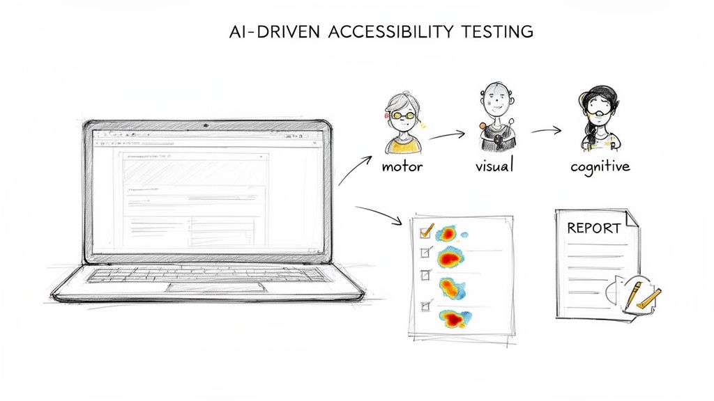
The Game-Changer: AI-Driven Testing with Uxia
Manual testing is absolutely critical, but let's be honest: it’s slow, and it's nearly impossible to scale across a complex, ever-changing product. This is where AI-driven platforms like Uxia completely change the game. They offer the best of both worlds—the depth of human-like interaction with the speed of automation.
Uxia lets you configure synthetic users that simulate real people with different needs and abilities. You can deploy testers who mimic the behaviours of users with motor, cognitive, or visual impairments, allowing you to test your product against the new WCAG 2.2 criteria at a massive scale.
For example, you can set up a mission to specifically test the new criteria in minutes:
Test for Dragging Movements (2.5.7): Assign a synthetic user with simulated motor impairments a task like reordering a list. Uxia will automatically verify if a single-pointer alternative (like up/down arrows) is available and fully functional.
Test for Findable Help (3.2.6): Create a mission where a synthetic user with cognitive challenges needs to locate your help section. The AI will instantly check if your help mechanism is present in a consistent location across all pages.
For product teams at startups and scale-ups using platforms like Uxia, prioritising WCAG 2.2's nine new success criteria can boost compliance from moderate issues to full AA in 2-4 months for complex sites. Uxia's AI synthetic testers excel here, instantly flagging issues in navigation, forms, and mobile touch targets specific to EU users, reducing manual testing costs by 80% while aligning with EAA deadlines. To get more details on these guidelines, you can explore the official W3C documentation.
By combining these methods, you build a powerful, robust validation process. Uxia generates detailed reports, complete with heatmaps and actionable issue logs, that satisfy the strict legal standards of the European market and beyond. This approach doesn't just find problems; it gives your team the precise insights needed to fix them, fast. You can also explore our guide on the best WCAG checker tools to round out your toolkit.
Here’s Your Actionable WCAG 2.2 Compliance Checklist
Moving to WCAG 2.2 can feel huge, but it doesn’t have to be a mad scramble. The secret is to treat it like any other project: break it down into manageable, prioritised chunks.
This checklist does exactly that. It turns a daunting goal into a clear, phased roadmap. Each step explains why it matters and who on the team typically owns it, making it easy to delegate and track. It’s not about boiling the ocean; it’s about making steady, meaningful progress.
Phase 1: Foundational Fixes
Before you even think about the new criteria, you need to get your house in order. These foundational fixes address the most common and highest-impact accessibility barriers. Nailing these gives you a solid base for everything that comes next.
Audit Colour Contrast: Go through your entire site and make sure all text meets the minimum 4.5:1 contrast ratio required by WCAG.
Why it Matters: This is one of the most frequent accessibility fails out there. It directly impacts users with low vision or colour blindness.
Team Responsible: Design
Ensure All Images Have Alt Text: Comb through every meaningful image and confirm it has descriptive alt text. If an image is just for decoration, it needs an empty alt attribute (
alt="").Why it Matters: Alt text is non-negotiable for screen reader users. It’s how they understand the content and purpose of your visuals.
Team Responsible: Dev, Content
Practical Recommendation: Use a browser extension to quickly check color contrast and missing alt text on live pages. This is a fast way for designers and content creators to self-audit.
Phase 2: Integrating The New WCAG 2.2 Criteria
With a solid foundation in place, it’s time to focus on the new WCAG 2.2 requirements. This phase zeroes in on the specific updates that modernise your product for mobile users and people with cognitive disabilities.
Review Interactive Elements for Target Size: Audit all your buttons, links, and other interactive controls. Make sure they meet the new 24x24 CSS pixels minimum target size.
Why it Matters: This is a game-changer for users with motor impairments and, frankly, anyone using a touchscreen. It cuts down on frustration and missed taps.
Team Responsible: Design, Dev
Test Focus Visibility with Sticky Elements: Manually test all your pages that have sticky headers, footers, or banners. As a user tabs through the page, the focus indicator must never be completely hidden by these elements.
Why it Matters: This fixes a massive headache for keyboard-only users. They need to see where they are on the page at all times to navigate effectively.
Team Responsible: Dev, QA
Validate Help Mechanism Consistency: If you have a help mechanism—like a contact link or a chatbot—confirm that it shows up in the same relative spot on every single page.
Why it Matters: Predictability is everything for users with cognitive disabilities. It lowers the mental energy required to find help when they need it.
Team Responsible: PM, Design
Phase 3: Building a Culture of Accessibility
Real compliance isn't a one-and-done project. It’s a cultural shift. This final phase is all about embedding accessibility into your team's DNA to guarantee success for the long haul.
Create an Accessibility Statement: Publish a clear, honest statement that outlines your commitment, your current level of conformance, and how users can give you feedback.
Why it Matters: This builds trust with your users and creates a public record of your efforts.
Team Responsible: PM, Legal
Establish an Internal Champions Programme: Find people on your team who are passionate about accessibility and empower them. Make them the go-to resources and advocates inside your organisation.
Why it Matters: This spreads the knowledge around and makes accessibility a shared responsibility, not just one person's job.
Team Responsible: PM, Management
WCAG 2.2, with its 86 total success criteria at A/AA levels, adds crucial fixes for cognitive disabilities and mobile use. For UX researchers and product managers in ES scaleups, this is gold. Implementing new criteria like target size (2.5.8, minimum 24x24 CSS pixels) and consistent help (3.2.6) can boost automated pass rates to 80%+ in the first month, according to real-world roadmaps.
To make this whole process a lot smoother, platforms like Uxia can automate the validation of many of these checklist items. You can set up missions for synthetic users to test things like target sizes or find help mechanisms, which speeds up your audits dramatically. For more practical tips, you might be interested in our guide on how to approach user interface design testing.
The Business Case for WCAG 2.2 Adoption
Thinking about accessibility purely in terms of compliance is a missed opportunity. It’s not just about avoiding fines; it’s a core business strategy. Adopting WCAG 2.2 is your clearest path to real returns, especially with the European Accessibility Act (EAA) enforcement deadline of June 28, 2025, right around the corner.
For any business operating in the EU, WCAG 2.2 provides a direct roadmap for EAA compliance. But the real win isn't just checking a legal box. It's about tapping into a huge, overlooked market.
Unlock New Markets and Revenue
Did you know that over 15% of the world's population lives with some form of disability? That's not a niche group; it's a massive and deeply loyal market with significant spending power. By building accessible digital products, you're not just doing the right thing—you're opening your doors to millions of customers who were previously shut out.
A practical recommendation here is to use analytics to identify where users with assistive technologies drop off in your funnels. Platforms like Uxia can help simulate these user journeys to pinpoint the exact accessibility barriers causing the drop-off, turning a compliance cost into a revenue opportunity.
Adopting WCAG 2.2 is a proactive move that serves as a powerful market differentiator. It signals to customers that your brand is inclusive, trustworthy, and committed to a superior user experience, building powerful brand loyalty that competitors can't easily replicate.
Gain a Competitive Edge in Europe
The EU’s key standard for digital accessibility, EN 301 549, is being updated to align with WCAG 2.2 as the EAA deadline approaches. Right now, a shocking 96% of websites fail automated WCAG tests, with homepages averaging over 50 errors each. This isn't just a compliance gap; it's a massive competitive advantage waiting to be claimed.
Some regions are already moving ahead. As you can discover in more detail, early adopters are creating a clear lead, showing that proactive compliance pays off.
This isn't just about following rules. It's about using data-driven design to build fundamentally better products from the ground up. Tools like Uxia let you test and validate your designs against WCAG 2.2 criteria automatically, ensuring you build accessible experiences from day one. You can learn more about how to integrate data into your design process in our guide. Getting this right now positions your brand as a leader, not a follower.
Your WCAG 2.2 Questions Answered
Whenever new guidelines like WCAG 2.2 drop, they always kick up a cloud of questions. Let's cut through the noise and tackle the ones we hear most often from product teams.
First up: is this mandatory right now? While major regulations like the European Accessibility Act have a clear 2025 deadline, the smart move is to start now. Getting ahead of the curve means you avoid a last-minute scramble and, more importantly, you start building better, more inclusive products sooner.
And what about mobile apps? Do these rules apply? Absolutely. WCAG is designed to be technology-agnostic. That means its principles apply just as much to your website as they do to native apps or even digital documents. The core ideas—making content perceivable, operable, understandable, and robust—are universal for any digital interface.
Making Compliance Achievable
A common concern, especially for smaller teams, is: "How can we realistically tackle all this?" The key is not to boil the ocean. Instead, you prioritise.
Your main goal should be Level AA conformance. This level addresses the most significant and common barriers for users with disabilities and has become the universal standard for both legal compliance and commercial success.
A practical recommendation is to start with the new Level A criteria, like Consistent Help (3.2.6) and Redundant Entry (3.3.7). These are often easier to implement and provide high value to users with cognitive disabilities, giving you quick wins on your compliance journey.
This is where having the right tools becomes a game-changer. Instead of getting bogged down in endless manual checks, platforms like Uxia can automate testing for many of the new WCAG 2.2 criteria. You can quickly validate your designs for things like minimum target sizes or focus visibility, making compliance genuinely achievable, even when you're short on time and resources.
Ready to build accessible products with confidence? Uxia uses AI-powered synthetic testers to validate your designs against WCAG 2.2 criteria in minutes, not weeks. Start building more inclusive experiences today by visiting https://www.uxia.app.