A Practical Guide to WCAG for Modern Product Teams
Master WCAG with this practical guide. Learn the POUR principles, A/AA/AAA levels, and how to build inclusive products that meet legal standards.
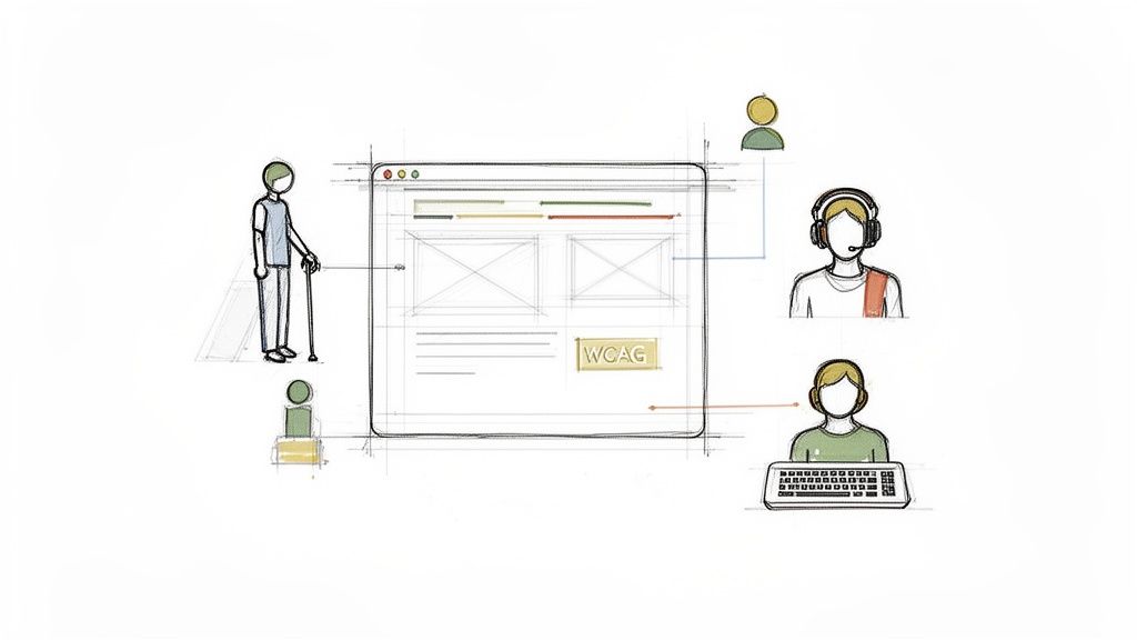
When you hear WCAG, don't just think of a rulebook. Think of it as an architectural blueprint for building better, more inclusive digital products that genuinely work for everyone. These are the Web Content Accessibility Guidelines, and they are the globally recognised standards for digital accessibility.
Why WCAG Is Your Blueprint for Better Products
Too many teams see WCAG as a compliance hurdle. That's the wrong way to look at it. Instead, view it as a strategic advantage. It's a framework that pushes you to design with empathy, which almost always sparks innovation and leads to a fundamentally better user experience for all, not just for users with disabilities.
It's a simple truth: a product that’s easy for someone using a screen reader to navigate is also a product that’s logically structured and simple for everyone to use.
Practical Recommendation: Start by making the core accessibility principles part of your team's onboarding. WCAG is your definitive guide for turning those principles into practice. It’s not about creating "basic" experiences; it's about creating adaptable ones. Accessible design can and should be visually rich and engaging.
A Global Standard with Local Impact
WCAG provides a universal language for digital accessibility, forming the backbone of legislation worldwide. Here in Spain, for example, WCAG is a legal requirement for the public sector, mandated through European standards.
But there's a big gap between the law and reality. Recent findings showed that only 34% of government websites were fully compliant. The average homepage had 12.4 WCAG errors, with potential fines hitting €30,000 per violation. This isn't just a local problem—it's a challenge many organisations face globally.
Adopting WCAG isn't just about avoiding legal trouble; it's about expanding your market. An accessible product is one that a larger audience can use. That directly translates to a bigger customer base and a stronger brand reputation.
The standards are developed by the W3C Web Accessibility Initiative (WAI), which provides extensive documentation and resources to help teams get it right.
This official resource page is the central hub for all things WCAG, including different versions and supporting materials that help make implementation much clearer.
Embedding WCAG from the Start
So, how do you do it? The most effective way is to integrate WCAG principles right from the very beginning of the design process. Treating accessibility as a last-minute check during final QA is a recipe for disaster—it's inefficient, expensive, and leads to a clunky user experience. The key is to shift left.
This is where pioneering platforms like Uxia are changing the game. By allowing teams to test for WCAG alignment directly within their design prototypes, Uxia embeds accessibility into the core workflow. This isn't just a theory; it has very practical benefits:
Early Detection: Spot and fix accessibility issues in Figma or even video prototypes, long before a single line of code is written.
Faster Iteration: Get immediate feedback from synthetic users who represent a range of abilities, cutting out the slow, expensive manual audits.
Actionable Insights: Go beyond a simple pass/fail checklist. Understand how your design choices actually impact users and build with real confidence.
By adopting this proactive mindset, you stop treating WCAG as a burden and start using it as a powerful tool for creating superior digital experiences.
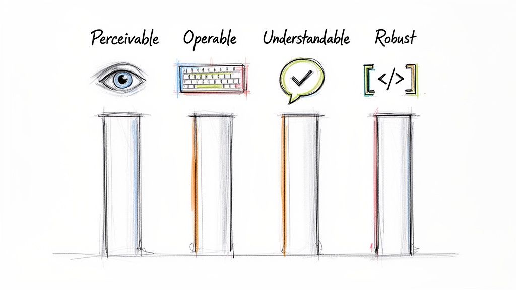
Decoding the Four Pillars of Accessibility: POUR
To really get your head around the WCAG guidelines, you have to stop thinking about them as just a technical checklist. It’s about people. At its heart, WCAG is built on four core principles, easily remembered with the acronym POUR. These aren't just fluffy ideas; they're the foundations of any truly accessible digital product.
Think of POUR as a lens for every single design and development choice you make. It forces you to ask: "Will this work for everyone?"
Let's break down what each principle actually means for your product and your users.
Perceivable: Can Everyone See and Hear Your Content?
The first principle, Perceivable, asks a simple but critical question: can everyone sense the information you're presenting? It means your content and UI elements must be presented in ways people can actually perceive, regardless of their sensory abilities.
This is all about providing alternatives. If content relies on sight, you need a non-visual option. If it relies on hearing, you need a silent one. It's a common mistake to think this is just for screen readers, but it goes much deeper.
Practical Recommendations to Make Your Product Perceivable:
Provide text alternatives (alt text) for images, icons, and charts so screen reader users get the same information.
Offer captions and transcripts for videos and podcasts so users who are deaf or hard of hearing aren't left out.
Ensure strong colour contrast between text and its background, making it readable for users with low vision or colour blindness.
Operable: Can Everyone Use Your Interface?
Next up is Operable. Can users successfully navigate and interact with every button, link, and form field? This principle is about making sure your product doesn't require an interaction that someone can't perform.
For instance, a user with hand tremors might find precise mouse clicks difficult, so making everything work with a keyboard becomes essential. It's about designing for flexibility, not just simplicity.
A classic Operable failure is the "keyboard trap." This happens when a user can tab into a component (like a pop-up) but can't tab back out. One small trap can make your entire app unusable for them.
Practical Recommendation: Unplug your mouse and try to use your product with only the Tab, Shift-Tab, Enter, and Esc keys. This simple exercise quickly reveals major operability issues. Checking this is a crucial step in any WCAG audit.
Understandable: Is It Clear and Predictable?
The third pillar is Understandable. Is the information clear? Does the interface behave in a way that makes sense? This principle tackles cognitive accessibility, ensuring you don't confuse users with inconsistent layouts, complex jargon, or surprising behaviour.
This is where good usability and accessibility are practically the same thing. An interface that's confusing for anyone is often a total blocker for someone with a cognitive disability.
Practical Recommendations to Make Your Product More Understandable:
Use plain language and avoid technical terms unless they're clearly defined.
Design predictable navigation that works the same way on every page.
Write helpful error messages that explain what went wrong and how to fix it, instead of just a vague "Error occurred."
This is an area where synthetic user testing tools like Uxia shine. By simulating how different users navigate your flows, they can flag confusing paths or unpredictable UI behaviour—pinpointing these WCAG failures before they ever frustrate a real person.
Robust: Will It Work With Today's and Tomorrow's Tech?
Finally, Robust means your content must be compatible with a wide range of user agents, especially assistive technologies. This is the most technical of the four principles, and it all comes down to writing clean, standards-compliant code.
If your code is a mess of non-standard HTML, screen readers and other tools simply can't interpret it correctly. It's like giving someone a book with half the words misspelled—the meaning gets lost.
This principle is also about future-proofing. By sticking to web standards, you ensure your product will work not only with today’s assistive tech but also with tools that haven't even been invented yet. Building robustly creates a stable, reliable experience for everyone, for years to come.
To tie it all together, here’s a quick summary of the POUR principles and what they mean in practice.
The Four POUR Principles of WCAG Explained
Principle | What It Means for Users | Key Questions for Product Teams |
|---|---|---|
Perceivable | Users can process information using one of their senses. Content isn't invisible to them. | Is there text for every image? Are there captions for videos? Is the text easy to read? |
Operable | Users can navigate and interact with all controls and elements, no matter how they use the device. | Does everything work with a keyboard? Are there time limits on tasks? Can users avoid mistakes? |
Understandable | The interface is clear, consistent, and predictable. Users aren't left confused or surprised. | Is the language simple? Is navigation consistent? Are error messages helpful? |
Robust | The product works reliably with different browsers, devices, and assistive technologies. | Does our code follow web standards? Have we tested with assistive tech? Will this break on future browsers? |
By keeping these four principles in mind throughout the design and development process, you move beyond just "checking boxes" for compliance. You start building products that genuinely work better for everyone.
Choosing Your Target: WCAG Level A, AA, or AAA?
Figuring out the WCAG levels is the first step toward setting real, impactful accessibility goals for your product. It’s not an all-or-nothing game. Instead, WCAG offers a tiered system that guides teams toward building progressively more inclusive experiences.
These tiers are Level A, Level AA, and Level AAA. Each level stacks on top of the one before it, meaning Level AA includes everything in Level A, and Level AAA includes everything in AA.
Think of it like building a house. Level A is the absolute essential foundation. Level AA adds the walls and a solid roof. And Level AAA brings in the high-end, specialised features that make the house truly exceptional.
Level A: The Essential Foundation
Level A covers the most basic, fundamental accessibility needs. If you fail to meet these criteria, you are actively creating show-stopping barriers for users with disabilities. Some people will find parts of your product completely unusable. These are the absolute non-negotiables.
A classic Level A requirement is providing alt text for images. Without it, someone using a screen reader has zero idea what information an image is supposed to be conveying. It's a digital brick wall. You can check out our guide on the latest WCAG 2.2 updates to see how these criteria evolve.
Practical Recommendation: View Level A not as a goal, but as the absolute minimum for your product to even be in the accessibility conversation. Aiming for Level AA is a much better long-term strategy.
Level AA: The Industry Standard
This is where most organisations should be aiming. WCAG Level AA conformance tackles the most common and significant barriers for disabled users. Hitting this target signals a strong, comprehensive commitment to accessibility, making your product usable and robust for the vast majority of people.
More importantly, Level AA is the benchmark cited in accessibility legislation all over the world, from European directives to legal interpretations of the ADA in the United States. Aiming for Level AA isn't just a best practice; it's a critical part of managing your legal risk.
Practical Recommendation: For almost any digital product, the most strategic goal is to target and maintain WCAG 2.2 Level AA compliance. This strikes the perfect balance between achieving a high degree of accessibility and setting realistic development goals.
The jump from A to AA is significant. For example, while Level A might just require a transcript for a pre-recorded audio file, Level AA ups the ante by requiring captions for live video content—a much more inclusive solution for users who are deaf or hard of hearing.
Level AAA: The Gold Standard
Level AAA is the highest and most rigorous level of conformance. Products that meet these criteria are accessible to the widest possible audience of people with disabilities. But getting there is incredibly difficult.
The W3C, the organisation behind WCAG, even says that it's not always possible to satisfy all Level AAA criteria for every type of content. Because of this, it's not recommended to make full Level AAA conformance a blanket policy across an entire site.
Practical Recommendation: Instead of aiming for full AAA conformance, pick specific AAA criteria that are relevant to your audience and achievable for your team. A great example is providing an enhanced contrast ratio (7:1) for key parts of your interface.
This is where tooling can make a huge difference. Platforms like Uxia help you assess your designs against these different levels, showing you exactly where you stand and helping you prioritise what to fix. By running tests with synthetic personas that represent a wide range of abilities, you can instantly see which WCAG failures are causing the biggest problems and focus your efforts on reaching that crucial Level AA standard.
How to Find and Fix Common WCAG Failures
Knowing the WCAG principles is one thing, but actually putting them into practice is a whole different ball game. Let's get practical and look at the common accessibility failures that pop up all the time in digital products—even those built by experienced teams.
Learning to spot these issues early is key. If you can catch them during the design phase in a tool like Figma, you prevent them from becoming expensive problems for developers to fix later on. It's about shifting your mindset towards prevention, which saves time, money, and frankly, a lot of headaches.
Failure 1: Low-Contrast Text
One of the most frequent (and easiest to fix) WCAG failures is low colour contrast between text and its background. This is a direct violation of the Perceivable principle.
For someone with low vision or certain types of colour blindness, text that blends into the background is effectively invisible. Imagine trying to use a checkout page where the "Complete Purchase" button is unreadable—it's a complete dead end.
The User Impact: A user with moderate low vision can't read your pricing or navigation links, making your site totally unusable for them.
The WCAG Rule: Success Criterion 1.4.3 Contrast (Minimum) requires a contrast ratio of at least 4.5:1 for normal text and 3:1 for large text (18pt or 14pt bold).
Practical Recommendation: Designers should use a contrast checker plugin right inside their design tools. This allows them to verify WCAG AA compliance instantly and fix colours on the spot, preventing issues from ever reaching development.
Failure 2: Images Without Descriptive Alt Text
Another incredibly common issue is missing or poorly written alternative text (alt text) for images. This breaks the Perceivable principle and makes visual information completely useless for screen reader users.
Simply writing "image" or "graph" is not helpful. The alt text needs to convey the same essential meaning as the image itself.
When an image lacks proper alt text, it's like a blank page for a blind user. They have no idea if they've missed a critical piece of data from a chart or just a simple decorative element. This uncertainty creates a frustrating and unequal experience.
Practical Recommendations for Writing Good Alt Text:
Be Concise and Descriptive: Get to the point. What is the essential information in the image? For a photo of a person, include their name and context. For a chart, summarise the key takeaway.
Avoid Redundancy: Don't start with "Image of..." or "Picture of...". Screen readers already announce that it's an image.
Mark Decorative Images Properly: If an image is purely for decoration and adds no real information, it should be marked with empty alt text (
alt=""). This tells screen readers to skip it, reducing auditory clutter.
Finding and fixing these issues is a core part of any good accessibility audit. To dive deeper, check out our comprehensive guide on the best WCAG checker tools available.
Failure 3: Unclear Form Labels and Instructions
Forms are the backbone of online interaction, but they are a massive source of WCAG failures. A classic mistake is using placeholder text as a label. It might look clean, but that text disappears as soon as a user starts typing.
This forces them to rely on memory—a huge problem for anyone, but especially for users with cognitive disabilities. To meet the Understandable and Operable principles, every form field needs a clear, programmatically associated label that is always visible.
The User Impact: A user with a cognitive disability gets confused when the placeholder label for an input field vanishes. They can't remember what they were supposed to enter and might just give up on the form.
The WCAG Rule: Success Criterion 3.3.2 Labels or Instructions requires that content needing user input has clear labels or instructions.
Practical Recommendation: Always use the
<label>element in HTML. Programmatically link it to its input field using theforandidattributes. This simple step ensures that screen readers announce the connection clearly and allows users to click on the label to focus on the input field.
Failure 4: Keyboard Navigation Traps
Finally, failing to support full keyboard navigation is a critical error that violates the Operable principle. Many users rely on a keyboard (using the Tab key) to get around the web due to motor disabilities.
A "keyboard trap" happens when a user can tab into a component, like a pop-up modal or a widget, but can't tab out of it. They're stuck.
This traps the user, making the rest of the page completely inaccessible. The only way out is often to reload the page, which is a massively frustrating experience.
Practical Recommendations for Keyboard Accessibility Testing:
Unplug Your Mouse: Seriously. Navigate your entire site using only the Tab key to move forward and Shift+Tab to move backward.
Check All Interactive Elements: Can you reach every single link, button, and form field?
Verify Visual Focus: Is there a clear visual indicator (like a blue outline) showing which element is currently selected?
Test for Traps: When you open a pop-up or dropdown menu, can you close it and get back to the main page using only your keyboard (usually with the Esc key)?
This simple manual test can reveal major accessibility barriers. For more complex workflows, platforms like Uxia can simulate these keyboard-only journeys with synthetic users, automatically flagging where navigation breaks down and providing clear insights to fix it.
Embedding WCAG Testing into Your Workflow
Accessibility should never be a final, stressful check right before launch. When you treat WCAG compliance like a last-minute QA task, it’s not just inefficient—it’s expensive and leads to a worse product for everyone.
The right way to do it? Weave accessibility validation into every single stage of your product development lifecycle, from the very first sketch to the final deployment. This means making WCAG testing a continuous and shared responsibility. To really nail this, it helps to understand the broader principles of quality assurance in software development. This mindset shift turns compliance from a gate into a guardrail, guiding your team toward building better products from day one.
Integrating WCAG into Design
The single most impactful place to start is in the design phase. Think about it: fixing an accessibility issue in a Figma file takes minutes. Fixing that same issue in production could take days or even weeks.
For designers, this is all about proactively building accessibility into their work. Start by using plugins directly within your design tools. There are tons of excellent, free options that can instantly check for common WCAG failures, saving countless hours down the line.
Practical Recommendations for Designers:
Colour Contrast Checkers: Use a plugin that checks text and UI element contrast against WCAG AA and AAA standards. This ensures your designs are readable for users with low vision or colour blindness right from the start.
Accessibility Annotations: Get into the habit of documenting accessibility needs directly in your design files. Specify things like heading levels (H1, H2, etc.), the intended focus order for keyboard navigation, and descriptive alt text for images. This gives developers a clear blueprint to follow.
Touch Target Sizing: Make sure all interactive elements have a large enough tap area—a good rule of thumb is at least 44x44 pixels. This makes them much easier to use for people with motor impairments.
Empowering Developers with Automated Checks
For developers, the goal is simple: catch WCAG violations before they even get committed to the codebase. This is where automated tools integrated directly into the development environment and CI/CD pipeline come in.
These tools act like an automated code reviewer for accessibility. They can flag issues like missing form labels, improper use of ARIA attributes, or images lacking alt text. They won't catch everything, but they're incredibly good at spotting a huge portion of common WCAG failures automatically.
Think of automated accessibility linters as a spellchecker for your code. They won’t tell you if your story is compelling, but they will instantly catch the obvious mistakes, allowing you to focus on the more complex narrative of the user experience.
A Hybrid Approach to QA and Testing
While automation is a fantastic first line of defence, it can only identify around 30-50% of WCAG issues. Many accessibility requirements, especially those tied to the Operable and Understandable principles, need human judgement. This is precisely why a hybrid testing model is the most effective approach.
This model combines three layers of validation:
Automated Scans: Use browser extensions and CI/CD tools for quick, automated checks. This is your go-to for low-hanging fruit like contrast errors or missing alt text.
Manual Testing: Actually use your product with a keyboard only. Fire up a screen reader and navigate through critical user flows. This is how you understand the real-world experience of using your product with assistive technology.
Synthetic User Testing: This is where a platform like Uxia becomes a game-changer. It perfectly bridges the gap between limited automated tools and slow, expensive manual audits.
This flowchart illustrates a simple process for remediating common WCAG errors found during testing.
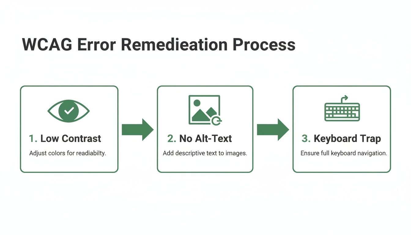
The flowchart shows how different teams can tackle specific WCAG failures—like low contrast, missing alt text, and keyboard traps—at various stages of the workflow.
With Uxia, your team can upload a design prototype or a video of a user flow. The platform then generates AI-powered synthetic personas representing users with different disabilities, such as a person with low vision or a keyboard-only user.
These synthetic users attempt to complete tasks, "thinking aloud" as they go. Uxia automatically flags specific WCAG issues right in the context of the user journey, revealing not just what is broken, but where and why it’s causing friction. You get rich, actionable insights in minutes, not the weeks it takes to coordinate traditional human testing. To learn more, check out our posts on https://www.uxia.app/blog/accessibility-testing.
By combining automated checks for technical compliance, manual testing for experiential validation, and synthetic user testing with Uxia for rapid feedback, you create a robust, continuous loop. This ensures you’re consistently building products that are not only WCAG compliant but truly usable for everyone.
Common WCAG Questions, Answered
As teams start folding WCAG into their day-to-day work, a few practical questions always pop up. Let's clear the air and give you the confidence to move forward.
How Often Is WCAG Updated?
Think of WCAG as a living standard. It has to evolve as technology does. The World Wide Web Consortium (W3C) periodically releases updates to keep pace with modern digital products. A great example is the recent jump from WCAG 2.1 to 2.2, which brought in new rules for things like focus appearance and dragging movements.
Practical Recommendation: Always target the latest official WCAG release. This keeps your product aligned with current best practices and, just as importantly, helps you stay ahead of the curve for future changes in tech and accessibility law.
Is WCAG a Legal Requirement?
This is a big one. While WCAG is technically a set of guidelines and not a law in itself, it has become the gold standard for digital accessibility in courtrooms and parliaments worldwide. Laws like the Americans with Disabilities Act (ADA) in the US and the European Accessibility Act all point to WCAG Level AA as the benchmark for compliance.
Practical Recommendation: For most businesses, aiming for and maintaining WCAG Level AA conformance is the smartest strategic move. It dramatically reduces your legal risk by showing a clear, good-faith effort to build an accessible experience for everyone.
Falling short isn't just a technical problem—it can lead to expensive lawsuits and seriously tarnish your brand's reputation. It's just good business to treat Level AA as a firm requirement.
Automated vs. Manual Testing
Another point of confusion is how to actually test for compliance. Automated tools are fantastic for catching a good chunk of issues quickly—somewhere between 30-50% of all WCAG violations. They're brilliant at spotting technical errors like colour contrast failures, missing alt text on images, or broken ARIA roles.
But automation can't tell you if your product is genuinely usable. It can’t tell you if your navigation is confusing, if your content makes sense, or if a specific interaction is a nightmare for someone with a motor impairment. That's where you need to bring in manual testing and simulation.
This is exactly the gap that platforms like Uxia are built to fill. By simulating how users with different abilities actually navigate your designs, you uncover the experiential problems that automated checkers completely miss. This is the key to verifying true compliance with the WCAG principles and making sure your product isn't just technically compliant, but truly accessible.
Ready to find and fix WCAG issues before they ever reach your users? Uxia’s synthetic user testing platform gives you actionable accessibility insights from your earliest prototypes in minutes, not weeks. Get started with Uxia today and build with confidence.