UX Design User Flow: A Practical Guide for 2026
Learn what a UX design user flow is, how to create one, and how to validate it with AI testing. This guide covers types, tools, and optimization.

You’re probably dealing with one of two situations right now. Either your team has a polished prototype that still feels risky, or you have analytics showing drop-offs but no clear explanation for why users stall halfway through a key task.
That’s where a ux design user flow stops being a diagram on a whiteboard and starts becoming a working business tool. A strong flow gives product teams a shared view of how people move from entry point to outcome. A tested flow shows where that path breaks, where users hesitate, and which fixes are worth making first.
What Is a UX Design User Flow
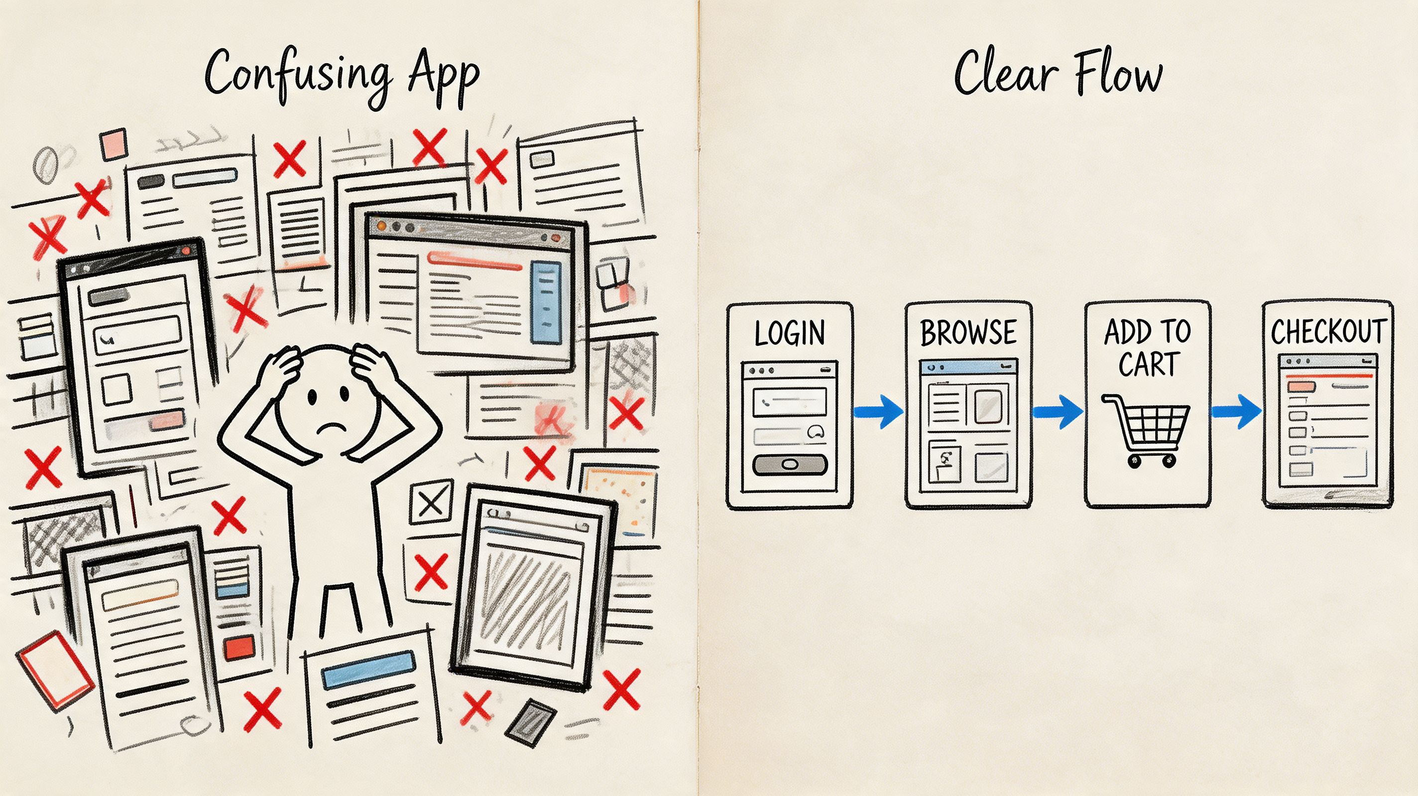
A user opens your app to do one thing. Book a ticket. Start a trial. Pay an invoice. Reset a password. Instead of moving cleanly through the interface, they bounce between screens, second-guess labels, and miss the next action. The problem usually isn’t just one button. It’s the path.
A ux design user flow is the map of that path. It shows the sequence of screens, actions, and decisions a user takes inside a product to complete a specific goal. Good flows don’t just document what exists. They help teams decide what should exist, what can be removed, and where confusion is most likely to appear.
What a user flow is and what it is not
A lot of teams mix up user flows, journey maps, and task flows. That creates messy documentation and weak decisions.
User flow: Maps the steps and interactions inside the product.
Journey map: Looks at the broader experience, including emotions, motivations, and context.
Task flow: Focuses on a narrower sequence of actions within a larger journey.
According to NN/g’s explanation of user journeys versus user flows, both tools capture how people accomplish goals, but they serve different purposes. Journey maps focus on emotions and overall experience for strategists, while user flows focus on steps and interactions for UX/UI designers. The same source also notes that usability testing is the best methodology for obtaining data to map these flows accurately.
A user flow should answer a simple question: what exactly does the user need to do next, and does the interface make that obvious?
Why teams use flows beyond product design
Flows also help operations, support, and delivery teams align around process logic. If you work across distributed product squads, it helps to borrow structure from adjacent disciplines that streamline operations for remote teams because the same principle applies. Clear paths reduce confusion, handoff mistakes, and rework.
The practical test is simple. If someone on your team can’t look at the flow and explain where users enter, what decisions they face, and what counts as success, the flow isn’t usable yet.
Why User Flows Are Crucial for Business Success
A team ships a polished signup funnel, acquisition looks healthy, and traffic is arriving on schedule. Then completion rates stall halfway through onboarding. The problem usually is not the visual design alone. It is the path itself. Users hit unclear decisions, extra steps, or dead ends, and the business pays for every one of those drop-offs.
That is why user flows matter to growth, not just to design documentation. They shape how quickly someone reaches value, how confidently they complete a purchase or setup, and how much rework the product team creates for itself later. At Uxia, we treat flows as testable hypotheses about behavior. If a flow predicts that users will choose a certain route, complete a task, and understand the next step, that prediction should be validated before release and improved after launch.
The business case goes beyond usability
Good flow design changes outcomes that executives already track: conversion, activation, retention, support volume, and delivery speed.
The financial upside of better UX is well documented. Forrester reported that, on average, every dollar invested in UX can return up to $100, according to Adobe’s summary of UX business impact research. Adobe also cites evidence that companies with strong design practices tend to outperform industry benchmarks. User flows are one of the places where that value becomes operational. They define the path customers must follow to produce revenue.
I see this mistake often. Teams approve screens one by one, but no one pressure-tests the sequence between them. The interface can look polished while the experience still leaks users at each decision point.
Where flows create measurable business impact
User flows influence performance most in the moments where intent is high and hesitation is expensive:
Revenue paths: Signup, checkout, booking, plan selection, and upgrade flows determine how many interested users become paying customers.
Activation paths: Onboarding, setup, and first-use flows affect whether users reach value fast enough to return.
Delivery efficiency: Clear flows help product, design, and engineering agree on states, dependencies, and edge cases before build starts.
Support reduction: Fewer confusing branches means fewer tickets, fewer abandoned tasks, and less manual recovery work.
Practical rule: If a user sees multiple next steps, the flow should make the preferred action obvious and justify every distraction that remains.
Ambiguity gets expensive fast
A weak flow rarely fails in one dramatic moment. It loses performance in small, cumulative ways. An extra form field lowers completion. A vague button label slows decisions. A missing success state makes users repeat an action they already finished.
That pattern is why flows should be reviewed like operating assumptions, not static diagrams. In Uxia projects, we use them early to expose risky branches and later to compare expected behavior with observed behavior. AI-assisted testing makes that loop faster. Instead of debating whether a path feels intuitive, teams can test where users hesitate, which branches they ignore, and which step breaks momentum.
Speed matters here too. Google found that as page load time goes from one second to three seconds, the probability of bounce increases by 32%, according to Google’s mobile site speed research. Flow quality includes that operational reality. A logical path still underperforms if transitions feel slow, uncertain, or interrupted at the point of decision.
Strong user flows give teams a way to improve business performance before problems reach production, and a way to keep improving after launch.
Choosing the Right Type of User Flow
Not every flow should look the same. The format depends on what decision you’re trying to make. Teams often over-design simple flows or under-spec complex ones, and both mistakes waste time.
The easiest way to choose is to ask one question first. Are you trying to understand a linear task, model decision logic, or review interaction details at the screen level?
User Flow Types Compared
Flow Type | Primary Purpose | Best For |
|---|---|---|
Task Flow | Show a single, linear path for completing one action | Narrow tasks like password reset, file upload, or applying a filter |
Flowchart | Show branching logic and decision points | Checkout rules, onboarding choices, permissions, and conditional states |
Wireflow or Screen Flow | Combine path logic with actual interface screens | Design reviews, developer handoff, prototype testing, and UI validation |
When to use each format
Task flows work well when there’s one main path and little branching. If you’re mapping “user updates billing details,” a task flow is usually enough. It keeps the team focused on sequence rather than visual polish.
Flowcharts are better when users can take different routes. These are useful when the product has optional onboarding, skipped steps, eligibility conditions, or alternate outcomes. A flowchart makes hidden complexity visible.
Wireflows become important once interface details affect comprehension. If the wording of a CTA, the placement of a checkbox, or the visibility of a progress indicator changes behavior, you need a flow that includes screens, not just boxes and arrows.
A practical selection method
Use this quick lens before you start mapping:
Use a task flow when the team needs speed and the path is straightforward.
Use a flowchart when stakeholders need to understand branching logic.
Use a wireflow when the flow can’t be separated from the UI itself.
A flow format is only useful if it helps the next decision happen faster. If the diagram looks polished but doesn’t help design, test, or build, it’s the wrong format.
There’s also a sequencing point here. Early product discovery often benefits from rough flowcharts. Mid-stage design benefits from wireflows. Final validation usually needs a prototype-based screen flow that users can directly interact with. Teams that use the same artifact for every stage usually end up either too vague or too detailed.
A Practical Guide to Building Your First User Flow
Most first-time user flows fail for one reason. Teams start with screens instead of goals.
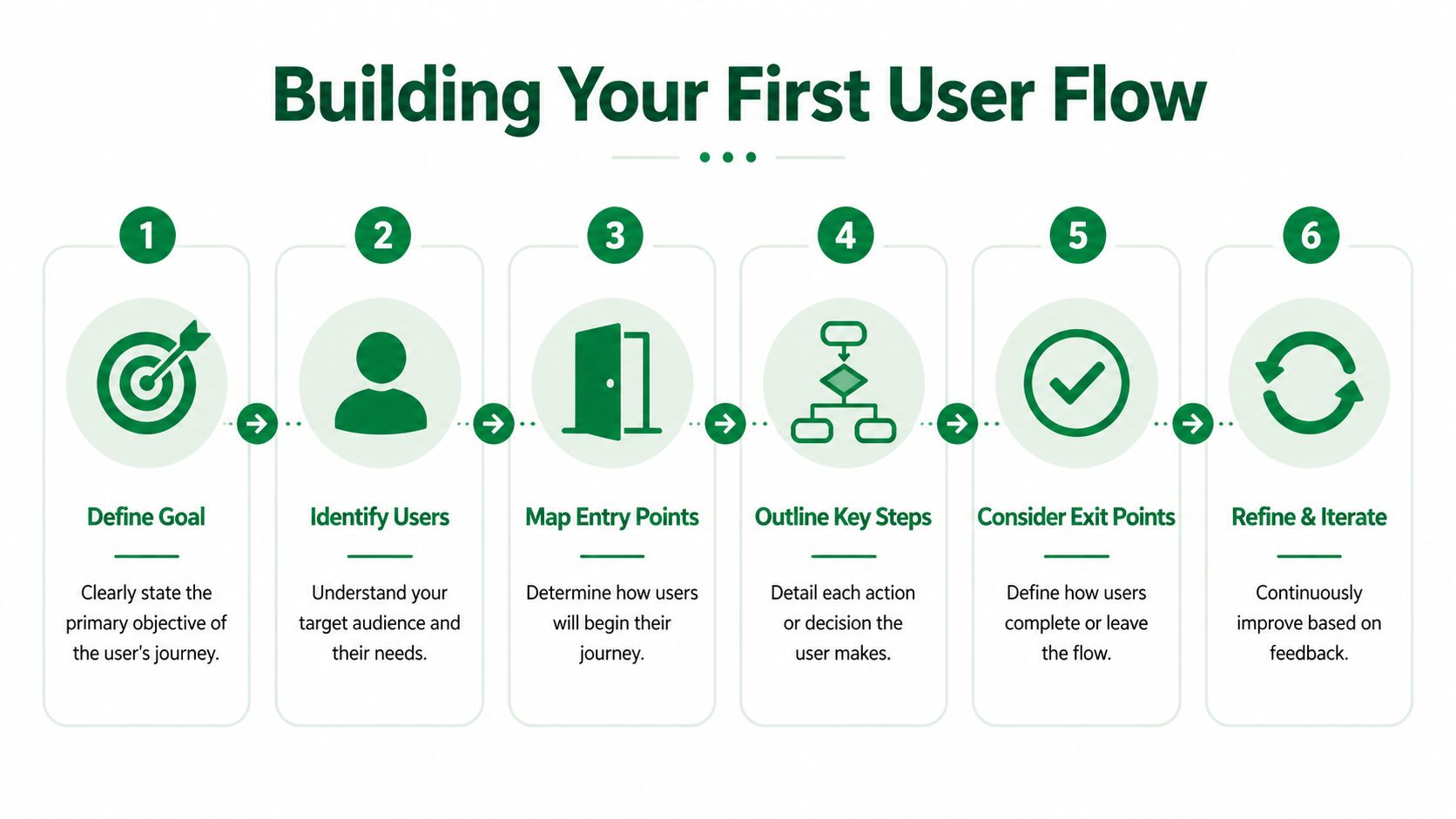
A solid ux design user flow starts by defining what the user is trying to achieve and what the business needs from that action. Once that’s clear, the flow becomes much easier to build and much easier to critique.
Start with the outcome, not the interface
Before opening Figma, Miro, Whimsical, or FigJam, write down the core task in plain language.
Examples:
User buys a train ticket
User starts a free trial
User changes delivery address
User submits a support request
Then define three anchors:
Entry point
Where does the user begin? Homepage, email, push notification, dashboard, search result, or direct deep link.Success state
What counts as completion? Confirmation page, account created, booking secured, or payment accepted.Failure or exit states
Where can the user abandon, pause, or get blocked?
Break the journey into atomic tasks
The most reliable way to make a flow usable is to decompose broad goals into smaller actions. According to B13’s guidance on user flow design, effective flow design requires breaking user objectives into atomic tasks, and this hierarchical decomposition enables 15-30% faster iteration cycles because teams can localize fixes instead of redesigning the whole flow.
That matters in practice. “Complete checkout” is too broad to diagnose. “Choose route,” “select fare,” “review basket,” “accept terms,” and “confirm payment” are specific enough to test.
Build the flow in a sequence that exposes friction
Use this order:
List the ideal path first: Map the shortest successful route before adding exceptions.
Add decision points next: Show where users must choose, confirm, compare, or recover from uncertainty.
Mark dependencies clearly: If a button stays inactive until users complete a prior action, note that explicitly.
Add alternate branches last: Error states, backtracking, and optional detours should be visible but not overpower the main path.
The best first draft is usually ugly and specific. Clean diagrams can come later. Early clarity matters more than presentation.
Sanity-check the flow before polishing it
Review the draft with product and engineering using practical questions:
Can a new team member explain the path without extra context?
Does every step move the user closer to the outcome?
Are there screens that exist because of internal process, not user need?
Where would someone hesitate if labels, trust signals, or system feedback were weak?
If you need examples of how these diagrams evolve in practice, Uxia’s article on user flow diagram methods and examples is a useful reference point for comparing formats and use cases.
One more rule helps a lot. Don’t map everything. Map the flows that matter most to adoption, revenue, activation, or support load. A narrow, high-impact flow is far more useful than a giant map nobody updates.
Validating Your User Flow with AI-Powered Testing
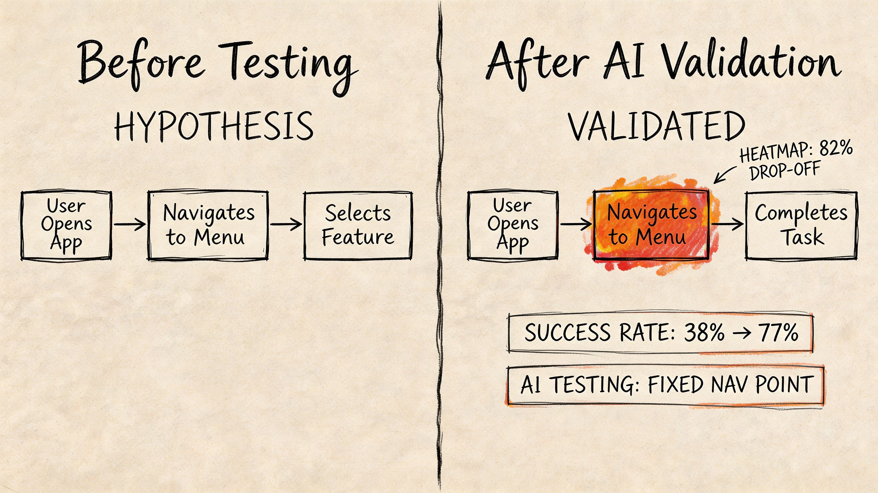
A designed flow is still a hypothesis. It describes how the team thinks users will behave. Validation starts when people, or realistic stand-ins for people, try to complete the task and show you where your assumptions break.
Why static flows aren't enough
A common gap in UX practice is what happens after a flow gets created. Teams map an ideal route, maybe review it internally, then move on. But live products don’t fail because the diagram was missing. They fail because the diagram wasn’t validated against actual behavior.
According to Resolute Software’s discussion of user flows, a major gap in UX practice is the lack of quantitative data to validate flows after creation. Analytics can show drop-offs, but they don’t explain why. That’s exactly where testing needs to combine behavior signals with qualitative reasoning.
A practical setup workflow
When I’m validating a prototype, I don’t start by uploading screens. I start by defining the task.
The sequence is straightforward:
Set the mission
Write the task the tester should complete. Keep it realistic and goal-based.Add the scenario
Give enough context so behavior reflects a plausible real-world intent.Upload the prototype
In practice, teams usually work from a Figma prototype link, a set of static screens connected into a path, or extracted screens from a video-based flow.Define the intended path
Mark the entry point, expected screens, and the end goal clearly.Add follow-up questions
Ask about confusion, trust, clarity, or reasons for hesitation.Choose the audience and launch
Select the profile you want to simulate, run the test, and compare actual behavior against the ideal route.
One option for doing this is Uxia, an AI-powered UX/UI testing platform that lets teams upload image, video, or prototype-based flows, assign a mission and audience, and review transcripts, visual analytics, heatmaps, and flow-level signals. If you want the broader workflow behind that approach, this guide to synthetic user testing for rapid UX insights with AI-driven workflows is a useful companion.
A short demo helps make that process concrete:
What good validation actually reveals
Good testing doesn’t just tell you that users failed. It tells you where the flow diverged from expectation and what caused the divergence. Sometimes the issue is navigation. Sometimes it’s copy. Sometimes a dependency is invisible, and users keep trying the right action before the interface is ready for it.
That’s the shift teams need to make. A user flow is not finished when it looks complete. It’s useful when the team can observe the path, challenge it, and revise it with evidence.
How to Find and Fix Friction with Uxia Insights
The most valuable flow analysis happens at decision points. That’s where users stop following the intended path and start revealing what the interface failed to communicate.
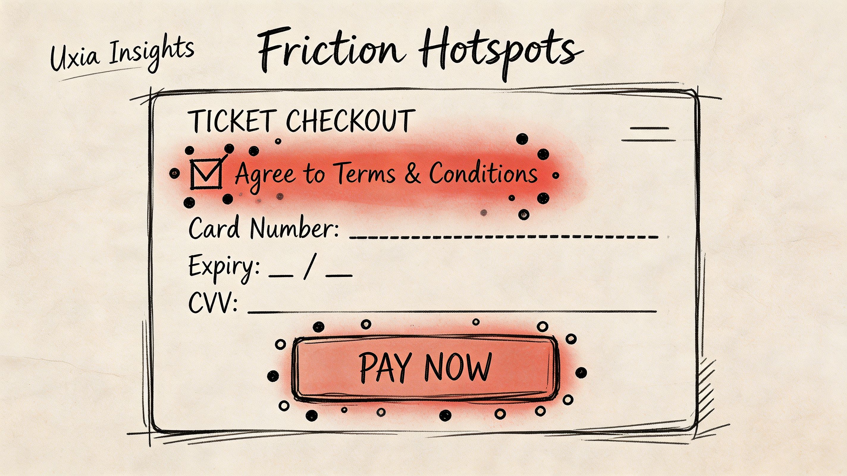
One complex example involved a public transport ticket-purchase flow. On paper, it looked manageable: discover route, select ticket, review order, complete payment, confirm purchase. In practice, it combined discovery, selection, checkout, and payment confirmation in one journey, with several points where the user had to infer what the system wanted next.
What the signals showed at each stage
Different signals matter at different moments in the flow.
At the entry stage: Heatmaps tell you whether the primary CTA is obvious or whether users are spreading attention across competing elements.
At decision points: Misclicks, repeated attempts, and transcript reasoning expose uncertainty and trial-and-error behavior.
Mid-journey: Clickpath behavior shows where users branch away from the ideal route.
Near completion: Success and drop-off signals show where motivation declines or the final hurdle becomes too hard.
According to UXCam’s explanation of user flow analysis, user flow analysis helps teams identify deviations from the Happy Path by mapping decision points and using session-level data such as heatmaps and click tracking to quantify the impact of each path and isolate friction precisely.
The actual UX gap
In that ticket flow, the biggest issue appeared near the end. Users reached checkout and saw required consent checkboxes, but the interface didn’t clearly explain that the payment CTA would remain inactive until those boxes were selected.
The report made the problem obvious. Qualitative feedback showed hesitation. Visual data showed scattered clicks around both the checkbox area and the payment button. Users weren’t calmly progressing. They were trying to brute-force the next step.
The useful insight wasn’t just that people failed. It was that they believed they were ready to proceed, and the interface gave them poor feedback about why they couldn’t.
That distinction matters. If users don’t understand a dependency, the issue is often system status and instruction clarity, not motivation.
The fix was small but high leverage
The change itself was modest. The dependency between the required consents and the payment button was made more explicit in the UI. That reduced ambiguity about what had to be selected before proceeding.
Teams often overreact. They assume a broken flow needs a redesign. Often it needs a targeted adjustment to copy, state visibility, control labeling, or the order of information.
A practical review habit helps here:
Check heatmaps first to see whether attention clusters around the intended action.
Read transcripts second to understand the user's reasoning in plain language.
Inspect path divergence third to see where users leave the ideal sequence.
Change one thing that addresses the cause, not the symptom.
If you want to combine path analysis with broader emotional interpretation, it can also help to review adjacent tools for analyzing customer emotion because frustration, trust, and uncertainty often show up in wording before they show up in completion outcomes. For teams doing this repeatedly, Uxia’s article on turning test results into UX insights is useful for structuring analysis after each run.
Building Better Products with Smarter User Flows
A product team ships a polished prototype, stakeholders approve it, and the live numbers still disappoint. In practice, that usually means the team documented a path without proving that real users could follow it under realistic conditions.
The better approach is to treat a user flow as a working hypothesis about how someone gets from intent to value. Hypotheses can be tested, challenged, and improved. That shift changes the role of the flow from a design artifact into a decision tool for product, UX, and growth teams.
At Uxia, I’ve seen the strongest teams use flows to make trade-offs explicit. They decide where to ask for information, which dependencies need explanation, and which steps can wait until after the user experiences value. Those choices affect completion, trust, and retention. A flow that looks clean in a workshop can still underperform if it asks for too much too early or hides a key condition behind weak feedback.
This is why mature flow work is iterative. Teams map the path, test the path, review where behavior diverges, and adjust the experience before code hardens the mistake. That cycle is cheaper than redesigning a released feature and faster than arguing over opinions in planning.
One practical tip: keep a version history for your user flows just as you would for interface designs or product requirements. When a conversion rate drops or a support issue appears, teams can trace which change introduced more friction. That makes optimization more precise because the discussion shifts from "users are confused" to "users started hesitating after we moved account creation ahead of pricing clarity."
The teams that improve fastest are not the ones producing the prettiest diagrams. They are the ones that can turn a flow into a test, learn from failure quickly, and revise the path while the cost of change is still low.
If you want to validate flows faster and move from assumptions to evidence, Uxia gives product teams a practical way to test prototypes with synthetic users, review visual reports and transcripts, and spot where users hesitate before those issues reach production.