
User Experience vs User Interface: A Practical Guide (2026)
Confused about User Experience vs User Interface? This definitive guide clarifies the roles, metrics, and workflows, and shows how to test both for success.
A product review goes sideways fast when one person says, “The UX needs work,” and another replies, “No, it just needs cleaner UI.” Both might be right. They’re usually talking about different failures.
That confusion slows decisions, muddles ownership, and leads teams to polish screens while leaving broken journeys in place. In practice, user experience vs user interface isn’t a branding debate or a job-title debate. It’s a workflow problem. If your team can’t separate interface quality from experience quality, you’ll test the wrong things, prioritise the wrong fixes, and argue over symptoms instead of causes.
The UX vs UI Debate in Your Team Meeting
A common meeting pattern looks like this. The PM says onboarding is underperforming. A designer points to inconsistent buttons and cramped spacing. Engineering says the flow already works. Marketing wants the landing page to feel more premium.
Everyone is using the same terms differently.
That matters because users react to UI first and judge UX over time. In the ES region, a 2023 survey found that 94% of first impressions of a brand’s website relate directly to its UI design elements, while only 55% of ES-based companies conduct thorough user experience testing. The same source notes that intentional UX strategies can raise conversion rates by up to 400% (Adobe blog on UX design stats).
The business implication is simple. UI shapes the first reaction. UX determines whether that reaction survives contact with the actual product.
Area | UI | UX |
|---|---|---|
What users notice first | Visual design, controls, layout | Flow, clarity, effort, trust |
Main question | “Can I see and use this?” | “Can I achieve what I came for?” |
Typical failure | Looks messy or feels inconsistent | Feels confusing, slow, or frustrating |
Team risk | Cosmetic polish without utility | Smart strategy hidden behind weak presentation |
Best evaluation style | Interface review and interaction checks | Task-based testing and longitudinal measurement |
Where teams usually get stuck
The main friction isn’t lack of talent. It’s mixed diagnosis.
A sign-up form can fail because the labels are unclear. That’s often a UI problem. The same form can fail because you’re asking for the wrong information at the wrong point in the journey. That’s a UX problem. If your team labels both as “bad UX”, nobody knows what to change first.
Practical rule: If the problem is on the screen, inspect UI. If the problem spans steps, expectations, or decision-making, inspect UX.
A better way to frame the debate
Use two separate questions in every review:
Interface question: Are the visual and interactive elements clear, consistent, and easy to operate?
Experience question: Does the flow help the user reach their goal with low friction?
Once you split those questions, discussions get shorter. Responsibilities get clearer. Testing becomes sharper.
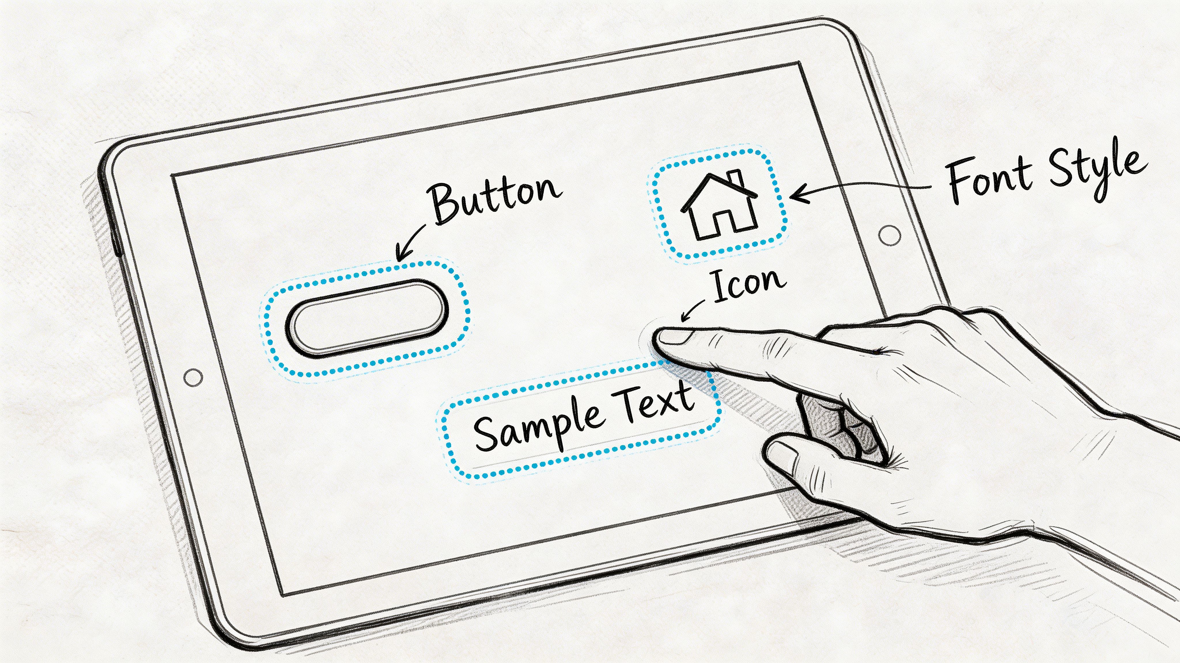
Defining User Interface Design The Look and Feel
User interface design is the layer people directly touch, tap, scan, read, and react to. It includes colour, typography, spacing, iconography, form controls, states, feedback, and the behaviour of interactive elements.
It’s easy to dismiss UI as “just visuals”. That’s a mistake. UI governs whether users can perceive options, understand hierarchy, and act with confidence.
What UI design covers
A solid UI practice usually includes:
Visual hierarchy. What stands out first, what recedes, and how the page guides attention.
Interaction design. Hover states, pressed states, transitions, and micro-feedback.
Information architecture at the screen level. Labels, grouping, menu patterns, and page layout.
Consistency rules. Buttons that look and behave the same, predictable form patterns, repeatable components.
Technical presentation quality. Rendering properly across browsers and devices.
UI isn’t only about appearance. It’s also about execution quality. According to the University of Phoenix article on UI vs UX differences, UI components must meet sub-3-second interaction loading times to help prevent user abandonment, and feedback mechanisms such as form validation response times directly affect error recovery success (University of Phoenix on UI vs UX differences).
What good UI does in practice
Good UI reduces hesitation. It helps users answer basic questions without effort:
Where do I start?
What can I click?
What happened after I clicked?
How do I fix an error?
What matters most on this screen?
If those answers aren’t obvious, the interface is doing too little work.
What bad UI looks like
Bad UI often shows up as small issues that compound:
Weak hierarchy makes every element compete for attention.
Inconsistent controls force users to relearn patterns on each screen.
Poor feedback leaves users guessing whether an action worked.
Crowded tappable elements increase accidental input, especially on mobile.
Visual polish without clarity makes the product look expensive but feel awkward.
A beautiful screen that hides the next step is still a bad interface.
How to review UI without turning it into opinion theatre
Use observable criteria instead of taste:
UI review question | What to look for |
|---|---|
Is the primary action obvious? | Clear contrast, placement, and wording |
Are controls recognisable? | Buttons look clickable, fields look editable |
Is feedback immediate? | Validation, loading, success, and error states |
Is the layout scannable? | Strong spacing, grouping, and readable text |
Is behaviour consistent? | Reused patterns across flows and breakpoints |
When teams review UI this way, comments get better. “I don’t like it” becomes “the hierarchy doesn’t show the primary action” or “the error state appears too late”.
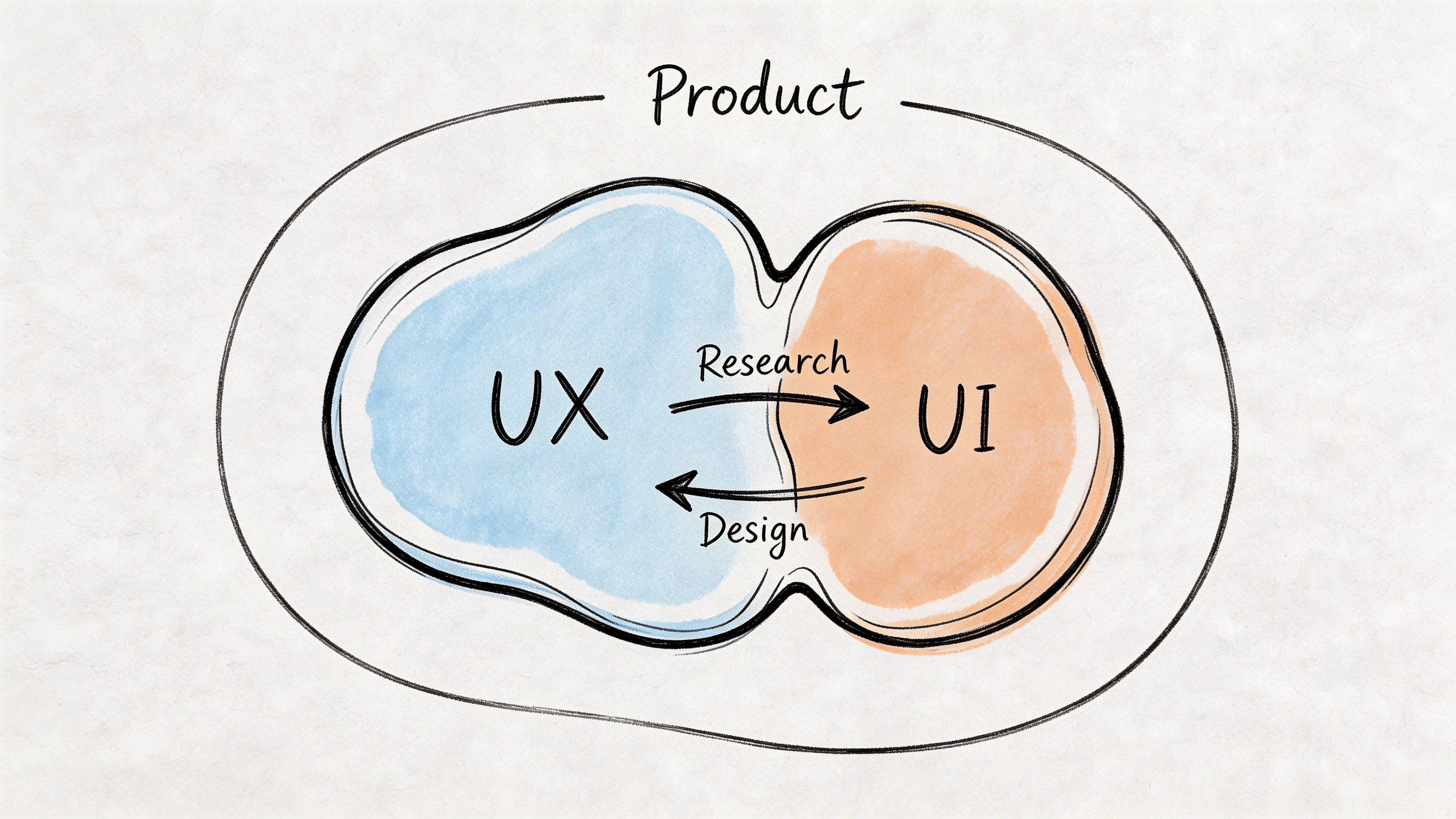
Defining User Experience Design The Overall Journey
User experience design is the broader system around the interface. It covers how people move through a product, what they expect at each step, where they get blocked, and whether the outcome feels worthwhile.
UI is the surface. UX is the path.
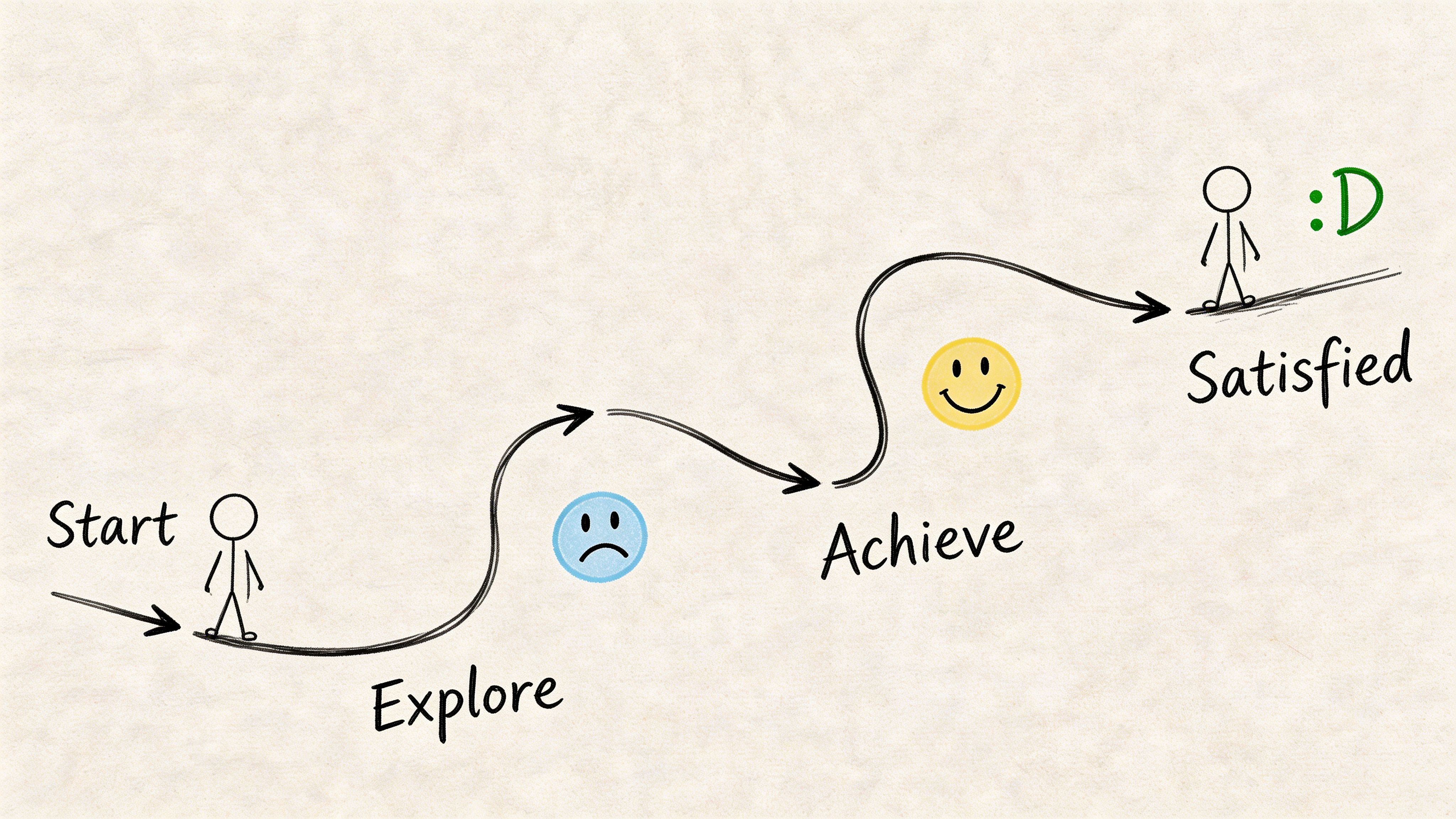
UX starts before screens
A UX problem often appears on a screen but starts earlier. If users don’t understand the offer, don’t trust the process, or can’t predict the next step, the design issue is broader than layout.
That’s why UX work usually includes:
User research to understand goals, context, and blockers
Journey mapping to see the full path across touchpoints
User flows to define sequence and decision points
Wireframes to test structure before visual polish
Usability testing to observe whether people can complete tasks
If your team needs a practical reference for improving the full journey, this guide to User Experience Optimization is useful because it frames optimisation as an ongoing product discipline rather than a one-off redesign.
UX is about reducing unnecessary effort
The quickest way to explain UX to a team is this: UX design removes friction between user intent and user outcome.
That friction can come from many places:
Too many steps
Poor sequencing
Missing reassurance
Confusing copy
Unclear information structure
Dead ends in the flow
A team can have polished screens and still deliver poor UX if the journey asks users to think too much, remember too much, or recover from too many mistakes.
The artefacts that make UX visible
UX work is often less visible than UI work because it shows up in planning documents before it shows up in pixels. One of the most useful artefacts is the user flow diagram. It gives teams a shared view of paths, branches, and failure points. This walkthrough on https://www.uxia.app/blog/user-flow-diagram is a good reminder that many “design issues” are really flow issues.
UX answers the question behind behaviour: why did the user hesitate, backtrack, or drop out?
How to recognise a UX issue
A likely UX problem sounds like this:
“Users don’t know which option fits them.”
“People reach checkout but abandon when we ask for one more step.”
“New users can finish the setup, but they don’t understand what to do next.”
“Support gets the same confusion point every week.”
None of those are fixed by changing colours alone. They require changes to structure, sequence, copy, and expectation-setting.
Key Differences UX and UI Compared Side-by-Side
A familiar product review goes like this. One person says the product needs a better UX. Another says the underlying issue is the UI. They are often looking at the same failure from different distances.
Use this visual as the simple version.
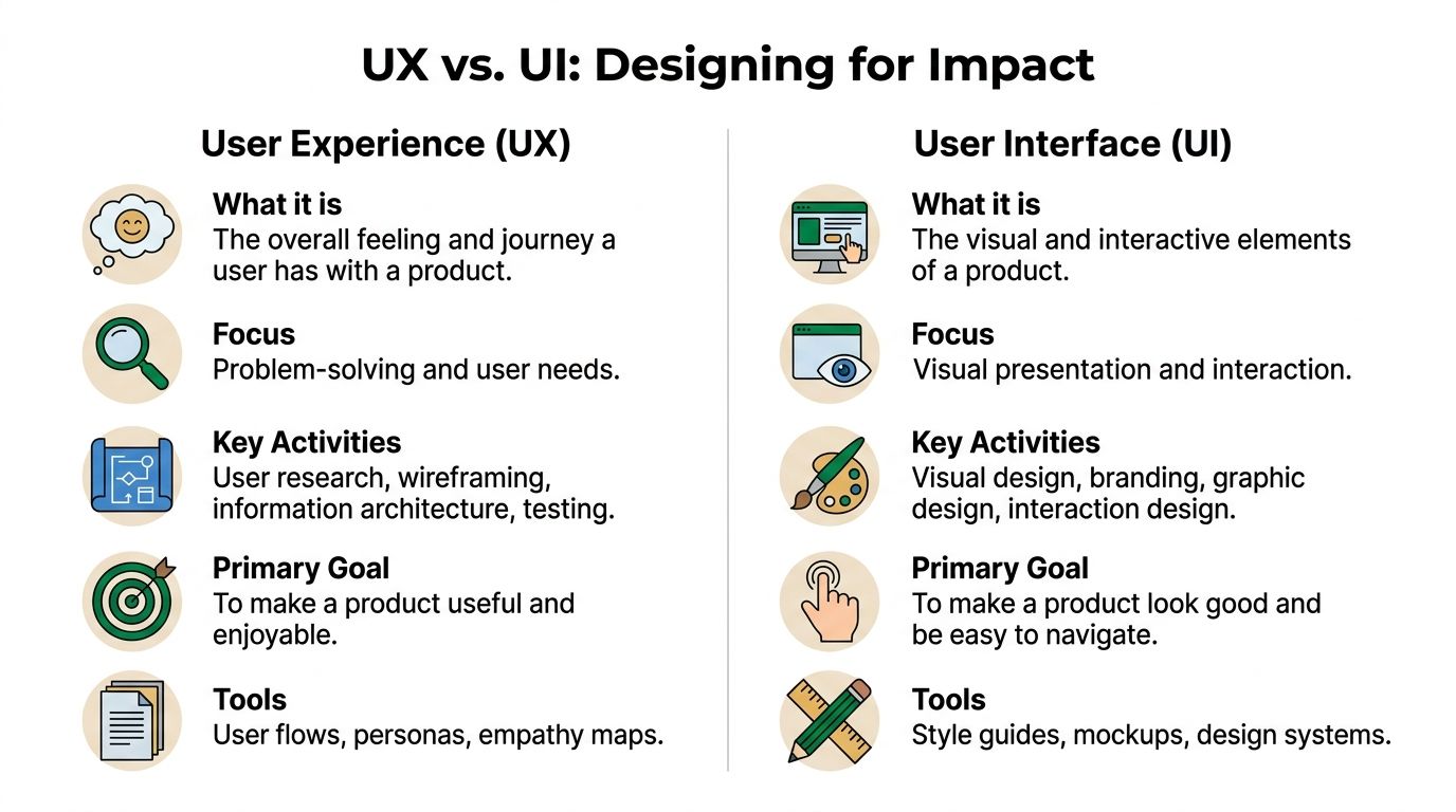
The side-by-side view
Dimension | UX | UI |
|---|---|---|
Core concern | End-to-end journey | Screen-level interaction |
Main goal | Help users complete meaningful tasks with low friction | Present actions and information clearly and attractively |
Typical questions | Is this useful, understandable, and efficient? | Is this readable, consistent, and easy to interact with? |
Common deliverables | User journeys, flows, wireframes, research findings | Mock-ups, component states, style guides, design systems |
Typical review method | Task observation, journey analysis, usability testing | Interface critique, state review, accessibility and consistency checks |
Main failure mode | Broken flow even with polished screens | Attractive interface that does not support action clearly |
The distinction matters during prioritisation, not just definition.
If users do not know where to click, the UI needs work. If they can click through every screen and still fail the task, the UX needs work. Teams that separate those cases make faster decisions because the fix becomes clearer to design, product, and engineering.
Different metrics for different layers
UX and UI should not share one vague success metric like “make it more intuitive.” That language creates review loops with no clear owner.
A better split is operational:
UX metrics track whether people complete the job. Teams usually watch task success, time to completion, error recovery, completion across key flows, and downstream behaviour such as repeat use.
UI indicators track whether the interface helps or slows the next action. Teams usually review misclicks, hesitation before interaction, interaction with key controls, accessibility defects, and confusion tied to a specific component or state.
This is also where modern teams tighten the workflow. Product managers define the outcome, UX maps the task, UI defines the interaction, and testing verifies both separately. Tools like Uxia help teams keep that loop active after launch by checking live behaviour continuously instead of relying on one round of pre-release feedback.
The tools differ because the questions differ
UX and UI teams often work in the same files but answer different questions.
UX work uses research notes, journey maps, flow diagrams, prototype scripts, analytics, and benchmark tracking.
UI work uses component libraries, design tokens, responsive specs, interaction states, and accessibility checks.
That difference matters in reviews. A wireframe can prove the path makes sense. It cannot prove the final hierarchy, tap targets, focus states, or readability hold up under real use. A polished mock-up can prove visual consistency. It cannot prove the journey is worth completing.
A short explainer can help align non-design stakeholders before reviews:
A useful rule for prioritisation
Release pressure exposes the difference quickly. Teams have one sprint left and need to decide whether to rework a flow or clean up the interface.
Use this rule:
Fix task failure first. If users cannot complete the job, treat it as a UX problem until proven otherwise.
Fix interaction confusion next. If users can finish but hesitate, misclick, or miss the intended action, focus on UI.
Refine polish after that. Visual quality matters, but polish should follow clarity and completion.
That order keeps teams from spending a sprint on cleaner screens while the underlying journey still leaks conversions or creates support load.
How UX and UI Collaborate in Product Development
The best teams don’t treat UX and UI as separate lanes that occasionally meet. They treat them as a loop.
UX identifies the problem space, maps the journey, and proposes structure. UI turns that structure into a usable interface with clear visual behaviour. Then testing pushes both disciplines back into revision.
A practical workflow that works
A typical high-functioning product workflow looks like this:
Discovery begins with UX Research, support patterns, behavioural data, and stakeholder goals shape the problem.
Flows and wireframes create shared structure Teams align on what the product should do before debating what it should look like.
UI design makes decisions concrete Visual hierarchy, controls, states, and responsive behaviour bring the flow to life.
Prototype review catches obvious gaps PM, design, and engineering identify feasibility issues, confusing states, and edge cases.
Testing validates both layers Users try the flow. The team watches where the journey breaks and where the interface misleads.
Iteration continues after launch Design quality is monitored as an ongoing product practice, not a final approval stage.
Where collaboration usually breaks
The handoff from wireframe to high-fidelity design is where many teams lose context.
UX might have clear rationale for why a step exists, but UI review drifts into aesthetic preference. Or UI might improve clarity on the screen, while nobody checks whether the added element creates friction elsewhere in the flow.
That’s why shared artefacts matter. Annotated flows, rationale notes, and prototype missions reduce rework. So does role clarity. A useful reference for teams redefining responsibilities is https://www.uxia.app/blog/decoding-the-modern-ux-ui-designer-role-in-2026.
Working rule: Don’t hand off wireframes as if the thinking is done. Hand off decisions, risks, and open questions.
Modern teams are shrinking feedback loops
AI-assisted testing is changing the pace of collaboration. A 2026 Product Hunt ES analysis reported a significant adoption of AI UX tools in Barcelona agencies over the last 12 months, with those tools often cutting testing costs and shortening sprint feedback loops between UX and UI designers (IXDF article reference).
Even without getting lost in tooling hype, the operational lesson is useful. The faster teams can validate both flow and interface, the less likely they are to argue from opinion.
What effective collaboration looks like in reviews
Good reviews sound different from bad ones.
Bad review:
“This doesn’t feel very UX.”
“Can we make it pop more?”
“Users will figure it out.”
Good review:
“Users don’t know the difference between these two paths.”
“The primary action loses emphasis below the fold.”
“The confirmation step doesn’t reassure users about what happens next.”
That shift in language is what mature teams build. It keeps UX strategic and UI concrete.
Testing and Validating Both UI and UX Effectively
A team ships a cleaner interface, conversion stays flat, and the review meeting goes sideways. UI points to the new visual hierarchy. UX points to the extra decision step added earlier in the flow. Engineering asks what should change first.
That situation is common because teams validate the wrong layer, or they validate one layer in isolation. A usability session can miss weak interface signals. An A/B test on button styling can produce a local win inside a broken journey.
Test the journey and the interface as separate design questions, then review the results together.
What to test for UX and what to test for UI
UX validation asks whether users can complete a meaningful task, understand what happens next, and recover when they go off path. The signals are usually hesitation at decision points, backtracking, abandoned tasks, and workarounds that suggest the flow does not match user intent.
UI validation asks whether the interface supports that task clearly on the screen. Look for missed taps, unclear labels, low-visibility actions, weak feedback, inaccessible states, and visual hierarchy problems that slow decisions.
Good teams map methods to the question instead of using one test format for everything:
Task-based usability testing checks whether the flow makes sense from start to finish.
Prototype testing catches structural issues before code is written.
UI-focused experiments compare labels, hierarchy, states, and interaction patterns.
Analytics and session review show where real users hesitate or drop.
Accessibility checks identify barriers that standard sessions often miss.
Each method answers a different question. Mixing them in the same sprint prevents the usual argument where one discipline claims success while the product still underperforms.
Benchmarking keeps teams honest
Single test rounds are useful, but they rarely settle whether the product is improving over time. Teams need a baseline, a repeatable set of tasks, and a small group of metrics they can track across releases.
As noted earlier, benchmarking works best when the team re-runs the same core tasks and compares performance over time. In practice, that usually means tracking:
Task success
Time on task
Error rate
Confidence or ease ratings
Drop-off at key steps
That structure changes the conversation. Instead of debating whether a redesign "feels better," the team can see whether users complete checkout faster, abandon onboarding less often, or need fewer corrections.
For analytics-side visibility, this guide to Google Analytics UX metrics is useful because it connects behavioural signals to user experience questions without treating analytics as the whole story.
Continuous validation beats one big test
High-performing product teams do not wait until design freeze or post-release analytics to learn what broke. They validate early concepts, test realistic prototypes, and keep measuring after launch. That rhythm matters more now because modern teams work across design systems, rapid iteration cycles, and AI-assisted workflows.
In practice, AI tools help teams run more checks without adding more meetings. A platform like Uxia can support continuous validation by testing image and video prototypes before engineering commits build time, which helps teams compare interaction cues, copy clarity, and screen-level hierarchy earlier in the sprint. Teams building that habit can use this guide to user interface design testing methods for regular sprint work.
The workflow is straightforward:
Before build: test task flow, comprehension, and content clarity on prototypes
Before release: test UI states, accessibility, and edge cases in near-final screens
After release: review behavioural data, session patterns, and task completion against the baseline
This is how strong teams reduce opinion-driven reviews. They know what was tested, which layer was tested, which method was used, and what changed from the last benchmark.
Actionable Checklists for UX and UI Practitioners
Many teams don’t need another debate about definitions. They need a review checklist they can use before the next handoff.
UI checklist for interface quality
Primary actions are visible. The most important button or control stands out without relying on guesswork.
States are complete. Hover, focus, error, loading, success, empty, and disabled states have all been designed.
Labels are clear. Buttons and fields use direct wording, not internal jargon.
Hierarchy is stable. Text size, spacing, and contrast make scanning easy.
Components are consistent. The same pattern behaves the same way across screens.
Feedback is immediate. Users can tell what happened after each action.
Responsive behaviour is considered. Mobile and desktop interaction patterns both make sense.
Accessibility isn’t bolted on. Contrast, focus visibility, and touch targets have been reviewed.
UX checklist for journey quality
The user goal is explicit. The flow supports a clear task, not a vague business intention.
The sequence makes sense. Each step prepares the next one and avoids unnecessary detours.
Decision points are supported. Users get enough context to choose confidently.
Friction is deliberate. If the flow slows users down, there’s a reason, such as trust or compliance.
Recovery paths exist. Errors, exits, and backtracking don’t trap the user.
Copy supports the journey. Instructions, reassurance, and expectations appear where people need them.
The flow has been observed. Real users, not only internal stakeholders, have attempted the task.
Validation is recurring. The team has a habit of retesting after meaningful changes.
A final operating rule helps both disciplines. Review UI before release. Review UX before and after release. Then revisit both as the product evolves.
If your team wants a faster way to validate both the interface layer and the full user journey, Uxia is built for that workflow. You can upload images or video prototypes, define a mission and audience, and get synthetic user testing with transcripts, heatmaps, issue detection, and prioritised insights in minutes. It’s a practical way to shorten review cycles, reduce guesswork, and keep UX and UI decisions grounded in evidence instead of opinion.