8 Template User Story Formats for 2026
Discover 8 expert-approved template user story formats. Learn how to write testable stories and validate them instantly with AI testers on our platform, Uxia.
Are your user stories testable?
A lot of teams think a good template user story is one that sounds Agile in a backlog. It mentions a user, a goal, and maybe a reason. Then sprint planning starts, designs move forward, and nobody checks whether the story can drive an actual validation step. That's the gap. A story that can't become a concrete test mission is too vague, too feature-led, or too detached from user intent.
The standard format has stayed popular for a reason. Mike Cohn helped popularise “As a [type of user], I want [some goal] so that [some reason]” in User Stories Applied, and Atlassian reported that 85% of its surveyed Agile teams (n=1,200) were using that exact template by 2010, with a 40% reduction in miscommunication in sprint planning cycles, according to internal Jira usage analytics shared in their 2011 Agile report and referenced by Mountain Goat Software on agile user stories.
But popularity isn't the same as usefulness. The useful version of a user story is one you can turn into a mission, assign to the right audience, and validate quickly. That's where Uxia changes the workflow. Instead of treating stories as backlog decoration, you can translate them into executable AI-powered UX tests with synthetic users, transcripts, friction flags, heatmaps, and prioritised insights.
Below are eight practical formats that work in real product teams, plus the fastest way to turn each one into a Uxia mission. Stop writing stories that only developers can interpret. Start writing stories that your whole team can test.
1. Classic Connextra Format
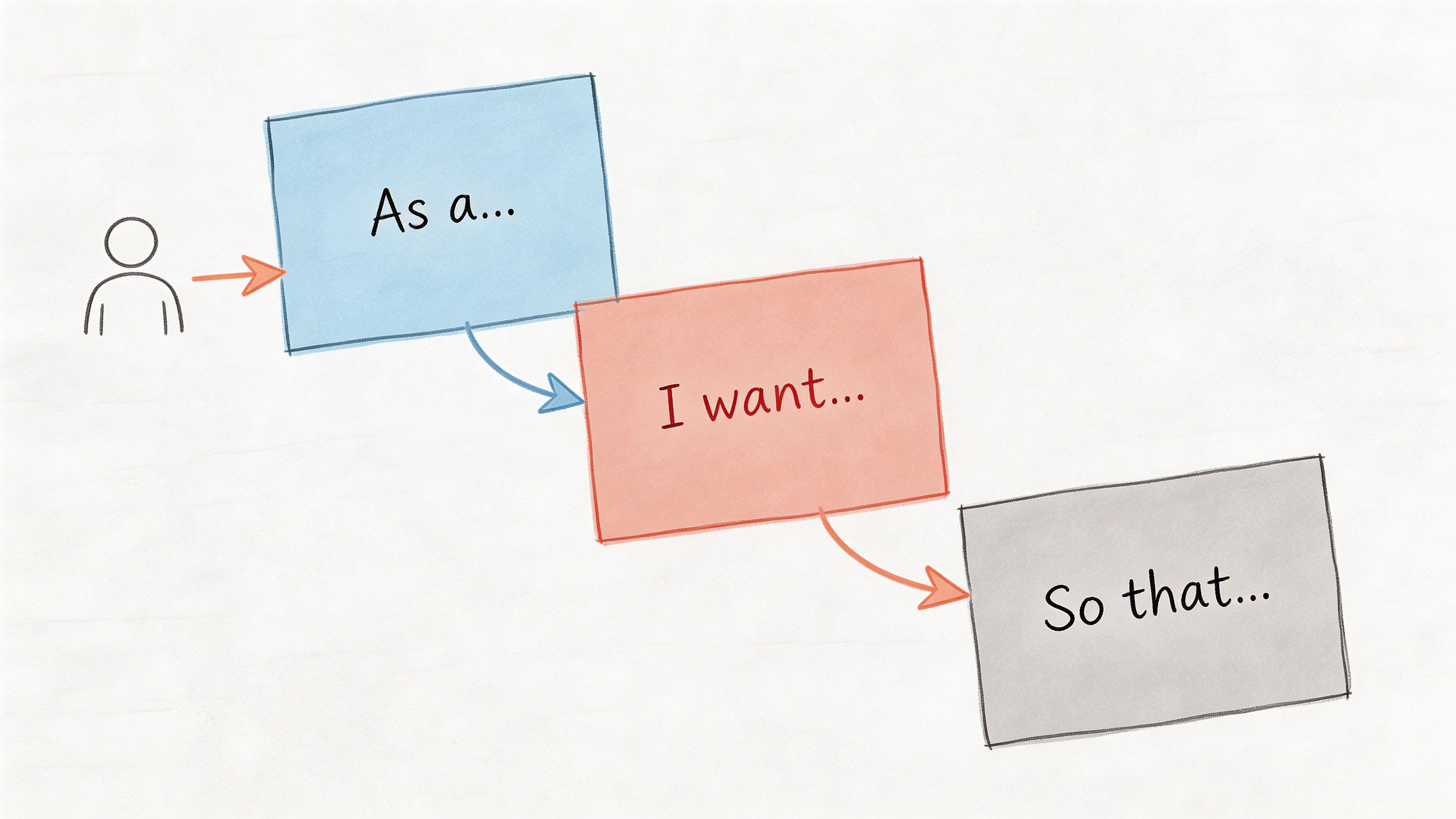
The classic template user story still earns its place because it forces three basics into one line: who, what, and why.
A simple example: As a product manager validating a new checkout flow, I want to test whether users understand the payment steps, so that I can reduce abandonment in the purchase journey.
That works because it names a role, a user goal, and the value behind the work. It doesn't yet tell you how to test it, though. That's the part many teams skip.
How to make it testable in Uxia
In Uxia, the cleanest move is to copy the story into the mission setup, then tighten the vague verbs. “Understand” becomes “complete payment without hesitation at the shipping step.” “Reduce abandonment” becomes “identify where trust or copy breaks down.”
That gives you a mission like this:
Audience: New online shoppers, mobile-first
Mission: Complete the checkout and explain what each payment step means
Output to review: Friction flags on trust, copy clarity, and navigation
If your story says “As a user”, it's too broad. Uxia works best when the audience matches a real segment. A first-time shopper and a returning buyer don't read the same interface the same way.
Practical rule: If the role in your story can't be mapped to a Uxia audience profile, the story isn't ready.
A second example: As a designer iterating on mobile navigation, I want synthetic testers to complete key tasks, so that I can identify friction points before launch.
That's a good backlog line. It's a better Uxia mission when you split “key tasks” into separate runs. One run for search. One for category browsing. One for account access. Comparative testing gives sharper signals than one overloaded mission.
If you're deciding when synthetic testing is the better fit, Uxia's guide on synthetic users vs human users is useful for choosing the right validation mode.
What works:
Specific roles: “First-time buyer” beats “user”
Concrete actions: “Find and apply a promo code” beats “use checkout”
Real reasons: “So that I can compare options quickly” is stronger than “for a better experience”
What doesn't:
Feature restatements: “As a user, I want a dashboard”
Missing value: no reason means weak prioritisation
Mixed intents: one story trying to cover three separate jobs
2. Job Stories
Job stories are better when behaviour depends more on context than on persona labels.
Instead of saying who the user is, they start with the situation: When I'm launching a new SaaS onboarding flow, I want to see if users can accomplish their initial goal without help, so I can assess whether the experience supports self-serve adoption.
That framing changes the kind of test you run. You're not only testing interface mechanics. You're testing intent under pressure, interruption, urgency, or uncertainty.
Where job stories outperform classic stories
A classic story can hide the trigger. Job stories surface it.
Take a dashboard redesign. “As a finance user, I want a better dashboard” is too blunt. This is stronger: When I'm checking financial performance before a meeting, I want to find the most important metrics immediately, so I can make a decision with confidence.
Now the Uxia mission is obvious. Ask synthetic users to open the dashboard, state what they look for first, and explain why. Then review transcripts and heatmaps in the context of urgency, not just click success.
The best job stories describe the moment that creates demand. That's where usability problems show up first.
Job stories also help when the same screen serves different motivations. Someone entering a settings page to fix a problem behaves differently from someone browsing options casually. In Uxia, that means running the same interface with different mission prompts, then comparing hesitation, path choice, and think-aloud reasoning.
The Uxia setup that works
Use three fields when translating a job story into a mission:
Situation: What triggered the session
Desired progress: What the user is trying to get done
Constraint: What's making the task harder
Example: When I'm signing up during a busy workday, I want to finish onboarding without reading long explanations, so I can start using the product straight away.
Good Uxia mission: Complete sign-up and get to the first meaningful action as quickly as possible. Say what slows you down or feels unnecessary.
What works:
Context-rich prompts: “during a busy workday” changes behaviour
Motivation-led analysis: review friction in relation to urgency
Scenario comparison: test the same flow under different circumstances
What doesn't:
Persona overload: demographics without situation rarely explain behaviour
Task-only missions: they miss why people abandon or hesitate
Abstract goals: “be productive” is hard to observe
3. User Story Mapping Format
A single template user story rarely captures a full journey. Story mapping fixes that.
You start with an epic, break it into stories, then break those into tasks. That hierarchy is useful because products fail less from one broken button and more from weak flow logic across steps.
Example: Epic: Complete a financial transaction Story: Add payment method Task: Validate card details and confirm payment
Or: Epic: Onboard enterprise users Story: Set team permissions Story: Invite colleagues Task: Check whether permission logic makes sense to a new admin
How to test a map instead of isolated screens
The mistake I see most often is testing tasks one by one and assuming the journey is fine. It isn't. A task can pass on its own and still fail in sequence.
In Uxia, test at story level first. That keeps the mission close to real intent. Then drill down into tasks if a story shows friction.
For example, don't start by testing “click the invite button.” Start with “set up your team and invite colleagues with the right access.” If synthetic users struggle, you'll see whether the problem is terminology, hierarchy, permissions, or screen order.
The team then has evidence that connects design issues to journey breakdown, not just component errors.
A strong companion for this work is a user flow diagram, because it exposes where your mapped stories diverge from actual navigation paths. If you need a dedicated planning resource, this User Story Mapping Tool can help structure the hierarchy before you validate it.
What good mapping changes
In Spain, a 2020 study by the Universidad Politécnica de Madrid surveyed 620 Agile teams and found that 78% used the classic user story template, with template teams showing 52% fewer defects in released features than non-template teams, linked to more precise acceptance criteria and stronger testability, as referenced in Maze's guide to user stories. The practical takeaway isn't “use more stories”. It's “write stories that can be validated at the right level of detail.”
Product School's ES branch analysis reported significant adoption among freelancers and agencies in Spain, linking that adoption to faster design iterations, according to previously referenced data. That's best treated as directional evidence for structured practice, not a guarantee from the template alone.
What works in Uxia:
Journey-based missions: one mission per major story
Separate runs by flow: onboarding, purchase, account recovery
Map-linked analysis: review friction by epic and story, not only by screen
What doesn't:
Testing tasks in isolation only
Huge epics with no validation checkpoints
Maps that never become executable missions
4. BDD Scenario Format
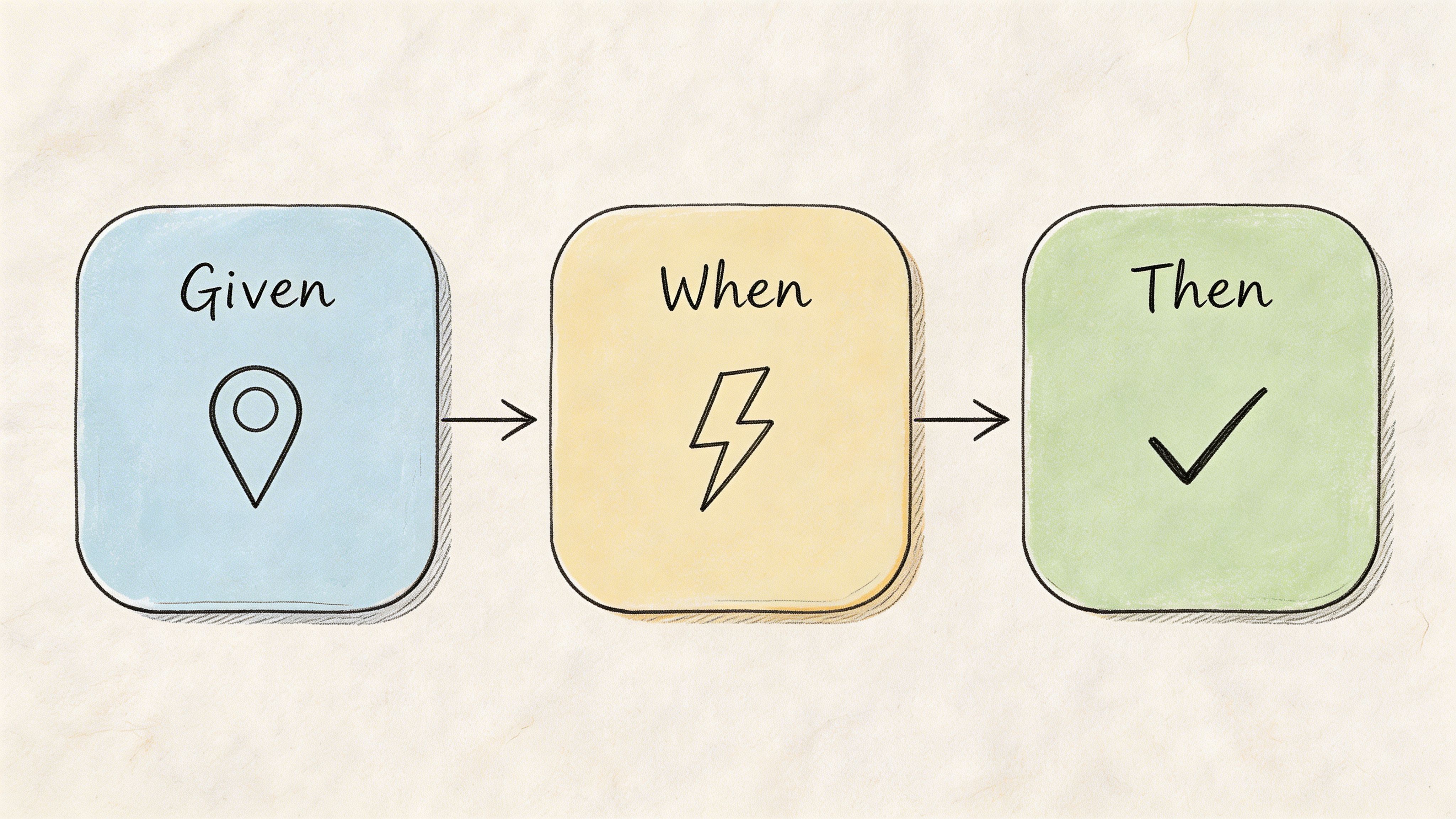
BDD is the most operational format on this list. It forces expected behaviour into a structure your team can observe.
Example: Given a user is on the checkout page, When they enter an invalid email, Then they see a clear error message explaining the required format.
This is excellent for acceptance criteria. It's also one of the easiest formats to convert into a Uxia mission because the observable outcome is already named.
Why BDD works well with synthetic testing
Most user stories break down at the “Then”. Teams write desired outcomes that sound sensible but aren't observable in testing. “Then the experience feels intuitive” isn't testable. “Then the user corrects the email without confusion” is.
In Uxia, you can turn the scenario above into a mission that asks synthetic users to complete checkout with imperfect input patterns. Then you inspect whether the transcript shows confusion, whether the correction path is obvious, and whether usability flags appear around the form field or message.
A second example: Given a designer has uploaded a prototype, When synthetic users interact with the navigation menu, Then Uxia captures which labels create hesitation or wrong-path clicks.
That isn't code-level BDD. It's product-level BDD, and it works because every condition can be seen in behaviour.
Write the “Then” so a researcher, designer, and engineer would all agree on what success looks like.
The trade-off
BDD can become too mechanical if every story turns into tiny edge-case scripts. That's useful for quality assurance, but it can narrow discovery too early.
Use BDD when:
You need precise acceptance criteria
Error handling matters
A flow has compliance, trust, or form risk
Use a looser format when:
You're still exploring motivations
You don't yet know the best path
The product concept itself is still uncertain
A practical Uxia pattern is to run one open mission first, then turn the recurring issues into BDD scenarios. Discovery first. Confirmation second.
5. Persona-Based User Stories
Some teams swing too far away from personas because generic persona work has given the method a bad name. The issue isn't persona-based stories. It's shallow personas.
A strong persona-based template user story names a user, gives them a goal, and adds the context that shapes behaviour.
Example: Persona: Sarah, startup CEO Goal: Review team performance metrics quickly Context: On mobile during a short commute
Or: Persona: Marcus, enterprise IT manager Goal: Set up single sign-on for a large team Context: Limited support, high security expectations
When persona stories are worth using
These stories work best when behaviour changes meaningfully across segments. Mobile executives, first-time buyers, procurement reviewers, and admins don't approach the same interface with the same expectations.
In Uxia, this is one of the most practical templates because the audience setup maps directly to the story. You can create synthetic testers aligned to demographic and behavioural profiles, then compare how each segment interacts with the same prototype.
That matters because many usability problems are segment-specific. A founder in a hurry might tolerate sparse help text but react badly to unclear hierarchy. An IT admin may accept complexity but expect explicit control and security language.
How to avoid fake precision
The trap is writing novels about imaginary people. Keep the persona useful by anchoring it to decisions.
Use this filter:
Role: What responsibility shapes their behaviour?
Urgency: Are they browsing, evaluating, fixing, or approving?
Constraint: Device, time pressure, domain knowledge, risk sensitivity
If the persona doesn't change the test mission, remove it.
One practical approach is to run separate Uxia tests for each high-value segment, then compare transcripts and friction patterns. That's more useful than trying to blend everyone into one “average user”. If your team needs a refresher on audience definition, this guide on how to create effective buyer personas is a helpful planning input before building test audiences.
What works:
Clear context constraints
Segment-specific missions
Result comparison across personas
What doesn't:
Decorative backstories
Too many personas in one sprint
Assuming every feature needs persona depth
6. Value-Driven User Stories
This format is for teams that want every story tied to an outcome, not just a feature request.
The structure is simple: Problem Solution Measurable outcome
It forces a sharper conversation than a standard story because it asks what will change if the work succeeds.
The right way to use value-driven stories
A weak version sounds like this: Problem: Users don't like checkout Solution: Improve checkout Outcome: Better UX
That's not useful.
A stronger version says: Problem: Users hesitate when shipping costs appear late in the flow Solution: Show shipping estimate earlier Outcome: More users move confidently to payment, with fewer trust-related objections in testing
Notice the difference. The second one still avoids made-up targets, but it gives the team a concrete signal to look for in Uxia.
You can write another one like this: Problem: Users struggle to find advanced settings Solution: Add search and clearer labels Outcome: Users locate target settings directly, with less backtracking and fewer copy-related complaints
How Uxia makes this format practical
Value-driven stories fail when teams define outcomes after the test. Uxia helps if you set the outcome first, then match the mission and review criteria to it.
That means deciding in advance:
What behaviour indicates success
What friction indicates failure
What evidence will change the roadmap decision
A useful companion mindset is explained in Uxia's piece on data-driven design. The point isn't to create endless dashboards. It's to make each story answerable with observable evidence.
One reason this template matters is that adoption of structured stories is increasingly tied to delivery effectiveness. Product School's ES branch analysis reported significant adoption among freelancers and agencies in Spain, linking that adoption to faster design iterations, according to previously referenced data. That's best treated as directional evidence for structured practice, not a guarantee from the template alone.
A value-driven story should survive one blunt question: “What decision will we make if this test fails?”
What works:
Outcome-first thinking
Mission prompts tied to business risk
Evidence thresholds agreed before testing
What doesn't:
Retroactive success criteria
Outcome language nobody can observe
Stories that describe output, not value
7. Accessibility-Focused User Stories
Accessibility stories improve products when they describe a real need, the assistive context, and what successful completion looks like.
Example: As a screen reader user with visual impairment, I need form labels to be correctly associated with inputs, so that I can complete the form independently.
Another: As a keyboard-only user with motor impairment, I need every interactive element to be reachable with visible focus states, so that I can interact with the product without a mouse.
Why this format matters in practice
A lot of teams treat accessibility as a compliance review after design. That's late. Accessibility-focused stories bring it into the same planning and validation workflow as every other requirement.
In Uxia, that means creating dedicated missions around navigation clarity, form completion, copy comprehension, and interaction patterns that often expose accessibility problems early. Synthetic testing doesn't replace specialist accessibility review, but it does help teams identify likely friction before implementation hardens.
This format also improves mainstream UX. Clear labels, predictable focus, descriptive feedback, and better hierarchy help everyone, not only people using assistive technologies.
What to validate on Uxia
Use missions that ask synthetic users to complete a task under constrained interaction expectations. Then inspect transcripts and flagged issues for signs of ambiguity, hidden actions, poor feedback, or navigation dead ends.
Good review prompts include:
Task completion clarity: Can the next step be identified quickly?
Interaction predictability: Does the interface behave consistently?
Copy precision: Are errors and labels understandable?
Navigation confidence: Is orientation maintained through the flow?
One practical caution: don't collapse accessibility into one generic story for the whole product. Break it down by flow. Login, checkout, onboarding, and settings each produce different barriers.
This is one of the best uses of a template user story because it keeps inclusive design tied to observable success, not abstract intent.
8. Design System User Stories
Design system work often gets squeezed into technical tickets that are hard for product teams to evaluate. A design system user story fixes that by focusing on the component, its states, and where it will be used.
Example: Component: Button States: Default, hover, active, disabled Use case: Primary action in forms
Or: Component: Modal dialog States: Open, loading, error Use cases: Confirmation, form submission, error handling
Why component stories need their own format
A standard user story can be awkward here because the value isn't always tied to one end-user feature. The point is consistent, understandable behaviour across products and flows.
That still needs validation. A button that looks clear in Figma may become ambiguous in context. A modal may technically function but interrupt users in the wrong moment. Components don't fail only because they're broken. They fail because people don't understand them.
In Uxia, test components in realistic contexts. Don't upload a bare button and ask whether it works. Put it inside a form, a pricing page, or a settings screen. Then ask synthetic users to complete a goal that relies on that component.
The practical pattern that saves time
Run fresh missions for meaningful state changes. Default versus disabled. Idle versus loading. Success versus error.
Then review:
State recognition: Do users understand what's happening?
Action confidence: Do they know what they can do next?
Consistency: Does the component behave as expected across placements?
Failure recovery: Do error and loading states preserve trust?
One useful external benchmark for structured story discipline comes from Atlassian's 2024 Jira ES data, which reported more efficient backlog refinement across many workspaces, according to previously referenced data. For design systems, that kind of structure matters because component decisions are reused across many teams and products.
What works:
Contextual component testing
Separate review of critical states
Design-system releases backed by validation evidence
What doesn't:
Testing components in isolation only
Ignoring edge states
Treating reusable UI as purely technical work
8-Format User Story Template Comparison
Format | Implementation Complexity 🔄 | Resource Requirements ⚡ | Expected Outcomes 📊 | Ideal Use Cases 💡 | Key Advantages ⭐ |
|---|---|---|---|---|---|
Classic Connextra Format (As a User, I want, So that) | Low: simple three-part structure, easy to adopt | Low: minimal time and training required | Clear acceptance criteria and quick alignment across teams | Sprint stories, rapid UX checks, baseline testing | Universally understood; fast to write and communicate |
Job Stories (When, I want to, So I can) | Medium: requires contextual framing and research | Medium-High: needs user research and scenario capture | Deeper insight into motivations; uncovers subtle usability issues | Prioritizing features; uncovering edge cases and motivations | Context-driven; reduces persona bias and reveals “why” |
User Story Mapping (Epic > Story > Task) | High: hierarchical mapping and planning effort | High: cross-functional workshops and ongoing maintenance | Detailed journey views; identifies dependencies and gaps | Complex multi-step workflows; end-to-end testing strategies | Aligns teams; exposes testing gaps and sequencing |
BDD Scenario Format (Given, When, Then) | Medium: formal syntax, discipline to write well | Medium: technical writing and automation integration | Executable specs with clear pass/fail testability | Regression testing; automated acceptance criteria validation | Automation-friendly; bridges developers and non-devs |
Persona-Based User Stories (Persona, Goal, Context) | Medium: needs thorough persona research and upkeep | Medium: persona development and data validation | Rich, targeted scenarios reflecting real user segments | Segment-specific testing; demographic and behavioral alignment | Builds empathy; maps directly to demographic profiles |
Value-Driven User Stories (Problem, Solution, Measurable Outcome) | Medium: requires consensus on problems and metrics | Medium: stakeholder alignment and baseline metrics | Measurable outcomes tied to business objectives | ROI-focused features; prioritization based on impact | Clear success criteria; focuses teams on measurable value |
Accessibility-Focused User Stories (User Need, Assistive Tech, Task Success) | High: requires accessibility expertise and detailed specs | High: specialists, assistive-tech modeling, extended testing | Inclusive coverage; reduced compliance and usability risks | Accessibility validation; inclusive design and compliance checks | Ensures accessibility; improves usability for all users |
Design System User Stories (Component, States, Use Cases) | Medium: component state documentation and governance | Medium: design system maintenance and testing cycles | Consistent component behavior; fewer implementation bugs | Building/maintaining design systems; component QA | Ensures consistency; scalable implementation guidance |
From Template to Test in Minutes
Choosing the right template user story matters, but the template itself isn't the advantage. The advantage comes when the story is written in a way that can become an immediate test.
That's the standard I use. If a story can't be turned into a clear mission on Uxia, it isn't ready. Something is missing. That's one of three things: a real audience, an observable outcome, or enough context to interpret behaviour properly.
The eight formats above solve different problems.
The classic Connextra format is still the best default when a team needs clarity fast. Job stories are stronger when motivation depends on situation. Story maps work when the risk sits in the journey, not the screen. BDD scenarios are ideal when you need precise acceptance criteria. Persona-based stories help when segments behave differently. Value-driven stories keep work tied to product decisions. Accessibility-focused stories make inclusive design testable earlier. Design system stories help teams validate reusable UI in context rather than trusting theory.
The common thread is testability.
That means replacing vague verbs with observable actions. It means writing “find the shipping cost and decide whether to continue” instead of “understand pricing”. It means defining what success or friction will look like before the test starts. It means splitting overloaded stories into separate missions when different audiences or tasks are involved.
Uxia becomes more than a research tool, transforming into the execution layer for your backlog. You upload a prototype, image, or flow. You define the mission and audience. Synthetic users then interact with the experience, think aloud, surface friction, and generate reports your team can act on quickly. Instead of waiting for recruiting, scheduling, moderation, and synthesis, you can validate a story while the design is still cheap to change.
That changes how product teams work. Stories stop being placeholders for future debate. They become compact hypotheses that can be checked almost immediately.
If you're writing stories for 2026, that's the standard worth adopting. Not “does this sound Agile?” but “can this be validated today?” Choose the format that fits the problem, write it with evidence in mind, and turn it into a Uxia mission before assumptions harden into product decisions.
If you want to turn every template user story into a fast validation loop, try Uxia. It helps product teams upload prototypes, define missions, and get actionable UX feedback from synthetic users in minutes, with transcripts, heatmaps, friction flags, and prioritised insights that make backlog decisions easier to defend.