Heuristics ux: 7 Principles to Boost Usability
Explore heuristics ux principles to boost usability. Learn quick heuristic evaluations and practical steps for building better products.

Building an intuitive, user-friendly product isn't about guesswork; it's about applying proven principles. Usability heuristics are time-tested guidelines that help design teams identify and solve common usability problems before they frustrate users and damage conversion rates. Think of them as a 'rule of thumb' checklist for creating interfaces that feel effortless and logical.
This article dives straight into the most critical heuristics UX principles, providing a practical framework for evaluating your own designs. We'll explore established frameworks from pioneers like Jakob Nielsen, show you how to conduct effective heuristic evaluations, and reveal how modern platforms like Uxia can amplify your efforts.
By combining traditional heuristic analysis with automated testing, you can turn theoretical principles into actionable, data-backed improvements. You will learn not just what these heuristics are, but how to apply them to build products that are not just functional, but genuinely effective and easy to use. This guide moves beyond subjective opinions to help you create interfaces that work.
1. Visibility of System Status
The first principle in our list of essential heuristics ux is Visibility of System Status. This heuristic, popularised by Jakob Nielsen, dictates that a system should always keep users informed about what is going on through appropriate and timely feedback. Users should never be left guessing whether their action was successful, is processing, or has failed. Clear communication about the system's current state builds trust, reduces anxiety, and gives users a sense of control.
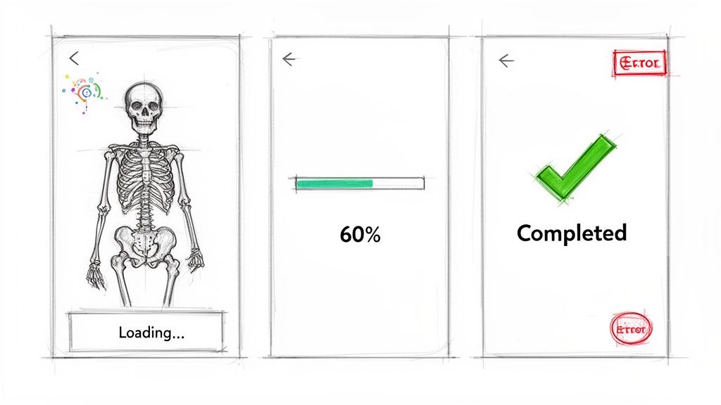
Think of Apple's download progress bars in the App Store or the "Sending..." message in Gmail. These indicators confirm that the system has received the request and is working on it. Without them, a user might repeatedly tap the download button or close the app, assuming it's broken. This principle is fundamental for creating a reliable and predictable user experience.
How to Implement Visibility of System Status
Use Skeleton Screens: Instead of a blank screen or a simple spinner, show a skeleton layout of the page that is loading. This provides a visual cue that content is on its way, managing expectations effectively.
Provide Step Indicators: For multi-step processes like a checkout flow, show users where they are in the sequence (e.g., "Step 2 of 4"). This helps them understand the scope of the task and how much is left to complete.
Leverage Colour and Icons: Use universally understood colour codes to signal status, such as green for success, amber for a warning, and red for an error. Accompany these colours with icons and text for accessibility.
Show Time Estimates: For operations that take more than a few seconds, provide an estimated completion time. This respects the user's time and allows them to decide whether to wait or do something else. Implementing principles such as providing immediate feedback through micro-interactions that drive user satisfaction is key to maintaining user engagement and informing users about system status.
By keeping users informed, you empower them to make confident decisions. A simple "Payment processing..." message can be the difference between a completed transaction and an abandoned cart.
Practical Recommendation: Analysing where users hesitate or abandon tasks is crucial. You can use a tool like Uxia to generate heatmap reports, which visually pinpoint areas where users might be getting stuck waiting for feedback that isn't there. This data helps you identify gaps in system visibility and prioritise improvements.
2. Match Between System and Real World
The second essential principle in our exploration of heuristics ux is the Match Between System and the Real World. This concept, championed by Jakob Nielsen, insists that a system should speak the user's language, using words, phrases, and concepts familiar to them, rather than system-oriented jargon. By following real-world conventions and making information appear in a natural and logical order, you create an experience that feels intuitive rather than one that requires study.
This heuristic is about bridging the gap between a user's mental model and the digital interface. For instance, Slack uses "Channels" instead of "Discussion Groups," Dropbox employs the familiar "folder" metaphor from desktop computing, and Notion organises content into "Blocks." These choices make the platforms immediately understandable because they align with concepts users already know. This alignment reduces cognitive load and speeds up adoption.
How to Implement Match Between System and Real World
Conduct User Interviews: Speak directly with your target audience to understand their vocabulary, workflows, and mental models. Listen for the specific terms they use to describe their tasks and goals.
Use Domain-Specific Language: If you are designing for a specialised field, such as finance or medicine, use the terminology that professionals in that domain use daily. Avoid simplifying to the point where it loses meaning for your expert users.
Test Real-World Metaphors: Before committing to a metaphor like "folders" or "cards," test its resonance with your users. A metaphor that seems obvious to your team may not be as clear to your audience.
Create a Terminology Glossary: Develop a shared glossary for your design and development teams to ensure everyone uses consistent, user-centric language throughout the product and its documentation.
By speaking your user's language, you show that you understand their world. This builds trust and makes your product feel like a natural extension of their existing workflow, not a foreign tool they must learn to operate.
Practical Recommendation: To uncover the precise language your users use, tools like Uxia are invaluable. By analysing think-aloud transcripts from user sessions, you can hear the exact words and phrases people use when interacting with your interface. This direct insight allows you to replace confusing system jargon with familiar terminology, directly improving one of the most foundational heuristics ux.
3. User Control and Freedom
The third principle in our guide to heuristics ux is User Control and Freedom. This heuristic, championed by Jakob Nielsen, asserts that users need clearly marked "emergency exits" to leave an unwanted state without going through an extended dialogue. It is about supporting user autonomy, allowing them to easily undo actions and recover from mistakes. This prevents users from feeling trapped and builds confidence in their ability to explore the system without fear of irreversible consequences.
A prime example is Gmail’s ‘Undo Send’ feature, which gives users a brief window to recall an email. Similarly, the extensive undo/redo functionality in Adobe's Creative Suite or the version history in Figma empowers users by making mistakes easily correctable. These features demonstrate respect for the user, acknowledging that errors happen and providing a safety net that encourages exploration and confident interaction.
How to Implement User Control and Freedom
Offer Undo/Redo: Implement undo and redo functions for as many user actions as possible. This is especially important for creative or data-entry tasks where mistakes are common. Keyboard shortcuts like Ctrl+Z are a must.
Use Soft Deletes: Instead of permanently deleting items immediately, move them to a "trash" or "archive" folder. This gives users a chance to recover items they deleted by accident, a far better experience than a final, irreversible action.
Confirm Destructive Actions: For actions that cannot be undone, such as deleting an account, use a confirmation modal. Clearly state the consequences (e.g., "Are you sure? This action cannot be undone.") and make the cancel option prominent.
Provide Clear Exits: Ensure users can easily cancel a process or go back. A multi-step form should always have a visible 'Back' or 'Cancel' button. Analysing your product's structure with a user flow diagram can help map out these critical paths and ensure no dead ends exist.
Empowering users with control doesn't mean a lack of guidance; it means providing clear paths forward, backward, and out. This freedom is the foundation of a forgiving and user-friendly interface.
Practical Recommendation: Identifying where users feel stuck is key to improving control. Uxia’s navigation friction reports can highlight moments in the user journey where people repeatedly go back and forth or abandon a task. This data points directly to areas where your design may be trapping users, helping you prioritise fixes that restore their sense of freedom.
4. Error Prevention and Recovery
An excellent user experience not only guides users to success but also skilfully steers them away from failure. This brings us to the fourth key principle of heuristics ux: Error Prevention and Recovery. A well-designed system anticipates potential user errors and aims to prevent them from happening. However, since no design is completely foolproof, it must also provide clear, constructive ways for users to recover when mistakes inevitably occur. This dual approach of proactive prevention and graceful recovery is crucial for building user confidence and reducing frustration.
Think of Stripe's real-time credit card validation that prevents invalid submissions or Figma's component constraints that stop designers from accidentally breaking a design system. These features don't wait for the user to fail; they provide guidance and constraints upfront. When errors do slip through, like trying to submit a Google Form with empty required fields, the system should offer helpful, non-technical messages that point to a clear solution.
How to Implement Error Prevention and Recovery
Use Inline Validation: Instead of displaying a list of errors after form submission, validate fields in real time. This gives immediate feedback and allows users to correct mistakes as they happen.
Write Human-Centred Errors: Avoid technical jargon. A message like "Invalid email format" is better than "Regex validation failed." Suggest a solution, not just the problem (e.g., "Did you mean example@email.com?").
Guide Input with Placeholders: Use placeholder text within form fields to show users the expected format, such as "DD/MM/YYYY" for a date field. This proactively reduces incorrect entries.
Disable Actions Until Ready: Keep the submit button disabled until all required fields are filled out correctly. This provides a clear visual cue that the form is not yet ready to be sent. More advanced approaches to mastering user-centred design can further refine this interaction.
A good error message is one the user never sees. A great one helps them solve the problem instantly when they do.
Practical Recommendation: To improve your error handling, it's vital to know where users are struggling. Uxia’s error flag reports can pinpoint which error messages are causing the most confusion or abandonment. Analysing this data allows you to rewrite messages that aren’t effective and refine your design to prevent those errors in the first place.
5. Aesthetic and Minimalist Design
The fifth principle in our guide to heuristics ux is Aesthetic and Minimalist Design. This concept, championed by figures like Jakob Nielsen and Dieter Rams, asserts that interfaces should not contain information which is irrelevant or rarely needed. Every extra unit of information in an interface competes with the relevant units and diminishes their relative visibility. A clean, purposeful design reduces cognitive load by removing visual clutter and non-essential features, ensuring every element on the screen serves a clear purpose.
Think of Google’s homepage, which centres on a single search box, or Apple’s product pages that highlight only key features. These designs don't overwhelm users; instead, they guide them directly toward their primary goal. By prioritising the essential, you create an experience that feels intuitive and efficient, respecting the user's attention and time. This approach is not just about looks; it's about making the interface more usable.
How to Implement Aesthetic and Minimalist Design
Apply the 80/20 Rule: Concentrate on the 20% of features that 80% of your users interact with. Move secondary functions or advanced options to less prominent areas.
Embrace Whitespace: Use negative space intentionally to separate elements, improve legibility, and create a calm, focused layout. Whitespace is an active element, not empty space.
Use Progressive Disclosure: Initially show only the necessary options and reveal more complex features upon user request. This keeps the primary interface clean for most users while still providing power features for those who need them.
Prioritise with Typography: Create a strong visual hierarchy using font size, weight, and spacing rather than relying on multiple colours or decorative elements that can create noise.
Conduct Card Sorting: Run card sorting exercises to understand how users group information. This helps you define an intuitive information architecture and identify what is truly essential from the user's perspective.
A minimalist approach isn't about removing everything; it's about making sure everything that remains adds value. Less, but better.
Practical Recommendation: Identifying non-essential elements can be challenging. You can use Uxia's heatmap and click map reports to see which interface elements users ignore. If a button or link receives almost no interaction, it’s a strong candidate for removal or relocation, helping you declutter the design based on actual user behaviour.
6. Flexibility and Efficiency of Use
The sixth principle in our exploration of heuristics ux is Flexibility and Efficiency of Use. Popularised by Jakob Nielsen, this heuristic states that a system should cater to both novice and expert users. Interfaces should allow new users to find their way easily while providing accelerators for experienced users to perform tasks more quickly. An effective design grows with the user, offering shortcuts and customisation that make frequent actions faster.
Consider Figma's extensive keyboard shortcuts or Slack's command palette (Cmd/Ctrl+K). These features are not essential for basic operation but empower frequent users to work much faster. They transform the interface from a simple tool into a powerful, personalised environment. Accommodating different skill levels makes a product feel both approachable and deeply capable.
How to Implement Flexibility and Efficiency of Use
Provide Keyboard Shortcuts: Implement shortcuts for all common actions and display them next to menu items for discoverability. This helps users learn them organically over time.
Implement a Command Palette: A "Cmd/Ctrl + K" pattern allows users to access any command through a quick search, a massive efficiency boost for power users who know what they want to do.
Allow Workspace Customisation: Let users rearrange toolbars, panels, and layouts to suit their specific workflow, as seen in applications like Photoshop or Notion.
Offer Advanced Preferences: Create a dedicated user preferences panel where experienced users can fine-tune settings and enable advanced options without cluttering the primary interface for novices.
A flexible system respects user expertise by providing faster paths to completion. Accelerators are a mark of respect for a user's time and growing skill.
Practical Recommendation: Analysing interaction patterns with a tool like Uxia can help you identify which users would benefit most from efficiency features. By segmenting users based on behaviour, you can discover opportunities for shortcuts that align with their most frequent tasks. This data is also valuable when assessing product satisfaction, which can be measured with methods like the System Usability Scale and its alternatives.
7. Recognition Rather Than Recall
The seventh principle in our exploration of essential heuristics ux is Recognition Rather Than Recall. This concept, central to cognitive psychology and popularised by usability experts like Jakob Nielsen, states that systems should minimise the user's memory load by making objects, actions, and options visible. Humans are much better at recognising things they have seen before than recalling them from scratch. An interface should present information conversationally, rather than making the user feel like they are taking a memory test.
Think about using a design tool like Figma. Instead of needing to remember the exact name of every component, you can browse a visual library. Similarly, Spotify’s sidebar always shows your playlists, so you don't have to recall their names to play one. These designs reduce cognitive strain, allowing users to focus on their goals, not on how to operate the interface.
How to Implement Recognition Rather Than Recall
Make Navigation Visible: Keep primary navigation options persistently visible. Avoid hiding key functions inside complex menus that require users to remember where things are located.
Use Contextual Menus and Tooltips: Display relevant actions and information when a user interacts with a specific element. Adobe's contextual tool panels are a great example, showing options relevant to the selected tool.
Provide Auto-complete and Suggestions: For search fields or forms, offer suggestions as the user types. Gmail’s auto-complete for email recipients saves users from having to remember every single address.
Show Recently Viewed Items: Display a list of recently used documents, products, or pages. This allows users to quickly resume previous tasks without having to retrace their steps or remember exactly what they were looking for.
By designing for recognition, you lower the cognitive barrier to entry and make your product feel more intuitive and effortless to use.
Practical Recommendation: Identifying where users struggle with recall is a key part of improving your interface. With Uxia, you can analyse think-aloud data from user sessions to hear exactly where users say things like, "Where was that button again?" or "I can't remember what this is called." This qualitative insight helps you pinpoint specific areas where visibility and recognition could be improved.
8. Help and Documentation
The eighth principle in our exploration of heuristics ux is Help and Documentation. While the ideal system is so intuitive it requires no explanation, this is rarely achievable. Therefore, it's critical to provide documentation that is easy to search, focused on user tasks, and presented in clear, simple language. Good help documentation acts as a safety net, empowering users to solve problems independently instead of abandoning the product in frustration.
Consider Slack's comprehensive knowledge base or Notion's extensive template gallery and tutorials. These resources don't just list features; they show users how to accomplish specific goals. This task-oriented approach is far more effective than a feature-based manual because it aligns directly with the user's mindset and needs. Effective help is not an afterthought but an integral part of the user experience.
How to Implement Help and Documentation
Create Task-Based Guides: Organise documentation around what users want to do (e.g., "How to create an invoice") rather than what a feature is (e.g., "The invoice button"). This makes solutions more discoverable.
Use Plain Language: Avoid technical jargon and internal terminology. Write instructions with simple, concrete steps that anyone can follow.
Make Help Contextual: Place help links, tooltips, or question mark icons directly within the interface where a user might need them. Don't force them to leave their workflow to find an answer.
Implement Robust Search: A powerful search function within your help centre is non-negotiable. Users expect to type in their problem and find a relevant solution quickly.
The best documentation feels like a conversation with a helpful expert, guiding you step-by-step to a solution. It anticipates your questions and provides clear, actionable answers.
Practical Recommendation: Identifying precisely where users get stuck is key to creating relevant help content. Uxia's friction reports can pinpoint steps in a user journey with high drop-off or hesitation rates, showing you exactly where a contextual help guide or tutorial would be most valuable. This data-driven approach ensures your documentation efforts are focused on the biggest user pain points.
9. Consistency and Standards
The ninth principle in our examination of crucial heuristics ux is Consistency and Standards. This heuristic asserts that users should not have to question whether different words, situations, or actions mean the same thing. Interfaces should follow established design patterns and platform conventions to create a predictable and learnable experience. When consistency is maintained, users can transfer knowledge from one part of your product to another, which reduces cognitive load and promotes efficient use.
This principle extends beyond your own product. By adhering to conventions set by major platforms like Apple's Human Interface Guidelines or Google's Material Design, you meet user expectations. Users spend most of their time on other sites and apps, and they bring those learned behaviours with them. A familiar interface feels intuitive, whereas an inconsistent one creates friction and confusion, forcing users to relearn basic interactions.
How to Implement Consistency and Standards
Develop a Design System: Create and maintain a comprehensive design system. This single source of truth for UI components, colours, typography, and interaction patterns is fundamental for enforcing consistency at scale.
Standardise Terminology: Use the same terms for the same concepts throughout your interface. A "Shopping Cart" on one page should not be called a "Basket" on another. This clarity is vital in all user-facing text and documentation. Providing clear and accessible support is a cornerstone of good UX; for inspiration on how to achieve this, explore some of the best knowledge base examples.
Follow Platform Conventions: Design with respect for the operating system's native patterns. An iOS app should feel like an iOS app, and a web application should follow established web standards. This helps users feel comfortable and in control.
Conduct Regular Audits: Periodically review your entire product to identify and correct inconsistencies in design, language, and behaviour. This ensures your standards do not erode over time.
A consistent system allows users to focus on their goals instead of decoding your interface. Every element should feel like it belongs to a cohesive, thoughtfully organised whole.
Practical Recommendation: By analysing user session recordings with a tool like Uxia, you can spot where inconsistencies cause problems. If users hesitate or click the wrong element repeatedly in a certain workflow, it may signal a break in your established patterns. This interaction data provides clear evidence of where standards need to be reinforced to improve usability.
10. Trust and Credibility
The tenth principle in our exploration of heuristics ux is Trust and Credibility. Users need to feel secure when sharing their data, attention, and financial details. This heuristic states that a system must actively build and maintain user trust through professional design, transparent policies, and verifiable proof of its legitimacy. Building credibility is foundational for user adoption, especially for products that handle sensitive information or financial transactions.
A design that appears unprofessional or contains errors can immediately erode a user's confidence. Likewise, vague privacy policies or a lack of contact information can create suspicion. Conversely, platforms like Stripe build immense trust by displaying security badges and compliance certifications, reassuring users that their financial data is safe. This focus on credibility is not just a 'nice-to-have'; it's a core requirement for a successful user experience.
How to Implement Trust and Credibility
Display Security Badges: Prominently show security certifications (e.g., SSL, PCI DSS compliance) and partner logos to provide visual assurance. This is especially critical during checkout or sign-up flows.
Show Social Proof: Use customer testimonials, case studies, user counts, and client lists to demonstrate that others trust your product. This validation helps new users feel more confident.
Maintain a Professional Polish: Ensure your interface is free from typos, broken links, and low-quality images. A well-crafted, polished design signals professionalism and care, which directly translates to trustworthiness.
Be Transparent About Data: Make your privacy policy and terms of service easy to find, read, and understand. Be upfront about how you collect, use, and protect user data, as seen in 1Password's transparent security reports.
Trust is the currency of the digital world. Every design element, from a security badge to a clear privacy policy, is an investment in building a credible and reliable relationship with your users.
Practical Recommendation: To pinpoint where trust might be breaking down, you can analyse user behaviour. A tool like Uxia can generate friction reports, highlighting where users hesitate or abandon a process. These friction points often correlate with a lack of trust signals, such as an absence of security information on a payment form, helping you prioritise where to add credibility-building elements.
Top 10 UX Heuristics Comparison
Heuristic | Implementation Complexity 🔄 | Resource Requirements 💡 | Expected Outcomes ⭐ | Ideal Use Cases ⚡ | Key Advantages 📊 |
|---|---|---|---|---|---|
Visibility of System Status | Low–Medium — UI + real-time signals | Moderate — frontend + backend telemetry | High — builds trust, fewer support issues ⭐⭐⭐ | Uploads, payments, async processes | Reduces uncertainty; improves perceived performance |
Match Between System and Real World | Medium — research + language mapping | High — user research, localization | High — lower learning curve, higher adoption ⭐⭐⭐ | Consumer products, domain-specific tools | Improves comprehension; reduces cognitive load |
User Control and Freedom | Medium–High — undo stacks, state management | High — storage, testing, complexity | High — fewer irreversible errors, more exploration ⭐⭐⭐ | Editors, design tools, transaction systems | Enables recovery; increases user confidence |
Error Prevention and Recovery | Medium — validation + helpful messaging | Moderate–High — UX writing, validation logic | High — fewer errors, faster task completion ⭐⭐⭐ | Forms, payments, data entry flows | Prevents costly mistakes; reduces support load |
Aesthetic and Minimalist Design | Low–Medium — iterative design decisions | Moderate — design time and testing | High — reduced cognitive load; clearer focus ⭐⭐ | Landing pages, consumer interfaces, dashboards | Enhances clarity; speeds task completion |
Flexibility and Efficiency of Use | High — shortcuts, personalization, macros | High — development + maintenance | High for experts — major productivity gains ⭐⭐⭐ | Pro tools, SaaS, power-user workflows | Boosts efficiency; supports scaling of use |
Recognition Rather Than Recall | Medium — visibility and contextual cues | Moderate — UI updates, content | High — fewer memory errors; faster tasks ⭐⭐⭐ | Complex apps, feature-rich interfaces | Lowers cognitive load; improves accessibility |
Help and Documentation | Low–Medium — authoring + search tooling | High — content creation & upkeep | Moderate — better self-service; fewer tickets ⭐⭐ | Complex features, onboarding, enterprise apps | Enables learning; fallback when UI is unclear |
Consistency and Standards | Medium — design system and governance | Moderate–High — libraries, audits | High — predictable UX; faster onboarding ⭐⭐⭐ | Multi-platform products, large teams | Reduces learning curve; simplifies maintenance |
Trust and Credibility | Medium–High — security + transparency measures | High — security, compliance, legal | Very High — increased adoption and retention ⭐⭐⭐⭐ | Finance, health, privacy-sensitive services | Builds user confidence; improves conversions |
From Heuristics to Action: Supercharge Your UX Workflow
We have journeyed through the core tenets of user experience design, from establishing clear system visibility to building unwavering user trust. These ten heuristics are not merely a checklist to be ticked off; they are the fundamental pillars that support intuitive, efficient, and enjoyable digital products. Mastering the principles of heuristics ux moves you beyond just creating functional interfaces and empowers you to architect experiences that feel natural and supportive to your users.
The real challenge, however, is not in understanding these principles, but in applying them consistently and effectively across a dynamic product lifecycle. A manual heuristic evaluation is a powerful diagnostic tool, yet it can be slow and resource-intensive, creating a bottleneck that stalls progress. The true a-ha moment for modern product teams comes when human expertise is paired with intelligent automation. This combination provides both the speed needed for agile environments and the deep, nuanced understanding that only a human designer can provide.
Bridging the Gap Between Principles and Practice
The ultimate goal is to integrate these guidelines into the very fabric of your design and development process. Instead of conducting evaluations as a separate, infrequent activity, heuristic thinking should become a constant.
Make it a Team Sport: Encourage everyone, from developers to product managers, to become familiar with UX heuristics. This shared language helps identify potential issues earlier and fosters a collective responsibility for user experience.
Prioritise with Data: When a heuristic violation is found, use metrics to assess its impact. How many users are affected? Does it block a critical user journey? This data-driven approach helps you prioritise fixes that deliver the most value.
Combine Methods for a Fuller Picture: A heuristic review tells you what the problem might be and why it's a problem based on established principles. Combine this with usability testing to see how the problem actually affects real users in their context.
A design that adheres to established heuristics ux principles is inherently more predictable and less stressful for the user. It meets their expectations, reduces cognitive load, and builds a subtle but powerful sense of confidence in your product.
Automating for Speed and Scale
This is where the power of automated analysis becomes a game-changer. Platforms like Uxia are designed to act as your tireless UX audit assistant. By running your designs or live products through its system, you can receive almost instant feedback on heuristic compliance.
Uxia's synthetic testers automatically analyse your interface, flagging violations related to consistency, error prevention, system feedback, and more. It provides a detailed, unbiased report that maps findings directly back to the core heuristics we've discussed. This frees up your team from the tedious aspects of manual inspection, allowing them to focus their expert minds on solving the complex, strategic problems that automation cannot. By integrating this workflow, you don't just find problems faster; you build a continuous feedback loop that raises the quality of your entire output.
The path from good to great UX is paved with a deep respect for these time-tested principles. By embedding them into your daily workflow and supporting your team with smart tools like Uxia, you create a sustainable process for building exceptional products that users will not just tolerate, but genuinely love.
Ready to see how automated heuristic analysis can accelerate your design process? Uxia offers a powerful platform to run instant, AI-driven audits on your designs and websites, providing actionable insights mapped to core UX principles. Start building better experiences today with Uxia.