A Practical Guide to Mastering UX Heuristics
Discover how to master UX heuristics with this practical guide. Learn core principles, real-world applications, and how to conduct effective evaluations.

Think of UX heuristics as your design team's secret weapon. They’re essentially a usability cheat sheet—a set of research-backed principles that help you quickly spot common design flaws in your website or app.
They aren't strict, unbreakable laws. Instead, they’re flexible guidelines that help you build products that just feel right to your users.
What Are UX Heuristics and Why Do They Matter
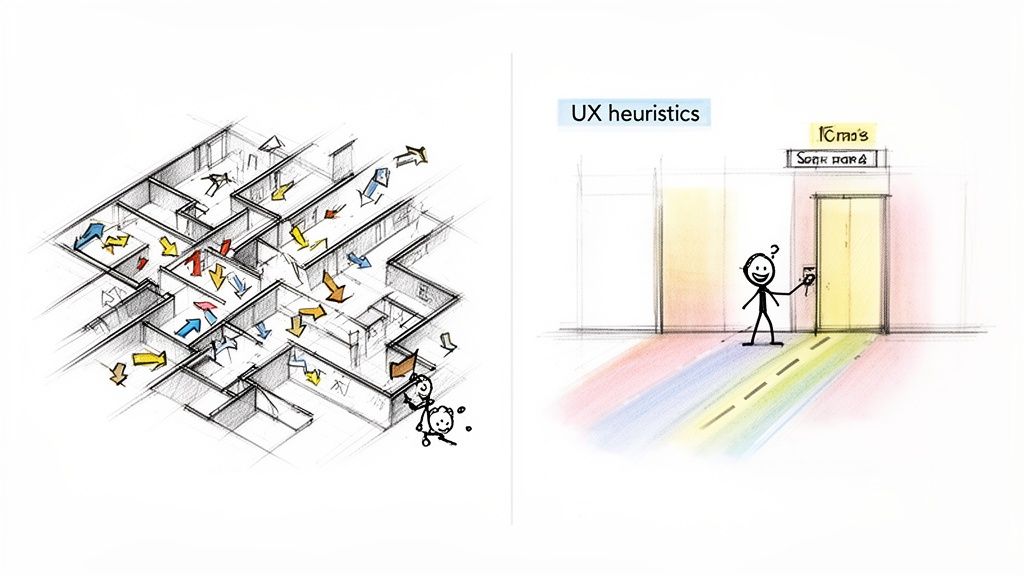
Ever tried to navigate a building with no signs, confusing hallways, and doors that all look the same? It’s frustrating. That’s exactly the kind of digital chaos UX heuristics help you avoid.
Think of them as the proven architectural "rules of thumb" for building digital products. They’re the shortcuts that let you catch obvious usability issues long before they become a headache for your customers.
The Foundation of Intuitive Design
Heuristics aren’t just abstract theories; they’re built on decades of research into how people actually use technology. The most famous principles, pioneered by usability expert Jakob Nielsen, give teams a solid framework for checking their work.
These principles help you answer fundamental questions about your interface:
Do users always know what’s going on?
Does the design speak the user’s language, not internal jargon?
Can someone easily back out of a mistake without causing a disaster?
The real power of heuristics comes from their connection to the broader philosophy of User-Centered Design, which puts the user’s needs at the absolute centre of the entire process. By sticking to these guidelines, you’re making sure your product is built on a solid, logical, and user-friendly foundation.
A heuristic evaluation is a sanity check before you ship. It’s a fast, structured way to spot usability issues without needing a full-blown user research cycle. This makes it an invaluable tool for any team aiming to build better products faster.
The Business Case for Heuristic Evaluation
Applying UX heuristics is more than a simple design check—it's a smart business move that pays for itself over and over. Finding a major usability flaw early is dramatically cheaper and faster than fixing it after the product has already been coded and launched.
For instance, a confusing checkout flow you spot during a heuristic review can be fixed in a mockup in a few hours. Fixing that same flow post-launch could mean weeks of developer time, lost sales, and a wave of frustrated support tickets.
This proactive approach saves time, cuts down on development waste, and prevents users from getting annoyed.
Ultimately, these principles empower your team to build products people actually enjoy using. And while a manual review is powerful, modern platforms like our own, Uxia, can put this process on steroids by delivering AI-driven insights in minutes. This lets teams run validations continuously and ensure every new feature meets a high usability standard. We’ll dive deeper into that synergy later in this guide.
Diving Into the Core Frameworks of Usability Heuristics
While the concept of using “rules of thumb” in design is nothing new, a few key frameworks have become the foundation of modern UX. These established sets of UX heuristics give product teams a shared vocabulary to check interfaces for common usability problems—quickly and consistently.
Think of them as a structured lens for analysing any digital product.
Among them, one framework truly stands out as the industry’s gold standard. Jakob Nielsen's 10 Usability Heuristics aren't just abstract ideas; they're practical, time-tested guidelines that have guided countless successful products. If you want to master heuristic evaluation, this is where you start.
The Gold Standard: Nielsen's 10 Usability Heuristics
You can think of Nielsen’s heuristics as a pre-flight checklist for your user interface. They help you spot potential turbulence long before your users ever experience it.
Let's break down each of the 10 principles with real-world examples, cutting through the jargon to see how they actually work.
The First 5 Foundational Heuristics
Visibility of System Status Your users should never be left guessing. The system must provide clear, immediate feedback on what’s happening—whether it’s a file upload progress bar, a spinning icon after a click, or a simple confirmation message.
Practical Recommendation: Implement loading indicators for any action that takes more than 0.1 seconds. For longer waits, use progress bars with estimated times to manage user expectations.
Match Between System and the Real World Your product should speak the user's language. Use words, phrases, and concepts they already know, not your internal team jargon. There’s a reason the shopping cart icon looks like a real cart—it’s a metaphor everyone instantly gets.
Practical Recommendation: Before finalizing your UI copy, conduct a quick survey with 3-5 target users to ensure your terminology is clear and familiar to them. Avoid acronyms and technical terms whenever possible.
User Control and Freedom People make mistakes. A great interface provides a clearly marked "emergency exit" to undo an action or cancel a process. This builds a sense of control and encourages users to explore without fear.
Practical Recommendation: Ensure every multi-step process has a clear "Back" or "Cancel" button. For destructive actions like deleting a file, provide an "Undo" option that appears for a few seconds.
Consistency and Standards Don't reinvent the wheel. Users shouldn't have to wonder if different words, icons, or actions mean the same thing. Your primary call-to-action button should look and behave the same way across your entire product.
Practical Recommendation: Create a simple design system or style guide that documents your colors, typography, and button styles. Make sure your team references it for all new feature development.
Error Prevention The best error message is the one that never has to appear. A thoughtfully designed interface stops problems from happening in the first place. Disabling the 'submit' button until all required fields are complete is a classic, effective example.
Practical Recommendation: Use inline validation on forms to give users real-time feedback as they type. For example, show a green checkmark when a username is available.
The Next 5 Heuristics for a Refined Experience
These next five principles build on the foundation, honing in on efficiency, minimalism, and recovery.
Recognition Rather Than Recall Minimise the user’s memory load by keeping objects, actions, and options visible. A user shouldn't have to remember information from one screen to the next. This is why e-commerce sites show you your "recently viewed items."
Practical Recommendation: In checkout flows, always display a persistent summary of the items in the user’s cart so they don't have to go back and check.
Flexibility and Efficiency of Use Your interface should work well for both beginners and experts. You can add accelerators—like keyboard shortcuts—to speed things up for power users, while the main interface remains simple and discoverable for newcomers.
Practical Recommendation: Implement keyboard shortcuts for common actions in complex web apps (e.g.,
Cmd/Ctrl + Sto save) and display them in tooltips for discoverability.
Aesthetic and Minimalist Design Every extra piece of information on a screen competes for the user's attention. Keep your interfaces clean, focused, and free of anything that’s irrelevant or rarely needed.
Practical Recommendation: For each screen, ask: "Is every element here absolutely necessary?" If the answer is no, remove it or move it to a secondary screen.
Help Users Recognise, Diagnose, and Recover from Errors When errors do happen, they need to be handled gracefully. Good error messages use plain language, clearly state the problem, and suggest a helpful solution. "Invalid Input" is bad; "Your password must be at least 8 characters long" is good.
Practical Recommendation: Write error messages that are human-readable, explain why the error occurred, and guide the user toward a solution. Never just show an error code.
Help and Documentation The goal is a system so intuitive it doesn't need a manual. But sometimes, help is necessary. Make sure any documentation is easy to find, focused on the user's goal, and provides clear, concrete steps.
Practical Recommendation: Instead of a dense help manual, use context-sensitive tooltips or short video tutorials that appear right where the user might need them.
To make these principles easier to reference, here’s a quick summary.
Nielsen's 10 Usability Heuristics at a Glance
This table gives you a quick-reference summary of Jakob Nielsen's foundational principles for interaction design.
Heuristic Principle | Core Idea |
|---|---|
Visibility of System Status | Keep users informed about what’s happening. |
Match System to Real World | Speak the user's language, not technical jargon. |
User Control and Freedom | Offer an "emergency exit" like 'undo' and 'cancel'. |
Consistency and Standards | Don't make users guess what things mean. |
Error Prevention | Design to prevent problems from occurring. |
Recognition Over Recall | Make information visible, don't force users to remember. |
Flexibility and Efficiency | Cater to both novice and expert users. |
Aesthetic & Minimalist Design | Keep it clean and focused; less is more. |
Help with Error Recovery | Write clear, helpful error messages. |
Help and Documentation | Make help easy to find and task-focused. |
These ten rules are your roadmap for creating interfaces that feel intuitive and supportive.
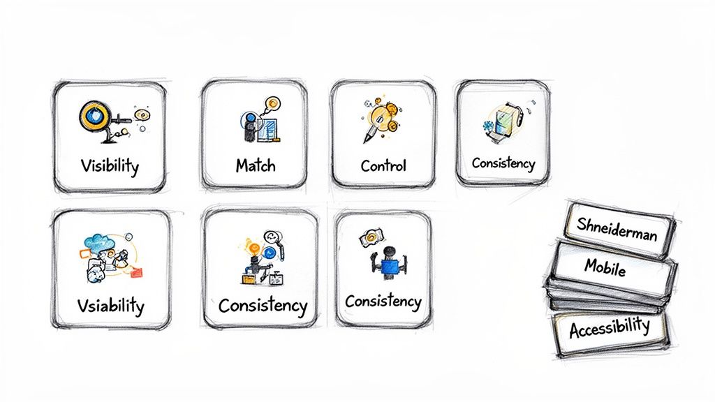
Broadening Your Heuristic Toolkit
While Nielsen’s principles are an incredibly powerful starting point, they aren't the only game in town. The best product teams know how to pick the right UX heuristics for the job. Our own platform, Uxia, often combines multiple frameworks to give you deeper, more context-aware insights.
For instance, Ben Shneiderman’s Eight Golden Rules of Interface Design offer a great complementary perspective. His rules, like "Offer informative feedback" and "Permit easy reversal of actions," echo Nielsen but put a stronger emphasis on giving the user a sense of command and control.
Another fantastic set comes from Bruce Tognazzini, an early interface designer at Apple. His First Principles of Interaction Design are especially useful for complex software, diving deep into user cognition. A key idea is "Efficiency of the User," which prioritises making the user’s entire journey as smooth as possible.
There are also specialised sets for specific contexts:
Mobile Heuristics: These address challenges unique to small screens, like touch target sizes, intuitive navigation, and minimising typing.
Accessibility Heuristics (WCAG): The Web Content Accessibility Guidelines function as a critical heuristic framework for ensuring your product is usable by people with disabilities.
Practical Recommendation: Don't limit yourself to one framework. For a mobile e-commerce app, combine Nielsen's heuristics with mobile-specific ones (e.g., "touch targets should be at least 44x44 pixels") to get a more comprehensive audit. Platforms like Uxia help by automating much of this analysis, letting you quickly test your designs against multiple frameworks at once.
How Heuristic Evaluations Drive Success Across the Globe
Heuristic evaluations aren't just some abstract, academic concept. They're practical, field-tested tools that deliver measurable business results all over the world. When you move from theory to practice, you start to see just how smart teams use these guidelines to build better products and get a serious return on their design investment.
Think of it this way: these evaluations give you a structured method for finding the exact usability issues that frustrate your users and tank your key metrics. By applying a heuristic lens, you can finally spot the friction points your customers are hitting every single day.
Brazil's UX Leadership and Tangible Results
Take the design community in Brazil, for example. It's widely seen as the most advanced hub for UX culture in Latin America, with a massive growth in events and local groups focused on applying core UX heuristics—like Nielsen's—to their own digital products.
In one incredible case, a major Brazilian bank completely changed its process. Instead of just shipping interfaces, they started running comprehensive heuristic audits. This simple shift helped them pinpoint massive navigation friction that was causing users to drop off. After a focused redesign, the bank saw user task completion rates jump by an unbelievable 32%. You can learn more about the region's progress and see extra details on the evolving Latin American UX scene.
This proves that a heuristic review is so much more than a box-ticking exercise. It's a direct path to finding problems that, once you fix them, lead to clear, quantifiable wins for both your users and your bottom line.
By systematically checking an interface against proven principles, you get an objective roadmap for what to improve. It stops being about subjective opinions and starts being about aligning your design with how people actually think and act.
A Global Strategy for Smarter Development
But the impact of UX heuristics isn't just a Latin American story. In South Africa, for instance, more and more organisations are baking UX activities right into their development cycles. Teams there are using heuristic evaluations as a lean, cost-effective way to slash expensive rework and drastically improve the final product.
This approach delivers two huge benefits:
Cost Reduction: Finding a major usability flaw in a prototype is exponentially cheaper to fix than finding it after the product is already coded and launched. Heuristics let you catch these disasters early.
Improved Outcomes: By consistently checking designs against well-known usability principles, teams make sure their products are more intuitive, efficient, and honestly, just more enjoyable to use. This leads directly to higher adoption and satisfaction.
Practical Recommendation: Integrate a quick heuristic review into your "definition of done" for every new feature. Before a feature can be considered complete, a designer or product manager should run a quick check against a core set of principles. This makes usability a shared responsibility.
Whether you run these reviews by hand or speed them up with a platform like Uxia, the goal is always the same: build better products by finding and killing user friction before it does any real damage. The insights you get from a heuristic review give you a solid foundation for making truly data-driven design decisions.
Your Step-by-Step Guide to Conducting a Heuristic Evaluation
So you understand what UX heuristics are. Great. But the real value comes when you put them into practice. A heuristic evaluation is how you turn those principles into a list of concrete, actionable fixes for your product.
Think of it as your team’s fast-track to finding the usability issues that are actively hurting your user experience and, ultimately, your bottom line.
A good evaluation isn’t just a random audit—it’s a focused process. Following a clear, three-phase framework keeps your efforts organised and ensures the final report actually drives change.
Let’s break down how it works.
Phase 1: Planning Your Review
This is easily the most important step. Proper planning sets the stage for everything, aligning your team and making the whole process efficient. If you skip this, you’ll end up with a chaotic pile of feedback that’s impossible to sort through.
Here’s how to build a solid plan:
Define the Scope and User Flows: You can't check everything. Pick specific user journeys to inspect. Are you looking at the new user onboarding? The checkout process? Maybe just the search functionality? Get specific.
Choose Your Heuristic Set: Nielsen's 10 heuristics are a brilliant starting point, but don't be afraid to add more. If you're reviewing a mobile app, for example, bring in mobile-specific heuristics for things like touch targets and navigation patterns.
Assemble Your Evaluators: You don’t need a huge committee. Research shows that a small group of 3 to 5 evaluators is the sweet spot. A team this size can spot around 75% of the usability problems, giving you a mix of perspectives without creating a mountain of duplicate feedback.
Practical Recommendation: Create a shared document (like a Google Doc or Notion page) outlining your plan. Include the exact URLs for each user flow, the chosen heuristics, and the list of evaluators. This ensures everyone is aligned before the review begins. Our platform, Uxia, automates this setup, allowing you to define your scope and start an evaluation in minutes.
This process flow shows how a heuristic audit directly fuels product improvements, leading from the initial audit to redesign and business growth.
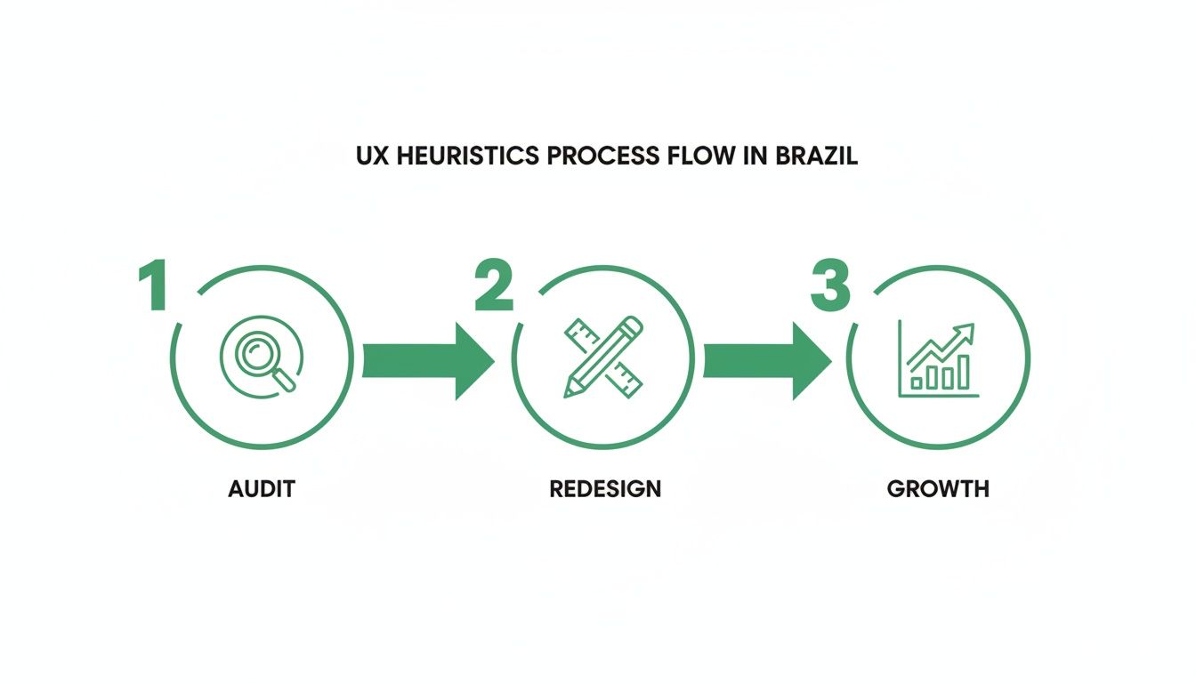
The visual makes it clear: these audits are the first step toward real, measurable success.
Phase 2: Executing the Evaluation
With your plan in place, it’s time for the evaluators to get to work. The most important rule here is to have each person conduct their review individually. This is critical for avoiding groupthink, where one person’s opinion starts to influence everyone else.
A best practice is for each evaluator to go through the interface independently at least twice. The first pass is for getting a feel for the overall flow. The second, more detailed pass is where they systematically hunt for and log specific heuristic violations.
During the review, evaluators need to log every single issue they find. A simple spreadsheet is often all you need. For each issue, make sure they record:
A short, clear description of the problem.
The specific heuristic being violated.
A screenshot or screen recording for visual context—this is non-negotiable for clarity.
The exact location of the issue (e.g., URL, screen name).
Practical Recommendation: Use a browser extension that can capture screenshots and annotations quickly. This saves time and makes it easier for evaluators to provide clear visual evidence for each issue they log.
Phase 3: Synthesising and Reporting Findings
Once all evaluators have finished their individual reviews, it’s time to bring everything together. This is where you transform a long list of problems into a prioritised roadmap your development team can actually use.
First, combine all the logged issues into a single master list and group any duplicates. The next step is absolutely crucial: assigning a severity rating to each issue. This helps stakeholders immediately understand which problems are on fire and which can wait.
A common severity scale looks like this:
Critical: A total showstopper. Users can't complete a core task. This needs to be fixed yesterday.
Major: A significant problem that will cause frustration for most users.
Minor: A smaller issue that might have a workaround but still makes the experience worse.
Cosmetic: A trivial visual flaw, like a pixel being out of place, that doesn’t affect functionality.
Practical Recommendation: Host a short (1-hour max) "synthesis session" where all evaluators discuss their findings and agree on severity ratings together. This consensus-building step is key to creating a report that the whole team can get behind.
While this manual process is powerful, it’s also time-consuming. That’s exactly why we built Uxia. Our platform is designed to automate this entire workflow. Instead of your team spending days consolidating spreadsheets, Uxia runs an analysis against core heuristics, flags issues, and generates a prioritised report with visual evidence in minutes. This frees up your experts to do what they do best: solve problems.
If you're interested in structured testing, you might find value in our deeper dive into other UX testing methodologies.
Accelerate Your Evaluations with AI and Uxia
While manual heuristic evaluations are a cornerstone of good UX, let’s be honest—they have their trade-offs. They can be slow to co-ordinate, prone to subjectivity, and a real pain to scale, especially for agile teams that need to ship fast.
This is where the next evolution of UX heuristics comes in: AI-powered analysis. Modern platforms like our own, Uxia, are built to smash through the limits of traditional methods. You get the reliability of an expert review but at the speed of automation.
Overcoming the Limits of Manual Reviews
Co-ordinating a manual evaluation is no small feat. You have to schedule the right evaluators, get them all on the same page, and then synthesise findings from a mess of different spreadsheets. It can grind a sprint to a halt, turning a valuable practice into a logistical bottleneck.
On top of that, human reviews are inherently subjective, even with a clear set of heuristics. A junior designer might rate an issue as critical, while a senior product manager sees it as minor. These debates stall real progress.
This is exactly the problem AI is designed to solve. By automating the inspection process with a tool like Uxia, you eliminate the bottlenecks and introduce a level of objectivity that’s incredibly difficult to achieve manually. If you want to get a better handle on the tech behind these tools, you can delve deeper into Large Language Models.
The Power of Speed and Objectivity
Imagine getting detailed heuristic feedback in minutes, not weeks. That's the real game-changer when you bring AI into your workflow.
With a platform like Uxia, product managers and designers get objective, bias-free insights almost instantly. Instead of waiting for a formal review cycle, you can run continuous checks throughout the entire development process, making sure every single iteration is on the right track.
Recent benchmarks really highlight the precision of modern AI in this space. Across Europe and South America, specialised AI tools for UX heuristics hit a documented 95% accuracy rate compared to human experts. These tests covered 48 different websites, including Spanish-language ones. Generic AI prompts, in contrast, often miss the mark, landing in the 50-75% accuracy range.
That combination of accuracy and speed is a massive advantage. It means you catch more issues, faster, and with far greater confidence. Uxia’s proprietary pipeline mirrors this precision, generating realistic AI participants for unmoderated tests that flag friction with similar reliability—specifically tailored to demographics in markets like Spain and wider Europe.
From Raw Findings to an Actionable Roadmap
One of the biggest headaches with manual heuristic analysis is turning a long, messy list of findings into a clear action plan. AI-driven platforms like Uxia are built to fix this.
Uxia doesn't just hand you a list of potential issues; it delivers a prioritised and actionable roadmap. The platform’s output is designed to be immediately useful for your team.
Here’s what that looks like:
Prioritised Findings: Issues are automatically sorted by severity, so your team knows exactly what to tackle first.
Visual Evidence: Visual heatmaps and session recordings show you precisely where AI testers ran into friction. No more guesswork.
Clear Summaries: The platform auto-summarises patterns and provides crystal-clear explanations for each violation, turning raw data into your next steps.
This automated synthesis transforms what used to be days of work into an instant report. If you're looking to integrate this level of analysis into your process, our guide on AI user research offers more practical tips.
Ultimately, by pairing established UX heuristics with the power of AI, modern teams can build better products, faster. You get the expert-level analysis you need without the traditional delays, allowing you to innovate with confidence. With Uxia, you can turn heuristic insights into action in record time.
Turning Heuristic Insights into Product Wins
If you've followed along this far, you know that UX heuristics aren't just another checklist. They're a powerful way of thinking for any team that's serious about building products people love. We've gone from the core principles to running manual audits and, finally, to using AI to make it all faster.
The real goal here is to empower you. You now have the tools to find and fix the exact usability problems that frustrate your users and damage your business.
A heuristic review is a sanity check before you ship. It’s a fast, structured way to spot usability issues without needing a full-blown user research cycle. This makes it an invaluable tool for any team aiming to build better products faster.
But learning is one thing; doing is another. The real value comes from putting these ideas into practice.
From Theory to Action
Start now. You don't need a huge, formal audit to get started.
Pick a single user flow in your product. Just one. Evaluate it against Nielsen's ten principles. I guarantee you'll find something surprising.
Start Small: A quick review is often enough to find low-hanging fruit you can fix immediately.
Be Proactive: Don't wait until the end. Weave heuristic checks into your design process early to avoid expensive rework down the line.
Practical Recommendation: Dedicate one hour every two weeks for a "Usability Blitz." Pick one team member, one user flow, and a few key heuristics. Document the top three findings and add them to your backlog. This makes continuous improvement a manageable habit.
This approach stops usability problems before they ever reach your users. And if you want to prove the impact of your fixes, check out our guide on the System Usability Score and its alternatives. It’s packed with great methods for quantifying your improvements.
You can also see for yourself how a platform like Uxia transforms heuristic analysis from a once-in-a-while task into a constant stream of product intelligence.
By mixing your own expertise with AI-driven speed, you can make user-centred decisions with total confidence. The end game is always the same: build better products that are a genuine joy to use.
Frequently Asked Questions About UX Heuristics
As you start working with UX heuristics, a few questions always come up. Here are the straight answers you need to apply these principles with confidence.
What’s the Difference Between Heuristic Evaluation and User Testing?
Think of it as an expert inspection versus a real-world test drive.
A heuristic evaluation is when usability specialists or experienced designers analyse an interface against a set of proven principles. It’s fast, brutally efficient, and designed to spot likely friction points without needing to recruit a single user.
User testing, on the other hand, involves watching actual users attempt to complete tasks. You get raw, unfiltered feedback directly from your audience. Both are vital, but a heuristic review can happen much earlier and faster. Modern tools like Uxia can even simulate this user behaviour, giving you the speed of an expert review with the insight of user observation.
How Many Evaluators Do I Need for a Heuristic Evaluation?
You don't need a huge committee. The foundational research from Jakob Nielsen is clear: a small group of 3 to 5 evaluators is the sweet spot.
This is typically enough to uncover around 75% of the usability problems in an interface. Why? Because after the fifth person, you start seeing the same issues over and over again.
Using a small team provides enough diverse perspectives to catch a wide range of issues without generating an overwhelming amount of duplicate feedback. It strikes the perfect balance between thoroughness and efficiency, making it a very practical method for teams of any size.
Can I Use Heuristics on an Early-Stage Prototype?
Absolutely. In fact, you should.
Applying UX heuristics to low-fidelity wireframes, mockups, or even paper sketches is one of the highest-leverage activities you can do. It's incredibly cost-effective.
This lets you catch fundamental design flaws and logic gaps before a single line of code gets written. Finding and fixing a problem in a prototype saves an immense amount of time, money, and developer headaches down the line. An early heuristic check isn't just a good idea; it's a smart investment. For instance, Uxia can analyze a Figma prototype just as easily as a live website, helping you validate your designs from day one.
Ready to transform your heuristic analysis from a slow, manual task into a continuous source of product intelligence? With Uxia, you can get AI-driven, actionable insights in minutes, not weeks. Start building better products faster with Uxia.