
A 2026 Guide to User Experience Optimization
Master user experience optimization with 2026 frameworks and KPIs. Learn how AI tools like Uxia accelerate testing and product improvement.

Most product teams don't lack ideas. They lack a reliable way to decide which experience problem is worth fixing next.
A familiar pattern plays out every week. Analytics show a drop in a key flow. Support tickets mention confusion. Design wants to clean up navigation. Engineering wants to improve performance. Marketing wants the onboarding message simplified. Everyone is reacting to a real signal, but nobody has a complete picture of the user behavior behind it.
That's where user experience optimization stops being a design exercise and becomes an operating system for product decisions. Done well, it gives teams a repeatable way to find friction, understand why it happens, change the experience, and confirm whether the change worked. It replaces opinion-driven prioritization with evidence-driven iteration.
In 2026, that process also has to move faster than the old research model allowed. Long study cycles, manual recruiting, and one-off usability projects don't match how modern product teams ship. Continuous UX optimization does.
What Is User Experience Optimization
User experience optimization is the ongoing practice of improving how people move through a product so they can complete important tasks with less friction, more confidence, and fewer errors.
That definition matters because many teams still treat UX work as a redesign event. They wait until complaints pile up, launch a broad cleanup effort, and then move on. That approach misses how experience problems show up in live products. They appear in small moments. A confusing label. A weak visual hierarchy. A form field that feels riskier than it should. A mobile tap target that demands too much precision.
It is a decision system, not a design polish pass
At a practical level, user experience optimization answers a short set of questions:
What user goal matters most right now
Where in the live experience do people hesitate, fail, or abandon
Why that friction is happening
Which change is most likely to improve the outcome
Whether the change improved behavior
When teams skip that sequence, they usually ship cosmetic fixes. The interface may look better, but the business metric doesn't move because the actual blocker was never identified.
Practical rule: If a team can't name the user task, the point of friction, and the expected behavioral change, it isn't doing optimization yet. It's just editing screens.
Continuous optimization beats periodic redesigns
The strongest teams don't ask whether the product is "done." They assume every important flow is a living system that needs regular inspection.
That means watching real behavior in sign-up, onboarding, checkout, search, settings, and support deflection paths. It means comparing what people were meant to do with what they did. It also means testing on live URLs when possible, because production behavior is where hidden friction tends to show itself.
A useful working definition is simple: user experience optimization is the discipline of reducing friction in the moments that matter most to the user and the business.
That framing helps product, design, research, and engineering align fast. It turns UX from a subjective conversation into an operational one.
The Goals and Business Impact of UX Optimization
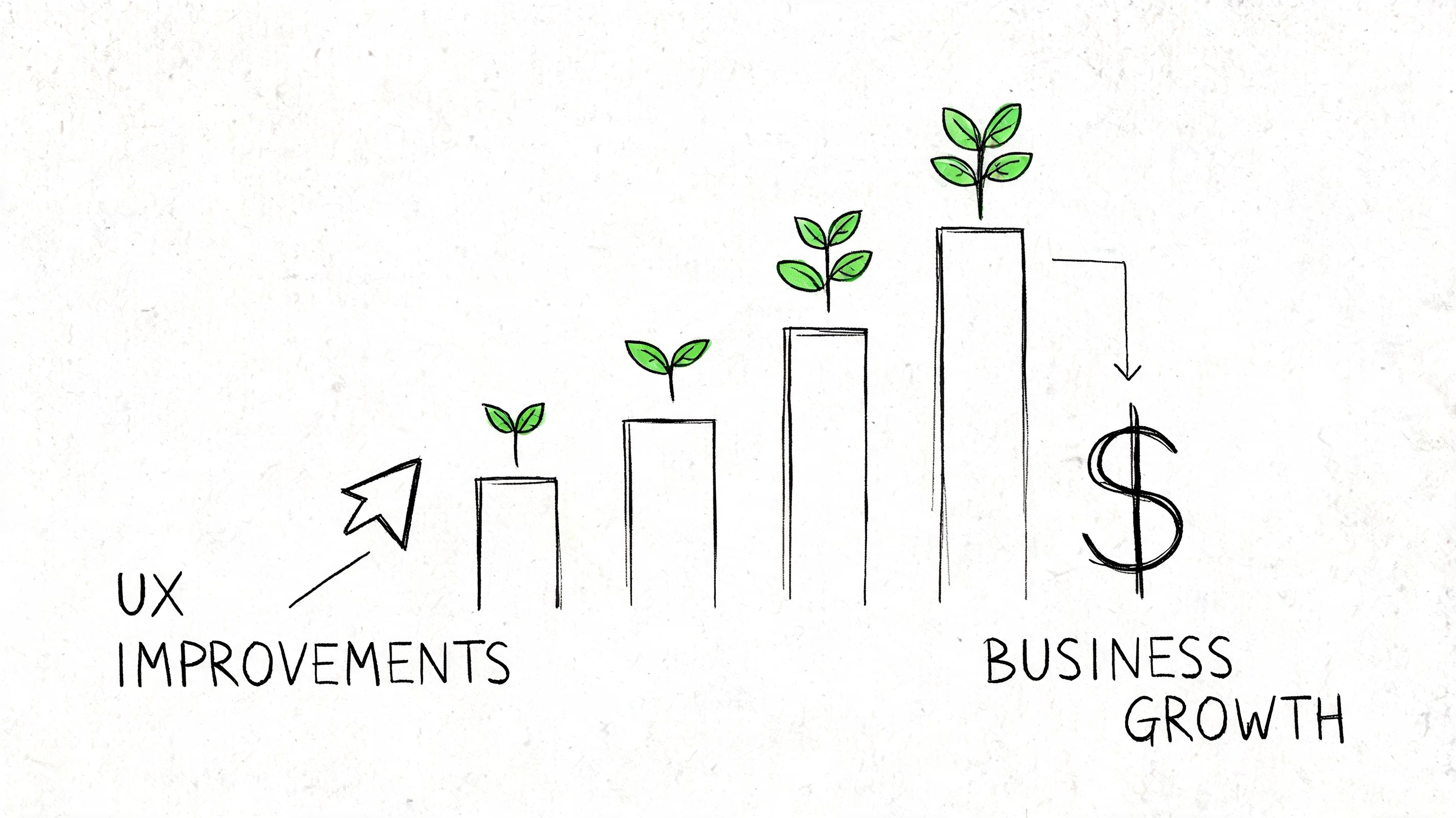
UX optimization matters because user friction is expensive. It slows acquisition, weakens activation, lowers conversion, increases abandonment, and erodes retention.
The business case is already strong. Research summarized by Lyssna cites Forrester findings that companies investing in user experience design achieve an average ROI of 9,900%, meaning every $1 invested in UX can return up to $100. The same source also notes that good UX design can increase website conversion rates by as much as 400%.
Good UX work changes business outcomes, not just screen quality
Teams often make the mistake of attaching UX only to satisfaction or visual appeal. In practice, optimization affects harder outcomes:
Conversion when users can move from intent to action without hesitation
Retention when first use feels clear instead of stressful
Revenue efficiency when fewer users stall in high-value flows
Support load when the interface answers questions before the user asks them
Trust when copy, feedback states, and flow structure reduce uncertainty
This is why UX optimization belongs in product planning, not in a side lane reserved for design reviews.
Pick KPIs that match the user job
A serious UX optimization program starts with metrics that reflect the task being improved. The wrong KPI creates false confidence.
A few examples work well in practice:
UX objective | Better KPI choices | Weak KPI choices |
|---|---|---|
Improve checkout | Task completion, abandonment by step, error patterns | Raw page views |
Improve onboarding | First-session task success, hesitation points, directness of navigation | Time on page alone |
Improve search | Search refinement behavior, result selection, successful next action | Session duration |
Improve self-serve support | Deflection behavior, successful issue resolution, repeated confusion themes | Traffic growth |
For some teams, that also means pairing product metrics with usability metrics such as task success rate, time on task, and error frequency. Those measures tell you whether people are succeeding efficiently, not just whether they stayed active.
A related tactic is to improve the way teams communicate findings internally. When optimization work needs buy-in from stakeholders who weren't present in testing, short demo assets help. Teams that need to produce stunning product demonstration videos often use them to show exactly where a user got stuck and why the fix matters.
The strongest teams tie UX evidence to roadmap choices
Optimization work gains influence when it changes prioritization. Instead of saying "this page feels dated," the team can say "this flow blocks a critical user goal, and the friction is observable."
That kind of evidence is why many product organizations are moving toward a more data-driven design approach. The shift isn't about reducing design to dashboards. It's about making design decisions more accountable to real behavior.
UX optimization does its best work when it narrows the distance between what users are trying to do and what the product currently makes them do.
A product with strong feature depth but weak experience quality often underperforms a simpler product with clearer flows. That's the core business impact. User experience optimization increases the value users can attain.
Diagnosing Friction and Identifying Opportunities
Most optimization work fails at the diagnosis stage. Teams see a weak metric, assume they know the cause, and jump straight to a solution.
That shortcut is expensive because friction rarely announces itself clearly. A drop in conversion might be copy confusion, missing trust cues, poor mobile layout, slow loading, or a broken expectation created earlier in the flow. You don't fix that by guessing.
Baymard's UX statistics roundup captures how unforgiving this can be. If a website takes more than three seconds to load, 40% of visitors will abandon it. The same source notes that 32% of customers will leave a brand they loved after just one bad experience, and 91% of unsatisfied customers leave without complaining. That last point matters because many teams still over-rely on direct feedback. Silence often means exit, not satisfaction.
Start with a live flow and a user goal
The cleanest way to diagnose friction is to focus on one mission-critical path at a time. Pick a flow where user intent is clear and business impact is meaningful. That could be account creation, plan selection, ticket purchase, document upload, or feature setup.
Then inspect the path through two lenses:
Behavioral evidence from analytics, funnels, drop-offs, and device splits
Observed evidence from replays, heatmaps, transcripts, and open-ended feedback
The first tells you where the problem is. The second tells you why it exists.
What friction looks like in the wild
Common signals are usually easy to recognize once the team knows what to look for:
Repeated hesitation before an action, especially near commitment points
Backtracking between steps that should feel linear
Dead clicks on elements that look interactive but aren't
Rage clicks on controls that users expect to work differently
Confused language in comments, transcripts, or support logs
Mobile-specific strain such as awkward tapping, obscured fields, or difficult scrolling
When teams need to organize messy open-ended feedback, a guide to essential qualitative analysis techniques can be useful. The point isn't academic rigor for its own sake. It's to turn scattered comments into recurring themes you can effectively prioritize.
Build an opportunity list, not a complaint list
A productive diagnosis ends with a ranked set of opportunities. That list should be framed around observed user problems, not proposed UI changes.
For example:
Weak framing | Strong framing |
|---|---|
Redesign payment screen | Users hesitate at the invoicing option because the copy is ambiguous |
Make onboarding cleaner | New users don't understand what happens after the first step |
Improve mobile layout | Tap targets are too small in a high-intent path |
That distinction matters. The first version prescribes a solution too early. The second describes the friction precisely enough that the team can test multiple fixes.
The best optimization opportunities are specific enough to test and broad enough to matter.
A practical diagnostic loop
A dependable pattern looks like this:
Pick one meaningful flow rather than auditing the whole product at once
Locate the friction point using funnel behavior and session evidence
Review real interactions to identify confusion, hesitation, or misclicks
Cluster recurring problems so one dramatic session doesn't distort priorities
Write the opportunity as a user problem tied to the task and likely cause
This is also where internal artifacts help. A clear user flow diagram for the target journey makes it easier to spot where the intended path diverges from actual behavior.
A team that gets diagnosis right usually finds the fix faster. A team that gets diagnosis wrong tends to launch redesigns that look active but don't remove the underlying friction.
A Modern Toolkit for UX Testing Methodologies
No single testing method answers every UX question. Analytics can show where a funnel leaks, but they can't explain the user's reasoning. Interviews can uncover motivation, but they don't always reflect what people do under real task pressure. A/B testing can validate a change, but only after the team has formed a strong enough hypothesis to test.
That's why modern user experience optimization works best as a toolkit, not a single method.
Traditional methods still matter
Human research remains valuable when the team needs depth, context, or nuanced reactions. Moderated interviews are useful for exploratory discovery. Live usability sessions help when the product is complex or the audience is specialized. Surveys can capture broad sentiment if the questions are disciplined.
But traditional methods also create bottlenecks. Recruiting takes time. Scheduling slows decisions. Sample quality varies. Studies are often scoped as projects instead of becoming part of a regular product loop.
Quantitative and qualitative methods work best together
The most reliable findings come from combining hard signals with observed behavior. Big Drop's write-up on analytics for UX optimization notes that heatmaps and recordings can expose rage-clicking on non-interactive elements, a behavior correlated with 40% higher bounce rates, and that addressing these issues can reduce error rates by 35%.
That pairing is what turns a symptom into a diagnosis.
Factor | Traditional Human Testing | AI Synthetic Testing (e.g., Uxia) |
|---|---|---|
Setup speed | Slower because recruiting and scheduling are required | Faster because tests can be launched without panel logistics |
Best use case | Deep exploration, nuanced discussion, specialized contexts | Rapid validation, frequent iteration, repeated checks across flows |
Live product testing | Possible, but often operationally heavier | Well suited to repeated tests on URLs and evolving product states |
Output format | Notes, recordings, researcher synthesis | Structured transcripts, interaction traces, heatmaps, summarized patterns |
Iteration cadence | Often periodic | Better aligned with continuous product cycles |
Cost profile | Higher coordination overhead | Lower operational friction for repeat studies |
Where AI synthetic testing changes the workflow
The major shift isn't just speed. It's repeatability.
Platforms such as Uxia's UX testing methodology resources reflect a newer model where teams can test live products or prototypes, define a mission, set an audience, and review both interaction data and think-aloud style transcripts without waiting on a traditional research cycle. That matters because optimization decisions are often time-sensitive. If a flow is leaking today, the team can't wait for a slow study cadence to confirm the obvious.
In practice, synthetic testing is especially useful when teams need to:
Check a live flow quickly after analytics reveal unusual drop-off
Compare iterations consistently using the same mission and audience setup
Inspect gated products that are difficult to test through public recruitment
Move from pattern to evidence by tying summarized issues back to transcript moments
Support sprint decisions without turning every UX question into a formal research project
Use human research when you need depth of interpretation. Use synthetic testing when you need speed, consistency, and frequent validation. Most mature teams need both.
What works and what doesn't
What works is a layered approach. Start with product data. Use observed sessions to understand behavior. Use targeted testing to validate whether the suspected issue is real and recurring. Then ship a change and test the same mission again.
What doesn't work is treating any one tool as complete. Dashboards alone flatten user behavior into metrics. Interviews alone can over-weight what people say. A/B tests alone can turn teams into optimization gamblers if the hypothesis quality is weak.
The modern toolkit is strongest when each method does the job it is good at.
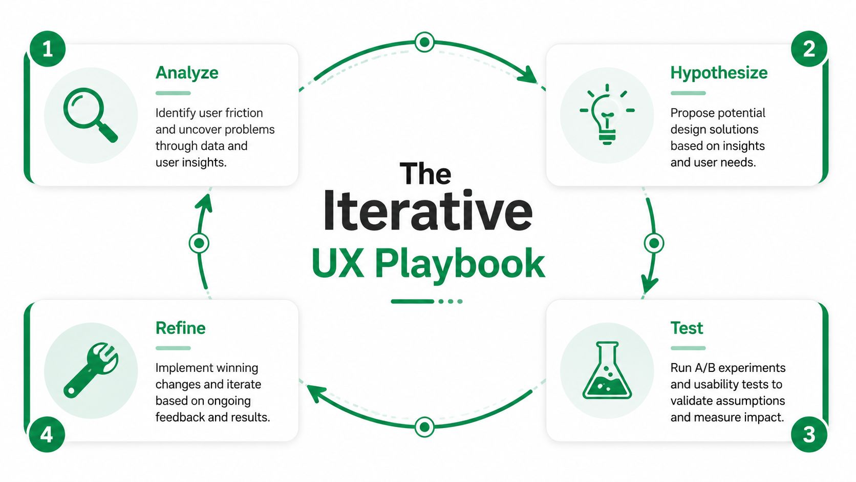
An Iterative Playbook for Continuous Improvement
Strong UX optimization is procedural. Teams that get results don't wait for a redesign cycle or a quarterly research window. They run the same loop repeatedly on the flows that matter most.
A practical playbook looks like this: define the goal, choose the live flow, give the user a clear mission, test it with the right audience, review where people hesitate or fail, prioritize the recurring friction, implement the change, and rerun the same task.
Step 1 begins with the user goal, not the screen
The easiest mistake is starting with the interface. Start with the job instead.
If the business problem is weak conversion in a purchase flow, define the user goal in plain language. Buy a ticket. Activate a trial. Submit a claim. Upgrade a plan. That creates a clean lens for evaluating what helps and what gets in the way.
Step 2 turns the task into a testable mission
Mission design matters more than many teams realize. A vague prompt creates vague findings. A clear mission produces behavior you can evaluate.
A useful mission usually includes:
A realistic scenario that gives the user context
A concrete objective with a clear end state
Relevant constraints if the actual flow has them
A matching audience profile so the behavior is directionally realistic
AI-powered synthetic testing makes the speed advantage operationally meaningful. ChatbotGen's overview of user experience optimization states that 70% of checkout abandonments stem from friction like confusing fields, and that AI-powered synthetic testing can identify these issues in minutes, leading to changes that can yield 25-40% conversion uplifts. The same source also notes average funnel drop-offs at 69% globally.
Step 3 looks for recurring friction, not isolated weirdness
A single odd session shouldn't drive a roadmap decision. Patterns should.
Review the test with a narrow eye. Where did users pause? Which labels created uncertainty? Where did confidence drop? Did users attempt actions on the wrong elements? Did they describe the system in ways that reveal a mismatch between product language and user language?
This is why transcripts plus interaction data are so useful. Click maps show what happened. Transcript moments show what the user thought was happening.
A concrete example from a payment flow
One useful example comes from a public transport ticket-purchase journey in Amsterdam. In testing, recurring issues surfaced around small tap targets, ambiguous onboarding copy, and confusion around the invoicing option.
Those aren't abstract usability critiques. They're direct optimization opportunities in a payment-adjacent journey where clarity and confidence matter. A team looking at those findings wouldn't need a grand redesign brief. It would have a short, practical improvement queue:
Clarify the onboarding language so users understand the next step.
Remove ambiguity around invoicing so payment choices feel safer.
Improve the mobile interaction targets where precision is currently too demanding.
If a finding can be translated into a concrete product change in one sentence, the research has done its job.
Step 4 validates the change with the same mission
A lot of teams stop after implementation. That's where optimization turns back into opinion.
Rerun the same mission with the same audience definition and compare behavior. Look for cleaner task completion, more direct navigation, and fewer repeated confusion points. Keep the scenario stable so the comparison is useful. Also separate true product issues from prototype artifacts or test setup noise. Otherwise the team may "solve" problems that only existed in the study environment.
That repeatability is what makes continuous validation practical instead of ceremonial. Teams can test a live URL, implement a targeted fix, and recheck the same path quickly.
For teams building this muscle, the LunaBloom AI blog is one of several useful places to follow how AI-assisted workflows are changing research and product iteration more broadly.
What this playbook changes inside a team
When the loop is working, roadmap discussions get sharper. Product managers stop arguing from intuition alone. Designers stop defending polished solutions before the problem is proven. Engineers get clearer evidence about what needs attention.
The result isn't just faster testing. It's better judgment.
How to Prioritize Optimizations and Avoid Common Pitfalls
Once a team has a list of issues, the primary challenge begins. Not every friction point deserves immediate attention. Some are loud but low impact. Others look minor on the surface but sit inside a high-value path and suppress retention or conversion.
Use a lightweight scoring model
You don't need a complicated framework to make good decisions. A simple ICE or RICE-style pass is often enough if the inputs are honest.
Score each candidate change on a few practical dimensions:
Factor | What to ask |
|---|---|
Reach | How many users encounter this friction in an important flow |
Impact | If fixed, does this improve completion, confidence, or retention |
Confidence | Do you have repeated evidence, or only a hunch |
Effort | Is this a copy tweak, a layout revision, or a deeper systems change |
This keeps teams from treating every issue as equally urgent.
Prioritize first-session friction aggressively
One category deserves extra weight: anything that disrupts the first-session experience.
UXCam's discussion of UX optimization notes that the first-session experience sets 80% of the long-term retention trajectory, and that rage taps on non-interactive elements during onboarding are a high-priority signal of unmet expectations. Teams often under-prioritize these issues because they seem small. They aren't. Early confusion changes whether users believe the product will be easy to learn.
A practical rule is simple. If a new user hits friction before they experience core value, move that issue up the list.
Common mistakes that slow optimization
Several failure modes show up repeatedly:
Chasing the wrong metric when the KPI doesn't match the user job
Fixing what is visible instead of what is consequential
Acting on one dramatic session instead of recurring evidence
Writing solutions before naming the user problem
Skipping the retest after implementation
Treating onboarding as marketing copy, not as product usability
The short video below is a useful companion when teams need a quick reset on how prioritization and UX choices shape real outcomes.
Balance quick wins with structural fixes
Quick wins matter. Clearer button copy, better labels, stronger affordances, and cleaner error messaging often remove friction fast.
But some problems are structural. Information architecture may be wrong. Permissions may interrupt the flow at the wrong moment. A pricing page may create trust issues the checkout team keeps trying to solve downstream. Good prioritization holds room for both kinds of work.
A UX backlog should never become a graveyard of small fixes that avoid the system-level problem.
The strongest teams review their optimization queue through two lenses at once. What's fastest to improve now, and what will keep causing friction until the underlying flow is redesigned?
Conclusion The Future of Continuous Validation
User experience optimization used to be treated as an occasional clean-up exercise. Teams ran a study, collected findings, made a batch of improvements, and moved on. That model doesn't fit modern product development anymore.
Products change too often. User expectations shift too fast. High-value flows can degrade between releases. A one-time usability effort won't catch that. Continuous validation will.
The more durable model is straightforward. Pick a meaningful user goal. Inspect the live flow. Diagnose friction with both behavior and observation. Prioritize the issues that matter. Implement a focused change. Test the same mission again. Repeat.
That loop changes how teams build. It makes UX evidence part of delivery instead of a separate research ceremony. It also raises the standard for product decisions. Instead of asking which opinion wins, teams ask what the user behavior supports.
AI changes this discipline in a deeper way than simple automation. It doesn't just speed up an old process. It makes a more frequent process possible. Teams can validate more often, on more flows, with tighter feedback loops and less operational drag. That matters because product quality rarely fails in one dramatic moment. It erodes through many small, untested assumptions.
The companies that build better products over the next few years won't be the ones with the most slides about customer centricity. They'll be the ones that operationalize user experience optimization as part of everyday product work.
That's the shift. UX isn't a one-off project anymore. It's a continuous system for making better product decisions with more confidence.
If you want to make that loop practical, Uxia gives product teams a way to test live URLs, prototypes, and gated flows with mission-based AI participants, then review transcripts, interaction data, heatmaps, and summarized friction patterns in a format that supports repeatable iteration.