
The Top 10 UX Design Heuristics to Master in 2026
Explore the top 10 UX design heuristics with real-world examples and practical advice. Learn how to apply them and improve your designs with Uxia.

In product design, speed often feels like the enemy of quality. Teams are under constant pressure to ship features, leaving little time for extensive user research. This is where UX design heuristics provide their greatest value. They aren't rigid, academic rules but time-tested guidelines for creating usable and intuitive interfaces. Think of them as a reliable compass for navigating design decisions, ensuring your product remains user-friendly even as technology and trends change.
A common challenge is applying these principles consistently and quickly. How do you check if your new checkout flow prevents errors or if your dashboard provides clear system status without derailing your development sprint? The answer lies in heuristic evaluation: a fast, cost-effective method for identifying usability problems. It's a foundational skill for any product team aiming to build better experiences efficiently. Practical recommendations, like conducting quick heuristic reviews, can be integrated even into agile sprints.
This article will break down 10 essential UX design heuristics, moving beyond theory to offer a practical playbook. We will analyse real-world examples from successful companies, providing concrete UI patterns and anti-patterns you can apply immediately. You will learn not only what these principles are but how to implement them. We'll also explore how to integrate heuristic reviews into your workflow, using tools like Uxia. Its AI-powered synthetic testers can automate evaluations, allowing your team to check designs against these critical heuristics in minutes. This turns a traditionally manual process into a rapid, data-driven validation step, helping you convert established principles into measurable improvements for your users.
1. Visibility of System Status
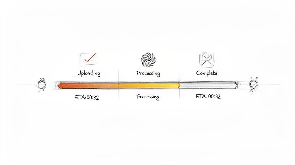
The first of Jakob Nielsen's ten foundational ux design heuristics, Visibility of System Status, dictates that a system should always keep users informed about what is going on. Through appropriate and timely feedback, a design communicates its current state, reducing user uncertainty, building trust, and empowering users to make confident decisions. When users understand the system's response to their actions-be it loading, processing, or completing a task-they feel in control.
This principle is critical for processes that aren't instantaneous. Ambiguity creates anxiety. Did my click register? Is the app frozen? Providing immediate and clear feedback answers these questions before they are even asked.
Strategic Analysis of Examples
Strong system status visibility is evident across many successful platforms.
Design Case: Domino's Pizza Tracker. Perhaps one of the most famous real-world examples, the Domino's Pizza Tracker shows the entire process from order placed, to prep, baking, quality check, and out for delivery. This detailed, real-time feedback reduces customer anxiety ("Where is my pizza?") and turns a waiting period into an engaging experience.
LinkedIn: When a user uploads a video, a dialogue box appears showing a progress bar and the message 'Processing your upload...'. This feedback is crucial; it confirms the upload has started and provides a sense of progression, preventing the user from navigating away or re-uploading prematurely.
Slack: The application provides multiple layers of feedback. Typing indicators ('...') show that a colleague is actively composing a message, while delivery status icons confirm a message has been sent and received. This real-time information manages expectations and facilitates smoother, more natural conversation flow.
Uxia: For complex operations like generating AI-powered tests or analysing user transcripts, Uxia provides multi-stage progress indicators. Users can clearly see when their data is being uploaded, when the AI is processing the analysis, and when the results are ready. This transparency demystifies the "black box" of AI processing and keeps users engaged.
Key Insight: Effective status feedback goes beyond a simple loading spinner. It should be contextual, informative, and, where possible, set expectations about duration.
Actionable Takeaways
To apply this heuristic effectively in your designs:
Practical Recommendation: For any action taking more than a few seconds, use progress bars, spinners with text, or multi-step checklists. For a platform like Uxia, this is essential when running synthetic user tests, making it clear that the system is working on the user's behalf.
Show Progress on Long Operations: For multi-step processes like e-commerce checkouts or software installations, use a visual stepper (e.g., "Step 1: Shipping > Step 2: Payment > Step 3: Confirmation").
Provide Time Estimates: Whenever possible, give an estimated time to completion. Even a rough estimate is better than none, as it helps users decide whether to wait or to perform another task.
2. Match Between System and the Real World
The second of the core ux design heuristics is the Match Between the System and the Real World. This principle states that a design should speak the user’s language, using words, concepts, and conventions that are familiar to them. Instead of system-oriented jargon, the interface should follow real-world conventions, making information appear in a natural and logical order that aligns with the user's mental model.
When a system uses terminology and concepts that users already understand, it lowers the cognitive load and makes the experience feel intuitive. This builds user confidence and reduces the learning curve, allowing people to achieve their goals faster without needing to decipher a foreign language.
Strategic Analysis of Examples
Successful products master this by deeply understanding their audience's vocabulary and workflows.
Design Case: Apple's Digital "Trash Can." The concept of dragging a file to a "Trash" or "Recycle Bin" icon to delete it directly mimics the real-world action of throwing away a physical piece of paper. This metaphor, first popularised by Apple, is so universally understood that it requires no explanation. It's a perfect match between a digital action and a real-world concept.
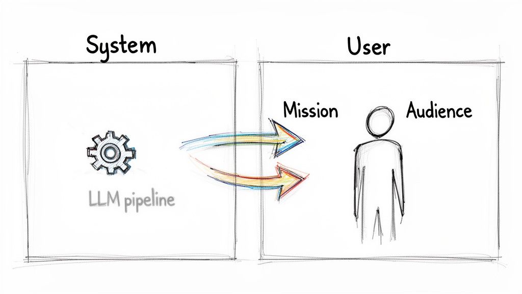
Uxia: The platform intentionally avoids technical AI terms. It uses 'synthetic testers' instead of 'AI agents' or 'LLM instances', which immediately connects with UX researchers familiar with traditional user testing. Similarly, user goals are framed as 'missions' rather than 'prompts' or 'queries', and usability problems are called 'friction points' instead of 'error codes', directly mirroring the language of product teams.
Figma: By calling its core design spaces 'Frames' rather than the traditional 'Artboards', Figma aligned itself with web development terminology. This subtle shift made the tool more intuitive for designers who work closely with engineers, creating a common language that simplifies the design-to-development handoff.
Notion: The application organises information using 'Pages' and 'Databases'. These are concepts that knowledge workers are deeply familiar with from word processors and spreadsheets. This familiar structure allows new users to immediately grasp how to build and connect information within the tool.
Key Insight: The goal is not to dumb down the system but to translate its complexity into a language the user fluently speaks. This requires empathy and research, not just clever copywriting.
Actionable Takeaways
To apply this heuristic and improve your product's usability:
Practical Recommendation: Conduct user research and listen to how your target audience describes their tasks, goals, and pain points. Create a small glossary of user-centric terms and use it consistently across your product.
Avoid Internal Jargon: What makes sense to your development team (e.g., 'API call failed') will likely confuse your users. Translate technical statuses into user-centric terms (e.g., 'Could not connect to your account').
Use Industry-Standard Language: In a platform like Uxia, using established research terms like 'unmoderated testing', 'usability issues', and 'heatmaps' builds credibility and ensures the tool integrates smoothly into existing workflows.
3. User Control and Freedom
The third principle in Jakob Nielsen's set of ux design heuristics, User Control and Freedom, addresses a fundamental human need: the ability to reverse a mistake. Users often perform actions by accident and require a clearly marked "emergency exit" to leave an unwanted state without going through an extended dialogue. Effective designs offer undo and redo functions, support cancellation of processes, and empower users to feel in charge, not trapped.
This heuristic is about building a forgiving system. When users know they can easily back out of a process or undo an error, they are more likely to explore and engage with the platform confidently. This safety net reduces anxiety and encourages learning and discovery.
Strategic Analysis of Examples
Providing robust control mechanisms is a hallmark of user-centric design.
Design Case: Gmail's "Undo Send." This is a classic example. After sending an email, a small pop-up gives the user a brief window (typically 5-30 seconds) to recall the message. This simple feature has saved countless users from the consequences of a premature or mistaken send, directly offering a high-stakes "emergency exit." It provides immense psychological safety.
Figma: The platform's unlimited undo/redo history (Ctrl+Z / Cmd+Z) is central to its workflow. Designers can iterate rapidly, experiment with bold ideas, and revert changes without fear of losing work. This fosters a creative, uninhibited environment that is essential for design exploration.
Uxia: When generating a complex AI-powered test, users might realise they need to adjust the audience parameters. Uxia allows users to pause the test generation process, modify settings like demographics or user personas, and then resume. This prevents wasted time and resources, giving users fine-grained control over even complex, multi-stage operations.
Key Insight: True user control isn't just about 'undo'. It's about providing exits, modification capabilities, and clear paths back from any point in a user journey.
Actionable Takeaways
To integrate this heuristic into your work:
Practical Recommendation: For any multi-step form or process, ensure there is a clear "Cancel" or "Back" button on every step. Users should never feel trapped in a workflow they entered by mistake.
Implement Undo/Redo: For any action involving content creation or modification, provide easy-to-access undo and redo functions. Keyboard shortcuts (Ctrl+Z) are a must for power users. Meticulously mapping these exits in your user flow diagrams can help identify potential friction points.
Make Recovery Frictionless: For a platform like Uxia, this means allowing users to pause test runs, maintain an activity history to review changes, and recover from errors with minimal effort. Use confirmation dialogues sparingly, reserving them only for truly destructive and irreversible actions.
4. Error Prevention and Recovery
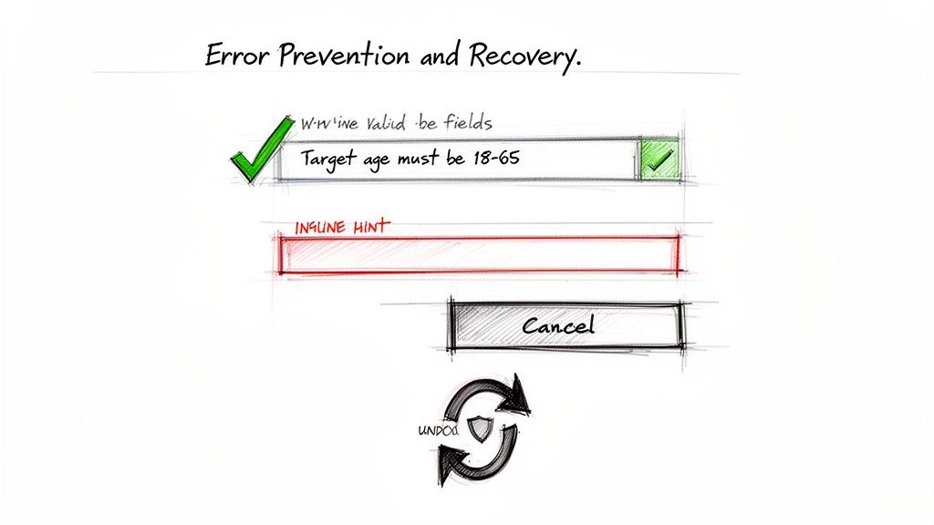
A core principle of thoughtful ux design heuristics is that it's far better to prevent problems from occurring in the first place than to rely on good error messages. This heuristic, Error Prevention and Recovery, champions designs that proactively eliminate conditions that lead to errors. By offering constraints, confirmations, and clear guidance, a system can guide users toward success and away from frustration.
When errors are unavoidable, the recovery process must be just as well-designed. Messages should be precise, written in plain language, and offer a constructive path forward, turning a potential dead-end into a simple course correction.
Strategic Analysis of Examples
Robust error prevention is a hallmark of user-centric design, often working invisibly to ensure a smooth experience.
Design Case: Stripe's Real-time Form Validation. The payment platform excels at this. As a user types their credit card number, Stripe provides immediate visual feedback, identifying the card type (Visa, Mastercard, etc.) and flagging an invalid number format before the user even attempts to submit the form. This prevents a failed transaction and avoids the confusion of a generic 'payment failed' message.
Notion: To prevent accidental data loss, Notion requires explicit confirmation before a user can delete a high-stakes item like a database or an entire workspace. The confirmation dialogue uses strong visual cues and requires the user to type the name of the item, making the action deliberate and preventing a costly mistake.
Uxia: Before a user can launch a synthetic user test, the platform validates the test configuration. For instance, it prevents a test from starting if a clear mission or objective hasn't been defined. This constraint ensures that the AI-powered analysis is based on a solid foundation, preventing wasted processing time and delivering more accurate, relevant insights.
Key Insight: The best error message is no error message. Proactive design that constrains choices and validates input in real-time is the most effective form of error handling.
Actionable Takeaways
To apply this heuristic and build more resilient designs:
Practical Recommendation: Use inline validation to check data as users enter it in forms. Instead of waiting for a submission to show an error, provide immediate feedback next to the problematic field, such as 'Email format is incorrect'. This is a simple but powerful way to prevent user frustration.
Use Constraints to Limit Errors: Where possible, replace free-text fields with constrained inputs like dropdown menus, sliders, or steppers. For a platform like Uxia, this means using predefined demographic profiles to prevent ambiguous or invalid user persona definitions.
Write Helpful Error Messages: When an error must occur, be specific. Instead of 'Invalid input,' write 'Target age must be between 18 and 65.' Provide constructive solutions or suggestions to guide the user to a successful outcome.
5. Aesthetic and Minimalist Design
This core principle from Jakob Nielsen's ux design heuristics states that interfaces should not contain information which is irrelevant or rarely needed. Every extra unit of information in a dialogue competes with the relevant units of information and diminishes their relative visibility. This isn't just about making things look "clean"; it's a strategic approach to reduce cognitive load and help users achieve their goals more efficiently.
A minimalist aesthetic focuses the user's attention on the essential, ensuring that the visual design supports the content and functionality, rather than overpowering it. A cluttered interface creates noise, making it harder for users to find what they need and complete tasks.
Strategic Analysis of Examples
Minimalism is about intentionality, ensuring every element serves a purpose.
Design Case: Google's Homepage. The Google search homepage is the ultimate example of minimalist design. It consists of a logo, a search bar, and a couple of buttons. There are no distractions. Every pixel is dedicated to the user's primary goal: searching for information. This radical simplicity has been a core part of its brand identity and usability for decades.
Apple: The product pages on Apple's website are a masterclass in this heuristic. They use generous whitespace, high-quality product imagery, and concise, focused messaging. There are no distracting sidebars or pop-ups, allowing the user to concentrate entirely on understanding the product's value.
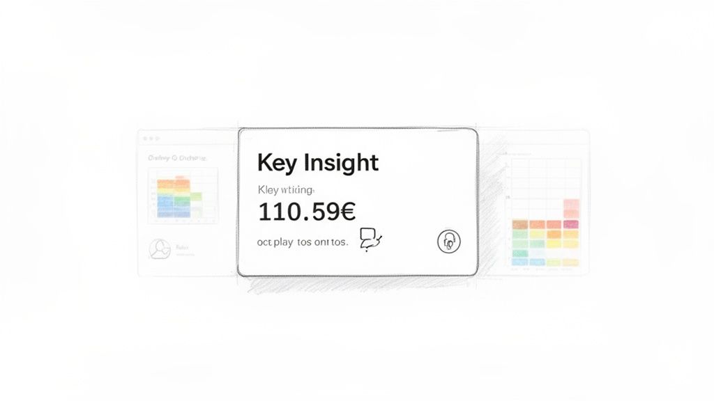
Uxia: The platform's dashboard embodies this principle by presenting test results and key metrics without visual clutter. Instead of overwhelming users with every data point at once, it highlights actionable findings and patterns. The clean layout guides researchers directly to the most important insights, making the analysis process faster and more focused.
Key Insight: Minimalism is not the absence of design, but the discipline of including only what is necessary. It's about signal-to-noise ratio; a great minimalist design maximises the signal (useful content) and minimises the noise (distracting elements).
Actionable Takeaways
To apply this heuristic effectively in your designs:
Practical Recommendation: For every element on the screen, ask: "Does this directly help the user achieve their goal on this page?". If the answer is no, or "maybe," consider removing it or moving it to a secondary screen. On a platform like Uxia, this means prioritising research insights over decorative graphics.
Use Whitespace Strategically: Treat empty space as an active design element. Use it to group related items, create separation between distinct sections, and guide the user's eye through the interface.
Establish Clear Visual Hierarchy: Use size, colour, contrast, and placement-not just more elements-to direct attention. Key actions and information should stand out, while secondary options should be less prominent. For Uxia, this means making key usability issues and findings highly visible, with supporting data accessible in secondary views.
6. Recognition Rather Than Recall
The sixth of Jakob Nielsen's core ux design heuristics, Recognition Rather than Recall, focuses on minimising the user's memory load. The principle states that it's far easier for humans to recognise information when they see it than to recall it from memory. A successful design makes objects, actions, and options visible and easily accessible, preventing users from having to remember information from one part of the interface to another.
This heuristic is about creating a cognitive shortcut. Instead of forcing users to remember complex commands, previous settings, or past interactions, the system should present this information contextually. This reduces mental strain, speeds up task completion, and makes the interface feel more intuitive.
Strategic Analysis of Examples
Good interfaces act as an external memory, presenting relevant options exactly when needed.
Design Case: Amazon's "Recently Viewed" Section. As you browse Amazon, the site keeps a running list of items you've looked at. When you return later, you don't have to recall the exact product name. You can simply recognise it from the visual list. This powerful feature drives re-engagement and sales by reducing the user's memory load.
Google Search: As a user begins to type a query, Google immediately shows a dropdown list of previous searches and popular suggestions. This is a classic example of recognition; users can simply select a past query rather than having to recall and re-type it perfectly.
Uxia: When setting up a new synthetic user test, Uxia presents a user's previous test configurations, such as missions and demographic profiles, as templates. Instead of recalling the exact parameters of a successful test from weeks ago, the user can recognise the configuration from a list and reuse it, drastically speeding up the test creation process.
Key Insight: A design that prioritises recognition feels like a helpful assistant that anticipates your needs, rather than a demanding tool that tests your memory.
Actionable Takeaways
To apply this heuristic effectively in your designs:
Practical Recommendation: In any workflow where users might repeat an action, show a list of "Recent" or "Frequently Used" items. This could be recently edited documents, recently contacted people, or recently used filters.
Create Smart Defaults and Templates: Surface frequently used options or configurations based on past user actions. For a platform like Uxia, showing past demographic profiles as reference points for a new test helps users make informed choices without starting from scratch.
Use Visual Cues and Autocomplete: Employ icons, labels, and autocomplete suggestions to make options instantly recognisable. When setting up a test in Uxia, providing autocomplete for missions or user personas can guide the user and reduce cognitive load.
7. Flexibility and Efficiency of Use
The seventh of Jakob Nielsen's core ux design heuristics, Flexibility and Efficiency of Use, advises that systems should cater to both novice and expert users. While beginners need a clear, guided path, experienced users should be able to accelerate their interactions through shortcuts and customisation. The goal is to create a design that is approachable for first-time use but allows for increased speed and productivity as a user becomes more proficient.
A system that balances these needs allows users to progress from novice to expert without hitting a ceiling. It respects the user's time and investment in learning the product by rewarding them with faster workflows.
Strategic Analysis of Examples
Efficient design empowers users by providing multiple ways to accomplish tasks, accommodating different levels of experience.
Design Case: Slack's Slash Commands. The platform masterfully serves both user types. A new user can easily send a message by clicking buttons and navigating menus. An expert, however, can use slash commands (e.g.,
/remind,/giphy,/poll) and keyboard shortcuts to perform actions without ever touching their mouse, dramatically increasing their efficiency.Jira: Jira is known for its depth, which can be intimidating for novices. However, it offers significant accelerators for power users, including keyboard shortcuts for nearly every action, saved filters (JQL) for complex queries, and automation rules that can manage issue transitions without manual intervention.
Uxia: The platform is designed for quick, simple test creation for new users. For power users and teams running frequent studies, it provides efficiency accelerators. Features like batch test creation, saved audience configurations, and templates for common test types allow experienced researchers to launch multiple test variations in a fraction of the time.
Key Insight: True flexibility isn't about adding more features. It's about providing alternative, faster paths for users who have moved beyond the basics, turning routine tasks into single-action commands.
Actionable Takeaways
To apply this heuristic and improve efficiency in your designs:
Practical Recommendation: Implement keyboard shortcuts for the top 3-5 most frequent actions in your application. For a platform like Uxia, this could be "Create New Test" or "Export Results". Make these shortcuts discoverable via tooltips or a help menu.
Allow for Customisation: Let users save their preferences. This could be creating templates for common test types, saving preferred audience configurations for quick reuse, or customising a dashboard view.
Support Batch Operations: For tasks that are often repeated, provide a way to perform them in bulk. In Uxia, this means supporting the creation of multiple test variations at once, which is a massive time-saver for teams doing A/B or multivariate testing.
8. Help and Documentation
The eighth of Jakob Nielsen's ux design heuristics, Help and Documentation, acknowledges that while an ideal system is usable without guidance, support is often necessary. When documentation is required, it must be easy to search, focused on user tasks, and present concrete steps. This information should be concise and contextually available, helping users overcome hurdles without disrupting their workflow.
Good documentation acts as a safety net, empowering users to self-serve and find solutions independently. It's not a substitute for intuitive design but a critical supplement that builds user confidence and reduces frustration, especially for complex features or new users.
Strategic Analysis of Examples
Effective help and documentation is integrated directly into the user experience, providing assistance at the moment of need.
Design Case: Notion's Template Gallery. The platform excels at onboarding through documentation. Its template gallery and integrated tutorial videos show users how to achieve specific outcomes, like creating a project tracker or a content calendar. This is documentation disguised as inspiration. Instead of reading a manual, users learn by doing with pre-built, functional examples.
Slack: Its Help Centre is a model of clarity, with searchable articles and guides for every feature. Contextual help is also available; typing
/remindin the message box prompts a tooltip explaining the command's syntax, guiding the user through the action without forcing them to leave the application.Uxia: For a platform dealing with sophisticated processes like AI-driven usability testing, contextual help is vital. Uxia places in-app tooltips next to complex settings, such as explaining how to define audience demographics or set up test missions. This prevents user error and clarifies the impact of each choice on the final test results.
Key Insight: The best documentation is proactive and contextual. It anticipates user questions and delivers answers within the workflow, rather than forcing users to hunt for a separate help manual.
Actionable Takeaways
To apply this heuristic effectively in your designs:
Practical Recommendation: Use info icons and tooltips next to features that might cause confusion. For a platform like Uxia, this is key for explaining technical terms like 'usability score' or 'sentiment analysis' directly within the results dashboard. This provides "just-in-time" help.
Make Documentation Searchable: Implement a robust search function within your help centre. Users should be able to find answers quickly by typing keywords related to their problem.
Create Task-Oriented Guides: Organise documentation around user goals, not feature lists. Create articles like 'How to Set Up Your First Test' or 'Interpreting Heatmaps' that provide clear, step-by-step instructions with screenshots.
9. Accessibility and Inclusive Design
A core tenet of modern ux design heuristics, Accessibility and Inclusive Design ensures that products are usable by people with a wide range of abilities and disabilities. This principle moves beyond mere compliance to foster genuine inclusivity, considering visual, hearing, motor, and cognitive impairments. A truly accessible design means everyone, regardless of their physical or cognitive abilities, can perceive, understand, navigate, and interact with a system effectively.
This heuristic is not just an ethical imperative; it's a foundation for better design for all users. Features created for accessibility, like clear language and high-contrast visuals, often improve the experience for everyone. A critical aspect of inclusive design is adhering to standards that help avoid issues such as website accessibility lawsuits, ensuring that all users can access and interact with the system effectively.
Strategic Analysis of Examples
Leading platforms demonstrate that building for accessibility is a key business and design advantage.
Design Case: Microsoft's Xbox Adaptive Controller. While a hardware example, its design philosophy is pure accessibility. Microsoft co-designed a highly customisable controller with disability communities to allow gamers with limited mobility to play. This shows a deep commitment to inclusion beyond simple compliance, actively enabling participation.
Apple: The company's commitment is evident across its ecosystem. Features like VoiceOver (a screen reader), Dynamic Type (adjustable text size), and Switch Control are built directly into iOS and macOS. This integration makes accessibility a default part of the user experience, not an afterthought.
Uxia: For a platform centred on data visualisation, Uxia prioritises accessible research. Heatmaps and graphs include text descriptions and are designed with colourblind-safe palettes. This ensures that UX researchers with visual impairments can fully interpret results and derive the same powerful insights as any other user.
Key Insight: True accessibility is proactive, not reactive. It involves designing inclusively from the start, rather than retrofitting solutions later.
Actionable Takeaways
To integrate accessibility into your design workflow:
Practical Recommendation: Prioritise keyboard navigation. Try to navigate your entire site or application using only the 'Tab' and 'Enter' keys. If you get stuck or can't perform a key action, you've found a critical accessibility issue to fix.
Design for Screen Readers: Use semantic HTML (e.g.,
<nav>,<main>,<button>) and ARIA labels to provide context for screen readers like NVDA or JAWS. This allows users with visual impairments to understand the structure and purpose of your content.Test with Automated Tools and Real Users: Use an accessibility web checker to catch common issues like contrast errors. For deeper insights, learn more about using an accessibility web checker. However, always supplement automated checks with testing by people with actual disabilities to uncover real-world usability barriers.
Go Beyond Colour: Do not rely on colour alone to convey information. Use icons, text labels, patterns, and other visual cues to ensure that critical information is accessible to users who are colourblind or have low vision.
10. Design for Context and Progressive Disclosure
The final ux design heuristic on our list centres on managing complexity by showing only what is necessary for the user's immediate task. Design for Context and Progressive Disclosure is the principle of revealing information and options gradually. By presenting a simple, focused interface initially and allowing users to access more advanced features on demand, designs can reduce cognitive load, prevent overwhelm, and guide users more effectively.
This approach respects the user's attention, making a product feel more approachable for novices while still offering the depth required by experts. It's not about hiding features, but about creating a clear information hierarchy that prioritises the most common user needs first.
Strategic Analysis of Examples
Progressive disclosure is a hallmark of clean, powerful software that balances simplicity with capability.
Design Case: Figma's Design Panel. The panel on the right shows fundamental properties like position, dimensions, and fill colour by default. More specific settings like strokes, effects, and export options are organised into collapsible sections (e.g., "Effects," "Export"). This allows designers to focus on the core attributes of an element without being distracted by a sea of less-frequently used controls.
Stripe: When a user fills out a payment form, Stripe often asks only for the essential card details first. Options for adding a separate billing address or saving payment information for future use are typically presented as secondary actions or revealed only after the primary information is entered. This simplifies the critical path to payment.
Uxia: When setting up a new test, Uxia guides users through a simple, core workflow: define the task, select the user panel, and launch. Advanced options, such as fine-tuning demographic profiles or customising analysis parameters, are neatly tucked away under an "Advanced Options" toggle. This ensures new users can start testing in minutes, while experienced researchers can easily access the powerful customisation tools they need without cluttering the main flow.
Key Insight: Progressive disclosure is an organisational tool. It creates a clear path for the majority of users while leaving signposted doors open for those who need to explore further.
Actionable Takeaways
To effectively apply this heuristic in your designs:
Practical Recommendation: Apply the "20% rule." Identify the 20% of features that 80% of your users will need for their primary task. Make these features front and centre. Everything else can be placed in a secondary, clearly labelled location like an "Advanced Settings" menu.
Use Clear Signalling: Don't hide advanced options completely. Use explicit labels like 'Advanced Settings', 'Show more', or clear icons (e.g., a downward arrow) to indicate that more functionality is available. For Uxia, this means ensuring the "Advanced Options" link is visible and logically placed.
Group and Collapse: Organise related secondary options into collapsible sections or accordions. For example, in Slack's notification settings, broad categories are visible, and clicking one expands to reveal granular controls. This keeps the initial view clean and manageable.
10-Point UX Heuristics Comparison
Heuristic | Implementation Complexity 🔄 | Resource Requirements ⚡ | Expected Outcomes 📊 | Ideal Use Cases ⭐ | Key Advantages 💡 |
|---|---|---|---|---|---|
Visibility of System Status | Medium — needs consistent, real-time feedback across async flows | Medium — frontend work, telemetry, ETA logic | Reduced uncertainty; fewer support tickets; increased trust | Long-running AI tasks, uploads, test runs | Clear progress indicators and timely feedback reduce anxiety |
Match Between System and Real World | Medium — requires user research and copy alignment | Low–Medium — content design and user interviews | Faster adoption; fewer misunderstandings | Professional audiences (UX researchers, product teams) | Uses familiar language and metaphors to align mental models |
User Control and Freedom | High — undo/redo, cancelable flows, state management | High — storage for history, robust rollback logic | Increased confidence; fewer destructive errors; exploration encouraged | Iterative workflows, experiment-heavy teams | Enables safe experimentation and quick recovery from mistakes |
Error Prevention and Recovery | Medium–High — validation, confirmations, helpful messaging | Medium — validation rules, UX writing, testing | Fewer failed runs; improved data quality; lower support load | High-cost operations (test launches, payments) | Prevents costly mistakes and provides actionable recovery steps |
Aesthetic and Minimalist Design | Low–Medium — design discipline and content prioritization | Low–Medium — design time and reviews | Improved focus; faster information processing; perceived professionalism | Dashboards, results presentation, executive summaries | Reduces cognitive load and highlights critical insights |
Recognition Rather Than Recall | Medium — surface history, templates, contextual cues | Medium — storage, UI components, suggestions | Faster task completion; fewer errors; better onboarding | Repeated tasks, template-driven workflows | Lowers memory load by surfacing prior configurations and context |
Flexibility and Efficiency of Use | High — shortcuts, batch ops, API surfaces | High — engineering, docs, automation support | Higher productivity for power users; scalable workflows | Enterprise teams, CI/CD integration, power users | Enables advanced users to optimize and automate repeatable work |
Help and Documentation | Low–Medium — create searchable, task-focused guides | Medium — content creation, videos, maintenance | Reduced support; smoother onboarding; self-service learning | Complex or evolving features, multi-role platforms | Provides role-specific guidance and reduces support dependency |
Accessibility and Inclusive Design | High — WCAG compliance, keyboard/screen-reader support | High — specialized testing, design/dev effort | Broader reach; legal compliance; improved usability for all | Public-facing products, diverse-user teams, regulated sectors | Ensures equal access and often improves overall design quality |
Design for Context & Progressive Disclosure | Medium — contextual logic and layered UIs | Medium — conditional UI, content hierarchy | Lower cognitive load; better onboarding for novices | Mixed-expertise audiences, complex configuration flows | Keeps UI simple initially while exposing advanced options on demand |
From Theory to Practice: Integrating Heuristics into Your Workflow
We have journeyed through the core principles that form the foundation of great user experiences. From ensuring system status is always visible to designing with accessibility at the forefront, these ten UX design heuristics are not isolated rules. Instead, they function as an interconnected system of checks and balances, guiding designers toward creating products that are clear, efficient, and enjoyable to use. The real challenge, however, isn't memorising the definition of 'Recognition Rather Than Recall' or 'Aesthetic and Minimalist Design'. The true test is applying these principles consistently and objectively, especially when faced with tight deadlines, conflicting stakeholder feedback, and complex technical constraints.
The gap between knowing the theory and executing it flawlessly is where many design processes falter. A heuristic evaluation, conducted manually by a team of experts, is a powerful diagnostic tool. It offers a structured way to audit an interface against these established usability principles. However, organising these reviews, compiling the findings, and debating the severity of each issue can be a slow, resource-intensive process. In fast-moving startups and scaleups, this traditional approach can feel like a bottleneck rather than a catalyst for improvement. The critical question becomes: how can we get the deep insights of a heuristic review without sacrificing speed?
Bridging the Gap with Accelerated Heuristic Analysis
This is where modern tooling provides a significant advantage, shifting the focus from manual auditing to automated analysis. Imagine being able to validate your designs against core usability principles in minutes, not days. This is the new reality for product teams who integrate synthetic user testing into their workflows. Instead of waiting for a formal review session, designers can get immediate, data-driven feedback. A practical recommendation is to use tools like Uxia to run a quick heuristic check before every design handoff.
For example, platforms like Uxia are designed specifically to close this gap. You can upload a design, whether it's a high-fidelity prototype or a live URL, and its AI-powered synthetic testers automatically assess the interface. These digital users simulate real human interaction and evaluate your design against many of the UX design heuristics we've discussed:
Clarity and Understanding: It flags confusing labels, ambiguous calls-to-action, and jargon that violates the "Match Between System and the Real World" principle.
Error Prevention and Friction: It identifies potential dead ends, confusing navigation paths, and form fields that are prone to user error before a single real user touches the interface.
Accessibility: It automatically checks for common accessibility issues, like poor colour contrast or missing alt text, helping you build more inclusive products from the start.
This approach doesn't replace the need for deep human insight or formal methods like usability testing with real people. Instead, it acts as a powerful, preliminary quality gate. It allows you to catch and fix dozens of low-hanging usability problems almost instantly, freeing up your team to focus on solving more complex, strategic design challenges during qualitative research sessions.
By integrating automated heuristic analysis, you are not just learning about UX design heuristics; you are embedding them directly into your daily design and development cycle. This creates a continuous feedback loop that raises the baseline quality of everything you ship. It transforms heuristics from a theoretical checklist into an active, practical tool for creating better products faster. The goal is to stop just reading about good design and start consistently delivering it.
Ready to move beyond theory? Stop guessing and start testing. Uxia allows you to run automated heuristic and usability analysis on your designs in minutes, giving you actionable feedback to improve your user experience instantly. Sign up for free and test your first design with Uxia today.