Usability Testing Scenario Template: A How-To Guide
Create a powerful usability testing scenario template with our step-by-step guide. Learn to write effective tasks, set success metrics, and get a free template.

You can usually tell when a test is going off the rails in the first five minutes. A participant pauses, rereads the prompt, and asks a question that should never be necessary: “What exactly am I supposed to do here?” Another person completes the task, but only because the wording practically told them which control to click. By the end of the session, the notes are full, the confidence is low, and the team still can't tell whether the design is weak or the task was.
That failure rarely comes from moderation alone. It comes from a weak usability testing scenario template.
Teams often treat the template like admin overhead, something to fill out after the main thinking is done. In practice, the template is the mechanism that forces rigor before anyone touches the prototype. It determines whether you get noisy anecdotes or evidence you can act on.
From Testing Chaos to Actionable Clarity
A rushed test usually looks organized on the surface. The prototype is ready. The participants are booked. The discussion guide exists in some form. Then the sessions start, and the cracks show.
One participant takes a task at face value and heads in a direction no real user would choose. Another interprets the same prompt completely differently. A third asks for clarification, which means the moderator has already influenced the outcome. What looked like “mixed feedback” is often just inconsistent task design.
That’s why a strong usability testing scenario template matters. It doesn’t just store tasks. It removes ambiguity before ambiguity can contaminate the study.
What breaks when the template is weak
The most common failure mode is simple. Teams write task prompts from the interface’s point of view instead of the user’s point of view. They use labels from the UI, reveal the path, or skip the authentic context that gives the task meaning. The result is fake fluency. Users appear successful because the prompt has done half the work.
A second problem is missing study rules. If the template doesn’t specify who qualifies, what success looks like, and how notes should be captured, each session becomes a slightly different experiment. You can’t compare outcomes cleanly because the team never aligned on what was being measured.
A messy test often starts long before the first participant joins. It starts when the team accepts a vague task as “good enough.”
There’s also a practical downstream effect. If you're evaluating usability and accessibility in parallel, a good scenario template prevents you from discovering issues too late. It helps to pair scenario work with an early pass through an accessibility checker so obvious barriers don't distort task performance during the study.
What the template changes
A solid template creates one source of truth. It makes the team state the product context, define the participant profile, write realistic tasks, and agree on what counts as success before testing begins. That discipline is what turns a session from improvisation into research.
When teams do this well, contradictions usually shrink. Not because users suddenly agree on everything, but because the test has stopped introducing avoidable noise.
Anatomy of a Powerful Scenario Template
A strong template is part brief, part test plan, and part scoring model. If it only contains a list of tasks, it’s incomplete.
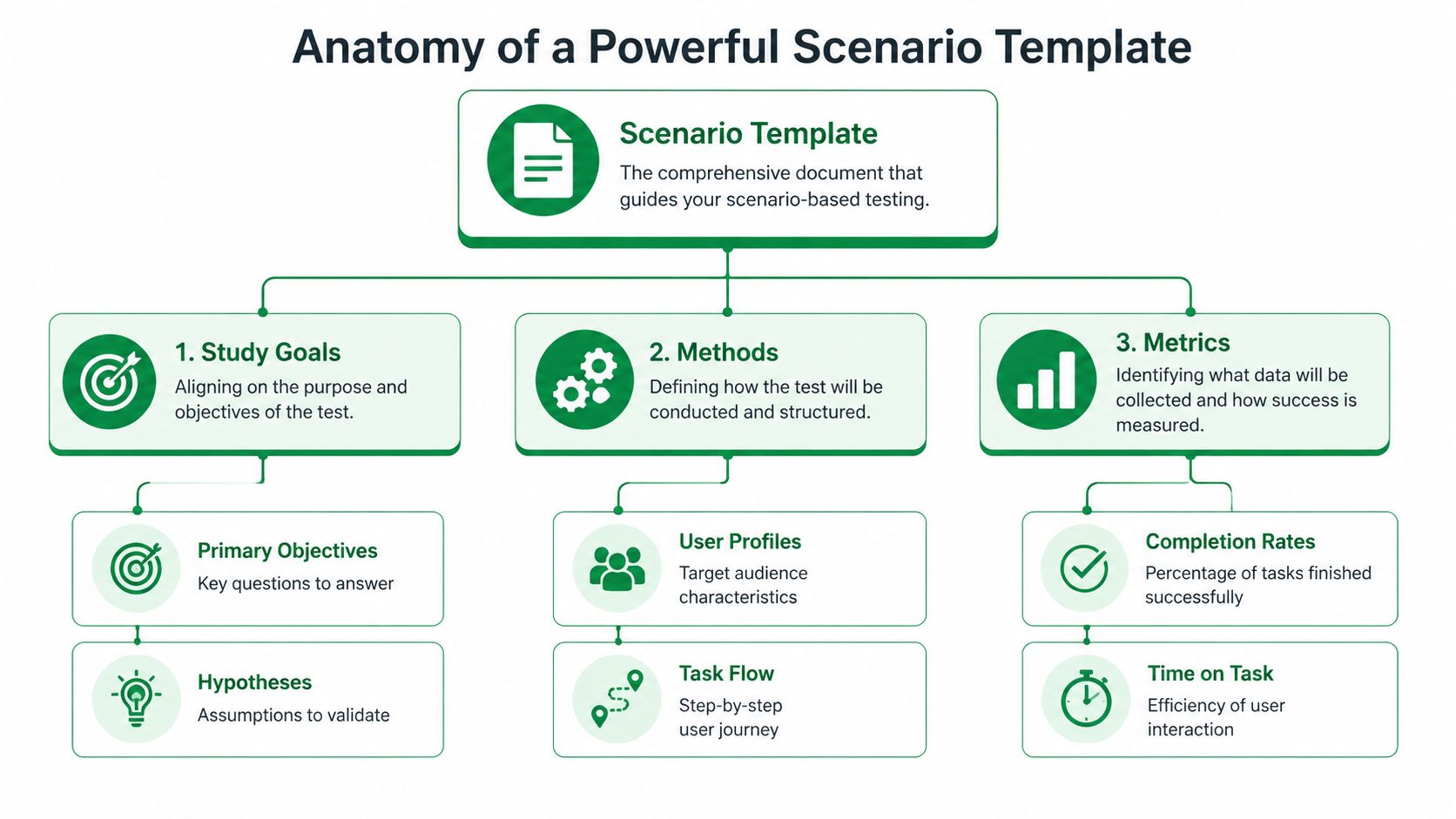
Start with study alignment
The first block should anchor the study itself. That means:
Product and feature context: What flow, feature, or journey is under review?
Research questions: What does the team need to learn?
Known risks or assumptions: Where do you expect friction, confusion, or trust issues?
Testing environment: Is this moderated, unmoderated, live product, Figma prototype, or another setup?
This sounds basic, but it prevents a common problem. Designers think they’re testing task clarity. Product managers think they’re validating conversion. Researchers think they’re diagnosing navigation. One template should make those priorities explicit.
Define the participant with enough precision
The participant section needs more than demographics. It should include relevant behavior and familiarity. If you’re testing onboarding for a SaaS tool, prior exposure to similar products matters more than broad age bands. If you’re testing an ecommerce checkout, purchase habits and device context can matter more than job title.
Include these fields directly in the template:
Target user type
Relevant behaviors or experience
Exclusions
Device or platform expectations
Any context participants need before starting
A team working on ecommerce homepage redesigns, for example, may also want to ground tasks in proven homepage conversion strategies so scenarios reflect actual commercial intent rather than generic browsing.
Add the non-negotiable metrics block
A mature usability testing scenario template includes metrics before the test starts, not after. Standard components often include task success rate, error rate, time on task, and the System Usability Scale. The average SUS score across products is 68, which gives teams a benchmark for interpreting results, according to Maze’s usability testing template guide.
That matters because it shifts the study away from “users seemed confused” and toward measurable patterns.
Practical rule: If a template doesn't specify how success, failure, hesitation, and error will be logged, the analysis will drift.
The minimum structure I’d expect
A reliable template usually contains these sections:
Template section | What belongs there |
|---|---|
Study overview | Product area, objective, scope, environment |
Participant profile | User type, behaviors, exclusions, device context |
Task scenarios | Goal-based prompts, constraints, order, notes |
Success definition | Pass or fail criteria for each task |
Observation fields | Errors, hesitations, quotes, workarounds |
Metrics | Task success rate, time on task, error rate, SUS |
Analysis frame | Pattern logging, severity notes, recommendations |
If your current template can’t answer “why are we testing this, with whom, under what conditions, and how will we judge the outcome,” it’s not a strong research instrument yet.
Crafting Actionable and Unbiased Task Scenarios
Most bad usability tests don’t fail because the prototype is unusable. They fail because the tasks are.
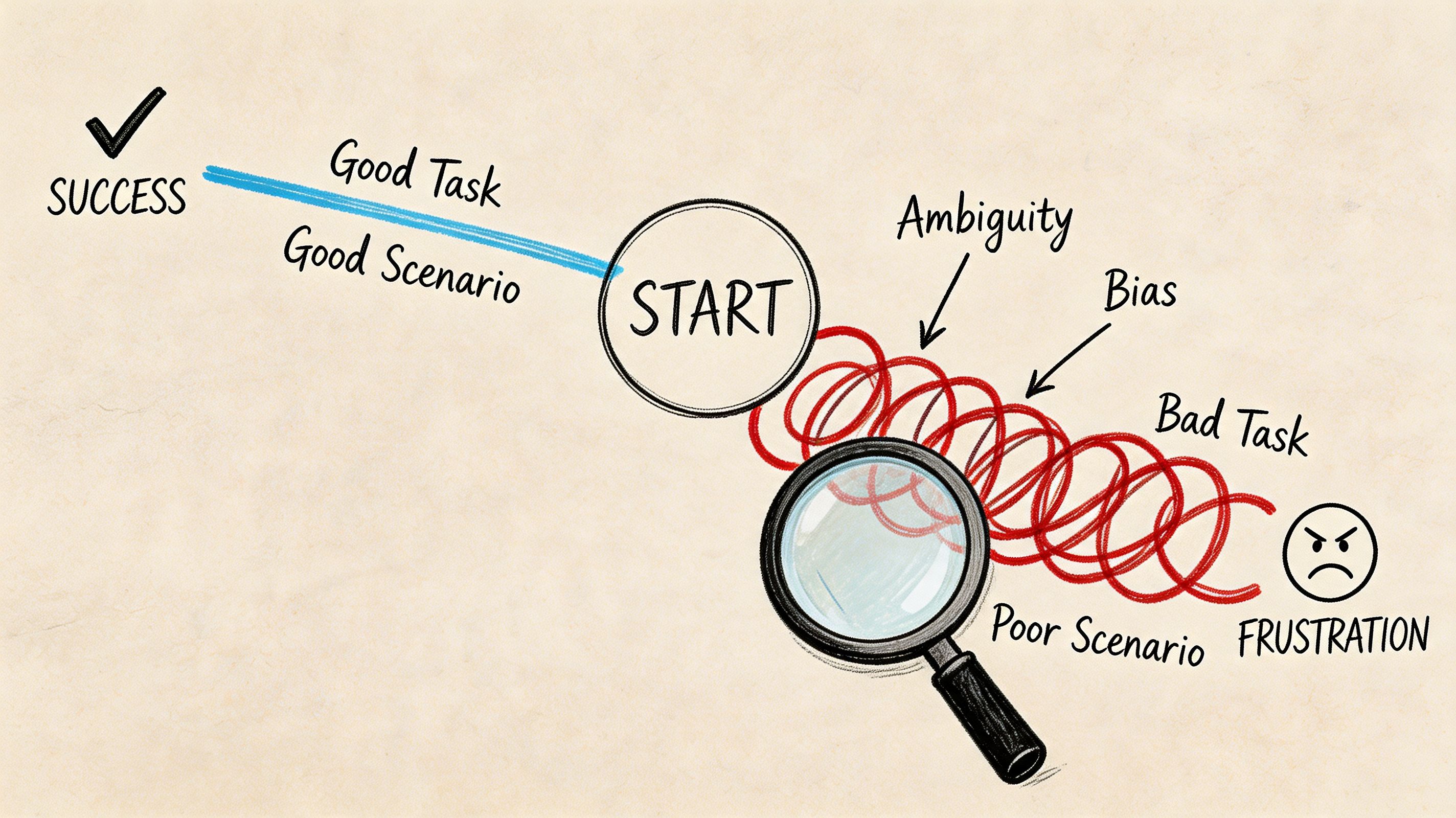
When a prompt says “Click the red button to sign up,” you’re not testing whether the design communicates the path. You’re testing whether the participant can follow instructions. That’s a different exercise.
Write for user intent, not interface obedience
Effective task scenarios should be realistic, encourage action, and avoid revealing how to use the interface. Nielsen Norman Group illustrates this with a travel example: instead of a generic instruction, a stronger prompt is, “You're planning a vacation to New York City, March 3 − March 14. You need to buy both airfare and hotel. Go to the [website] and see who has the best deals,” as explained in their article on task scenarios for usability testing.
That principle is foundational because it changes participant behavior. Real context produces real choices.
Better prompts usually have these traits
They start with a believable situation: Give the participant a reason to act.
They describe the outcome, not the clicks: Focus on what they need to achieve.
They avoid UI labels when possible: Don’t preload the answer.
They remove jargon: Internal product language contaminates the task.
They fit the user type: A first-time user and an expert should not get the same framing.
Here’s the difference in practice:
Weak task | Stronger task |
|---|---|
Click the pricing tab and choose the Pro plan | Your team needs collaboration features for a new project. Find a plan that would support that need |
Use the filter menu to export transaction history | You need a copy of your recent transaction history for reporting. Try to get it out of the product |
Tap forgot password and reset your login | You can’t remember your password and need to access your account today |
Why wording quality affects data quality
A leading task inflates apparent usability because it removes the need to interpret labels, information hierarchy, and navigation cues. That’s exactly the material you’re supposed to be testing.
The same discipline shows up in good instructional writing. If your team struggles to write concise prompts without over-explaining, this guide for creating user-friendly documentation is a useful parallel reference. The goal isn't to turn tasks into tutorials. It's to write with enough clarity that participants know the objective without being handed the method.
This short walkthrough is worth watching because it shows how small wording shifts change participant behavior:
A quick stress test for every task
Before you approve a scenario, ask:
Would a real user ever have this goal?
Does the prompt expose the path too clearly?
Could two moderators read this differently?
Will failure tell us something useful about the design?
If the answer to that last question is no, rewrite it. A good task should produce signal whether the user succeeds or struggles.
Calibrating Scenarios for Different Product Contexts
One of the biggest mistakes in usability testing is assuming every prototype deserves the same task detail. It doesn’t.
Teams often write rich, highly specific scenarios for low-fidelity wireframes that can’t support realistic interaction. That mismatch creates confusion, and the confusion gets misread as product feedback. Maze calls out this paradox directly in its examples guide on prototype realism and early-stage usability testing.
Match the task to the maturity of the design
A wireframe, a clickable Figma prototype, and a near-production build support different kinds of questions. Your usability testing scenario template should reflect that.
Here’s the practical way to approach it:
Prototype state | Best scenario style | What you’re really testing |
|---|---|---|
Low-fidelity wireframe | Open-ended, expectation-based prompts | Information hierarchy, concept clarity, content expectations |
Mid-fidelity clickable prototype | Goal-oriented tasks with limited flow detail | Navigation, labels, path discovery, early interaction logic |
High-fidelity or functional prototype | Specific, realistic multi-step scenarios | End-to-end usability, efficiency, friction, trust, completion |
What good calibration looks like
For a rough wireframe, don’t ask someone to “find the best subscription option, compare features, and complete checkout.” The prototype likely can’t support that. A better prompt is, “You’re considering this product for your team. What would you expect to see on this page before deciding whether to continue?”
For a high-fidelity mobile flow, you can be far more specific because the interface can carry the task. Now it’s appropriate to test a realistic sequence with dependencies and edge cases.
Early-stage testing breaks when teams ask prototypes to do jobs they weren't built to do.
This issue gets sharper in asynchronous studies, where nobody is present to rescue an unclear prompt. If the task and prototype are mismatched, participants invent their own interpretation. The result looks like behavioral data, but it’s often just confusion.
Add a fidelity check to the template
Many teams don’t need a new research process. They need one extra field in the template:
Prototype fidelity
Interaction limits
Allowed assumptions
Scenario detail level
What feedback is in scope
That single addition changes how tasks are written. It also makes handoff cleaner when studies move into remote or asynchronous formats. If your team is running self-serve research, this guide to unmoderated user testing is a useful companion because task clarity matters even more when no moderator can intervene.
Calibration is not a nice-to-have. It’s what keeps early concept testing from generating false negatives and late-stage validation from staying too vague to be useful.
Defining and Measuring Task Success
Without predefined success criteria, teams end up debating impressions instead of reading evidence. One person says the task “felt easy.” Another says the participant was “probably fine.” Neither statement is reliable enough to guide design decisions.
The template should lock this down before testing starts.
Define success in behavior, not sentiment
For each task, write what success means in observable terms. Reaching the intended destination. Completing the flow. Doing it without hints. Avoiding a key error. Those rules should sit next to the scenario itself, not in a separate analysis doc nobody checks during the session.
Marker’s usability testing template guidance is useful here. It notes that a Task Success Rate below 70% indicates critical usability issues that require redesign, and that patterns seen in 3 out of 5 participants typically point to systemic issues rather than outliers, as described in its article on usability testing templates and benchmarks.
Use the metrics to separate noise from priority
Quantitative measures prove their worth. You’re not replacing observation. You’re giving it structure.
Usability Metric Benchmarks
Metric | Poor (<70%) | Good (70-90%) | Excellent (>90%) |
|---|---|---|---|
Task Success Rate | Critical usability concerns | Generally workable with room to improve | Strong completion performance |
That table is intentionally narrow. Not every metric fits the same threshold model. What matters is that your template specifies which measures apply to each task and how they’ll be interpreted.
Other fields worth defining in advance:
Error logging: What counts as an error versus a harmless detour?
Time on task: When does delay indicate confusion rather than normal reading?
Assist level: Was the participant independent, lightly prompted, or rescued?
Post-task rating: Optional, but useful if kept separate from behavioral outcomes.
SUS belongs in the template, not as an afterthought
If you’re using SUS, include it in the study plan from the start. That avoids a common mistake where teams run a behavioral test, then bolt on a questionnaire without deciding how it fits the analysis. The System Usability Scale has an average score of 68 across products, which gives you a practical benchmark when reading results. For a deeper breakdown, this guide to the System Usability Score and its alternatives is worth keeping in your research toolkit.
Good analysis starts before the session. If success criteria live only in the researcher's head, the study is already subjective.
What to include beside every task
A clean task row in your template should have:
Field | Why it matters |
|---|---|
Task objective | Keeps the team aligned on intent |
Success criteria | Prevents subjective scoring |
Failure conditions | Clarifies what counts as breakdown |
Observation prompts | Guides note-taking without scripting the session |
Severity or impact note | Helps with prioritization after the test |
This is what turns a session into something the team can trust. Not just a transcript of reactions, but a structured read on where the interface supports users and where it doesn’t.
Your Complete Template and Uxia Integration
A usable template doesn’t need to be fancy. It needs to be complete, repeatable, and easy for the team to use under deadline pressure.
Copy-ready usability testing scenario template
Use this structure as a starting point:
Study name and product area
Research questions
Prototype type and fidelity
Testing method and environment
Participant profile
Exclusions and prerequisites
Task ID
Scenario prompt
Task objective
Success criteria
Failure conditions
Observation notes
Error notes
Time on task field
Post-task question
Study-level SUS plan
Pattern summary
Recommended design actions
This format works because it forces decisions early. It also scales well across moderated sessions, unmoderated studies, and iterative concept reviews.
Why structure matters once the template leaves the doc
The biggest gain from a strong template isn’t documentation quality. It’s execution speed. A well-structured set of scenarios can move directly into a modern testing workflow without needing to be reinterpreted by every researcher, designer, or stakeholder involved.
That matters even more if your team is exploring AI-supported research operations. The cleaner the task design, success definition, and participant framing, the more reliable the downstream analysis becomes. For teams evaluating that shift, this guide to synthetic user testing provides a useful foundation.
A good usability testing scenario template is not a formality. It’s the quality control layer for the whole study. It protects your data from vague prompts, mismatched fidelity, and subjective scoring. Once that structure is in place, every test gets easier to run and much easier to trust.
If you want to turn that structure into faster validation, Uxia is built for it. Upload your prototype, define the mission and audience, and use a disciplined scenario template to generate AI-led testing with transcripts, heatmaps, and prioritized usability insights in minutes.