
The Top 10 UI UX Heuristics to Master in 2026
Discover the 10 essential ui ux heuristics to build better products. Learn how to apply them with practical tips, real-world examples, and AI-powered testing.

In the fast-paced world of digital product design, creating an interface that is not only visually appealing but also intuitive and effective is paramount. This is where UI UX heuristics come into play. They are the time-tested principles, the established rules of thumb, that guide designers towards creating seamless user experiences that meet user expectations and business goals. Forget vague theories; this guide is a practical roundup of the 10 most critical heuristics you need to know.
We will break down each principle into actionable steps, showcase real-world examples of success and failure, and explain how to detect and fix common issues. This structured approach helps product teams move from guesswork to a deliberate, evidence-based design process that consistently delivers results. By mastering these foundational concepts, you can build interfaces that are not just compliant, but genuinely user-centric.
Furthermore, we will demonstrate how you can use advanced AI-powered platforms like Uxia to audit these heuristics rapidly and at scale, identifying friction points before they impact your users. This article provides a clear framework for building products that people find easy and enjoyable to use. For a concise overview of how to apply these principles more broadly, explore this guide to achieving better website UX. Our focus here will be on providing the specific, in-depth knowledge needed to evaluate and improve your own digital interfaces effectively.
1. Visibility of System Status
The principle of Visibility of System Status states that a digital product should always keep users informed about what is happening behind the scenes. This is achieved through appropriate and timely feedback. When users perform an action, they need to know if the system received it, is processing it, or if it was successful. This constant communication builds trust and reduces uncertainty, making the user feel in control.
Lacking this feedback is like speaking to someone who gives no verbal or non-verbal cues; you are left wondering if they are even listening. Good UI/UX heuristics demand clear communication, preventing users from feeling lost or frustrated, which can lead them to abandon a task or repeat an action unnecessarily.
Real-World Examples
Stripe: When processing a payment, Stripe displays clear spinners and messages like "Processing payment..." followed by a success or failure state. This reassures both the customer and the merchant that the transaction is being handled.
Figma: In a collaborative design file, Figma shows the cursors and avatars of other active users in real-time. This "social presence" is a form of system status, clearly communicating who is doing what and where.
Slack: Messages show a subtle sending indicator and then a timestamp upon delivery. Read receipts, when enabled, provide another layer of status visibility, confirming the recipient has seen the message.
How to Implement and Test
Implementing this heuristic involves providing immediate and clear feedback for all user interactions.
Immediate Feedback: For actions that complete in under a second, use micro-interactions like button state changes (e.g., changing colour or showing a tick) to acknowledge the input instantly.
Timed Operations: For processes that take longer than two seconds, a progress bar or spinner is essential. If possible, provide an estimated time remaining, like Apple does during software installations, to manage user expectations.
Practical Recommendation: When designing a file upload feature, don't just show a generic "Uploading..." spinner. A practical implementation would display the file name, a progress bar showing the percentage complete, and the estimated time remaining. This detailed feedback turns an uncertain wait into a predictable process.
Testing Status Visibility: You can use Uxia's AI-powered synthetic testers to validate that status indicators are understood. Set up tasks where the AI must interpret loading states or success messages to proceed. This unmoderated testing can quickly reveal if your feedback is ambiguous or easily missed by users under different conditions, such as varied network speeds.
2. Match Between System and Real World
The principle of a Match Between System and the Real World advises that a digital product should speak the user's language. It should use words, phrases, and concepts familiar to the user, rather than system-oriented terms. By following real-world conventions and making information appear in a natural and logical order, you lower the cognitive load required to learn and use the interface.
Ignoring this heuristic is like travelling to a foreign country without a dictionary; you can see things, but you cannot understand or interact with them effectively. Effective UI/UX heuristics ensure the system feels intuitive because it mirrors the user’s existing mental models. This familiarity builds confidence and makes the user feel more capable and in control from their very first interaction.
Real-World Examples
Notion: The platform uses familiar organisational concepts like "Table," "Board," and "Calendar" for its database views. This allows users to immediately grasp how to structure their information, as these models match real-world methods for project management and data organisation.
Mailchimp: By using industry-standard marketing terms like "Campaigns," "Audience," and "Reports," Mailchimp aligns its interface with the professional language of its target users. This makes the tool feel intuitive for marketers who are already familiar with these concepts.
Adobe Photoshop: The software's tool palettes, with icons for brushes, pencils, and erasers, directly mirror the tools found in a traditional artist's physical workspace. This clever metaphor makes complex digital tools instantly recognisable and accessible.
How to Implement and Test
Implementing this heuristic requires deep empathy for your users and their context. The goal is to bridge the gap between your system's logic and your user's reality.
Conduct User Research: Start with user interviews and domain research to understand the specific language and mental models of your target audience. This is a foundational step in mastering user-centred design.
Avoid Technical Jargon: Review all user-facing copy, from button labels to error messages, and replace any internal or technical jargon with plain language. Create a product-specific terminology glossary to ensure consistency across the entire team and interface.
Practical Recommendation: If your product is for financial analysts, use terms like "CAGR" (Compound Annual Growth Rate) and "EBITDA". However, for a consumer budgeting app, use simpler terms like "Yearly Growth" and "Earnings". Always map your language to your specific user persona's expertise.
Test Your Terminology: Use Uxia's AI-powered synthetic testers to validate that your chosen language and metaphors are understood by different user segments. You can create tasks that require the AI to interpret labels and navigate based on real-world concepts. This helps confirm whether your mental model matches the user's, catching potential confusion before it impacts real users.
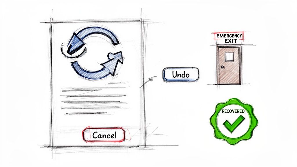
3. User Control and Freedom
The principle of User Control and Freedom insists that users should be able to easily undo actions and exit unwanted states. People frequently select system functions by mistake and need a clearly marked "emergency exit" to leave the unwanted state without having to go through an extended process. This freedom to backtrack builds confidence, encouraging exploration without the fear of irreversible consequences.
When a digital product fails to offer this control, it can feel restrictive and unforgiving. A user might accidentally delete important data or get trapped in a confusing workflow. Excellent UI/UX heuristics empower users by providing clear, accessible mechanisms like undo, redo, and cancel, ensuring they remain in command of their experience.
Real-World Examples
Gmail: After sending an email, Gmail displays a brief "Undo Send" option, with a customisable time window. This feature acts as a safety net for correcting typos or second thoughts.
Google Docs: Beyond a simple undo, Google Docs offers a comprehensive version history, allowing users to revert to any previous state of the document. This provides ultimate control over their work.
Slack: Messages can be edited or deleted after sending. This flexibility allows users to correct mistakes or remove information, with a subtle "(edited)" label to maintain conversational transparency.
How to Implement and Test
Implementing this heuristic means building safety nets into your user interface so mistakes are never catastrophic.
Provide Clear Exits: Every modal, pop-up, or multi-step process should have a conspicuous "Cancel" or "Close" button. Standard keyboard shortcuts like the Escape key should also be supported.
Support Undo/Redo: The universal keyboard shortcuts (Ctrl+Z for undo, Ctrl+Y for redo) should be consistently supported for actions like typing, deleting, or moving elements.
Confirm Destructive Actions: For irreversible actions like permanent deletion, use a confirmation dialogue. Signal the severity with clear language and visual cues, such as a red button for the final confirmation.
Practical Recommendation: In a multi-step checkout flow, always provide a "Back" button to the previous step and a clear summary of all information before the final "Confirm Purchase" action. This gives users the freedom to review and correct details without starting over.
Testing for Control: You can use Uxia's AI-powered synthetic testers to ensure these safety nets are discoverable and effective. Set up tasks where the AI must intentionally make a mistake and then recover using an "undo" or "cancel" feature. This helps validate that your emergency exits are intuitive and function as expected under various scenarios.
4. Error Prevention and Recovery
The principle of Error Prevention and Recovery argues that the best error message is no error message at all. This core UI/UX heuristic prioritises designing interfaces that prevent problems from occurring in the first place. When errors are unavoidable, the system must provide clear, constructive guidance to help users recover quickly and with minimal friction.
A system that allows users to easily make mistakes and then presents confusing or generic error codes creates frustration and erodes trust. Good design anticipates potential slip-ups and builds in constraints, confirmations, and helpful suggestions. When a user does make a mistake, the interface should act as a helpful guide, not a stern critic, explaining the problem in plain language and offering a clear path to a solution.
Real-World Examples
Typeform: As you fill out a form, Typeform validates each field in real-time. An email field that is incorrectly formatted is immediately flagged with a helpful hint, preventing submission errors long before the user clicks "submit."
Slack: When composing a message or post, Slack often disables the "send" or "post" button until all required fields are filled. A subtle tooltip explains why the button is inactive, guiding the user to complete the necessary steps.
Stripe: During checkout, Stripe provides real-time validation for credit card numbers. It can identify the card type (Visa, Mastercard) from the first few digits and will immediately flag an invalid number, saving users from a failed transaction after submission.
How to Implement and Test
Effectively implementing this heuristic involves a proactive, not reactive, approach to user input and system interactions.
Real-Time Validation: Instead of waiting for a form submission, validate user input as they type. Use inline hints and visual cues like green checkmarks for correct entries or red outlines for incorrect ones. Provide clear format examples (e.g., Phone: XXX-XXX-XXXX) as placeholders.
Smart Constraints: Disable buttons or options that are not currently available and use tooltips to explain why. For example, a "Continue" button should remain disabled until all required form fields are completed.
Practical Recommendation: For a "Create Password" field, don't wait for the user to submit to tell them the rules. Display the requirements (e.g., "8+ characters, 1 number, 1 special character") upfront and use a real-time strength meter to give immediate feedback.
Testing Error States: Use Uxia's AI-powered testers to validate that users can understand and recover from various error states. You can configure synthetic users to input incorrect data, miss required fields, or trigger edge cases. Analysing their ability to follow error messages and successfully complete the task provides critical data on the effectiveness of your error recovery design. This also helps assess the clarity of your error messages, which can have a direct impact on usability metrics. To dig deeper, you can learn more about the System Usability Score and its alternatives.
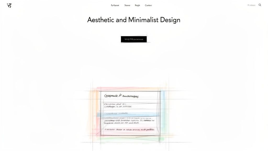
5. Aesthetic and Minimalist Design
The heuristic of Aesthetic and Minimalist Design argues that interfaces should not contain information which is irrelevant or rarely needed. Every extra unit of information in a dialogue competes with the relevant units of information and diminishes their relative visibility. This principle, popularised by design philosophies from Dieter Rams to Apple, focuses on clarity by removing visual clutter.
A minimalist approach isn't about creating a stark or empty interface; it's about thoughtful curation. Each element on the screen should serve a purpose, supporting the user's primary goals. By prioritising content over decoration, a design reduces cognitive load, allowing users to focus on what matters and accomplish their tasks more efficiently. This is a core concept within good ui ux heuristics.
Real-World Examples
Google: The classic Google homepage is the definitive example. It features a single search input field, placing the primary user goal front and centre without any distractions.
Medium: The article reading interface on Medium uses generous whitespace and a clean, focused layout. This design choice puts the content first, making it easy for users to read without being sidetracked by unnecessary interface elements.
DuckDuckGo: Similar to Google's ethos, DuckDuckGo's search interface is clean and uncluttered. It avoids the visual noise of excessive ads or complex features, providing a direct path to information.
How to Implement and Test
Achieving a truly minimalist design requires a disciplined approach to content and feature prioritisation.
Content Audits: Regularly review your interface to identify and remove non-essential elements. Use data from analytics and heat maps to pinpoint features or information that users ignore.
Strategic Whitespace: Use negative space intentionally to create a clear visual hierarchy. Whitespace can group related items and guide the user's eye towards the most important actions or information.
Progressive Disclosure: Hide advanced or secondary options behind a user action, like a click or tap. This keeps the primary interface clean while still providing access to more complex functionality when needed.
Practical Recommendation: In a user dashboard, display the three most critical metrics prominently. Place secondary information and customisation options under a "View More Details" link or a settings icon. This keeps the primary view scannable and actionable.
Testing for Clutter: You can validate visual complexity with Uxia. Deploy AI synthetic testers with different user personas to perform tasks. Analyse their behaviour to see if they are distracted by visual clutter or struggle to find primary functions. This helps confirm that your minimalist design remains functional and doesn't hide essential controls too well.
6. Flexibility and Efficiency of Use
The principle of Flexibility and Efficiency of Use states that a system should cater to both inexperienced and expert users. It should allow them to interact at a pace and complexity that suits their skill level. Novices require a straightforward path with clear guidance, while experts need accelerators like shortcuts, customisation, and advanced commands to perform tasks more quickly.
An interface that fails this heuristic either overwhelms beginners with too many options or frustrates experts by forcing them through a rigid, step-by-step process. Effective UI/UX heuristics recognise this diversity in user experience, creating a system that is approachable for first-time use but also powerful enough for seasoned professionals to master and make their own.
Real-World Examples
Figma: The application offers a simple, icon-driven interface for basic tasks. For power users, it provides an extensive set of keyboard shortcuts and a command palette (Cmd/Ctrl + P) to access any function rapidly without touching the mouse.
Slack: New users can easily send messages and join channels. Experienced users can utilise slash commands (e.g.,
/remind) and the Workflow Builder to automate routine tasks, dramatically increasing their productivity.Notion: While simple enough for basic note-taking, Notion exposes a powerful API and advanced database functionalities. This allows expert users to build custom dashboards and integrate complex workflows directly into their workspace.
How to Implement and Test
Implementing this heuristic means building layers of interaction that users can choose to engage with as their proficiency grows.
Provide Accelerators: Implement keyboard shortcuts for frequent actions and document them in an easily accessible help menu. A searchable command palette (often triggered by Ctrl/Cmd + K) is an excellent way to expose these accelerators.
Enable Customisation: Allow users to personalise their workspace by rearranging toolbars, creating custom presets, or saving preferred layouts. This lets experts optimise the interface for their specific workflows.
Practical Recommendation: In a project management tool, allow users to create tasks via a simple "Add Task" button (for novices) but also support advanced input like typing
Create task "Finish report" for @anna due:friday #urgentdirectly into a command bar (for experts).Testing for Efficiency: You can use Uxia to test this heuristic by creating distinct user personas representing novice and expert users. Assign tasks to AI-powered synthetic testers configured with different expertise levels to measure task completion times and identify friction points. This helps validate that shortcuts provide a genuine efficiency gain for experts without confusing beginners.
7. Recognition vs. Recall
The principle of Recognition vs. Recall states that interfaces should minimise the user's memory load by making objects, actions, and options visible. It is far easier for a person to recognise information presented to them than it is to recall it from memory. This is a fundamental concept in UI/UX heuristics, prioritising clarity and reducing cognitive strain.
Relying on recall forces users to remember commands, previous steps, or where information is located, which can lead to errors and frustration. A well-designed system presents users with the options they need, exactly when they need them. This approach makes an interface feel intuitive and effortless, as users are guided through tasks rather than having to memorise the path.
Real-World Examples
Google Drive: When you start typing in the search bar, Google Drive immediately shows suggestions for recent files, folders, and keywords. This autocomplete feature turns a recall-based task (remembering a file name) into a recognition-based one (selecting from a visible list).
Adobe Photoshop: The toolbar displays icons for all available tools, such as the brush, eraser, and selection tools. Users can recognise the tool they need from its icon rather than having to remember a specific command or keyboard shortcut for every function.
Asana: When assigning a task, Asana presents a dropdown menu populated with team members. Instead of recalling and typing a collaborator's full name, the user simply recognises their name and avatar from the list provided.
How to Implement and Test
Implementing this heuristic involves making sure crucial information and actions are always visible and easily accessible.
Contextual Menus: Use contextual menus and tooltips to provide relevant options where and when the user needs them, rather than burying them in a deep navigation structure.
Visible Navigation: Use clear labels, breadcrumbs, and consistent iconography to ensure users can always recognise where they are in the application and what actions are available.
Suggestion and History: Implement features like "Recently Viewed Items," "Search History," or suggestion chips in forms to offload the burden of memory from the user.
Practical Recommendation: On an e-commerce site, display a "Recently Viewed Products" section on the homepage. This allows returning users to easily find items they previously considered without having to recall the product name or search for it again.
Testing for Recognition: With Uxia's AI-powered synthetic testers, you can create tasks that require locating specific features or information. Observe whether the synthetic users can complete the tasks without hesitation. If they frequently explore incorrect menus or fail to find an option, it is a clear sign that the interface is relying too heavily on recall.
8. Help and Documentation
The principle of Help and Documentation acknowledges that even the most intuitive interface may require user support. This heuristic states that help systems should be readily available, easy to search, and focused on the user’s tasks. Effective documentation provides concrete, actionable steps to solve a problem rather than abstract, conceptual explanations.
While the ideal system wouldn't need a manual, it's better to provide support than to leave users stranded. Good documentation is not a failure of design but a recognition of complex user needs. It should be contextually integrated, appearing where and when users need it most, preventing them from having to abandon their workflow to search for answers in a separate knowledge base.
Real-World Examples
Stripe: The developer documentation is a prime example of excellence. It provides clear, copy-paste code examples alongside conceptual explanations, allowing developers to implement solutions quickly without guesswork.
Figma: Figma’s in-app help panel offers contextual suggestions based on the tool a user is currently interacting with. This proactive support helps users discover features and solve problems without leaving the design canvas.
Slack: The Slack Help Centre is highly searchable, with articles covering specific tasks like "Set a channel topic or description." It combines written steps with clear visuals, making it easy for users to follow along and accomplish their goals.
How to Implement and Test
Implementing this heuristic means creating support that is both accessible and genuinely helpful. The best documentation anticipates user needs and provides immediate, clear guidance.
Contextual Assistance: Place tooltips, info icons, or links to relevant articles directly within the interface, especially near complex features or settings. Error messages should also link directly to documentation that explains how to resolve the issue.
Action-Oriented Content: Frame help articles around user tasks. Use titles like "How to Create a New Project" instead of "Understanding Projects." This task-focused approach provides immediate value.
Practical Recommendation: Instead of a generic "Help" link in your footer, add a small question mark icon next to a complex feature like "Analytics Filters". Clicking it should open a pop-up or sidebar with a short explanation and a link to the full documentation for that specific feature.
Testing Documentation: You can use Uxia's AI-powered synthetic testers to validate the clarity and findability of your help content. Task an AI user with solving a specific problem using only your documentation. This will quickly reveal if your help articles are confusing, hard to find, or missing key information, allowing you to pinpoint areas where users are likely to get stuck.
9. Consistency and Standards
The principle of Consistency and Standards asserts that a digital product should maintain both internal and external consistency. Internal consistency means using the same patterns, terminology, and design elements throughout your own product. External consistency involves adhering to established platform conventions, such as the design guidelines for iOS or Android. This heuristic is fundamental to good UI/UX because it reduces the user's cognitive load; they can apply prior knowledge to new contexts without needing to learn new rules for every interaction.
When consistency is broken, users are forced to stop and think, which disrupts their flow and can lead to frustration. A button that performs a "save" action on one screen should not be used for a "delete" action on another. By establishing predictable patterns, you create an intuitive experience that feels familiar and dependable, which is a core part of effective UI/UX heuristics.
Real-World Examples
Google Material Design: Across its suite of products like Gmail, Google Calendar, and Google Drive, Google applies its Material Design system. This ensures that buttons, menus, and navigation behave predictably, creating a cohesive experience no matter which Google service a person is using.
Microsoft Office: The ribbon interface, first introduced years ago, remains a consistent feature across Word, Excel, and PowerPoint. Users who learn to navigate the ribbon in one application can easily find their way around the others, demonstrating powerful internal consistency.
Apple's Human Interface Guidelines: Apple enforces strict design standards for iOS apps. This means users intuitively know how to use navigation bars, tab bars, and standard system controls, providing a seamless experience when switching between different applications on their device.
How to Implement and Test
Implementing this heuristic starts with establishing clear guidelines and conducting regular audits to ensure they are followed.
Develop a Design System: Create and maintain a design system or a simple style guide. This document should define colours, typography, spacing, component behaviour, and voice and tone. It serves as a single source of truth for designers and developers.
Follow Platform Conventions: Respect the established design languages of the operating systems you build for (e.g., Apple's HIG for iOS, Material Design for Android). Do not make an Android app look and feel exactly like an iOS app, as this violates user expectations.
Conduct Audits: Regularly review your product to identify and correct inconsistencies. This includes checking for inconsistent terminology, varying button styles, or different interaction patterns for similar tasks.
Practical Recommendation: Define a single, universal icon and label for a core action like "Save". Ensure that every instance of saving—whether it's a document, a user profile, or a setting—uses this exact same component. Avoid using synonyms like "Update" or "Apply" for the same action.
Testing for Consistency: Use Uxia's AI-powered synthetic testers to assess if users can apply learned patterns across your interface. You can design a test where the AI learns an interaction on one screen and is then tasked with performing a similar action on a different screen. Its success rate will reveal how consistent your design patterns truly are.
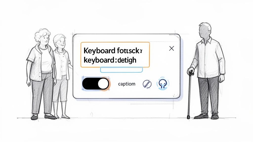
10. Accessibility and Inclusive Design
The principle of Accessibility and Inclusive Design states that interfaces must be usable by people with diverse abilities and circumstances. This foundational UI UX heuristic ensures products serve everyone, including those with permanent disabilities like blindness, temporary impairments like a broken arm, or situational limitations like using a screen in bright sunlight. Designing for accessibility from the start is more effective and economical than retrofitting it later.
Failing to prioritise accessibility excludes a significant portion of the population and often leads to a frustrating experience for all users. An inclusive approach, considering factors like keyboard navigation, screen reader compatibility, colour contrast, and captions, ultimately creates a more robust and user-friendly product for everyone, not just those with disabilities.
Real-World Examples
Apple: Across its entire product line, Apple integrates extensive accessibility features like VoiceOver (a screen reader), Dynamic Type for adjustable text sizes, and AssistiveTouch, making its technology usable for a wide range of needs.
Gov.uk: The UK government's website is a benchmark for digital accessibility, adhering strictly to WCAG 2.1 AA standards. Its simple layout, clear language, and semantic HTML structure make vital information accessible to all citizens.
LinkedIn: The platform offers robust keyboard navigation, allowing users to move through profiles, posts, and interactive elements without needing a mouse. This is critical for users with motor impairments.
How to Implement and Test
Building an accessible product involves a continuous commitment to inclusive practices throughout the design and development lifecycle.
Technical Foundations: Use semantic HTML with a proper heading hierarchy (H1, H2, H3, etc.) to give the page structure. Ensure all interactive elements, like buttons and links, are focusable and can be operated with a keyboard. Provide descriptive
alttext for all meaningful images.Content and Design: Maintain sufficient colour contrast between text and its background to meet WCAG AA standards. Add captions and provide transcripts for all video and audio content. Avoid auto-playing animations or provide an option to disable motion.
Practical Recommendation: When creating an online form, ensure every input field has a corresponding
<label>tag. This is not just good practice—it's essential for screen reader users, as it allows the software to announce the purpose of each field, making the form usable for visually impaired individuals.Testing for Accessibility: You can use Uxia’s AI-powered synthetic testers to automate parts of your accessibility auditing. Configure AI personas to simulate users with different needs, such as colour blindness or reliance on screen readers, to test for compliance and identify usability barriers. For more in-depth analysis, explore the full scope of accessibility testing techniques to ensure your product is truly inclusive.
Top 10 UI/UX Heuristics Comparison
Heuristic | 🔄 Implementation complexity | ⚡ Resource requirements | 📊 Expected outcomes | 💡 Ideal use cases | ⭐ Key advantages |
|---|---|---|---|---|---|
Visibility of System Status | Medium — UI + realtime/back-end signals | Front‑end dev, real‑time APIs, QA, micro‑animations | Increased trust; reduced abandonment and confusion | Long operations, payments, multi‑step flows, collaboration | Immediate feedback; lowers user anxiety; fewer support tickets |
Match Between System and Real World | Low–Medium — content & UX research effort | User research, content design, localization testing | Faster learning; higher adoption and accuracy | Domain‑specific apps, onboarding, enterprise tools | Intuitive language/metaphors; reduced cognitive load |
User Control and Freedom | High — complex state & undo/redo logic | State management, storage, testing, UX flows | More exploration; quicker recovery from mistakes | Editors, collaborative tools, transaction systems | Reversible actions; user confidence; reduced error impact |
Error Prevention and Recovery | Medium–High — validation + messaging design | Validation logic, UX writing, QA, edge‑case testing | Fewer errors; higher completion rates; less support load | Forms, checkouts, data entry, security‑critical flows | Prevents problems; clear actionable guidance for recovery |
Aesthetic and Minimalist Design | Low–Medium — design skill and review | Design time, content audit, usability testing | Improved focus; faster comprehension; better perceived quality | Content sites, dashboards, consumer apps, landing pages | Reduced cognitive load; cleaner hierarchy; better performance |
Flexibility and Efficiency of Use | High — multiple modes and shortcuts | Development for shortcuts/APIs, docs, advanced UX testing | Higher productivity for power users; better retention | Professional tools, enterprise workflows, power‑user apps | Supports novices and experts; accelerates frequent tasks |
Recognition vs. Recall | Low — IA and visible affordances | UI design, information architecture, usability tests | Faster task completion; fewer errors from memory lapses | Navigation‑heavy apps, search interfaces, toolbars | Improved discoverability; lower cognitive effort |
Help and Documentation | Medium — ongoing content maintenance | Technical writers, video production, searchable help system | Increased self‑sufficiency; fewer support requests | Complex features, developer platforms, onboarding | Task‑focused guidance; reduces reliance on support |
Consistency and Standards | Medium–High — governance across teams | Design system, audits, cross‑team coordination | Predictable UX; faster onboarding; easier maintenance | Large products, multi‑platform apps, enterprise suites | Reduces learning curve; coherent product experience |
Accessibility and Inclusive Design | Medium–High — expertise + testing | Accessibility audits, assistive‑tech testing, design/dev effort | Broader audience; legal compliance; improved overall UX | Public services, consumer apps, any wide‑reach product | Inclusive access; better quality, SEO, and compliance |
From Principles to Practice: Heuristics in Action
Mastering the ten core UI/UX heuristics we've explored is more than an academic exercise; it's a fundamental shift in how you approach product design and development. Moving from simply knowing about Visibility of System Status or Consistency and Standards to actively embedding them into your workflow is where real value is created. These principles are not a rigid set of rules to be checked off a list, but rather a flexible and powerful lens through which to view every design decision, user flow, and interaction.
The true strength of these guidelines is their ability to provide a common language for your entire team. When a designer, a product manager, and an engineer can all reference User Control and Freedom to critique an onboarding flow, you foster a culture of user-centricity. This shared understanding reduces subjective debates and grounds conversations in established usability principles, leading to faster, more aligned decision-making.
Integrating Heuristics into Your Workflow
To prevent these principles from becoming abstract ideals, they must be integrated into your day-to-day operations. The goal is to make heuristic evaluation a continuous, proactive habit rather than a reactive, post-launch analysis.
Here are some actionable steps to get started:
Pre-Design Audits: Before starting a new feature or redesign, run a quick heuristic evaluation on the existing interface or a competitor's product. This establishes a baseline and highlights key areas for improvement from the outset. Platforms like Uxia can automate this initial audit, providing rapid insights.
Design Critiques: Structure your team's design critiques around specific heuristics. Instead of saying, "I don't like this button," you can frame feedback more constructively, such as, "This button's placement might violate the Consistency and Standards heuristic we've established elsewhere in the app."
Pair with User Testing: Use heuristic evaluation to identify potential issues and form hypotheses. Then, validate these findings with qualitative user testing. This combination of expert review and direct user feedback is incredibly powerful.
The Compounding Value of Consistent Evaluation
Consistently applying these ui ux heuristics has a compounding effect on product quality and team efficiency. Small, regular improvements prevent the accumulation of "usability debt" which can become difficult and costly to fix later on. By diagnosing and addressing friction points related to Error Prevention or Recognition vs. Recall during the design phase, you save valuable development cycles and prevent user frustration down the line.
Furthermore, these principles are directly tied to business outcomes. A clear, intuitive interface that follows established heuristics reduces user abandonment and increases conversion rates. To effectively apply UI/UX heuristics in a business context, particularly for online sales, one can refer to a practical guide on e-commerce and web design that converts. This connection between good design and tangible results is crucial for securing buy-in and resources for user-centred initiatives.
Ultimately, the journey from knowing these heuristics to truly mastering them is about practice and perspective. It's about training your eye to see the small details that make a big difference, and building the discipline to challenge your own assumptions. By committing to this practice, you are not just building better interfaces; you are building better products that respect your users' time, attention, and trust.
Ready to move from manual checks to automated insights? Uxia can supercharge your heuristic evaluation process, providing rapid, data-driven analysis of your interfaces against core usability principles. Discover how you can identify and fix usability issues faster by visiting Uxia today.