Multi Task Usability Testing: Design Unbiased Studies
Learn how to design multi task usability testing studies that avoid order bias, measure the right metrics, and deliver reliable results

Teams still treat usability testing like a checklist. They hand users one task, watch for completion, and call the study rigorous. That sounds tidy, but in real products, people aren't isolated from notifications, switching costs, or prior steps, so a longer task list can make a test less trustworthy if you design it badly.
Multi Task Usability Testing is useful only when it captures the friction of real work without letting task order, learning, or the act of measurement distort what you see. A checkout flow, a dashboard handoff, or a settings change rarely happens in a vacuum, and that's why a narrow single-task test can miss the most important problems. If you're documenting flows as part of your sprint work, a good companion resource is technical documentation software, because the same discipline that makes instructions clear also makes test missions easier to compare.
Why One Task Is Never Enough
A single-task study can look clean and still miss the failure. A checkout screen may seem fine when someone only enters a card number, then the same person hesitates when they compare shipping options, return to a promo code they saw earlier, or recover after a notification interrupts them. The interface has not changed much, the working memory load has.
That is why a longer task list is not automatically better. Each added task can teach the next one, and each interruption can reshape the next answer. If you do not control for sequence, you may measure learning instead of usability.
A useful example is checkout testing where payment entry looks strong, but performance drops once users must remember a promo code from a previous screen while comparing delivery choices. The flow is still the same product flow. The demand on attention is different.
Practical rule: every added task also adds bias unless you plan the sequence, the metrics, and the analysis before the session starts.
Multi task usability testing works best as a way to observe competing demands. You are looking for the point where memory, switching, and goal management start to interfere with one another. That is the part a single isolated task usually misses.
If your sprint work also requires clear handoff notes, technical documentation software can help your team write cleaner task instructions. Clear wording makes the missions easier to compare, which matters when you are trying to separate a true usability problem from confusion caused by the prompt itself.
If you want a structured way to write the missions themselves, Uxia's usability testing tasks guidance is a useful companion once you know what the session needs to measure.
What Multi Task Usability Testing Actually Measures
Think of a gym that only tests one machine. You'd learn whether someone can use a treadmill, but not how they handle the transition from treadmill to rowing machine to a stair climber while tired. Multi task usability testing is closer to the obstacle course. It looks at how people move through a connected series of missions, not just whether one step works in isolation.
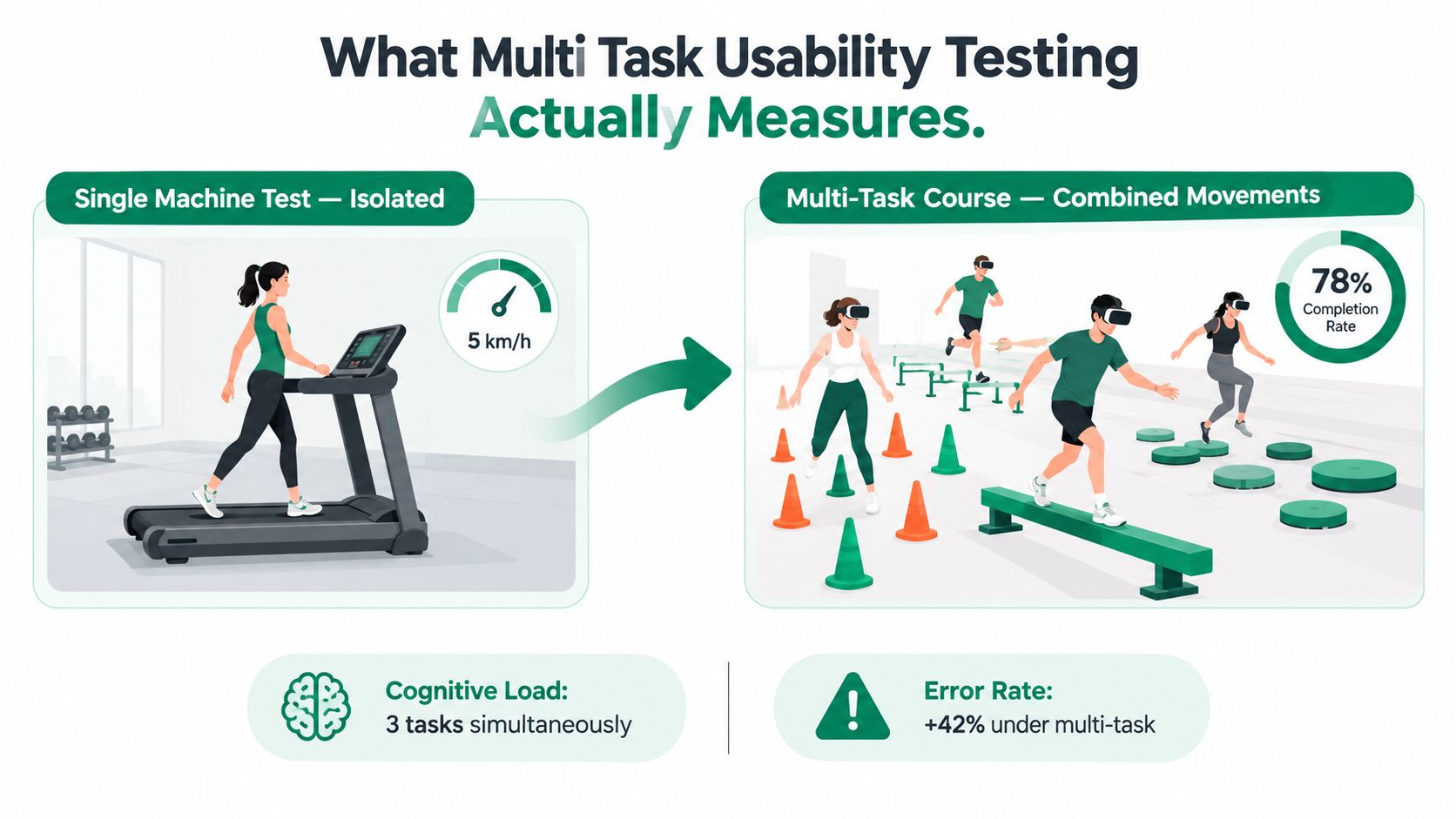
The right metrics depend on that difference. Completion rate still matters, but it isn't enough on its own. You also need response time, error rate, switching behavior, and the interaction between the primary and secondary task, because those signals show where attention gets taxed.
Key concept: the comparison between a baseline flow and a multitask flow tells you the usability cost of competing attention demands.
That's why the 2019 PLOS ONE experiment matters here. With 96 participants, average response time rose from 573 milliseconds in single-task trials to 980 milliseconds in dual-task trials, a 407-millisecond dual-task cost, or roughly 71%. Error rates also increased from 3.4% in repetition trials to 4.0% in task-switch trials, a 0.6-percentage-point rise. In other words, the penalty comes from doing more than one thing at once, and the study makes that cost visible in the PLOS ONE experiment on dual-task performance.
For product work, that means you should instrument flows that involve notifications, comparison shopping, cross-app handoffs, remembering a code, or moving between workflow stages. A single aggregate success rate can hide the fact that users are slower, more error-prone, or more fragile when attention splits. The better readout is the difference between a baseline condition and a multitask condition.
Multi Task Versus Single Task and Concurrent Testing
Single-task testing gives you clean diagnostics, but it's artificial. Multi-task testing feels closer to real use, but it's noisy and vulnerable to order effects. Concurrent measurement, where you ask users to rate a task while they're still doing it, gives you timing precision but can change the behavior you're trying to observe.

Approach | Best For | Main Risk |
|---|---|---|
Single-task tests | Early diagnosis of one flow | Too artificial for real multitask behavior |
Multi-task studies | Realistic journeys and competing demands | Order bias, learning carryover |
Concurrent testing | Pinpointing the moment confusion appears | The measurement itself changes the result |
The concurrent trade-off is especially important. In the 28-user experiment on website tasks, users who rated tasks during performance judged them 26% less favorably than users who rated afterward, and concurrent ratings increased session time by roughly 15%. That makes concurrent ratings useful for locating friction, but not for treating in-task satisfaction as if it were the same thing as post-task judgment.
Use each method for the question it's best at. Single-task sessions work for fast discovery and first-pass navigation checks. Multi-task sessions fit realistic workflow testing and prototype comparisons. Concurrent questioning is strongest when you need to know exactly when confusion starts, but you should keep the interruption schedule consistent so you're not measuring the interruption more than the interface.
Designing Missions and Task Sequences Without Bias
Start with a mission, not a checklist. A mission sounds like the thing a user came to do, such as finding a replacement part, updating billing, or comparing two delivery options. A flat list can pull participants into box-ticking behavior, while a mission gives them a reason to move the way they would in real use.
Write realistic missions first
A good mission has a goal, a context, and a constraint. That context matters because it shapes attention. “Update your shipping address before the order ships” is more realistic than “change the address field,” and that realism is what shows whether the workflow still holds under pressure.
Then separate tasks that are independent from tasks that are linked. If a later task depends on an earlier one, label it as dependent instead of pretending it is a clean comparison. That distinction keeps you from overreading results when prior exposure has already changed performance.
Counterbalance the order
The easy mistake is giving everyone the same sequence. The counterbalanced website-task study found that task order can shape judgments through primacy, recency, and frustration effects. In practice, the first task can set a mental frame for the second, just as the first bite of a meal changes how the next one tastes.
For two tasks, use two groups, A then B and B then A. For four tasks, spread the main positions so each major task appears roughly equally often in each slot. If the workflow truly depends on sequence, keep the dependency and report it plainly instead of pretending order did not matter.
Don't let “realistic flow” become a cover for accidental bias. Realism and balance need to be designed together.
A reusable scenario template helps here:
User goal: what the person is trying to accomplish.
Starting context: what they already know or have open.
Task constraint: what limits or interruptions shape the action.
Success signal: what counts as completion.
Order rule: whether the task can move, repeat, or depend on another task.
If you want a deeper prompt library for task wording, Uxia's usability testing tasks article fits neatly with this workflow. It helps teams turn vague product goals into concrete missions that participants can follow without guessing.
Recruitment and Sample Size for Reliable Results
The famous five-user rule is useful in one narrow situation, but it doesn't generalize to every study. In a 60-person study of a web-based employee timesheet application, random groups of five users found anywhere from 55% to 99% of usability problems. With 10 users, the lowest-performing group found 80%, and with 20 users it found 95%. That's why Nielsen Norman Group's sample-size guidance should be read as a decision aid, not a universal law.
Match the sample to the decision
If your goal is fast discovery, a small round can be enough to expose obvious friction. If you're comparing segments, estimating prevalence, validating a high-risk workflow, or making a release call, you need a larger and more deliberate sample. The question isn't “How many users is enough?” The question is “Enough for what decision?”
Accessibility raises a different issue. A 2025 review of digital-accessibility evaluations found that users with disabilities remain excluded from many studies, and that samples often don't represent the people most affected by the design. Synthetic or non-disabled participants can help with early screening, but they can't stand in for lived experience with assistive technology, impairment variation, or context.
Practical rule: use scalable screening to catch obvious issues early, then bring in disabled participants for the validation that synthetic testing can't provide.
That layered approach is where tools like Uxia can fit. Uxia generates synthetic participants for fast multi-task screening, which helps teams catch broad friction before recruiting gets involved, but those sessions still need targeted follow-up with disabled users when accessibility is part of the decision. For recruitment planning and audience definition, Uxia's usability test participants guidance is a useful reference point.
Analyzing Results by Task Position
A results dashboard can lie to you if it collapses every task into one average. A person who performs well on task three may have learned the interface from task one, or may be less tired than the first group. If you don't track position, you can't tell whether the design improved or the participant adapted.
Store the sequence with every session
The first rule is simple. Save the task order for each participant. Without that, you can't separate learning effects from product effects, and you can't tell whether the same prototype would have looked better or worse in a different slot.
Research on the System Usability Scale describes a design where 20 participants attempted two tasks on two different websites, and the presentation order was counterbalanced across participants to reduce learning and ordering bias, as described in the System Usability Scale study design. That's the logic to borrow: compare matched order groups, not pooled sessions that pretend sequence never happened.
Read metrics by position, not just in aggregate
Break down completion, errors, abandonment, and confidence by task position. Then look for patterns where the same task performs differently depending on whether it comes first, second, or later in the sequence. That tells you whether the friction is real or whether users just got better at the workflow as the session continued.
A simple checklist keeps the analysis honest:
Record the sequence. Keep the order with each participant or synthetic user.
Group by position. Compare first task, second task, and later tasks separately.
Flag dependencies. Mark linked tasks as non-independent.
Inspect ratings carefully. Don't treat one overall score as the whole story.
If you need a working template for reading session output, Uxia's usability test analysis resource is a good companion. It pairs naturally with order-aware reporting because both focus on turning raw sessions into decisions, not just summaries.
Your Multi Task Testing Workflow With Uxia
The cleanest workflow is the one your team can repeat under sprint pressure. Upload the prototype or live flow, define the mission and audience, then build a balanced task sequence instead of handing every participant the same path. Uxia's synthetic participants can then run those sequences without recruiting delays, so you get recordings, transcripts, flagged friction, and prioritized findings in one pass.
That matters because the win isn't a single perfect study. It's a habit of bias-aware validation, where every sprint tests the next risky assumption before the team spends more time on it. When you review the output, keep the same checklist every time, mission wording, counterbalancing plan, metrics by position, and subgroup reporting.
A practical go-live list looks like this:
Mission wording: does it sound like a real user goal?
Sequence plan: are comparable tasks counterbalanced or clearly marked as dependent?
Metrics: are you recording time, errors, abandonment, and ratings by position?
Audience split: are subgroup differences visible in the report?
Follow-up path: does the study tell you what to fix next?
Uxia fits well when a team needs fast multi-task screening, repeated iteration across sprints, and a report that keeps the raw sessions visible instead of hiding them behind a single score. Use it for the early pass, then validate the important accessibility and edge cases with the people who live those constraints.
If you want to run the next study with less bias and faster turnaround, visit Uxia and set up a multi-task test around your current sprint goal. You'll get a repeatable workflow for missions, sequences, and reporting, so your team can catch sequence effects before they slip into the release decision.