
If users say they trust your product, why do they still abandon signup, hesitate at pricing, or avoid entering payment details? That gap is where most trust work fails. Teams polish the surface, ask a vague trust question, and learn nothing they can fix. A structured credibility assessment treats trust as a measurable UX outcome, with separate scores, reasons, and evidence you can test again after a redesign.
Why Most Products Look Trustworthy but Still Fail a Credibility Check
A clean layout, a known logo, and confident copy can make a product look credible in a stakeholder review. Users judge differently. They notice whether the price changes late in checkout, whether support looks reachable, whether a claim has evidence, and whether the interface asks for sensitive data before explaining why.
That's the credibility gap. What people say in a survey, such as “this looks professional,” doesn't predict what they'll do when money, health data, or work files are at stake. Behavior rewards clarity and proof, while stated trust often rewards familiarity and polish.
Why Intuition Fails in Team Reviews
Internal reviewers already know the company, the roadmap, and the intended meaning of every screen. They fill gaps users can't fill. A designer reads “bank level security” as reassurance, while a first time visitor may read it as an unsupported slogan and wonder which bank, which standard, and who verified it.
Practical rule: If a trust claim can't be tied to visible evidence on the screen where the user must act, treat it as untested, not established.
Independent sellers face the same problem at smaller scale, which is why guidance on trust for independent sellers is useful context for teams without a big brand to borrow credibility from. Their buyers look for ownership, policies, contact routes, and proof that a real business stands behind the transaction. Larger products need the same signals, even when brand recognition hides weak spots for a while.
A repeatable approach changes the conversation from taste to diagnosis. Instead of asking whether a page feels trustworthy, you score expertise, accuracy, completeness, bias, and purpose separately, capture confidence and reasons, and check which design cues move each score. Product designers, PMs, and researchers can then prioritize fixes alongside usability and accessibility issues, rather than debating brand instinct.
You'll get a framework for scoring, a sprint ready playbook, and a way to run controlled variants quickly without replacing human judgment where stakes or ambiguity are high.
What Credibility Assessment Actually Means for Digital Products
For digital products, credibility assessment means evaluating whether a user has good reasons to believe a source, a claim, and an interface at the moment of decision. Those are related judgments, but they're not the same. A company can seem expert while one pricing claim remains vague, and a clear claim can still sit inside a confusing flow that makes people suspicious.
Research traditions support that separation. Research on online information credibility and its recurring dimensions identified perceived expertise, fairness, bias, truthfulness, accuracy, completeness, prior knowledge, and overall message quality, showing that audiences combine source, message, and context rather than judging from one signal. For a product team, the lesson is direct. Don't collapse those dimensions into one trust rating.

Translating Dimensions into Design Language
Think of each dimension as a question a user asks, often without speaking. Expertise asks who knows this subject and how you'd know. Accuracy asks whether numbers, dates, and promises can be checked. Completeness asks what's missing, such as fees, limits, eligibility, or cancellation terms. Bias and purpose ask whether the interface is informing, selling, or steering.
Legal sites make the expertise question especially visible, since visitors must judge credentials before contacting a firm. Discussion of how to establish website authority for legal shows the same underlying task in another sector, namely turning qualifications and proof into signals a cautious visitor can verify. The sector changes, but the assessment logic doesn't.
Take a fintech onboarding screen. It may score well on expertise because it names its banking partner and uses precise language about identity checks. It may fail completeness because it requests a card before explaining trial charges, renewal dates, or how to cancel. A single trust question would average those results into mush, while separate sub scores tell the team to keep the partner disclosure and fix the missing terms.
Track each dimension beside task behavior. If users rate expertise highly but still won't proceed, credibility isn't solved, it's uneven, and the weak dimension is your design brief.
Design Cues and Behavioral Signals That Move Trust
Users rarely audit every claim. They use shortcuts, such as reputation, endorsement, consistency, and whether a design behaves as expected. Your job isn't to condemn shortcuts, it's to understand which cues trigger them and whether those cues point toward justified confidence or manipulation.
Research on website credibility and design elements that increased perceived credibility ranked real world feel, ease of use, expertise, trustworthiness, and tailoring by impact, while commercial implications and amateurism most damaged credibility. Translate that into modern product terms and you get testable variables, not brand slogans. Real world feel means named people, reachable support, physical or organizational accountability, and policies users can inspect.
Boosters and Killers You Can Audit
Ease of use matters because friction creates suspicion. When navigation fails, error messages blame the user, or a form resets without warning, people infer carelessness about larger obligations like billing and data handling. That's why credibility work overlaps with established heuristic evaluation practices for UX, even though the outcome you're measuring is belief, not just task completion.
Credibility dimension | Boosts perceived credibility | Damages perceived credibility |
|---|---|---|
Expertise | Named authors, credentials, specific evidence | Generic claims, stock imagery, no ownership |
Accuracy | Transparent pricing, dates, checkable sources | Hidden fees, shifting totals, stale copy |
Real world feel | Contact routes, policies, identifiable company | Anonymous pages, unreachable support |
Ease of use | Clear navigation, forgiving forms, accessible text | Broken microcopy, confusing errors, clutter |
Purpose | Honest labeling of ads and recommendations | Dark patterns, pressure timers, disguised selling |
Tailoring | Relevant defaults and examples for the audience | One size copy that ignores the user's task |
Commercial pressure deserves special attention. Users don't object to selling itself, they object when persuasive intent hides inside advice, comparisons exclude obvious alternatives, or urgency appears without a real deadline. Amateurism works similarly. A typo alone won't destroy trust, but typos plus blurry images, inconsistent terminology, and dead links tell a story about quality control.
Use the table as a pre test audit, then verify with people. Ask what made a screen seem credible or suspicious, where they hesitated, and what proof they'd need next. Their answers connect abstract dimensions to observable moments you can redesign.
The CRAAP Framework as a Credibility Scoring Rubric
Library and research training uses CRAAP to stop people accepting information because it looks polished or agrees with them. The five criteria are Currency, Relevance, Authority, Accuracy, and Purpose. Adapted for products, they become a compact rubric for screens, claims, help content, AI outputs, and research findings themselves.
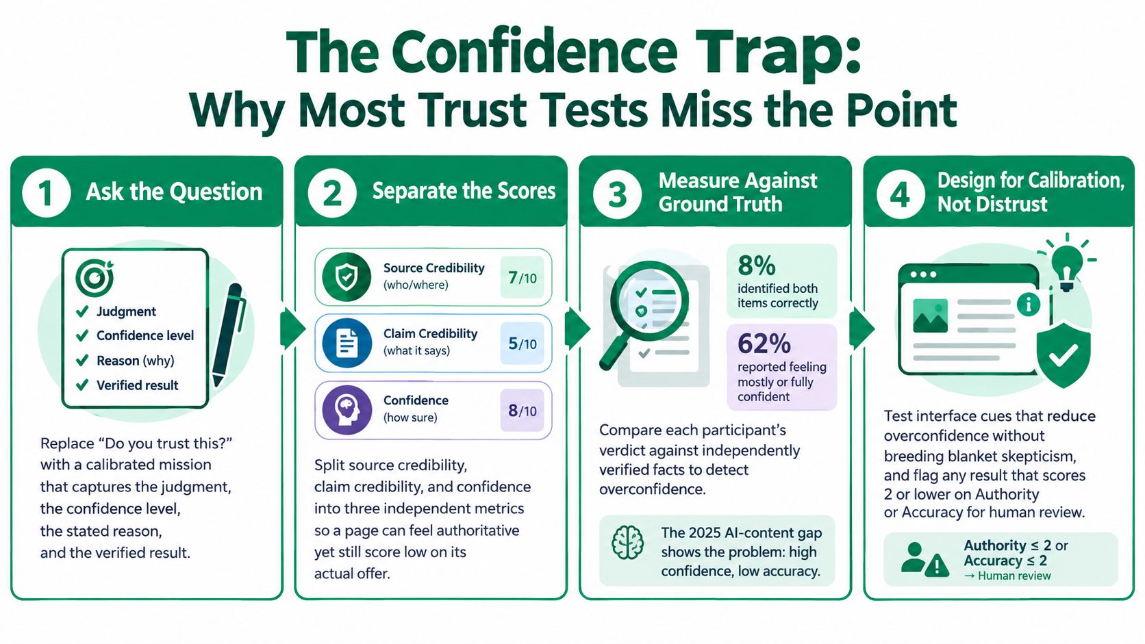
The scoring mechanic keeps judgments auditable. The CRAAP scoring guide and its decision thresholds scores each dimension from 1 to 5 and recommends avoiding reliance when a source scores 3 or lower in at least two categories, or 2 or lower for Authority or Accuracy. That rule matters because it prevents a strong average from hiding a fatal weakness.

Applying Each Criterion to a Product Screen
Currency: Is the copy, price, policy, model capability, or compliance statement current, and can users see a date or version?
Relevance: Does the content answer this user's mission at this step, or is it generic reassurance pasted everywhere?
Authority: Who is responsible for the claim, and is expertise visible through credentials, partners, methods, or accountable ownership?
Accuracy: Can the claim be verified against evidence, calculation, documentation, or observed product behavior?
Purpose: Is the screen informing, selling, entertaining, or persuading, and would an ordinary user recognize that intent?
Score per screen, not per product. A help center may be current and accurate while a pricing page scores poorly on purpose because sponsored placement looks like neutral advice. Per screen scores also fit naturally beside the quantitative measures described in usability testing metrics teams can track over time, so credibility trends don't live in a separate slide deck.
Consider an AI feature description that says it “reviews contracts like a lawyer.” Currency may be fine if the capability shipped recently, and relevance may be high for legal teams. Authority drops if no qualified reviewer, method, or limitation is named, and accuracy drops if the comparison can't be substantiated. Under the threshold rule, that claim needs human review and rewriting before it guides onboarding, sales material, or roadmap claims.
A rubric doesn't make judgment disappear. It makes judgment visible enough for another person to challenge.
The Confidence Trap Most Trust Tests Miss
“Do you trust this?” sounds efficient, but it measures a feeling without checking whether that feeling is warranted. A user can feel certain and be wrong, or feel uneasy about accurate information because presentation is unfamiliar. Credibility assessment needs calibrated confidence, meaning confidence that rises and falls with correctness.
The gap can be wide. A 2025 study of AI generated and authentic news judgments found that only 8% correctly identified both items and 32% classified neither correctly, while about 62% reported being mostly or fully confident. Education, age, and news checking frequency did not reliably predict detection ability, so you can't solve the problem by targeting supposedly savvier users.
Separate Three Scores That Teams Often Merge
First, score source credibility. Does the company, author, institution, or system seem qualified and accountable? Second, score claim credibility. Is this specific promise, price, recommendation, or AI answer believable and checkable? Third, score confidence. How sure is the user, and does that certainty match verified ground truth?
Those separations produce useful diagnoses. A health product may earn high source credibility from clinical branding, low claim credibility for an unsupported outcome promise, and poor calibration because users accept the promise quickly. Another product may have accurate claims but low source credibility because ownership and contact details are hard to find. Each pattern needs a different fix.
Record four things for every important judgment.
Initial judgment: What did the participant decide or choose?
Confidence level: How certain were they before seeing feedback?
Stated reason: Which cue drove the decision?
Ground truth result: Was the judgment correct against independently verified evidence?
Then test cues that improve calibration without teaching blanket distrust. Examples include showing uncertainty where it exists, placing evidence beside claims, explaining what a badge does and doesn't verify, and slowing irreversible actions with a clear review step. The goal isn't maximum trust, it's trust in the right places, at the right strength, for the right reasons.
A Practical Playbook for Running a Credibility Assessment
Run credibility assessment like any other disciplined UX study, with a defined surface, explicit dimensions, controlled tasks, and decision rules agreed before results arrive. The structure below fits inside a sprint because each step produces an artifact another person can review. It also prevents a common failure, collecting colorful trust quotes that never change a decision.
Before accepting a finding, document its provenance. The CRAAP framework for evaluating resources and supporting evidence operationalizes credibility through Currency, Relevance, Authority, Accuracy, and Purpose, and requires identifying the source artifact, date, user mission, supporting evidence, and commercial or editorial motive. Apply that same discipline to research outputs, not only to the product screens under test.
Step 1 Define the Trust Surface
List the screens, claims, and moments where belief affects action. Typical surfaces include signup, identity verification, pricing, checkout, permissions, health or financial advice, AI generated answers, reviews, and cancellation. For each one, note the risk if the user believes wrongly and the cost if the user distrusts wrongly, because both errors matter.
Keep scope narrow enough to finish. One onboarding flow with payment capture is a better first study than “trust across the whole app.” Name the artifacts and versions, so later scores can be compared against the exact design that produced them.
Step 2 Choose Dimensions and Ground Truth
Select the rubric dimensions relevant to that surface and define what correct means before testing. For pricing, ground truth may be the actual renewal amount and cancellation rule from billing documentation. For an AI answer, it may be a verified source or expert reviewed response. Without ground truth, you can measure perception, but you can't measure calibration.
Teams that evaluate external opportunities face a similar documentation problem, and a data-first project evaluation framework offers a useful parallel for separating evidence, assumptions, and decision criteria. Borrow the habit, even if your subject is a checkout screen. Every important claim should point to evidence a reviewer can inspect.
Step 3 Write Missions That Force a Judgment
Avoid leading prompts that ask only whether something feels trustworthy. Give the participant a realistic goal, require a decision, then capture confidence and reasoning. Think aloud instructions help reveal which cue carried weight, whether it was a credential, a review count, missing fees, or tone.
Sample mission: Visit this signup screen and decide whether you'd enter your card details. Say what made it feel safe or unsafe, rate your confidence, and explain what you'd check before proceeding.
That mission works because it creates behavior to observe. The participant might proceed, hesitate, search for terms, open a policy, or abandon. Follow with dimension ratings after the task, so scores reflect the experience rather than priming it.
Step 4 Run Heuristic Review and Unmoderated Tests
Start with an expert audit using the booster and killer list, then run unmoderated tests with the target audience profile. Include at least one controlled variant where feasible, such as social proof shown or hidden, source label present or absent, evidence reordered, or a distracting alternative introduced. Controlled variants tell you whether you're measuring the content itself or neighboring interface signals.
Choose sample size with diminishing returns logic. Early participants usually expose major hesitation patterns, while later participants help estimate how common a pattern is and whether subgroups reason differently. Stop adding similar participants when new sessions mostly repeat known reasons, and spend remaining effort on variants or high risk segments.
Step 5 Score, Prioritize, and Retest
Score each screen on the chosen dimensions, preserve participant reasons beside the numbers, and flag fatal weaknesses for human review before they influence decisions. Prioritize by consequence, not by how easy the copy edit looks. A confusing fee disclosure at payment outranks a mildly generic testimonial on a low risk page.
Close the loop with a retest using the same mission and ground truth. You're looking for three changes, higher claim credibility where evidence improved, better calibrated confidence, and fewer hesitations caused by missing information. If trust rises but calibration worsens, the redesign may be more persuasive without being more credible, and that's a warning, not a win.
How AI-Driven Synthetic Testing Changes Credibility Assessment
Human intuition is a weak instrument for detecting deception, which is one reason structured testing matters. A meta analysis of deception judgments across 206 documents and 24,483 judgments estimated average accuracy at approximately 54%, compared with 50% from random guessing. Product teams shouldn't expect stakeholders, or participants, to spot credibility problems reliably from feel alone.
Synthetic testing helps by making controlled credibility experiments practical at speed. In Uxia, teams upload a prototype or flow, set a mission and audience profile, and receive think aloud transcripts, trust related findings, and prioritized issues they can compare across variants. That factual workflow is useful because recruitment delays often push trust questions out of the sprint entirely.

What to Look for in the Output
Read the transcript for reasoning, not just sentiment. A useful excerpt names the exact cue, such as “the price is clear, but I can't tell who operates this service,” and connects it to a decision. Pair that with a per screen scorecard, hesitation points in the flow, and a ranked list of credibility issues, then decide which items need confirmation with human participants.
The obvious objection is that synthetic testers don't feel trust. That's true, and it defines the boundary. Their value is consistency, scale, and variant control, such as hiding endorsement badges, removing social proof, reordering evidence, or adding a decoy option to see whether judgments shift for irrelevant reasons. Background on how AI synthetic testers approach human reliability helps teams set expectations without treating the output as unquestionable.
Escalate ambiguous, high risk, or culturally sensitive findings for human review. Use synthetic runs to find patterns quickly and narrow the questions worth spending scarce human research time on.
A Minimum Viable Credibility Checklist Before Every Release
Before a major release, run these checks even if you can't run the full playbook.
Score the flow: Apply the rubric to every high risk screen and claim.
Capture calibration: Record judgment, confidence, reason, and ground truth result.
Test one variant: Remove social proof or a source label and observe what changes.
Review fatal weaknesses: Send low Authority or Accuracy results to a human owner.
Fix missing proof: Add evidence beside the action it supports, then retest the same mission.
Treat credibility as a release habit, not an annual audit.
Run your next credibility assessment before launch, not after users hesitate at signup, pricing, or payment. With Uxia, you can upload a prototype, set a trust focused mission and audience, and get transcripts, scorecards, and prioritized credibility issues in minutes. Start with one high risk flow, compare a variant, and fix the weakest dimension first.