
Buyer Persona Canva: Create & Validate Profiles
Master buyer persona canva creation! This guide for product & UX teams shows you how to go from template to a validated persona using Uxia.

The most popular advice about buyer persona canva is also the least useful. It tells teams to pick a nice template, fill in age, job title, pain points, and favorite brands, then call the persona done.
That produces a tidy artifact. It rarely produces a better product.
A persona only earns its place if it changes design decisions, copy choices, navigation, onboarding, and what gets tested next. If it can't do that, it's just a slide. Canva is excellent for making personas understandable across product, design, and marketing. The mistake is treating the visual as the finish line instead of the start of a testable hypothesis.
Beyond Pretty Cards Why Most Personas Fail
Canva became the default place to make personas for a reason. 55.61% of its users are aged 18 to 34, it serves users in over 190 countries, and US traffic accounts for about 98 million monthly visits according to these Canva usage figures. That reach makes it the obvious tool for product designers, UX researchers, and marketers building visual customer profiles.
But popularity doesn't make the output reliable.
Most persona documents fail because teams confuse clarity of presentation with quality of evidence. A clean avatar, a soft color palette, and a believable quote can make assumptions feel settled. They aren't. If the underlying inputs came from opinions, partial sales notes, or a workshop full of internal guesses, the persona just gives confidence to the wrong decision.
Practical rule: If a persona can't be turned into a test scenario, it probably isn't specific enough to guide product work.
The failure usually shows up in familiar ways:
Demographics dominate: Teams spend too much space on age, location, and title, then barely define what the person is trying to achieve.
Pain points stay generic: “Needs efficiency” and “values simplicity” sound useful but don't point to a design change.
No validation loop exists: The persona gets presented once, exported as a PDF, and slowly stops matching what users do.
That's why I treat buyer persona canva work as a translation layer. Canva makes the persona legible for the team. Validation makes it trustworthy. The strongest workflow is to create the persona visually, then pressure-test the assumptions against product behavior and observed friction.
If you want examples of what a useful profile looks like before building your own, this collection of buyer persona examples for product teams is a good reference point. The important shift is simple: stop asking whether the persona looks complete, and start asking whether it can survive contact with real usage.
Structuring a Persona That Drives Decisions
A product persona should include the fields that affect what gets designed. If a field won't change a screen, flow, message, or test plan, it doesn't deserve much space.
For B2B products, that matters even more. Data-driven canvases that prioritize priority initiatives and success metrics yield 2.5x higher conversion, and over-reliance on job titles causes up to 65% inaccuracy in persona profiles according to this B2B buyer persona canvas breakdown.
The fields I always keep
My default structure is compact, but every field has a job:
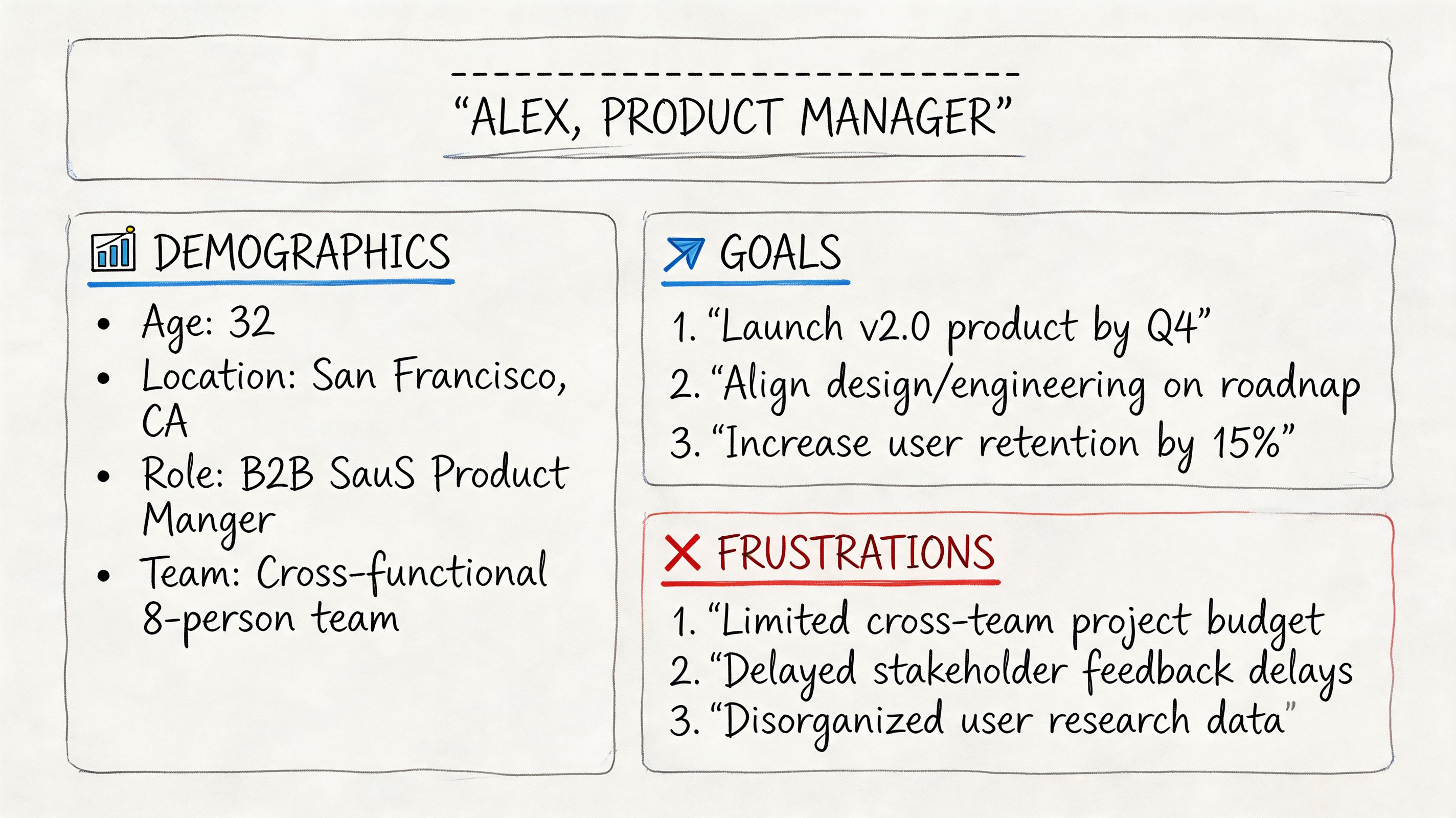
Name and role: Enough to make the persona easy to reference in reviews. “Laura, Operations Manager” is more useful than “Business User Segment B.”
Age range, location, industry: Light context only. These help frame environment and expectations, but they shouldn't dominate the card.
Digital confidence: This affects onboarding depth, UI complexity, and whether you can rely on self-serve discovery.
Main goal: The job they're trying to get done in the product.
Biggest frustration: The friction most likely to block progress.
Buying trigger: What made them start evaluating solutions now.
Decision criteria: The standards they use to say yes or no.
Objections: What creates hesitation, especially around trust, effort, or fit.
Preferred communication style: This shapes landing page copy, demo flow, and support tone.
Product context: What tool, workflow, or problem they're coming from.
Day in the life: A short narrative that keeps the persona grounded in actual constraints.
What works better than generic marketing fields
A weak persona says “values innovation.” A useful one says “wants proof quickly and ignores vague claims.” The second statement drives design. It tells you to surface evidence early, reduce decorative copy, and keep the first screen direct.
Here’s a practical comparison:
Persona field | Weak version | Useful version |
|---|---|---|
Goal | Grow business | Evaluate a product quickly and decide if it solves the team's workflow problem |
Frustration | Dislikes complexity | Gets annoyed by unclear navigation, hidden pricing, and long forms |
Objection | Concerned about cost | Won't book a demo before seeing enough evidence to justify the time |
Context | SaaS buyer | Arrives while comparing tools between meetings and needs clarity fast |
A persona should describe what the person is trying to accomplish, what gets in the way, and what proof they need to move forward.
That same structure maps cleanly into synthetic profile thinking later. Demographic traits, behavioral traits, context, motivations, and pain points are also the attributes you need when you want to validate assumptions instead of admire them. If you're refining the layout itself, this user persona template reference is useful for comparing what belongs on the page and what should stay in your research notes.
Building Your Persona Visually in Canva
The practical part of buyer persona canva work isn't choosing the prettiest template. It's reshaping a template so the team can scan it in seconds and still see the logic behind your design decisions.
A lot of existing tutorials miss that. They focus on basic marketing traits, while UX teams need behavior and testing context. That gap matters because 68% of product managers struggle to align personas with AI testing tools like Uxia, as noted in this video coverage of the gap in current persona tutorials.
Start with the layout, not the content
Open Canva and search for persona templates, but don't commit too early. Most templates are overloaded with demographic widgets and decorative shapes. Choose one with a strong visual hierarchy instead:
Top section for identity. Name, role, industry, and one-sentence summary.
Middle left for goals and buying triggers.
Middle right for frustrations, objections, and decision criteria.
Bottom band for product context and a short day-in-the-life story.
That structure works because product teams read personas diagonally. They want to know who this is, what they want, what's blocking them, and how that should change the experience.
What to remove from the default template
Most Canva persona templates ship with fields that look polished but slow the team down. I usually delete:
Favorite brands or apps: Sometimes relevant, often filler.
Long bio paragraphs: These bury the insight.
Decorative stats blocks: If they don't support a design decision, cut them.
Moodboard clutter: Useful in brand work. Less useful in product validation.
Then I add the fields that product reviews need. Digital confidence, decision criteria, objections, and product context belong on the canvas because they change what gets prioritized.
A short walkthrough can help if you're adapting Canva for the first time:
Keep it scannable for real team use
The best Canva personas aren't dense. They're legible in a design critique, a roadmap review, or a sprint planning session.
Use these rules:
One idea per block: Goals in one block, frictions in another. Don't mix them.
Short labels beat long prose: “Buying trigger” is easier to scan than a paragraph about why they're in market.
Use consistent emphasis: Bold field labels, plain body text, one accent color.
Design for shared screens: If text disappears on a Zoom call, the persona won't be used.
Canva's brand controls help keep the format consistent across multiple personas, but consistency isn't the main win. The primary benefit is making the persona easy enough to read that people use it while reviewing the product.
A Simple Trick to Visualize Goals and Frustrations
The fastest way to make a persona useful is to stop listing goals and frustrations separately. Connect them.
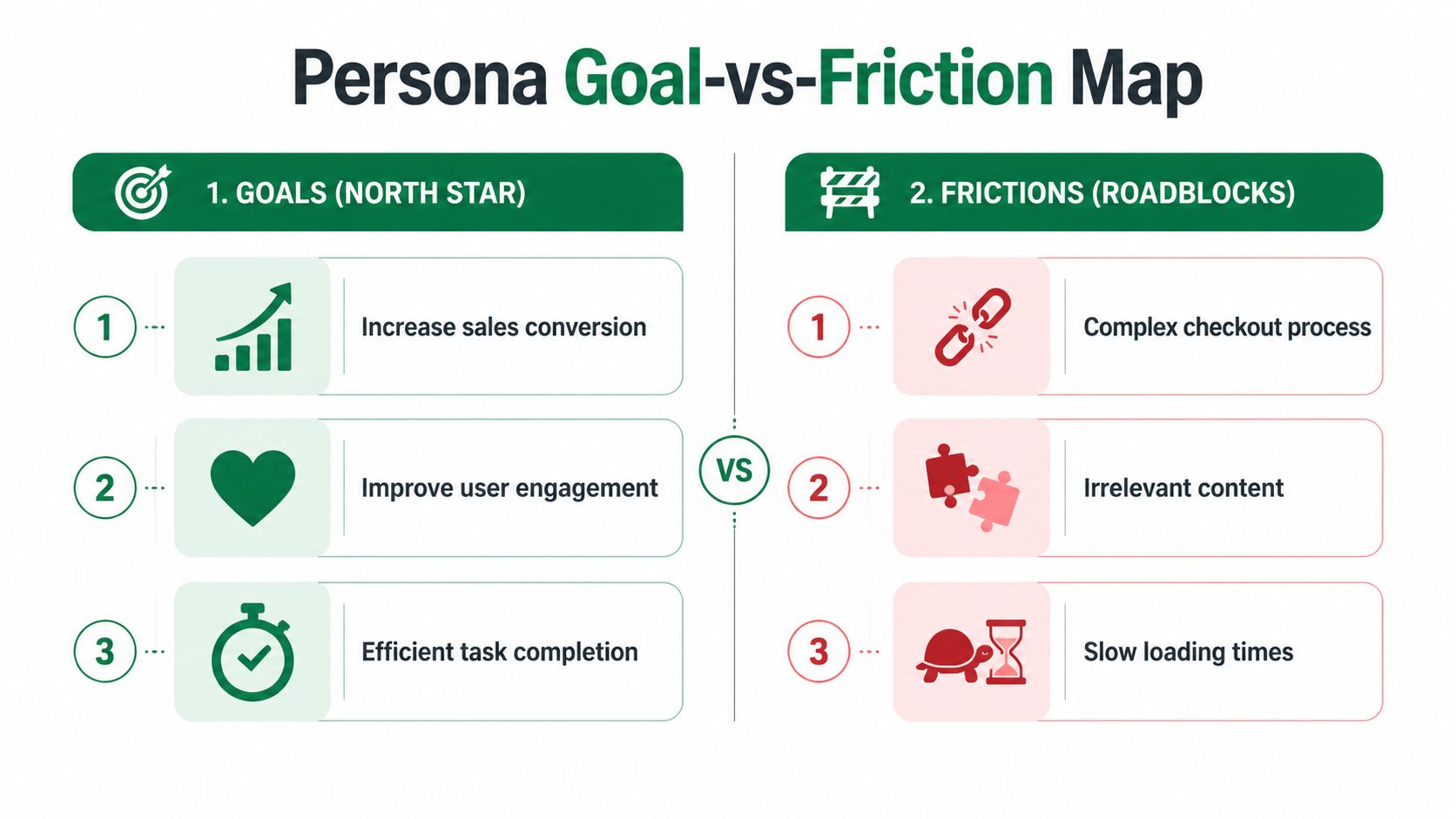
I use a simple Goal-vs-Friction Map inside the persona card. On one side, place the top goals. On the other, place the blockers. Then connect each goal to the friction that interrupts it. This turns the persona from a profile into a working model of where the experience breaks.
That matters because good persona work needs more than demographics. Up to 70% of personas are based on guesswork, and a rigorous process depends on layering qualitative insight, including key problems and perceived barriers, on top of quantitative data, as explained in this guide to buyer persona mistakes and methodology.
How the map works in practice
Take a persona like Laura, an operations manager evaluating a tool quickly between other tasks.
Her map might look like this:
Goal: Understand product value fast
Friction: Vague hero copy and buried proof pointsGoal: Compare options confidently
Friction: Too much jargon and unclear differentiationGoal: Move forward without extra effort
Friction: Long forms and hidden pricing
You don't need a complex diagram. In Canva, three colored tags on the left, three on the right, and a few arrows are enough.
The point isn't decoration. The point is helping the team see which design choices create friction for a specific person with a specific goal.
Small design choices that make the map readable
A few visual details make this much stronger:
Use one color for goals and another for frictions: The distinction should be obvious even at a glance.
Add simple icons sparingly: A clock for urgency or a warning symbol for blockers can help, but don't crowd the card.
Check contrast and font weight: If the map isn't readable on a shared screen, it won't influence discussion.
Keep each label short: The explanation can live in notes. The canvas needs to stay fast.
This is one of those changes that improves workshop quality immediately. Instead of debating abstract persona traits, the team starts asking better questions: Which friction do we remove first, and what evidence do we have that it's real?
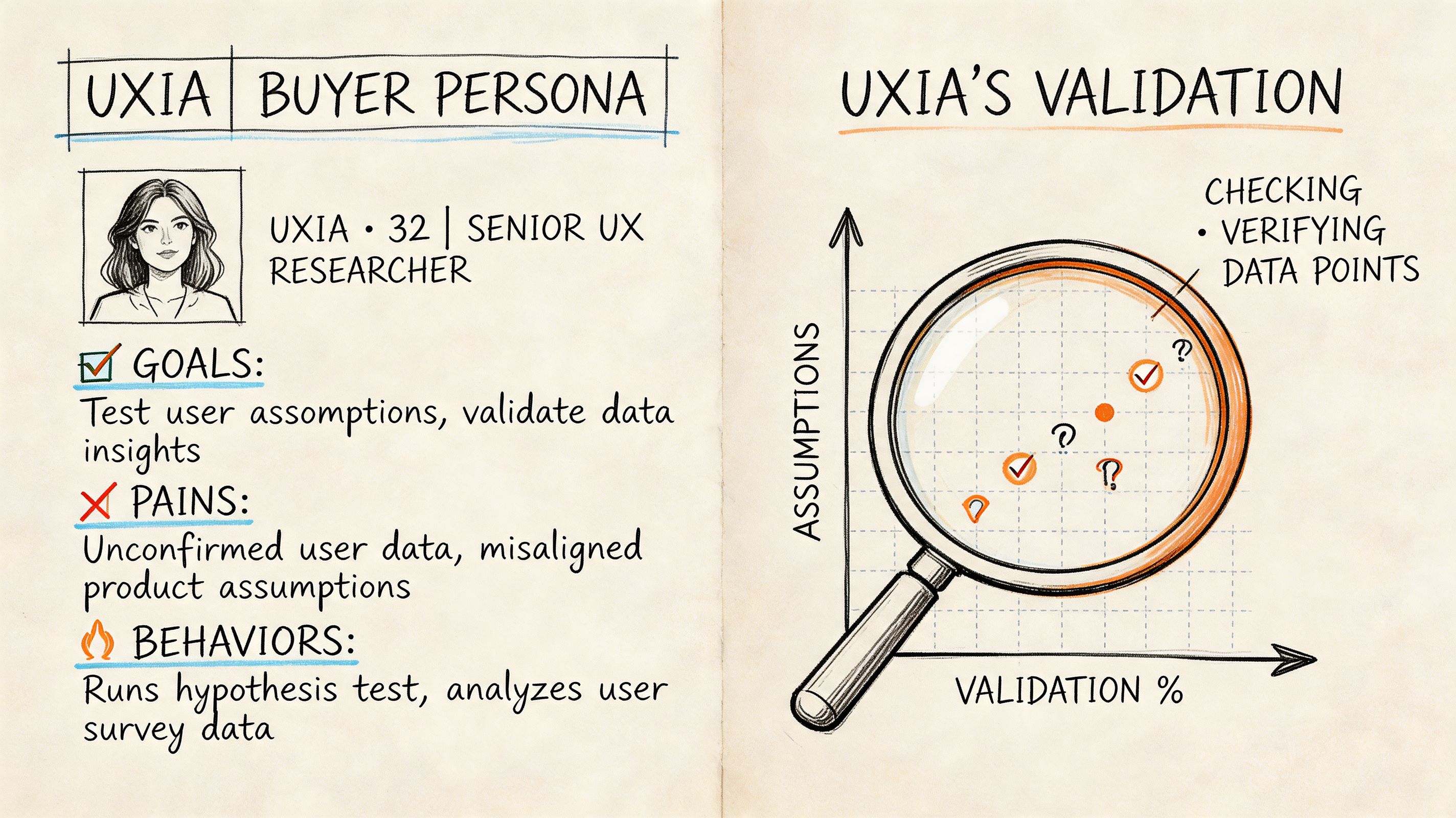
From Assumption to Evidence Validate with Uxia
A Canva persona becomes valuable when you treat it as a hypothesis. The visual card says, “We believe this kind of person wants this outcome, hits these barriers, and decides in this way.” The next move is to test that belief.
That validation layer is the missing piece in most buyer persona canva content. AI-driven UX testing adoption has grown by 74%, and 52% of teams cite persona drift as a key problem, according to this Canva persona examples resource discussing the gap around persona updates. Static personas age quickly. Product experiences change, markets shift, and assumptions go stale.
Translate the persona into test criteria
Take the earlier Laura example:
Demographic context: Operations leader at a mid-sized company
Behavioral pattern: Time-poor, comfortable with digital tools, skeptical of extra steps
Motivation: Evaluate relevance quickly
Likely blockers: Unclear navigation, hidden pricing, forms that ask too much too early
Those aren't just descriptive fields. They're test inputs. Build your audience criteria from them, run the same mission through the product flow, and compare what the persona predicted with what the testing output shows. You're looking for alignment or contradiction.
If the persona says Laura wants immediate clarity, but the audience repeatedly hesitates before the main CTA, you've learned something. Maybe the CTA isn't specific enough. Maybe the proof is too low on the page. Maybe your persona understated the trust barrier.
What to compare after the run
The useful comparison isn't “did people like it?” It's more specific.
Review outputs in categories such as:
Journeys: Where they moved smoothly and where they broke off
Heatmaps: Which elements attracted attention and which were ignored
Think-aloud patterns: What they misunderstood, distrusted, or found unclear
Drop-offs and success signals: Whether the expected path occurred
If the results contradict the persona, refine the persona. Don't force the product to fit your original story.
When you're interpreting verbal feedback and open-text observations, this BuildForm guide for qualitative analysis is worth reading. It gives a practical lens for turning messy comments into usable patterns instead of cherry-picking quotes that confirm what the team already believed.
Keep the persona alive
The strongest workflow is cyclical:
Stage | Output |
|---|---|
Persona created in Canva | Shared team understanding |
Audience translated into testing criteria | A concrete hypothesis |
Validation run on the product | Behavioral evidence |
Persona updated | Stronger next round of decisions |
If you want a deeper view of how synthetic audiences compare with older validation approaches, this practical guide to synthetic users and UX validation is useful background. The key point is straightforward. A static card can align a room. Evidence can change a roadmap.
Putting Your Validated Persona to Work
A validated persona shouldn't live in a research folder. It should show up in the places where product choices get made.
Export the Canva version in a format that's easy to share in design reviews and planning docs. Keep the visual concise, then attach a short evidence summary from the latest validation run. That pairing works well because one artifact helps the team remember the person, while the other shows what happened in the product.
I also recommend a simple operating rhythm:
Use the persona in critiques: Ask which screen choice helps or hurts this person.
Bring evidence into roadmap conversations: Don't let the persona stay a branding exercise.
Refresh it when behavior changes: The card should evolve with new findings, not stay frozen.
Tie frictions to concrete design work: If checkout hesitation is a recurring issue, use practical references on optimizing UX and checkout to help the team move from observation to solution.
The shift is small but important. Canva helps teams understand the persona quickly. Validation keeps that understanding honest. That's the standard worth adopting if you want personas that improve the product instead of decorating the process.
If you're ready to turn buyer persona canva work into a repeatable validation workflow, Uxia helps product teams test persona assumptions with synthetic users, observe journeys and friction, and refine profiles based on evidence instead of guesswork.