
8 Synthetic Users Use Cases for UX Teams in 2026
Explore 8 practical synthetic users use cases for UX/UI testing. Learn how platforms like Uxia accelerate validation, from prototyping to accessibility.

Traditional UX research is still treated like a phase. Design happens first, then validation gets scheduled, recruited, moderated, and summarized later. That model is too slow for teams shipping weekly. In controlled evaluation, Nielsen Norman Group found synthetic users could produce initial desk research outputs in minutes, giving a speed advantage of over 100x compared with traditional recruiting and interview cycles for early-stage exploratory work in their benchmark of synthetic users.
That speed matters because most UX mistakes aren’t deep architectural failures. They’re missed labels, weak hierarchy, confusing onboarding, inaccessible controls, and trust gaps that a team could've caught before handoff. Synthetic users make those checks cheap enough to run often.
They also aren't magic. The strongest current pattern is practical: use synthetic users to narrow the problem space, stress-test assumptions, and prepare stronger human research. Platforms like Uxia fit that workflow well because they let teams upload prototypes, define a mission, assign an audience, and review transcripts, friction points, and visual reports quickly.
That’s where synthetic users use cases become useful instead of theoretical. The value isn’t “AI research” as a concept. The value is knowing when to run a fast simulation, what mission to give it, what outputs to review, and when to stop and bring in real participants. The eight use cases below focus on exactly that.
1. Rapid Prototyping Validation & Iteration
The cheapest product mistake to fix is the one caught before a line of code is shipped. Rapid prototype validation is where synthetic users earn their keep fastest, because they let teams compare flows while the cost of change is still low.
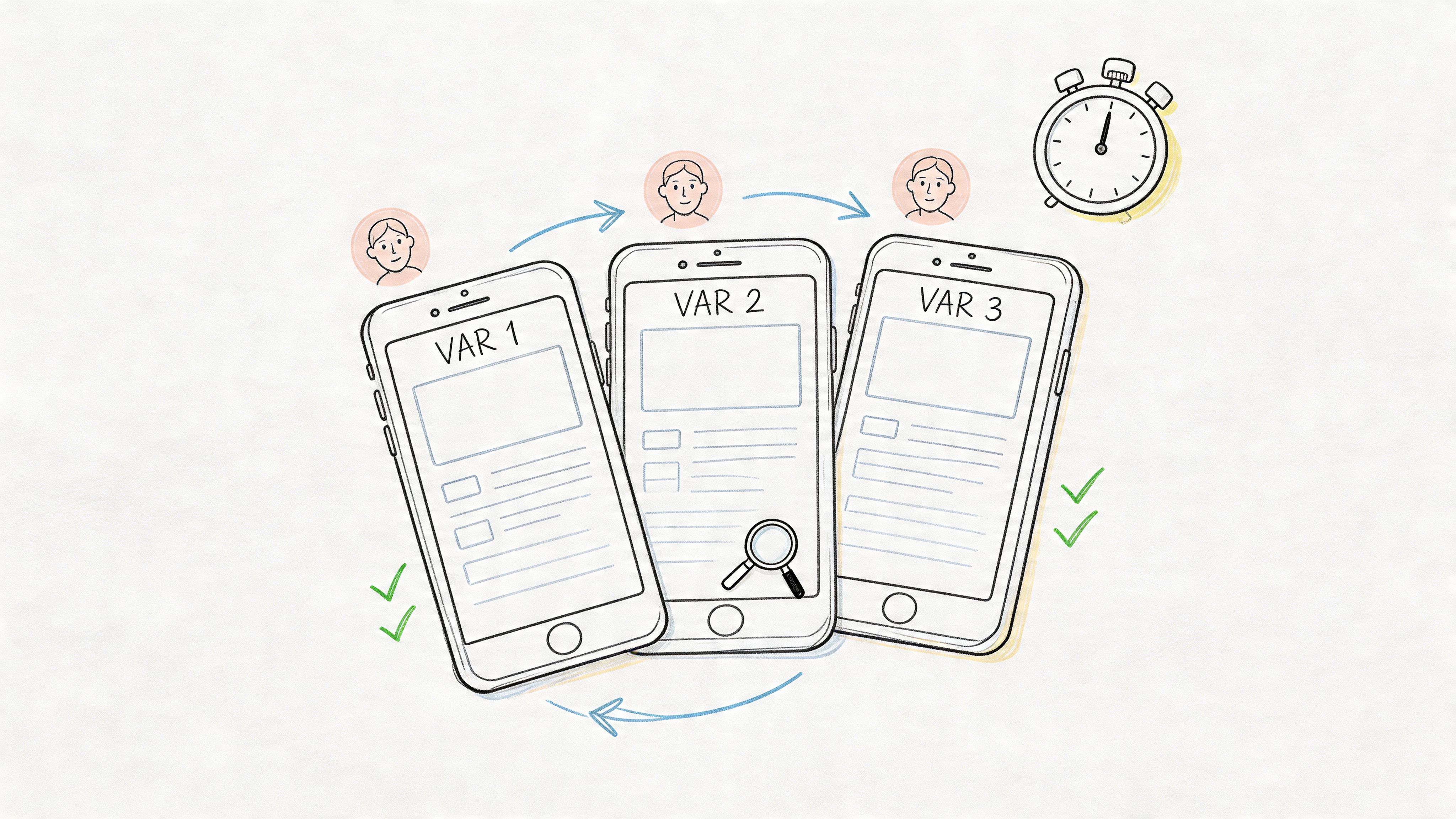
The practical use case is straightforward. Put two or three versions of the same task in front of the same audience model, then compare where each version creates delay, confusion, or drop-off. This works especially well for wireframes, click-through prototypes, and early interactive mocks where the team is still deciding structure, sequence, and copy.
A mobile banking team might test three dashboard layouts for "find recent transactions and export a statement." A SaaS team might compare onboarding paths that change only the setup order, CTA wording, and empty-state guidance. The point is not to ask which design people "like" more. The point is to see which version gets users to the goal with fewer wrong turns.
Mission to run
On Uxia, set a mission that mirrors a real user outcome and gives the model a clear threshold for friction:
Task-focused prompt: “You’ve just signed up. Connect your workspace, invite a teammate, and locate the first report.”
Context-aware framing: “You’re short on time and deciding whether this product is worth continuing with.”
Decision trigger: “Call out the first moment where you hesitate, feel unsure what to do next, or think the product is asking for too much effort.”
Then review the results at the variant level. A useful starting point is Uxia's process for AI-powered testers and 98% usability issue detection using NN/g research, because it maps the workflow from mission design to issue review in a way product teams can run.
Practical rule: Test competing directions at the same fidelity level. A polished prototype will often outperform a rough one for reasons that have nothing to do with the underlying flow.
What to inspect first:
Task completion path: Did users reach the goal cleanly or bounce between elements?
First hesitation point: Where did confidence drop?
Hierarchy interpretation: Did users understand what was primary, secondary, and optional?
Instruction dependence: Could they progress from interface cues alone, or did the mission prompt do too much work?
This is also where trade-offs matter. Synthetic users are strong at exposing structural problems early, especially around findability, sequence, and decision load. They are weaker at capturing emotional nuance, social context, or edge-case motivations tied to lived experience. Use them to reduce the number of bad options quickly. Then bring human participants into the smaller set of decisions that still need real-world judgment.
2. User Experience Friction Identification
Some flows look clean in design review and still fail in use. That usually happens in multi-step journeys where each individual screen seems reasonable, but the overall sequence creates drag.
Synthetic users are effective at repeatedly walking those journeys and exposing where the product asks for too much effort, too soon. In practical deployments across SaaS, e-commerce, FinTech, and EdTech, synthetic-user testing has been described as costing one-third as much and taking half the time of traditional human studies in this analysis of synthetic users in product testing.
A strong example is a B2B analytics platform where new users need to import data, map fields, and build a first dashboard. Individually, each step makes sense. In sequence, users often lose confidence because the system assumes too much product knowledge.
Mission to run
On Uxia, define the mission around a complete user outcome, not a screen:
Core mission: “Import a CSV, map the fields correctly, and create a dashboard you’d trust enough to share.”
Behavioral instruction: “Think aloud whenever terminology feels unclear or the next step isn’t obvious.”
Segment variation: Run the same mission for a first-time operator, a manager reviewing team setup, and an experienced analyst migrating from another tool.
Then inspect friction in layers.
Navigation friction: Where do users search instead of act?
Copy friction: Which labels or helper text get misread?
Interaction friction: Where do they click or pause with no payoff?
Confidence friction: At what point do they doubt the result they’re creating?
A useful complement is issue clustering. If several synthetic personas struggle at the same transition point, that’s usually worth fixing before launch. Uxia’s workflow aligns well with this kind of structured issue review, especially when paired with guidance from its article on applying NN/g research to AI-powered usability testing.
Friction rarely appears as a dramatic failure. More often, it shows up as quiet uncertainty, repeated rereading, and hesitant navigation.
What doesn't work well is asking broad questions like “what do you think of the experience?” That produces generic approval. Friction testing works when the mission is concrete and the success condition is unambiguous.
3. Accessibility Compliance Testing
Accessibility is one of the best synthetic users use cases because teams can test for barriers long before formal audits or public release.
A common mistake is treating accessibility as a final compliance pass. By then, the expensive problems are already baked into navigation, forms, and content structure. Synthetic users can help surface likely issues earlier, especially around keyboard flow, form labeling, semantic clarity, and content comprehension.
Here’s a useful way to frame it on Uxia. Create audience profiles that reflect the constraints you expect to support, then assign a task that forces interaction with the most fragile parts of the interface: forms, menus, modal windows, error handling, and media.
Before reviewing results, it helps to align the team around the accessibility standard you’re testing against. Uxia’s own guide to accessibility testing workflows is a practical starting point.
A related area many teams overlook is media accessibility. If your product includes tutorials, demos, or onboarding videos, strong closed captioning software matters because comprehension breaks don't stop at the UI.
What to ask synthetic users to do
Keyboard path mission: “Complete account creation without using a mouse.”
Screen-reader oriented mission: “Find pricing, compare plans, and explain which option you’d choose.”
Cognitive-load mission: “Reset your password after encountering an error, and describe what feels confusing.”
What to look for is less about a single pass/fail verdict and more about barrier patterns. Do labels explain intent? Are instructions separated from action? Does the product require memory from one step to the next? Are errors recoverable?
Accessibility lens: Run accessibility missions on the same core flows you test for conversion. Teams often validate one and forget the other.
Synthetic users won't replace manual audits by specialists, and they won't fully replicate lived disability experience. They are still valuable for catching obvious barriers earlier, reducing rework, and helping teams ship stronger first drafts.
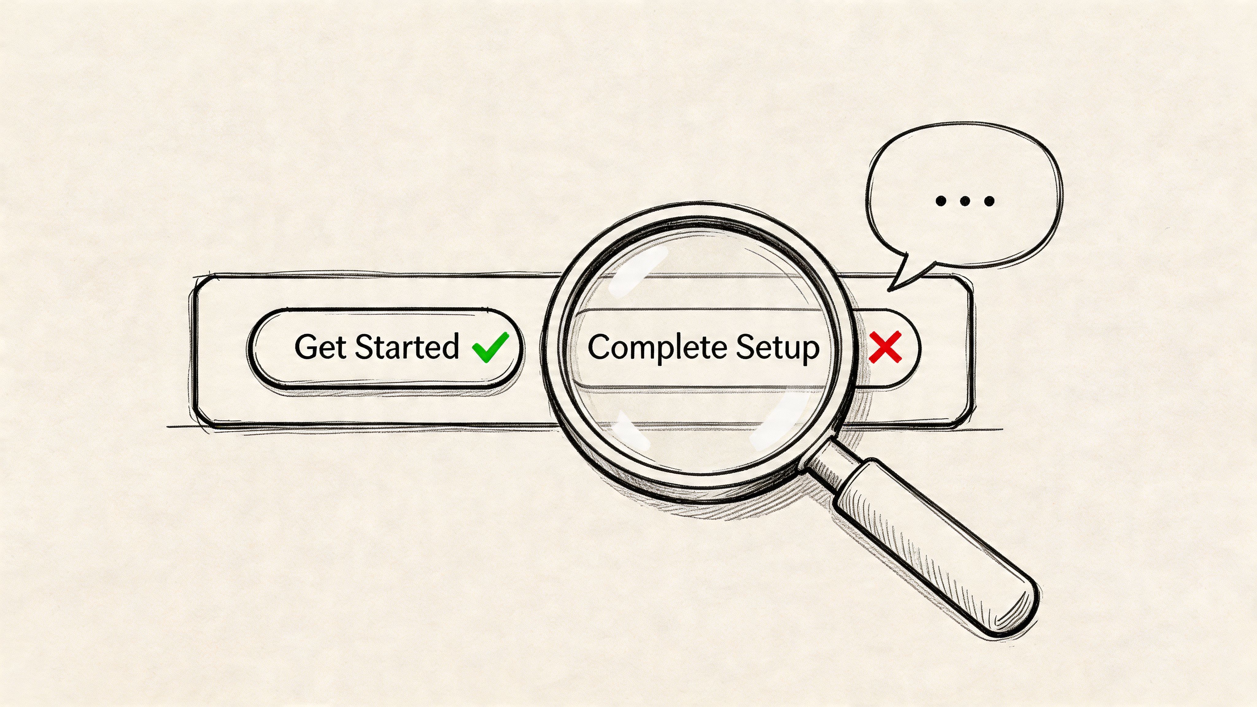
4. Copy & Microcopy Optimization
A surprising amount of UX failure is language failure. The layout is fine. The controls work. But the product uses labels that make sense internally and sound vague to everyone else.
Synthetic users are good at exposing this because transcript-style feedback makes confusion visible. If users repeatedly stop at “Create Workspace,” “Activate Sync,” or “Submit Request,” the issue usually isn't motivation. It’s interpretation. One team might mean “finish setup,” while users read “start something technical.”
This use case works especially well for onboarding, checkout, forms, and error states. A SaaS product can compare “Complete Setup” against “Get Started.” An e-commerce team can test reassurance copy near payment fields. A mobile app can review whether an error message tells users what happened and what to do next.
Mission to run
Use side-by-side copy variants in context. Don’t test isolated labels detached from the interface.
Variant mission: “Choose the option that helps you move forward fastest, and explain any wording that slows you down.”
Recovery mission: “Trigger an error intentionally, then describe whether the message helps you recover.”
Trust mission: “Read the billing page and say which phrases increase or reduce your confidence.”
One thing that does work well is transcript mining for repeated wording failures. If several synthetic users paraphrase a CTA incorrectly, the copy is carrying the wrong meaning. Uxia is useful here because it lets teams review qualitative feedback alongside the interface under test, which keeps copy decisions grounded in task context.
What doesn’t work is treating synthetic users as a final authority on brand voice. They can tell you whether something is clear, literal, and confidence-building. They’re less suited to deciding whether copy feels culturally distinctive or emotionally resonant in a nuanced brand sense.
5. New Feature Launch Readiness Testing
Shipping a feature without launch-readiness testing is one of the fastest ways to mistake delivery for adoption.
Teams usually declare a feature ready once QA passes and edge cases are handled. Launch risk sits elsewhere. Users may not notice the feature, may misread what it does, or may see it and choose the older path because it feels safer. That is the gap synthetic users are good at exposing before release.
The right way to use them is operational, not aspirational. Give them a concrete job inside the actual interface and watch where the new feature fails to earn attention or fit into an existing workflow. Broad opinion prompts produce weak signals here. Task performance produces useful ones.
Mission to run
A productivity app releasing “shared templates” on Uxia can test readiness with missions tied to actual launch risk:
Discovery mission: “Start a new project using the method that looks fastest to you.”
Adoption mission: “Set up a repeatable workflow for your team using any feature that seems built for reuse.”
Interpretation mission: “Explain what ‘shared templates’ means here, and say when you would use it.”
Conflict mission: “Complete the setup using whichever option feels most familiar, and explain why you chose it.”
The strongest signals are specific. Measure feature notice rate, first-click path, time to correct interpretation, whether users choose the new path over the incumbent one, and how often they need to reopen menus or reread labels. In transcript review, look for phrases like “I assumed this was for admins,” “this sounds advanced,” or “I’d probably skip this for now.” Those are launch blockers, not minor wording issues.
A good pre-launch readout answers four questions. Did users see the feature without prompting? Did they understand the label and entry point? Did the feature fit the current mental model of the product? Did it create hesitation in a flow that was previously straightforward?
The real test is behavioral clarity. If users need explanation, onboarding copy, or a release note just to recognize the feature’s value, the interface is still doing too little.
One trade-off matters. Synthetic users are strong at catching discoverability and comprehension failures in a short window. They are weaker at predicting whether a feature becomes part of long-term habit. Product teams still need live usage data, support tickets, and follow-up research after launch. Used well, synthetic testing reduces avoidable launch misses before real users pay the price.
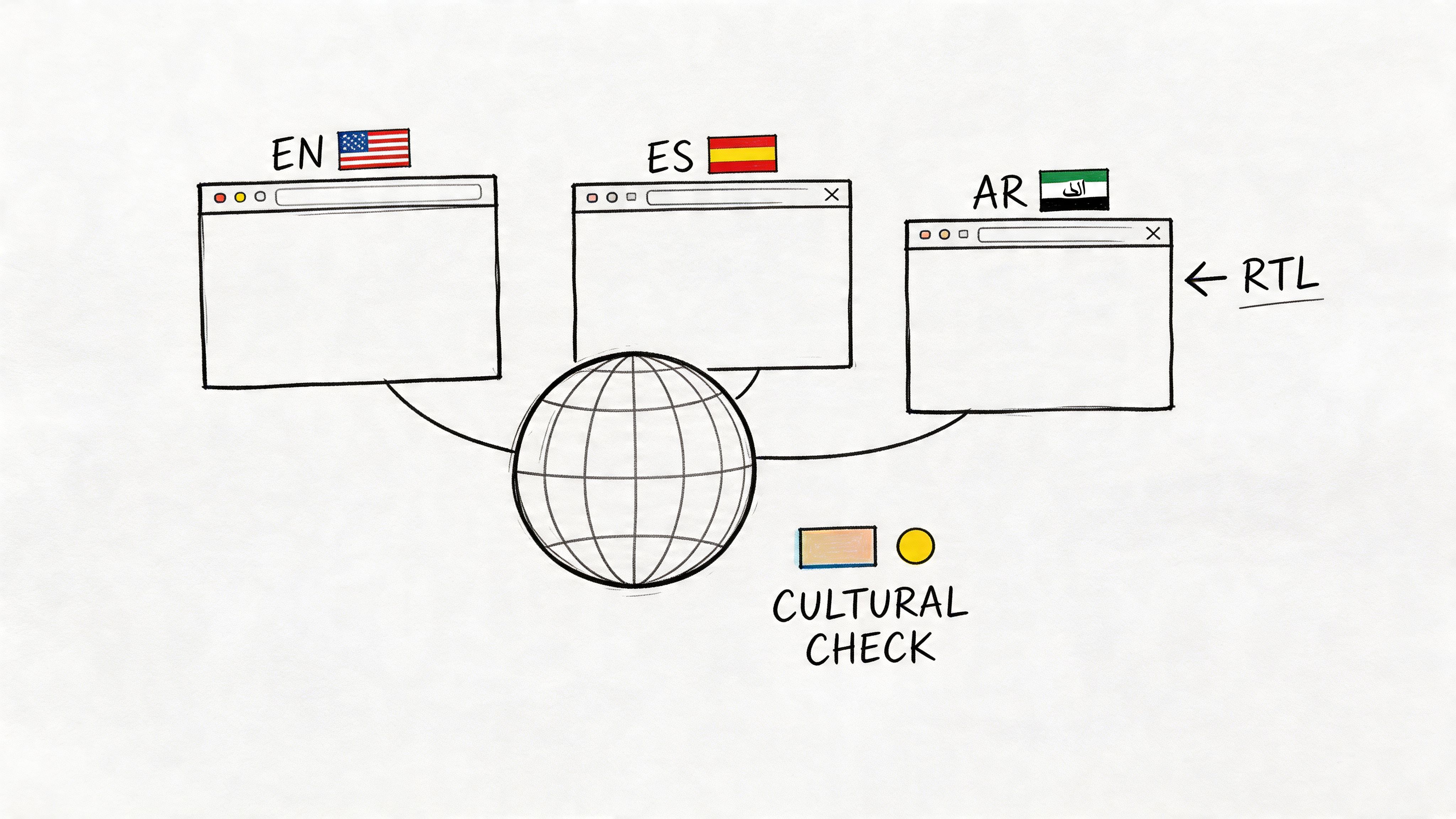
6. Localization & Internationalization Validation
Localization failures break conversion faster than weak translation. The usual problem is operational mismatch. The form expects a postal code format that does not exist locally. The checkout defaults to a payment method people in that region rarely use. The trust signals read like they were imported from another market without adaptation.
Synthetic users are useful here because they let product teams test local expectations before release, not after support tickets pile up. They are especially good at catching form friction, payment confusion, layout issues, and copy that feels translated rather than written for the market. That makes this use case practical for teams shipping onboarding, ecommerce, and account flows across several locales at once.
The limit is clear. Synthetic users can surface likely friction, but they should not be treated as a substitute for in-region research on culture, tone, humor, or social norms. Coverage is still uneven across global audiences, particularly outside the markets represented most heavily in training data. Use the output as a screening layer, then confirm important decisions with real participants from the target region.
Mission to run
On Uxia, create region-specific missions tied to actual tasks and local conventions.
Checkout mission: “Buy a low-cost item using the payment method you would expect to use in your country, and explain anything that feels unfamiliar or missing.”
Account mission: “Create an account and complete the address form without guessing what any field means.”
Trust mission: “Review this page and explain whether it feels built for people in your region or translated from another market.”
Review the results for specific failures, not generic sentiment. Track form completion rate, hesitation on address and phone fields, payment method preference mismatch, time to finish checkout, and comments that signal mistrust or confusion. In transcripts, strong signals sound like “I do not know what goes here,” “I would expect bank transfer,” “this wording feels imported,” or “I am not sure this applies in my country.”
One useful comparison is mechanical versus cultural fit. Mechanical fit covers date formats, currencies, tax labels, reading direction, character support, and local payment flows. Cultural fit covers whether the page sounds credible, familiar, and intended for the region. Synthetic users can help you find the first category quickly. The second still needs live validation with people who live and buy there.
A good readout answers three questions. Can users complete the task without guessing? Does the interface reflect local conventions well enough to earn trust? Which issues are safe to fix immediately, and which ones require follow-up research in that market?
Teams entering a new region should treat synthetic testing as a filter. It helps catch obvious localization mistakes before launch. It does not replace local expertise.
7. Enterprise & B2B Workflow Validation
Consumer flows are usually linear. Enterprise flows rarely are.
An HR platform, CRM, procurement system, or analytics suite has different roles, permissions, approvals, and exception paths. One person starts a task, another approves it, and a third person audits it later. Synthetic users are especially useful here because they can simulate those role-based journeys without forcing a team to recruit multiple real participants for every iteration.
A solid example is employee onboarding software. The employee needs clarity and progress cues. The manager needs visibility and reminders. The admin needs compliance and exception handling. If the same workflow tries to satisfy all three through one generic interface, the result usually feels bloated to everyone.
Mission design for complex systems
On Uxia, create role-specific testers instead of generic “B2B users.”
Employee mission: “Complete your onboarding tasks and confirm what remains.”
Manager mission: “Approve a new hire request, spot missing inputs, and escalate if needed.”
Admin mission: “Audit the workflow, correct an exception, and verify permissions.”
Review the outputs for role mismatch. Are managers seeing details meant for admins? Are individual contributors blocked by terminology used only by internal operations teams? Are permission boundaries understandable, or do they feel arbitrary?
A common mistake is testing only the happy path. Enterprise systems break down in approvals, edits, reversals, and edge cases. Synthetic users are useful for exercising those paths early, especially when engineering teams want feedback before staging environments are fully populated.
What doesn’t work is asking synthetic users to evaluate specialized domain legitimacy in isolation. If your product serves healthcare, legal, or regulated finance workflows, the role simulation still needs review from subject-matter experts.
8. Trust & Security Communication Testing
Security friction is often necessary. Confusing security friction isn’t.
Users will tolerate extra steps when the product explains why those steps matter and what protection they provide. They abandon flows when the interface feels opaque, alarmist, or inconsistent. Synthetic users are good at identifying where trust communication breaks because they expose the gap between what the team intended and what a user infers.
This use case matters in banking, healthcare, identity verification, B2B admin controls, and any checkout flow handling sensitive information. A payment screen with too little explanation can feel unsafe. A verification step with too much legal language can feel threatening.
Mission to run
Ask synthetic users to complete a security-sensitive task while narrating confidence and hesitation:
2FA mission: “Log in on a new device and explain whether each security step feels protective or burdensome.”
Privacy mission: “Review a consent screen and state what data you think will be shared.”
Payment mission: “Complete checkout and point out the exact moment you either trust or distrust the page.”
What to inspect first is not whether they “like” the flow. Review where their confidence rises or drops. Did they understand why verification was required? Did they believe the privacy claim? Did badges, labels, or policy text help, or did they look decorative?
A practical strength of Uxia here is speed. Teams can test multiple trust-message variants before release rather than debating internally whether “bank-grade security,” “encrypted,” or plain-language explanations are the right choice.
The trade-off is familiar. Synthetic users can reveal comprehension gaps and likely trust friction. They can’t stand in for real-world legal risk review, compliance review, or live-user confidence after an actual incident or outage.
Synthetic Users: 8 Use-Case Comparison
Use case | 🔄 Implementation complexity | ⚡ Resource requirements | 📊 Expected outcomes | 💡 Ideal use cases | ⭐ Key advantages |
|---|---|---|---|---|---|
Rapid Prototyping Validation & Iteration | 🔄 Low–Medium, upload prototypes and define personas quickly | ⚡ Low, design assets + platform access; minimal recruitment | 📊 Very fast usability feedback; rapid iteration and prioritized fixes | 💡 Design sprints, pre-handoff checks, multi-variant testing | ⭐ Fast time-to-feedback, parallel variant testing, cost-efficient |
User Experience Friction Identification | 🔄 Medium, requires defined flows and success metrics | ⚡ Moderate, scenario creation, analytics interpretation | 📊 Clear bottleneck detection (task completion, time-on-task) | 💡 Conversion optimization, pre-launch QA, weekly baselining | ⭐ Quantifies friction for data-driven prioritization |
Accessibility Compliance Testing | 🔄 Medium–High, needs accessibility personas and WCAG mapping | ⚡ Moderate, accessibility expertise + verification audits | 📊 Flags WCAG issues, improves inclusivity, lowers legal risk | 💡 Accessibility-by-design, compliance-driven projects, gov/edu sites | ⭐ Early compliance detection; more cost-effective than late audits |
Copy & Microcopy Optimization | 🔄 Low, prepare copy variants and mission briefs | ⚡ Low, copy variants and transcript analysis tools | 📊 Improved clarity and conversion; readability and sentiment signals | 💡 CTAs, onboarding, error messages, landing page headlines | ⭐ Data-driven messaging decisions; fast A/B of microcopy |
New Feature Launch Readiness Testing | 🔄 Medium, needs functional prototypes and realistic scenarios | ⚡ Moderate, cross-persona tests, integration validation | 📊 Validated discoverability and initial adoption; fewer support tickets | 💡 Staged rollouts, beta validation, feature discoverability checks | ⭐ Reduces launch risk and informs go-to-market messaging |
Localization & Internationalization Validation | 🔄 Medium–High, regional personas and cultural checks required | ⚡ Moderate–High, native language reviewers, legal/compliance input | 📊 Validates cultural fit, formatting, and region-specific flows | 💡 Market expansion, RTL support, local payments/compliance | ⭐ Prevents cultural missteps; validates localization quality at scale |
Enterprise & B2B Workflow Validation | 🔄 High, multi-user, role-based and permissioned workflows | ⚡ High, detailed role personas, domain knowledge, complex scenarios | 📊 Ensures role-appropriate UX and permission correctness | 💡 Enterprise SaaS deployments, permission-sensitive workflows | ⭐ Validates complex workflows and reduces large-scale adoption friction |
Trust & Security Communication Testing | 🔄 Medium, requires compliance language and security personas | ⚡ Moderate, legal/compliance review and secure flow prototypes | 📊 Clearer trust messaging; balanced security vs. usability | 💡 Fintech, healthcare, payments, authentication flows | ⭐ Optimizes security communication to improve conversion without weakening protection |
From Insight to Action Making Synthetic Testing Your Default
Synthetic testing works best as a standard pre-decision check in the product cycle. Teams use it before specs harden, before copy gets signed off, and before engineering spends time polishing the wrong thing. That shift changes research from a scheduled event into an operating habit.
The practical value of these synthetic users use cases is not the theory. It is the repeatable workflow behind them. For each use case in this article, the pattern is the same: define the product risk, write a mission, run the test, review where the agent stalled or hesitated, and decide what changes are worth making before involving human participants. That approach gives product teams a faster first pass on common decisions without pretending it replaces live customer input.
Used well, synthetic testing shortens the path between assumption and evidence. Used poorly, it creates false confidence. The difference usually comes down to scope.
A good starting point is one high-volume flow with clear business impact, such as signup, onboarding, checkout, or account recovery. Write a mission around an outcome, not a vague prompt. “Create an account and find the pricing details for a team plan” will produce better signal than “explore the product and share feedback.” Review the transcript alongside the click path. If the agent says the page is clear but loops between two screens, the behavior matters more than the summary.
Then use the findings to make small, testable changes:
tighten page hierarchy when users miss the main action
rewrite labels when agents pause on basic navigation choices
fix accessibility blockers that prevent task completion
clarify trust language where hesitation shows up near payment, login, or consent
escalate to human research when the decision involves regulation, emotion, cultural nuance, or a major roadmap commitment
Providing teams with an operational win, synthetic testing is fast enough to run every sprint, but useful enough to influence prioritization. It can help product, design, and research teams enter human studies with sharper questions and fewer avoidable issues still sitting in the prototype.
If you want to explore various use cases for AI agents, synthetic testing is a strong example of where narrow scope and clear evaluation criteria make AI particularly useful in product work.
Uxia is one practical way to run that workflow. A team can upload a prototype or live flow, define an audience, assign a mission, and review the resulting feedback while the work is still easy to change.
If you want to make validation part of every sprint, try Uxia. Upload a prototype or live flow, assign a mission, choose a target audience, and review synthetic-user feedback before the next design decision hardens into code.